
Chapter 4
Using the Google Analytics Interface
The Google Analytics user interface makes use of the latest developments in Web 2.0 technology to construct report data in a highly accessible, industry-leading format. For example, rather than use a side menu to navigate through different reports (though that is available), the user is encouraged to drill into the data itself.
In this chapter we review the Google Analytics interface, particularly in relation to discovering information. By understanding the report layout, you will quickly become accustomed to drilling down into the data, investigating whether a number or trend is good, bad, or indifferent for your organization.
In Chapter 4, you will learn:
- Discoverability and the context of data
- The difference between dimensions and metrics
- How to navigate your way around the plethora of information
- How to manipulate data tables and charts
- How to schedule exports of data
- The value of segmentation and pivot views
- How to annotate charts to highlight key events
Discoverability and Initial Report Access
A common complaint from users of other web analytics tools is that the vast quantity of data generated is often overwhelming and difficult to find. The result is that report users get lost and frustrated—unable to decipher the information—and the web metrics project can stall at this point. Such feedback enabled Google to build an intuitive Google Analytics report interface focused on the user, usually a marketer, as opposed to the data. The revised user interface design (the team responsible came from MeasureMap, a Google acquisition) has proved so successful in user-experience studies that the format is being adopted throughout Google—notice the similarly styled graphs you now see in AdWords, AdSense, FeedBurner, and the geomap overlay of Google Insights, for example.
In addition to making the data very accessible, the user interface enhances discoverability. By this I mean how easy it is for you to ascertain whether the report you are looking at is good news, bad news, or indifferent to your organization. In other words, Google Analytics simplifies the process of turning raw data into useful information so that you can take appropriate action, such as reward your team, fix something, or change your benchmarks.
The Google Analytics drill-down interface differs from other web analytics tools that have a menu-driven style of navigation. You can select menu-driven navigation if you prefer it, but the Google Analytics interface makes it much easier to explore your data in context—that is, within the data, so that you do not waste your time navigating back and forth between reports to answer your questions. In addition, links within the reports suggest related information, and fast, interactive segmentation enables you to reorganize data on-the-fly. Short narratives, scorecards, and sparklines summarize your data at every level. Moreover, to help you understand, interpret, and act on data relationships, context-sensitive help articles are available in every report.
Simple and Effective Data Visualization
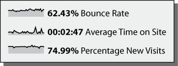
A sparkline is a mini-image (thumbnail) of graphical data that enables you to put numbers in a temporal context without the need to display full charts. For example, the following screen shot shows an array of numbers that on their own would be meaningless. However, the sparkline graphics show these in context by illustrating the trends over the time period selected. It’s a neat and condensed way of conveying a lot of information—originally an invention of Edward Tufte, a pioneer of data visualization (http://en.wikipedia.org/wiki/Edward_Tufte).
Assuming you already have a Google Analytics account (or have access to one), Figure 4-1 schematically illustrates the report-access process. As with all Google products, access to your Google Analytics account is via your Google Login—a Google-registered email address that can be any email address you control, such as [email protected]. Your Google Account is your centralized access point. From it, you may have access to multiple Google Analytics accounts, each one with multiple web properties and profiles (report sets).
Figure 4-1: Schematic access process for Google Analytics reports

When you first log in to your Google Analytics account, you will be presented with the Account Home screen, shown in Figure 4-2. At first, this will most likely contain only a single web property and single profile, created when your Google Analytics account was initially opened. However, in an agency environment you may have access to many Google Analytics accounts and hence you will see additional accounts, web properties, and profiles. This is the case for Figure 4-2, which shows two accounts, three web properties (labeled with a P), and eight profiles. Note that if you are logging in via AdWords, the exact layout may appear slightly different.
At this stage, consider a profile to be defined as a report set, that is, a set of Google Analytics reports dedicated for a particular purpose, such as UK visitors only, US visitors only, and so forth. The use of profiles is discussed in the section titled “Using Accounts, Web Properties, and Profiles” in Chapter 6, “Getting Started: Initial Setup.”
Tip: You can preview Google Analytics capabilities at www.google.com/analytics/tour.html. The walkthrough is in English, with other languages shown as subtitles.
Figure 4-2: Account Home screen for two Google Analytics accounts containing three web properties and eight profiles

Navigating Your Way Around: Report Layout
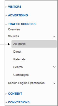
As with all web-based software applications, the best way to get to know its capabilities is to see it in action. With the Google Analytics report interface, you can do this quickly, which is one of its key strengths. The report screen shots used in this chapter are taken from the Traffic Sources Sources All Traffic report, found by navigating through the menu shown in Figure 4-3.
Figure 4-3: Use the All Traffic report as a starting place for learning the user interface.
An example of a typical report is shown in Figure 4-4. The key areas I describe in this chapter are labeled. I’ll use this as a guide for introducing the features of the Google Analytics user interface. If you have access to a Google Analytics account, I recommend having it at hand while reading this chapter in order to become familiar with the points discussed.
Note: Everything described in this chapter is part of the Standard Reporting suite in Google Analytics. This is selected by default when you view your profile reports and is highlighted in the orange menu bar at the top of Figure 4-4. Apart from Standard Reporting Suite, there are three other important menu items in the top orange bar: Home, Custom Reporting, and the Settings icon to the right—you will see the Settings icon only if you have administrative access to the profile you are viewing. The Home area contains real-time reports, your dashboards, intelligence events, and flow visualization reports. These are discussed in Chapter 5, “Reports Explained.” Custom reporting is described in Chapter 9, “Google Analytics Customizations.”
Figure 4-4: A typical Google Analytics report with guideline path (also shown in the color section)

Although Google Analytics is the industry leader for its information architecture, if you are new to web analytics, the layout of the reports can still appear daunting—there is simply a lot of information to convey and to digest. However, once you understand the basic layout, you will quickly realize just how intuitive it is to use.
The dotted path I have used in Figure 4-4 is typical for how I examine a report for the first time. Essentially, my eyes travel in a clockwise fashion—starting from the date selector at the top-right corner, down through the data table, past the footer options, around to the dimension selector and table filter, up through the data chart and the report tab menu, then across to the advanced segments, export features, and Dashboard. The path also approximately translates to the data granularity. That is, the further around you explore, the more detail is revealed.
The following sections describe each of the labels in detail. However, I first need to clarify the terminology of dimensions and metrics.
Dimensions and Metrics
Two types of data are represented in Google Analytics reports, dimensions and metrics:
- Dimensions are text strings that describe an item. Think of them as names, such as page URL or title, referral source, medium, keyword, campaign name, browser type, transaction ID, product name, and so on. Dimensions are the first column of data that is shown in a report—see the left side of the table in Figure 4-4.
- Metrics are the numbers associated with a dimension. For example, number of visitors, time on page, time on site, number of pageviews per visit, bounce rate, revenue, goal value, and so forth.
Figure 4-5 illustrates the separation of dimensions and metrics in a report table. Throughout Google Analytics you will notice that the convention is for dimensions to be color-coded green, while metrics are color-coded in blue.
Note: The labels referred to in the following sections correspond to those shown in Figure 4-4.
The Data Table
I begin the exploration of Figure 4-4 with the part highlighted as the data table. This refers to the entire table of data for a report and is the core information for your analysis. I briefly summarize the impact of changing table settings here with further details described in the sections for each label, A to R.
Figure 4-5: The difference between dimensions and metrics: dotted lines = dimensions; solid lines = metrics (also shown in the color section)

The contents of the data table can vary greatly (see label M for changing this) and can be displayed in a variety of different ways (as explained with label D2). However, for most reports you will see the first column listing your dimension entries and the remaining five columns showing their associated metrics. A secondary dimension can also be shown (label G)
The default table view is to display the top 10 rows of data, ordered by number of visits (highest first). The order index can be changed by clicking on any of the column headings and can be set to ascending or descending. You can also apply a weighted sort algorithm for some metrics (label I). The control options displayed in the bottom footer (label E) and table header row (label D1) allow you to change how many rows and which parts of the table are shown. Individual dimensions can be plotted side by side (label F) and dimensions can be quickly searched for and filtered by (labels J and K).
For most reports, the listed dimensions are links. Clicking them allows you to drill down into that particular dimension for on-the-fly segmentation. For example, clicking on the dimension entry google / organic takes you to a table of the same metrics but for that dimension (segment) only. Once segmented in this way, you can then select an alternative dimension to display (label H).
Advanced segments take this a step further (label O) and you can add a “reduced view” of the table to a dashboard (label R). You can also schedule emails of your data to be sent (label Q). The maximum number of report rows that can be displayed in the user interface is 500. To view more than this you can export the data (label P).
Date Range Selector
Figure 4-4, Label A: At first glance this is very straightforward. However, there are some subtleties here that go unnoticed by many users, so I recommend getting familiar with all the date range options.
By default, when you view reports, you view the last month of activity. As discussed earlier in this chapter, for account and profile overview reports this means, assuming today is day x of the month, the default date range for reports is from day x of the previous month to day x-1 of the current month. By default, the current day is not included because this skews calculated averages.
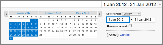
Clicking the date area within the report allows you to make changes. This is shown in Figure 4-6. For example, perhaps you wish to focus on only a single day’s activities. In that case, select only that day by clicking it on the calendar. You can also enter the date manually by using the fill-in fields provided. In this respect, the date range selector works like any other calendar tool. To select an entire calendar month, click the month name.
Figure 4-6: Selecting a date range
To compare the current date range data with any other date range, check the Compare To Past box. By default, Google Analytics will select a date range to compare. For example, if your first date range is the current day, the previous day will be automatically selected as the comparison. If your first date range is the last 30 days of data, the previous 30 days will be selected by default, and so forth. You can overwrite the second date range as required.
The result of comparing two date ranges is shown in Figure 4-7. As you can see, the two data sets are overlaid on the chart and each dimension row of the data table is now split, showing metrics for the two date ranges. The comparison data, shown as % Change, displays positive changes—that is, an increase compared with the previous period as green, whereas negative changes are shown in red. The exception to this is when viewing bounce rates. In this case, a decrease in bounce rate would be green and an increase would be red, to reflect that a decrease in bounce rate is desirable.
Figure 4-7: Comparing two date ranges (also shown in the color section)

Note: Take care when viewing chart data for different date ranges. By default, Google Analytics will select a suitable second date range for you—the previous 30 days, for example. However, this usually does not align with the first date range—for example, Mondays may not align with Mondays. When comparing date ranges, always attempt to align days of the week. For example, compare Monday–Friday of this week with Monday–Friday of the previous week.
Aggregate Summary Metrics
Figure 4-4, Label B: Above the data-over-time graph is a summary row for the entire displayed report, as shown in the following image.

In this example, the display metrics shown are either the sum of, in the case of number of visitors, or weighted average for the other metrics, such as the weighted average for time on site, bounce rate, and so forth.
Just below these metrics is a comparison with the site as a whole. Shown in Figure 4-4 is a snapshot of all visit data. Therefore, the comparisons are the same values. If, however, you drill down into a report—for example, selecting row 2 from the table (google / organic), which reveals keyword information, the summary row shows metrics for that segment only, with comparison information to the overall site metrics. The percentage difference is also displayed in parenthesis.
A subtlety of the summary row is the small arrow pointing upward below the first column (Visits). This indicates what data is being plotted in the data-over-time graph—in Figure 4-4 this is visits over time, which is the default setting. Clicking one of the other summary columns will change this. The arrow will move to the metric being plotted.
Chart Options
There are three powerful charting options, labeled on Figure 4-4 as C1, C2, and C3. These control how much data is displayed on the chart and also provide an animation feature.
Changing Graph Intervals
Figure 4-4, Label C1: The default report graph interval is daily. That is, you see an aggregate point on the data-over-time graph for each day. That works well when viewing data from 1 to 60 days. However, for longer time periods, such as six months and further, having such a granularity will appear as noise, obscuring information contained in the signal. To improve this, and to reveal longer-term trends, change the graphing interval to weekly or monthly—using the selector shown in the following image.
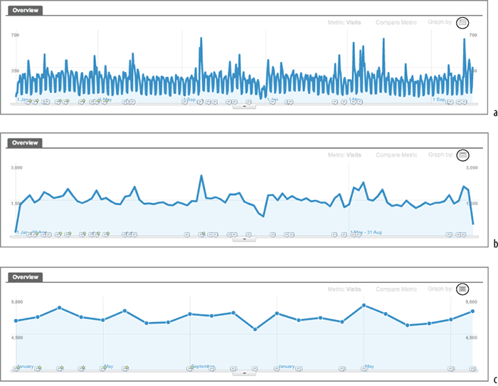
Figure 4-8 shows the effect of viewing a 22-month period at different graph intervals. As you can see, for longer time periods, the higher resolution of daily data points appears as noise and is not particularly revealing. Using weekly or monthly data points is much more useful. Essentially, it’s for you to decide what works best for you. I recommend weekly chart intervals for a data window of 3 to 12 months and monthly chart intervals when viewing data over more than a 12-month period.
Figure 4-8: Data-over-time graph for a 22-month period showing visitors as (a) daily, (b) weekly, (c) monthly data points
Some reports also have the ability to change the graphing interval to hourly. This enables you to track at what times of the day visitor traffic arrives on your site—midnight to midnight. Knowing what times of the day are most productive for you provides powerful insight for scheduling campaigns or downtime—for example, starting and stopping ads, changing your keyword buys, viral marketing events, and the best time to perform web server maintenance. However, an important caveat to consider when interpreting the hourly reports is if you are receiving significant visitors from different time zones—for example, US versus European time zones. If this is your situation, consider segmenting your visitors using a geographical filter before interpreting these reports. See Chapter 8, “Best Practices Configuration Guide,” for more information.
Plotting a Second Metric
Figure 4-4, Label C2: The default graph is always for visits, though clicking one of the other summary row metrics can change this (described for label B). By clicking the drop-down menu above the data-over-time graph (the menu is shown in the following graphic), you can add a second metric to be plotted.
The list of available metrics can be extensive. and the exact content will vary, depending on which report you are viewing at the time—see Figure 4-9. When comparing with a second metric, each is presented in a different color and is scaled by either the left or right y-axis. This does not affect the contents of the underlying table.
Figure 4-9: Plotting a second metric (also shown in the color section)

Graph Modes
Figure 4-4, Label C3: By default all report charts are shown as static data-over-time charts. Although important, unless you observe dramatic changes in your visitor traffic on a day-to-day basis, chances are you rarely notice anything of significance with this graphing format. An alternative is to animate your data-over-time using motion charts. Select this option from the drop-down menu, shown in the following image, to see how multiple metrics evolve over time. Motion charts are discussed in more detail in Chapter 5.
Tip: An animated chart of five dimensions is difficult to describe on paper, so I encourage you to check out the official motion charts demonstration on YouTube at www.youtube.com/watch?v=D4QePIt_TTs. If like me you become a fan of this feature, you can rate the team behind it (and their singing abilities!) at www.youtube.com/watch?v=nimrc-uG7UY.
Changing Table Views
By default, Google Analytics displays your data in a table of 10 rows, corresponding to the 10 most popular dimensions, ordered by number of visits. Clicking one of the other columns headings—for example, bounce rate—changes the ordering. Most tables contain hundreds of rows of data and often thousands, even tens of thousands for high-traffic websites. How you view the table of data clearly has an impact on your comprehension, and this is described for labels D1 and D2 of Figure 4-4.
Moving through the Table Window
Figure 4-4, Label D1: Using the arrow buttons, shown in the image below, is a very simple way of navigating through your data rows—moving forward or backward through 10 rows at a time.
You can also combine this with the option labeled E, which allows you to expand the number of rows displayed to 25, 50, 100, 250, or 500 rows at a time. Although useful, this is clearly a basic way of finding information in the table. A more advanced way is using the table search and filter options (labels J and K respectively). These are discussed later in this section.
Changing the Table Display
Figure 4-4, Label D2: If you would rather see your data in a pie chart, or bar chart, than as a flat table, the table view option available in most reports (see the following image) enables you to select a different view to display your data:
Data This is the default flat table showing one dimension column and five metrics columns. The default sort order is by traffic volume (visits) descending. You can change the sort order, or select a different sort criteria, by clicking the column headings.
Percentage This is a pie chart view with any of the five metrics from the summary row (label B) available to plot using the drop-down menus.
Performance This is a bar chart view and my most common selection when initially viewing a report. For me, it gives the clearest perspective of overall performance of each data row—highlighting the major influences before I investigate further.
Comparison This delta view compares the displayed metric to the site average and is my second most common table view selection. However, I find users often confuse what this report shows, so it is worth understanding how the comparison value is calculated. I use the metrics shown in Figure 4-10 to illustrate this. The calculation is a two-step process, as follows:

Figure 4-10: Comparison view (also shown in the color section)
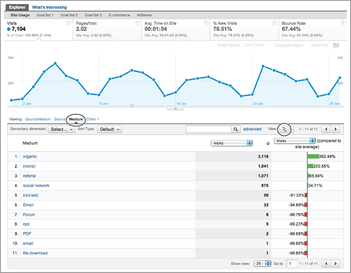
The site average calculation tells me that the average traffic per medium is 645.82 visits—though this is not displayed in the report. The first medium listed (organic) actually received 3,116 visits during this time period—clearly way above the average. How much more is what the comparison metric shows. The calculation is as follows:
The comparison value is showing that organic traffic sent 382 percent more visits than might be expected from looking at the average for all mediums. Because the percentage is greater, a scaled bar is color-coded green and to the right. If it would be less than the average, the bar is color-coded red and to the left.
The comparison chart is a great way to get an at-a-glance view of what is performing well. For example, looking at the table in Figure 4-10 as a whole, the comparison column is showing that the first two mediums (organic and direct) contribute the most traffic and these are way above average. In fact, only the first four referral mediums contribute more than the average. The rest are performing below par. Without the comparison metric available, it is difficult to comprehend what a “good” value is and what is poor. Showing the comparison against the site average allows you to put this into perspective.
Tip: Use the comparison view when the number of table rows is relatively few. For example, less than 50 rows. Otherwise, the metric tends to suffer from long-tail effects; that is, where you see only very large positive and large negative. Such differences are easy to spot in the default table view, therefore use the comparison option to help you find more subtle differences.
Term cloud This is a word cloud display that will be familiar if you read blog sites or conduct search engine optimization. Essentially, a word cloud is a visual depiction of the dimension column from the report table. An example for referral sites is shown in Figure 4-11.
Figure 4-11: Term cloud table view for referral keywords
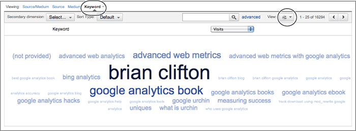
As you can gather from Figure 4-11, the larger the term, in this case queries used on referral search engines, the more significant it is in the report (in this case, the more visits that were received for a particular keyword). Any of the five metrics from the summary row (label B) are available to use instead from the drop-down selector menu highlighted on the right of Figure 4-11.
Tip: Term clouds are an excellent way to spot patterns in large volumes of data. Use the term cloud view when you wish to visualize data from a large data table—more than 50 rows. This avoids data blindness.
Pivot The pivot view is analogous to pivot tables in Excel. The resulting data view can appear complex at first glance, so it is worth spending some time understanding what the pivot view of Figure 4-12 is showing.
Figure 4-12: Pivot view of data
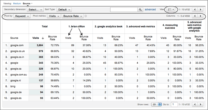
To obtain the view shown in the screen shot in Figure 4-12, first select Source as the dimension for the data table; then select the pivot view. This displays the extra pivot row of options as highlighted in Figure 4-12. Choose to pivot by keyword, showing visits and bounce rate. The result is a table that lists the top five keywords along the top, each one further split to show visits and bounce rate on a per–search engine basis. The pivot table view is therefore a powerful way to view multiple data points simultaneously, without the need to navigate back and forth between different reports.
To view the next five keywords by visit volume, use the arrows on the right of the pivot row and so forth.
Tip: The pivot view places more data in one place at your fingertips. By doing this, it reduces the need to go back and forth between reports. However, don’t add more data to your reports until you understand the overall trends of a particular data set first. The pivot view is for when you are ready to perform more detailed analysis and cross-referencing.
Plotting Multiple Rows
Figure 4-4, Label F: For any report containing a data table, you can plot the metrics of up to two individual dimensions by selecting the check box next to the row of interest and clicking Plot Rows, shown in the following image.

Secondary Dimensions
Figure 4-4, Label G: So far, only one primary dimension has been displayed in the example reports presented here—from Figure 4-4, this is the source / medium referral combination for a visit. You can further refine this by splitting each primary dimension with a secondary one selected from the drop-down menu at label G and shown in the following image.

For example, Figure 4-13 shows each source / medium combination further split by visitor type. This of course increases the number of rows in your table as each source / medium can now have up to two entries—new and returning visitor types. Note that the sort order is maintained—by default descending by visit volume. As such, the second entry for a particular source / medium may not show next to the first. For example, most of your google / organic visits may be returning visitors. Therefore, the corresponding entry for new visitors may display much farther down in the table.
Figure 4-13: Viewing a secondary dimension (also shown in the color section)

The number of secondary dimensions available to use can vary for different reports. The example shown in Figure 4-13 allows you to ascertain, within the same report, which referrals are driving traffic acquisition versus which drive visitor retention. Without using the secondary dimension, you would need to view two separate reports to gather this information.
Changing the Displayed Dimension
Figure 4-4, Label H: For most reports, the listed dimensions are links. Clicking on them allows you to drill down into that particular dimension for on-the-fly segmentation. Consider the following example: Within the data table, click the dimension entry google / organic. This takes you to a table of the same metrics, but for that dimension only. Once the dimension is segmented in this way, you can then select an alternative dimension to display (as shown in the following image), such as keywords used by that segment of visits.
Table Sorting
Figure 4-4, Label I: For any particular report you may be viewing, tables are initially sorted by traffic volume (visits) in descending order. To reverse the sort order, click the Visits column header entry. Alternatively, to sort on another column, click the desired column heading. However, there’s an issue with this type of sorting when you are viewing large amounts of data with numerous outliers; you will see a small volume of data points with very high or very low values that are not of interest to you.
To understand the issue, let’s consider a table of data sorted by bounce rate. At either ends of the spectrum you are likely to see a small volume of visits with either a 100 or 0 percent bounce rate. For example, you may see the top 10 source / medium referrers with a bounce rate of 100 percent, but each contributing only 1 visit. Clearly, this is not a helpful report. To overcome this, select Weighted from the Sort Type drop-down menu at label I, shown in the following image.
Weighted sort orders the data according to its importance and not just by its value. Essentially, it takes into account the volume of visits to weight the significance of the chosen sort metric. The final result is to give you more actionable data when you wish to sort by a ratio metric. To illustrate this, Figure 4-14 shows a data table sorted by bounce rate with and without the weight sort feature applied.
Figure 4-14: Report table sorted by bounce rate: (a) with default sort applied, (b) with weight sort applied

Note: In some ad reports, the weighting factor will be impressions or clicks rather than visits.
How Weighted Sort Works
Weight sort works by taking into account importance factors for a particular ratio metric. An obvious importance factor is traffic volume, so I use this to illustrate how the weighted sort algorithm would work if this was the only factor. Note this is not the exact approach used by Google Analytics because other factors such as impressions, click-throughs, and so forth may also be added to the calculation. However, this nicely illustrates the methodology.
Consider the bounce rates for two referral sources reported as follows:
- Source 1 Bounce Rate = 85%, receiving only 1% of the total visit traffic.
- Source 2 Bounce Rate = 55%, receiving 60% of the total visit traffic.
Using the default sort method for descending bounce rates, source 1 would appear above source 2 in the table. However, the effective bounce rate (used for weighted sorting) takes into account visit volume. For this calculation, I have assumed the average bounce rate for all referrers in the report is 35 percent:

As a general formula this can be written as follows:
effective metric N = (%visits N × metric value N) + ( (1 – %visits N) × average metric valueall visits)
The effective value for the bounce rate is what is used by Google Analytics when selecting a weighted sort. As you can see, source 2 now has a higher effective bounce rate than source 1 and so will show ahead of it in the table. This means the bounce rate of source 2 is considered more important to you than the bounce rate of source 1 as it received more visits.
Table Search
Figure 4-4, Label J: Websites can receive a lot of data. Even a small, moderately active blog can generate thousands of visits per month and therefore tens of thousands of data points to go with it. As shown in Figure 4-4, the total number of rows for the Source Medium report is 316—see the text next to label D1. Although expanding and changing the data window, as described for labels D1 and F, can be of help, visually browsing through each table row is clearly not going to be something you wish to do regularly (nor will it be much fun!).
To avoid such a laborious task, you can quickly search your data by using the table search box shown at label J in Figure 4-4 and in the following image.
The table search box uses a simple pattern lookup to match against in your primary dimension column. For example, if you only wanted to see Yahoo visitors in your table, you simply enter “yahoo” in the search. This is applied to all the table data, not just the visible rows. Partial matches are also allowed, so “yah” on its own will work. Likewise, to view only organic search visitors, search for “organic.”
Although it’s very simple and easy to use, you may quickly find yourself wanting more advanced search functions. This is available via the advanced option and is described next.
Table Filters (Advanced)
Figure 4-4, Label K: The simple table search function described for label J acts on the first dimension column only. However, what if you wish to exclude data from the table or use more advanced criteria, such as include data only if a metric is above a certain threshold? Using the advanced option for table filtering allows you to achieve this. An example is shown in Figure 4-15.
Figure 4-15: An advanced search filter for complex table filtering (also shown in the color section)
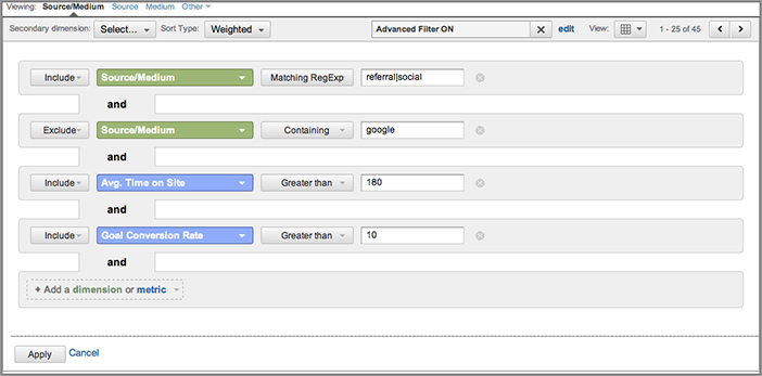
The advanced filter shown in Figure 4-15 is an example of a multiple filter that matches against two dimensions (color-coded green) and two metrics (color-coded red):
Show visits who come from a referral OR a social media website, AND
Exclude any referrals from Google (such as from my personal Google profile),
AND
Have spent more than 3 minutes on the site, AND
Have achieved a goal conversion rate of greater than 10 percent.
Only data that matches all of these criteria will be shown in the resultant table. Therefore, using table filters is a powerful way of drilling down into large volumes of data by specifying either simple or complex filter criteria. Try different examples and combinations to become familiar with these.
As with the table search feature, described for Figure 4-4, label J, advanced table filters cannot be saved for later use and are only available while you’re viewing a particular report. That is, if you navigate away to a different report set, your filter will be lost. If you regularly use the same filter on your table data, consider building an advanced segment instead because these are saved and can be applied to any report, profile, or Google Analytics account. Advanced segments are discussed in Chapter 8.
Note: Figure 4-15 makes use of a simple regular expression for pattern matching on the first match criteria. Appendix A contains an overview of using regular expressions. The filter criteria are not case sensitive and you can specify partial matches—for example, “social” will match both “social media” and “social networks.” I have assumed you are tracking social network visitors by the method described in Chapter 7.
Chart Display and Annotation
Figure 4-4, Label L: If you mouse over any of the data points within the data-over-time graph, you will notice a pop-up bubble view that displays the data point’s date and value alongside the equivalent comparison data point if Compare To Past (label A), Compare Metric (label C2), or Plot Rows (Label F) is selected. This is shown in the following image.

In addition, if you click on a specific chart data point, a dark vertical line highlighting the date selected is shown and the bubble view remains fixed—so that it remains in place while you mouse over other data points. For Figure 4-4, the fixed bubble view is shown for Monday, 10 January 2012 with Visits: 266.
At the bottom of the bubble view you can click to “Create new annotation.” That is, you can add a note to highlight your thoughts or mark a key event relevant to your website. Consider chart annotations as your Post-it notes, allowing you to keep track of things that can help you explain data patterns. For example, perhaps you have relaunched your website with a new design, announced a new product, launched a new marketing campaign, are aware of system downtime, and so forth. All of these are important business activities that can have a dramatic impact on your website’s performance. These are marked as small bubble-like icons displayed on the timeline of report charts—as shown below and to the right of label L. Click one of these icons for the detail of an existing annotation to be displayed.
Figure 4-16 is an excellent example of how useful chart annotations can be. As you can see, there was a catastrophic drop in visitor numbers on Wednesday 22 June—from an expected 10,000 plus visits down to 610 (effectively zero for this website). An investigation revealed that the Google Analytics Tracking Code (GATC) was left off by mistake during a system-wide update. At the time all those involved in the metrics team were made aware of the issue, but looking back months or even years later, the incident will be forgotten. The chart annotation ensures that the incident is labeled for all to understand what happened during that week.
Figure 4-16: Displaying chart annotations

Annotations are applied on a per-user basis. Therefore, you can choose your notes to be private—only viewable by yourself—or public—viewable by all report users. Once set, annotations are displayed on all data-over-time charts within the same profile. Owners can edit or delete these at any time. The text limit is 160 characters and any day can have multiple associated annotations.
For events that are more important than others, you can highlight your annotations by adding a star (this is a highlighting technique familiar to any Gmail user). The 22 June annotation in Figure 4-16 has been highlighted in this way. Highlighted annotations are set on a per-user basis; that is, another user viewing the same profile will not see your starred annotations.
Tip: The use of chart annotations allows you to log events directly on your data charts and therefore avoid wasting time reinvestigating the issue later. Use these for whatever events you consider would significantly influence your traffic.
Report Sections
Figure 4-4, Label M: Above the summary table is a set of menu links that expand the metrics available in your reports, as shown in the following image.
You can think of these menu links as extensions of the data table width—that is, rather than having an overly wide table containing all visit metrics, we have more manageable, shorter tables separated by type. Effectively, these menus are used to hide the extended table from view and keep the reporting interface focused.
You will notice that the Site Usage tab is always present for this report (and many others). The report provides headline metrics of Visits, Pages Per Visit, Average Time On Site, Percent New Visits, and Bounce Rate. Whether you see additional tabs will depend on your configuration. For example, if you have configured your goals (up to 20 split into five sets), use transaction tracking, or use AdWords or AdSense, then metrics for all of these configuration may be displayed in their own separate menu links. If you have not configured these configurations, the tabs will not show.
Essentially, you use menu links as if moving across a large data table. If you find an interesting data point in your Site Usage report, at the very least you will want to see if it is replicated in your goal conversion and e-commerce reports. For example, does a large influx of visitors from Twitter lead to a concomitant increase in goal conversions or revenue from that source? The menu links allow you to check for this and when clicking through you will maintain any search criteria (label J) or any advanced filters (label K) across the menu links—for the same report.
Tabbed Views
Figure 4-4, Label N: The default view for reports is the Explorer view, as shown by label N. This is the only view for standard reporting. Additional tabbed views can be added when building custom reports. Essentially, additional tabbed views allow you to extend the data table with further metrics and dimensions. Building custom reports is discussed in Chapter 9, “Google Analytics Customizations.”
Advanced Segments
Figure 4-4, Label O: As you will discover from reading this book and experimenting with reports yourself, there are many ways to segment data in Google Analytics. The simplest is to drill down on a dimension within your data table. For example, clicking google / organic as a referral source in the screen shown in Figure 4-4 leads you to a data table for just that segment. However, the advanced segments area at label O (see the following image) provides you with much greater flexibility for visitor segmentation.
Segmenting your data is a powerful way for you to understand your visitor personas—both geographics and demographics—and is discussed in greater detail in Chapter 8.
Export
Figure 4-4, Label P: Data export is available in three industry-standard formats: PDF, CSV, and TSV. Select Export (shown in the following image) from the top of each report to have your data exported in PDF (for printable reports), or CSV or TSV (to import into Excel or similar).
Note: The additional CSV for Excel format is there to better handle the UTF-8 encoding used by Google Analytics reports. UTF-8 encoding is a way to ensure that non-ASCII character sets are handled correctly in web pages. Google Analytics requires this because reports need to be available in 40 plus languages. However, an import of UTF-8 encoded data into Excel does not go smoothly—hence the slightly modified format for this purpose.
The maximum number of report rows that can exported is 500 (this matches the maximum number displayed in the user interface). However, there is a workaround that allows you to export up to 20,000 rows. To do this, use the following instructions:
- In the report you want to export, set the Show Rows selector (label E) to 500.
- The report URL will update with this information at the end: explorer-table.rowCount%3D500, where 500 at the end of the string indicates the number of rows displayed in the report.
- Change the value of the explorer-table.rowCount parameter to the number of rows you want to export. For example, explorer-table.rowCount%3D1000 sets it to 1000.
- Press the Enter key to load that URL into the browser.
- Visually confirm that the report now displays the new number of rows.
- Select the Export tab (label P). The exported data should contain all the rows you indicated in the URL.
Tip: If you require more than 20,000 rows, export the first 20,000 and then view the 20,000th line (via the control labeled E in Figure 4-4) and export again. Alternatively, update to the Premium (paid-for) version, which allows you to export up to 1 million rows. Google Analytics Premium is discussed in Chapter 3, “Google Analytics Features, Benefits, and Limitations.”
Exporting data is a feature of Google Analytics that provides you with the flexibility of manipulating your web visitor data. If exporting data is a key requirement for your website analysis, consider also the automatic export options the Google Analytics export API can provide—discussed in Chapter 12, “Integrating Google Analytics with Third-Party Applications.”
Email Reports
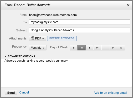
Figure 4-4, Label Q: Manually exporting data is great for manipulating it further or for creating one-off reports to present to your team. Once you have chosen which reports are important to your stakeholders, you will probably wish to have these sent to them via email—either ad hoc or scheduled on a regular basis. To do this, choose the Email link next to the Export link. You can schedule reports to be sent daily, weekly, monthly, or quarterly, as per Figure 4-17.
Figure 4-17: Scheduling a report for email export
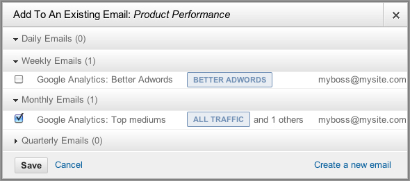
If you wish to group a set of reports into an existing email schedule, use the “Add to an existing email” link, shown at the bottom of Figure 4-17. This brings up the pop-up window shown in Figure 4-18, allowing you to select which existing email to add your report to.
Figure 4-18: Adding a report to an existing email schedule
Settings are saved on a per-user and profile combination. Therefore, two different users viewing the same profile can set their own email schedules. When email is scheduled, all times are local to Mountain View, California (Google headquarters). Although the exact time is not specified, a daily report sent in the morning will actually be sent sometime in the afternoon for European customers.
Add to Dashboard
Figure 4-4, Label R: Almost every report in Google Analytics contains an Add To Dashboard button at the top (shown in the following image).
As the name suggests, it takes a reduced snapshot of the report you are viewing and places it in your Dashboard area—as shown in Figure 4-19. The data is reduced to showing up to two metrics. The reduction is applied to keep your Dashboard area concise. You can select an existing dashboard or create a new one if needed. Dashboards are discussed in further detail in Chapter 5.
Figure 4-19: Adding a report to your dashboard area

In Chapter 4, you have learned the following:
Viewing data You now understand metrics and dimensions and the different ways you can view data with chart options, data views, and table sorting.
Navigating a report You have learned the different ways you can select and compare dimensions and secondary dimensions and how to compare date ranges or different metrics side by side.
Drilling down into data You have seen the role that search and table filters can play to refine displayed data down to a single data row or group of rows.
Looking at more than just visit numbers You know how to move between site usage reports, goal conversions, and e-commerce and AdWords reporting within the same report section.
Exporting and email scheduling You have learned how to export and schedule the emailing of reports in different file formats.
Annotating charts You now understand how to annotate charts so that important events or changes are logged for further reference.