
Chapter 10
Focusing on Key Performance Indicators
By now you understand what web analytics tools can do, how to set up Google Analytics using best practices, and how to navigate its interface so that you feel comfortable with the data.
What we have discussed so far has been fairly straightforward—dare I say easy? The next step, providing key performance indicators (KPIs), is the difficult part—not from a technical perspective but purely in terms of communication.
KPIs enable your colleagues to focus on the parts of their online strategy that are most effective at increasing visitors, leads, conversions, and revenue for the business. The key for large organizations is delivering different KPI reports to each stakeholder and ensuring that these are hierarchical.
In Chapter 10, you will learn:
- To set objectives and key results
- To select and prepare KPIs
- To present hierarchical KPIs
- About example KPIs segmented by stakeholder job roles
- About KPIs for a Web 2.0 environment
Setting Objectives and Key Results
To summarize the story so far, the best-practice implementation principles are as follows:
- Tag everything—get the most complete picture of your website visitors possible.
- Clean and segment your data—apply filters.
- Define goals—distill the 100-plus reports of Google Analytics into performance benchmarks.
If you have followed these steps, that’s excellent. However, the usual problem is that few other people in your organization know what you’ve done or appreciate your work. To many people, you have created a set of nice charts and reports. Even if they don’t say it aloud, they may be thinking, “So what?”
The unfortunate truth is that you will have wasted your time unless you can get the buy-in to use the visitor data to drive business decisions and be the focal point for instigating change on your website. With your initial understanding of your visitor data, this is your next step—that is, to set key performance indicators for your website and align these with the objectives and key results (OKRs) of your organization. For this you need to bring in stakeholders from the other parts of the business.
What Is a Stakeholder?
Stakeholders can be internal or external to your organization; for example, a search marketing agency can be a stakeholder that’s external to your organization. They can be actively involved, or they may be end users of your reports attempting to make strategic business decisions from it. In this context, stakeholders are senior managers who have the organizational authority to allocate resources (people, budget) and can prioritize change. They are the people who make or break a change.
This is precisely why you need stakeholders on board. As discussed in Chapter 1, “Why Understanding Your Web Traffic Is Important to Your Business,” web measurement is all about providing the foundation and yardstick for instigating change.
Most people are using web analytics as a benchmark: how did we do yesterday, and how are we doing today? Smart people are actually analyzing to optimize their website. The advanced people are using Web data to optimize all of their marketing.
—Jim Sterne, founding director and chairman of the Web Analytics Association
OKRs are about understanding your business goals. This is an important prerequisite before you delve into the specific KPIs for your website. Essentially, you need to ensure that the two are in alignment, and setting OKRs prepares the way. Once you have your list of OKRs, the business language of your organization, you can use them to build your KPIs, the analyst language of your website.
The process of defining your OKRs consists of four steps:
1. Map your stakeholders.
2. Brainstorm with them.
3. Set your OKRs.
4. Distill and refine your OKRs.
Step 1: Map your stakeholders. Who are your stakeholders? They may be marketing, sales, PR, operations, web development and design agencies, e-commerce managers, content creators—even the CEO. Of course, it may be only the CEO, but if not, select one person from each department as the key contact for initial discussions. Your first choice may not end up being the right person, but you can change that later. The important thing is to get people on board from those departments. A key initial stakeholder is the person or department responsible for your Google Analytics implementation. If changes to your setup are required, this person should be involved from the start so they understand the vision and direction of your other stakeholders. This person can advise you on what can and cannot be done, understands the pain points, and can advise on alternative strategies as needed.
Your key contacts are the individuals who represent the interests of that department within your organization. They can canvass opinion from the rest of the organization on your behalf; in other words, they do not have to be the most senior people in their departments, though they should have a strategic and overview role, such as managerial. Try to make this a two-way street, with you setting the scene with your initial data and thoughts on the current situation and stakeholders providing their perspective on how it fits with their department. For example, they may provide information from customer relationship management (CRM) systems, call center figures, web server performance, and so on.
Step 2: Brainstorm with your stakeholders. Determine their requirements and expectations, and, more important, manage these to ensure that your project is a success. Accomplish this by arranging regular meetings with your stakeholders. For the first meeting, bring everyone together and aim to get a consensus of opinion. This should focus on what is currently happening—not whether it is good or bad, but rather what information is available. By the end of the session, you and your stakeholders should start to understand each other with respect to terminology, what data can be collected, and its accuracy and limitations.
For the second and subsequent meetings, meet with each stakeholder separately. In broad terms, you will be guiding the stakeholder as to what information can be gleaned from your reports and how it can be useful to the business. The trick is to get them to realize the opportunity that data insights can bring, so take some ideas into the meeting with you. Often your stakeholders will ask for more information, or possibly less, but usually they want to see data cross-referenced against other metrics—something to prepare for the next meeting. This brainstorming process usually takes one or two meetings and is an important period in which to manage expectations, such as timeline and budget.
Step 3: Set your OKRs. With expectations managed and stakeholders on board and feeling engaged with the project, you should be ready to ask the question, “What is the objective of our website from your specific point of view?” With this, ask them to define what performance constitutes good and what constitutes bad. If you can answer those three questions from each stakeholder, you have done a great job. The key, and often the difficulty, is to delve below the obvious macro objectives of generating more overall revenue, sales leads, and traffic volumes. Those of course will be dealt with, but it’s the layers of detail below this that impact on those, and that’s what you need to find out. Don’t worry if you need a few more meetings to achieve this. Every organization is different. But try not to let this process drag on or you risk losing momentum. The process taking place is not set in stone and can be reviewed and modified in six months or whenever necessary.
Encourage your stakeholders to give measurable answers to your objectives question or suggest some yourself; these form the results part of the OKRs. The following are example OKRs I have come across:
- A Main Street retail store carries tens of thousands of products. It is not feasible to have all of these on its e-commerce-enabled website because some are not cost-effective to ship, for example. By analyzing the site’s transaction and feedback data (the objective), it wishes to select the most popular product categories for the focus of its online efforts (the result).
- A home furniture store that does not have a transactional website produces a printed catalog each year (at great expense). However, which products make it into the printed version is a mixture of experienced guesswork and luck, based largely on the whims of fashion trends. By analyzing the interests of its web visitors (objective), it wishes to better predict and select with greater confidence which items should go into their next catalog (result).
- A gaming company wants to understand which is the next hot market to establish operations in. By understanding the geographies and language demographics of its web visitors (objective), it wishes to select candidate markets for further research and tests (result).
- A waste disposal company wishes to emphasize the environmental friendliness of its work on its corporate website. But what are visitors who visit a waste disposal website interested in (objective)? Understanding this will enable the company to better tailor content to get its environmental message across (result).
- A government information site, a nonprofit, is struggling to cope with the inquiry volume of its visitors and has requested an investment in new support staff. However, the funding department wants to know whether this is a cost-effective option or whether they should alter how their website operates, such as provide more self-help articles (objective). The web team needs to understand which visitor actions are of most value to support their funding request (result).
Step 4: Distill and refine your OKRs. With a long list of objectives and key results from your stakeholders (such lists are always long to start with), distill it down to the five most important OKRs for each. This should be your maximum because it is likely that each OKR will require more than one KPI to measure it. Therefore, focusing your efforts on the five most important OKRs will stand you in good stead because managers generally cannot cope with a long list of directives to act on. Where possible, group OKRs and keep them directional by avoiding the temptation of overspecifying.
Google Analytics is your free data-gathering and reporting tool, but it will not optimize your website for you. That requires smart people (you!) to analyze, interpret, and act on the reported findings. To act on your Google Analytics information—that is, instigate changes—you need to present your findings in a clear, understandable format to stakeholders. These are a diverse group of people who sit at different levels in your organization—all the way up to the board, one hopes. That’s the caveat: Presenting web analytics data outside of your immediate team is a challenge because most businesspeople simply do not have the time to understand the details that such reports offer.
To communicate your story effectively to your stakeholders, create reports in a format and language that business managers understand—that is, KPI reports. These are abridged versions of your web analytics reports, usually summarized in Microsoft Excel or PowerPoint.
What Is a KPI?
Web analytics aside, organizations around the world use key performance indicators to assess their performance. Also sometimes referred to as key success indicators (KSI) or balanced score cards (BSC), KPIs are used in business intelligence to appraise the state of a business. Once an organization has set its OKRs, it needs a way to measure progress. Key performance indicators are those measurements.
Similarly, in web analytics, a key performance indicator is a web metric that is essential for your organization’s online success. The emphasis here is on the word essential. If a 10 percent change—positive or negative—in a KPI doesn’t make you sit up and call someone to find out what happened, then it is not well defined. Good KPIs create expectations and drive action, and because of this they are a small subset of information from your reports.
When considering your KPIs, bear in mind the following:
- Try to use monetary values where possible; everybody understands $$$.
- If not a monetary value, use a ratio, percentage, or average rather than the raw number. This allows data to be presented in context.
- A KPI needs to be temporal, that is, time bound. This highlights change and its speed.
- A KPI drives business-critical actions. Many things are measurable, but that does not make them key to your organization’s success.
Use KPIs to put your data into context. For example, saying “We had 10,000 visitors this week” provides a piece of data, but it is not a KPI because it has no context. How do you know whether this number is good or bad? A KPI based on this data could be “Our visitor numbers are up 10 percent month on month.” This is a temporal indication that things are looking good over the time span of one month. In this example, the raw number should still be part of the KPI report, but it is not the KPI itself.
For the reasons just given, the vast majority of KPIs are ratios, percentages, or averages. However, sometimes a raw number can have a much greater impact. Consider the following examples:
- Our website lost 15 orders yesterday because our e-commerce server was down for 34 minutes.
- We lost $10,000 in potential revenue last week because our booking system does not work for visitors who use Firefox.
- We spent $36,000 last month on PPC keywords that did not convert.
Clearly, knowing what fraction of the total these numbers represent is important, but the impact of the raw numbers themselves is far greater at obtaining action and therefore should be the KPI .
The key point is that you should develop KPIs relevant to your particular business and your stakeholders. Any metric, percentage, ratio, or average that can help your organization quickly understand visitor data and is in context and temporal should be considered a KPI.
Preparing KPIs
Most of the hard work of preparing KPIs consists of defining OKRs—the dialogue you had with your stakeholders in obtaining the business objectives of your company. The key results used to establish OKR success are in fact your KPIs; you just need to turn these into actual web metrics that are available to you.
Sometimes (actually, quite often) discussing KPIs with stakeholders instills fear in your colleagues. They think you are performing the web equivalent of a time and motion study that is going to spotlight their deficiencies and single them out as not doing a good job. That fear is understandable: Being measured is not a comfortable feeling. However, my approach has always been to dispel that image. Evangelize web analytics KPIs as the tools to help your stakeholders shine and be rewarded for their efforts. Wield a carrot, not a stick.
The art of building and presenting a KPI report lies in being able to distill the plethora of website visitor data into metrics that align with your OKRs. For small organizations, having a report of 10 KPIs aligning with 10 OKRs is usually sufficient. For organizations with many stakeholders, having only one KPI report will not cover the requirements of your entire business—there are simply too many stakeholders to reach a consensus about what the KPI short list should contain. Therefore, ensure that you tailor your KPI reports to specific needs by having individual stakeholder and hierarchical KPI reports.
Here is a six-point KPI preparation checklist:
1. Set your OKRs.
I repeat this here because of its importance. Identifying your stakeholders, discussing their needs, and being aware of the overall business plan for your organization enables you to put in place relevant metrics. This is an essential first step to ensure that your KPIs align with the business objectives of your organization. Otherwise, you are just a hit counter monkey—looking backward and not forward.
2. Translate OKRs into KPIs.
This means setting specific web metrics against the business OKRs. Some metrics will be directly accessible from your Google Analytics reports; for example, if your e-commerce department says they want to “increase the amount of money each customer spends,” then you will look for the average order value (AOV) from within the e-commerce section and monitor this over time. However, not all KPI metrics can be obtained in this way; sometimes segmentation is required or the multiplication or division of one number by another. Table 10-1 is a useful translation tool.
Table 10-1: Sample OKR-to-KPI translation
| Stakeholder OKR | Suggested KPIs |
| To see more traffic from search engines |
Percentage of visits from search engines Percentage of conversions from search engine visitors |
| To sell more products |
Percentage of visits that add to shopping cart Ratio of visits that complete the shopping cart over the number that started Percentage of visits in which shopping cart is abandoned at position X in the process |
| To see visitors engaging with our website more |
Percentage of visits that leave a comment, click a love button (Facebook Like, Twitter Follow, Google +1, etc.) or download a brochure Percentage of visits that complete a Contact Us form or click a mailto link Average time on site per visit Average page depth per visit |
| To cross-sell more products to our customers |
Average order value Average number of items per transaction |
| To improve the customer experience |
Percentage of visits that bounce (single-page visits) Percentage of internal site searches that produce zero results Percentage of visits that result in a support ticket being submitted |
3. Ensure that KPIs are actionable and accountable.
For each translated KPI, always go back and ask the stakeholder, “Who would you contact if this metric fell by 10 percent?” and “Who would you formally congratulate if it rose by 10 percent?” If a good answer for both is not forthcoming, then the suggested KPI is not a good one to include in your short list. I emphasize the word formally because this is a good way to focus the minds of your stakeholders on KPIs that lead to actions. A formal recognition could be a department-wide email bulletin or a performance bonus—that usually does the trick.
4. Create hierarchical KPI reports.
Ensure that each recipient of your KPI report receives only the data they need; the more relevant the information presented, the more attention and buy-in you will gain. It follows that a chief marketing officer will need a different, though similar, KPI report than a marketing strategist or account manager.
5. Define partial KPIs.
A frequently requested OKR is to increase the website conversion rate, usually sales or leads. This is often straightforward to measure, but it is also black and white—the visitor either converts or doesn’t. By providing partial KPIs, also known as micro conversions, you can preempt your stakeholder’s next question: “Why is the conversion rate so low?” I refer to these as partial KPIs because they relate to the partial completion of a full KPI. For example, if the conversion is to purchase, then adding an item to the shopping basket is a partial KPI—it’s the first step of the conversion process. Here are some similar partial KPIs:
- Reaching a certain point in a checkout process
- Adding additional items (up-sell products) to the shopping cart
- For a multipage subscription form, the completion of step x of y
- Navigating to the download area or special offers section
- Completing an onsite search successfully, that is, nonzero results
Tip: Tracking partially completed forms is discussed in the section “Tracking Partially Completed Forms with Virtual Pageviews” in Chapter 7, “Advanced Implementation.”
6. Consolidate.
After forming a list of required KPIs for each stakeholder, consolidate them by looking for overlaps. The point of KPIs is to focus on the metrics that are important to your business. To be significant, each KPI should represent at least 10 percent of the whole—so no more than 10 KPIs are allowed. If a single KPI is much less than 10 percent in importance, then drop it or consolidate it into a more important one. I cannot emphasize the importance of having no more than 10 KPIs. Having more than 10 will cost you the interest of your stakeholders by your third report!
Remember that initial KPI reports are not set in stone—they can and should evolve as your audience learns to understand the metrics of their website and develop their actions to effect change. Review your KPI short list quarterly, at the very least, and refine the six steps described here as required.
Tip: As part of your role as a web analyst, you might also want to include KPIs that are not part of your Google Analytics reports—for example, search engine rankings, notes of any offline campaigns or PR, website updates, new product launches, user feedback, news and events that impact your business, server uptime, and response speed. All of these can help explain what you see and therefore add value to your data.
The best way to present KPI reports is by using Microsoft Excel or a similar spreadsheet program. Every strategist, manager, or executive is familiar with the spreadsheet format and recognizes its layout immediately. It is far better to present your KPI reports using Excel than to try to teach a new interface (Google Analytics) to old hands. In addition to using Google Analytics, you may be collecting data from different sources, such as visitor surveys or search engine–ranking reports. Combining all of them into one familiar interface will make it easy for everyone to understand the material you are presenting.
Figure 10-1 is an example KPI report for an online marketing executive containing 10 key metrics. Color coding (using Excel’s conditional formatting) and arrows have been used to highlight positive and negative changes, with a threshold of 5 percent used to “double highlight” values.
Figure 10-1: Example KPI report for a travel website using Excel
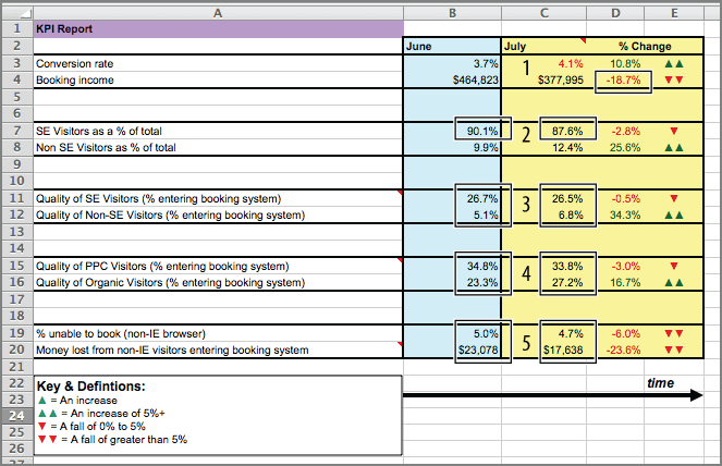
All the data shown in Figure 10-1 is readily available from within Google Analytics, but using a spreadsheet to combine exactly what data elements your stakeholder wants to see enables you to deliver a concise report within a familiar interface.
Tip: Once you have built your KPI spreadsheet, you may wish to have its metrics refreshed automatically each time it is viewed—or applied to a different profile or Google Analytics account. To achieve this, read Chapter 12, “Integrating Google Analytics with Third-Party Applications.” You can download an automated example of the spreadsheet used in Figure 10-1 from the book blog site at www.advanced-web-metrics.com/chapter10. The spreadsheet is updated with API calls and can be edited. With thanks to Mikael Thuneberg.
The stakeholder (online marketer for a travel website) who receives the KPI report shown in Figure 10-1 is interested in the performance of his online marketing efforts—SEO and PPC—specifically, the propensity to book a vacation.
Interpreting the KPI report from Figure 10-1:
1. Online revenue is down 18.7 percent for July compared with June.
Action: Check whether the drop in online revenue is a seasonal fluctuation experienced across the whole business or unique to the online channel. Note that despite the fall in revenue, the conversion rate is up by 10.8 percent.
2. Approximately 90 percent of all visitors who arrive at the website do so from search engines.
Action: Ninety percent of visitors arriving via a search engine appears at first glance to be too high a figure; share this statistic with the rest of the marketing department for discussion. Is this the result of a great search engine marketing strategy or are other channels not working very well?
3. Visitors from search engines are almost five times more likely to enter the booking system than non-search-engine visitors.
Action: See 2.
4. Visitors from pay-per-click sources are 24 to 49 percent more likely to enter the booking system than organic search engine visitors.
Action: Increase the budget for pay-per-click campaigns—they work! However, PPC may be working better here because of failings with organic search optimization. For example, are the organic landing pages meeting the expectation of the visitor, or perhaps are they too generalized? Regardless, in the short term, raising the pay-per-click budget makes sense.
Because the website booking engine does not work with non–Internet Explorer web browsers, the website is losing $17,000 to $23,000 per month.
Action: Set up a meeting with the web development department to investigate an improved booking engine that will work with other major web browsers.
As you can see, significant action points are required as a result of the KPI report presented. Without this data being shown in such a clear and concise way, discovering the action points from the wealth of Google Analytics reports available would be like finding a needle in a haystack and they could even be missed.
As the volume of KPI data increases over time, plot your KPIs to spot long-term trends.
Tip: Consider delivering your KPI reports on a quarterly basis if you are a corporate or governmental organization and monthly if your website is a key part of your business model. If you are a transactional e-commerce site, certain stakeholders will want to receive reports weekly, even daily for very high-volume websites. Consider which report frequency is realistic for you. If your organization cannot take action on a daily basis, particularly your web development and design team, then daily KPI reports do not make sense. Bear in mind the issues discussed under “Understanding Web Analytics Data Accuracy,” in Chapter 2, “Available Methodologies and Their Accuracy.”
Presenting Hierarchical KPIs via Segmentation
There are hundreds of potential KPIs for your business. Which ones are relevant to your organization is an important discussion you will need to have with your company stakeholders. A key point stressed earlier is that you must deliver hierarchical KPI reports. That is, KPI reports for the chief marketing officer will differ from those for departmental managers, and they will differ from those for the account managers and strategists within each department.
For example, the CMO of a retail site would want to see the average conversion rate, average order value, and cost per acquisition. A marketing strategist would like to see this same information segmented by referral medium type (paid search versus organic search versus social media referrals versus email marketing and so on). Without wishing to insult any chief marketing officer’s intelligence, segmentation detail is generally too much information and is not required in order to give direction to the team, that is, to balance the investment of TV, radio, print, and digital marketing. However, it is required for the digital strategists to be effective in their role.
Detailed KPIs are obtained by segmentation, and a great deal of segmentation is available within the Google Analytics interface. As described in Chapter 4, “Using the Google Analytics Interface,” rather than use a menu-style navigation system, Google Analytics encourages you to drill down through the data itself, automatically cross-segmenting by each click-through of the reports. Where applicable, you will often see a drop-down menu for further analysis. For example, Figure 10-2 highlights the numerous ways to cross-segment visitors by displaying a secondary dimension. In addition, using Advanced Segments allows you to segment data at the visit level.
Most segmentation for KPI building involves the visitor type, referring source, or visitor geography. Segmenting on-the-fly via the user interface is a great tactic for quickly understanding the behavior of different visitor segments. Once you have identified the key ones that affect your website, you may wish to create specific profiles that report on only these. Having dedicated segmented reports enables you to investigate visitor behavior in greater detail, more efficiently, and more quickly. Segmentation is discussed in detail in the section “Why Segmentation Is Important” in Chapter 8, “Best Practices Configuration Guide.”
Figure 10-3 illustrates this model for an e-commerce website. Both the marketing strategist and head of department have six KPIs. That does not mean six metrics each, because that would be oversimplifying. For example, the head of department will wish to review sales performance by both volume and revenue; that is, the highest-selling products by quantity may not be the most profitable. For the marketing strategist, each KPI is further subdivided by referral source (segmented).
Figure 10-2: The two types of segmentation within reports: showing a secondary dimension; using advanced segments

Figure 10-3: Hierarchical example e-commerce KPI with differences highlighted
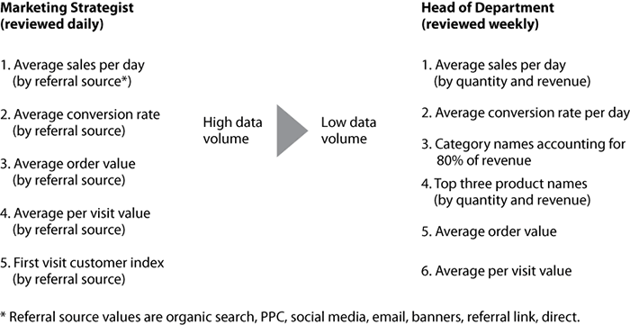
In addition, each recipient does not review these KPIs in isolation—the marketing strategists have their weekly meeting with the head of department. Hence there is a strong overlap in metrics. Highlighted in Figure 10-3 are the ones that do not overlap. For example, even if the three top-selling products change on a daily basis, the marketing strategist cannot take action. Therefore this is not on their KPI list. Instead, product selection and promotion is a decision the head of department will make, following a review of seven days’ worth of data. Thus this KPI is on the head of department’s list.
Explanations of the KPIs shown in Figure 10-3 are included later in this chapter.
Performing segmentation for hierarchical KPIs is a fine balance between obtaining clarity about visitor behavior and generating information overload. Clearly, Google Analytics offers a great number of segmentation options. However, whenever you segment data, you multiply the information reported—double it, triple it, and so on. This is clearly contrary to the purpose of KPI reporting. Therefore, you should apply a good deal of thought and investigation prior to segmenting. For example, ask yourself, “How is this going to enhance my understanding of visitors, and what will I do with such information?” If you are not satisfied with your own answers, don’t overload yourself with more segmented data.
Benchmark Considerations
KPIs are important to drive improvement for your own website. Although it is obviously interesting and insightful to compare how your website is performing against those of your peers and competitors, in my opinion it is a mistake to place too much emphasis on external industry benchmarks. These can be misleading and often end up with you finding the benchmark that fits your story, giving a false impression of success.
KPIs vary greatly by business sector—for example, retail, travel, technology, B2B, finance, and so on. Even within subsectors there is wide variance: Think flights versus vacations or food retail versus clothing retail. Even comparing against your competitors with identically defined goals is fraught with gross approximations. The exact path that visitors will take to complete a goal and the quality of their user experience along the way will vary for every website. Slight changes in these can have a major impact on conversion rates. I deliberately emphasize the phrase identically defined goals here because definitions from different organizations can become blurred. For example, retail managers will often wish to differentiate existing customer visits from noncustomer visits. Quoting an average conversion rate across an industry can therefore be misleading.
Also, consider that e-commerce conversion rates can be measured in a variety of ways:
- The number of conversions / total number of visits to the website
- The number of conversions / total number of visitors to the website
- The number of conversions / total number of visits that add to cart
- The number of conversions / total number of visitors who add to cart
In the preceding list you can also substitute the word transactions for conversions. That is, a visitor may complete a purchase and enjoy the experience so much that they return to make an additional purchase within the same visit session. Depending on the web analytics tool used and the preference of the organization, that can be defined as one conversion with two transactions or two conversions with two transactions.
Note: For the preceding scenario, Google Analytics would show one conversion and two transactions because the visitor has converted to a customer and this can happen only once during their session.
The following list includes some other onsite factors that can greatly affect conversion rates, and therefore muddy the waters for benchmarking:
- Your website’s search engine visibility (organic and paid search listings).
- Your website’s social media visibility (Facebook, Twitter, LinkedIn, Google+, and so forth).
- You website’s usability and accessibility. (Is your site easy to navigate?)
- Whether a purchase requires registration up front. It’s exasperating to see how many sites require this. Put it at the end of the transaction process.
- Your page response and download times. Page bloat is a conversion killer.
- Page content quality and imagery. These should be up to a professional standard.
- The use of trust factors such as safe-shopping logos, a privacy policy, a warranty, use of encryption for payment pages, client testimonials, and so on.
- The existence of broken links or broken images. These destroy the user experience.
- Quick and accurate onsite product searching.
- Whether your website works in all major browsers.
As you can see, comparing apples with apples is complicated. By all means, benchmark yourself against your peers. It can be an interesting and energizing comparison. However, I emphasize the need for internal benchmarking as the main driver for your website’s success.
Rather than produce a dictionary-style list of every potential KPI metric, I have focused on a small group that require a little more thought in preparation (that is, they cannot be simply plucked from your Google Analytics reports) or require further explanation. This is not intended to be an exhaustive list; rather, it is a sample to demonstrate how KPIs are defined and used. KPIs tell an easy-to-follow story. The story you need to tell will be very specific to your organization and your stakeholder relationships.
For job roles, I have grouped and differentiated the KPIs into five stakeholders: e-commerce manager, marketing and communications manager, social media manager, content creator, and webmaster. These should not be considered mutually exclusive, though. For example, marketers want to know the bottom line and e-commerce managers need to prioritize. As discussed previously, the level of segmentation applied will determine the hierarchy. As a web analyst, your role covers all of the above with regular deep dives to support your stakeholders.
Last, there is almost always more than one way to discover the KPI information within Google Analytics, and quite often the data points lie within several overlapping reports. In the following examples, I list the most obvious or most likely way to access the data.
Note: In Google Analytics, goal conversions and revenue (if you have monetized your goals) are reported separately from purchaser (e-commerce) conversions and revenue. Metrics that require the total revenue use the e-commerce plus goal revenue amounts.
E-commerce Manager KPI Examples
An e-commerce site probably has the most potential KPIs to choose from because the main goal (purchase) is relatively easy to measure and the site objective (driving visitors into the shopping-cart system) is so clearly defined. Google Analytics has an entire section dedicated to the reporting of e-commerce activity. However, most of my KPIs come from other reporting areas.
Looking beyond visitor volume, the following KPIs are suggested for an e-commerce manager:
- Average conversion rate
- Average value (a.k.a. average order value).
- Average per-visit value
- Average ROI
- Customer on first visit index
Average Conversion Rate
This is a high-level metric that every retailer watches with a keen eye in the offline world and is very easy to identify for online transactions. However, although useful, the conversion rate quoted in your reports is a blunt metric—for example, see Figure 10-4 (taken from the Conversion E-commerce Overview report). The calculation by Google Analytics is straightforward: the number of transactions divided by the total number of visits (expressed as a percentage). For example, 1,054 transactions from 346,193 web visits is a conversion rate of 0.30 percent.
Figure 10-4: E-commerce Overview report graphing the conversion rate KPI over time

However, this calculation includes all visitors to your website, even those who came for the wrong reasons and therefore have no intention of purchasing. To provide more insight, it would be useful to remove such visitors. You can achieve this by looking at your site-wide bounce rate. For example, if your site bounce rate for the same time period is 20 percent, the number of “prospect” visitors is actually 276,954 (0.8 × 346,193) and your conversion rate recalculates as 0.38 percent—27 percent higher than reported.
For a partial KPI, you can further refine your conversion rate by including only those visits that begin the purchase process, such as add to cart. This tells you how good your checkout process, rather than your entire site, is at converting. Replace the denominator by the number of visits that get to page 1 of your checkout system (from your Content Site Content Pages report). Similarly, to measure how good your site’s content is at driving conversions, your calculation would be number of visits that add to cart divided by total number of visits that do not bounce.
Average Value
Like the average conversion rate, the average value (often referred to as the average order value) is an important high-level KPI that retailers watch closely. It is listed here because it is such an important metric for e-commerce managers. However, it is straightforward to calculate, and it can be obtained directly from your Google Analytics reports, as shown in Figure 10-4.
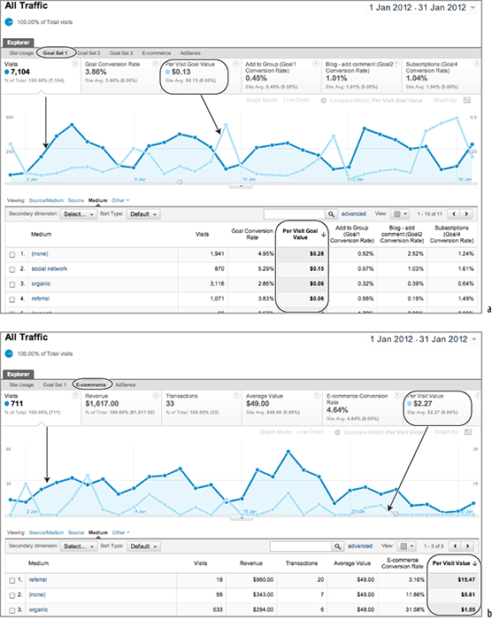
Average Per-Visit Value
Understanding the average value per visit to your website is a strong KPI. Every visit has a value to your organization. Even if a visitor does not purchase, you can monetize your goals to evaluate your lead generation, registrations, and downloads. These all contribute to being able to differentiate your visitors and therefore target them better in future campaigns.
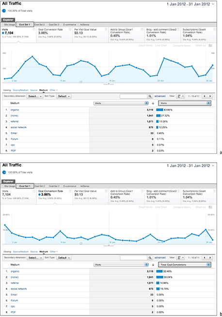
Knowing the value of your visitors and segmenting these by referral source and campaign (as well as other dimensions) is a powerful aid to both your e-commerce and marketing departments. By default, Google Analytics measures two types of per-visit value: per-visit goal value (based on the value of your goals) and per-visit value (based on e-commerce transaction data). These can be obtained directly from your reports. Figure 10-5 shows both types (taken from the Traffic Sources Sources All Traffic report). You add the two together for the overall average per-visit value KPI. Visitors who achieve neither a monetized goal nor a purchase will have a zero value for that visit.
Figure 10-5a and Figure 10-5b show the respective per-visit values segmented by medium in the tables and graphed against overall traffic. From Figure 10-5a, you can see that the per-visit goal value increases when overall visitor traffic is low (on the weekends). It appears from this that people research information during the week yet commit to a monetized goal on the weekends. Direct visitors, that is from medium = none, have the higher value by far when it comes to goal conversions. However, for transactions (Figure 10-5b), the situation is quite different—the most valuable visitors are from referral sites. The transaction pattern also matches the traffic volume pattern, more or less. Understanding why this difference arises is an important next step for this site.
Note: Although you can define up to four different goal sets, the overall goal conversion rate and per-visit goal values are not set-specific. That is, the calculation is based on all defined goals.
Average Return on Investment
Return on investment (ROI) is a KPI that all business managers understand. It tells you how much, as a percentage, you are getting back for every dollar you spend acquiring visitors. For clarity, the formula used for calculating return on investment in Google Analytics, expressed as a percentage, is
ROI = (revenue – cost) / cost
where cost is the amount spent acquiring Google AdWords visitors—currently Google AdWords is the only cost data that can be imported into Google Analytics. For example, if for every $1 you spend on AdWords, you get $2 back in sales from your website, your ROI would be 100 percent. If you received $3 back for the same outlay, your ROI would be 200 percent, and so forth. Obviously, you want to maximize your ROI—the greater this number, the better.
Figure 10-5: Obtaining (a) the per-visit goal value and (b) the per-visit value
Note: Although Google Analytics currently has only cost data from your AdWords account, you can use the Export API to pull out data from Google Analytics and combine with other cost data in Excel, for example. Tools to do this are described in Chapter 12.
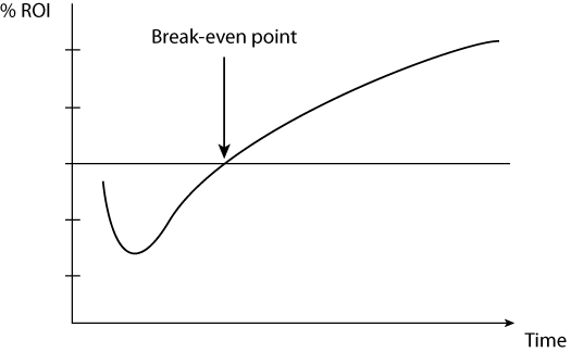
A negative ROI means you are losing money: Your costs of acquisition are greater than your returns. However, when launching a new AdWords campaign, ROI is likely to be negative until repeat visitors or brand awareness starts to grow and leads to more conversions (see Figure 10-6). Reaching the break-even point (0 percent ROI) could take hours, days, weeks, or even months, depending on many (visitor-centric, online, offline) factors. For mature campaigns, keep your ROI above 0 percent unless there is a clear reason not to do so. For example, you may be a new entry in the market and want to buy market share to gain customers at a later date.
Figure 10-6: Possible change in ROI over time for a new AdWords campaign
Within Google Analytics you can drill down to view ROI reports for AdWords at three levels: Campaign, Ad Group, and Keyword. Figure 10-7 shows data at the Ad Group level (taken from the Advertising AdWords Campaigns report). The report table clearly shows that although the Ad Group for “Auto-track plugin” has a very low click-through rate (CTR), it has the highest ROI by far at 239.53 percent. That is to say, for every dollar invested in the “Auto-track plugin” Ad Group, an average of $3.40 is returned—a pretty good investment, though reasons to explain (and therefore improve) the low CTR should be investigated. From the data graph, Figure 10-7 also shows that the overall AdWords ROI was not always positive during January, with a four-day period when costs were higher than returns. That seems odd to appear during the middle of a campaign and so should be investigated further—perhaps there was an error in the AdWords account setup.
Figure 10-7: AdWords ROI report shown for each Ad Group

Of course, ROI is a top-level indication of performance from your total income. It does not take into account what profit margin you make on your sales. Nor does it take into account the volume of transactions or visitors received. For example, a high ROI campaign may be so specific that it generates only a small revenue. A lower ROI (less-specific) campaign may in fact produce greater revenue because of the higher visitor volume it generates.
Modifying ROI to take into account profit margins is further discussed in the section “Optimizing Your Search Engine Marketing” in Chapter 11, “Real-World Tasks.”
Customer on First Visit Index
Use this KPI when you are evaluating the impact of promotion codes, discounted pricing, and trust factors—those things that can help convert a new visitor into a new customer on their first visit. It answers the question, “What is the likelihood of a new visitor becoming a customer on their very first visit?”
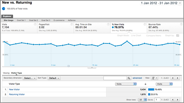
You may notice from your reports a high proportion of transactions generated by new (first-time) visitors, as per Figure 10-8 (taken from the Visitors Behavior New vs. Returning report). But how does that relate to the number of first-time visitors? Take Figure 10-8, for example: Although it is correct to say that 72.73 percent of transactions are from new visitors, it is not true to also interpret this as 72.73 percent of new visitors are generating your transactions—unless the number of new visitors to the site is also exactly 72.73 percent. It could be that only a small percentage of new visitors are generating your income.
Figure 10-8: Percent transactions from new visitors

The customer on first visit index KPI allows you to understand this relationship better. It is defined as follows:
From the data in Figure 10-8 and knowing the percentage of new visitors, the value is calculated as follows:
customer on first visit index = 72.73 / 86.22
customer on first visit index = 0.84
Interpretation: A value of 1.0 indicates that a new visitor is equally likely to become a customer as a returning visitor. A value less than 1.0 indicates that a new visitor is less likely to become a customer than a returning visitor, and a value greater than 1.0 indicates that a new visitor is more likely to become a customer than a returning visitor.
Hence, for this example business, this KPI shows that a new visitor is 16 percent less likely to purchase than a returning visitor. Would new visitors be more likely to purchase on their first visit if the product cost was reduced? Following this KPI allows you to highlight any impact of promotion codes, discounted pricing, and trust factors on your site’s propensity to convert.
Marketer and Communication KPI Examples
Bringing good-quality visitors—that is, qualified leads—to your website is the bread and butter of your marketing and communications (marcomm) department. Putting offline marketing to one side, the “bringing” part is achieved with online marketing. Working alongside this is the managing of communications between an organization and its public (often referred to as public relations). The toolbox for your department may include any or all of the following sources: search engine optimization (free search rankings), pay-per-click advertising (paid search), social network interactions (Facebook, LinkedIn, Twitter, Google+, forums, blogs, and so forth), press releases, banner advertising, affiliate networks, links from site referrals, and email marketing.
In this section and the following subsections, I focus on the needs of the digital marketing team. Although I dislike separating, and therefore siloing the communications team, I focus on social media KPIs in the section “Social Media KPI Examples” later in this chapter.
Determining which traffic is qualified means looking at the conversion rates, campaign costs, revenue generated (e-commerce or goal values), and ROI. KPIs for the marketing department therefore overlap strongly with KPIs for the e-commerce manager. An important difference is that marketers look not only at transaction rates but also at goal conversions because these build visitor relationships that, it is hoped, will later lead to purchases. In addition, understanding the levers that drive a KPI and correlating them with departmental campaigns and activity is a key requirement. Note that because e-commerce conversions have been discussed in the previous section, only KPIs related to goal conversions are considered here.
Understanding Campaign Tracking
It is important that you fully understand campaign tracking when considering marketing and communication KPIs because the setup and management of this will be your responsibility. Don’t worry, as you can discover in Chapter 7, campaign tracking is a nontechnical process. However, it does require “ownership,” and this is best placed with the marketing team; in other words, do not delegate this to your IT department.
In most cases, online marketing and social media are grouped under the general marketing and communications department. It is therefore critical here to use hierarchical KPIs to differentiate those members of your audience who specialize with the online channel from generalists who need to consider it against other channels. Looking beyond the overall visitor volume to a site, the following KPIs are suggested for marketers:
- Percentage brand engagement
- Conversion quality index
- Average ROI by campaign type
- Percentage of new versus returning visitors (or customers)
Percentage Brand Engagement
In his blog at www.webanalyticsdemystified.com, Eric T. Peterson describes brand engagement as the brand index KPI. Visitors who know your brand and have arrived at your site because of it have, by definition, engaged with you. This KPI is defined as follows:

Note that when referring to search terms here, I am referring to search engine referral keywords, both paid and free search. Direct-access visits are also included because these are people who know your website address and therefore your brand. I have assumed a best practice implementation of campaign tracking and that you have excluded access of your own staff from your reports (see “Profile Segments: Segmenting Visitors Using Filters,” in Chapter 8).
A percentage brand engagement report is not yet directly available within Google Analytics, but it is straightforward to calculate from two other reports. First, from the Traffic Sources Sources Search Overview report, select keyword from the dimension menu and use the table filter to enter your regular expression of brand keywords. In my case, I used the table filter Keyword "Matching RegExp" brian|clifton|advanced web metrics|measuring success, where the pipe character (|) represents the logical operator OR (see Figure 10-9a). This includes my effective business name, Brian Clifton, and product names, Advanced Web Metrics and Measuring Success (the book and the supporting blog respectively). The number of direct visits is taken from the Traffic Sources Sources Direct report (see Figure 10-9b).
Figure 10-9: (a) Search keywords used by visitors and (b) Direct Traffic metrics

Constructing Regular Expressions
Because a maximum of 255 characters is allowed within the table filter box, you should construct your regular expression with some thought. For example, in Figure 10-9a, the brand term I am actually looking for is “Advanced Web Metrics with Google Analytics”—one example brand name for the book website. However, I shorten this to “advanced web metrics” because this will pick up both terms and any other brand terms containing this phrase. It is also unlikely to match any non-brand terms. The result is a significant saving of repeated text. Further examples of the use of regular expression is given in Appendix A, “Regular Expression Overview.”
Once you have filtered this way, you could define an advanced segment to keep these terms permanently at hand for easy comparison. Advanced segments have much greater character limits for constructing regular expressions (see Table 8-2). Using advanced segments and profile filters is discussed in Chapter 8.
Using the data from Figures 10.9a and 10.9b and knowing that the total number of search engine visitors to this example website is 3,121 (taken from the Traffic Sources Search Engines report), the calculation is as follows:
percentage brand index = (399 + 1941) / (3121 + 1941)
percentage brand index = 46.23%
This illustrates how important branding is for my site (www.advanced-web-metrics.com). It may be that I would wish to increase this metric (a common request from marketers and brand managers), though often you may actually wish to reduce this. That is, you would want to increase the volume of traffic from visitors who are new to your brand.
By selecting a Goal Set tab within the reports of Figures 10.9a and 10.9b, you can also quickly calculate the brand index KPI on a per-goal basis.
Conversion Quality Index
Viewing a breakdown of visitors by referrer is an extremely effective set of KPIs for the marketer. For example, what’s driving your traffic acquisition—email marketing, organic search, paid advertising, social networks, affiliates, or your offline marketing? Going beyond visitor volumes, the conversion quality index (CQI) is all about measuring how well targeted your campaigns are at driving conversion on your website.
For example, suppose 50 percent of your visitors are from AdWords (labeled in your reports as google / cpc), but only 20 percent of conversions are from this campaign source. That’s an underperforming campaign because given two equally targeted campaigns, each producing 50 percent of your visitor traffic, both should produce 50 percent of your conversions. If one outperforms the other by generating more than its share of conversions, then by definition that campaign must be better targeted.
Note: The introduction of the Multi-Channel Funnels feature in August 2011 (discussed in Chapter 5, “Reports Explained”) certainly adds another dimension to the use of the Conversion Quality Index. That is, some campaigns can heavily assist but not drive the final conversion. However, given two or more equally targeted campaigns, this is unlikely, though still possible. Therefore, in conjunction with calculating your CQI, observe your Multi-Channel Funnels reports to see if this is the case for you. If a campaign medium is driving visits but not conversions, remove this medium from your CQI calculation.
The conversion quality index, shown here, enables you to view these differences so you can better understand the effectiveness of your visitor-acquisition strategy:
This report does not yet exist in Google Analytics. However, it is easy to calculate from the available reports using the data in Figure 10-10 (taken from the Traffic Sources Sources All Traffic report). The values from these reports are then used to populate the rows of Table 10-2. Think of this as dividing one chart by the other in order to standardize the data. In this example, I have selected referral “medium” for the quality index. If individual campaign detail is important to you, drill down into a specific source to obtain these numbers.
Interpretation for the conversion quality index KPI: A value of 1.0 tells us that a visitor from the referral is as likely to convert as a visitor from any other. A value of less than 1.0 indicates that a visitor is less likely to convert than a visitor from any other referral, and a value of greater than 1.0 indicates that a visitor is more likely to convert than a visitor from any other referral. As a marketer, you should be aiming for a value of 1.0 for each referral setup. Column D of Table 10-2 normalizes the CQI to the highest value.
By using this method, three distinct types of referral performance are highlighted:
High performing Social network, direct (medium = none)
Medium performing Referrals, organic search
Low performing All other referral mediums, including email, forum, AdWords (CPC), and PDF documents
Table 10-2: Conversion quality index (CQI)

Viewing the data of Table 10-2 for the site advanced-web-metrics.com, we can see that social network and direct visitors are the highest performers. That is, they have the greatest engagement level. Effectively, these visitors are punching way above their weight in terms of propensity to convert—an observation that is completely missing from any Google Analytics reports.
Figure 10-10: (a) Number of visits as a percentage by referral medium and (b) conversion rates as a percentage by referral medium
What is also interesting from the CQI analysis is the very low performance of email, forum, CPC (AdWords) and PDF referrals. At first glance you would wish to drop these campaigns. The large caveat with this hypothesis is very low visit numbers for these (only five visits for CPC). Hence, disregard such conclusions until more data is collected. (I left these in to highlight the need to keep raw numbers close at hand when calculating KPIs that are averages, ratios, or percentages.)
Assuming you have enough conversion data (at least hundreds of goal completions for each data row) to mitigate random fluctuations, the conversion quality index is a valuable KPI against which to benchmark your referrals. It allows marketing managers to ask the question, “Does the distribution of our marketing budget match our conversions?” If, for example, little of your budget is being spent on social media participation, then you know from Table 10-2 that this source provides a great goal conversion rate for you and so should be exploited further.
Why Is Organic Search Showing Such a Low CQI?
Organic search is often touted as been a very good source of quality traffic—the visitor is proactively searching for your content after all. However, even after eliminating data rows that provide fewer than 100 visits from Table 10-2, the results still show that visitors from organic search engines perform the worst. From experience, provided its normalized CQI is above 0.7, I tend not to worry about this because of the ubiquitous nature of search and the popularity of Google as a search engine.
For example, people will arrive at your website through a search for all sorts of reasons that may not be relevant to your business, including job search, competitive research, clients searching for contact details, spammers, misspellings, and misassociations (Omega watches versus Omega Couriers, for example). This can lead to high volumes of organic referral traffic from search engines that are not qualified, which unfortunately is difficult to avoid if you are actively promoting yourself via search engine optimization.
If your normalized organic CQI is lower than 0.7 of your best performing campaign, bring in the person responsible for search engine optimization of your site and discuss the approach being used, that is, its keyword focus.
Average ROI by Campaign Type
This KPI is the same as the one discussed for e-commerce managers and shown in Figure 10-7. I list it here for completeness.
Percentage of New versus Returning Visitors (or Customers)
Knowing whether new or returning visitors are driving your website metrics is an important top-level guide to the success of your online marketing strategy—see Figure 10-11 (taken from the Visitors Behavior New vs. Returning report). If your marketing focus is on acquiring new visitors, then you would expect a greater proportion of these. If you focus on visitor retention, then you would expect the number of returning visitors to be higher.
Figure 10-11: Understanding new versus returning visitors
Unless you are embarking on a new online marketing initiative, these metrics should remain fairly stable. Generally speaking, the more proactive your organization is at search engine marketing, the higher the percentage of new visitors—typically, 70 percent plus. Exceptions to this are customer-support websites and content-publishing websites that have a more even mix of new versus returning visitors.
Be careful when interpreting changes in percentage of visitor types. For example, a decrease in percentage of new visitors could in fact be due to an increase in percentage of returning visitors rather than any change in your new-visitor acquisition strategy. To check, compare different date ranges and examine the raw numbers.
In addition to traffic volume, you can view the ratio of new versus returning customers—provided you are labeling visitors who purchase, as described in Chapter 9, “Google Analytics Customizations.” By this method, select your customer label in the Visitors Demographics Custom Variables report and cross-segment by visitor type.
Social Media KPI Examples
Social media communication has a strong overlap with the digital marketing department. In fact, often the social media campaign is precisely to market to a potentially large audience. However, if done well (and it is often done very badly), social media communication can go way beyond the reach of digital marketing and build strong relationships with users. So much so that users can inadvertently become evangelists for your products and services, spreading the good news virally—without requesting a cent in return! It can of course also work the other way round; that is, spreading bad news or a bad experience, very quickly.
Essentially, social media communication attempts to influence active participants by putting your side of the story out there, be it to announce something new and newsworthy, to defuse criticism, or to provide comment on an existing story. You do this by interacting with others, instigating discussions, and responding to conversations on sites where people engage with each other. Beyond the high profile examples of Facebook, Twitter, Google+, and LinkedIn, there are numerous others. According to Wikipedia (http://en.wikipedia.org/wiki/List_of_social_networking_websites), there are 76 social websites with more than 1 million registered users.
Whichever conversational approach you use, the key to success is to always have more content as a follow-up on your own website. That way, interested visitors are likely to click through from the social networking site onto yours. In doing so, what is happening away from your website (and therefore difficult to measure and compare) becomes trackable within Google Analytics. Therefore, a visitor from a social media network simply becomes another visitor segment that you can analyze.
This is a key point I wish to emphasize: Social media visitors are simply another segment of visitors, as per the many other visitor segments you will be defining in Google Analytics, such as search engine visitors, visits resulting from email marketing, and so forth. Hence, the KPIs you use to benchmark such visitors remain the same as for other segments. That is, are they driving sales, leads, downloads, conversions?
Tracking Social Conversations That Happen Off Site
As discussed in Chapter 1, Google Analytics is an onsite web measurement tool—it tracks visitors who visit your website. If people discuss your company or products elsewhere, for example on Yahoo! Groups, Facebook, or Twitter, you cannot measure it (or even know it is taking place) with Google Analytics. You need different tools for this, as shown in Figure 1-3.
However, the key to measuring social media success is to interact with the conversations and provide a link for further information back to your website with campaign tracking parameters in your landing page URL. That way, those social media users that are truly engaged with your message will click through to your site. When they do so, Google Analytics will report which particular social network and specific conversation they came from.
So if social media visits are simply another visitor segment, why do we need a KPI section in this chapter for them? For tracking visitors from a social network, we don’t. However, as a producer of content on your website, you have the possibility of initiating social conversations yourself. You do this by providing the opportunity for your visitors to easily reference your page, or site, on their social network—such as a button that enables a tweet of your content, a Facebook Like button (which is added to the visitor’s Facebook wall), a Google +1 button, and many other potential buttons to suit your audience preferences. Collectively, I refer to such buttons as love buttons, and examples are shown in Figure 10-12.
Figure 10-12: Examples of social media love buttons

These small icons should be embedded within your key pages—that means those that have real informative content (not product pages, checkout pages, or similar hard-sell content). If you run a blog on your site, group or forum, review or rating system, or any other form of user-generated content, these are good places to position your love buttons. Then, if people are genuinely interested in your content, there is a strong chance they will wish to share it with their friends and colleagues—finding good content on the Internet is hard enough as it is! Love buttons make doing so a simple process for the visitor, sometimes just one click.
As you will no doubt have already concluded, interactions with such buttons are a key engagement point—visitors are using their word of mouth to spread your message. Gold dust for any marketing or PR manager!
Percentage Love Button Usage
Because clicks on these are links to outbound links, that is, links that take the visitor away from your website to their social network account (usually via a pop-up window), you will need to ensure that they are set up in your implementation. See the Campaign Tracking section of Chapter 7, “Advanced Implementation.” Assuming they are in place, tracking the percentage usage of such buttons is straightforward because there is a dedicated Google Analytics report for you in the Visitors Social section of your reports, either in aggregate (all buttons) or broken down by each button type—see Figure 10-13.
Using these reports also lets you obtain broader social media KPIs:
- The number of social actions (retweets/Likes/Google +1/Shares) per page of your site. Calculate this by taking the total number of social actions and divide by the number of pages on your site that contain a love button.
- The ratio of social actions to community size. For example, the number of page tweets per 1,000 Twitter followers, or the number of Shares per 1,000 LinkedIn connections.
Figure 10-13: Breakdown of visitors who clicked a love button
Content Creator KPI Examples
If you create content—that is, you are an author, journalist, or copywriter for a content-driven website—then audience engagement is your goal. How long people spend reading your content and how much of it they consume are key indicators for measuring engagement.
Essentially, there are three categories of content-driven websites:
Product and organization information Examples include corporate website information, product review sites, blogs, help-desk support, online training sites, and so on.
Advertising-based content These include free-to-read content websites that derive revenue from selling advertisements (banner or text ads) alongside content. Examples include cnet.com, myspace.com, and most TV, newspaper, and magazine websites such as nytimes.com, ft.com, and cnn.com. Some blogs also embed contextual advertising within their articles—for example, using AdSense.
Subscription-based content As an alternative to deriving income from advertising, content-driven websites can offer subscription-based content; that is, you pay as a subscriber to access the material (or perhaps a more complete version of an article). Examples include jupiterresearch.com, econsultancy.com, forrester.com, and many daily newspaper sites.
The latter two categories I classify as publishers, and they usually employ both methods of generating revenue. As a publisher, if you provide advertising-based content, then you have a dilemma: If you write the perfect article to fit on one page, visitors will read that single page, be satisfied, and move on to another site or activity. They will be single-page visitors. However, single-page visits are not good for business when you derive your revenue from advertising. To increase your revenue, you want visitors to read more pages so that they are exposed to more advertisements (greater inventory), increasing the likelihood that they will click one. That makes your website more attractive to advertisers.
Regardless of your content site’s business model, greater engagement with your visitors is the key. Consequently, content managers are always looking at ways to include complementary subject matter with each article or page to encourage this. Clearly for content sites, visit volume—the number of visits per day, week, or month—is an important KPI, along with how this varies over time. However, the following sample KPIs focus on helping you measure engagement:
- Bounce rate
- Percent engagement
- Average time on site and pageviews per visit
- Advertisement performance
- Percent new versus returning visitors
- Percent high, medium, low visitor recency
Bounce Rate
A bounce in Google Analytics terminology is a one-page, zero-action visit—that is, a visitor arrives on your website, views one page, has no further action, and then bounces off to another site or closes their browser. It’s an important, very-easy-to-understand KPI that every stakeholder wishes to reduce. Bounced visitors have no value to your business (assuming you have a well-crafted article that entices further click-throughs) and are important to minimize because an e-commerce manager wishes to maximize revenue. Web analysts love analyzing bounce rates—such a simple metric that can be so telling for web performance.
The bounce-rate calculation can vary for different web analytics vendors, so I clarify the formula here for Google Analytics:
I emphasize the use of the term zero actions. By action, I mean any non-pageview action that can be tracked by Google Analytics—such as an event (file download, Flash movie interaction, and so on) or e-commerce transaction. See Chapter 7 for further details on e-commerce and event tracking.
Note: Labeling a visitor, as described in Chapter 9, is not defined as an action in this context.
The average website bounce rate (a weighted average of all your page bounce rates) is quoted in numerous places throughout Google Analytics reports (for example, in the Content Overview report). To view the bounce rate for a particular page, view the Content Site Content Pages report, shown in Figure 10-14. Because bounce rates can vary quite widely from page to page, I maintain focus by using an advanced filter in Figure 10-14 to exclude outliers (very high or very low bounce rates and pages with low pageview traffic). The filter is shown in Figure 10-15.
Figure 10-14: Top Content report using an advanced filter to focus on bounce rates

Figure 10-15: The advanced table filter used to exclude outliers in the bounce rate report

From a content creator’s point of view, a high percentage of bounced visitors means poor engagement. But what constitutes a high bounce rate? I use a traffic-light system as follows.

High bounce rate pages (red, greater than 50 percent) obviously need to be prioritized for review. Perhaps there is out-of-date content or errors on the page. If you cannot find a reason for a visitor’s bounce, consider culling the content—remove pages that have a high bounce rate. After all, producing and maintaining content has a cost. If visitors are not interested in reading more than one page from you, then maybe the content is not relevant to your website.
Medium bounce rate pages (amber, 25–50 percent) hopefully constitute the bulk of your Top Content report. Thus, it can be some time before you optimize these for improvement—lower bounce rates.
Low bounce rate pages (green, less than 25 percent), although performing well, should not be ignored. Target them for new promotions, major news updates, or key announcements because they have the greatest traction with your visitors.
Note: Anil Batra has written a report on typical industry bounce rates by surveying 80 companies across five industry sectors. Bearing in mind my caveats of external benchmarking discussed earlier in this chapter, his report makes interesting reading and is free to download from www.anilbatra.com/digitalmarketing/bounce-rates.asp.
Crafting Your Article to Entice Click-Throughs
If you write the perfect one-page article, visitors will read the content, be perfectly satisfied and engaged, and then leave your website. Clearly that is not desirable—you want them to click around, see other great content from you, subscribe, and click an advertisement or two. By doing so they not only generate income for you but also differentiate themselves from visitors who truly are not interested in your content.
Facilitate this by tailoring your post to entice click-throughs, not by using special offers or giveaways (though that can, of course, be a method) but by how you craft your content. Here are some examples:
- For longer articles, use a natural break or continue point, such as “click to read page 2,” to break up your content onto multiple pages.
- Reference previous articles on your site for the visitor to refer to (click to) for more detail. You can also do this for external links so long as you track these as virtual pageviews or events. See Chapter 7.
- Use thumbnail images that require a click-through to your site to view it properly, or use a “view this article in full” link.
- Avoid ad blindness; that is, the overuse of animation on advertisements that cause visitors to ignore that section of the page in order to concentrate on reading the information they came for in the first place.
Percentage Engagement
Percent engagement has the opposite meaning of bounce rate. However, it is not simply the inverse of the bounce rate calculation. That is, just because a visitor does not bounce does not mean they are engaged—that would be far too simplistic.
Apart from visitors reading your content, how else could you determine their engagement? Examples include downloads, subscriptions, article ratings, blog comments, social share (Tweet, Facebook Likes, Google +1, Digg, StumbleUpon, and so on), and visitors who provide unsolicited feedback in some other way. Whatever the method, visitors who connect with your website are a valuable metric of engagement. Expressed as a percentage, the calculation is as follows:
Google Analytics tracks all data at the aggregate level, so it is best to track this KPI on a per-visit basis rather than a per-visitor basis. Hence, it is not possible to determine whether a small number of visitors—for example, one visitor—is making all the engagements. Such a scenario is highly unlikely but something to bear in mind.
If all of your engagements are defined as goals, a simple way to obtain this KPI is to view the Conversions Goals Overview report, shown in Figure 10-16.
Figure 10-16: Goal conversion rates

The Goals Overview report shows the number of goal completions, or engagements. Divided by the total number of visits (taken from Figure 10-11), the percent engaged visits for this example data is as follows:
percentage engaged visits = 274 / 7104
percentage engaged visits = 3.85%
Why not simply use the conversion rate that is directly reported in Figure 10-16? Although the numbers appear the same in this example (3.85% versus 3.86%), they are in fact different calculations. The conversion rate calculation uses unique conversions. That is, in Google Analytics a visitor is defined as converting only once during their session even though they may have completed numerous goals.
In my example, I have assumed that visitors clicking your social media love buttons (see the preceding section, “Social Media KPI Examples”) are also defined as goals, which I recommend they should be. In this case, defined as an event goal by setting category = social media in the goal configuration area (see Chapter 8 for details on goal setup). In this way, all engagements are considered equal. However, you can also differentiate by selecting particular goals from the Goal Option drop-down menu shown in Figure 10-16. In addition, Google Analytics reports the percent socially engaged KPI directly—see Figure 10-17 (taken from the Visitors Behavior New vs. Returning report).
Figure 10-17: The percent socially engaged KPI is reported directly in Google Analytics

If some of your engagements are not defined as goals, you can still find these metrics (as URLs or events) in your reports. Use advanced table filters to quickly find these numbers.
Percent Engaged Visitors
It is possible to be clever here and use the _setCustomVar() function as a label to track whether a visitor has engaged with your website (see “Labeling Visitors, Sessions, and Pages,” in Chapter 9 for the use of visitor labeling). The KPI could then be changed to percentage engaged visitors by substituting for the number of visits:
This can be further refined by either labeling the visitor on a per-session basis (only labeled as engaged or not during each visit) or persistently (remembering previous engagement label on subsequent visits). The total number of engaged visitors shows in the Visitors Demographics Custom Variables report.
Average Time on Site and Pageviews per Visit
The average time on site is the length of time visitors spend interacting with your website, and it is a good base metric to help you understand whether your visitors are engaging with your site. All content creators want to increase this KPI—assuming, of course, the visitor experience is a good one.
The calculation is straightforward, though it is worth mentioning how it is determined. To calculate the time on site, Google Analytics uses the difference in time between the last and first pageview a visitor requests (or event if you are also tracking these). Note that times are measured when the page or event is requested, not when a visitor leaves a page. That complicates matters when the page in question is the last one visited—you know when the visitor made the request but not when they left. Perhaps the visitor opened another site in a new browser window or new browser tab or just minimized their browser while continuing with other work. These are very common scenarios resulting in the tracking session being closed by a cookie time-out, which is set at 30 minutes by default in Google Analytics, though it can be adjusted; see “Customizing the GATC” in Chapter 7. Having a final pageview last 30 minutes would clearly skew the time-on-site metrics. To avoid the situation, Google Analytics ignores the last pageview for all time-on-site calculations. In fact, this is a common approach throughout the web analytics industry.
The depth of visit—that is, the average pages per visit—is closely related to the time on site. If one increases, you would expect the other to also increase. Hence, they are displayed together in your Google Analytics reports. For example, if your depth of visit KPI causes you to ask further questions, you should also refer to the time on site. It could be that a low average pages per visit KPI is a bad thing. However, if these visitors also display a high time on site or trigger other on-page events such as watching a Flash movie clip, then it could be good thing.
As with all KPIs, don’t use the site-wide average because that is too broad to be useful. A more informative view is to compare how these vary by visitor segment. For example, compare average time on site and pages per visit for new versus returning visitors or by referring traffic sources. To illustrate this, Figure 10-18 shows how these vary by referring source medium (taken from the Traffic Sources Sources All Traffic report). An interesting observation is that visitors from a print ad campaign have a very low pages per visit and low time on site, whereas visitors from social network sites have much higher rates. Initial thought—drop the print ad and invest the money saved into social media activities; marketing is changing!
By comparing segments for these KPIs, you can better tailor your website content, advertising, and overall usability for each visitor type. If you believe your content is already well structured and intuitive to use (everyone initially thinks that about their website), yet the average time on site or page depth is low, then consider how you are acquiring your visitors. Examine whether they are qualified visitors and whether the landing page they first arrive at is suitable for them.
Figure 10-18: Average time on site and pages per visit by referring source medium

A Higher Time on Site or Page Depth Is Not Always a Good Thing
It’s difficult to tell if a higher value for these metrics is a good thing or not. On the one hand, spending more time on your site and viewing more pages could mean visitors are highly engaged and interested in your content; on the other, they could be confused and lost in your navigation. Therefore, take care before drawing conclusions from these metrics. Always attempt to cross-reference with other KPIs that can provide further insight—particularly bounce rate and engagement KPIs.
Advertisement Performance
If you are an AdSense user—that is, you are displaying Google advertising alongside your content and benefiting from a share of the advertising revenue—there is a set of Google Analytics reports dedicated just for you. Assuming you have followed the integration steps described in Chapter 6, “Getting Started: Initial Setup,” the Content AdSense report contains a host of KPI metrics, all of which can be of use straight out of the box—see Figure 10-19.
Figure 10-19: AdSense report

I always prefer monetized KPIs, so the AdSense Revenue / 1,000 Visits and the AdSense eCPM metrics are particular favorites from this report. These two metrics tell you how much advertising revenue you are making from AdSense click-throughs per 1,000 visits and per 1,000 AdSense page impressions, respectively. Clearly you will want to increase these.
Because AdSense is contextual- or interest-based advertising, the key to improving these metrics is to provide good-quality content (isn’t it always!) so that Google’s ad network can find a relevant ad match. The stronger that correlation, the more relevant the ad will be and hence the more likely a visitor will click it.
If you are not an AdSense user, then a little more work is required to obtain these metrics for yourself. Assuming your advertisements lead a visitor to an external website, you will need to track these outbound links as discussed in Chapter 7, either as virtual pageviews or as events. With this tracking in place, performing calculations is straightforward using the Content Site Content Pages report (virtual pageviews) or from the Content Events Top Events report (events), as shown next.
Extending the method, you can obtain your advertising revenue per 1,000 visits by multiplying this value by the average value of your advertising sales. You can even differentiate ad formats; that is, you can take into account your rate card and have a different advertising revenue per 1,000 visits for each format, by using the technique described in Chapter 7 in “Tracking Banners and Other Outgoing Links as Events.”
The reason for multiplying the average by 1,000 is that this metric is usually very small and does not convey the information as well as a KPI. In addition, advertising rate cards for content and media sites are usually priced according to a cost-per-thousand-impressions model (CPM—cost per mille; mille is Latin for thousand). Having this KPI with the same multiplier is clearly beneficial to help establish your rate card.
If you feel these KPIs are low, then investigate the quality, quantity, relevance, and placement of advertisements.
Note: For non-AdSense users, these calculations do not take into account that a single visit could produce all advertisement click-throughs—an unlikely scenario, but something to bear in mind if you spot a large anomaly.
Percent New versus Returning Visitors
This KPI is the same as the one discussed for e-commerce managers and shown in Figure 10-11. I list it here for completeness.
Percent High, Medium, Low Visitor Recency
Recency is defined as the amount of time that passes between sequential visits—that is, when were the current visitors last on your site? From experience, many people struggle to understand what recency is telling them or how to interpret the chart. Maybe it is because the terminology is not widely used in business. Nonetheless, it is an essential metric for measuring engagement. The report in Figure 10-20 illustrates this (taken from the Visitors Behavior Frequency & Recency report). Note that I have applied an advanced segment = returning visitors. This makes sense when considering recency—the time period since the last visit—because new visitors are not relevant in this instance.
Interpreting the chart in Figure 10-20 of the returning visits made in the period shown, the vast majority (52.40 percent) of them are for the same day, 9.94 percent also visited one day before, 4.67 percent visited two days ago, and so on. For visitor recency KPI reports, group this chart into high, medium, and low categories. The boundaries for each group will depend on your business model, though I tend to use the following:
- High = within one week
- Medium = between 8 and 30 days
- Low = more than 30 days
Figure 10-20: Visitor recency chart

In all examples, the higher the recency, the better; that is, the fewer days between previous visits, the more engagement you have. For e-commerce websites, this could be the amount of time between visit and purchase. However, not all sites exhibit this behavior; high-value purchase items tend to have long visitor recency because visitors take longer to consider their purchase.
Note: According to a July 2007 ScanAlert report, online shoppers take an average of 34 hours and 19 minutes from their first visit to purchase.
Webmaster KPI Examples
Your webmaster department includes the people responsible for keeping your website up and running smoothly. Therefore, they need to know the expected visitor load on their servers. They also need to advise your design and content-creation departments on visitor profiles from a technical perspective, such as which browsers are most commonly used and what language settings visitors have on their computers. This is how the industry of web analytics got started—webmasters wanting to know “how many?”
Webmaster KPIs are usually nonhierarchical because of their technical importance and intended audience: technical people for whom high-level summary indicators raise more questions. For this audience, you may also consider bringing in other nonvisitor metrics to supplement the Google Analytics pageview data, such as web server uptime, server response speed, bandwidth used, and so on. These are not considered here.
Sample KPIs for webmasters include the following:
- Volume of visitors, visits, and pageviews
- Percentage of visitors without English language settings
- Percentage of visitors not using Microsoft Internet Explorer
- Percentage of visitors waiting too long for a page load
- Percentage of visitors receiving an error page
- Internal search performance and quality
Volume of Visitors, Visits, and Pageviews
This is a classic base metric that enables webmasters to quickly get a handle on the volume of traffic the website receives. Such metrics are important in determining the load on your web servers and network infrastructure and the potential importance of your website compared to other parts of your business. For example, if you measure your customer base in the thousands and one week you suddenly received 100,000 visits, your business needs to know about this!
The following metrics can be obtained directly from the Visitors Overview report:
- Average number of visits per time frame
- Average number of unique visitors per time frame
- Average number of pageviews per time frame
- Average pageviews per visit
For such metrics, collect data over long periods to diminish the effects of large fluctuations. If you are a B2B website, the number of visits per day averaged over a week will be skewed by the weekend. In this case, it would be better to consider the average over the working week (Monday through Friday).
Percentage of Visits without English Language Settings
The more insight you have about your website visitor demographics, the better, and this KPI strongly overlaps with the goals of the marketing department. The visitor language setting is an excellent way of determining your international reach and whether your content matches this. Of course, if your main website language is not English, then simply replace the KPI name “English” with the appropriate language.
You can view the distribution of visitor languages directly from the Visitors Demographics Languages report (see Figure 10-21). You will need to do some grouping here because all language types are reported. For example, British English (en-gb) is reported separately from American English (en-us). Similarly, Spanish, Portuguese, and French have different variations, as do many other languages. It is therefore important to group (or not) different language versions according to your requirements. To view grouped data, use an advanced segment as per Figure 10-22.
Figure 10-21: Distribution of visitor language settings
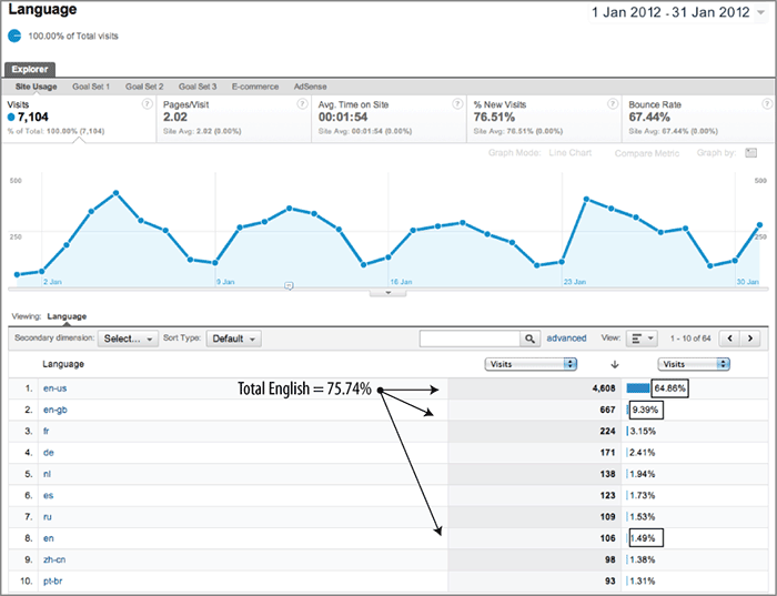
Figure 10-22: Advanced segment for grouping English language visits

Note: Don’t infer too much from the difference between en-gb and en-us because a great many non-US users have their browser settings set as en-us by default and never bother to change this. For example, I noticed that when I access my Google Analytics reports, I do so in US English. In over two years I have not bothered to change this to UK English.
From Figure 10-21 you might assume that the vast majority of visitor language requirements (75.74 percent) are accounted for. However, you should always assess this further. For example, viewing the Goal Set tabs, all things being equal, you would expect that the same proportion of conversions should occur for English visitors as for non-English visitors (if not higher). If that is not the case, there may be an opportunity for you to market in other languages. Also compare this table for new versus returning visitor segments. If foreign visitors feel you are not catering to their language needs, they are unlikely to return, and comparing your language distribution for returning visitors will reveal this.
Note: An excellent resource for comparing Internet world statistics is www.internetworldstats.com. See, for example, www.internetworldstats.com/stats7.htm, where English accounts for 26.8 percent of world Internet usage (May 2011), down 2 percent in the last two years.
Percentage of Visits Not Using Microsoft Internet Explorer
Microsoft has contributed hugely to the proliferation of the Internet because of its ubiquitous operating systems and free browser software (Internet Explorer). However, times are changing—the once-dominant use of the software giant’s products is being eroded by alternative operating systems from Apple and Ubuntu (Linux for the desk/laptop) and the abundance of browsers such as Firefox, Opera, Safari, and Chrome.
Various web browsers and operating systems render web pages differently. This means pages can look different from what was intended or not even work—the browser usually has the greatest impact here. Despite the use of Internet Explorer being globally estimated at 53 percent (see the sidebar “The Price of Incompatibility”), it still amazes me to visit websites of well-known brands that cannot process orders from non–Internet Explorer visitors. An example of this is posted at www.advanced-web-metrics.com/blog/2010/11/17/how-much-money-does-easyjet-lose/. Simply put, they are losing out on significant revenue and damaging their brand reputation to boot. Perhaps it is because testing web pages on different browsers and operating system platforms is a laborious job for webmasters and therefore rarely prioritized.
Whatever the reasons, you can access this KPI at a glance from the Visitors Technology Browser & OS report, shown in Figure 10-23. Knowing what your visitors use to access your website enables you to prioritize resources effectively. As you can see from Figure 10-23, the majority of visitors to this example site do not use Internet Explorer (81.32 percent).
In this case, having the website working well in MS Internet Explorer, Chrome, and Firefox is important, accounting for 90 percent of all visits. In addition, you should assess this further by viewing the Goal Set tabs. For example, visitors from MS Internet Explorer and visitors from Firefox should result in approximately the same conversion rates. If not, then likely your website does not work equally well for both browsers. Taking this a step further, you can also drill down on a browser type and view individual browser version details.
Figure 10-23: Visitor browser types

The Price of Incompatibility
Browser market share data from Net Applications for July 2011 (http://marketshare.hitslink.com/browser-market-share.aspx?spider=1&qprid=0) shows a global average of 47 percent of non–Internet Explorer users (up from 33 percent two years ago). Assuming these visitors behave in the same way as Internet Explorer visitors (there is no reason to suppose otherwise for the same website), that equates to an 89 percent loss of revenue if your website cannot work in these browsers (100/53). Even if your percentage of visitors not using Internet Explorer is lower than the global average, say only 20 percent, that is still 25 percent (100/80) of your money left on the table. A crime in my view!
Putting this into perspective, consider the percentage gains your marketing department is trying to squeeze out from optimizing online marketing campaigns—typically an additional 1 to 2 percentage point improvement, an order of magnitude smaller.
With browser standards now well established, there really is no excuse for not making your website work well in all browsers that have double digit usage by your visitors.
Percentage of Visitors Waiting Too Long for a Page Load
Slow-loading pages are a frustrating experience for any web user. It could be your overbloated landing pages or the visitor’s Internet connection. Whatever the bottleneck may be, the speed at which visitors access your content has obvious implications for webmasters. A study by Forrester Consulting for Akamai Technologies (September 2009) revealed that 2 seconds is the threshold in terms of an average online shopper’s expectation for a web page to load (www.akamai.com/html/about/press/releases/2009/press_091409.html). In addition, its report reveals that 79 percent of online shoppers who experience a dissatisfying visit are less likely to buy from that site again. Interestingly, its similar study of 2006 revealed a 4-second rule—web users are becoming less tolerant of slow page loads. Whether you have a transactional website or not, I suggest the 2-second rule be applied to your web pages.
The Site Speed report, as discussed in Chapter 5, is an excellent place to view the impact of individual page load time on your site. However, to use page-load time as a KPI, select the Performance tab as shown in Figure 10-24 (taken from the Content Site Speed report). Your threshold may vary, though I suggest that reducing the percentage of visitors waiting longer than 3 seconds should be your KPI. From Figure 10-24, this is 30.2 percent.
Figure 10-24: Site Speed Performance report

Percentage of Error Pages Served
This is an obvious metric any webmaster would wish to minimize. It is defined as follows and quoted as a percentage:
Tracking error pages is discussed in “Tracking Error Pages and Broken Links” in Chapter 9. You track them as virtual pageviews so they can be viewed in your Content Pages report. A target for this KPI could be to maintain this level at less than 0.1 percent of your total pageviews.
Internal Search Performance
Onsite search is now so important for large websites that it has become an integral part of the navigation system. Even for smaller sites, a good internal search engine can improve the user experience and hence your bottom line, so measuring the internal search experience is a key metric.
Important site search KPIs are available in the Content Site Search Overview report, shown in Figure 10-25.
Figure 10-25: Site Search Overview report

The report in Figure 10-25 is a great starting point to evaluate your site search performance. For example, from this report you obtain the following:
- Percentage of visits that use site search (1.62 percent).
- Average number of search results viewed per search (1.17).
- Percentage of people exiting the site after viewing search results (25.16 percent).
- Percentage of people conducting multiple searches during their visit (25.81 percent). This excludes multiple searches for the same keyword.
- Average time on site for a visit following a search (00:04:17).
- Average number of pages visitors view after performing a search (2.32). If this is fewer than 1, then a significant number of visitors searching are not going beyond your results page.
Other important KPIs for site search include how visitors who use this facility compare with those who do not. For example, are site search visitors more likely to convert, spend more money, spend more time on site, or view more pages—that is, less likely to bounce? You can see these rates by viewing the Content Site Search Usage report, as shown in Figure 10-26.
Figure 10-26: Site Search Usage report

From Figure 10-26, you can see that visitors who use the site search facility do indeed behave quite differently from those who do not. The Pages/Visit and Average Time on Site metrics are more than four times as high, while Bounce Rate is significantly lower. In addition, although not shown, the Goal Conversion rate for site search users is double that of those who do not use site search. From this report, site search clearly has a positive impact on the user experience for this example site, assuming the quality of the search results is good (see later in this section).
Note: Be aware that when selecting different metrics from the drop-down menu, the row order (and color key) may change depending on which is the highest value. For example, Visits With Site Search may be displayed as the first row when revenue is selected but as the second row when bounce rate is selected. This is the same behavior for all reports. That is, the highest value is always displayed first in the data table by default, something that still catches me out sometimes!
Why Site Search Visits May Not Have Zero Bounce Rates
A lower bounce rate is expected for site search visitors because by definition visitors who perform an onsite search will view at least two pages—one to conduct the search and one to view the results. So why is the bounce rate not zero?
Two common explanations are that your search result pages are indexed by the search engine robots and therefore can be accessed directly from a Google search, for example, and visitors can bookmark search results and therefore view them directly at a later date. For both of these scenarios, if the visitors do not view any further pages from you (or trigger any events), they are counted as bounced visits.
To compare site search usage against visits that do not search the site, take the site search metric and divide by the equivalent non–site search metric. This provides you with the ratio of how much more valuable (or not) site search is for your site. For example, Figure 10-27 shows that for the Per Visit Goal Value metric, visits that use site search are 23 percent more valuable than those that do not (0.16 / 0.13). Other useful metrics for this calculation are Conversion Rate, Revenue, and Number of Transactions, if applicable.
Figure 10-27: Valuing the impact of site search usage
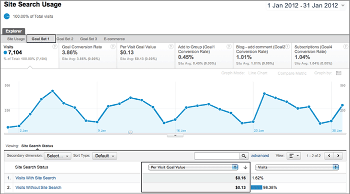
Internal Search Quality
Determining your site search’s result quality is harder to ascertain. Without asking your visitors what they think (survey integration is discussed in Chapter 12), a useful KPI is the number of zero-result search pages delivered. The theory is that searches producing zero results reflect a poorly configured internal site search engine.
Tracking zero results for site search is discussed in Chapter 8. Essentially, a different URL is required for search terms that generate a zero result than for those that do not. I use the Category field for this, as shown in Figure 10-28 (taken from the Content Site Search Search Terms report). From this example data, you can see that 17.61 percent of visits that used the search facility received a zero result. You can investigate this further by clicking the zero category label and viewing the search terms that generated this result. Measuring the success of site search is described in Chapter 11.
Figure 10-28: Percentage of zero search results
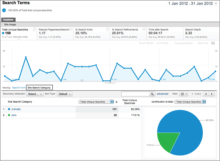
Note that it is possible that zero site search results could also be due to acquiring poor-quality traffic, though I have not considered this possibility here.
Web 2.0 is a phrase attributed to Tim O’Reilly (see www.oreillynet.com/lpt/a/6228 and www.oreillynet.com/pub/a/oreilly/tim/news/2005/09/30/what-is-web-20.html). In effect, it is a buzzword for the next generation of browser applications. According to Wikipedia, “Web 2.0 is a term often applied to a perceived ongoing transition of the World Wide Web from a collection of websites to a full-fledged computing platform serving web applications to end users. Ultimately Web 2.0 services are expected to replace desktop computing applications for many purposes.”
The irony is that the technology that drives Web 2.0 is part of the original Web 1.0 technology and has been around for many years—that is, JavaScript and XML. Thus, Web 2.0 does not refer to any technical advancements of the Web or the Internet infrastructure it runs on but refers to changes in the way the medium is used. That’s not to devalue the significance of Web 2.0, because this major shift in how users participate and surf the Web is driving the second generation of interactive web applications.
Example Web 2.0 Sites
Here are some excellent examples of Web 2.0 websites with RIAs:
Google Maps: maps.google.com (Ajax)
Google Mail: mail.google.com (Ajax)
Yahoo! Mail: mail.yahoo.com (Ajax)
Google Docs: docs.google.com (Ajax)
YouTube: www.youtube.com (Flash and Ajax)
Photosynth: photosynth.net (Silverlight)
MobileMe: www.mobileme.com (Ajax)
Flickr: www.flickr.com (Ajax)
Silverlight Showcase: silverlight.net/showcase/ (Silverlight)
As you can see, Google is a great proponent of Web 2.0 technologies. In fact, Google Analytics itself is a prime example—combining Flash and Ajax.
Web 2.0 applications are usually built using Ajax (asynchronous JavaScript and XML) techniques. Similar to LAMP and DHTML, Ajax is not a technology in itself but a collection of technologies and methodologies combining JavaScript, XML, XHTML, and CSS. Another Web 2.0 technology is Flash. As with Ajax, it has been around for over 12 years but has only recently emerged as something more than just cool animation, with its ability to stream video and interact with XML. Other technologies include Adobe Flex, Adobe AIR, and Microsoft Silverlight as well as HTML5—the latest version of HTML, which can achieve a great deal of animation and may even supersede the proprietary Flash format one day (in fact, iPhones, iPads, and the latest version of Windows Mobile no longer support Flash in favor of HTML5). Collectively, all these technologies are referred to as rich Internet applications (RIAs).
Why the Fuss about Web 2.0?
The techniques employed when developing a website using Web 2.0 technologies separate the components of data, format, style, and function. Instead of a web server loading a discrete page of information combining all those elements, each element is pulled separately. This has tremendous implications when it comes to defining KPIs because the concept of a pageview all but disappears.
For example, load http://maps.google.com in your browser and navigate to your hometown (usually in the format of “town, country”). Then zoom in and out and pan around by dragging the map. You can also change to satellite view or a hybrid of that and map view. It is difficult to describe this in words, but if you try it out you very quickly get the idea.
Google Maps is an excellent example of the power and interaction of a Web 2.0 website. When you load the first page, there is an initial delay while a JavaScript file is downloaded in the background. This is the controlling file that interacts with your mouse instructions. Note that the page and controlling JavaScript file are only loaded once. Then, as you interact with the map (zoom, pan around, and so on), further data is requested on-the-fly and inserted into the existing page. (The page URL does not change while you do this; the web page itself has become part of the delivery process.) By contrast, a traditional Web 1.0 website would require the reloading of the page to insert each additional map image.
This is an example of a visitor requesting one HTML page yet interacting in many different ways—perhaps creating dozens of actions or events (zooming and panning around) and gaining significant benefit from the experience. Clearly, using only pageview data for your KPIs is not going to work if your website contains RIAs.
Note: Tracking Web 2.0 websites is not an issue for Google Analytics. These websites can even be monetized. See “Event Tracking” in Chapter 7.
Web 2.0 sites are still relatively rare, but they can have a huge impact. For example, not many people are unaware of Google Maps, Yahoo! Mail, and YouTube. The key to their growing success is that the user experience is “cool.” Visitors find and interact with content quickly and without waiting for page refreshes. I often refer to Web 2.0 as drag-and-drop technology.
Consider the screen shot from YouTube shown in Figure 10-29. The six areas highlighted are actions or events that the visitor can interact with; that is, they are not pageviews. Essentially, the visitor can multitask with all of these on the same page (only one pageview).
Figure 10-29: Visitor engagements on YouTube
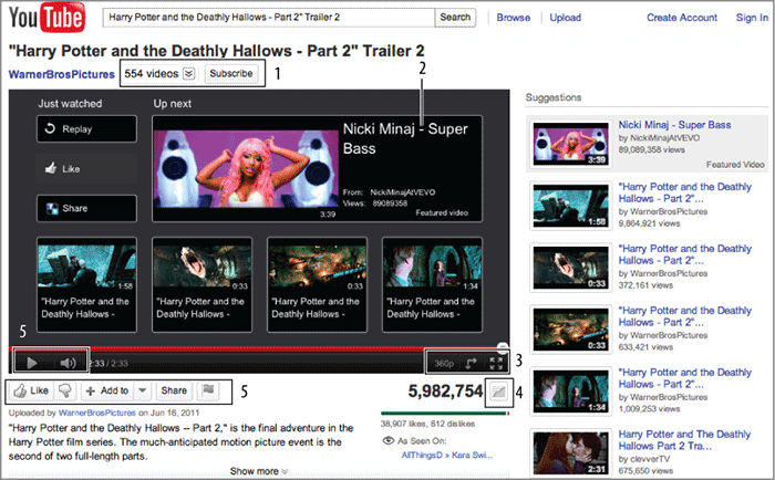
As the number of Web 2.0 RIA sites grows, the requirement to define KPIs for them grows. Rather than think in terms of pageviews, analysts need to think in terms of actions and events that indicate engagement. In other words, what actions do you want your visitors to perform in order to classify an engagement?
Another implication of Web 2.0 has been the proliferation of user-generated content (UGC) sites—collectively referred to as social networks. Examples include Twitter, YouTube, Facebook, Google+, Myspace, Bebo, Orkut, and the plethora of Blogger and WordPress blogs. Measuring visitors from social networks is straightforward because they are tracked just like any other visitor to your site. The caveat is that without segmentation or rewrite filters, such visitors are buried deep within all your other referral traffic. Chapter 8 discusses how to bubble these up in your reports in the section “Example Custom Segments.”
KPIs for Web 2.0 are actually no different from existing KPIs for a Web 1.0 world. True, you may be tracking them as events rather than pageviews; however, beyond visitor volume and transactions numbers, key metrics boil down to engagements, that is, determining how strong your virtual relationship is with your anonymous visitors. Engagement is exactly what savvy marketing managers and content creators are already focusing on with Web 1.0 technologies. If that describes you (I hope it does if you have read this far), any changes planned for your site involving RIAs or UGC will be easy for you to accommodate within your existing KPI strategy.
We discussed engagement in detail in the section “Content Creator KPI Examples.” The principle is the same for RIAs and UGC. Without changing your analytical thinking, the following current KPIs are suited to a Web 2.0 environment:
- Percentage of visitors with content interaction—for example, zoom, pan around, view next message, customize
- Percentage of visitors triggering an event—for example, play, pause, next, upload, advertisement click-through, drag to cart
- Percentage engagement—for example, subscribe, register, comment, rate, Facebook Like, Google +1, retweet, and so forth
In Chapter 10, you have learned the following:
Setting objectives and key results Setting OKRs is an important prerequisite for aligning KPIs with your business, allowing you to manage expectations and gain the support of the business as a whole.
Defining KPIs based on business goals We discussed selecting and preparing KPIs by translating OKRs into actionable and accountable metrics, allowing success metrics from the Web to be incorporated into the rest of the business.
Making KPIs easy to understand You learned how to present KPIs in a clear format that business managers recognize and understand.
Defining KPIs by stakeholder job roles We examined KPI examples by job role to help you get started with important metrics.
Understanding the new KPIs You learned how Web 2.0 and rich Internet applications are changing metrics and KPI definitions.