
Chapter 5
Reports Explained
At my last count, Google Analytics had over 100 default reports—and when you take into consideration segmentation options, pivot views, intelligence alerts, flow visualization, real-time reporting, and custom reports, the number grows exponentially. Clearly, no one person is going to look at all those reports on a regular basis—nor should you try. Hence, I attempt to whet your appetite to investigate further.
In this chapter, I focus on the important reports that can give you that initial understanding or contain a great deal of insight. I strongly recommend you review Chapter 4 before reading this chapter.
Of course, my report selection may not reflect the information most important to you—every website is different. Once you understand the drivers or blocking points for your visitors, you can focus on more detail and build your own list of top reports.
In Chapter 5, you will learn:
- The Home overview
- The top standard reports
- To understand data sampling
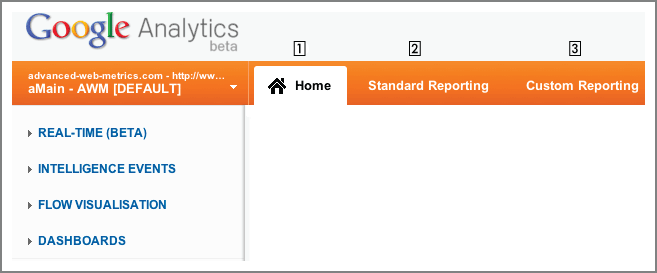
There are three main reporting areas in Google Analytics, labeled Home, Standard Reporting, and Custom Reporting. These are available from the tabbed menu at the top of your reports—as shown in Figure 5-1. Clicking each one of the top tab menus reveals a different side menu of items. In this chapter I focus on the Home and Standard Reporting areas because this is where you will spend the vast majority of your time when viewing your data. Custom reporting is described in Chapter 9, “Google Analytics Customizations.”
Figure 5-1: The three reporting areas of Google Analytics with the Home area selected
Real-Time Reporting
As the name suggests, this is a subset of reports that show you what’s happening on your site as it happens. This can be very powerful when you launch, announce, or advertise a new product or offer and are aiming to achieve a large impact quickly. For example, you advertise via TV and radio during a particular event (halftime during a football game) and need to know the immediate impact your message has. Even if you are not performing such offline advertising, blog posts, tweets, and PR announcements also attempt to create a big time-sensitive splash in the market place.
Previously, to gain this insight you would have needed to wait until your data was processed before viewing your reports—and this can be up to 24 hours later for high-traffic sites. The real-time reports allow you to see a selection of visit data processed within only a few seconds of visitors arriving on your site. An example is shown in Figure 5-2.
The report shown in Figure 5-2 is continually updated—every second the data-over-time charts are adjusted as well as the data table below (an impressive technical achievement to provide for millions of account users). The two data-over-time charts represent the last 30 minutes and last 60 seconds of activity, with a color-coded bar chart summarizing referral sources. As with other report tables in Google Analytics, you can drill down on a particular dimension by clicking its link in the table. For example, clicking the Organic link in the table reveals the search engine name and keyword detail that visitors are using at that very moment to arrive on your site.
Figure 5-2: A real-time report showing up-to-the-second view of referral sources (also shown in the color section)

Other reports in this section show real-time locations of your visitors as well as how your content is performing, that is, what your top pages being viewed right now are.
Tip: Another use for real-time reporting is for testing—either the testing of new content or a new marketing campaign. Quickly knowing that you can view the new data in your real-time reports ensures that updates and new campaigns launch smoothly.
Intelligence Events
The Intelligence Events report can dramatically impact your day-to-day analysis of web traffic data—for the better. It is a key report (deliberate emphasis) to greatly help you spot important changes in traffic patterns. This saves you the trouble of having to drill down into reports to find important changes; it actually finds the important changes for you in the first place. By that, I mean the Google Analytics intelligence engine is able to spot and highlight changes in metrics that often go unnoticed, buried beneath a plethora of other metrics—hence the name for this report set.
Intelligence works by performing statistical analysis on your previous data patterns to predict the future! Assuming you have reasonable levels of visits to your site each day (more than 100 visits per day) and enough historical data for the algorithms to work with (at least a month), Google Analytics will predict with reasonable accuracy what traffic levels are expected for the current day, week, and month. Comparing predicted values with the level of traffic you actually receive allows Google Analytics to highlight significant changes and optionally send you email alerts about them.
Note: Regardless of your traffic levels, Google Analytics will still generate intelligence reports for you. However, because all statistical methods require good sample sizes (at the very least hundreds of data points) to become valid, low traffic volumes can yield odd results. The larger your traffic volumes, the more accurate predicted statistics are.
Intelligence Overview
Figure 5-3 shows an example Intelligence Events Overview report. This is a summary table showing what automatic events were triggered for this particular time frame. It is broken down as follows:
Metric and Segment The particular metric that has changed significantly and the report segment from which it came.
Period The time period that the alert is applicable to. This can be daily, weekly, or monthly.
Date and Change The date range for the alert and the percentage of change observed when compared to previous time periods.
Importance The Importance bar shown for each alert row is the estimate of how real the alert is; that is, not the result of random fluctuations. The longer the histogram, the more real the result. The histogram is color-coded green for a positive change and red for a negative change.
You click the Details link to view a particular alert report.
Figure 5-3: The Intelligence Overview report (also shown in the color section)

In Figure 5-3, the automatic alert shown in row 1 is due to 20 percent more US visitors than expected in January, compared to previous months of activity. Row 3 shows a dramatic loss in the per-visit goal value when compared to daily trends, and row 5 shows that when compared to daily trends, conversion rates from Google on 9 January were significantly higher than expected.
For this example data, seasonality undoubtedly plays a large part in the alert triggers. However, knowing that on a particular day Google visitors convert more than six times higher than expected, for example, could be a valuable piece of information that your marketing and sales department can act on. Without the intelligence alert, this information can easily go unnoticed as just another data point hidden below a much larger total conversion rate.
What Does Alert Importance Mean?
The Importance column shown in Figure 5-3 for each alerted metric is the output of a complex calculation that determines whether the alert is real and not the result of a random fluctuation. However, in Google’s traditional way, the complexity of this calculation (confidence intervals and p-values) is hidden from the user and replaced with the simple bar graphic that represents a scale of 0 to 9. The longer the bar appears, the more “real” the result. Essentially, alerts with a high Importance value should be prioritized for further investigation.
For more information on the statistics of normal distributions, see
Intelligence Detail: Daily Events
There are three levels of Intelligence Events detail: Daily, Weekly, and Monthly. The only difference between these three reports is the time period that is considered when Google Analytics calculates what the expected range is for a metric. I therefore describe only the Daily Event report here. Clicking this item from the side menu brings up a report similar to that shown in Figure 5-4.
Figure 5-4 shows the standard visits-over-time chart (that you find in most of your reports), with an alert timeline below it. Bars on the alert timeline are shown when at least one automatic or custom alert is triggered. A mouse over an alert brings up a mini data bubble showing the date and number of alerts for that period—for example, three alerts on 23 June. Clicking an alert bar reveals a table of the metrics that triggered the alert, and these are shown below the timeline. In Figure 5-4, three automatic alerts are shown that reveal significant increases in visits, visitors, and pageviews for the selected day alongside their expected values.
Figure 5-4: The daily intelligence report (also shown in the color section)

Tip: Once you have established the reasons for an alert, it is a good idea to add a chart annotation to your report to make it easier for others (and yourself) to remember the event.
Focusing only on the alert table of Figure 5-4, the small chart icon to the left of each alert allows you to change the standard visits-over-time chart to the alerted metric over time. Alongside each alert is an Importance bar. This is the same metric as shown in the Overview report in Figure 5-3—it is the probability that a result is not due to chance. The grayer the Importance bar appears, the more likely the result is real and not simply by coincidence. At the right side of each row is a Go To Report link that will take you to the relevant full Google Analytics report, segmented for that alert.
The Weekly Events and Monthly Events reports operate in exactly the same way as described here. The only difference is that they compare the aggregate metrics for one week (or month) against the previous weeks (or months).
What Constitutes a Significant Change for an Alert?
The Google Analytics definition of a significant change, or what triggers an alert, is when a metric varies by a magnitude of X-sigma or greater from its expected value, where X-sigma is a multiple of the metric’s standard deviation. To understand this, let’s look at some standard statistical theory.
A normal (Gaussian) distribution is defined by two parameters: the mean value mu (μ) and its standard deviation sigma (σ). Sigma is a measure of the average difference between a value and the mean. The universal properties of a normal distribution are such that differing from the mean by ± one standard deviation will account for 68 percent of all measured values. Differing by ± two standard deviations will account for 95 percent of all values. Differing by ± six standard deviations will represent 99.9999998 percent of all values—in other words, as close to all measured values of the distribution as possible without being pedantic.

This graphic is taken from http://en.wikipedia.org/wiki/File:Standard_deviation_diagram.svg and is used with permission.
Alert Sensitivity
The sensitivity of an automatic alert—that is, how easy it is to trigger the alert—is determined by the Automatic Alert Importance slider bar—highlighted in Figure 5-4. Although not labeled, the slider bar scales from 7 sigma (lowest sensitivity) to 1 sigma (highest sensitivity). For example, at the highest sensitivity, if a metric is more than one standard deviation away from the predicted mean, an alert will be triggered. Conversely, at the lowest sensitivity value, a metric must be seven standard deviations away from the mean to trigger an alert. Hence, the sensitivity slider is a balance between highlighting significant changes and alert overload. My preference is to set this just to the left of halfway—approximately 3 sigma, 99.7 percent away from the mean value.
For more information on the statistics of normal distributions, see
Automatic Versus Custom Alerts
So far, I have discussed only automatic alerts. However as you will have noticed in Figure 5-3 and Figure 5-4, there are two types of alerts—Custom and Automatic. Automatic alerts (color-coded green) are alerts that Google Analytics has determined by its algorithmic method. That is, each day the intelligence engine checks for significant changes in the following dimensions:
- All traffic
- Visitor type (new or returning visitor)
- City
- Region
- Country/territory
- Campaign
- Keyword
- Source
- Medium
- Referral path
- Landing page
- Exit page
Note: In addition to the list shown for dimensions that are checked for automatic alerts, other dimensions may also be checked. For example, your AdWords click-through rate. However, at present there is no documentation from Google on which dimensions are used.
Any metric for these dimensions that falls outside the computed expected range is flagged as an alert. On the other hand, the creation of a custom alert gives you greater control. A custom alert allows you to set an alert criterion from any collected metric and apply it to any dimension—and even apply a custom segment. Two examples of a custom alert are shown in Figure 5-5 and Figure 5-6, created by selecting the + Create a Custom Alert link.
The custom alert setup in Figure 5-5 sends out an email to the alert creator (and optionally to other email addresses) when a new campaign actually starts to generate revenue. Often, there can be a significant time lag between when a marketing campaign is launched and when it generates new revenue. Because of this, newly generated revenue can go unnoticed—beneath all the other campaign and marketing activity the analyst needs to track. This alert takes cares of that with an email message.
Figure 5-5: A custom alert notifying you when a new campaign generates revenue

Figure 5-6: A custom alert notifying you of traffic spikes
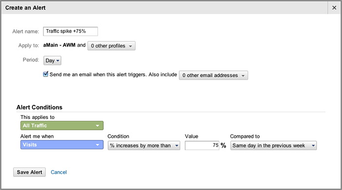
Figure 5-6 notifies the alert owner when traffic suddenly peaks—in this case if it is more than 75 percent higher when compared to the same day the previous week. It could also be modified for traffic troughs or revenue spikes and troughs.
Note: Emailing of alerts is currently available for custom alerts only.
Flow Visualization
Flow Visualization reports present a graphical view of the paths visitors take through your website. This includes the referral source, through your various pages, and where along their paths they exited your site. An example is shown in Figure 5-7.
Figure 5-7: An example Flow Visualization report (also shown in the color section)
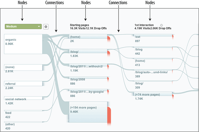
The terminology used here consists of nodes and connections. A node represents one metric of a dimension. It can be a single page or a collection of pages. For example, in Figure 5-7 the selected dimension is the referral medium and the metric is all visits. A connection represents the path from one node to another. The thickness of the connection is proportional to the volume of traffic along that path.
Note: The clever part of the Funnel Visualization report is the concept of nodes. A node can be single page from your site, but most likely it represents an auto-generated group of pages. Google Analytics automatically groups what it considers similar pages together. The result is that you view paths through similar pages rather than paths through every page on your site. That greatly simplifies the visualization of visitor flow and is a huge improvement over traditional path analysis reports shown by other vendor tools.
The Flow Visualization report has some powerful controls to aid your analysis—this is an industry leading report! First, any dimension can be selected as your starting node using the green drop-down item at the top left of Figure 5-7. By default, the top five matches based on traffic volume are displayed. If you wish to change this and examine a different subset of the dimension, click the gear icon next to the green dimension menu to open the Customize Dimension Items control, shown in Figure 5-8. Up to five segments can be added.
Figure 5-8: Example customized dimension for a Flow Visualization report

There is also the option to apply an advanced segment to the report using the controls placed just above the report—shown in Figure 5-9. This can be an existing default segment or a custom segment you have previously created. If no advanced segment is selected, all visitors are shown by default.
Figure 5-9: Flow Visualization controls

Next to the segment selection drop-down in Figure 5-9 is the Connections slider. Use the slider to filter the display based on connection volume. For example, moving the slider to the right increases the sensitivity of the display and will show more connections of lower visit volume. Combine this with the zoom and pan feature shown with the slider bar on the left in Figure 5-9. Note that you can also pan left and right through the visualization paths by dragging your mouse across the report.
So now you can navigate around the Flow Visualization report. However, the power of this report lies in understanding how traffic flows through your site. Hover over a connection of interest to view the flow of metrics. The connection will darken to highlight your selection and a data bubble appears showing the before and after node names and the amount of traffic that went down that particular path. Hover over an exit node to see how many visitors exited your site from that node. Click the connection to keep it permanently highlighted with a darker color, and click again to remove the highlight.
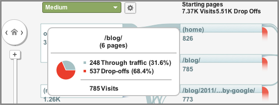
Hover over a node to view the traffic flow for that particular node—as shown in Figure 5-10. This shows not only the traffic flow through the node (defined as the path /blog), but also the number of pages this represents. In this case, Google Analytics has automatically grouped together six pages it considers similar. To view the node URLs, click the node and select Group Details from the pop-up menu.
Figure 5-10: Node traffic flow
By clicking a node, you can select one of the following options:
Highlight traffic Through Here Highlights the connections for all traffic that moved through that node. To remove the highlight, click the node again, then click Clear Highlighting.
View Only This Segment
Explore Traffic Through Here Changes the visualization to show all connections to and from the node. When used, this generates a Navigation Flow report, which is also a separate menu item in the Flow Visualization report section. This option is shown for page nodes only.
Group Details This opens a pop-up window with further options to choose from as follows:
- Top Segments (dimension nodes only): The current metric.
- Outgoing Traffic (dimension nodes only): The pages to which traffic flowed from that node.
- Top Pages: The most visited pages represented by that node. For example, if a node represents a collection of pages in the Shoes directory, then you see information about the pages in that directory that had the most traffic.
- Traffic Breakdown: The sources of traffic, based on the dimension you selected for the visualization.
- Incoming Traffic: Not available for Visitors Flow.
- Outgoing Traffic: The pages to which the node sent traffic.
Tip: Flow Visualization is a powerful way of exploring traffic patterns on your website. Google has put an enormous amount of development time into simplifying the display. However, it still remains a complex picture. Therefore, experiment with focusing on a particular segment, rather than viewing all of your traffic. Also revisit this report on many occasions as you build up your knowledge. This is certainly not a one-time view report.
Dashboards
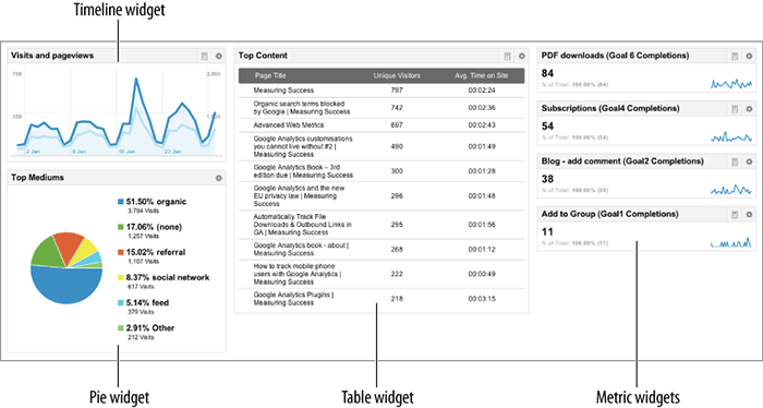
A dashboard is an overview area where you can place a summary chart or table (known as a widget) copied from the main body of the Google Analytics reports. The idea is that a dashboard can give you an at-a-glance overview of the key metrics and trends happening on your site. From here, if you notice a significant change, you can click through to go to the detailed report section. An example dashboard is shown in Figure 5-11.
Figure 5-11: The Dashboard summary report

When viewing a dashboard, you can move a widget’s placement by dragging and dropping it into another desired position. Also, you can change the selection of widgets shown at any time, with a maximum of 12 available to display per dashboard and a limit of 20 dashboards. Each dashboard has a three-column view, and you can organize it any way you wish. However, I recommend that rather than randomly displaying your widgets across a dashboard, you build your dashboards so that widgets are grouped by type—that is, traffic acquisition, engagement, calls to action—and are consistently placed into one of the columns, as shown in Figure 5-11.
There are two ways to add a widget:
- You can navigate to a report and click the Add To Dashboard link at the top of the page, as described for label R in Figure 4-4 in the previous chapter. If you choose this method, you can add the report to an existing dashboard or create a new one.
- Within an existing dashboard, you can create a new widget by selecting the + Add Widget button at the top of the dashboard report. Figure 5-12 shows the resulting pop-up display
Figure 5-12: Adding a new dashboard widget
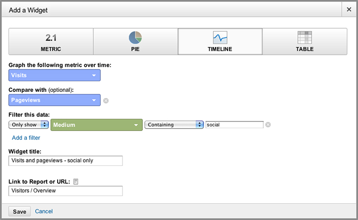
Working my way down through Figure 5-12, the first selection is to choose a widget type from the four available. In this example, Timeline is selected and the remaining settings refer to this—the other widgets operate in a similar way. Figure 5-13 highlights what the widget types look like on the dashboard.
Figure 5-13: Dashboard widget types
For a Timeline chart, up to two metrics can be plotted alongside each other with two y-axis scales. Optionally, a filter can be applied to the data. As shown in Figure 5-12, visits and pageviews are to be plotted over time for social media visits only (filtered by medium). The remaining items are to name the widget and optionally add a direct link to the full report.
Note: Applying a widget filter is not the same as applying an advanced segment. That is, it is hit based, not visit based. Consider the following example: You apply a widget filter of Page URL = homepage.php. This will include data only for that specific page URL—no other data from the same visit is included. Conversely, for an advanced segment based on the same page URL criteria, if one page during a session matches, the entire session data (visit) is included. That is, pages that do not match the criteria will show in the report because they are part of a visitor’s session that included a match. Advanced segments are discussed in detail in Chapter 8, “Best Practices Configuration Guide.”
The widget naming is straightforward, though I recommend you include a brief filter description if this option is applied—otherwise it is difficult to discern the name of the widget from the dashboard view. The link to the full report is a clever piece of technology that auto-populates with a shortcut as you type. For example, type the word visit to get yourself familiar with the technique.
A key point to emphasize is that a dashboard is configured on a per-user basis. That is, the contents are specific to your login and cannot be adjusted by others.
Note: Not to be confused with your Google Analytics dashboards, the Google Analytics service has a status dashboard that allows you to see if there any reported problems with the system. This can be found at www.google.com/analytics/status.
The following sections are not intended as a definitive list of the only reports you should look at. Rather, they are suggestions to take you beyond the initial visitor volume numbers that you will see. Reviewing these reports for your organization will give you an understanding of visitor behavior before you map your organization’s stakeholders and determine what key performance indicators to use for benchmarking your website.
The reports in this chapter are not listed in any particular order, except for the first one, which is an important development for digital marketers (released summer 2011) that deserves special attention. Before reading this chapter, review Chapter 4 to ensure that you get the most out of using the reports.
Multi-Channel Funnels
As discussed in Chapter 3, “Google Analytics Features, Benefits, and Limitations,” the default attribution model for Google Analytics is to give credit for a conversion, or a transaction, to the last referral campaign. As you will have appreciated, that is a simplification of what can happen in reality. That is, typically a visitor will come to your website a number of times before they are ready to convert, and each visit can be via a different referrer. Multi-Channel Funnels is a suite of reports that helps you understand the full referral path and what impact each referral has on the final conversion. I consider two reports here—Assisted Conversions and Top Conversion Paths.
Assisted Conversions Report
Consider a person looking for a new product or service who is ultimately looking to buy or contact you online. In this scenario, many people start their search on Google looking for general information—they do not yet know the name of the product or company they are looking for and perhaps are not familiar with the exact product terminology. In a “research” frame of mind, they typically select organic links to improve their knowledge because these links are ranked by their corresponding website’s content and link value (the number of other websites that link to them). A second visit to your site may come from a review site. Once a decision is made to commit to a purchase or make contact with a supplier, people are then more likely to click an ad for their third visit because these ads have strong call-to-action incentives.
Assuming this results in three visits to your website and a conversion takes place on the third visit, the Multi-Channel Funnels report will show the complete, three-step referral path and will also monetize the first interaction, the last interaction, and any steps in between (assists). Figure 5-14 shows an example assisted conversion report for a site that has monetized goals and an e-commerce shopping cart.
Figure 5-14: Multi-Channel Funnels assisted conversion report

In Figure 5-14, the summary row (label A) immediately tells you that more than one referral contributed to the final conversion. In this example, there are 34 assisted conversions. If the revenue for these conversions—from a mixture of goal values and transactions—is assigned to the assist referrals, their total value is $106, whereas if all the revenue is assigned to the last interaction, the value is $721.
The last column provides a very insightful ratio: The number of assisted referral conversions divided by the number of last click referrals. In this example, the overall value is 0.17. This is a measure of how important assists are to the overall digital marketing plan. A value close to 0 indicates that this channel functioned primarily as the final conversion interaction. A value close to 1 indicates that this channel functioned equally in an assist role and as the final conversion interaction. The more this value exceeds 1, the more this channel functioned in an assist role.
Note: Clarifying Figure 5-14, label A, the total number of goal completions plus transactions (if applicable) is 195, of which 34 had assists from other referrals. That is, it is not 195 + 34 goal completions.
The data table below the chart in Figure 5-14 shows the breakdown of these metrics on a per-channel basis. It is interesting to note that paid advertising (row 6) plays a higher assisting role for this example website than it does as a last click interaction (label B). This shows how simplistic last click conversion analysis is. If only the last click was given credit, paid advertising would be substantially undervalued. In fact, this is applicable for all the referral mediums shown, except for social network—though it should be noted that the conversion numbers are very low toward the bottom of the table.
By default, the Assisted Conversions report shows your referral data grouped into the color-coded dimension named channels. These are analogous to referral mediums—as discussed in the sidebar “Glossary of Terms” in Chapter 1, “Why Understanding Your Web Traffic Is Important to Your Business.” The exception is the channel named Social Network, which is an advanced segment compiled from over 150 social network sites. You can change the referral dimension shown using the links above the data table (label C). You can also create your own custom channel grouping—either from scratch or using an existing channel group as a template. An example of this is discussed in Chapter 11, “Real-World Tasks.”
By default, the Multi-Channel Funnels reports show you data for all conversions from all referral sources. The setting by label D allows you to modify this—for example, viewing data from only AdWords visits. Likewise, you may wish to see data for transactions only or for a specific goal.
As with other reports in Google Analytics, you can apply segmentation to your Multi-Channel Funnels reports. Elsewhere, this is termed Advanced Segments—see Figure 4-4, for example. Within the Multi-Channel Funnels reports it is called Conversion Segments (label E in Figure 5-14). The principal of segmentation is exactly the same in both cases. An example of using a conversion segment for a Multi-Channel Funnels report is discussed in Chapter 11. Advanced Segments are discussed in Chapter 8.
Figure 5-14, label F, shows a message you may see in your Multi-Channel Funnels reports. This is an automatic warning that is displayed if you have a profile filter applied to your report. Essentially, profile filters either remove or manipulate your collected data. Clearly such filters could have a major impact on how representative Multi-Channel Funnels reports can be, hence the warning message.
The general guidance is to use an unfiltered profile for analysis of Multi-Channel Funnels reports—you should always have an unfiltered profile as your data backup! However, filters that do not exclude the referral source, medium, or campaign values of your visitors are okay to use. Similarly, filters that rewrite page URLs, making them readable for example, or rewrite referral mediums for affiliates or social network visits, are usually safe to use. Similarly, filters that exclude entire visits—such as, exclude internal staff, exclude all visits from France, and so on—are usually safe.
In summary, although it is best to avoid profile filters when viewing Multi-Channel Funnels reports, when considered alongside the accuracy of the technique itself (see sidebar), as long as you are not removing visits based on referral data, your data should be fine. Profile filters are discussed in detail in Chapter 8.
The Accuracy of Multi-Channel Funnels
Multi-Channel Funnels reports are generated from conversion paths logged at Google Analytics during the 30 days prior to each conversion or transaction. For this, the unique ID of each visit is required—this is obtained from the Google Analytics __utma cookie. Because a cookie is involved, the same accuracy caveats as described in Chapter 2, “Available Methodologies and Their Accuracy,” apply here. That is, visitors who delete their cookies between visits and those who use multiple devices for their browsing will not have accurate Multi-Channel Funnels reports.
If your site sells or provides high-value items, bear in mind that these incur a longer consideration time for purchasers to commit. The higher the value, the more likelihood this could span more than 30 days. If so, you will not see the full referral path of your visitors, the initial steps being missing.
The Multi-Channel Funnels reports also highlight the need for a thorough process for implementing accurate and reliable campaign tracking. This is a critical step if you advertise your website, promote it on social networks, conduct email marketing, or work with affiliates and partners. Campaign tracking is discussed in Chapter 7, “Advanced Implementation.”
Top Conversion Paths
This report shows the conversion paths your customers or leads took on their way to converting. An example is shown in Figure 5-15. Looking at this report allows you to see what interactions exist between referrers. In this example, numerous table rows show that “direct” referral visits are combined with another channel. This is interesting because a direct visitor by definition is already familiar with the website URL. Yet email, paid advertising, and organic search still play a role in driving the conversion for these visitors.
Figure 5-15: Top Conversion Paths report
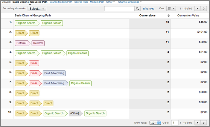
Considering only last-click-wins analysis, the report shown in Figure 5-15 shows that email and paid advertising would be given credit for only one conversion each. Yet they played a role in three and two conversions, respectively. This report therefore allows you to obtain a more holistic view of how all your digital marketing efforts contribute and interact with each other.
Although not shown here, the same options as shown in Figure 5-14, labels A through F, are available in the Top Conversion Paths report—with a nice little addition: the Path Length drop-down menu, shown in Figure 5-16. This deserves a special mention because of the neat, at-a-glance information it provides. Apart from the ability to change the path length shown in the report, set as 2 Or More by default, this clever item displays a summary table and chart of conversions by path length. Immediately, this allows you to understand the impact of referrer path length on goal conversions. For example, in Figure 5-16 it shows that a significant proportion of conversions have 10 or more referrers!
Figure 5-16: Multi-Channel Funnels Path Length view

Important Notes for Multi-Channel Funnels
There are important considerations to take into account when interpreting your Multi-Channel Funnels reports:
- Multi-channel funnels data is compiled from unsampled data and is based on all conversions and transactions.
- Historically, multi-channel funnels data is available back to January 2011.
- Multi-channel funnels reporting is delayed by up to two days due to the amount of processing required to generate the reports.
- Google Analytics records up to 5,000 interactions per conversion path. There is no limit to the number of unique conversion paths that can be recorded.
- A conversion path is created for each conversion and transaction recorded. For example, repeat conversions by the same visitor are shown as different paths.
- Assisted/Last Interaction Conversions ratio: If a channel assisted multiple times in the path of a single conversion, only one conversion is included in the ratio as an assisted conversion. If a channel both assisted and served as the last interaction for a given conversion, the channel is only credited as a last interaction conversion for the ratio.
How Direct Visits Are Treated
In the Multi-Channel Funnels reports, if a person converts on your site during a “direct” visit, the conversion is attributed to the “direct” channel. This differs from other Google Analytics reports in which the conversion is attributed to the previous nondirect campaign or source, if there is one. The default behavior is described in the section “The Default Attribution Model” in Chapter 3.
Social Interactions
Social engagement is the ability to track the actions of people who click your social love buttons. These are the small social network icons that you can add to your website: Like (Facebook), Tweet (Twitter), Google +1 (Google), Share (LinkedIn), and so forth. These are important interactions for website marketers because they indicate a very strong engagement. That is, a visitor appreciated your content so much that they are prepared to tell their friends, colleagues, and acquaintances. It’s the equivalent of word of mouth marketing, with the added potential of becoming viral—and it’s free.
Google Analytics has the following reports available in the Visitors Social section:
Engagement How many visitors click one of your love buttons and their associated metrics (pages per visit, time on site, per-visit value, conversion rate, e-commerce revenue, and so on) compared with those who are not socially engaged with you.
Action This is the action provided by the love button, and its value will depend on the social network used and your implementation of its button. Available options include Like, Dislike, Tweet, Share, +1.
Pages The pages where the action took place. This report has a very useful pivot table view set as default that shows the source and action on a per-page basis.
An example Social Action report in shown in Figure 5-17. In this case, Twitter is the preferred social source. With this information you can adjust your social marketing budget accordingly.
To get the most out of this report, ensure that you are familiar with the section “Navigating Your Way Around: Report Layout” in Chapter 4.
Visitors: Location
The Visitors Demographics Location report shows you where your visitors come from, enabling you to identify your most lucrative geographic markets. Visually stunning, the map overlay is also an extremely powerful report—it gets across the information you need to know at a glance. The displayed maps are color-coded by density—the darker the color, the higher the reported metric, such as more visits or revenue. A density key is shown in the bottom-left corner, and you can mouse over the regions, countries, or cities to view top-level metrics.
Geographic information is extremely powerful for targeting your online marketing activities. For online marketing, Google AdWords (and other pay-per-click networks) enables you to geotarget your advertisements. In this respect, the locations report of Google Analytics can be used in two ways: to identify new locations for potential online campaigns and to measure the effectiveness of existing geotargeted campaigns.
Figure 5-17: Example Social Action report

To illustrate its ability, consider the two charts in Figure 5-18—shown for the same profile and date range. Figure 5-18a shows the visitor information, whereas Figure 5-18b shows the e-commerce conversion rate data from the same visitors. As you can see, the map densities are quite different.
Within the map, use your mouse to click and zoom in from world view to country, regional, and city level and along the way examine visitor statistics from that part of the world. You zoom out by using the breadcrumb navigation located just above the summary row of data at the top of the report. Below the displayed map is the tabulated data for the selected region, with the additional option of selecting a continent and subcontinent. For each location, you can cross-segment your visitors against other metrics, such as referral source, medium, language, and so on, by using the Secondary Dimension drop-down. For example, once you have found your location of interest, you can cross-segment to view which mediums are popular with your visitors there—as shown in Figure 5-19.
Figure 5-18: Geographic density of (a) visits and (b) goal conversions rate for the same data set

As with all reports shown in this chapter, to get the most out of this report, ensure you are familiar with the section “Navigating Your Way Around: Report Layout” in Chapter 4.
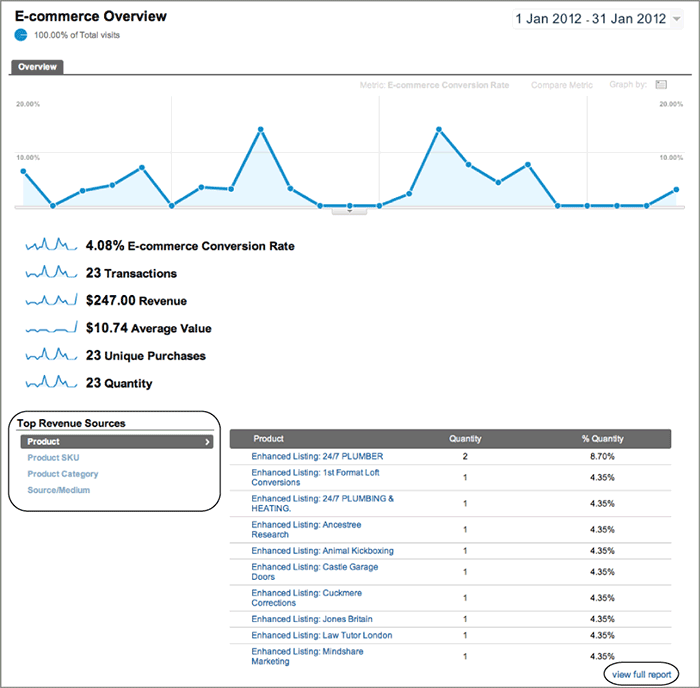
E-commerce: Overview Report
The e-commerce section is a suite of reports that enable you to identify top-performing products and revenue sources and to trace transactions back to a specific campaign—right down to the keyword level. Individual product data can be viewed and grouped (referred to as categories), and loyalty and latency metrics (the number of days to transact, the number of visits to transact) are available. Such information is critical for a successful product-by-product search-engine marketing initiative as well as for determining what products to stock and your pricing strategy.
Note: Even if you do not have an e-commerce facility, you should still monetize your website by adding goal values. Monetizing a non-e-commerce website is discussed in detail in Chapter 11, “Real-World Tasks.”
Figure 5-19: Segmenting geographic visitors using a secondary dimension

From the initial Conversions E-commerce Overview report (see Figure 5-20), a wealth of information is provided for you to feast on. These are the details that are driving your website transactions. From here, select a top revenue source from the left-hand table to view its detail in the right-hand table; products are selected by default. Click one of the top-performing products to view its individual report and then cross-segment, by selecting a secondary dimension, against other fields, such as referral source, campaign name, keywords, and so on. Alternatively, to view all products, select the View Full Report link at the bottom of the report highlighted in Figure 5-20.
Motion Charts
Motion charts are a great aid for data visualization. They turn static, dry, two-dimensional data tables into something that is interesting and even exciting to look at—a rare phenomenon in the world of data analysis! Most important, motion charts animate data against time, so that you can see how multiple metrics evolve. A static version is shown in Figure 5-21.
Figure 5-20: A typical E-commerce Overview report
A motion chart is not a report in itself. Rather, it’s an animated view of an existing report. Hence, you can access motion charts from most Google Analytics reports by selecting the Graph Mode button at the top of the chart (refer to Figure 4-4, label C3). When a report is animated, five dimensions are plotted: x-axis, y-axis, data point size, data point color, and time. Because of the difficulty in describing how all of these interact on paper, I strongly encourage you to view the official YouTube demonstration on the Google Analytics channel at www.youtube.com/watch?v=D4QePIt_TTs.
Note: The voice behind many Google Analytics demonstrations on YouTube is Alden DeSoto. You can view one of his many talents (and other Google Analytics team members) at. www.youtube.com/watch?v=nimrc-uG7UY.
Figure 5-21: Motion chart for the Traffic Sources Medium report

In the example in Figure 5-21, the five dimensions for each data point are as follows:
- Visits—shown on the y-axis
- Pages per visit—shown on the x-axis
- Goal conversion rate—color
- Average time on site—bubble size
- Time—displayed as a time slider below the chart (paused on January 10)
The signals for success in this motion chart are data points that are up and to the right, have a large bubble size, and appear hot (red in color). This informs you of any mediums that are driving high volumes of traffic, with strong engagement (in terms of pages per visit and time on site), and conversions. If and when that happens, how long such a situation lasts, and how each medium compares over time are key pieces of information that are practically impossible to ascertain from a static set of data tables.
There are many more features of motion charts that you should explore. For example, you can plot x- and y-axis on a log scale (used when the range of displayed values is very broad), adjust the speed of an animation, plot trails for each data point, zoom in on a particular chart area, alter the opacity of data points to highlight those of most importance, and even change the presentation from a bubble chart to a bar chart—though I have always preferred the bubble chart format.
At first, the motion of multiple metrics moving across the screen can make your eyes glaze over; it can even be mesmeric. “It’s pretty, but what’s it telling me?” is often the initial response from users. However, once you get familiar with following the different metrics, you’ll learn how to spot unusual events that require further investigation.
The key to getting the most from this report is selecting long time periods (greater than a month) and repeatedly viewing the animation in slow motion. After three or four run-throughs, you should notice any activity of interest. Select Trails and adjust the opacity to focus on certain data points accordingly. Remember that a motion chart is a visualization tool—that is, the precursor for further analysis.
Tip: Ensure that you use all five dimensions of the motion chart available to you—even if fewer are required. For instance, I often use the color and bubble dimensions as duplicates to highlight a significant change. In the example in Figure 5-21, if the average time on site is not a metric of interest, I would also use the bubble size for the goal conversion rate. That way, higher conversion-rate data points are double highlighted with a large bubble and warmer color. The more you can make important data stand out, the better.
Goal and Funnel Reports
As discussed throughout this book, goal reporting (conversions) is an important measurement for your organization. Regardless of whether you have an online retail facility or not, measuring goal conversions is the de facto way to ascertain whether your website is engaging to your visitors and therefore a key component of measuring success.
In addition to measuring your goal conversion rate, the Conversions Goals Goal URLs report enables you to view the specific URLs that trigger the reporting of a goal. This is particularly useful when a wildcard is used to define the goal, such as, for example, *.pdf. In this case, the Goal URLs report will list all the PDF downloads that trigger the reporting of that defined conversion.
Also within this section, the Reverse Goal Path report considers the last three steps (pages) visitors took before reaching a goal. This is an excellent place to look for visitor paths that could be considered for funnel analysis.
Goal Conversions versus Goal Completions
Say, for example, one of your website goals is *.pdf—that is, the download of any PDF file. A visitor arrives on your website and downloads five PDF files. Google Analytics will count this as one goal conversion (not five, as you might expect). The rationale for this is that visitors can convert only once during their session, which makes sense.
To view the total number of PDF downloads and which files they were, you can either view the Conversions Goals Goal URLs report or, if you wish to cross-segment the data, go to the Content Pages report and use the table filter to display only PDF files.
Funnel analysis (sometimes referred to as path analysis by other vendor tools) is a subsection of the Goals report. Some goals have clearly defined paths that a visitor takes to reach the goal. An obvious example is an e-commerce checkout process; others include newsletter sign-ups, registration subscriptions, reservation systems, and brochure requests. Not all goals have a defined path, but if yours do, then it is useful to visualize how your visitors traverse them (or not) to reach the goal. The Funnel Visualization report helps you do just that, and an example is shown in Figure 5-22 taken from the Conversions Goals Funnel Visualization section.
Figure 5-22: A three-step Funnel Visualization report

The pages of a funnel a visitor is expected to pass through (as defined by your configuration) to reach the goal are in the central section highlighted in Figure 5-22—in this example, to download software. The tables to the left are entrance pages into the funnel. The tables to the right are exit pages out of the funnel steps—that is, where visitors go when they leave the funnel page. The exit pages listed can be other pages within your website or the report can show the visitor leaving the site completely. A well-defined funnel should have the vast majority of visitors passing downward into a minimum number of funnel steps.
Funnel visualization enables you to assess how good your funnel pages are at persuasion—that is, how good they are at getting visitors to proceed to the next step, getting closer to approaching conversion. A funnel with pages optimized for persuasion and conversion should have a minimal number of exit points (pages to the right of the funnel), thereby leading to a high conversion rate. A detailed funnel analysis is considered in the section “Funnel Optimization Case Study” in Chapter 11.
Visitor: Mobile Report
Google Analytics tracks all visitors to your website, whether they come via a mobile, laptop, desktop, or any other Internet-enabled device that can execute JavaScript and set cookies. Mobile devices include smartphones and tablets such as the iPad, the Samsung Galaxy Tab, and so forth. Because the user experience of accessing a website via a mobile device is not the same as via a desktop or laptop, Google has a dedicated report section just for such visitors—found in the in the Visitors Mobile section.
The mobile Overview report provides the information required to understand the differences between mobile visitors and those from regular computers. Metrics such as pages per visit, time on site, per-visit value, conversion rate, e-commerce revenue, and so forth can be compared for the two visitor types. This report looks very similar to other Google Analytics reports, except the data is for the two segments of Mobile = Yes and Mobile = No. Therefore, I show the Visitors Mobile Devices report (Figure 5-23).
Figure 5-23: Mobile devices report

The report shown in Figure 5-23 lists the mobile brand and device name as the dimension. In addition, clicking the small camera icon next to the device name displays a pop-up with images of the selected device—as shown for Samsung. Other interesting dimensions that can be selected include Mobile Input Device (such as touch screen, clickwheel, joystick) and Screen Resolutions (from the Other drop-down menu option). You can also select screen resolutions as a secondary dimension.
To get the most from this report, ensure that you are familiar with “Navigating Your Way Around: Report Layout” in Chapter 4.
Note: No additional Google Analytics setup is required to track visitors from smartphones or tablets. However, if your site needs to cater to users of older-generation feature phones and their WAP protocol, you will need to implement server-side tracking. This is discussed in “Tracking Mobile Visitors” in Chapter 6, “Getting Started: Initial Setup.”
Traffic Sources: Search Engine Optimization
The vast majority of reports in your Google Analytics account are generated from data of visitors actually viewing your content. That is, they are on-site analytics reports. The Search Engine Optimization reports are an example of combining this with off-site data, which is data points Google captures prior to a visitor coming to your site. The following off-site metrics are examples that could be shown in your Search Engine Optimization reports:
- Impressions—the number of times any URL from your site appeared in Google’s search results viewed by a user, not including paid AdWords search impressions
- Average Position—the average ranking of your website URLs for the query or queries
This information comes from an import of data from your Google Webmaster Tools account (www.google.com/webmasters). Essentially, Webmaster Tools is a set of tools from Google to assist you in the management and promotion of your website in Google’s organic results. In other words, it’s information about your pages’ visibility on Google search properties, so it’s an important set of reports.
Note: The differences between onsite and offsite web analytics are discussed in Chapter 1.
To view your Search Engine Optimization reports, you will need to have a Google Webmaster Tools account and integrate it with your Google Analytics account. This is described in Chapter 6. Assuming you have done this, a key report from this section is the Queries report, shown in Figure 5-24. These are the keywords used by your visitors on one of Google’s search properties (such as google.com or google.co.uk). As you will note from Figure 5-24, I have added a secondary dimension Google Property to the table and sorted descending by the number of click-throughs.
Figure 5-24: Search Engine Optimization report

The Google Property dimension shown in Figure 5-24 can have one of four values: Web Search, Mobile Search, Video Search, or Image Search. From this report, row 6 shows that a significant number of visits (strictly speaking, click-throughs) came from Google image search. That fact alone may be important to the website owner and marketing department.
By viewing the Impressions column and comparing it with the Clicks column, you can see how much of your potential audience you are capturing via your organic rankings—the Click Through Rate (CTR) column provides the ratio. In this example, the CTR highlights that my relatively unique name is capturing only 4.46 percent of the total traffic (table row 1). That could be of concern, only capturing such a small percentage of the market. However, a little further investigation reveals a US basketball coach shares the same name. So I may not be doing so badly with my organic rankings after all.
Data Import Accuracy and Limitations
The data shown in the Traffic Sources Search Engine Optimization reports is an import from your Google Webmaster Tools account and is subject to the same limitations. That is, data is limited to your top 1,000 daily query terms and top 1,000 daily landing pages. There is also a two-day delay for importing the Webmaster Tools data. As with all data imports, be aware that click-through data may not exactly align with your visit reports. Accuracy considerations are discussed in Chapter 2.
AdWords: Campaigns
As you might expect from a product by Google, Google Analytics integrates tightly with AdWords. Other integrations include AdSense, Webmaster Tools, and FeedBurner. Undoubtedly in the future there will be further integrations with other Google products. In fact, I see this as Google’s main challenge moving forward—integrating Google Analytics within all Google products to provide a unified measurement platform for each.
AdWords, being a key component of any digital marketer’s armory these days, has a dedicated subsection of reports within the Advertising menu navigation. Assuming you have an AdWords account and it is linked to your Google Analytics account, your AdWords impression, cost, position, and click-through data is imported into this report area.
Note: An AdWords import takes place whenever a report containing AdWords data is generated. This ensures that you always view the latest data and that it will match what you can view directly in your AdWords account.
The power of combining your AdWords account data with Google Analytics is illustrated in Figure 5-25—taken from the Advertising AdWords Campaigns report. For example, Figure 5-25 shows the campaign detail with the same column headings and report tabs as for any other visitor type. That is, for each campaign, you can view its performance in terms of site usage, goal conversions, and e-commerce performance. Do not limit yourself to the initial default data shown. Use the full suite of reports features available to you, as described in the section “Navigating Your Way Around: Report Layout” in Chapter 4. You can also drill down and perform the same analysis at the ad group and keyword levels by selecting these reports from the navigation menu.
At the top of Figure 5-25 are buttons to show traffic from visitors who used a high-end mobile (smartphone) or tablet device when clicking your ad. Essentially these are advanced segments for the different device types and allow you to analyze your performance just for those visitor users.
A unique menu tab for AdWords reports is Clicks, shown in Figure 5-26. With the exception of the Revenue Per Click (RPC) and ROI columns, the data in the Clicks report is imported directly from your AdWords account. The revenue is obtained by summing your website’s monetized goals and any e-commerce revenue generated by AdWords visitors.
Figure 5-25: AdWords per campaign

Figure 5-26: AdWords Campaigns report showing the Clicks detail

In addition to tracking your AdWords cost data, you should keep a close eye on your return on investment (ROI). Chapter 11 looks at interpreting this data in more detail.
Tip: Chapter 9 describes how to build a custom report to improve the AdWords report shown in Figure 5-26.
Note: As per other Google Analytics reports, the data shown in the AdWords reports is based on visitors with cookies. Therefore, the numbers may not match the totals viewed in your AdWords account reports because AdWords can track only clicks. For a more detailed explanation of discrepancies between AdWords and Google Analytics reports, see Chapter 2, “Available Methodologies and Their Accuracy.”
AdWords: Keyword Report
This report allows you to view the performance of your ads at the keyword level. However, for this example I use it to display the domains of click-throughs from the display network. Digital marketers have the option of displaying ads on either the Google search network (google.com, ask.com, aol.com, and so on), the display network, or both. The display network comprises websites, news pages, and blogs that partner with Google to display targeted AdWords ads. The partner uses AdSense to manage this and shares in some of the click-through revenue.
If you have opted in to displaying your ads on the Google display network, then your Advertising AdWords Keywords report will display (content targeting) in the keyword column for such click-throughs—as shown in Figure 5-27 (a table filter is used to show only these visits). To analyze the performance of your content network visits, apply the secondary dimension of Placement Domain to show which website the visitor came from.
At this time it is not possible to view the actual keyword matching that AdSense has performed.
Note: You can find further information on AdSense and the content network at www.google.com/adsense and http://adwords.google.com/select/afc.html.
Tip: The Google search network consists of several well-known web brands (former giants in fact!). However, at present it is not possible to see which of these refer your visitors in the AdWords reports. For example, a visitor from aol.com who clicked an AdWords ad to your site will show in your reports as an AdWords visitor—the same as if they came via google.com. However, you can differentiate these and see the referring domain using the customization described in the section “Differentiating Pay-Per-Click Network Partners” in Chapter 9.
Figure 5-27: AdWords Keywords report showing the referring domain for content network visitors

AdWords: Matched Queries Report
For managing an AdWords account, digital marketers create ads for groups of related search terms. For example, to target visitors to this book’s website, I might select the following search terms:
- Web metrics
- Advanced web metrics
- Advanced web metrics third edition
- Advanced web metrics second edition
- Advanced web metrics any edition
Assuming the same landing page URL is suitable for each search term, I would create a single ad for all four-plus search terms—there is no need to create separate ads for each term. Within AdWords you achieve this by setting the match type equal to phrase for the term “web metrics.” In this way, any search query with this phrase will result in my ad being displayed to the user. Incidentally, I could also add negative search terms, so that “web metrics with Yahoo Analytics” does not display my advertisement!
In this case, a single ad targeting multiple search terms, “web metrics” is the bid term, whereas the visitor’s actual search term that triggers the ad is called the search term. You can view the correlation between bid terms and search terms in the Advertising AdWords Matched Search Query report, setting the secondary dimension as Keyword—as shown in Figure 5-28. Note that Google Analytics uses the terminology Keyword and Matched Search Query for the AdWords bid term and search term, respectively.
Figure 5-28: AdWords Matched Search Query report showing the search term and corresponding bid terms

AdWords: Keyword Positions Report
The AdWords Keyword Positions report tells you what position your AdWords ad was in when the visitor clicked it. In addition, you can drill down and view how your ad conversion rate, bounce rate, per-visit goal value, number of transactions, revenue, and other metrics vary by position, using the Position Breakdown drop-down menu.
In Figure 5-29, the left side of the report table lists the AdWords keywords you have bid on during the specified time frame. Selecting one of these options changes the view on the right to a schematic screen shot of the Google search engine, with the positions your ad was shown at and the number of visits received while in that position. This emulates what the positions would look like on the Google search engine results page.
You might expect that the higher your position in the AdWords auction model, the more visitors you receive. However, this may not always be the case and may not be desirable. For example, high ad positions—especially those displayed at the top of the pages rather than on the side—may get more clicks, but they may be less qualified (poorer quality). Therefore, it’s important to study the effect of ad position on other metrics. Figure 5-30 shows the Goal 1 conversion rate and per-visit goal value for a different keyword selected from the same report. As you can see, these metrics show a very different pattern by position compared to the volume of visits by position. The key to success is to strike the right balance between high-quality click-throughs and volume of traffic.
Figure 5-29: AdWords Keyword Positions report
Figure 5-30: AdWords Keyword Positions report for (a) Goal 1 conversion rate and (b) per-visit goal value

Understanding the Average Position Metric
Hal Varian, Google’s chief economist, has written a very insightful article on the subject of understanding the average position metric. The post is available from the AdWords official blog:
http://adwords.blogspot.com/2011/04/understanding-average-position-metric.html
Content: Navigation Summary
Knowing which pages, and landing pages, are popular on your site is an obvious first step when assessing your website’s performance. The common per-page metrics of pageviews, time on site, bounce rate (single-page zero event visits), and percentage of visits that leave from a page (% Exit) are all available in the Content Site Content Pages report and the Landing Pages report, respectively. I discuss the use of the Landing Pages report in Chapter 11.
Going beyond the page metrics, another useful report is the Navigation Summary. You get to this from the Pages report by clicking a listed URL (or page title) and then selecting Navigation Summary. An example is shown in Figure 5-31 for the URL /blog/auto-tracking-file-downloads-outbound-links/.
Figure 5-31: Navigation Summary report
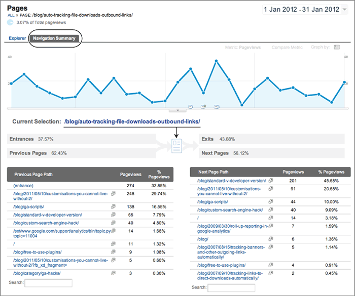
At first the Navigation Summary report can appear confusing. However, the key is to focus on the central “page” icon that represents the URL selected. The summary metrics to left of the page icon show the percent of visits that came directly to this page and the remaining percentage that came via another page on this site. The summary metrics to the right of the page icon show the number of visits that left the site completely from this URL and the number of visits that went on to view another page within the site.
Below the summary information is the detail of the previous and next page URLs viewed. This is a great way to understand how traffic has flowed through a specific page URL. By default, the top 10 previous and next URLs are shown in the table. You can drill down below this using the search boxes provided at the bottom. You can view each page URL by clicking the small icon in each row. This opens the page in a new window.
Note: If you wish to see a more general view of how traffic flows through your website, view the Flow Visualization report as described earlier in this chapter.
Content: Site Speed
No one likes waiting, yet for some reason the tolerance for waiting on the Internet is super low—it’s simply too easy to go somewhere else. And people do. A study by Forrester Consulting examining e-commerce website performance and its correlation with an online shopper’s behavior found site performance to be a key factor in a consumer’s loyalty to a site.
www.akamai.com/html/about/press/releases/2009/press_091409.html
You probably realized this already. However, the report puts some interesting numbers to what our intuition tells us:
- Fifty-two percent of online shoppers stated that quick page loading is important to their site loyalty.
- The speed threshold expected was only 2 seconds.
- Shoppers often become distracted when made to wait for a page to load. Fourteen percent will begin shopping at another site, and 23 percent will stop shopping or walk away from their computer.
- For retail and travel sites, 79 percent of online shoppers who experience a dissatisfying visit are less likely to buy from that site again.
Hence, your site’s speed is closely correlated with your revenue, lead generation, visitor engagement, and their loyalty. In view of that, Google has a dedicated report that focuses on the speed of your pages in the Content Site Speed section. My initial preference is the Performance report shown in Figure 5-32 because it provides a quick overview of any performance issues.
You can view the performance of your individual URLs by clicking on the Explorer link above the summary metrics. The impact of geolocation on your speed can be seen in the Map Overlay section. The general rule of thumb is that the farther away your visitors are from your web servers, the longer the latency of their connection.
Figure 5-32: Site Speed report

Site Speed Data Sampling
Site speed data is automatically collected for all web properties at a 1 percent sample rate. No changes to your web pages or your GATC are required.
The default sample rate may be adjusted using the _setSiteSpeedSampleRate function. Allowed sample rates range from 0 (to disable site speed tracking) to 10 (maximum allowed sample rate). This is described in the section “Customizing the GATC” in Chapter 7.
Site Search: Usage Report
The Site Search reports contained in the Content section of Google Analytics are dedicated to understanding the usage of your internal search engine (if you have one). For large, complex websites with thousands of product pages, and in some cases hundreds of thousands, having an internal site search engine is critical for a successful visitor experience—no navigational system can perform as well as a good internal search engine in these cases.
At the very least, Site Search reports are a form of market research—every time visitors enter a keyword into your search box, they are telling you exactly what they want to find on your website. Marketers can use this information to better target campaigns. Content creators can use it to improve page titles and descriptions. Product managers can use it as a feedback mechanism for designing new features or adding new products. Hence, a report on the search terms used by visitors on your website is clearly powerful information for your organization.
In addition, understanding where on your website a visitor uses your search box, what page they go to following a search, how long they stay on your site after conducting a search, whether they perform further search refinements, whether they are more likely to make a conversion, and whether their average order value is higher are also vital clues that can help you optimize the visitor experience.
The answers to all these questions can be found in the Content Site Search section, as shown in Figure 5-33.
Figure 5-33: Site Search report showing which pages visitors start their search from (also shown in the color section)
Content: In-Page Analytics
The In-Page Analytics report loads a page from your website and then overlays it with the key metrics for each link on that page. It’s an excellent visual way to see which links on your website drive traffic, conversions, transactions, and revenue (see Figure 5-34). The default view is to display the percentage of clicks received for each link on a page using a small orange bar next to the link—mouse over a percentage bar chart to see the corresponding pop-up metrics as per label A in Figure 5-34.
You can easily change the metrics displayed using the control drop-down menu at the top of the report—label B. For example, you can show number of goal completions, transactions, revenue, or goal value. You can also set a threshold for visualizations of that metric, such as, for example, clicks with more than 10 percent.
The In-Page Analytics report is a working HTML preview of your website. Hence, you can click any of your links to navigate to that page and view its overlaid statistics. As you may have noticed in Figure 5-34, some metrics are duplicated. For example, the logo at the top-left side and the first link in the top menu (Home) both show 9.1 percent of the clicks from this page. In fact, these two metrics are duplicates because each link points to exactly the same page. Chapter 9 describes how you can customize your links so that the In-Page Analytics repo rt can be used to differentiate links that point to the same URL.
Figure 5-34: In-Page Analytics report

The control labeled C in Figure 5-34 allows you to show or hide the overlay metrics, color-code the orange bar (blue for low values, red for high, with shades in between), and expand the view to a fuller screen.
Current Limitations of In-Page Analytics
In order for In-Page Analytics to work correctly, the page referenced by each link must exist as an HREF element on the page being viewed. That is, if you use the function _trackPageView for generating virtual pageviews (as described in Chapter 7, “Advanced Implementation”), the In-Page Analytics report will not work. Nor will In-Page Analytics work for pages containing Flash content.
Another example is the submission of forms. A submit button or form tag does not contain an HREF element. Therefore, if you have a goal conversion configured as a form submission, the In-Page Analytics report will not show this as part of the metrics.
Report sampling is a process used for sites that generate large volumes of visit data. The rationale is to optimize the report generation and minimize any delays in the building of reports.
Essentially, if Google Analytics is in report sampling mode, it examines only a portion of the collected data for calculating results. Then for displaying the report, Google Analytics automatically scales these numbers back up. For example, if 10 percent of your actual data is used for the sample calculation, metrics such as number of visits and number of pageviews are multiplied by 10 in the displayed report. It’s a standard statistical approach when dealing with large volumes of data—a smaller representative subset of data is used to estimate the total values.
Note: As a rule of thumb, if your site receives fewer than 100,000 visits per month, is it highly unlikely you will come across report sampling.
Note that report sampling is different from data collection sampling, which is discussed in “Customizing the GATC” in Chapter 7. Data collection sampling determines how much data is sent to Google Analytics, and this is under your control. Report sampling happens automatically when a report is generated that exceeds certain thresholds.
Whether your data is automatically sampled or not is determined on a per-report basis. Ultimately this comes down to the volume of data to be processed by your report request—determined by the date range and report type you select in the user interface. For example, the suite of reports contained in the Standard Reporting section of Google Analytics (refer to Chapter 4, Figure 4-3 and Figure 4-4) is generated from unsampled, pre-aggregated data tables. Any report request that can be satisfied by using the pre-aggregated data is not sampled.
However, a report request may require a custom data set, such as the use of advanced segments, a secondary dimension, or a custom report. In these cases, if the requested data comes from a web property that exceeds 500,000 visits for the same date range, sampling will take place.
Per-Visit Sampling
Sampling occurs on a per-visit basis at the web property level. That is, Google selects a random sample of visits from each day for a particular web property. Figure 4-1 in Chapter 4 explains the relationship between web properties and profiles. Further information on the report sampling criteria is available at
http://code.google.com/apis/analytics/docs/concepts/gaConceptsSampling.html
To illustrate this, suppose you are viewing the Content Site Content Landing Page report, with a secondary dimension of medium selected, and this results in a table with a total of 90,000 visits. Why may such a relatively small data set be sampled?
In this case, you are requesting a custom data set that cannot be obtained from the unsampled, pre-aggregated reports. Therefore, a request to the raw session data is required. Sampling will happen if the total number of visits during the selected date range for this web property exceeds 500,000 visits. Note my deliberate emphasis on web property—even if you have a filtered profile excluding most of your traffic, sampling is taken at the web property level.
To indicate that a report is generated from sampled data, Google Analytics displays a yellow notification box at the top of the screen stating, “This report is generated in fast-access mode,” as shown in Figure 5-35. Although not explicitly written, this means sampling has taken place.
Figure 5-35: Report sampling notification within the user interface

Consider report sampling as a sign of success—that is, you are receiving so many qualified visitors that reporting all their activity becomes a time-consuming and resource-intensive process. However, attempt to minimize when sampling can happen by structuring your data in a way that makes sense. For example, rather than placing everything together, consider spreading your data over different Google Analytics web properties and even separate Google Analytics accounts. Using extra Google Analytics accounts is discussed in “Roll-up Reporting” in Chapter 6.
Note: Google Analytics Premium, the paid-for version of Google Analytics, has a feature that enables you to download unsampled reports in CSV format. Note that within the user interface, the report generation is still subject to the same sampling criteria in order to keep the reports loading fast; that is, a 500,000 visit threshold for custom data requests that cannot be served via pre-aggregated data. Google Analytics Premium is discussed in Chapter 3.
In Chapter 5, you have learned the following:
How to effectively use the Home area Real-time reporting, intelligence alerts, flow visualization, and dashboards are key areas to be aware of when you have a specific need outside of the standard report set.
Which standard reports are the most useful You have learned about the top reports that can help you understand visitor behavior and provide a starting point for further detailed analysis and optimization.
How to understand report sampling You have learned how data sampling may impact the numbers you see in your reports and how to mitigate against such impacts.