
CHAPTER 19
Tools and Techniques: Problem Solving Through Pattern Discovery and Probing
It is being in touch, with customers, suppliers, your people. It facilitates innovation, and makes possible the teaching of values to every member of an organisation. Listening, facilitating, and teaching and reinforcing values. What is this except leadership? Thus MBWA is the technology of leadership. Leading is primarily paying attention. The masters of the use of attention are also not only master users of symbols, of drama, but master storytellers and myth builders
– Tom Peters and Nancy Austin
SYNOPSIS
Logical thinking takes a concrete shape when it is reinforced with data. Scrutiny and analysis of data pertaining to an issue brings forth many aspects and clues of the issue deserving to be investigated and probed. To facilitate this process one should equip himself/herself with a good knowledge of simple quantitative methods of analysis and gain good practice in application of these methods.
Background
Problems, difficulties, set-backs, bottle-necks, obstacles are an integral part of life. Systems do help to minimise their magnitude as well as their frequency. In spite of this, problems cannot be wished away. They have to be faced and solved. For addressing and solving a problem there is a structured route which is discussed in Chapter 27. To develop the competency in solving a problem, logical thinking qualitatively as well as quantitatively is very important. The previous chapter has been the subject of qualitative thinking; and the current one deals with tools and techniques of quantitative thinking starting with an understanding of what a problem is.
Problem
What is a problem? Generally, a problem is an issue which is in need of a change for the better. The issue can be related to any situation, activity, work or a process. The nature of the issue can be diverse and varied. But the focus of the problem, no matter to what issue it is related to and what its nature is, admits of the following discipline.
- Clear definition of the issue.
- The current status of the issue spelt quantitatively.
- The new level to attain, stated quantitatively.
- A clearly laid out route for investigation to find the causes/sources of the problem, followed by the measures to prevent the recurrence of the problem at source.
Pattern discovery and investigation route
Investigation has to be data-based and its focus at all stages of the investigation has to hinge on the core idea of Pattern discovery. This thought governs every type of investigation ranging from the simple ones to the more complicated and breakthrough types meriting even the Nobel Prize. The following example related to the research on peptic ulcer by Dr. J. Robbin Warren and Professor Barry J. Marshall which has won the 2005 Nobel Prize for them, in the field of medicine, is instructive and illuminating in understanding the general route of investigation as well as the role of pattern discovery. (When conventional belief was challenged’ 2005).
- Stress and lifestyle were considered as the major causes of peptic ulcer disease. The researches mentioned ‘challenged prevailing dogmas’: Deliverance from a conditioned mind.
- Warren observed small curved bacteria colonising the lower part of the stomach (antrum) in about 50 per cent of patients from whom biopsies had been taken: Data orientation and pattern discovery.
- Signs of inflammation were always present in the gastric mucosa close to where the bacteria were seen: Rational sub-grouping of data facilitating stratified thinking to formulate more precise pattern/idea.
- The duo initiated study of biopsies from 100 patients to conclusively prove that the bacterium (Helicobacter pyroli) is indeed the culprit: Formulating the hypothesis for detailed investigation based on the hunches, conjectures and sharpened intuition derived from pattern discovery; planning of special data for experimentation.
- Marshall succeeded in cultivating Helicobacter pyroli from several of the biopsies. It is now firmly established that H. pyroli causes more than 90 per cent of duodenal ulcer and up to 80 per cent of gastric ulcer: Establishing the cause of the problem.
- Further investigation showed that the recurrence of ulcer even after being healed by inhibiting gastric acid production was due to non-eradication of the bacteria: Understanding the nature of cause to find a permanent solution.
- In treatment studies, Marshall and Warren as well as others showed that patients could be cured from peptic ulcer disease only when the bacteria were eradicated from the stomach: Conclusive phase of the permanent solution.
- Thanks to the pioneering discovery of Marshall and Warren, peptic ulcer disease is no longer a chronic, frequently disabling condition, but a disease that can be cured by a short regimen of antibiotics and acid-secreting inhibitors: Implementation phase.
Thus, problem-solving is a composite process based on data orientation, quantitative stratified thinking habit, thorough knowledge of the field of the problem, discipline to formulate conjectures, hypotheses based on observation and data, verification of conjectures, hypotheses on causes of the problem, remedial measures on causes through experimentation; pilot-scale implementation of the actions arising out of experimental results, verification of results and large scale implementation.
The entire processes stated are facilitated through the concepts of logical thinking dealt in Chapter 18; tools and the techniques for handling data are discussed in this chapter; role of data, statistical techniques and interpretation of data are discussed in Chapters 20 and 23–25.
Data orientation
Data orientation sharpens one’s questioning ability and logical thinking. The following example illustrates the point.
In a curing process, the curing equipment is an oven. It is found that the throughput from the oven and input to the oven were not matching resulting in high in-process stock. Data on throughput, input and in-process stock also indicated the imbalance. Hence, it was decided to install one more oven. The logic was to increase the capacity thereby increasing the throughput. One smart member of the problem-solving team posed the question: Is the proposal to install one more oven the only solution for increasing the throughput? This made the team look beyond the easy-way-out. It focused on (a) the utilisation of the existing facility and (b) improving the method of using the facility. Downtime was high. The pattern of loading needed much to be desired. Both were set right to the effect that input and throughputs were balanced. This led to the new realisation that while increasing the capacity to increase the throughput is logical, the reverse logic that to increase throughput, increasing the capacity is not always necessarily the correct approach.
Tools and techniques
To exploit data, it must be appropriately analysed to discover patterns of interest, if any, lying latently in the data. Basic tools of analysis are charting and summarisation of data that enable a pattern discovery. These are simple tools of analysis. The tools and techniques covered in this chapter are given in Table 19.1.
All these tools and techniques facilitate a critical look at certain non-random pattern in the rearrangement of raw data, and allow a technical pattern that generates certain hypothesis/hunches/suggestions which need to be further investigated. The different methods of handling the raw data is the basis for generating ideas and thoughts for further investigation besides being a means to sharpen one’s intuition through pattern discovery already referred to as a non-random pattern. Each of these tools is explained as follows.
The tools dealt here are simple, easy-to-learn and use. They bear no relation to the advanced sophisticated tools of pattern recognition, such as image processing, computer vision, artificial intelligence, fuzzy mathematics, which are extensively used in areas as divergent from speech pattern to that of remote sensing.
TABLE 19.1 Tools and Techniques: Quantitative Analysis
| Name of the tool/technique |
|---|
| Run chart: Type 1 Run chart: Type 2 Stratification Pareto law Tally sheet Frequency distribution Scatter diagram Box plot Break-even point Statistical tolerancing Safety factor with statistical basis Control chart on measurement: X-bar and R Process capability index Few approaches: critical incident analysis, engineering a failure and generation of defects at levels that generate failure Benchmarking |
Run chart: Type 1
Run chart Type 1 is shown in Figure 19.1.
With reference to Figure 19.1, it can be noted that the characteristic considered against time does not vary much, exhibiting a steady pattern with close fluctuation. Such situations are there in plenty. Notable examples are house rent, power and water consumption per unit of output, etc. Here the data is naturally available time-wise—hour, day, week, month, year.
Now the issue is how to change for the better because the current level is very steady, consistent and hence fairly well-controlled.
In such a situation, thinking must be focused on fundamental/basic, new and different types of interventions/changes. For example, house rent is one such steady, consistent phenomenon. The changes to be thought of are how to divert the house rent expenditure towards buying a home. In case of water, rainwater harvesting and in case of power—use of non-conventional sources of energy. These are the fundamental changes/interventions that need to be thought of.
Figure 19.1 Run chart – Type 1
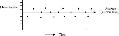
Figure 19.2 Run chart – Type 2

The point to be noted is that steady, consistent and well-controlled situations are great opportunities for breakthrough and must be handled as such.
Run chart: Type 2
Run chart Type 2 is shown in Figure 19.2.
The point to be noted in Figure 19.2 is that the characteristic considered does vary unsteadily over time, showing close clusters as well as wide variations. This is a typical situation. Here also data are naturally available time-wise—hour, day, week, month.
Here, the run-chart indicates areas of interest in the shape of unusual patterns as shown by A, B, C and D in Figure 19.2. This stimulates thinking and questioning to understand the underlying phenomenon for the unusual pattern and take suitable measures to change the status quo for better.
Areas of interest that need to be probed can be found from the run chart as follows:
- Reasons for the maximum response, minimum response: (A) and (B).
- Reasons for clusters of low response and high response: (C) and (D).
- Reasons for unusual non-random trends—upwards and downwards—if any.
Any data ordered in time, needs to be represented as a run chart with a wide scale to bring out oscillations to attract the eye to catch the areas of interest.
Stratification
Category-wise data such as machine-wise output data, student-wise score data, gender-wise data, age-wise data are also available. If response is summarised for each category and presented in a tabular form, it brings the areas of interest over which one has to think and question. This is the trigger for the improvement process. This category-wise summarisation of data is called stratification of data.
Table 19.2 shows category-wise summarisation of data regarding monthly expenditure. The areas of interest here are:
- Basic intervention: (1), (4) on priority.
- Detailed analysis as explained later: (2).
- Probing basic data: (5), 13 per cent of the total expenses are miscellaneous. This reflects poor quality of data. Find more meaningful stratification and reduce the miscellaneous expenditure to less than 10 per cent.
TABLE 19.2 Summary of Data: Stratified and Summarised Monthly Domestic Expenditure

Rejection operator-wise and product-type-wise summarised over 4 months period are as under:

Pattern of rejection is such that it weighs heavily on B and 1 when compared to the rest. Thus, the area of interest lies in operator B, Product 1.
Downtime in 1000 hr of operation in five similar machines is as under:

Where does the area of interest lie? It is in the following patterns reflected in the stratified summary data:
- Focus on ‘oil leak’.
- Why there is no oil leak in ‘A’ and ‘B’?
- Why there are differences in oil leak between A–B and C–D–E?
- Same reasoning as in (ii), (iii) for lever breakage.
- Why ‘B’ is the best? How it differs from the rest?
- 10 hr out of 48 hr (nearly 20%) is accounted as other causes. This reflects that quality of data is poor. Reduce this category to less than 10 per cent.
From this presentation, the point to be noted is that one should train one’s eye to spot the areas of interest. This comes with extensive practice in handling raw data to discover patterns and raise the basic question—What information can be obtained from these patterns? Raw data includes any data that are available in various records, reports, log sheets, etc., and their charting.
Pareto law
It is the phenomenon of few contributing significantly to the whole. It is a universal phenomenon as could be seen hereunder:
- Few items account for 65–70 per cent of the total consumption value and a large number of items account for only 35–30 per cent of the consumption value.
- If 2 per cent rejection is spread over 10 types of defects, only 3–4 of them would account for more than 50 per cent of the rejection.
- If among a group of 120 workmen, 15 per cent is the rate of absenteeism, only about 25–20 workmen account for a major chunk, say 10 per cent out of 15 per cent and the remaining account for 5 per cent.
- If there are 80 types of products marketed, 60–65 per cent of the contribution is accounted by only 15–20 items.
This universality of ‘vital few and useful many’ is also found in the new field of Systems Biology. Dr. Mohan Babu and his advisor Dr. Sarah Tecchmann at the Medical Research Council’s Laboratory of Molecular Biology at the University of Cambridge, UK, have found that ‘a few players (transcriptional regulators) decide the production of several proteins while there are many who decide the production of a few proteins. So essentially, 80% of decisions are taken by 20% of the regulators termed the master regulators’. (Prasad 2006)
Universality of Pareto law can be illustrated from another area, that of oil fields—‘less than 1 per cent of the producing oil fields account for 75% of global production. Thus, what we have are a handful of giant oil fields and numerous trickles’. (Mahalingam 2006)
Yet another illustration of the universality of the law of focus comes from the field of entomology. Peter Ryan, Head of Mosquito Control Laboratory of the Queensland Institute of Medical Research in Australia has found that all types of water containers are not equally important as breeders of dengue mosquitoes, but only certain types are important which produce 90% of dengue mosquitoes. (Raj 2006)
Dr. J. M. Juran gave the name The Pareto Principle to this phenomena. He also coined the expression ‘vital few and useful many’.
Identifying the vital few facilitates giving attention to them and triggers ‘thinking and questioning’ on them. ‘Vital few’ represents the area of interest for improvement. For these reasons, in recent years, Pareto law is also called the Law of Focus. Where to focus is again a pattern reflected in the data summary.
The method of carrying out Pareto analysis is illustrated by an example on domestic expenditure termed ‘bills and provisions’. It is common knowledge that domestic expenditure contains several individual items. Let us say that there are 20 items. As shown in Table 19.3, the data are rearranged in the descending order of expenditure to know the vital few, and the observations are recorded. This completes Pareto analysis.
TABLE 19.3 Expenditure: Average per Month on Bills and Provisions

Five items (u), (a), (p), (e) and (k) account for 72.50% of the total expenditure. Hence, these are the ‘vital few’. Remaining 15 items which account for 27.5% of the total expenditure are the ‘useful many’.
Any action taken on ‘vital few’ makes a significant impact on the whole. Area of interest lies in the ‘vital few’.
Another illustration of the application of Pareto law is invoice errors drawn from the routine work of invoice preparation. Errors in invoice were related to the following 16 issues:
- Customer name
- Contact name
- Customer address
- Account number
- Purchase order number
- Items ordered and its unit
- Quantity of items ordered
- Discounts
- Total price
- Tax
- Shipping costs
- Payment due date
- Remittance address
- Printing errors
- Dispatch address
- Freight insurance
During an 8-week period, the data collected as errors showed that in all the invoices of that period there were 2020 errors.
Now the question is, on which of the 16 issues the focus has to be bestowed for investigation and action. In other words, how to know which ones among the 16 are more important?
The 2020 errors were classified ‘issue-wise’ and the results were tabulated as in Table 19.4 in descending order. The five issues: (5), (8), (2), (6) and (7) were found as fit candidates for investigation.
A number of illustrations of Pareto analysis chart are given in Annexure 19A. In our observation, during case study presentations, ‘Pareto law’ application is shown compulsorily. But it is shown in more than one type of presentation: tabular form, bar chart, pie diagram, bar chart cum cumulative chart. All these are unnecessary frills. Any one of the forms will be sufficient.
Pareto law, as a law of focus has entered far and deep in the psyche of every practitioner of continual improvement. This is not only good but also a must. But there are occasions where there is a flat-low-level-defect status that evades prioritisation demanding focus on each individual type of defect.
Tally sheet
Tally sheets: an aid to convert opinions into facts When opinions are expressed, they should be welcome. The flow of opinions should not be stopped. Opinions need to be verified to convert them into facts. This verification is done through data, based on the frequency tally check sheet.
TABLE 19.4 Pareto Analysis Summary

‘Tally sheet’ tool is illustrated here under:

Frequency distribution/histogram
Application: The frequency distribution/histogram displays the dispersion or spread of data.
Description: A histogram is a visual representation of the distribution of data. It is useful for visually communicating information about a process and for guiding the focus for improvement efforts.
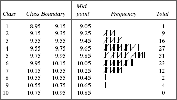
Procedure: The procedure for a histogram is best explained by applying it to the following data related to the thickness of a metal strip (mm).

Step 1. Count the number of data points in the set of data.
In our example, there are 125 data points (1–125).
Step 2. Determine the range R for the entire data set. The range is the smallest value of the set of data subtracted from the largest value. In our case, the range is equal to 10.7 minus 9.0. Thus, the range equals 1.7.
Step 3. Divide the range value into a certain number of classes referred to as K. The following table provides an approximate guideline for dividing set of data into a reasonable number of classes. For our example, 125 data points would be broken down into 7–12 classes. We will use K?? 10 classes.
| No. of data points | No. of classes (K) |
|---|---|
| Less than 50 50–100 100–250 250 and above |
5–7 6–10 7–12 10–20 |
Step 4. Determine the class width, H. A convenient formula is as follows:
In this case, it helps to round off H to the nearest whole number. For our purposes, 0.20 would appear appropriate.
Step 5. Determine the class boundary or end point. Take the smallest value in the data set. In our example, the smallest value is 9.0. Note the least value up to which a measurement is taken. In our example, this is 0.1. Obtain the lowest limit of class interval as equal to smallest value (9.0) minus half the least value of measurement (0.1/2) which works out 9.0 – 0.05 = 8.95. By adding 0.20 (the value of the width of the class interval) to the least value, class interval values are obtained as 8.95–9.15, 9.15–9.35, 9.35–9.55, etc.
Step 6. Construct a frequency table based on the values (i.e., number of classes, class width, class boundary) computed. The frequency table is actually a histogram in a tabular form. A frequency table based on the data of the thickness of a metal strip is shown here.
Step 7. The histogram is constructed based on the frequency table. A histogram is a graphical representation of the frequency table. It provides us with a quick picture of the distribution for the measured characteristic. A histogram for our example is as follows.
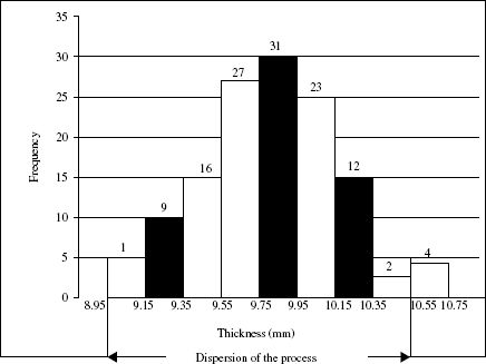
As pointed out earlier, the histogram is an important diagnostic tool because it gives a ‘bird’s eye view’ of the variation in a data set. In our case, the data has its central value around 9.75 to 9.95. It also appears that the data is close to normal curve—bell-shaped curve.
The common types of histograms encountered in real-life situations and their possible interpretation are given in Figure 19.3. Each of the situations in Figure 19.3 is a pattern that reflects its own ‘story’ termed as interpretation.
Figure 19.3 Patterns of histogram

From these situations, the following types of observations can be made from histogram analysis:
- Where is the process centred? Is it at the target value which is generally the average value of the minimum and maximum values of the tolerance?
- How is the dispersion of the process? Is it superior or inferior to the width of the tolerance?
- If the dispersion is inferior (wider than the tolerance band), it sets one to think what needs to be done to improve the process.
- Is the data obtained after inspection to allow removal of items beyond the tolerance limits?
- Has the process been subjected to frequent setting changes? Frequent setting causes more variability. Is a superior process not handled properly by frequent settings?
- Are the sources of data different?
- Is the process stable?
The observations can lead to different conjectures and hypotheses on how to improve the process.
Relationship: scatter diagram
Description
A scatter diagram is a simple graphical technique for studying the relationships between two sets of associated variables. Data displayed by a scatter diagram form a cloud of dots. Relationships are interpreted based on the shape of the cloud as depicted in Figure 19.4.
A scatter diagram is useful in a situation where a discovery or a confirmation of relationships is important in a quality improvement project.
Figure 19.4 Scatter diagram of different types of patterns
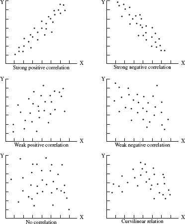
Figure 19.5 Data and scatter plot

- Collect paired data (x, y) between which the relationship is of interest. It is desirable to have about 30 pairs of data.
- Find the minimum and maximum values of both x and y and graduate the horizontal (X) and vertical (Y) axis. Use a graph paper. Both axis should be of equal length. Usually x is an independent or predictor variable and y is a dependent variable. X-axis represents the independent/predictor variable and Y-axis the dependent variable.
- Plot the data on the graph paper. When the same data is obtained from different pairs, draw concentric circles or plot the second point in the immediate vicinity of the first.
- Label the axis with the characteristics they represent, as independent and dependent variables.
Illustration of the types of patterns is given in Figure 19.5. Annexure 19B gives few more examples of scatter diagram.
Box plot
Box plot is a plot of the 25th, 50th and 75th percentiles. From any given data, obtain the following values:
- 50th (median) percentile
- 25th percentile
- 75th percentile
- Difference between (3) and (2) is the interquartile range
- Upper limit = (3) + 1.5 (4)
- Lower limit = (1) – 1.5 (4)
Annexure 19C gives the method of obtaining percentile values. The values are plotted as shown in Figure 19.6.
Figure 19.6 Box plot

Box plot is a simple idea that contains all the important information—median (50th percentile)—and the spread or variability of the observation. The skewness of the distribution can be gauged by the location of the median in relation to 25th or 75th percentile— closer to the bottom line of the box (25th percentile), the skewness is negative; closer to the 75th percentile, skewness is positive. The total variability is reflected in the values beyond (5) and (6) in Figure 19.6. Box plot is a means of incorporating the patterns of data in terms of its location and variation to make comparisons and have a visual impact of the comparisons for indepth thinking.
When box plot of similar data obtained from different situations is compared with one another, distinctive features, if any, can be easily detected and these give valuable clues in conjecturing the technical reasons for the pattern noted.
The two lines emerging out of the box on its either side are also called whiskers. Hence, box plot is also known as box and whisker plot.
Break-even point
Break-even (BE) point or operating break-even point is defined as level of sales corresponding to which profits cover both fixed and variable costs.
Let,
Q = quantity sold
P = selling price per unit
V = variable cost per unit
F = total fixed costs
P – V = contribution per unit to fixed cost.
Break-even level quantity QBE is such that
QBE (P – V) = F
This means that the total contribution to fixed cost derived from producing QBE is equal to the actual fixed cost.
Therefore,
Example 1 A publishing firm is selling books at Rs. 250 per book. The variable cost is Rs. 70 per book. The fixed cost is Rs. 30,000. The number of books to be sold to cover the entire fixed cost (BE point) is
Break-even concept can be used to set the target for sales to achieve certain target of profit and its formula is
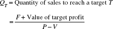
Example 2 From Example 1, the volume of sales corresponding to a profit target of Rs. 30,000 is calculated as follows:
Statistical tolerancing
The use of the statistical tolerancing technique helps in setting realistic tolerances.
Traditional methods A, B and C are three components with their nominal dimensions and tolerances shown as follows:
| Component | Nominal dimension (in.) | Tolerance |
|---|---|---|
| A B C |
0.025 0.100 0.050 |
±0.001 ±0.0005 ±0.002 |
A, B and C are assembled together to form a sub-assembly. The tolerance for the assembly as per conventional tolerancing is
0.175 ± 0.0035
The point to be noted is that each tolerance has to be expressed as an equal bilateral one.
Statistical tolerancing The statistical law of tolerancing is if μA, μB and μC are the nominal dimensions of the components A, B and C, respectively, with their corresponding individual tolerance of ±A, ±B and ±C, then the tolerance for their assembly A + B + C is
The fact that tolerance is an equal bilateral one is also to be noted here. As per the formula of statistical tolerancing, the tolerance for the sub-assembly of A + B + C is
As per statistical tolerancing, the tolerance for the sub-assembly is liberal at ±0.005 compared to the traditional one of ±0.0035.
Interpretation Accepting that the tolerance for the sub-assembly specified as ±0.0035 cannot be relaxed, the tolerance for individual components can be relaxed appropriately without prejudicing the assembly tolerance. For instance, the tolerance in each of A and B can be relaxed to ±0.002 and assembly tolerance can still be as ±0.0035. This can be verified as follows.
Sub-assembly tolerance A + B + C with individual tolerances of A, B and C at ±0.002, ±0.002, ±0.002 is
It is implied that components A, B and C are produced in a process under statistical control.
Application of tolerance to bearing and shaft Shaft and bearing assembly is a common one. Here, the need is tolerance for the clearance between shaft and bearing.
Consider the following example
| Component | Tolerance | Conventional tolerance on clearance |
|---|---|---|
| Shaft Bearing |
0.997 ± 0.001 1.000 ± 0.001 |
Max. clearance = 1.001 – 0.996 = 0.005 Min. clearance = 0.999 – 0.998 = 0.001 Clearance for assembly = 0.005 – 0.001 = 0.004 |
Statistical tolerancing

If tolerance of 0.004 (±0.002) for the bearing and shaft assembly is in order, then the tolerance for the individual components of the assembly can be arrived as follows:
(Tolerance of assembly)2 = (Tolerance of shaft)2 + (Tolerance of bearing)2
i.e., (0.004)2 = 2(Tolerance of bearing/shaft)2
Therefore,
Thus, tolerance of individual shaft/bearing can be relaxed to ±0.0028 from the specified ±0.001.
Safety factor with statistical basis
The traditional approach to safety factor (SF) is based on the equation
Suppose the average strength is 20 kg/cm2 and worst expected stress is 5 kg/cm2, the SF is 4.
Safety factor of 4 implies that in a real-life situation, an environment that induces stress and the item that has to have the strength to bear that stress will always be at the average levels assumed in deriving an SF of 4. But stresses do vary. Hence, if environmental stress of a level higher than the average has to be faced with the item having its strength lower than its assumed average, then SF would be a casualty.
To illustrate this point, suppose at a given time, the worst stress is 12 kg/cm2 and strength is 11 kg/cm2, the safety factor is 11 ÷ 12 = 0.91. Thus, under the influence of variation, a real-life situation, the specified SF of 4 turns deceptive and fallacious. Therefore, the variation has to be taken into account to set the SF. This recognition of variation is from the statistical point of view.
Safety factor based on statistical point of view is illustrated in the following example and it helps to set the true-to-life SF.

Thus, to meet operational stress of 5 kg/cm2, design for a stress level of 14 kg/cm2. This is equivalent to the following expression:
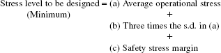
It would be a rewarding exercise to review all the cases involving SF and revise them on the basis of statistical logic as already explained. In fact, this exercise on reviewing SFs itself can be a CIP for the R&D/design team.
Control chart on measurements: X-bar and R chart for investigation on process capability
Here, X-bar and R chart technique is considered as a tool for process investigation on capability of the process. The procedure for application of X-bar and R chart technique is as follows:
- Select the process to be investigated.
- Verify that the process needs investigation through X-bar and R chart technique. This is known previously due to part/components of the process not meeting the dimensional requirements of one or more characteristics. Of several such characteristics, select the one that is most important. If more than one is important, then X-bar and R chart technique has to be applied to each.
- Decide the ‘characteristic’ to be investigated and it has to be a measurable characteristic.
- Select a suitable measuring device that is fit for measuring the characteristic.
- Set up the data sheet as shown in Table 19.5.
- After the machine is set and cleared for continuous production, take four/five consecutive components from the process. This constitutes a sample. Measure each one and record the measurements in the data sheet.
- Record in the data sheet the details, if any, of any other ‘factor’ which might have intervened at that time.
- Note that the duration of taking the four/five consecutive items from the process is a short one. Hence the variation from piece to piece can be due to ‘common causes’.
- The time interval between the samples is longer and the number of samples taken is spread over several hours. This time gap allows for all special causes of variations such as change of operator, tool regrinding/change, etc. Determine the appropriate time-interval first and then collect 25–30 samples of 4/5 components from the process.
- Set-up the X-bar and R chart as shown in the Figure 19.7 and assess the process capability after exercising the steps (11) to (17).
- Look for non-random patterns of variation as reflected in the different patterns given in Figure 19.8.
- List out the special causes identified.
- Plan and implement the corrective measures appropriate to each special cause.
- Repeat the steps (5) to (14) and judge the state of control. The process attains a state of statistical control when there are no non-random patterns of variation in X-bar as well as R charts.
- When the state of control is attained, evaluate the process capability PC as

where R′ is the average value of the ranges corresponding to a state of statistical control and d2 is corresponding ‘n’ obtained from tables.
- Compute PC index, denoted by Cp, as follows:

where U and L are upper and lower specifications.
- A process capability index of 1.33 is reasonably satisfactory and efforts to increase it to 1.50 should continue. An index of 1.33 is far from satisfactory.
The following distinctions are to be noted:- Actions taken to bring in control and assessing process capability index is a step in the direction of establishing normalcy.
- Status of normalcy measured as process capability index by itself may not be a desired status. If the index is below 1.33 it is far from satisfactory.
- If the index is above 1.33 it is a desirable state and the best one is 1.50. Reaching this state calls for breakthrough efforts.
- Process capability is a measure of variability of a process due to common causes. It is a measure of minimum variability that has to be tolerated in a process at a given period. It is not fait accompli. Process capability can be improved by reducing the magnitude of variability in common causes through various measures as follows:
- Proper upkeep and maintenance of equipments/machines.
- Environmental control in terms of relative humidity, dust, temperature, etc., as prescribed for a process.
- Ensuring proper heat dissipation, minimum friction and vibration.
- Uninterrupted power supply free from voltage fluctuation and power trips.
- Ensuring uniformity in processing conditions such as maintaining the same temperature in an oven at all its locations and uniform agitation in a mixing vessel.
- Likewise steady supply of water, steam, compressed air, etc., at desired levels in requisite volume.
- Steadily improving the ability to maintain the process parameters at required levels.
- Strengthening the means to measure and monitor the process status to control it properly.
- Homogenising the input process materials.
TABLE 19.5 Data Sheet for ![]() and R Chart
and R Chart
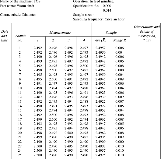
Figure 19.7 X-bar and R chart

Figure 19.8 Patterns to ‘discover’ special causes

In our earlier book (Sreenivasan and Narayana 1996) we had stated that the techniques such as control charts for defect/defectives and acceptance sampling plans would recede in their importance and hence were not covered. The present Six Sigma outlook that is gaining ground confirms the view.
Calculations related to X-bar and R chart
Step 1. Record the average and range of each sample as shown in the data.
Step 2. Obtain ![]() , the average of the average of sample means
, the average of the average of sample means
where Σ![]() is the sum of the K sample averages, K = 25, the number of samples
is the sum of the K sample averages, K = 25, the number of samples
Verify that ![]() = 2.49416.
= 2.49416.
Step 3. Obtain ![]() , the average of the ranges of the samples
, the average of the ranges of the samples
where ΣR is the sum of the ranges of 25 samples. Verify that ![]() = 0.0066.
= 0.0066.
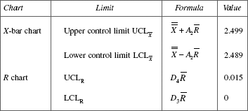
where A2, D3 and D4 are control limit factors obtained from statistical table corresponding to sample size ‘n’. Here n = 4.
Step 5. Process capability (to be computed when X-bar and R chart shows that the process is in statistical control)
σ = Process standard deviation represented by the symbol s.d.
where R′ is the average of the ranges obtained from the process under statistical control and ‘d2’ is the value obtained from the statistical table corresponding to the sample size ‘n’ for the data on hand.
It can be verified that s.d. for the example dealt with is 0.0032.
Process capability is defined as equal to 6 s.d. or ±3 s.d. which is 0.0192 or ±0.0096.
Step 6. Process capability index for the component on hand is
Where U and L are upper and lower specification respectively.
Process capability index
Different views on process capability index are explained with an example in Table 19.6.
TABLE 19.6 Different Viewpoints of Process Capability Index
Few approaches: critical incident analysis, engineering a failure and defect generation at levels that generate failures
When defect level reaches lower levels—1000 ppm and below—hounding ‘a type’ defect becomes more important. This is similar to a patient with a unique disease demanding altogether, a line of treatment and approach unique to the disease. This mindset is not commonly found. Cost–benefit outlook helps to take up such problems.
In this context, the lesson offered by the medical world needs to be recognised. It addresses rare unique diseases with great zeal and vigour to learn more about it and master it. This outlook needs to be grafted to other fields as well. This is essential to reach the Six Sigma level.
The narrow-focused, cost-oriented intervention should be kept at bay while tackling a rare defect. One should not fall trap to cost orientation, couched in seemingly correct logic, ‘Is the effort worth eliminating such a rare defect?’ It is anti-Six Sigma approach. It is this kind of unimaginative logic that arrests improvement, kills initiative, puts the clock backwards and makes organisations regret missing growth opportunities.
Few approaches outlined here can be useful in handling ‘rare’ defects:
- Critical-incident analysis. The best illustration of Critical-incident-analysis can be found in the book ‘Complications-Notes from the life of a Young Surgeon’ by Atul Gawande. It relates to a series of measures taken in the design of anaesthesia machines to alter the working hours of anaethesiology residents whereby death date resulting from anaesthesia reduced from 1 or 2 per 10,000 operations in 1960–1980 to 1 per 200,000 now.
- Engineering a failure. The concept of engineering a failure is of immense value to know the cause(s) of defect(s) and its prevention.
The point to be noted is that the unique defect maintains its status as unique till its cause and source are known; and once these are identified, the unique-defect loses its uniqueness.
Engineering a failure is essentially a process of identifying the framework within which a failure definitely occurs. The framework can be an undesirable feature in the product or unfavourable combination of process factors. The framework needs to be identified on the basis of observation, technical logic, conjecture, experimentation and a combination of all.
The framework has to be identified and tests should be conducted on several samples which are within the framework. If the rate of failure is around 70–75 per cent, it confirms that the framework characteristics are the causes for failure. The ways and means of plugging the cause–sources should be found, the effectiveness of plugging action should be confirmed; and the effective ones institutionalised. Thus, defect is prevented. A case example of engineering a failure is in Annexure 19D.
- Evaluate at levels that causes higher rate of failure. Say a defect ‘A’, its current failure rate is 100 ppm. The parameters of testing for this defect at which the failure can be of a higher order, say 50,000 ppm, should be identified (5%). Any changes/modifications/actions taken to reduce the defect rate in A can be evaluated at stringent levels to assess their effectiveness. If the defect rate substantially falls below, say 1 per cent, it can be concluded that the modifications made are effective and further replication of the trials can confirm the result.
Benchmarking
Meaning
Any continual improvement task has to define the problem and state the objective(s) clearly and unambiguously. This aspect has been dealt with in Chapter 27. In order to bring in greater focus for the task it is necessary to state the level of performance/result to be achieved. This helps to augment for the improvement project deep commitment, intensive effort and objective review of the progress. One of the methods commonly adopted for specifying the target in quantitative terms is through an approach termed ‘Benchmarking’.
Benchmark is a reference level of performance/result decided to be adopted by a company. The company adopting it can have one of the two objectives—either to attain the reference level or go beyond that level. Therefore, the benchmarked level has to be meaningful as well as adequately challenging for the company either to attain or go beyond that level.
The benchmarked level is also the one already achieved by any entity termed reference base. The reference base can be an event, individual, team or institution. It has to be a credible one to be considered as a reference base.
Few examples as under explain the above attributes of benchmarking tool:
- Some hospitals may benchmark 2 min as the cycle time taken to put a patient under treatment from the time the patient arrives at the hospital. This benchmark is credible when definition of ‘putting a patient under treatment’, ‘patients’ arrival at the hospital’ are clear and the data on cycle time is monitored transparently for public view.
- Suppose another hospital also adopts 2-min cycle time, this can be sufficiently challenging but achievable one with effort and determination incase the present cycle time is 30 min. On the contrary, if the present cycle time is 3 hr, setting a benchmark of 2-min cycle time turns out to be a cruel joke and cause for cynicism, despair and disillusionment even before the task of improvement takes off. Therefore, prior to taking a decision on reference value for benchmarking, an assessment has to be made of the present status of performance of the concerned activity.
- Where technology employed influences the performance, the technology employed by the company and that of the benchmarked company need to be same and not different with respect to parameters of performance. Suppose energy comparison is involved, it is futile to benchmark a process which is not energy-efficient by design against the performance of a process designed for being energy-efficient. Likewise, assigning a benchmark of 99.9% for material conversion efficiency in a plastic moulding process designed to be free from fins for another one where process has to have fins is incorrect.
Scope of benchmarking
Benchmarking can be implemented to any process, operation, activity, functional area and requirement. Performance parameters can also be diverse like attendance, equipment utilisation, warranty costs, yield, consumption of consumables and utilities.
For example, in a manufacturing organisation, the different parameters which can be covered by benchmarking exercise is given in Table 16.2. Each parameter stated in this table has a number of characteristics each of which can be benchmarked as can be seen in Annexure 16.A–16.H.
Benchmarking attitude
Benchmarking is just the beginning. The real impetus to succeed with a benchmarking exercise lies in an attitude of looking at the “peaks” and getting inspired to reach the peak one after the other in a continual from. Such an attitude of looking at, admiring and reaching peak after peak—all characterise as ‘benchmark attitude’. An example of benchmark attitude can be seen in the historical ‘firsts’ of labour welfare measures achieved by the house of Tatas summarised in Table 19.7 although the jargon ‘benchmarking’ might not have been prevalent during those times.
TABLE 19.7 Benchmark Events of the Tatas in Labour Welfare
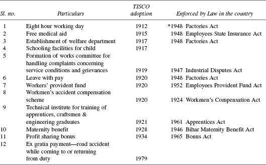
*By 1912 many western nations had not implemented 8 hr working day by Law.
Source: ‘The Creation of Wealth’ R.M. Lala page 284–285 Penguin 2004
With such an attitude of benchmarking, the continual improvement gets a new impetus to adopt the best practices, best methods, best procedures to achieve the benchmarked level. Thus, ‘Benchmarking’ is a powerful approach to achieve better results continually. Benchmarking attitude is a habit comprising of
- Eagerness, curiosity to spot the islands of excellence
- Gathering information on
- What ‘they’ do and ‘we’ do not do
- What ‘they’ do not do and ‘we’ do
- Specific reasons for their success and
- Internalising the above to reach the peak.
Close contact as well as joint activities with lead customers, lead suppliers and leading institutions can help to get valuable information on good systems, practices besides right attitude.
Conclusion
This chapter dealt with data exploration through charting and summarisation according to stratification in order to discover technical patterns of value and understand such patterns to improve the processes. Hence, all the tools covered (not exhaustive) in previous as well as this chapter constitute the compulsory skill-set of fundamental importance to everyone engaged in continual improvement task.
Annexure 19A
Figure 19A.1 Pareto diagram for machine stoppages (M/C no. 14)
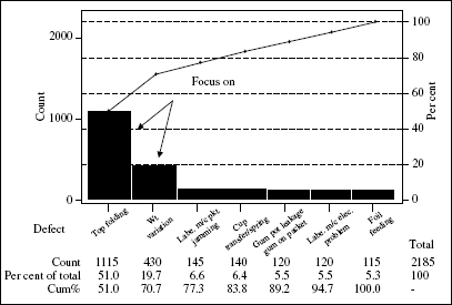
Figure 19A.2 Pareto analysis of customer complaints
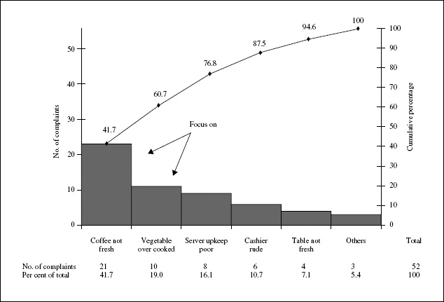
Figure 19A.3 Pareto analysis of passenger complaints at an airport

Annexure 19B
Figure 19B.1 Scatter diagram of automotive speed vs. mileage

TABLE 19B.1 Data on Conveyor Speed and Severed Length

Figure 19B.2 Scatter diagram for conveyor speed and severed length

Annexure 19C
Calculation of 25th, 50th and 75th percentiles
Following are the data on thickness of steel strips (micron).

Obtain the 25th, 50th and 75th percentile for these data.
Step 1. The data as a frequency distribution are summarised as follows. This also facilitates to arrange the data in ascending order.
| Group no. | Thickness of strip | No. of measurements |
|---|---|---|
| 1 2 3 4 5 Total |
2.81 2.83 2.85 2.87 2.89 |
5 12 26 5 2 50 |
No. of data points = 50
Step 2. The general rule for obtaining pth percentile is as follows:
(a) ‘n’ the total number of data points is even.
The pth percentile data point is given by
(b) ‘n’ the total number of data points is odd.
The pth percentile data point is given by
Step 3. Apply the rule for the set of data points rearranged as shown in Step 1. Here ‘n’ is even. Therefore, the formula (a) of Step 2 is applicable. The results are as follows:
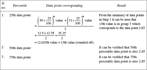
The data for which the three percentile points are same implies that the data comes from a symmetrical distribution, normal law.
Annexure 19D
Illustrative example: engineering a failure
Detonating cord is an explosive accessory. It is supplied in reels of continuous length as per customer requirement. There is a specification that not more than one joint is allowed in a reel and also on the maximum number of joint reels permitted in one shipment. The overall failure rate due to transmission failure is very low: 1 in 10,000.
In a certain year, only two complaints were received, one each from two different customers. Both the complaints were due to transmission failure. The customer had furnished all the details that facilitated the traceability to the reel that was sent to the customer. From the record, it was found that both the reels were with a knot. Hence, it was surmised that the knot may be a cause of transmission failure.
The knot was examined. It was the usual reef knot. The doubt that arose was that the kink in the reef knot itself could be the cause of failure and hence it was conjectured that binding with a thread with the two free ends kept in parallel would be a better way of a joining instead of reef knot.
How to establish the validity of this conjecture? This was done by ‘engineering failure’. Here the framework is the knot itself. One hundred samples each of reef knot and parallel tied types were made and fired. It was found that 75 per cent of the reef knot samples failed and none in the parallel type. The latter was adopted and failure rate reached single digit ppm level.