
Chapter 3. Using the Validation Controls
In This Chapter
• Overview of the Validation Controls
• Using the RequiredFieldValidator Control
• Using the RangeValidator Control
• Using the CompareValidator Control
• Using the RegularExpressionValidator Control
• Using the CustomValidator Control
• Using the ValidationSummary Control
• Creating Custom Validation Controls
• Summary
In this chapter, you learn how to validate form fields when a form is submitted to the web server. You can use the validation controls to prevent users from submitting the wrong type of data into a database table. For example, you can use validation controls to prevent a user from submitting the value “Apple” for a birth date field.
In the first part of this chapter, you are provided with an overview of the standard validation controls included in the ASP.NET 4 Framework. You learn how to control how validation errors display, how to highlight validation error messages, and how to use validation groups. You are provided with sample code for using each of the standard validation controls.
Next, we extend the basic validation controls with our own custom validation controls. For example, you learn how to create an AjaxValidator control that enables you to call a server-side validation function from the client.
Overview of the Validation Controls
ASP.NET 4 includes six validation controls:
• RequiredFieldValidator—Enables you to require a user to enter a value in a form field.
• RangeValidator—Enables you to check whether a value falls between a certain minimum and maximum value.
• CompareValidator—Enables you to compare a value against another value or perform a data type check.
• RegularExpressionValidator—Enables you to compare a value against a regular expression.
• CustomValidator—Enables you to perform custom validation.
• ValidationSummary—Enables you to display a summary of all validation errors in a page.
You can associate the validation controls with any form controls included in ASP.NET Framework. For example, if you want to require a user to enter a value into a TextBox control, you can associate a RequiredFieldValidator control with the TextBox control.
Note
Technically, you can use the validation controls with any control decorated with the ValidationProperty attribute.
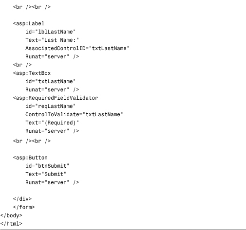
Listing 3.1 contains a simple order entry form. It contains three TextBox controls that enable you to enter a product name, product price, and product quantity. The validation controls validate each of the form fields.
Listing 3.1. OrderForm.aspx


A separate RequiredFieldValidator control is associated with each of the three form fields. If you attempt to submit the form in Listing 3.1 without entering a value for a field, a validation error message display (see Figure 3.1).
Figure 3.1. Displaying a validation error message.

Each RequiredFieldValidator associates with a particular control through its ControlToValidate property. This property accepts the name of the control to validate on the page.
CompareValidator controls associate with the txtProductPrice and txtProductQuantity TextBox controls. The first CompareValidator checks whether the txtProductPrice text field contains a currency value, and the second CompareValidator checks whether the txtProductQuantity text field contains an integer value.
There is nothing wrong with associating more than one validation control with a form field. If you need to make a form field required and check the data type entered into the form field, you need to associate both a RequiredFieldValidator and CompareValidator control with the form field.
Finally, the Page.IsValid property is checked in the Page_Load() handler before the form data displays. When using the validation controls, you should always check the Page.IsValid property before doing anything with the data submitted to a page. This property returns the value true when, and only when, no validation errors are on the page.
Validation Controls and JavaScript
By default, the validation controls perform validation on both the client (the browser) and the server. The validation controls use client-side JavaScript. This is great from a user experience perspective because you get immediate feedback whenever you enter an invalid value into a form field.
Note
The RequiredFieldValidator does not perform client-side validation until after you attempt to submit a form at least once or you enter and remove data in a form field.
Almost all desktop browsers support client-side JavaScript. Supported browsers include Internet Explorer, Firefox, Chrome, Safari, and Opera. It is becoming more common to browse the web on mobile devices such as cell phones. Many of these mobile browsers do not yet support JavaScript.
You can use the validation controls with browsers that do not support JavaScript (or do not have JavaScript enabled). If a browser does not support JavaScript, the form must be posted back to the server before a validation error message displays.
Even when validation happens on the client, validation is still performed on the server. This is done for security reasons. If someone creates a fake form and submits the form data to your web server, the person still can’t to submit invalid data.
If you prefer, you can disable client-side validation for any of the validation controls by assigning the value False to the validation control’s EnableClientScript property.
Using Page.IsValid
As previously mentioned, you should always check the Page.IsValid property when working with data submitted with a form that contains validation controls. Each of the validation controls includes an IsValid property that returns the value True when a validation error doesn’t exist. The Page.IsValid property returns the value True when the IsValid property for of the validation controls in a page returns the value True.
It is easy to forget to check the Page.IsValid property. When you use a browser that supports JavaScript with the validation controls, you are prevented from submitting a form back to the server when validation errors exist. However, if someone requests a page using a browser that does not support JavaScript, the page is submitted back to the server even when validation errors exist.
For example, if you request the page in Listing 3.1 with a browser that does not support JavaScript and submit the form without entering form data, the btnSubmit_Click() handler executes on the server. The Page.IsValid property is used in Listing 3.1 to prevent down-level browsers from displaying invalid form data.
Warning
Unfortunately, many developers have made the mistake of forgetting to include a check of the Page.IsValid property several times when building applications. Because you do not normally develop a web application with JavsaScript disabled in your browser, you won’t notice the problem described in this section until you start getting invalid data in your database tables.
Setting the Display Property
All the validation controls include a Display property that determines how the validation error message is rendered. This property accepts any of the following three possible values:
• Static
• Dynamic
• None
By default, the Display property has the value Static. When the Display property has this value, the validation error message rendered by the validation control looks like this:
<span id="reqProductName" style="visibility:hidden;">(Required)</span>
The error message is rendered in a <span> tag that includes a Cascading Style Sheet (CSS) style attribute that sets the visibility of the <span> tag to hidden.
If, on the other hand, you set the Display property to the value Dynamic, the error message is rendered like this:
<span id="reqProductName" style="display:none;">(Required)</span>
In this case, a CSS display attribute hides the contents of the <span> tag.
Note
In previous versions of ASP.NET, all <span> tags rendered by validators would also have “color:Red” in the style attribute. To become more standards-compliant, this inline styling is not present in ASP.NET 4. Instead, you should define a CSS class for your validation messages and set the CssClass property on each validator to style your messages.
You can use both the visibility and display attributes to hide text in a browser. However, text hidden with the visibility attribute still occupies screen real estate. Text hidden with the display attribute, on the other hand, does not occupy screen real estate.
In general, you should set a validation control’s Display property to the value Dynamic. That way, if other content displays next to the validation control, the content is not pushed to the right. All modern browsers (Internet Explorer, Firefox, Chrome, Safari, and Opera) support the CSS display attribute.
The third possible value of the Display property is None. If you prefer, you can prevent the individual validation controls from displaying an error message and display the error messages with a ValidationSummary control. You learn how to use the ValidationSummary control later in this chapter.
Highlighting Validation Errors
When a validation control displays a validation error, the control displays the value of its Text property. Normally, you assign a simple text string, such as "(Required)" to the Text property; however, the Text property accepts any HTML string.
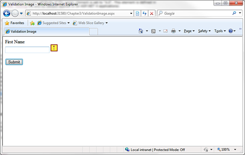
For example, the page in Listing 3.2 displays an image when you submit the form without entering a value for the First Name text field (see Figure 3.2).
Figure 3.2. Displaying an image for a validation error.
Listing 3.2. ValidationImage.aspx


In Listing 3.2, the Text property contains an HTML <img> tag. When a validation error occurs, the image represented by the <img> tag displays.
Another way that you can emphasize errors is to take advantage of the SetFocusOnError property supported by all the validation controls. When this property has the value True, the form focus automatically shifts to the control associated with the validation control when a validation error occurs.
For example, the page in Listing 3.3 contains two TextBox controls that are both validated with RequiredFieldValidator controls. Both RequiredFieldValidator controls have their SetFocusOnError properties enabled. If you provide a value for the first text field and not the second text field and submit the form, the form focus automatically shifts to the second form field.
Listing 3.3. ShowSetFocusOnError.aspx


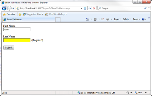
Finally, if you want to really emphasize the controls associated with a validation error, you can take advantage of the Page.Validators property. This property exposes the collection of all the validation controls in a page. In Listing 3.4, the Page.Validators property highlights each control that has a validation error (see Figure 3.3).
Figure 3.3. Changing the background color of form fields.
Listing 3.4. ShowValidators.aspx


The Page.Validators property is used in the Page_PreRender() handler. The IsValid property is checked for each control in the Page.Validators collection. If IsValid returns False, the control validated by the validation control is highlighted with a yellow background color.
Using Validation Groups
In the first version of the ASP.NET Framework, there was no easy way to add two forms to the same page. If you added more than one form to a page, and both forms contained validation controls, the validation controls in both forms were evaluated regardless of which form you submitted.
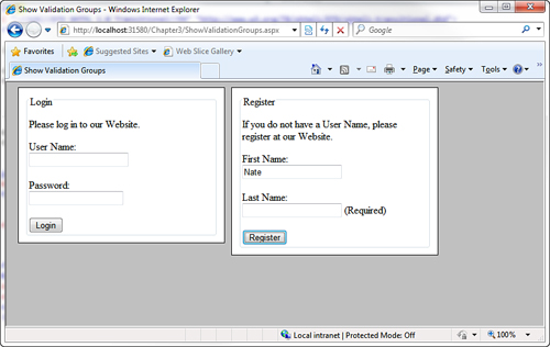
For example, imagine that you wanted to create a page that contained both a login and registration form. The login form appeared in the left column and the registration form appeared in the right column. If both forms included validation controls, submitting the login form caused any validation controls contained in the registration form to be evaluated.
Since the release of ASP.NET 2.0, you no longer face this limitation. The ASP.NET 2.0 Framework introduced the idea of validation groups. A validation group enables you to group related form fields together.
For example, the page in Listing 3.5 contains both a login and registration form, and both forms contain independent sets of validation controls.
Listing 3.5. ShowValidationGroups.aspx


The validation controls and the button controls all include ValidationGroup properties. The controls associated with the login form all have the value "LoginGroup" assigned to their ValidationGroup properties. The controls associated with the register form all have the value "RegisterGroup" assigned to their ValidationGroup properties.
Because the form fields are grouped into different validation groups, you can submit the two forms independently. Submitting the Login form does not trigger the validation controls in the Register form (see Figure 3.4).
Figure 3.4. Using validation groups.
You can assign any string to the ValidationGroup property. The only purpose of the string is to associate different controls in a form together into different groups.
Note
Using validation groups is particularly important when working with Web Parts because multiple Web Parts with different forms might be added to the same page.
Disabling Validation
All the button controls—Button, LinkButton, and ImageButton—include a CausesValidation property. If you assign the value False to this property, clicking the button bypasses any validation in the page.
Bypassing validation is useful when creating a Cancel button. For example, the page in Listing 3.6 includes a Cancel button that redirects the user back to the Default.aspx page.
Listing 3.6. ShowDisableValidation.aspx


The Cancel button in Listing 3.6 includes the CausesValidation property with the value False. If the button did not include this property, the RequiredFieldValidator control would prevent you from submitting the form when you click the Cancel button.
Using the RequiredFieldValidator Control
The RequiredFieldValidator control enables you to require a user to enter a value into a form field before submitting the form. You must set two important properties when using the RequiredFieldValidator control:
• ControlToValidate—The ID of the form field validated.
• Text—The error message displayed when validation fails.
The page in Listing 3.7 illustrates how you can use the RequiredFieldValidator control to require a user to enter both a first and last name (see Figure 3.5).
Figure 3.5. Requiring a user to enter form field values.

Listing 3.7. ShowRequiredFieldValidator.aspx

By default, the RequiredFieldValidator checks for a nonempty string (spaces don’t count). If you enter anything into the form field associated with the RequiredFieldValidator, the RequiredFieldValidator does not display its validation error message.
You can use the RequiredFieldValidator control’s InitialValue property to specify a default value other than an empty string. For example, the page in Listing 3.8 uses a RequiredFieldValidator to validate a DropDownList control (see Figure 3.6).
Figure 3.6. Using a RequiredFieldValidator with a DropDownList control.

Listing 3.8. ShowInitialValue.aspx


The first list item displayed by the DropDownList control displays the text "Select Color". If you submit the form without selecting a color from the DropDownList control, a validation error message displays.
The RequiredFieldValidator control includes an InitialValue property. The value of the first list from the DropDownList control is assigned to this property.
Using the RangeValidator Control
The RangeValidator control enables you to check whether the value of a form field falls between a certain minimum and maximum value. You must set five properties when using this control:
• ControlToValidate—The ID of the form field validated.
• Text—The error message displayed when validation fails.
• MinimumValue—The minimum value of the validation range.
• MaximumValue—The maximum value of the validation range.
• Type—The type of comparison to perform. Possible values are String, Integer, Double, Date, and Currency.
For example, the page in Listing 3.9 includes a RangeValidator that validates an age form field. If you do not enter an age between 5 and 100, a validation error displays (see Figure 3.7).
Figure 3.7. Validating a form field against a range of values.

Listing 3.9. ShowRangeValidator.aspx


If you submit the form in Listing 3.9 with an age less than 5 or greater than 100, the validation error message displays. The validation message also displays if you enter a value that is not a number. If the value entered into the form field cannot be converted into the data type represented by the RangeValidator control’s Type property, the error message displays.
If you don’t enter any value into the age field and submit the form, no error message displays. If you want to require a user to enter a value, you must associate a RequiredFieldValidator with the form field.
Don’t forget to set the Type property when using the RangeValidator control. By default, the Type property has the value String, and the RangeValidator performs a string comparison to determine whether a value falls between the minimum and maximum value.
Using the CompareValidator Control
The CompareValidator control enables you to perform three different types of validation tasks. You can use the CompareValidator to perform a data type check. In other words, you can use the control to determine whether a user has entered the proper type of value into a form field, such as a date in a birth date field.
You also can use the CompareValidator to compare the value entered into a form field against a fixed value. For example, if you build an auction website, you can use the CompareValidator to check whether a new minimum bid is greater than the previous minimum bid.
Finally, you can use the CompareValidator to compare the value of one form field against another. For example, you use the CompareValidator to check whether the value entered into the meeting start date is less than the value entered into the meeting end date.
The CompareValidator has six important properties:
• ControlToValidate—The ID of the form field validated.
• Text—The error message displayed when validation fails.
• Type—The type of value compared. Possible values are String, Integer, Double, Date, and Currency.
• Operator—The type of comparison to perform. Possible values are DataTypeCheck, Equal, GreaterThan, GreaterThanEqual, LessThan, LessThanEqual, and NotEqual.
• ValueToCompare—The fixed value against which to compare.
• ControlToCompare—The ID of a control against which to compare.
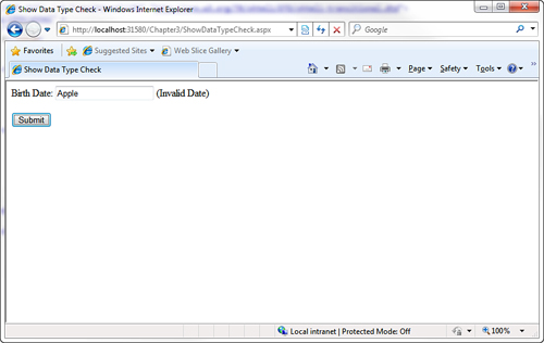
The page in Listing 3.10 illustrates how you can use the CompareValidator to perform a data type check. The page contains a birth date field. If you enter a value that is not a date, the validation error message displays (see Figure 3.8).
Figure 3.8. Performing a data type check.
Listing 3.10. ShowDataTypeCheck.aspx


The page in Listing 3.10 contains a CompareValidator control. Its Type property has the value Date, and its Operator property has the value DataTypeCheck. If you enter a value other than a date into the birth date field, the validation error message displays.
Warning
An important limitation of the CompareValidator concerns how it performs a data type check. You cannot enter a long date into the form in Listing 3.10 (for example, December 25, 1966). You must enter a short date (for example, 12/25/1966). When validating currency amounts, you cannot enter the currency symbol. If these limitations concern you, you can use either the RegularExpression or CustomValidator controls to perform a more flexible data type check.
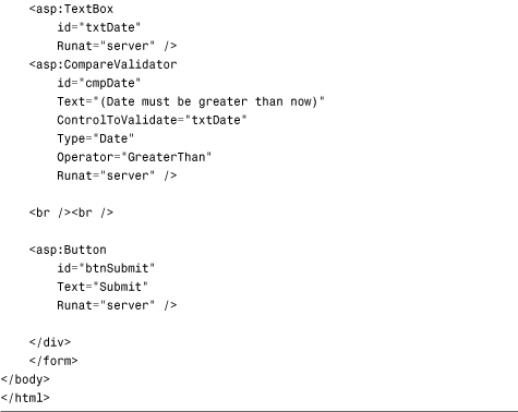
You can also use the CompareValidator to perform a comparison against a fixed value. For example, the page in Listing 3.11 uses a CompareValidator to check whether a date entered into a form field is greater than the current date (see Figure 3.9).
Figure 3.9. Comparing a form field against a fixed value.

Listing 3.11. ShowFixedValue.aspx

Finally, you can use a CompareValidator to compare the value of one form field against another form field. The page in Listing 3.12 contains a meeting start date and meeting end date field. If you enter a value into the first field that is greater than the second field, a validation error displays (see Figure 3.10).
Figure 3.10. Comparing two form fields.

Listing 3.12. ShowCompareValues.aspx


Just like the RangeValidator, the CompareValidator does not display an error if you don’t enter a value into the form field being validated. If you want to require that a user enter a value, you must associate a RequiredFieldValidator control with the field.
Using the RegularExpressionValidator Control
The RegularExpressionValidator control enables you to compare the value of a form field against a regular expression. You can use a regular expression to represent string patterns such as email addresses, Social Security numbers, phone numbers, dates, currency amounts, and product codes.
For example, the page in Listing 3.13 enables you to validate an email address (see Figure 3.11).
Figure 3.11. Validating an email address.

Listing 3.13. ShowRegularExpressionValidator.aspx
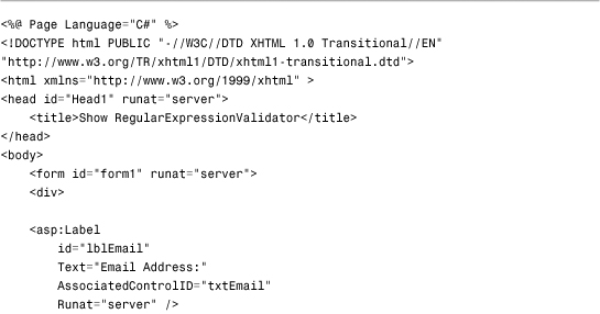
The regular expression is assigned to the RegularExpressionValidator control’s ValidationExpression property. It looks like this:
w+([-+.']w+)*@w+([-.]w+)*.w+([-.]w+)*
Regular expressions are not fun to read. This pattern matches a simple email address. The w expression represents any nonwhitespace character. Therefore, roughly, this regular expression matches an email address that contains nonwhitespace characters, followed by an @ sign, followed by nonwhitespace characters, followed by a period, followed by more nonwhitespace characters.
Note
There are huge collections of regular expression patterns living on the Internet. A popular website for finding regular expressions is http://regexlib.com/.
Just like the other validation controls, the RegularExpressionValidator doesn’t validate a form field unless the form field contains a value. To make a form field required, you must associate a RequiredFieldValidator control with the form field.
Visual Web Developer Note
If you open the property sheet for a RegularExpressionValidator control in Design view and select the ValidationExpression property, you can view a number of canned regular expressions. Visual Web Developer includes regular expressions for patterns such as email addresses, phone numbers, and Social Security numbers.
Using the CustomValidator Control
If none of the other validation controls perform the type of validation that you need, you can always use the CustomValidator control. You can associate a custom validation function with the CustomValidator control.
The CustomValidator control has three important properties:
• ControlToValidate—The ID of the form field being validated.
• Text—The error message displayed when validation fails.
• ClientValidationFunction—The name of a client-side function used to perform client-side validation.
The CustomValidator also supports one event:
• ServerValidate—This event is raised when the CustomValidator performs validation.
You associate your custom validation function with the CustomValidator control by handling the ServerValidate event.
For example, imagine that you want to validate the length of a string entered into a form field. You want to ensure that a user does not enter more than 10 characters into a multiline TextBox control. The page in Listing 3.14 contains an event handler for a CustomValidator control’s ServerValidate event, which checks the string’s length.
Listing 3.14. ShowCustomValidator.aspx


The second parameter passed to the ServerValidate event handler is an instance of the ServerValidateEventArgs class. This class has three properties:
• Value—Represents the value of the form field being validated.
• IsValid—Represents whether validation fails or succeeds.
• ValidateEmptyText—Represents whether validation is performed when the form field being validated does not contain a value.
In Listing 3.14, if the string represented by the Value property is longer than 10 characters, the value False is assigned to the IsValid property and validation fails. Otherwise, the value True is assigned to the IsValid property and the input field passes the validation check (see Figure 3.12).
Figure 3.12. Validating field length with the CustomValidator control.

The ServerValidate event handler in Listing 3.14 is a server-side function. Therefore, validation does not occur until the page is posted back to the web server. If you want to perform validation on both the client (browser) and server, you need to supply a client-side validation function.
Warning
If you don’t associate a client validation function with a CustomValidator control, the CustomValidator doesn’t render an error message until you post the page back to the server. Because the other validation controls prevent a page from posting if the page contains any validation errors, you won’t see the error message rendered by the CustomValidator control until you pass every other validation check in a page.
The page in Listing 3.15 illustrates how you can associate a client-side validation function with the CustomValidator control. This page also checks the length of the string entered into a TextBox control. However, it checks the length on both the browser and server.
Listing 3.15. ShowCustomValidatorJS.aspx
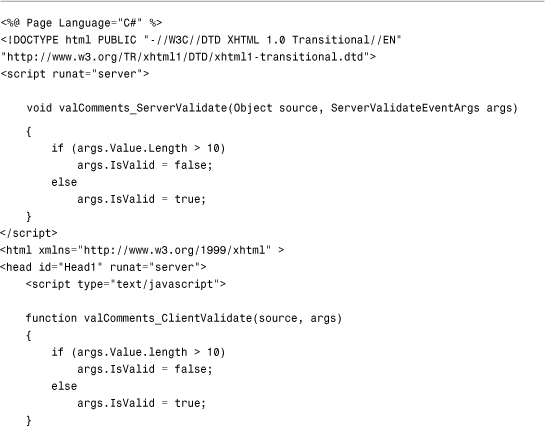

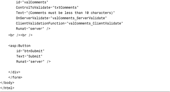
The CustomValidator control in Listing 3.15 includes a ClientValidationFunction property. This property contains the name of a JavaScript function defined in the page’s <head> tag.
The JavaScript validation function accepts the same two parameters as the server-side validation function. The first parameter represents the CustomValidator control, and the second parameter represents an object that includes both a Value and an IsValid property. The client-side function is nearly identical to the server-side function (with the important difference that it is written in JavaScript).
Unlike the RangeValidator, CompareValidator, and RegularExpressionValidator controls, you can validate a form field with the CustomValidator control even when the form field is left blank. The CustomValidator control includes a property named the ValidateEmptyText property. You can use this property to cause the CustomValidator control to validate a form field even when the user hasn’t entered a value into the form field. For example, the page in Listing 3.16 contains a TextBox that requires a product code that contains exactly four characters.
Listing 3.16. ShowValidateEmptyText.aspx


The CustomValidator control in Listing 3.16 includes a ValidateEmptyText property that has the value True. If the ValidateEmptyText property was not included, and you submitted the form without entering any data, no validation error would display.
Finally, unlike the other validation controls, you are not required to associate the CustomValidator control with any form field. In other words, you don’t need to include a ControlToValidate property.
For example, the page in Listing 3.17 contains a timed test. If you don’t answer the question within 5 seconds, the CustomValidator control displays a validation error message (see Figure 3.13).
Figure 3.13. Performing validation against no particular field.

Listing 3.17. TimedTest.aspx


Using the ValidationSummary Control
The ValidationSummary control enables you to display a list of all the validation errors in a page in one location. This control is particularly useful when working with large forms. If a user enters the wrong value for a form field located toward the end of the page, the user might never see the error message. If you use the ValidationSummary control, however, you can always display a list of errors at the top of the form.
Each of the validation controls includes an ErrorMessage property. We have not been using the ErrorMessage property to represent the validation error message. Instead, we have used the Text property.
The distinction between the ErrorMessage and Text property is that any message that you assign to the ErrorMessage property appears in the ValidationSummary control, and any message that you assign to the Text property appears in the body of the page. Normally, you want to keep the error message for the Text property short (for example, "Required!"). The message assigned to the ErrorMessage property, on the other hand, should identify the form field that has the error (for example, "First name is required!").
Note
If you don’t assign a value to the Text property, the value of the ErrorMessage property displays in both the ValidationSummary control and the body of the page.
The page in Listing 3.18 illustrates how you can use the ValidationSummary control to display a summary of error messages (see Figure 3.14).
Figure 3.14. Displaying a validation summary.
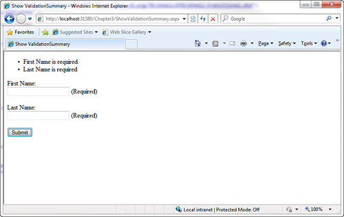
Listing 3.18. ShowValidationSummary.aspx


If you submit the form in Listing 3.18 without entering a value for the first and last name, validation error messages appear in both the body of the page and in the ValidationSummary control.
The ValidationSummary control supports the following properties:
• DisplayMode—Enables you to specify how the error messages are formatted. Possible values are BulletList, List, and SingleParagraph.
• HeaderText—Enables you to display header text above the validation summary.
• ShowMessageBox—Enables you to display a pop-up alert box.
• ShowSummary—Enables you to hide the validation summary in the page.
If you set the ShowMessageBox property to the value True and the ShowSummary property to the value False, you can display the validation summary only within a pop-up alert box. For example, the page in Listing 3.19 displays a validation summary in an alert box (see Figure 3.15).
Figure 3.15. Displaying a validation summary in an alert box.

Listing 3.19. ShowSummaryPopup.aspx
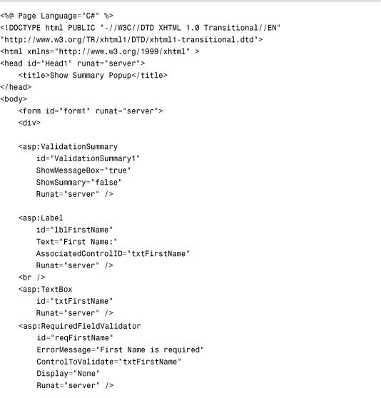

Both of the RequiredFieldValidator controls have their Display properties set to the value None. The validation error messages appear only in the alert box.
Creating Custom Validation Controls
In this final section, you learn how to create custom validation controls. We create two custom controls. First, we create a LengthValidator control that enables you to validate the length of an entry in a form field. Next, we create an AjaxValidator control. The AjaxValidator control performs validation on the client by passing information back to a custom function defined on the server.
You create a new validation control by deriving a new control from the BaseValidator class. As its name implies, the BaseValidator class is the base class for all the validation controls, including the RequiredFieldValidator and RegularExpressionValidator controls.
The BaseValidator class is a MustInherit (abstract) class, which requires you to implement a single method:
• EvaluateIsValid—Returns true when the form field being validated is valid.
The BaseValidator class also includes several other methods that you can override or otherwise use. The most useful of these methods follows:
• GetControlValidationValue—Enables you to retrieve the value of the control being validated.
When you create a custom validation control, you override the EvaluateIsValid() method and, within the EvaluateIsValid() method, you call GetControlValidationValue to get the value of the form field being validated.
Creating a LengthValidator Control
To illustrate the general technique for creating a custom validation control, in this section we create an extremely simple one. It’s a LengthValidator control, which enables you to validate the length of a form field.
The code for the LengthValidator control is contained in Listing 3.20.
Listing 3.20. LengthValidator.cs

Listing 3.20 contains a class that inherits from the BaseValidator class. The new class overrides the EvaluateIsValid method. The value from the control being validated is retrieved with the help of the GetControlValidationValue() method, and the length of the value is compared against the MaximumLength property.
Note
To use the class in Listing 3.20, you need to add the class to your application’s App_Code folder by right-clicking the App_Code folder and choosing to add a new item. Any class added to this special folder is automatically compiled by the ASP.NET Framework.
The page in Listing 3.21 uses the LengthValidator control to validate the length of a comment input field (see Figure 3.16).
Figure 3.16. Validating the length of a field with the LengthValidator control.

Listing 3.21. ShowLengthValidator.aspx
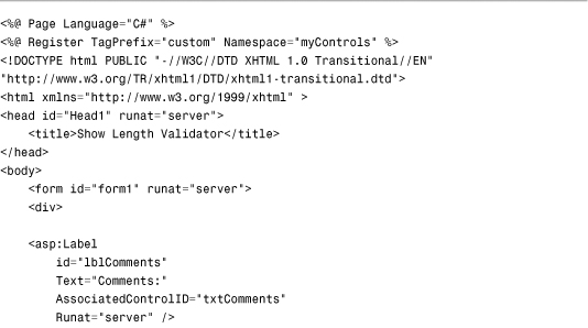

The LengthValidator is registered at the top of the page with the <%@ Register %> directive. If you need to use the control in multiple pages in your application, you can alternatively register the control in the <pages> section of your application’s web configuration file.
Creating an AjaxValidator Control
In this section, we create an extremely useful control named the AjaxValidator control. Like the CustomValidator control, the AjaxValidator control enables you to create a custom server-side validation function. Unlike the CustomValidator control, however, the AjaxValidator control enables you to call the custom validation function from the browser.
The AjaxValidator control uses AJAX (Asynchronous JavaScript and XML) to call the server-side validation function from the client. The advantage of using AJAX is that no postback to the server is apparent to the user.
For example, imagine that you create a website registration form and you need to validate a User Name field. You want to make sure that the User Name entered does not already exist in the database. The AjaxValidator enables you to call a server-side validation function from the client to check whether the User Name is unique in the database.
The code for the AjaxValidator control is contained in Listing 3.22.
Listing 3.22. AjaxValidator.cs


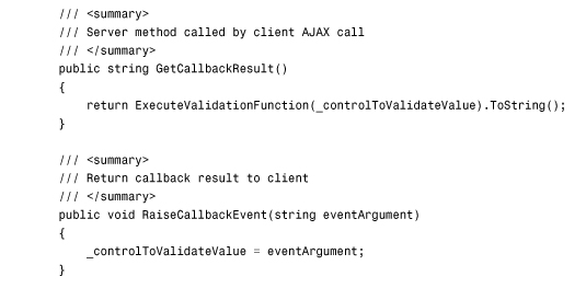
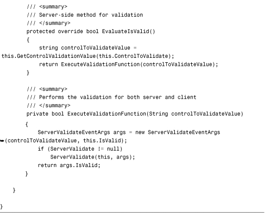
The control in Listing 3.22 inherits from the BaseValidator class. It also implements the ICallbackEventHandler interface. The ICallbackEventHandler interface defines two methods called on the server when an AJAX request is made from the client.
In the OnPreRender() method, a JavaScript include file and startup script are registered. The JavaScript include file contains the client-side functions called when the AjaxValidator validates a form field on the client. The startup script associates the client-side AjaxValidatorEvaluateIsValid() function with the AjaxValidator control. The client-side validation framework automatically calls this JavaScript function when performing validation.
The JavaScript functions used by the AjaxValidator control are contained in Listing 3.23.
Listing 3.23. AjaxValidator.js

The AjaxValidatorEvaluateIsValid() JavaScript method initiates an AJAX call by calling the WebForm_DoCallback() method. This method calls the server-side validation function associated with the AjaxValidator control. When the AJAX call completes, the AjaxValidatorResult() method is called. This method updates the display of the validation control on the client.
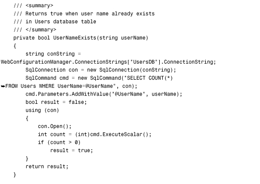
The page in Listing 3.24 illustrates how you can use the AjaxValidator control. This page handles the AjaxValidator control’s ServerValidate event to associate a custom validation function with the control.
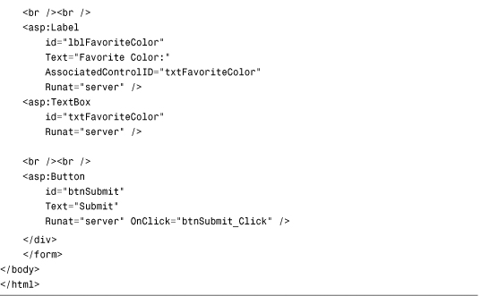
The page in Listing 3.24 contains a form that includes fields for entering a username and favorite color. When you submit the form, the values of these fields are inserted into a database table named Users.
In Listing 3.24, the validation function checks whether a username already exists in the database. If you enter a username that already exists, a validation error message displays. The message displays in the browser before you submit the form back to the server (see Figure 3.17).
Figure 3.17. Using the AjaxValidator to check whether a username is unique.

It is important to realize that you can associate any server-side validation function with the AjaxValidator. You can perform a database lookup, call a web service, or perform a complex mathematical function. Whatever function you define on the server is automatically called on the client.
Listing 3.24. ShowAjaxValidator.aspx


Summary
In this chapter, you learned how to perform form validation with the ASP.NET 4 Framework. First, you were provided with an overview of all the standard validation controls. You learned how to highlight validation error messages and how to take advantage of validation groups to simulate multiple forms in a single page.
In the final section of this chapter, you learned how to create custom validation controls by deriving new controls from the BaseValidator control. You saw the creation of a custom LengthValidator and AjaxValidator control.