
Chapter 10. Using List Controls
In This Chapter
• Overview of the List Controls
• Working with the DropDownList Control
• Working with the RadioButtonList Control
• Working with the ListBox Control
• Working with the CheckBoxList Control
• Working with the BulletedList Control
• Creating a Custom List Control
• Summary
The List controls enable you to display simple lists of options. For example, you can use the RadioButtonList control to display a group of radio buttons or the BulletedList control to display a list of links.
In this chapter, you learn how to use each of the List controls included in the ASP.NET Framework. In particular, we discusses the DropDownList, RadioButtonList, ListBox, CheckBoxList, and BulletedList controls. You learn how to bind the different types of List controls to a data source such as a database table. You also learn how to work directly with the list items contained by a List control.
Finally, at the end of this chapter, you learn how to build a custom List control. We create a client-side multiselect List control that enables you to select multiple list items at a time.
Overview of the List Controls
The five List controls inherit from the base ListControl class. This means that all the List controls share a common set of properties and methods. This section provides you with an overview of the common features of the List controls.
Declaring List Items
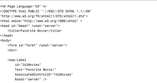
The List controls render a list of options. Each option is represented by an instance of the ListItem class. For example, you can use the page in Listing 10.1 to render a set of options for selecting your favorite movie (see Figure 10.1).
Figure 10.1. Displaying a list of movies.

Listing 10.1. FavoriteMovie.aspx

The page in Listing 10.1 contains a RadioButtonList control that contains three ListItem controls that correspond to the three radio buttons. All the List controls use the ListItem control to represent individual list items.
The ListItem control supports the following five properties:
• Attributes—Enables you to add HTML attributes to a list item.
• Enabled—Enables you to disable a list item.
• Selected—Enables you to mark a list item as selected.
• Text—Enables you to specify the text displayed by the List Item.
• Value—Enables you to specify a hidden value associated with the List Item.
You use the Text property to indicate the text that you want the option to display, and the Value property to indicate a hidden value associated with the option. For example, the hidden value might represent the value of a primary key column in a database table.
The Selected property enables you to show a list item as selected. Selected radio buttons and check boxes appear checked. The selected option in a DropDownList is the default option displayed. Selected options in a ListBox appear highlighted. And in the case of a BulletedList control, the selected property has no effect whatsoever.
The Enabled property has different effects when used with different List controls. When you set a ListItem control’s Enabled property to the value False when using the DropDownList or ListBox controls, the list item is not rendered to the browser. When you use this property with a CheckBoxList, RadioButtonList, or BulletedList control, the list item is ghosted and nonfunctional.
Binding to a Data Source
You can bind any of the List controls to a data source. The List controls support both declarative databinding and programmatic databinding.
For example, the page in Listing 10.2 contains a DropDownList control bound to the Movies database table with declarative databinding (see Figure 10.2).
Figure 10.2. Displaying list items with declarative databinding.

Listing 10.2. DeclarativeDataBinding.aspx

The DropDownList control’s DataSourceID property points to the ID of the SqlDataSource control. When you open the page in Listing 10.2, the SqlDataSource control retrieves the records from the Movies database table. The DropDownList control grabs these records from the SqlDataSource control and creates a ListItem control for each data item.
The DropDownList control has both its DataTextField and DataValueField properties set. When the DropDownList control creates each of its list items, it uses the values of the DataTextField and DataValueField properties to set the Text and Value properties of each list item.
As an alternative to declarative databinding, you can programmatically bind any of the List controls to a data source. For example, the page in Listing 10.3 binds a ListBox control to a collection that represents a shopping cart (see Figure 10.3).
Figure 10.3. Show list items with programmatic binding.

Listing 10.3. ProgrammaticDataBinding.aspx


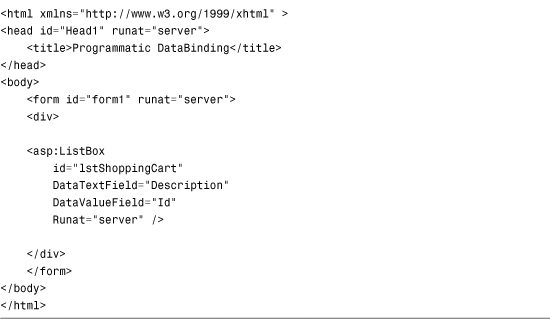
In Listing 10.3, the ListBox is bound to the collection in the Page_Load() method. The DataTextField and DataValueField properties of the ListBox control represent properties of the CartItem class.
Note
A List control’s DataTextField and DataValueField properties can refer to any public property of a class, but you cannot bind a List control to a public field.
Determining the Selected List Item
Displaying options with the List controls is all very nice, but at some point you need to determine which option a user has selected. The List controls support three properties that you can use to determine the selected list item:
• SelectedIndex—Gets or sets the index of the selected list item.
• SelectedItem—Gets the first selected list item.
• SelectedValue—Gets or sets the value of the first selected list item.
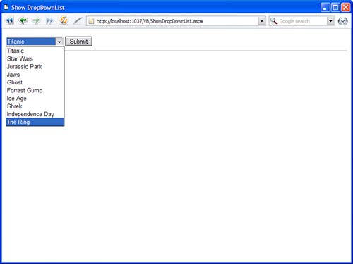
For example, the page in Listing 10.4 enables you to select an item from the DropDownList control and display the value of the selected item’s Text property (see Figure 10.4).
Figure 10.4. Selecting an item from a DropDownList control.

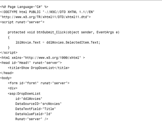
Listing 10.4. SelectMovie.aspx


The SelectedItem property retrieves the selected ListItem control from the DropDownList control. The value of the selected item’s Text property displays in the Label control.
You can use these properties when you want to associate a List control with another DataBound control. For example, the page in Listing 10.5 contains a DropDownList control that displays a list of movie categories and a GridView control that displays a list of movies that match the selected category (see Figure 10.5).
Figure 10.5. Master/Details form with a list control.
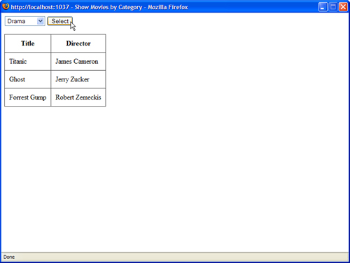
Listing 10.5. ShowMoviesByCategory.aspx
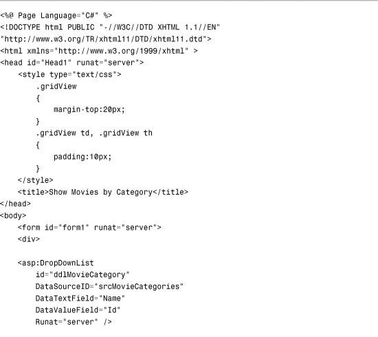
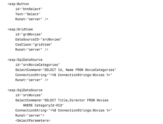

The DropDownList control is bound to the srcMovieCategories SqlDataSource control, and the GridView control is bound to the srcMovies SqlDataSource control. The srcMovies SqlDataSource control includes a ControlParameter, which represents the SelectedValue property of the DropDownList control. When you select a movie category from the DropDownList control, the selected value changes, and the GridView control displays a list of matching movies.
Appending Data Items
You can mix the list items that you declare in a List control and the list items that are added to the control when it is bound to a data source. This is useful when you want to display a default selection.
For example, imagine that you create a form in which you want to require a user to pick an item from a List control. In this situation, you should add a default item to the List control so that you can detect whether a user has actually picked an item.
You can mix declarative list items with databound list items by assigning the value True to the AppendDataBoundItems property. The page in Listing 10.6 illustrates how you can add a default list item to a List control (see Figure 10.6).
Figure 10.6. Displaying a default list item.
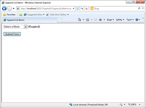
Listing 10.6. AppendListItems.aspx

The page in Listing 10.6 includes both a DropDownList control and a RequiredFieldValidator control. The DropDownList control includes a list item that displays the text Select a Movie. The Value property of this list item is set to the empty string. If you attempt to submit the form without selecting a list item other than the default list item, the RequiredFieldValidator displays an error message.
The DropDownList control includes an AppendDataBoundItems property that is set to the value True. If you neglect to set this property, the databound list items overwrite any declarative list items.
Enabling Automatic PostBacks
All the List controls, except for the BulletedList control, support a property named the AutoPostBack property. When this property is assigned the value True, the form containing the List control is automatically posted back to the server whenever a new selection is made.
For example, the page in Listing 10.7 contains a DropDownList control that has its AutoPostBack property enabled. When you select a new item from the DropDownList control, the page is automatically posted back to the server and the Label control displays the selected item.
Listing 10.7. AutoPostBackListControl.aspx

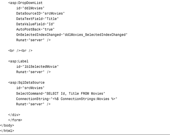
When you enable the AutoPostBack property, a JavaScript onchange() event handler is added to the List control. The onchange event is supported by all recent browsers including Firefox 1.0 and Opera 8.0.
The DropDownList control has a SelectedIndexChanged event handler named ddlMovies_SelectedIndexChanged(). The SelectedIndexChanged event is raised whenever you make a new selection in the List control (independent of the AutoPostBack property). The ddlMovies_SelectedIndexChanged() method displays the selected list item in a Label control.
Web Standards Note
You should avoid using the AutoPostBack property because it creates accessibility problems for persons with disabilities. If you can’t use a mouse, and you are interacting with a website through the keyboard, having a page post back to the server whenever you make a selection change is a frustrating experience.
Using the Items Collection
All the list items rendered by a List control are contained in the List control’s list item collection. This collection is exposed by the Items property.
You can work directly with the list items in this collection. For example, you can add or remove particular list items, or you can change the order of the list items.
The page in Listing 10.8 contains two ListBox controls and two button controls. When you click the Add button, a list item is moved from the first ListBox to the second ListBox control. When you click Remove, the list item is moved back to the original List control (see Figure 10.7).
Figure 10.7. Using the ListPicker to select list items.

Listing 10.8. ListPicker.aspx
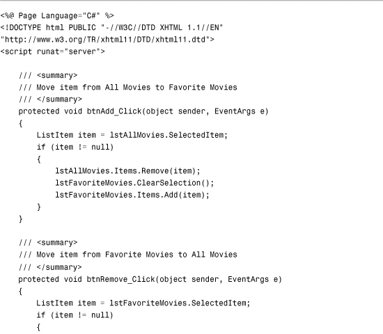


The first ListBox in Listing 10.8 is bound to the Movies database table. You can use the ListBox controls to pick your favorite movies by moving movie titles from the first ListBox to the second ListBox.
When you click the Add button, the btnAdd_Click() method executes. This method grabs the selected item from the All Movies ListBox and adds it to the Favorite Movies ListBox. The Remove button does exactly the opposite.
Both the btnAdd_Click() and btnRemove_Click() methods call the ClearSelection() method of the ListBox class. This method iterates through all the list items and sets the Selected property for each list item to the value False. If multiple list items are selected, an exception is thrown.
Note
One problem with the page discussed in this section is that the page must be posted back to the server each time you move an item from the first ListBox to the second ListBox. At the end of this chapter, you learn how to create a MultiSelectList control, which uses a client-side script to get around this limitation.
Working with the DropDownList Control
The DropDownList control enables you to display a list of options while requiring a minimum of screen real estate. A user can select only one option at a time when using this control.
The page in Listing 10.9 illustrates how you can use the DropDownList control to display all the movie titles from the Movies database table (see Figure 10.8).
Figure 10.8. Displaying list items with the DropDownList control.
Listing 10.9. ShowDropDownList.aspx

The DropDownList control renders an HTML <select> tag. One problem with the HTML <select> tag is that it has an infinite z index. In other words, you can’t place other objects, such as an absolutely positioned <div> tag, in front of a DropDownList control in a page.
One way to get around this problem is to use a third-party control such as the EasyListBox control (available at http://www.EasyListBox.com). This control works fine when other objects are layered over it. It also supports several advanced features such as multiple columns and images in list items.
Working with the RadioButtonList Control
The RadioButtonList control, like the DropDownList control, enables a user to select only one list item at a time. The RadioButttonList control displays a list of radio buttons that can be arranged either horizontally or vertically.
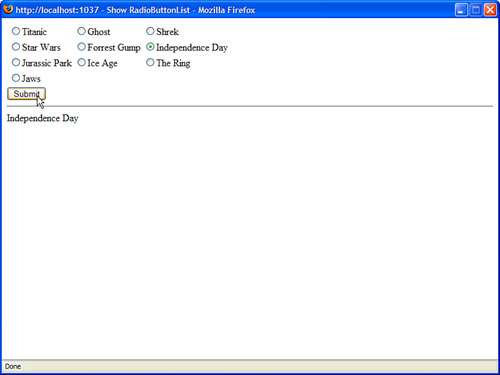
The page in Listing 10.10 illustrates how you can use the RadioButtonList control to display a list of movie titles (see Figure 10.9).
Figure 10.9. Displaying list items with the RadioButtonList control.
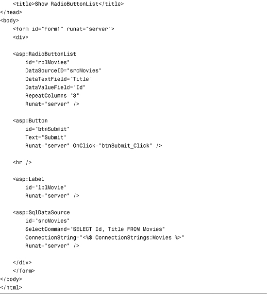
Listing 10.10. ShowRadioButtonList.aspx

In Listing 10.10, the radio buttons are rendered in a three-column layout. The RadioButtonList control includes three properties that have an effect on its layout:
• RepeatColumns—The number of columns of radio buttons to display.
• RepeatDirection—The direction that the radio buttons repeat. Possible values are Horizontal and Vertical.
• RepeatLayout—Determines whether the radio buttons display in an HTML table. Possible values are Table and Flow.
By default, the radio buttons rendered by the RadioButtonList control are rendered in an HTML table. If you set the RepeatLayout property to the value Flow, the radio buttons are not rendered in a table. Even when the RadioButtonList renders its items in Flow layout mode, you can specify multiple columns.
Working with the ListBox Control
The ListBox control is similar to the DropDownList control with two important differences. First, the ListBox control requires more screen real estate because it always displays a certain number of list items. Furthermore, unlike the DropDownList control, the ListBox control enables a user to select multiple items.
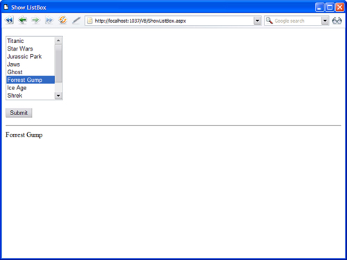
The page in Listing 10.11 illustrates how you can enable a user to select a single item from a ListBox control (see Figure 10.10).
Figure 10.10. Displaying list items with the ListBox control.
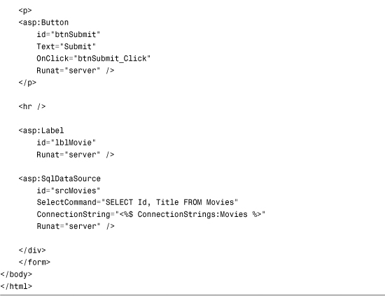
Listing 10.11. ShowListBox.aspx

The ListBox control in Listing 10.11 includes a Rows property. The Rows property determines the number of list items that the ListBox displays.
You can also configure the ListBox control to enable a user to select multiple items. This is illustrated in the page in Listing 10.12 (see Figure 10.11).
Figure 10.11. Selecting multiple list items.

Listing 10.12. ShowMultipleListBox.aspx
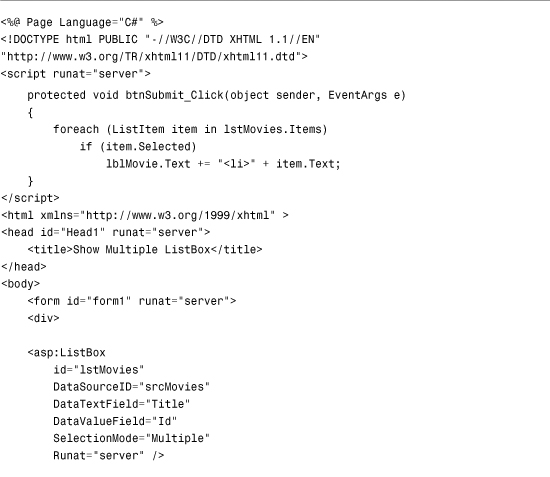

The ListBox in Listing 10.12 includes a SelectionMode property that is set to the value Multiple. A user can select multiple items from the ListBox by using the Ctrl or Shift key when clicking more than one list item.
Warning
Most users don’t understand how to select multiple items from a ListBox control. If you want to allow users to pick multiple items, a better approach is to use either the CheckBoxList control (discussed in the next section) or the MultiSelectList control (discussed in the final section).
When you click the Submit button in Listing 10.12, all the selected list items display in a Label control. The SelectedItem, SelectedIndex, and SelectedValue properties return only the first list item selected. When multiple items are selected, you need to iterate through the Items collection of the ListBox control to detect the selected items.
Working with the CheckBoxList Control
The CheckBoxList control renders a list of check boxes, which can be rendered horizontally or vertically. Unlike the other List controls, a user always can select multiple items when using a CheckBoxList control.
For example, the page in Listing 10.13 contains a CheckBoxList control that renders its list items in two columns (see Figure 10.12).
Figure 10.12. Displaying list items with the CheckBoxList control.

Listing 10.13. ShowCheckBoxList.aspx
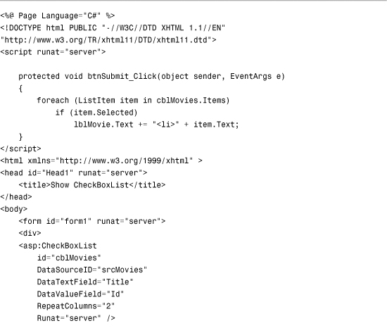

When you click the Submit button, the values of the Text property of any selected check boxes display in a Label control. The selected check boxes are retrieved from the CheckBoxList control’s Items property.
The CheckBoxList control includes three properties that affect its layout:
• RepeatColumns—The number of columns of check boxes to display.
• RepeatDirection—The direction in which the check boxes are rendered. Possible values are Horizontal and Vertical.
• RepeatLayout—Determines whether the check boxes display in an HTML table. Possible values are Table and Flow.
Normally, a CheckBoxList control renders its list items in an HTML table. When the RepeatLayout property is set to the value Flow, the items are not rendered in a table.
Working with the BulletedList Control
The BulletedList control renders either an unordered (bulleted) or ordered (numbered) list. Each list item can be rendered as plain text, a LinkButton control, or a link to another web page.
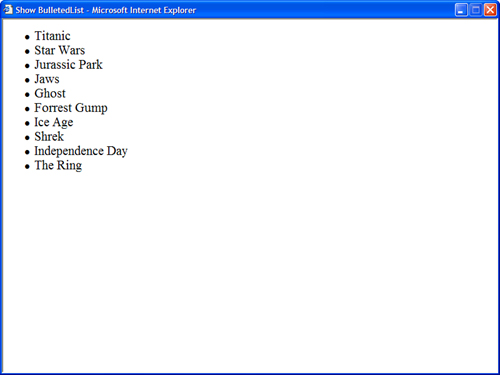
For example, the page in Listing 10.14 uses the BulletedList control to render an unordered list of movies (see Figure 10.13).
Figure 10.13. Displaying a list items with the BulletedList control.
Listing 10.14. ShowBulletedList.aspx

You can control the appearance of the bullets that appear for each list item with the BulletStyle property. This property accepts the following values:
• Circle
• CustomImage
• Disc
• LowerAlpha
• LowerRoman
• NotSet
• Numbered
• Square
• UpperAlpha
• UpperRoman
You can set BulletStyle to Numbered to display a numbered list. If you set this property to the value CustomImage and assign an image path to the BulletImageUrl property, you can associate an image with each list item. For example, the page in Listing 10.15 displays an image named Bullet.gif with each list item (see Figure 10.14).
Figure 10.14. Displaying image bullets.

Listing 10.15. ShowBulletedListImage.aspx

You can modify the appearance of each list item by modifying the value of the DisplayMode property. This property accepts one of the following values from the BulletedListDisplayMode enumeration:
• HyperLink—Each list item renders as a link to another page.
• LinkButton—Each list item renders by a LinkButton control.
• Text—Each list item renders as plain text.
For example, the page in Listing 10.16 displays a list of links to other websites (see Figure 10.15).
Figure 10.15. Displaying list items as hyperlinks.

Listing 10.16. ShowBulletedListHyperLinks.aspx
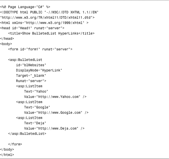
Each list item has both its Text and Value properties set. The Text property contains the text that displays for the list item, and the Value property contains the URL for the other website. The Target property is set to the value blank. When you click one of the hyperlinks, the page opens in a new window.
Warning
The BulletedList control is different from the other List controls because it does not support the SelectedIndex, SelectedItem, and SelectedValue properties.
Creating a Custom List Control
All the List controls inherit from the base ListControl class. If you are not happy with the existing List controls, you can build your own.
In this section, we create a custom List control named the MultiSelectList control that renders two list boxes and an Add and Remove button. You can click the buttons to move items between the two list boxes (see Figure 10.16).
Figure 10.16. Using the MultiSelectList control.

The custom control uses client-side JavaScript to move the items between the two list boxes. Using JavaScript enables you to avoid posting the page back to the server each time a list item is moved. The client-side JavaScript is standards-compliant so it works with all web browsers, such as Internet Explorer, Firefox, Safari, and Opera.
The code for the custom MultiSelectList is contained in Listing 10.17.
Listing 10.17. MultiSelectList.cs

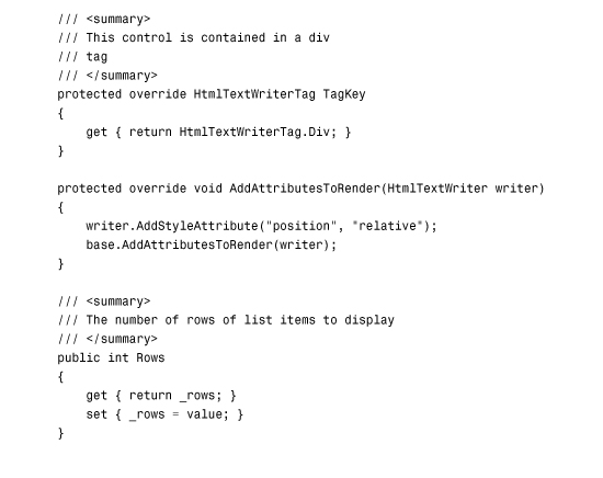


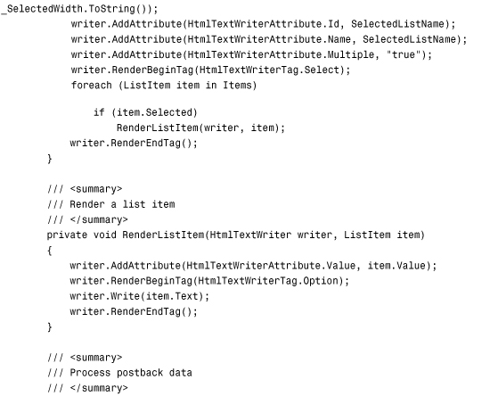

The TagKey property of the base ListControl class is overridden. The elements of the control are contained in an HTML <div> tag.
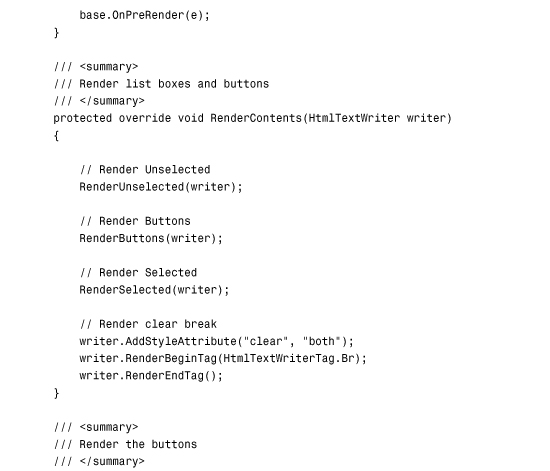
The MultiSelectList renders its user interface in the RenderContents() method. This method renders the two list boxes and button controls. Each unselected list item renders in the first list box and each selected item renders in the second list box.
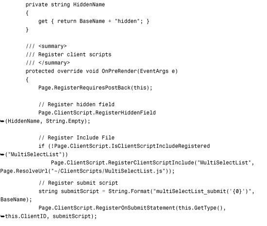
Furthermore, the MultiSelectList control implements the IPostBackDataHandler interface. When a user posts a page that contains the MultiSelectList control to the server, each item that the user selected is retrieved, and the Items collection of the List control is updated.
The control takes advantage of a client-side JavaScript library contained in a MultiSelectList.js file. This JavaScript library is registered in the control’s OnPreRender() method. The MultiSelectList.js library is contained in Listing 10.18.
Listing 10.18. MultiSelectList.js
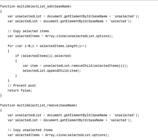

Listing 10.18 contains three JavaScript functions. The first two functions simply move list items from one list box to the other list box. The multiSelectList_submit() function is called immediately before a page containing the MultiSelectList control posts to the server. This control records each of the selected list items (the items in the second list box) to a hidden form field.
The page in Listing 10.19 illustrates how you can use the MultiSelectList control.
Listing 10.19. ShowMultiSelectList.aspx

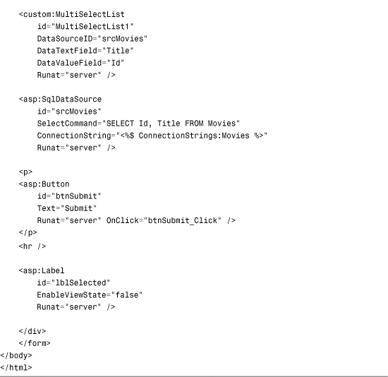
In the page in Listing 10.19, the MultiSelectList control is bound to a SqlDataSource control, which represents the contents of the Movies database table. You can select movie titles in the MultiSelectList control by moving movie titles from one list box to the second list box. When you click the Submit button, the selected movies display in a Label control.
Summary
In this chapter, you learned how to use List controls to display simple option lists. You saw the DropDownList, RadioButtonList, ListBox, CheckBoxList, and BulletedList controls.
You also saw the common features of the List controls. You learned how to append data items to a List control and automatically post a form containing a List control back to the server.
Finally, you worked through the creation of a custom List control, which involved deriving a new control from the base ListControl class. The custom List control takes advantage of client-side JavaScript to enable users to select multiple list items without requiring a page to post back to the server when each item is selected.