
A Web Part is the basic web element used in MOSS 2007 to contain and organize information on a Web Part page. A Web Part page is a specialized web page that contains one or more Web Parts and provides a container for different types of Web Parts. Web Parts are designed for different purposes, such as to contain lists, organize documents, and create forums.
MOSS 2007 comes with a default set of Web Parts:
Content Editor Web Part
Form Web Part
Image Web Part
List View Web Part
Page Viewer Web Part
Site Users Web Part
XML Web Part
These default Web Parts can be customized to suit your specific needs.
Each Web Part serves a particular need within a Web Part page. A Web Part page can contain as few or as many Web Parts as it is formatted to contain, and individual Web Parts can be set up to connect to one another, providing a unique presentation of data.
This Web Part is used to add formatted
text, images, tables, and hyperlinks to a
Web Part page. The information can be added in HTML format using the Source Editor, the Rich Text Editor, or a Content Link. The most common use for this
Web Part is to add textual and graphic data, similar to how a typical web page
presents on the Internet. Hyperlinks can be included, but a remote web page
cannot be presented in a frame in this Web Part. Instead, use the Page View Web
Part to display web content in frames. Although the Content Editor Web Part can accept most
HTML tags, it is not compatible with the FORM
element. If you need to create a form page within a Web Part page, you must use
the Form Web Part.
How you enter information in this Web Part depends on how it is formatted, which input method you prefer, and occasionally, where the data is located:
- Source Editor
Information is entered into a simple text editor in HTML format. This acts similarly to other text editors, such as Notepad, and requires that the author know basic HTML syntax and construction. Text not using proper HTML formatting will not display correctly. Also, any images, tables, or hyperlinks included with this editor must be written with the relevant HTML tags.
- Rich Text Editor
This editor allows you to enter information in plain text without HTML formatting. A set of tools allows you to insert hyperlinks, images, tables, and bullet lists and to format the size and color of text. The Rich Text Editor is limited compared to Microsoft Office Word, so don’t expect have all of the options of adding and editing content that are available in a full-featured word processor.
- Content Link
You can use this method to link the Web Part to a text file that contains HTML formatting. This method does not support connections to web pages that contain
FORMtags and will produce an error if this is attempted. If you try to connect to web content from a web page outside of the site, this may fail if that site does not have anonymous access enabled. Only http:// or https:// protocols are supported.
This Web Part is used to connect simple form controls to other Web Parts. It also can be used to filter lists—for example, presenting a view of a products list that displays only items within a certain price range. This Web Part can be customized to utilize many typical form elements, such as radio buttons, checkboxes, and text boxes.
Connect the Form Web Part to any other Web Part on the site. An example of this is using the Form Web Part to connect to one or more Web Parts on another Web Part page on the site, to present a filtered view of your selections in the Form Web Part.
Customize the Form Web Part with either the built-in Source Editor or a web design application such as Microsoft Office SharePoint Designer 2007 to add a text box, text area, checkbox, Option button, or drop-down menu.
You can use this Web Part to add one or more graphics to a Web Part page. This includes your corporate logo, product images, diagrams, or drawings. The image should exist on the site for faster load times, but you can link to an off-site image. This image will be static unless it is an animated GIF or some other similar graphic.
Tip
You can also add an image directly in a Content Editor Web Part, either by writing the link in HTML in the Source Editor or by using the image tool available in the Rich Text Editor.
You also have the option of connecting the Image Web Part to another Web Part that provides the path or hyperlink to an image. This allows the image to behave dynamically, depending on what is happening on the remote Web Part. Compatible graphics formats include:
Bitmap (.bmp)
Enhanced Metafile (.emf)
Graphics Interchange Format (.gif)
Joint Photographic Experts Group (.jpg)
Portable Networks Graphics (.png)
Custom properties of this Web Part allow you to configure alternate text for the graphic, align the image vertically and horizontally, and modify the default background color of the Web Part.
Despite the name, there is no distinct Web Part called List View Web Part. This is more of a feature of certain types of Web Parts that include lists. For example, you can create a list called Technologies and categorize the different technologies in the list as either Applications, Languages, or Libraries (APIs). After the list is constructed, if you want to look at just the Languages technologies, you can choose the Languages list view. This option filters the list, displaying only those list items categorized as Languages.
MOSS 2007 contains a variety of specific List Web Parts that you can use, depending on what kind of data you have and how you want it presented. Lists that have the View List View option are as follows:
Announcements
Contacts
Custom Lists
Document Libraries
Events
Form Libraries
Issues
Links
Lists with Data Imported from Spreadsheets
Tasks
You can create multiple views for a List and specify a variety of properties per view. You can also link different list items, such as Document Name and Edit, so that when the name of a document is selected, an editing window opens, allowing you to modify the item’s properties. The custom properties of a List View Web Part are:
When you open a List View Web Part, the default view is Current View, which represents the view that was most recently selected. For example, if you previously chose Languages from the Technologies list and then saved and closed the list, when you access it again, the Current View would be the Languages View. You can change from Current View to any other view you have created, but be careful to save the selection by clicking OK; otherwise, you might lose your changes. Selected View Types are:
“All
list_name" or All Documents, which displays the entire list.Explorer view shows all files as icons.
Summary view shows a summary of the list content.
Additional List Views are the views that you have customized, such as Applications, Languages, and Libraries (APIs).
The "Edit the current view” options let you modify how the list will be displayed, including the columns, sort order, and which filter is used.
The Toolbar Type option lets you choose between Summary Toolbar, Full Toolbar, and No Toolbar. Full Toolbar is the default setting for Custom Lists.
This Web Part is essentially a web frame that displays the content of any web page to which it is hotlinked. You can link the Page Viewer Web Part to any web page, folder, or document available over a network connection. This can be handy for viewing information that changes frequently, such as a spreadsheet accessed by members of a team.
You must use a web browser that supports HTML IFRAME to view information in a Page Viewer Web Part. To view files or folders in the Page Viewer, you must use Internet Explorer.
As with any other frame, the information displayed in the Page Viewer Web Part is independent from the rest of the Web Part page. For example, if you click links on the web page in the Page Viewer Web Part, you are navigating only within the linked page, not within the SharePoint site. You remain on the same Web Part page, regard-less of where you browse on the remote site.
The Page View Web Part has two custom properties that work in unison to display either a web page, folder, or file:
The Web Page, Folder, or File Group lets you choose which type of information you want displayed. If you choose the Web Page option, the http:// notation is automatically included in the Links field (see the next bullet point). If you choose either Folder or File, no change will occur to the Links field until you make it.
Links lets you enter the hyperlink protocol (http or https) and URL to the web page, or the relative or absolute URL to the folder or file you desire. The field will not accept file paths such as C:documents and settingsjpylesMy Documents webfile.
A Site Users Web Part is a specialized list that displays a list of individual users and groups who have access to the MOSS 2007 site. As explained previously in “List View Web Part,” most lists can be filters to display more than one view of the information they contain. For example, let’s say you have a list containing all of the users in your department. You can filter it by work group so that only a specific team appears on the list. Then you can add that filtered Site Users Web Part to the main page of the team’s subsite.
The Site Users Web Part is added by default to the home page of a Document Workspace site but can be added manually to any Web Part page. Clicking on the Smart Tag next to any user’s name takes you to a page displaying that person’s contact information. Here you’ll find the same messaging options available in many other Office products, allowing you to send an email or instant message, add the user’s contact information to your address book in Outlook, or schedule a meeting.
You can configure three custom properties in the Site Users Web Part:
“Number of items to display” lets you choose the number of user names appearing in the list. The range is from 1 to 1,000.
Display Type lets you choose which types of users or groups will appear in the list.
Toolbar Type lets you include or remove the “Add new user” link from the Web Part.
This Web Part displays Extensible Markup Language (XML)-formatted
data and applies Extensible Stylesheet Language
Transformations (XSLT) styling to that data prior to it being displayed. As with
the Content Editor Web Part, the XML Web Part does not support the use of the
HTML FORM element. If you must use FORM tags, you’ll be required to choose either the
Page Viewer Web Part or the Form Web Part.
The XML Web Part is commonly used to display XML documents or forms as well as structured data from database tables. There are two methods you can use to add data to this Web Part:
- XML and XSL Editors
Plain-text editors that allow you to create and modify information within the Web Part. You need to be familiar with XML and XSLT syntax and structure to effectively use this method.
- XML and XSL Links
Let you hyperlink to a document containing XML and XSLT source code. This is an ideal method to display information that is frequently updated by an automated process. The two valid hyperlink protocols supported are HTTP and HTTPS. As with the Page Viewer Web Part, you can use either relative or absolute URLs, but file paths—such as C:documents and settingsjpylesMy DocumentsXMLfile—are not supported.
The two methods of adding information to the XML Web Part are not mutually exclusive. Although it’s not supported, this Web Part allows you to combine edited and linked data. As previously stated, one reason to use linked XML documents is to display frequently updated information. You can add edited XML in the same Web Part to display a message to users in case the linked data becomes unavailable (due to a network problem, for example).
Customizing a Web Part page by adding Web Parts allows you to organize and present text, graphics, lists, links, and other information in the way that makes the most sense for your team, department, or organization. Different Web Part pages contain different field formatting. The fields available on the various Web Part pages are determined by the content type of the master pages in SharePoint’s Master Page Gallery.
Tip
See Chapter 7 for more information about master pages.
To select a Web Part page to suit your needs, do the following:
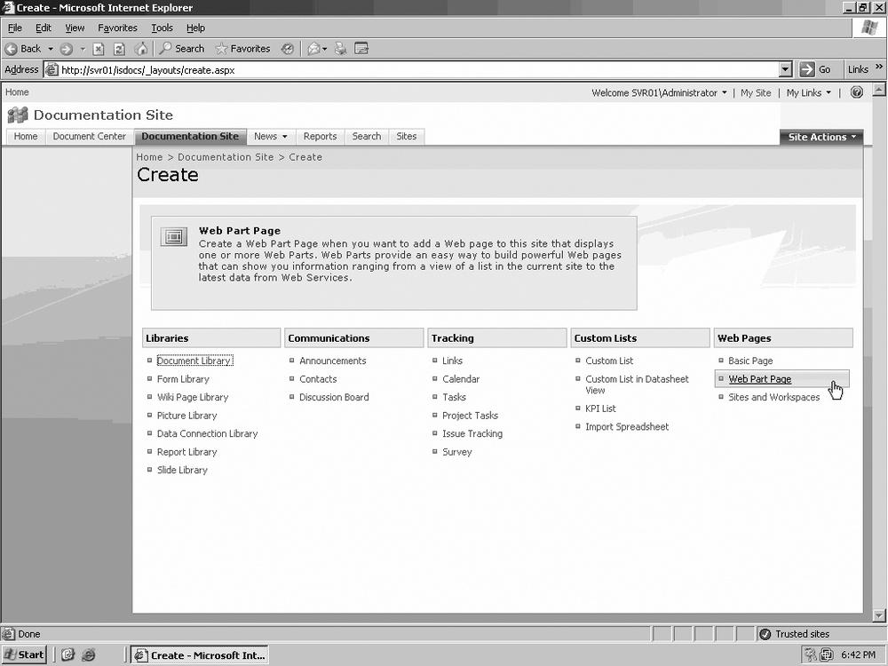
On your site, click Site Actions and select Create from the menu.
In the Web Pages column, click Web Part Page, as Figure 8-1 illustrates.
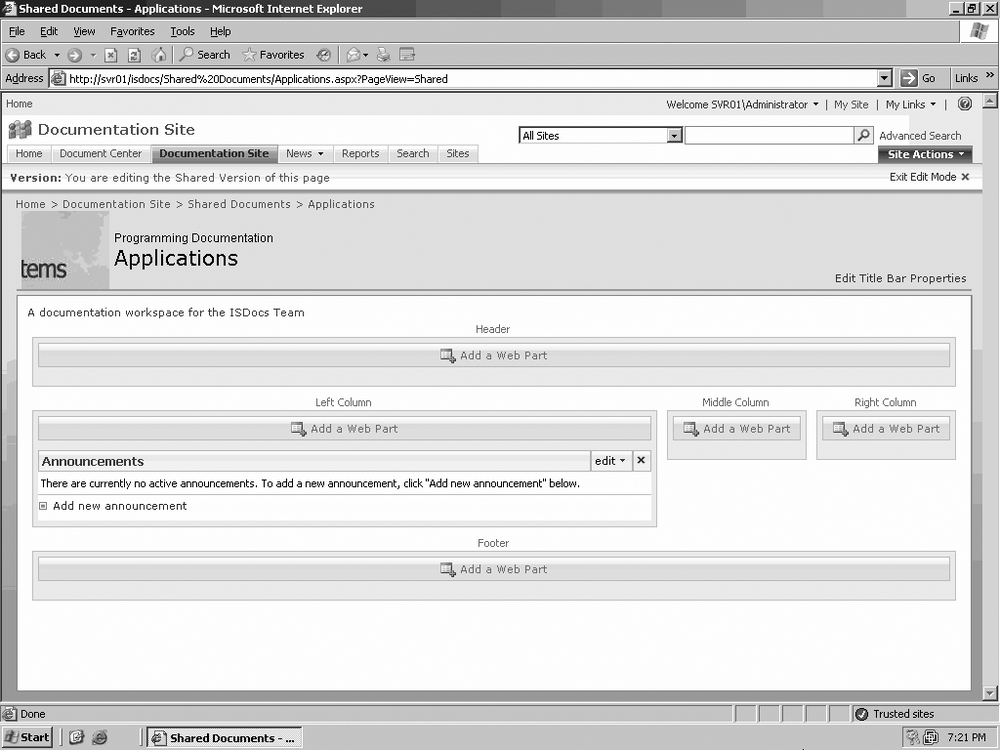
On the new Web Part page page, give your new Web Part page a name by typing it in the Name field.
In the Layout section, choose the type of page layout you want from the list.
Under Save Location, choose the document library where you want to save your new Web Part page.
Click Create, as shown in Figure 8-2.

The new Web Part page opens in Edit Mode and is ready to be customized.
Once you have selected the content type for your Web Part page, you can customize it in a variety of ways.
The title bar of a Web Part page includes a logo image, the name of the page or site, a caption, and a description. The default content for these elements will have to be changed in order for this page to reflect your particular team, department, or site:
On the Web Part page, click Site Actions and select Edit Page from the menu.
Click on Edit Title Bar Properties.
Edit the Title, Caption, and Description fields by typing in the desired text.
Replace the default image URL in the URL field with the URL to your corporate or department logo.
Tip
Typically, all of your site’s images are stored in a SharePoint image library. You can then use an Image Web Part to hotlink to the location of the image using the image’s URL. See Chapter 13 for more information.
If you don’t want to require authentication for users to access the site, you can enable anonymous access with the Authentication button.
Click OK to save your changes, as illustrated in Figure 8-3.
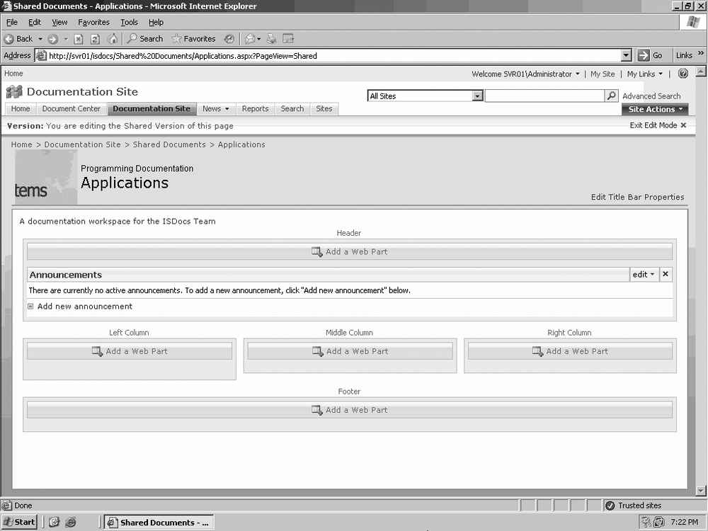
After you’ve modified the Web Part page title bar, you will want to customize the Web Part page by adding specific Web Parts. When you begin accessing Web Parts, the Web Part page will enter Edit View, which will show the underlying Web Part page fields. Once you access a Web Part, you can choose to drag and drop it in the desired field. You can also click directly in the field to add a Web Part. The first thing you need to do is locate the desired Web Part.
On the Web Part page, click Site Actions and select Edit Page from the menu.
In the title of the desired Web Part field, click “Add a Web Part.”
Check the box of the desired Web Part and click Add, as shown in Figure 8-4.

As you saw earlier in this chapter, there are a variety of Web Parts available for use on your site, and your selections depend on what you want to do with that page. Once you have populated a Web Part page with Web Parts, you can move those Web Parts around to different fields on the page if necessary.
Although you can move Web Parts to any Web Part field on the page, usually you cannot alter the structure and placement of the fields. However, these fields can be edited if you use a SharePoint-compatible web design tool, such as Office SharePoint Designer 2007. Otherwise, you are limited to adding, moving, and deleting Web Parts in the existing page structure:
On the Web Part page, click Site Actions and select Edit Page from the menu.
Once the page is in Edit Mode (Figure 8-5), you can drag and drop the Web Parts wherever you want.
Once you are finished editing the Web Part page, as in Figure 8-6, click Exit Edit Mode.

You have the ability to connect data from two different Web Parts and present it in a customized view. This way, you can make changes to one Web Part that will affect the behavior of the other Web Part. The basic characteristics of this process are as follows:
Information flows in only one direction, from the source to the recipient Web Part.
Information can be in the form of lists, rows, cells, or parameter values.
You can connect only Web Parts that exist on the same Web Part page.
Tip
You can connect Web Parts on two separate Web Part pages by using a SharePoint-compatible web design tool, such as Microsoft Office SharePoint Designer 2007.
A practical example of creating a data flow connection between two Web Parts is connecting the Attendees list from a Meeting Workspace to an Image Web Part. If the Attendees list contains photos of the people on the list, every time you select an individual meeting attendee on the list, that person’s photo will be passed to the Image Web Part and displayed.
This process requires a certain amount of planning in order to get the result you want. The first thing is to decide the rationale for connecting the two Web Parts and the advantages of this connection. Once you’ve decided which two types of information you want to connect, select the two Web Parts and add them to the desired Web Part page. Connect the two Web Parts and verify that information is being shown the way you want it.
Warning
Be careful. You can correctly connect two Web Parts and still end up displaying meaningless results. For example, you can pass data from a Web Part that contains employee ID information to a Web Part that displays product ID information. Even though the connection is correct, the displayed data doesn’t satisfy your requirements. To see how to avoid this problem, read the “Using the Configure Connection Dialog Box” section, later in this chapter.
There are several different types of Web Part connections you can configure. You can also connect more than one pair of Web Parts on a single Web Part page. The following is a list of the most commonly used Web Part connections:
- Alternate Data Views
This connection type allows you to send data from a List View Web Part to a Web Part that provides a different view of the data. Examining data in an alternate view can let you filter the information by relationships or categories not apparent in the sending Web Part. Data types that you can pass from the List View Web Part include cells, fields, lists, or parameters. For example, you can pass list data to an organizational chart to show relationships between departments, pass row data to a chart to display demographic information, or pass cell data to display a percentage of progress toward a goal.
- Calculations
SharePoint contains several Web Parts that can perform calculations without a connection to a separate Web Part. The advantage of creating a connection is displaying the calculation in a different view. For example, you can perform a calculation on tax payments in the sending Web Part and pass it to a list Web Part to see what your payments will be on a quarterly basis.
- Data Enhancement
This type of connection lets you add different information types to list data. For example, suppose your regional office is having an annual meeting for sales staff coming from different field offices in different states. You can access the address of the regional office in the sending list Web Part and pass it to a map Web Part, showing the route from the airport to the regional office.
- Master and Details
This connection type is used to pass general information from a list to a Web Part that can display details. For example, you can pass information from an employee list to a Web Part that can display details about individual employees.
- Parent and Child
Use this type of connection if you want to pass data from one list to another. For example, you can pass row data from one list and have that data and any related row data displayed in the receiving list.
- Search and Filter
Use this connection type to conduct a search in one Web Part and have all search results displayed in another Web Part filtered by columns, such as name, address, and phone number.
- Summary and Details
This connection type is commonly used to pass summary data from a list to a Web Part that can display detailed information from the summary.
The following describes the basic action of connecting two Web Parts and editing that connection. You can create the connection from either Web Part:
On the Web Part page, click Site Actions and select Edit Page from the menu.
Choose one of the two Web Parts, click on Edit in the Web Part menu, and then select Connections, as shown in Figure 8-7.
Select the type of connection you want to create.
Click the name of the Web Part.
When the Configure Connection Dialog Box appears, select the desired Field Name and click Finish, as shown in Figure 8-8.
Once the connection is made, click on Exit Edit Mode.

Warning
For some connection types, you might have to use the Configure Connection dialog box. See the “Using the Configure Connection Dialog Box” section, later in this chapter.
Verify that you are seeing the desired effect.
When you are creating or modifying a connection between two Web Parts, after you click on Edit and select Connections, you will see several different command options that you can use. Here’s the rundown on the key command selections.

If you are using a List View Web Part, you can select a row in the list to pass to the other Web Part.
Warning
How that row data is used by the receiving Web Part depends on which type of Web Part it is. The row data may be simply displayed or it might be treated as a parameter value.
This command option allows you to pass List View Web Part row data to more than one Web Part on the same Web Part page. You cannot pass data from more than one row to the receiving Web Part. You also cannot pass data from the New Row or the Total Row. How you edit the connection depends on the view you are using to access the Connection submenu:
- Standard view
Use the options in the Select Item column to choose which row to pass to the receiving Web Part. You can select only one column from this view.
- Datasheet view
You can select multiple rows in a List View Web Part in this view, but only the row data with the active cell will be passed on to the receiving Web Part.
Use this command to send List View Web Part information to another Web Part specifically designed to display list data. This connection type also supports passing row data from the List View Web Part to more than one other Web Part on the same Web Part page. Regardless of whether you are in Standard or Datasheet view, only the row data in the view is passed to the receiving Web Part.
The prior two commands are used to set up the connection from the sending Web Part. Use the Get Sort/Filter From commands to configure the connection from the receiving Web Part. This command is used when the sending Web Part is a List View Web Part. This connection type supports only a single connection from one Web Part to another on the same Web Part page. The receiving Web Part must be capable of displaying one of the following types of information:
A column of data by sorting it either in ascending or descending order in a List View Web Part
Name and value pairs in one or more columns in a List View Web Part
Use the Configure Connection dialog box to match a specific data source in one Web Part to another. This avoids having a data type displayed incorrectly in the receiving Web Part. You can use this tool to match row data in the sending Web Part to a cell or field in the receiving Web Part. Another example is matching row data to a column in the receiving Web Part and then filtering the result. The most important issue to remember is that the underlying data types must be the same between sender and receiver, even if the actual Web Part items (rows, cells, and so on) don’t have identical names.
One of the advantages of working with Sites and Web Part pages is that your environment can remain fluid. As your business and information needs change, so can your site. At some point, a connection between two Web Parts that was once useful will become obsolete. In that case, you can easily break the connection.
On the Web Part page, click Site Actions and select Edit Page from the menu.
Choose either Web Part, click the menu, select Connections, and then select the connection type and the name of the Web Part on the other end of the connection.
When the Remove Connection confirmation dialog box appears, as in Figure 8-9, click Finish.

You can use a Content Editor Web Part to display text, hyperlinks, tables, and images on a Web Part page. Often this Web Part is used for the majority of the content on a Web Part page because it can be configured to display a variety of content types.
Information can be added and edited on the Content Editor Web Part using either a Rich Text Editor or a Source Editor. The Source Editor will let you enter information in HTML format, so knowledge of HTML is required to use this editor. You can also link to data on another page using the Content Link option. Inserted and linked data can be combined on a Content Editor Web Part to provide a wider range of information sources. The valid hypertext protocol formats for the Content Link option are http:// and https://.
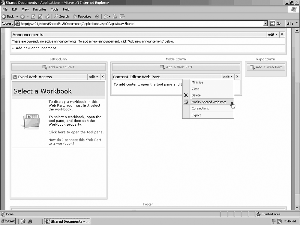
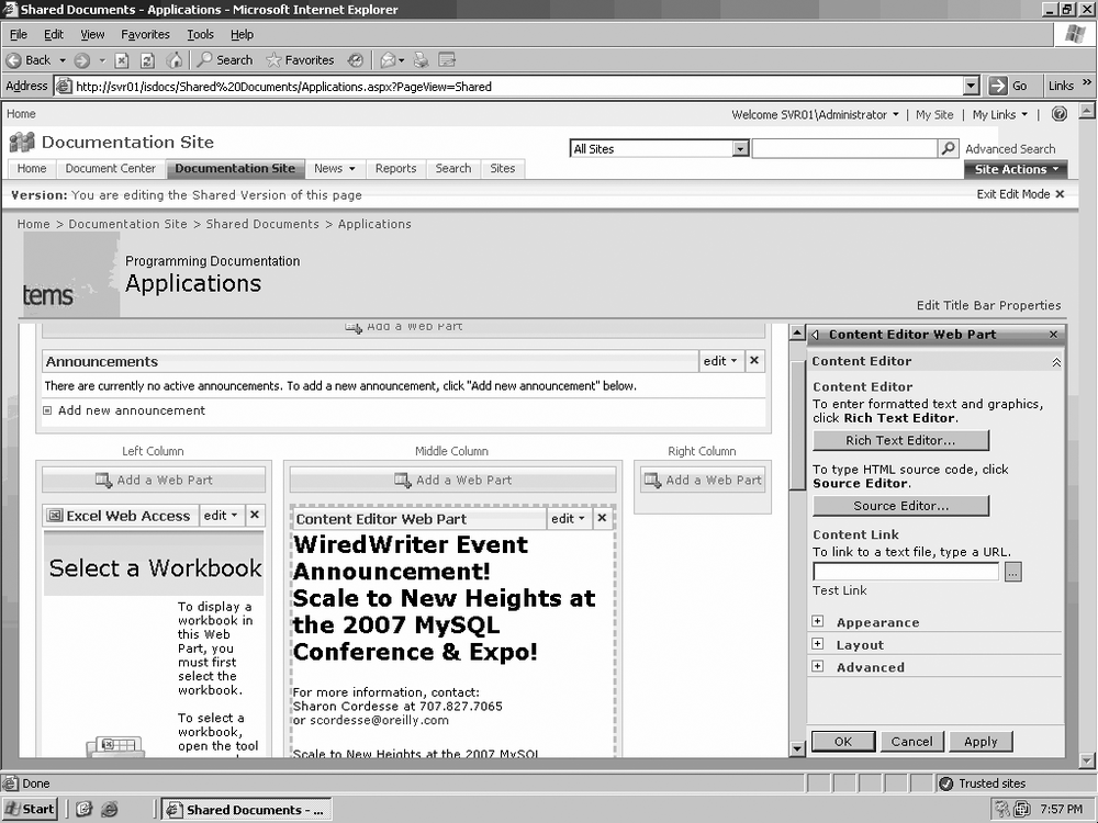
In Edit Mode, click the Edit button on the Content Editor Web Part and click Modify Shared Web Part, as shown in Figure 8-10.
Open the tool pane, click Source Editor to open the HTML text editor, and then add some HTML content, as shown in Figure 8-11.
Click Save to apply the changes in Edit view (Figure 8-12), and then click OK to view the changes in Standard page view.
Click the Edit button on the Web Part again, select Modify Shared Web Part, and then click the Rich Text Editor button.
When the Rich Text Editor opens (Figure 8-13), you can use the editor to modify the text in the Web Part without having to use HTML
When you are done with your editing, click Save, and then click OK.
To leave Edit Mode, click Exit Edit Mode, as shown in Figure 8-14.

As previously mentioned in this chapter, Form Web Parts are most commonly used to receive List View Web Part data through a data connection and then filter the data. Filtered data can be presented by name, number sequence, or some other value.
As you read in the “Connect Data in Web Parts” section earlier in this chapter, you can connect two compatible Web Parts and use the receiving Web Part to display information from the sending Web Part. The following steps specifically describe how to connect two Form Web Parts:
On the desired Web Part page, click Site Actions and select Edit Page from the menu.
Click on the Web Part menu, select Connections from the menu, and then select Provide Form Value To.
Click on the name of the Form Web Part to which you want to connect.
Type whatever text you want to display in the text field, and then either click GO or press Enter.
You can customize the functionality and appearance of the Form Web Part with
the Source Editor. When you open the Source Editor, you can add content or
features to this Web Part in HTML; however, there are a number of caveats to
consider. You can add only certain types of HTML FORM elements to the Form Web Part. Table 8-1 lists those elements, what they
control, and what value is passed.
Table 8-1. HTML FORM element controls
|
HTML element |
Control |
Value passed |
|---|---|---|
|
|
Checkbox |
The |
|
|
Drop-down list menu |
A comma-delimited string of the |
|
|
Option button |
The |
|
|
Text area |
The |
|
|
Text field |
The |

Other issues regarding modifying the Form Web Part in the Source Editor include:
Give all form fields unique names.
Do not modify the code for the GO button, and do not add a second GO button.
Do not modify the
onkeydownoronclickevent code; you may break the Form Web Part.
Tip
These event codes are part of a scripting routine dynamically created by the Form Web Part at runtime to make it possible to connect the Form Web Part to another Web Part.

You can customize the Form Web Part only when you are in Shared view. Although this process enables you to customize the Form Web Part and add buttons, checkboxes, and input fields, Microsoft’s SharePoint documentation recommends the use of a SharePoint-compatible web design program, such as Office SharePoint Designer 2007, to reduce the amount of effort involved.
Image Web Parts let you place pictures and graphics on Web Part pages in your SharePoint sites. Image Web Parts display graphics stored in a SharePoint Image Gallery or anywhere else that can be reached over a network connection.
Warning
It is not recommended that you hotlink to an image stored on an Internet host due to bandwidth limitations across a WAN. Also, if you do not own the image, you may be violating copyright laws by displaying it on your site.
Although you can also place an image on a web page by using a Source Editor and creating the link in HTML, the Image Web Part lets you control the image’s background color and alignment on the page. You can also use this Web Part to display an image from another Web Part that is linked to the image gallery.
Tip
See the “Change an Image on the Main Site Page” section in Chapter 7 to see how to add a basic image to an Image Web Part.
The Image Web Part supports the following image formats:
Windows Bitmap (.bmp)
Windows Enhanced Metafile (.emf)
Graphics Interchange Format (.gif)
Joint Photographic Experts Group (.jpg, .jpeg)
Portable Network Graphics (.png)
When you add an Image Web Part to a Web Part page and edit the Web Part to link to an image or another Web Part, there are several properties you can modify that will affect the placement and appearance of the image:
- Image Link
This is the specific path or URL leading to the image location. The Image Link won’t be available if this Web Part is connected to another Web Part.
- Alternative Text
This is the text that will appear if the image cannot be displayed for some reason or if you use your cursor to hover over the image.
- Image Vertical Alignment
This property controls the vertical position of the Image Web Part. The default value is Middle, but you can specify either Top or Bottom.
- Image Horizontal Alignment
This property controls the horizontal position of the image in the Image Web Part. The default value is Center, but you can specify either Left or Right.
- Web Part Background Color
You can use this property to determine the color that will appear behind the image. The default background color is determined by the theme set for your site. You can select a color either by using a color grid or by typing in the RGB or Hexadecimal value. You can also set the background to transparent if you want to return to the background color set by the site’s theme.
Tip
Read more about site themes in Chapter 7.
You can connect one Image Web Part to another Image Web Part or any other Web Part that has a link to a graphic in an Image Gallery
On the Web Part page, click Site Actions and select Edit Page from the menu.
Click on the Web Part menu, select Connections, and then select “Get an Image From.”
Click the name of the Web Part to which you want to connect.
As stated earlier in this chapter, there really is no such thing as a “List View Web Part.” List View Web Parts are what result when a new list or library is created in SharePoint. The Web Part is a full or filtered display of the list you created.
For instance, let’s say you create a list of hyperlinks to the corporate web sites of all the companies you purchase from. You may buy only three basic products but use dozens of vendors. A full, unfiltered list shows every link, but you can create filters for the list and then filter those links by product type. From there, it’s just a matter of placing the Web Parts where you want them in your site and filtering them for the relevant view. Keep in mind that you can also connect your lists to other Web Parts and further customize how information is displayed.
List View data is always displayed in a tabular format. There are two basic views for this tabular data: Standard and Datasheet. To use Datasheet View, you will need a SharePoint-compatible Office program such as Excel 2007 or Access 2007, as well as support for ActiveX Controls.
If you connect a List View Web Part to a non-List View Web Part, you can run into some issues. Most tabular data types don’t display in a nontabular format when you connect these two Web Parts together. You can only use list and list column data types that are supported for connections to nonlist Web Parts (Table 8-2).
Table 8-2. Supported list and list column data types
|
Supported list types |
Supported list column types |
|---|---|
|
Announcements |
Single line of text |
|
Contacts |
Choice |
|
Events |
Number |
|
Issues |
Currency |
|
Links |
Date and Time |
|
Tasks |
Hyperlink or Picture (for matching columns) |
|
Custom lists |
Lookup |
|
Lists that contain data imported from a spreadsheet |
Yes/No |
|
Document libraries |
Calculated |
|
Form libraries |
You can be in either Standard or Datasheet view when you create a connection between a List View Web Part and another Web Part:
On the Web Part page, click Site Actions and select Edit Page from the menu.
Click on the Web Part menu, select Connections, and then select either Provide Row To or Get Sort/Filter From, depending on whether you are at the sending or receiving Web Part.
Click the name of the Web Part you want to connect to.
To filter the list view and display only a subset of the list, click the Selected View property and select a view from the list.
As you just learned, it is possible to edit the list view of a list so that only a portion of it appears in the Web Part. There are actually quite a number of properties you can configure that will change the list or library appearance:
On the Web Part in Standard view, click the title of a list or library Web Part, such as Announcements.
Click Settings, and then select List Settings, as shown in Figure 8-15.
Scroll down to the bottom of the page, and under Views, click All Views.
When the Customize All Views page opens, you can modify the following properties:
- Columns
Display columns by checking their checkboxes. Clear the checkboxes by any column names you don’t want to display. You can also order columns left to right by choosing a number from the drop-down menu next to the column name. (See Figure 8-16.)
- Sort
You can choose any two columns by which to sort. For example, you can sort first by “Created by” and then by “Issue.”
- Filter
You can filter by any of the criteria available in the Columns section, providing a more restricted view of the entire list. Filter when you want to show only relevant data from the list and not the entire contents.
- Group By
Use this to group all list items that have a common value. You can group documents by the author or subject so they appear together in the list view.
- Totals
You can display the totals of any item in the Columns area, such as the total number of Issues or the total number of items authored by a particular user.
- Style
You can apply a style to your list view, such as Shaded or Bulleted Table.
- Show all items without folders
Select this option if you do not want to display a tree-like view of list items. This is also known as a Flat View.
- Limit Item
Use this property if you have a very long list and don’t want to display all items in the view at the same time.
- Mobile
This option is available if you want to view the list or library on a mobile device such as a PDA.
Click OK to save your changes.


Once you’ve edited the list or library view and placed the List View Web Part on a Web Part page, you can further modify the appearance of the list by editing the Web Part:
On the Web Part page, click Site Actions and select Edit Page from the menu.
Click the Web Part menu, and then select Modify Shared Web Part.
Click the Selected View arrow and select a view from the list. Your options are:
All Documents
List Name View
Explorer View
Summary View
Additional Views List (custom views created by the user)
Click “Edit the Current View” if you want to edit this view rather than change to a different view.
Select a toolbar type. Your options are:
Summary Toolbar
Full Toolbar
No Toolbar
Click OK to save your changes.
As stated earlier in this chapter, the Page Viewer Web Part is used to link to another web page and present that content in a frame, and to display any folder or file, including document and spreadsheet files. In order to display web content in a frame, you must be using a web browser that supports the HTML IFRAME element.
On the Web Part page, enter Edit Mode. In the Web Page custom properties, do one of the following:
Choose Folder if you want to display folder data in the Web Part.
Choose File Group if you want that content to be displayed.
Choose Webpage if you want content from a remote web page to be displayed.
Use this Web Part to display lists of employees in a team, department, or company. You can also use it to show lists of Domain Groups. This Web Part appears by default whenever you create a Document Workspace.
Tip
See Chapter 9 for more information.
When a list of users or groups is placed on a Web Part page, you can access information about particular users or use the list to contact them. To find detailed information about the user, click the user’s name. Depending on what information was entered when the list was created, you can find the user’s address, department, email address, phone number, and more.
Click the Smart Tag by the user’s name to access available contact information and either email the user, add him to your address book, schedule a meeting, make a phone call, or send an instant message.
There are three properties specific to this Web Part:
- Number of Items to Display
You can limit the number of names you can show in the list in a range between 1 and 1,000.
- Display Type
Use this option when you want to specify which users or groups you want to appear in the list.
- Toolbar Type
This controls the presence or absence of the “Add new user” option.
Tip
See Chapter 14 for more information about creating lists.
When you add a Site Users Web Part to a Web Part page, in addition to the administrator, the following groups are added to the page by default:
Tip
You’ll read more about SharePoint Users and Groups in Chapter 12.
To add a Site Users Web Part to a Web Part page, do the following:
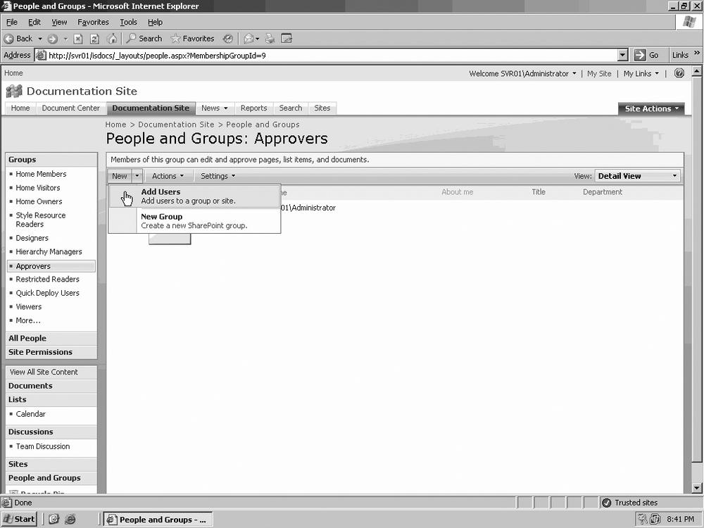
On the Web Part page in the Site Users Web Part under Groups, click the group where you want to add a member, as shown in Figure 8-17.
On the “People and Groups” page, click New and select either Add Users or New Group from the menu, as in Figure 8-18. In this exercise, we will select Add Users.
On the Add Users page in the User/Groups field, add one or more users either by user names, group names, or email addresses, separating each name with a semicolon.
Under Give Permission, use the drop-down menu to select the permission type you want to assign the user or users.
You can also click the “View permissions this group has on sites, lists, and items” link to see the details of this permission type.
Click OK to add the users, as shown in Figure 8-19.

As mentioned at the beginning of this chapter, you can use this Web Part to display XML-formatted data and apply XSLT to style the data prior to showing it.

As with the other Web Parts discussed in this chapter, the XML Web Part possesses a set of unique properties:
- XML Editor
This is a plain-text editor that you can use to write XML code. Knowledge of XML is necessary to use this editor.
- XML Link
This property contains a field where you can enter a hyperlink to a file containing XML content. Valid hypertext protocols are http:// and https://.
- XSL Editor
This is a plain-text editor that you can use to enter XSLT source code. Knowledge of XSLT is required to use this editor.
- XSL Link
This property contains a field where you can enter a hyperlink to a file containing XSLT content. Valid hypertext protocols are http:// and https://.
Using the Source Editors in the XML Web Part is almost the same as using the Source Editor in the Content Editor Web Part, as you can see in XML Web Part. When you click either the XML Editor or XSL Editor buttons, a blank text editor opens, just as in the Content Editor Web Part. You are free to enter the appropriate XML or XSLT content or to use the XML or XSL Links to link to pages containing the relevant content, as shown in Figure 8-20.

As you’ve learned, Web Parts and Web Part pages are the key elements in how content is presented on your MOSS 2007 site and site collection. Individual Web Parts can stand alone or connect to other Web Parts to present a different display of the information contained on the “sending” Web Part. Web Parts can present data forms such as text, HTML, XML, various graphics formats, interactive forms, and many other methods. There is virtually no limit to how data presentation can be modified to fit your needs.