Chapter 3

Data Exploration

Abstract

Data exploration, also known as exploratory data analysis (EDA), provides a set of simple tools to achieve a basic understanding of the data. The results of data exploration can be extremely useful in grasping the structure of the data, the distribution of the values, and the presence of extreme values and interrelationships within the data set. Descriptive statistics is the process of condensing key characteristics of the data set into simple numeric metrics. Some of the common metrics used are mean, standard deviation, and correlation. Visualization is the process of projecting the data, or parts of it, into Cartesian space or into abstract images. In the data mining process, data exploration is leveraged in many different steps including preprocessing, modeling, and interpretation of results.

Keywords

Data exploration; statistics; Cartesian space; mean; standard deviation; variance; correlation; scatter chart; histogram; distribution
The word “data” is derived from Latin word dare, which means “something given”—an observation or a fact about a subject. Data mining helps decipher the hidden relationships within the data. Before venturing into any advanced analysis of the data using statistical, machine learning, and algorithmic techniques, it is essential to perform basic data exploration to study the main characteristics of the data. Data exploration helps us to understand the data better, to prepare the data in a way that makes advanced analysis possible, and sometimes to get the necessary insights from the data faster than using advanced analytical techniques.
Data exploration, also known as exploratory data analysis (EDA), provides a set of simple tools to obtain some basic understanding of the data. The results of data exploration can be extremely powerful in grasping the structure of the data, the distribution of the values, and the presence of extreme values and interrelationships within the data set. Data exploration also provides guidance on applying the right kind of further statistical and data mining treatment to the data. Data exploration tools are a part of standard data analysis software packages from the ubiquitous Microsoft Excel® to advanced data mining software like R, RapidMiner, SAS, IBM SPSS etc. Simple pivot table functions, computing statistics like mean and deviation, and plotting data as a line, bar, and scatter charts are part of data exploration techniques that are used in everyday business setting.
Data exploration can be broadly classified into two types—descriptive statistics and data visualization. Descriptive statistics is the process of condensing key characteristics of the data set into simple numeric metrics. Some of the common metrics used are mean, standard deviation, and correlation. Visualization is the process of projecting the data, or parts of it, into multidimensional space or into abstract images. Data exploration in the context of data mining uses both descriptive statistics and visualization techniques. This chapter serves as a roadmap for exploring and analyzing a data set. The process of structured data exploration reveals much information about the data, which can be used to decide on the next steps for mining the data.

3.1. Objectives of Data Exploration

In the data mining process, data exploration is leveraged in many different steps including preprocessing or data preparation, modeling, and interpretation of the modeling results.
1. Data understanding: With preliminary analysis, data exploration provides a high level overview of each attribute in the data set and interaction between the attributes. Data exploration helps answers the questions like what is the typical value of an attribute, how much the data points differ from the typical value, or are there any outliers in the data set, for example.
2. Data preparation: Before applying the data mining algorithm, we need to prepare the data set for handling of any anomalies that may be present in the data. But first, those anomalies need to be identified, which includes finding outliers, missing values, and removal of duplicate or highly correlated attributes. Some data mining algorithms do not work very well when input attributes are correlated with each other. Thus, correlated attributes need to be identified and removed.
3. Data mining tasks: Basic data exploration can sometime substitute for the entire data mining process. For example, scatterplots can identify clusters in low-dimensional data or can help develop regression or classification models with simple visual rules.
4. Interpreting the results: Finally, data exploration is used in understanding the prediction, classification, and clustering results of the data mining process. In low dimensional clustering, a scatterplot is an efficient way to visualize clusters. Histograms allow for comprehension of the distribution of the attribute and can also be useful for visualizing numeric prediction, error rate estimation, etc.

3.2. Data Sets

Throughout the rest of the chapter and the book we will introduce a few classic data sets that are simple to understand, easy to explain, and can be used commonly across many different data mining techniques, which allows us to compare the performance of these techniques. The most popular of all data sets for data mining is probably the Iris data set, introduced by Ronald Fisher, in his seminal work on discriminant analysis, “The use of multiple measurements in taxonomic problems” (Fisher, 1936). Iris is a flowering plant that is widely found across the world. The genus of Iris contains more than 300 different species. Each species exhibits different physical characteristics like shape and size of the flowers and leaves. The Iris data set contains 150 observations of three different species, Iris setosa, Iris virginica, and Iris versicolor, with 50 observations each. Each observation 
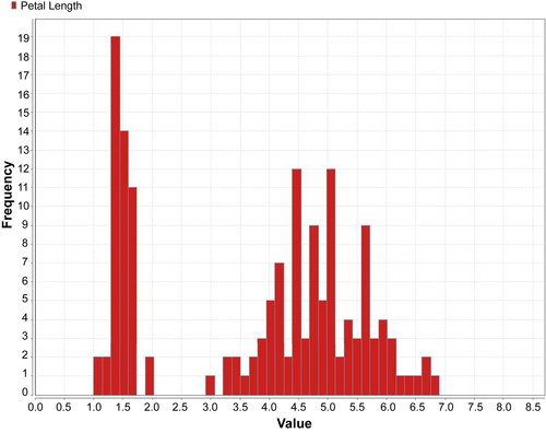
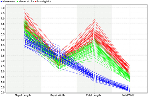
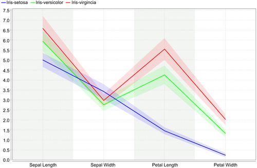
consists of four attributes: sepal length, sepal width, petal length, and petal width. The fifth attribute is the name of the species observed, which takes the values Iris setosa, Iris virginica, and Iris versicolor. Petals are the brightly colored inner part of the flowers and sepals form the outer part of the flower and are usually green in color. In an Iris however, both sepals and petals are purple in color, but can be distinguished from each other by differences in shape (
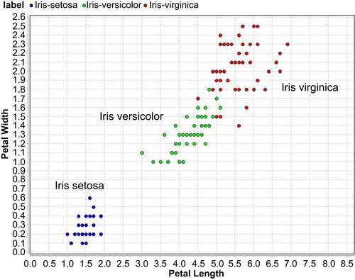
Figure 3.1).
image
Figure 3.1 Iris versicolor. Photo by Danielle Langlois. July 2005 (Image modified from original by marking parts. “Iris versicolor 3.” Licensed under Creative Commons Attribution-Share Alike 3.0 via Wikimedia Commons.1)
All four attributes in the Iris data set are numeric continuous values measured in centimeters. One of the species, 
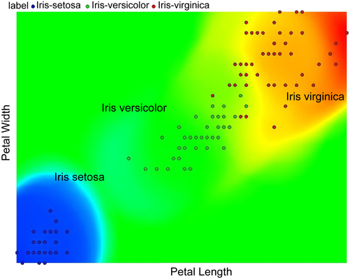
Iris setosa, can be easily distinguished from the other two using linear regression or simple rules, but separating the virginica and versicolor classes requires more complex rules that involve more attributes. The data set is available in all standard data mining tools, such as RapidMiner, or can be downloaded from public websites such as the University of California Irvine – Machine Learning repository2 (Bache & Lichman, 2013). This data set and other data sets used in this book can be downloaded from the companion website www.LearnPredictiveAnalytics.com.
The Iris data set is used for learning data mining mainly because it is simple to understand and explore and can be used to illustrate how different data mining algorithms perform on the same standard data set. The data set extends beyond two dimensions, with three class labels of which one class is easily separable (Iris setosa) by visual exploration, while classifying the other two classes is slightly challenging. It helps to reaffirm the classification results that can be derived based on visual rules, and at the same time sets the stage for data mining to build new rules beyond the limits of visual exploration.

3.2.1. Types of Data

Data comes in different formats and types. Understanding the properties of each variable or features or attributes provides information about what kind of operations can be performed on that variable. For example, the temperature in weather data can be expressed as any of the following formats:
▪ Numeric centigrade (31ºC, 33.3ºC) or Fahrenheit (100ºF, 101.45ºF) or on the Kelvin scale
▪ Ordered label as in Hot, Mild, or Cold
▪ Number of days within a year below 0ºC (10 days in a year below freezing)
All of these attributes indicate temperature in a region, but each has different data type. A few of these data types can be converted from one to another.

Numeric or Continuous

Temperature expressed in centigrade or Fahrenheit is numeric and continuous because it can be denoted by numbers and take an infinite number of values between digits. Values are ordered and calculating the difference between values makes sense. Hence we can apply additive and subtractive mathematical operations and logical comparison operations like greater than, less than, and is equal operations.
An integer is a special form of the numeric data type that doesn’t have decimals in the value or more precisely doesn’t have infinite values between consecutive numbers. Usually, they denote a count of something like number of days with temperature less than 0ºC, number of orders, number of children in a family, etc.
If a zero point is defined, numeric becomes a ratio or real data type. Examples include temperature in Kelvin scale, bank account balance, and income. Along with additive and logical operations, ratio operations can be performed with this data type. Both integer and ratio data types are categorized as a numeric data type in most Data Mining tools.

Categorical or Nominal

Categorical data types are variables treated as distinct symbols or just names. The color of the human iris is a categorical data type because it takes a value like black, green, blue, grey, etc. There is no direct relationship among the data values and hence we cannot apply mathematical operators except the logical or “is equal” operator. They are also called a nominal or polynominal data type, derived from the Latin word for “name.”
An ordered data type is a special case of a categorical data type where there is some kind of order among the values. An example of an ordered data type is credit score when expressed in categories such as poor, average, good, and excellent. People with a good score have a credit rating better than average and an excellent rating is a credit score better than the good rating.
Data types are relevant to understanding more about the data and how the data is sourced. Not all data mining tasks can be performed on all data types. For example, the neural network algorithm does not work with categorical data. However, we can convert data from one data type to another using a type conversion process, but this may be accompanied with possible loss of information. For example, credit scores expressed in poor, average, good, and excellent categories can be converted to either 1, 2, 3, and 4 or average underlying numerical scores like 400, 500, 600, and 700 (scores here are just an example). In this type conversion, there is no loss of information. However, conversion from numeric credit score to categories (poor, average, good, and excellent) does incur some loss of information.

3.3. Descriptive Statistics

Descriptive statistics refers to the study of aggregate quantities such as mean, standard deviation or distributions quantification of the main characteristics of a data set. The descriptive measures increases the understanding of the data set; these measures are some of the commonly used notations in everyday life when we deal with data. Some examples of descriptive statistics include average annual income, median home price in a neighborhood, range of credit scores of a population, etc. In general, descriptive analysis covers the following characteristics of the sample or population data set (Kubiak & Benbow, 2006):
Characteristics of the Data SetMeasurement Technique
Center of the data setMean, median, and mode
Spread of the data setRange, variance, and standard deviation
Shape of the distribution of the data setSymmetry, skewness, and kurtosis
We will explore the definition of these metrics shortly. In a different context, descriptive statistics can be broadly classified into univariate and multivariate exploration depending on number of variables under analysis.

3.3.1. Univariate Exploration

Univariate data exploration denotes analysis of one variable or an attribute at a time. The example Iris data set for one species, Iris setosa, has 50 observations and 4 attributes, as shown in Table 3.1. Let’s explore some of the descriptive statistics for Sepal length variable.

Measure of Central Tendency

The objective of finding the central location of a variable is to quantify the data set with one central or most common number.
Mean: The mean is the arithmetic average of all observations in the data set. It is calculated by summing all the data points and dividing by the number of data points. The mean for sepal length in centimeters is 5.0060.
Median: The median is the value of the central point in the distribution. The median is calculated by sorting all the observations from small to large and selecting the mid-point observation in the sorted list. If the number of data points is even, then the average of the middle two data points is used as the median. The median for sepal length is 5.0000.
Mode: The mode is the most frequently occurring observation. In the data set, data points may be repetitive and the most repetitive data point is the mode of the data set. In this example, the mode is 5.1000.
In a variable, the mean, media, and mode may be different numbers and this indicates the shape of the distribution. If the data set has outliers, the mean will get affected while in most cases the median will not. The mode of the distribution can be different from the mean or median, if the underlying data set has more than one natural normal distribution.

Measure of Spread

In desert regions, it is common for the temperature to cross above 110ºF during the day and drop below 30ºF during the night while the average temperature for a 24-hour period is around 70ºF. Obviously, the experience is not same as living in a tropical region with an average daily temperature around 70ºF, where the temperature is between a more narrow range from 60ºF to 80ºF. What matters here is not just central location of the temperature, but the spread of temperature. There are two common metrics to quantify spread.

Table 3.1

Iris Data Set and Descriptive Statistics (Fisher, 1936)

ObservationSepal LengthSepal WidthPetal LengthPetal Width
15.13.51.40.2
24.93.11.50.1
4953.41.50.2
504.42.91.40.2

image

StatisticsSepal LengthSepal WidthPetal LengthPetal Width
Mean5.0063.4181.4640.244
Median5.0003.4001.5000.200
Mode5.1003.4001.5000.200
Range1.5002.1000.9000.500
Standard Deviation0.3520.3810.1740.107
Variance0.1240.1450.0300.011

image

Range: The range is the difference between the maximum value and the minimum value of the variable. The range is simple to calculate and articulate but has shortcomings as it is severely impacted by the presence of outliers and fails to consider the distribution of all other data points in the attributes, especially the central point. In the above example, the range for the temperature in the desert is 80ºF and the range for the tropics is 20ºF. A desert experiences larger temperature swings as indicated by the range.
Deviation: The variance and standard deviation measure the spread by considering the values of all the data points of the attribute. Deviation is simply measured as the difference between any given value and the mean of the sample (xiμ), where μ is the mean of the distribution and xi is the individual data point. The variance is the sum of the squared deviations of all data points from the average data point divided by the number of data points. Standard deviation is the square root of the variance. For a data set with N observations, the variance is given by Equation 3.1:

Variance=s2=1Ni=1N(xiμ)2

image (3.1)

Since the standard deviation is measured in the same units as the variable, it is easy to understand the magnitude of the metric. High standard deviation means the data points are in general spread widely around the central point. Low standard deviation means data points are closer to the central point. If the distribution of the data aligns with the normal distribution, then 63% of the data points lie within one standard deviation from the mean. Figure 3.2 provides the univariate summary of the Iris data set with all 150 observations, for each of the four numeric attributes.
image
Figure 3.2 Descriptive statistics for the Iris data set.

3.3.2. Multivariate Exploration

Multivariate exploration is the study of more than one attribute in the data set at the same time. This technique is critical to understanding the relationship between the attributes, which is very central to the objectives of Data Mining problems. Like univariate explorations, we will discuss the measure of central tendency and variations in the data.

Central Data Point

In the Iris data set, we can express each data point as a set of all the four attributes:
observation i: {sepal length, sepal width, petal length, petal width}
For example, we have observation 1: {5.1, 3.5, 1.4, 0.2}. This observation point can also be expressed in four-dimensional Cartesian coordinates and can be plotted in a graph (although plotting more than three dimensions in a visual graph can be challenging). In this way, we can express all 150 observations in Cartesian coordinates. If our objective is to find the most “typical” observation point, it would be a data point made up of the mean of each attribute in the data set independently. For the Iris data set shown in Table 3.1, the central mean point is {5.006, 3.418, 1.464, 0.244}. Since we are calculating the mean, this data point may not be an actual observation. It will be a hypothetical data point with the most typical attribute values.

Correlation

Correlation measures the statistical relationship between two variables, particularly dependence of one variable with another variable. When two variables are highly correlated with each other, they both vary at the same rate with each other either in the same or in opposite directions. For example, consider average temperature in a day and ice cream sales. Statistically, the two variables that are correlated are dependent on each other and one may be used to predict the other. If we have sufficient data, we can predict future sales of ice cream if we know the temperature forecast. However, correlation between two variables does not imply causation, that is, one doesn’t necessarily cause other. Ice cream sales and shark attacks are correlated, however there is no causation. Both ice cream sales and shark attacks are influenced by the third variable—the summer season. Generally, ice cream sales sees an increase as temperature rises and more people go to beaches, which cause an increase in encounters with sharks.
Correlation between two attributes is commonly measured by the Pearson correlation coefficient (r), which measures the strength of linear dependence (Figure 3.3). Correlation coefficients take a value from –1 <= r >= 1. A value closer to 1 or –1 indicates the two variables are highly correlated, with perfect correlation at 1 or –1. Perfect correlation exists when the variables are governed by laws of physics, for example, when we observe the values of gravitational force and mass of the object (Newton’s second law) and the price of the product and total sales (price ∗ volume). A correlation value of 0 means there is no linear relationship between two variables.
image
Figure 3.3 Correlation of variables.
The Pearson correlation coefficient between two variables x and y is calculated by the following formula:

rxy=i=1n(xix¯)(yiy¯)i=1n(xix¯)2i=1n(yiy¯)2    =i=1N(xix¯)(yiy¯)NSxSy

image (3.2)

where sx and sy are the standard deviations of random variables x and y, respectively. The correlation coefficient has some limitations in quantifying the strength of correlation. When data sets have more complex nonlinear relationships like quadratic functions, only the effects on linear relationships are considered and quantified using correlation coefficient. The presence of outliers can also skew the measure of correlation. Visually, correlation can be observed using scatterplots of variables in each Cartesian coordinate (Figure 3.3). In fact, visualization should be the first step in understanding correlation because it can identify nonlinear relationships and show any outliers clearly in the data set. Anscombe’s quartet (Anscombe, 1973) clearly illustrates the limitations of relying only on the correlation coefficient (Figure 3.4). The quartet consists of four different data sets, with two variables (x, y). All four data sets have same mean, variance for x and y, and correlation coefficient between x and y, but look drastically different when plotted in the chart. This evidence illustrates the necessity of visualizing the variables instead of just calculating statistical properties.
image
Figure 3.4 Anscombe’s Quartet: descriptive statistics vs. visualization (Anscombe, F. J., 1973. Graphs in Statistical Analysis, American Statistician 27 (1), pp. 19–20.)

3.4. Data Visualization

Visualizing data is one of the most important aspects of data discovery and exploration. Though visualization is not considered a data mining technique, terms like visual mining or pattern discovery based on visuals are increasingly used in the context of data mining, particularly in the business world. The discipline of data visualization encompasses the methods of expressing data in an abstract visual form. The visual representation of data provides easy comprehension of complex data with multiple variables and their underlying relationships. The motivation for data visualization includes:
Comprehension of dense information: A simple visual chart can easily include thousands of data points. By using visuals, the user can see the big picture, as well as longer-term trends that are extremely difficult to interpret purely by expressing data in numbers.
Relationships: Visualizing data in Cartesian coordinates enables exploration of the relationships between the variables. Although representing more than three variables on the x-, y-, and z-axes is not feasible in Cartesian coordinates, there are a few creative solutions available by changing properties like the size, color, and shape of data markers or using flow maps (Tufte, 2001), where more than two attributes are used in a two-dimensional medium.
Vision is the most powerful sense in the human body. As such, it is intimately connected with cognitive thinking (Few, 2006). Human vision is trained to discover patterns and anomalies even in the presence of a large set of data. However the effectiveness of the pattern detection depends on how effectively the information is visually presented. Hence, selecting suitable visuals to explore data is critically important in discovering and comprehending hidden patterns in the data (Ware, 2004). In this chapter, we are categorizing visualization techniques into: Univariate visualization, multi-variate visualization and visualization of large number of variables using parallel dimensions.
We will review some of the common data visualization techniques used to analyze data. Most of these visualization techniques are available in a commercial spreadsheet software like MS Excel (R). RapidMiner, like any other data mining tool, offers a wide range of visualization tools. To maintain consistency with rest of the book, all the following visualization is output from RapidMiner using the Iris data set. If you are new to RapidMiner, we suggest you review Chapter 13 Getting started with RapidMiner.

3.4.1. Visualizing the Frequency Distribution of Data in a Dimension

The visual exploration starts with investigating one attribute at a time using univariate charts. The techniques discussed in this section gives an idea of how the attribute values are distributed and shape of the distribution.

Histogram

A histogram is one of the most basic visual ways to understand the frequency of occurrence of a range of values for one variable. It approximately determines the distribution of the data by plotting the frequency of occurrence in a range. In a histogram, the continuous variable under inquiry takes the horizontal axis and the frequency of occurrence takes the vertical axis. For a continuous, numeric data type we need to specify the range or binning value to group a range of values; for example, in the case of human height in centimeters, all the occurrences between 152.00 and 152.99 are grouped under 152. There is no optimal number of bins or bin width that works for all distributions. In general, if the bin width is too small, the distribution becomes more precise but reveals the noise due to sampling. A general rule of thumb is to have a number of bins equal to the square root or cube root of the number of data points.
image
Figure 3.5 Histogram of petal length in Iris data set.
Histograms are used to find the central location, range, and shape of distribution. In the case of the petal length variable in the Iris data set, we see the data is multimodal (Figure 3.5), where the distribution does not follow the bell curve pattern. Instead, there are two peaks in the distribution. This is due to the fact that we have 150 observations of three different species in the data set. If we sum all the frequencies by ranges, it should sum to 150.
A histogram can be modified to include different classes, in this case species, in order to gain more insight. The enhanced histogram with class labels shows the data set is made of three different distributions (Figure 3.6). Iris setosa’s distribution stands out with a mean around 1.25 and a range from 1 to 2 cm. Iris versicolor and Iris virginica’s distributions overlap Iris setosa’s slightly and have separate means.

Quartile

A box whisker plot is a simple visual way of showing the distribution of a continuous variable with information such as quartiles, median, and outliers, in some cases overlaid by mean and standard deviation. The main attraction of box whisker or quartile charts is that we can compare multiple distributions side by side and deduce the overlap between them. Quartiles are denoted by Q1, Q2, and Q3 points, which indicate the data points with 25% bin size. In a distribution, 25% of the data points will be below Q1, 50% will be below Q2, and 75% will be below Q3.
image
Figure 3.6 Class-stratified histogram of petal length in Iris data set.
The Q1 and Q3 points in a box whisker plot are denoted by the edges of the box. The Q2 point is indicated by a cross line within the box. Q2 is also the median of the distribution. Outliers are denoted by circles at the end of the whisker line. In some cases, the mean point is denoted by a solid dot overlay followed by standard deviation as a line overlay.
In Figure 3.7 quartile charts for all four variables of Iris data set are plotted side by side. We can observe petal length has the broadest distribution from the 150 observations and petal width is generally the smallest measurement out of all four variables.
We can also select one variable—petal length—and explore it further using quartile charts by introducing a class variable. In the plot in Figure 3.8, we can see the distribution of three species for the petal length measurement. Similar to the previous comparison, the distribution of multiple species can be compared.
image
Figure 3.7 Quartile plot of Iris data set.
image
Figure 3.8 Class-stratified quartile plot of petal length in Iris data set.

Distribution Chart

For continuous numeric variables like petal length, instead of visualizing the actual data in the sample, we can instead visualize its normal distribution function. The normal distribution function of a continuous random variable is given by the formula
image
Figure 3.9 Distribution of petal length in Iris data set.

f(x)=12πσe(xμ)22σ2

image (3.3)

where μimage is the mean of the distribution and σimage is the standard deviation of the distribution. Here we are making an inherent assumption that the measurements of petal length (or any continuous variable) follow the normal distribution and hence we can visualize its distribution instead of actual values. The normal distribution is also called the Gaussian distribution or “bell curve” for the attribute due to its bell shape. The normal distribution function tells the probability of occurrence of a data point within a range. If a data set exhibits normal distribution, then 68.2% of data points fall within one standard deviation from the mean. 95.4% of the points fall within 2σimage and 99.7% within 3σimage of the mean. When the normal distribution curves are stratified by class type, we can gain more insight into the data. Figure 3.9 shows the normal distribution curves for petal length measurement for each Iris species type. From the distribution chart, we can infer the petal length for Iris setosa sample is more distinct and cohesive than Iris versicolor and Iris virginica. If we get an unlabeled measurement with a petal length of 1.5 centimeter, we can predict that the species is Iris setosa; if the measurement is 5.0 centimeters, then there is no clear prediction based on petal length, as it could be either Iris Versicolor and Iris virginica.

3.4.2. Visualizing Multiple Variables in Cartesian Coordinates

The multivariate visual exploration considers more than one attribute in the same visual. The techniques discussed in this section focuses on the relationship of one attribute with another attribute. These visualizations examines two to four attributes simultaneously and becomes cumbersome when more than three attributes are studied.

Scatterplot

A scatterplot is one of the most powerful yet simple mathematical plots available. In a scatterplot, the data points are marked in Cartesian space with variables of the data set aligned in coordinates. The variables or dimensions are usually from a continuous data type. The data point itself can be colored to indicate one more variable from the data set. One of the key observations that can be concluded from a scatterplot is the existence of a relationship between two variables under inquiry. If the variables are correlated, then the data points align closer to an imaginary straight line; if they are not correlated, the data points are scattered. Apart from basic correlation, scatterplots can also indicate the existence of patterns or groups of clusters in the data and identify outliers in the data. This is particularly useful for low-dimensional data sets. Chapter 11 Anomaly Detection provides techniques for finding outliers in high-dimensional space, by calculating the distance between data points.
Figure 3.10 shows the scatterplot between petal length (x-axis) and petal width (y-axis). Generally, these two attributes are slightly correlated, because this is a measurement of the same part of the flower. When we color the data markers to indicate different species using class labels, we can observe more patterns. There is a cluster of data points, all belonging to species Iris setosa, on the lower left side of the plot. Iris setosa has much smaller petal length and width. This feature can be used as a rule to predict the species of unknown observations. One of the limitations of scatterplots is that only two variables can be used at a time, with additional variables possibly shown in the color of the data marker (usually reserved for class labels).
image
Figure 3.10 Scatterplot of Iris data set.

Scatter Multiple

A scatter multiple is an enhanced form of a simple scatterplot where more than two dimensions can be included in the chart and studied simultaneously. The primary variable is used for the x-axis coordinate. The secondary axis is shared with more variables or dimensions. In this example (Figure 3.11), the values on the y-axis are shared between sepal length, sepal width, and petal width. The variable information is conveyed by colors used in data markers. Here, sepal length is represented by data points occupying the topmost part of the chart, sepal width occupies the middle portion, and petal width is in the bottom portion. Note that the data points are duplicated for each variable in the y-axis. Data points are color-coded for each dimension in y-axis and the x-axis is anchored with one variable—petal length. Even though a scatter multiple plot allows for investigation of multiple dimensions, only two variables can be compared at a time, one of which one is on the primary axis.

Scatter Matrix

A scatter multiple enables comparison of more than two variables via scatterplot. But, the comparison is always with a primary variable and the relationship between two variables used on the y-axis is not very visible. If the data set has more variables, it is important to look at combinations of all variables through a scatterplot. A scatter matrix solves this need by comparing all combinations of variables with individual scatterplots and arranging these plots in a matrix.
image
Figure 3.11 Scatter multiple plot of Iris data set.
A scatter matrix for all four attributes in the Iris data set is shown in Figure 3.12. The color of the data point is used to indicate the species of the flower. Since there are four attributes, there are four rows and four columns, for a total of 16 scatter charts. Charts in the diagonal are a comparison of the variable with itself; hence they are eliminated. Also, the charts below the diagonal are mirror images of the charts above the diagonal. In effect, there are six distinct comparisons in scatter multiples of four variables. Scatter matrices provide an effective visualization of comparative, multivariate, and high-density data displayed in small multiples of the same scatterplots (Tufte, 2001).
image
Figure 3.12 Scatter matrix plot of Iris data set.
image
Figure 3.13 Bubble chart of Iris data set.

Bubble Chart

A bubble chart is a variation of a simple scatterplot with the addition of one more variable, which is used to determine the size of the data point. In the Iris data set, petal length and petal width is used for x- and y-axes and sepal width is used for the size of the data point. The color of the data point is species class label (Figure 3.13).

Density Chart

Density charts are similar to scatterplots, with one more dimension included as background color. The data point can also be colored to visualize one dimension and hence a total of four dimensions can be visualized in a density chart. In the example in Figure 3.14, petal length is used for the x-axis, sepal length for the y-axis, sepal width for the background color, and class label for the data point color.

3.4.3. Visualizing High-Dimensional Data by Projection

Visualizing more than three attributes on a two dimensional medium (like paper, screen) is challenging. We can overcome this limitation by using transformation techniques to project the data points in parallel axis space. In this approach, a Cartesian axis is shared by more than one attribute.
image
Figure 3.14 Density chart of a few variables in the Iris data set.

Parallel Chart

A parallel chart visualizes a data point quite innovatively by transforming or projecting multidimensional data into two-dimensional chart medium. In this chart, every attribute or dimension is linearly arranged in one coordinate (x-axis) and all the measures are arranged in the other coordinate (y-axis). Since the x-axis is multivariant, each data point is represented as a line in a parallel universe.
In the case of the Iris data set, all four attributes are arranged along the x-axis and each observation is represented as a data point. The y-axis represents generic distance and it is “shared” by all these attributes on the x-axis. Hence, parallel charts work only when attributes share a common unit of numerical measure. If there are different units, we can still use parallel charts by normalizing the attribute. This visualization is called a parallel axis because all four attributes are represented in four parallel axes, parallel to the y-axis.
In this chart, a class label is used to color each data line so that we introduce one more dimension into the picture. By observing this parallel chart in Figure 3.15, we notice that there is overlap between the three species on the sepal width attribute. So, sepal width cannot be the metric used to differentiate these three species. However, there is clear separation of species in petal length. No observation of Iris setosa species has a petal length below 2.5 cm and there is very little overlap between the Iris virginica and Iris versicolor species. Visually, just by knowing the petal length of an unknown observation, we can predict the species of the Iris flower. We will check this hypothesis in later chapter on Classification.
image
Figure 3.15 Parallel chart of Iris data set.

Deviation Chart

A deviation chart is very similar to a parallel chart as it has parallel axes for all the attributes on the x-axis. Data points are extended across the dimensions as lines and there is one common y-axis. Instead of plotting all data points, deviation charts only show the mean and standard deviation statistics. For each class, deviation charts show the mean line connecting the mean of each attribute; the standard deviation is shown as the band above and below the mean line. The mean line doesn’t correspond to a data point (line). In a way, information is elegantly displayed and the essence of a parallel chart is maintained.
In Figure 3.16, a deviation chart for the Iris data set is shown with species class label used for color and stratification. We can observe that the petal length is the key differentiator of the species class label because the mean line and the standard deviation bands for the species are well separated.

Andrews Curves

An Andrews plot belongs to a family of visualization techniques where the high-dimensional data is projected into a vector space so that each data point takes the form of a line or curve. In an Andrews plot, each data point X with d dimensions, X = (x1, x2, x3, …, xd), takes the form of a Fourier series:
image
Figure 3.16 Deviation chart of Iris data set

fx(t)=x12+x2sin(t)+x3cos(t)+x4sin(2t)+x5cos(2t)+

image (3.4)

This function is plotted for –π < t < π for each data point. Andrews plots are useful to determine if there are any outliers in the data and to identify potential patterns within the data points (Figure 3.17). If two data points are similar, then the curves for the data points are closer to each other. If curves are far apart and belong to different classes, then we can use the information to classify the data (Garcia-Osorio & Fyfe, 2005).
Many of the charts and visuals discussed in this chapter explore the multivariate relationships within the data set. They form the set of classic data visualizations used for data exploration, post-processing, and understanding data mining models. Some new developments in the area visualization deals with networks and connections within the data objects (Lima, 2011). To better analyze data extracted from graph data, social networks, and integrated applications, connectivity charts are often used. Interactive exploration of data using visualization software provides an essential tool to observe multiple attributes at the same time, but has limitations on the number of attributes used in visualizations. Hence, dimensional reduction using techniques discussed in Chapter 12 Feature Selection can help in visualizing higher-dimensional data.
image
Figure 3.17 Andrews curves of Iris data set.

3.5. Roadmap for Data Exploration

If we have a new data set that has not been investigated before, having a structured way to explore and analyze the data will be helpful. We present here a summary roadmap to inquire about a new data set. Not all steps may be relevant for every data set and the order may need to be adjusted for some sets, so readers are encouraged to view this roadmap as guideline.
1. Organize the data set: Structure the data set with standard rows and columns. Organizing the data set to have objects or instances in rows and dimensions or attributes in columns will be helpful for many data analysis tools. Identify the target or “class label” attribute, if applicable.
2. Find the central point for each attribute: Calculate mean, median, and mode for each attribute and the class label, if applicable. If all three values are very different, it may indicate the presence of an outlier, or a multimodal or non-normal distribution for an attribute.
3. Understand the spread of the attributes: Calculate the standard deviation and range for an attribute. Compare the standard deviation with the mean to understand the spread of the data, along with the max and min data points.
4. Visualize the distribution of each attribute: Develop the histogram and distribution plots for the attributes. Repeat the same for class-stratified histograms and distribution plots, where the plots are either repeated or color-coded for each class.
5. Pivot the data: Sometimes called dimensional slicing, a pivot is helpful to comprehend different values of the attributes. This technique can stratify by class and drill down to the details of any of the attributes. Microsoft Excel® popularized this technique of data analysis for general business users.
6. Watch out for outliers: Use scatter plot or Quartiles to find outliers. The presence of outliers skews some measures like mean, variance, and range. Based on the application, outliers can be excluded when rerunning data analysis. Notice if the results change. Identifying the outlier may be the objective in some applications.
7. Understanding the relationship between attributes: Measure the correlation between attributes and develop a correlation matrix. Notice what attributes are dependent with each other and investigate why they are dependent.
8. Visualize the relationship between attributes: Plot a quick scatter matrix to discover the relationship between multiple attributes at once. Zoom in on the attribute pairs with simple two-dimensional scatterplots stratified by class.
9. Visualization high-dimensional data sets: Create parallel charts and Andrews curves to observe the class differences exhibited by each attribute. Deviation charts provide a quick assessment of the spread of each class for each attribute.

References

Anscombe F.J. Graphs in Statistical Analysis. American Statistician. 1973;27(1):17–21.

Bache K, Lichman M. University of California, School of Information and Computer Science. 2013 Retrieved from UCI Machine Learning Repository. http://archive.ics.uci.edu/ml.

Few S. Information Dashboard Design: The Effective Visual Communication of Data. O’Reilly Media; 2006.

Fisher R.A. The use of multiple measurements in taxonomic problems. Annals of Human Genetics. 1936;7:179–188. doi: 10.1111/j.1469-1809.1936.tb02137.x.

Garcia-Osorio C, Fyfe C. Visualization of High-Dimensional Data via Orthogonal Curves. Journal of Universal Computer Science. 2005;11(11):1806–1819.

Kubiak T, Benbow D.W. The Certified Six Sigma Black Belt Handbook. Milwaukee, WI: ASQ Quality Press; 2006.

Lima M. Visual Complexity: Mapping Patterns of Information. New York: Princeton Architectural Press; 2011.

Tufte E.R. The Visual Display of Quantitative Information. Cheshire, CT: Graphics Press; 2001.

Ware C. Information Visualization: Perception for Design. Waltham, MA: Morgan Kaufmann; 2004.

..................Content has been hidden....................

You can't read the all page of ebook, please click here login for view all page.
Reset