
Chapter 8
Model Evaluation
Abstract
This chapter describes three commonly used tools for evaluating the performance of a classification algorithm. We first introduce the confusion matrix and provide the definitions for several terms that are used in conjunction, such as sensitivity, specificity, recall, etc. We then describe how to construct receiver operating characteristic (ROC) curves and show when it would be appropriate to use them along with the area under the curve (AUC) concept. Finally we present lift and gain charts, and show how to construct and interpret them. The RapidMiner implementation includes step-by-step processes for building each of these three very useful evaluation tools.
Keywords
Model evaluation; classification performance; accuracy; precision; recall; sensitivity; specificity; ROC curve; lift chartsIn this chapter we will formally introduce the most commonly used methods for testing the quality of a predictive model. Throughout this book, we have used various “validation” techniques to split the available data into a training set and a testing set. We have used several different types of “performance” operators in RapidMiner in conjunction with validation without really explaining in detail how these operators function. We will now discuss several ways in which predictive models are evaluated for their performance.
There are three main tools that are available to test a classification model’s quality: confusion matricies (or truth tables), lift charts, and ROC (receiver operator characteristic) curves. We will define and describe in detail how these tools are constructed and demonstrate how to implement performance evaluations using RapidMiner. To evaluate a numeric prediction from a regression model, there are many conventional statistical tests that may be applied (Black, 2008) which was discussed in Chapter 5 Regression Methods.
8.1. Confusion Matrix (or Truth Table)
Classification performance is best described by an aptly named tool called the confusion matrix. Understanding the confusion matrix requires becoming familiar with several definitions. But before introducing the definitions, we must look at a basic confusion matrix for a binary or binomial classification where there can be two classes (say, Y or N). The accuracy of classification of a specific example can be viewed one of four possible ways:
▪ The predicted class is Y, and the actual class is also Y → this is a “True Positive” or TP
▪ The predicted class is Y, and the actual class is N → this is a “False Positive” or FP
▪ The predicted class is N, and the actual class is Y → this is a “False Negative” or FN
▪ The predicted class is N, and the actual class is also N → this is a “True Negative” or TN
A basic confusion matrix is traditionally arranged as a 2 x 2 matrix as shown in Table 8.1. The predicted classes are arranged horizontally in rows and the actual classes are arranged vertically in columns, although sometimes this order is reversed (Kohavi & Provost, 1998). (Note: We will follow the convention used by RapidMiner and lay out the predicted classes row-wise as shown in Table 8.1.) A quick way to examine this matrix or a “truth table” as it is also called is to scan the diagonal from top left to bottom right. An ideal classification performance would only have entries along this main diagonal and the off-diagonal elements would be zero.
These four cases will now be used to introduce several commonly used terms for understanding and explaining classification performance. As mentioned earlier, a perfect classifier will have no entries for FP and FN (i.e., the number of FP = number of FN = 0).
Sensitivity is the ability of a classifier to select all the cases that need to be selected. A perfect classifier will select all the actual Y’s and will not miss any actual Y’s. In other words it will have no false negatives. In reality, any classifier will miss some true Y’s and thus have some false negatives. Sensitivity is expressed as a ratio (or percentage) calculated as follows: TP/(TP + FN). However, sensitivity alone is not sufficient to evaluate a classifier. In situations such as credit card fraud, where rates are typically around 0.1%, an ordinary classifier may be able to show sensitivity of 99.9% by picking nearly all the cases as legitimate transactions or TP. We also need the ability to detect illegitimate or fraudulent transactions, the TNs. This is where the next measure, specificity, which ignores TPs, comes in.

Specificity is the ability of a classifier to reject all the cases that need to be rejected. A perfect classifier will reject all the actual N’s and will not deliver any unexpected results. In other words, it will have no false positives. In reality, any classifier will select some cases that need to be rejected and thus have some false positives. Specificity is expressed as a ratio (or percentage) calculated as follows: TN/(TN+FP).
Relevance is a term that is easy to understand in a document search and retrieval scenario. Suppose you run a search for a specific term and that search returns 100 documents. Of these, let us say only 70 were useful because they were relevant to your search. Furthermore, the search actually missed out on an additional 40 documents that could have been actually useful to you. With this context, we can define additional terms.
Precision is defined as the proportion of cases found that were actually relevant. For the above example, this number was 70 and thus the precision is 70/100 or 70%. The 70 documents were TP, whereas the remaining 30 were FP. Therefore precision is TP/(TP+FP).
Recall is defined as the proportion of the relevant cases that were actually found among all the relevant cases. Again with the above example, only 70 of the total 110 (= 70 found + 40 missed) relevant cases were actually found, thus giving a recall of 70/110 = 63.63%. You can see that recall is the same as sensitivity, because recall is also given by TP/(TP+FN).
Accuracy is defined as the ability of the classifier to select all cases that need to be selected and reject all cases that need to be rejected. For a classifier with 100% accuracy, this would imply that FN = FP = 0. Note that in the document search example, we have not indicated the TN, as this could be really large. Accuracy is given by (TP+TN)/(TP+FP+TN+FN).
Table 8.2
| Term | Definition | Calculation |
| Sensitivity | Ability to select what needs to be selected | TP/(TP+FN) |
| Specificity | Ability to reject what needs to be rejected | TN/(TN+FP) |
| Precision | Proportion of cases found that were relevant | TP/(TP+FP) |
| Recall | Proportion of all relevant cases that were found | TP/(TP+FN) |
| Accuracy | Aggregate measure of classifier performance | (TP+TN)/(TP+TN+FP+FN) |
Table 8.2 summarizes all the major definitions. Fortunately, the analyst does not need to memorize these equations because their calculations are always automated in any tool of choice. However, it is important to have a good fundamental understanding of these terms.
8.2. Receiver Operator Characteristic (ROC) Curves and Area under the Curve (AUC)
Measures like accuracy or precision are essentially aggregate in nature, in the sense that they provide the average performance of the classifier on the data set. A classifier can have a very high accuracy on a data set, but have very poor class recall and precision. Clearly, a model to detect fraud is no good if its ability to detect TP for the fraud = yes class (and thereby its class recall) is low. It is therefore quite useful to look at measures that compare different metrics to see if there is a situation for a trade-off: for example, can we sacrifice a little overall accuracy to gain a lot more improvement in class recall? One can examine a model’s rate of detecting TPs and contrast it with its ability to detect FPs. The receiver operator characteristic (ROC) curves meet this need and were originally developed in the field of signal detection (Green, 1966). A ROC curve is created by plotting the fraction of true positives (TP rate) versus the fraction of false positives (FP rate). When we generate a table of such values, we can plot the FP rate on the horizontal axis and the TP rate (same as sensitivity or recall) on the vertical axis. The FP can also be expressed as (1 – specificity) or TN rate.
Consider a classifier that could predict if a website visitor is likely to click on a banner ad: the model would be most likely built using historic click-through rates based on pages visited, time spent on certain pages, and other characteristics of site visitors. In order to evaluate the performance of this model on test data, we can generate a table such as the one shown in Table 8.3.
The first column “Actual Class” consists of the actual class for a particular example (in this case a website visitor, who has clicked on the banner ad). The next column, “Predicted Class” is the model prediction and the third column, “Confidence of response” is the confidence of this prediction. In order to create a ROC chart, we need to sort the predicted data in decreasing order of this confidence level, which has been done in this case. Comparing columns Actual class and Predicted class, we can identify the type of prediction: for instance, spreadsheet rows 2 through 5 are all true positives (TP) and row 6 is the first instance of a false positive (FP). As observed in columns “Number of TP” and “Number of FP”, we can keep a running count of the TPs and FPs and also calculate the fraction of TPs and FPs, which are shown in columns “Fraction of TP” and “Fraction of FP”.
Table 8.3
Classifier Performance Data Needed for Building an Roc Curve
| Actual Class | Predicted Class | Confidence of “response” | Type? | Number of TP | Number of FP | Fraction of FP | Fraction of TP |
| response | response | 0.902 | TP | 1 | 0 | 0 | 0.167 |
| response | response | 0.896 | TP | 2 | 0 | 0 | 0.333 |
| response | response | 0.834 | TP | 3 | 0 | 0 | 0.500 |
| response | response | 0.741 | TP | 4 | 0 | 0 | 0.667 |
| no response | response | 0.686 | FP | 4 | 1 | 0.25 | 0.667 |
| response | response | 0.616 | TP | 5 | 1 | 0.25 | 0.833 |
| response | response | 0.609 | TP | 6 | 1 | 0.25 | 1 |
| no response | response | 0.576 | FP | 6 | 2 | 0.5 | 1 |
| no response | response | 0.542 | FP | 6 | 3 | 0.75 | 1 |
| no response | response | 0.530 | FP | 6 | 4 | 1 | 1 |
| no response | no response | 0.440 | TN | 6 | 4 | 1 | 1 |
| no response | no response | 0.428 | TN | 6 | 4 | 1 | 1 |
| no response | no response | 0.393 | TN | 6 | 4 | 1 | 1 |
| no response | no response | 0.313 | TN | 6 | 4 | 1 | 1 |
| no response | no response | 0.298 | TN | 6 | 4 | 1 | 1 |
| no response | no response | 0.260 | TN | 6 | 4 | 1 | 1 |
| no response | no response | 0.248 | TN | 6 | 4 | 1 | 1 |
| no response | no response | 0.247 | TN | 6 | 4 | 1 | 1 |
| no response | no response | 0.241 | TN | 6 | 4 | 1 | 1 |
| no response | no response | 0.116 | TN | 6 | 4 | 1 | 1 |

Observing the “Number of TP” and “Number of FP” columns, we see that the model has discovered a total of 6 TPs and 4 FPs (the remaining 10 examples are all TNs). We also see that the model has identified nearly 67% of all the TPs before it fails and hits its first FP (row 6 above). Finally all TPs have been identified when Fraction of TP = 1) before the next FP was run into. If we were to now plot Fraction of FP (False Positive Rate) versus Fraction of TP (True Positive Rate), then we would see a ROC chart similar to the one shown in Figure 8.1. Clearly an ideal classifier would have an accuracy of 100% (and thus would have identified 100% of all TPs). Thus the ROC for an ideal classifier would look like the thick curve shown in Figure 8.1. Finally a very ordinary or random classifier (which has only a 50% accuracy) would possibly find one FP for every TP and thus look like the 45-degree line shown.

As the number of test examples becomes larger, the ROC curve will become smoother: the random classifier will simply look like a straight line drawn between the points (0,0) and (1,1)— the stair steps become very small. The area under this curve is basically the area of a right triangle (with side 1 unit and height 1 unit), which is 0.5. This quantity is termed area under the curve (AUC). AUC for the ideal classifier is 1.0. Thus the performance of a classifier can also be quantified by its AUC: obviously any AUC higher than 0.5 is better than random and the closer it is to 1.0, the better the performance. A common rule of thumb is to select those classifiers that not only have a ROC curve that is closest to ideal, but also an AUC higher than 0.8. Typical uses for AUC and ROC curves are to compare the performance of different classification algorithms for the same dataset.
8.3. Lift Curves
Lift curves or lift charts were first deployed in direct marketing where the problem was to identify if a particular prospect was worth calling or sending an advertisement by mail. We mentioned in the use case at the beginning of this chapter that with a predictive model, one can score a list of prospects by their propensity to respond to an ad campaign. When we sort the prospects by this score (by the decreasing order of their propensity to respond), we now end up with a mechanism to systematically select the most valuable prospects right at the beginning and thus maximize our return. Thus, rather than mailing out the ads to a random group of prospects, we can now send our ads to the first batch of “most likely responders,” followed by the next batch and so on.
Without classification, the “most likely responders” are distributed randomly throughout the data set. Let us suppose we have a data set of 200 prospects and it contains a total of 40 responders or TPs. If we break up the data set into, say, 10 equal sized batches (called deciles), the likelihood of finding TPs in each batch is also 20%, that is, four samples in each decile will be TPs. However, when we use a predictive model to classify our prospects, a good model will tend to pull these “most likely responders” into the top few deciles. Thus we might find in our simple example that the first two deciles will have all 40 TPs and the remaining eight deciles have none.
Lift charts were developed to demonstrate this in a graphical way (Rud, 2000). The focus is again on the true positives and thus it can be argued that they indicate the sensitivity of the model unlike ROC curves, which can show the relation between sensitivity and specificity.
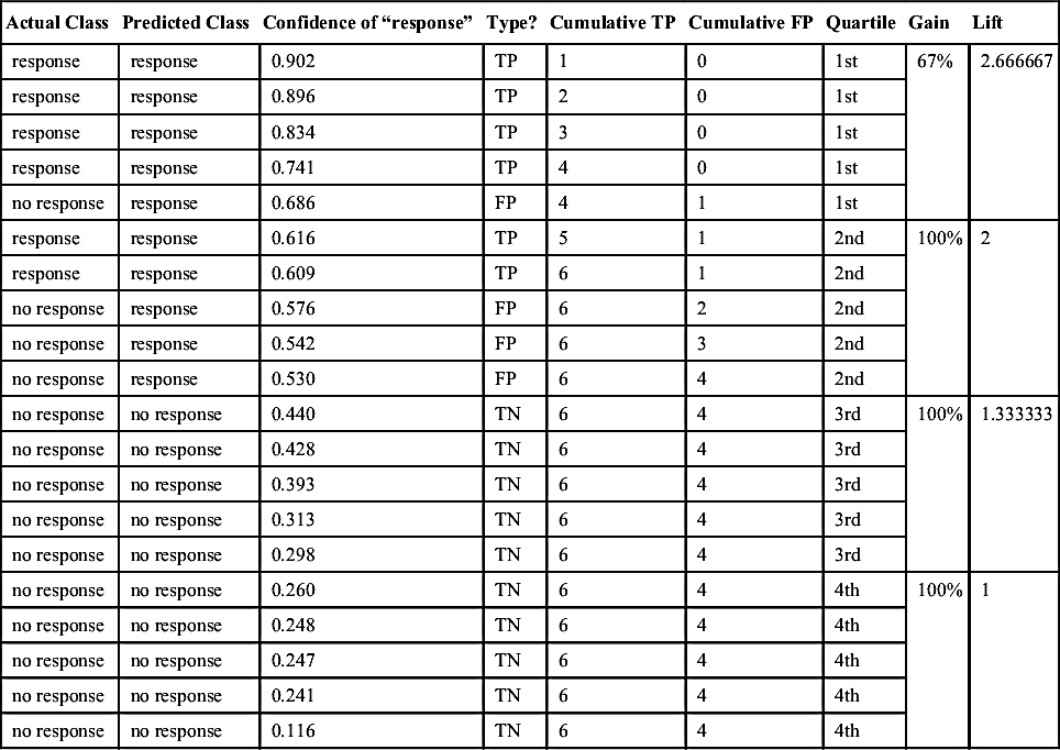
The basis for building lift charts is the following: randomly selecting x% of the data (for prospects to call) would yield x% of targets (to call or not). Lift is the improvement over this random selection that a predictive model can potentially yield because of its scoring or ranking ability. For example in our earlier data from Table 8.3, there are a total of 6 TPs out of 20 test cases. If we were to take the unscored data and randomly select 25% of the examples, we could expect 25% of them to be TPs (or 25% of 6 = 1.5). However, scoring and reordering the data set by confidence will improve this. As can be seen in Table 8.4, the first 25% or quartile of scored (reordered) data now contains four TPs. This translates to a “lift” of 4/1.5 = 2.67. Similarly the second quartile of the unscored data can be expected to contain 50% (or three) of the TPs. As seen in Table 8.4, the scored 50% data contains all six TPs, giving a lift of 6/3 = 2.00.
The steps to build lift charts are as follows:
1. Generate scores for all the data points (prospects) in the test set using the trained model.
2. Rank the prospects by decreasing score or confidence of “response.”
3. Count the TPs in the first 25% (quartile) of the data set, and then the first 50% (add the next quartile) and so on; see columns “Cumulative TP” and “Quartile” in Table 8.4.
4. Gain at a given quartile level is the ratio of the cumulative number of TPs in that quartile to the total number of TPs in the entire data set (six in the above example). The 1st quartile gain is therefore 4/6 or 67%, the 2nd quartile gain is 6/6 or 100%, and so on.
5. Lift is the ratio of gain to the random expectation at a given quartile level. Remember that random expectation at the xth quartile is x%. In the above example, the random expectation is to find 25% of 6 = 1.5 TPs in the 1st quartile, 50% or 3 TPs in the 2nd quartile, and so on. The corresponding 1st quartile lift is therefore 4/1.5 = 2.667, the 2nd quartile lift is 6/3 = 2.00, and so on.
The corresponding curves for the simple example are shown in Figure 8.2. Typically lift charts are created on deciles not quartiles. We chose quartiles because they helped to illustrate the concept using the small 20-sample test data set. However the logic remains the same for deciles or any other groupings as well.
8.4. Evaluating The Predictions: Implementation
We will use a built-in data set in RapidMiner to demonstrate how all the three classification performances (confusion matrix, ROC/AUC and lift/gain charts) are evaluated. The process shown in Figure 8.3 uses the Generate Direct Mailing Data operator to create a 10,000 record data set. The objective of the modeling (Naïve Bayes used here) is to predict whether a person is likely to respond to a direct mailing campaign or not based on demographic attributes (age, lifestyle, earnings, type of car, family status, and sports affinity).
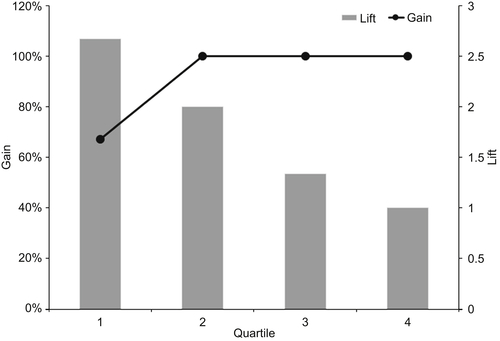
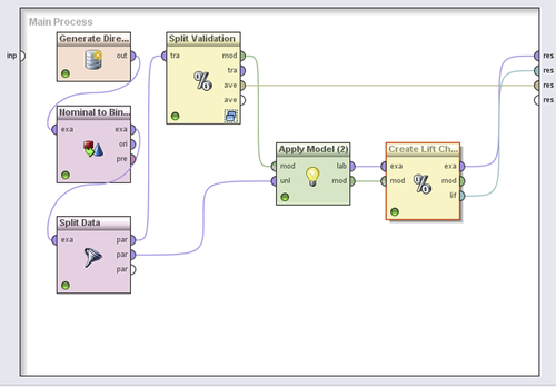
Table 8.4
Scoring predictions and Sorting by Confidences is the basis for generating lift curves
| Actual Class | Predicted Class | Confidence of “response” | Type? | Cumulative TP | Cumulative FP | Quartile | Gain | Lift |
| response | response | 0.902 | TP | 1 | 0 | 1st | 67% | 2.666667 |
| response | response | 0.896 | TP | 2 | 0 | 1st | ||
| response | response | 0.834 | TP | 3 | 0 | 1st | ||
| response | response | 0.741 | TP | 4 | 0 | 1st | ||
| no response | response | 0.686 | FP | 4 | 1 | 1st | ||
| response | response | 0.616 | TP | 5 | 1 | 2nd | 100% | 2 |
| response | response | 0.609 | TP | 6 | 1 | 2nd | ||
| no response | response | 0.576 | FP | 6 | 2 | 2nd | ||
| no response | response | 0.542 | FP | 6 | 3 | 2nd | ||
| no response | response | 0.530 | FP | 6 | 4 | 2nd | ||
| no response | no response | 0.440 | TN | 6 | 4 | 3rd | 100% | 1.333333 |
| no response | no response | 0.428 | TN | 6 | 4 | 3rd | ||
| no response | no response | 0.393 | TN | 6 | 4 | 3rd | ||
| no response | no response | 0.313 | TN | 6 | 4 | 3rd | ||
| no response | no response | 0.298 | TN | 6 | 4 | 3rd | ||
| no response | no response | 0.260 | TN | 6 | 4 | 4th | 100% | 1 |
| no response | no response | 0.248 | TN | 6 | 4 | 4th | ||
| no response | no response | 0.247 | TN | 6 | 4 | 4th | ||
| no response | no response | 0.241 | TN | 6 | 4 | 4th | ||
| no response | no response | 0.116 | TN | 6 | 4 | 4th |
Step 1: Data Preparation
Create a data set with 10,000 examples using the Generate Direct Mailing Data operator by setting a local random seed (default = 1992) to ensure repeatability. Convert the label attribute from polynomial (nominal) to binominal using the appropriate operator as shown. This enables us to select specific binominal classification performance measures.
Split data into two partitions: an 80% partition (8,000 examples) for model building and validation and a 20% partition for testing. An important point of note is that data partitioning is not an exact science and this ratio can change depending upon the data.
Connect the 80% output (upper output port) from the Split Data operator to the Split Validation operator. Select a relative split with a ratio of 0.7 (70% for training) and shuffled sampling.
Step 2: Modeling Operator and Parameters
Insert the naïve Bayes operator in the Training panel of the Split Validation operator and the usual Apply Model operator in the Testing panel. Add a Performance (Binomial Classification) operator. Select the following options in the performance operator: accuracy, false positive, false negative, true positive, true negative, sensitivity, specificity, and AUC.
Step 3: Evaluation
Add another Apply Model operator outside the Split Validation operator and deliver the model to its “mod” input port while connecting the 2,000 example data partition from Step 3 to the “unl” port. Add a Create Lift Chart operator with the following options selected: target class = response, binning type = frequency, and number of bins = 10. Note the port connections as shown in Figure 8.3.
Step 4: Execution and Interpretation
When the above process is run, we will generate the confusion matrix and ROC curve for the validation sample (30% of the original 80% = 2400 examples) whereas we will generate a lift curve for the test sample (2,000 examples). There is no reason why we cannot add another Performance (Binomial Classification) operator for the test sample or create a lift chart for the validation examples. (The reader should try this as an exercise —how will you deliver the output from the Create Lift Chart operator when it is inserted inside the Split Validation operator?)

The confusion matrix shown in Figure 8.4 is used to calculate several common metrics using the definitions from Table 8.1. Compare them with the RapidMiner outputs to verify your understanding.
TP = 629, TN = 1231, FP = 394, FN = 146
| Term | Definition | Calculation |
| Sensitivity | TP/(TP+FN) | 629/(629+146) = 81.16% |
| Specificity | TN/(TN+FP) | 1231/(1231+394) = 75.75% |
| Precision | TP/(TP+FP) | 629/(629+394) = 61.5% |
| Recall | TP/(TP+FN) | 629/(629+146) = 81.16% |
| Accuracy | (TP+TN)/(TP+TN+FP+FN) | (629+1231)/(629+1231+394+146) = 77.5% |
Note that RapidMiner makes a distinction between the two classes while calculating precision and recall. For example, in order to calculate a class recall for “no response,” the positive class becomes “no response” and the corresponding TP is 1231 and corresponding FN is 394. Therefore a class recall for “no response” is 1231/(1231+394) = 75.75% whereas our calculation above assumed that “response” was the positive class. Class recall is an important metric to keep in mind when dealing with highly unbalanced data. Data is considered unbalanced if the proportion of the two classes is skewed. When models are trained on unbalanced data, the resulting class recalls also tend to be skewed. For example, in a data set where there are only 2% responses, the resulting model can have a very high recall for “no responses” but a very low class recall for “responses.” This skew is not seen in the overall model accuracy and using this model on unseen data may result in severe misclassifications.
The solution for this problem is to either balance the training data so that we end up with a more or less equal proportion of classes or to insert penalties or costs on misclassifications using the Metacost operator as discussed in Chapter 5 Regression Methods. Data balancing is explained in more detail in Chapter 13 Getting Started with RapidMiner.

The AUC is shown along with the ROC curve in Figure 8.5. As mentioned earlier, AUC values close to 1 are indicative of a good model. The ROC captures the sorted confidences of a prediction. As long as the prediction is correct for the examples the curve takes one step up (increased TP). If the prediction is wrong the curve takes one step to the right (increased FP). RapidMiner can show two additional AUCs called “optimistic” and “pessimistic.” The differences between the optimistic and pessimistic curves occur when there are examples with the same confidence, but the predictions are sometimes false and sometimes true. The optimistic curve shows the possibility that the correct predictions are chosen first so the curve goes steeper upwards. The pessimistic curve shows the possibility that the wrong predictions are chosen first so the curve increases more gradually.
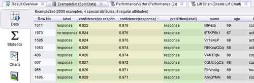
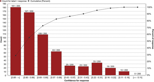
Finally, RapidMiner’s lift chart outputs do not directly indicate the lift values as we demonstrated with the simple example earlier. In step 5 of our process, we selected 10 bins for our chart and thus each bin will have 200 examples (a decile). Recall that to create a lift chart we need to sort all the predictions by the confidence of the positive class (“response”), which is shown in Figure 8.6.
The first bar in the lift chart shown in Figure 8.7 corresponds to the first bin of 200 examples after the sorting. The bar tells us that there are 181 TP in this bin (you can see from the table in Figure 8.6 that the very second example, Row No. 1973, is an FP). From our confusion matrix earlier, we know that there are 629 TPs in this example set. A random classifier would have identified 10% of these or 62.9 TPs in the first 200 examples. Therefore the lift for the first decile is 181/62.9 = 2.87. Similarly the lift for the first two deciles is (181+167)/(2∗62.9) = 2.76 and so on. Also, the first decile contains 181/629 = 28.8% of the TPs, the first two deciles contain (181+167)/629 = 55.3% of the TPs, and so on. This is shown in the cumulative (percent) gains curve on the right hand y-axis of the lift chart output.
As described earlier, a good classifier will accumulate all the TPs in the first few deciles and will have very few FPs at the top of the heap. This will result in a gain curve that quickly rises to the 100% level within the first few deciles.
Conclusion
This chapter covered the basic performance evaluation tools that are typically used in classification methods. We started out by describing the basic elements of a confusion matrix and explored in detail concepts that are important to understanding it, such as sensitivity, specificity, and accuracy. We then described the receiver operator characteristic (ROC) curve, which had its origins in signal detection theory and has now been adopted for data mining, along with the equally useful aggregate metric of area under the curve (AUC). Finally, we described two very useful tools that had their origins in direct marketing applications: lift and gain charts. We discussed how to build these curves in general and how they can be constructed using RapidMiner. In summary, these tools are some of the most commonly used metrics for evaluating predictive models and developing skill and confidence in using these is a prerequisite to developing data mining expertise.
One key to developing good predictive models is to know when to use which measures. As discussed earlier, relying on a single measure like accuracy can be misleading. For highly unbalanced data sets, we rely on several measures such as class recall and specificity in addition to accuracy. ROC curves are frequently used to compare several algorithms side by side. Additionally, just as there are an infinite number of triangular shapes that have the same area, AUC should not be used alone to judge a model—AUC and ROCs should be used in conjunction to rate a model’s performance. Finally, lift and gain charts are most commonly used for scoring applications where we need to rank-order the examples in a data set by their propensity to belong to a particular category.
..................Content has been hidden....................
You can't read the all page of ebook, please click here login for view all page.