
Creating User Controls
User controls enable you to build a user interface component that leverages one or more existing controls, combining them to form a single unit. Creating a user control is as simple as adding a new Silverlight User Control item to your project and adding controls to it using the XAML designer, designing it as you would a view. In fact, as you discovered back in Chapter 3, the MainPage class itself is a user control. Your user control then appears in the Toolbox, where you can drag and drop it into your views as required. You can write logic in the code-behind for the user control, and you can also define properties and events that can be used by the views that consume the user control.
 Workshop: Creating a Simple User Control
Let's create a simple user control that includes a label and a text box together as a single component.
- Add a new item to the
Controlsfolder in your AdventureWorks project, using the Silverlight User Control item template, and name itFormField.xaml - Declare the
sdknamespace prefix in the root element of your XAML file:xmlns:sdk="http://schemas.microsoft.com/winfx/2006/xaml/presentation/sdk" - Lay it out with a
Labelcontrol and aTextBoxcontrol in aGrid, like so:<Grid x:Name="LayoutRoot" Background="White">
<Grid.ColumnDefinitions>
<ColumnDefinition Width="Auto" />
<ColumnDefinition Width="*" />
</Grid.ColumnDefinitions>
<sdk:Label Name="dataLabel" Padding="0,0,5,0" HorizontalAlignment="Right"
Target="{Binding ElementName=dataField}" />
<TextBox Name="dataField" Grid.Column="1"
HorizontalAlignment="Stretch" VerticalAlignment="Center" />
</Grid> - If you set the design size of the user control to
d:DesignWidth = 300,d:DesignHeight = 30, the control in the designer should be as shown in Figure 12-1.
Figure 12-1. The FormField control in the XAML designer
The full XAML for the user control is as follows:
<UserControl x:Class="AdventureWorks.Controls.FormField"

    xmlns="http://schemas.microsoft.com/winfx/2006/xaml/presentation"

    xmlns:x="http://schemas.microsoft.com/winfx/2006/xaml"

    xmlns:d="http://schemas.microsoft.com/expression/blend/2008"

    xmlns:mc="http://schemas.openxmlformats.org/markup-compatibility/2006"
xmlns:sdk="http://schemas.microsoft.com/winfx/2006/xaml/presentation/sdk"
mc:Ignorable="d"
d:DesignHeight="30" d:DesignWidth="300">
<Grid x:Name="LayoutRoot" Background="White">
<Grid.ColumnDefinitions>
<ColumnDefinition Width="120" />
<ColumnDefinition Width="*" />
</Grid.ColumnDefinitions>
<sdk:Label Name="dataLabel" Padding="0,0,5,0"
HorizontalAlignment="Right"
Target="{Binding ElementName=dataField}" />
<TextBox Name="dataField" Grid.Column="1"
HorizontalAlignment="Stretch" VerticalAlignment="Center" />
</Grid>
</UserControl> - Compile your project (this is necessary in order for your user control to appear in the Toolbox).
- Add a new view to the
Viewsfolder in your project, namedTestControlsView.xaml. - Open this view in the designer. You will find that your
FormFielduser control appears in the Toolbox. You can now drag it from the Toolbox and onto the design surface of the TestControlsView view, just as you would any other control. Note that you can't set the label, nor get/set the text in theTextBoxas yet, as we haven't exposed properties from the control enabling this as yet. We'll do that in the next workshop.
 Note The MoXAML Power Toys described back in Chapter 10, provides a feature with which you can select some XAML from the XAML view in the designer and extract it to a user control. This can help you refactor elements of your views into a separate reusable user control. This functionality is built into Expression Blend; select the elements in the designer, right-click, and select Make Control from the context menu.
Exposing Properties Overview
For simple user controls that might simply display a static layout, such as some text, or consume and display some data via their DataContext property, you might not need to add any additional functionality to the control to allow the view consuming the control to interact with it. However, this sort of scenario will only apply to the simplest of controls, and your control will usually need to expose properties, methods, and events to the view that is consuming it.
When you dropped the FormField control (created in the previous workshop) onto the design surface of your view, there was no way to get/set the text in the label or text box. You can enable this by exposing some corresponding properties from the user control: Label and Value. The label will display the string assigned to the Label property, and the text box will display the value assigned to the Value property.
There are two ways to expose a property from a user control:
- As a standard property
- As a dependency property
Both of these are implemented quite differently, and you need to choose the right one based upon how you expect it to be used. Until now, we've avoided talking about dependency properties in depth, but you will find yourself needing them quite often when writing custom controls. We'll look at these in a bit, but first let's look at the somewhat simpler task of implementing standard properties.
Using Standard Properties
You know how to create standard CLR properties, and there's nothing difficult involved. However, when adding properties to a user control, you can choose whether their values will be “pushed” into the control's presentation layer, or whether the control's presentation layer will “pull” (consume) those property's values.
Throughout this book, we've discussed the push and pull mechanisms for populating views with data. Using the push-based model, the code supporting the views needs to know about and have access to the view and its contents. By implementing a pull-based model, taking advantage of XAML's powerful binding features, you enable the code to take a back seat, and simply act as a provider to the view. The view can then take charge of how it's populated, providing a cleaner model where the code-behind simply serves the needs of the view, without actually needing to know anything about the view itself. This concept also applies to creating controls, and is especially applicable to creating custom controls, as you'll discover later in this chapter, in which there is a wider separation between the XAML and the code than for user controls.
Let's take a look at implementing both the “push” and the “pull” methods in a user control.
Note Although your initial urge will probably be to push the data into the control from the code-behind, implementing the pull model will enable a cleaner separation of presentation from behavior and improve the testability of the control.
Properties That Push Their Values into the User Control's Presentation Layer
When creating a standard property on your user control, your initial urge might be to simply push the value into the control from the property's setter. With user controls, this approach probably makes sense, as user controls have little in the way of a clean separation of presentation from behavior. For example, you might implement the Label and Value properties for the FormField control like so:
public string Label

{

    get { return dataLabel.Content.ToString(); }

    set { dataLabel.Content = value; }

}


public string Value
{

    get { return dataField.Text; }

    set { dataField.Text = value; }

}
As you can see, the code-behind is in charge of getting/setting the appropriate control property values in the user control. This works quite satisfactorily, but tightly couples the control's presentation and logic. It may be acceptable to do this in user controls, but when it comes to creating custom controls, which we'll look at later in this chapter, doing so is not generally a good idea. Let's now look at the alternative method, in which the presentation layer consumes the property values instead.
Properties That Are Consumable from the Presentation Layer
We can turn things around, however, and put the presentation in charge of consuming the values of the properties. We simply need to maintain the values of the properties in the code-behind, and notify the presentation layer when their values have changed. The presentation layer will simply bind to these properties.
Workshop: Implementing Standard Properties
In Chapter 7, we discussed how standard properties do not automatically notify bindings when their value has changed. Instead, you need to raise the PropertyChanged event when the property values are updated, which requires the entity/object to implement the INotifyPropertyChanged interface As you will recall, implementing the INotifyPropertyChanged interface enables control property bindings to be aware that the source property's value has changed, and to update the property on the control accordingly.
Likewise, when writing a user control whose presentation layer will bind to its properties, it should implement the INotifyPropertyChanged interface, and any standard property you create on your user control should raise the PropertyChanged event in its setter. Let's implement the Label and Value properties on our control now in this fashion:
- Add the following
usingstatement for theSystem.ComponentModelnamespace to theFormFieldcontrol's code-behind:using System.ComponentModel; - Implement the
INotifyPropertyChangedinterface on the control:public partial class FormField : UserControl, INotifyPropertyChanged
{
public FormField()
{
InitializeComponent();
}
public event PropertyChangedEventHandler PropertyChanged;
protected void OnPropertyChanged(string propertyName)
{
if (PropertyChanged != null)
PropertyChanged(this,new PropertyChangedEventArgs(propertyName));
}
} - Create the properties, and raise the
PropertyChangedevent in their setters:
private string _label = "";
private string _value = "";
public string Label
{
get { return _label; }
set
{
_label = value;
OnPropertyChanged("Label");
}
}
public string Value
{
get { return _value; }
set
{
_value = value;
OnPropertyChanged("Value");
}
}
The code-behind for the FormField user control should now be as follows:
using System.ComponentModel;
using System.Windows.Controls;
namespace AdventureWorks.Controls
{
public partial class FormField : UserControl, INotifyPropertyChanged
{
public FormField()
{
InitializeComponent();
}
private string _label = "";
private string _value = "";
public string Label
{
get { return _label; }
set
{
_label = value;
OnPropertyChanged("Label");
}
}
public string Value
{
get { return _value; }
set
{
_value = value;
OnPropertyChanged("Value");
}
}
public event PropertyChangedEventHandler PropertyChanged;
protected void OnPropertyChanged(string propertyName)
{
if (PropertyChanged != null)
PropertyChanged(this,
                            new PropertyChangedEventArgs(propertyName));

    }

}
}
If you compile your project and return to the TestControlsView.xaml file, you will find that these two properties appear in the XAML IntelliSense and in the Properties window for the control, enabling you to get and set their values. Of course, they don't actually do anything as yet, because the presentation layer for the control isn't bound to them yet. Let's do that now.
Workshop: Consuming the Properties in the Presentation Layer
We have a Label property and a Value property on our FormField control, enabling the view hosting the control to set the label of the control, and get or set the control's value (that is, the text in the text box). However, there is still a missing piece. We also need to connect the control's presentation layer to these properties, and consume their values. We need to bind the Content property of the Label control to the Label property, and the Text property of the TextBox control to the Value property. To do so, we need to use the techniques described in Chapter 11 (see the section “Binding to a Property in the View's Code-Behind”).
- In the XAML for the
FormFieldcontrol, bind the user control'sDataContextproperty to the user control itself:DataContext="{Binding RelativeSource={RelativeSource Self}}" - Bind the
Contentproperty of theLabelcontrol to theLabelproperty you created on the user control:<sdk:Label Name="dataLabel" Padding="0,0,5,0" HorizontalAlignment="Right"
Content="{Binding Label}"
Target="{Binding ElementName=dataField}" /> - Next, bind the
Textproperty of theTextBoxcontrol to theValueproperty you created on the user control:<TextBox Name="dataField" Grid.Column="1"
Text="{Binding Value, Mode=TwoWay}"
HorizontalAlignment="Stretch" VerticalAlignment="Center" />
The complete XAML for the user control is now as follows:
<UserControl x:Class="AdventureWorks.Controls.FormField"
xmlns="http://schemas.microsoft.com/winfx/2006/xaml/presentation"
xmlns:x="http://schemas.microsoft.com/winfx/2006/xaml"
xmlns:d="http://schemas.microsoft.com/expression/blend/2008"
xmlns:mc="http://schemas.openxmlformats.org/markup-compatibility/2006"
xmlns:sdk="http://schemas.microsoft.com/winfx/2006/xaml/presentation/sdk"
mc:Ignorable="d"
d:DesignHeight="30" d:DesignWidth="300"
DataContext="{Binding RelativeSource={RelativeSource Self}}">
<Grid x:Name="LayoutRoot" Background="White">
<Grid.ColumnDefinitions>
<ColumnDefinition Width="120" />
<ColumnDefinition Width="*" />
</Grid.ColumnDefinitions>
<sdk:Label Name="dataLabel" Padding="0,0,5,0" HorizontalAlignment="Right"

           Content="{Binding Label}"

           Target="{Binding ElementName=dataField}" />
<TextBox Name="dataField" Grid.Column="1"

         Text="{Binding Value, Mode=TwoWay}"

         HorizontalAlignment="Stretch" VerticalAlignment="Center" />
</Grid>
</UserControl>
Note The way you bind to the properties in the code for a user control is quite different than the way you do so with custom controls, as you will see later in this chapter.
Assigning the Properties Values in a View That Hosts the User Control
When you drop the FormField control onto a view, you can now assign values to its Label and Value properties, and the control will update its appearance in the XAML designer accordingly:
<my:FormField Label="First Name:" Value="Chris" Width="350" />
However, you're most likely going to want to bind the FormField control's Value property to some data:
<my:FormField Label="Test:" Value="{Binding FirstName}" Width="350" />
If you attempt to do so, though, you will find that an exception is thrown when you run the application. This is because standard properties cannot accept markup expressions, such as a binding, as their value. To accept a markup extension as its value, a property needs to be a dependency property. As this is a fairly normal requirement for properties on controls, it's probably time that we finally take a look at dependency properties in depth.
Using Dependency Properties
When WPF was in development, the team decided that standard CLR properties didn't fully meet the requirements for the new presentation technology they were developing. The standard properties didn't automatically notify any associated bindings when their value was changed, because you needed to implement the INotifyPropertyChanged interface to do so, and more importantly, they needed properties that could self-compute or resolve their value based on a number of external sources, such as a markup extension or value precedence criteria. To achieve these requirements, the WPF team came up with the concept of dependency properties, which have also been adapted to Silverlight, albeit in a slightly limited capacity.
Note They are named dependency properties because the property's value depends on external sources, such as a data binding or a resource.
Why We Need Dependency Properties
Dependency properties are possibly one of the most complex aspects of Silverlight to get your head around, but they are also a fundamental concept that you should understand, even if you aren't planning on creating your own custom controls.
Implementing standard properties on your controls may be acceptable for some properties, but as soon as you need to assign a markup expression to one, you will find that doing so throws an exception when you run your application. You might recall from Chapter 2 that any property you assign a markup extension, such as a data binding expression, must be a dependency property. Markup expressions are evaluated at runtime, so the property needs to recognize that it has been assigned a markup expression and evaluate it.
Assigning a markup extension to a standard property will result in an exception as the XAML engine tries but fails to convert the markup extension to the property's type, such as a string, integer, or Boolean. Dependency properties solve this problem by being able to accept markup extensions as values, and evaluate them at runtime to determine what value the property should use. This is one of the more common scenarios in which dependency properties are required. Another reason is that a property might have multiple sources of values that it should use, such as a style, animation, template, or binding, and it needs to be able to determine which value it should actually use. Dependency properties can accept all these values, and choose which value to use according to value precedence criteria.
Note Many Silverlight and WPF developers overuse dependency properties, mostly because they don't understand when they should and shouldn't be used. As a general rule, you will need to implement dependency properties only on custom controls. If you want to simply notify any bindings bound to a property that its value has changed, you are usually better off creating it as a standard property, implementing the INotifyPropertyChanged interface on the class and raising the PropertyChanged event in the property's setter instead.
Registering a Dependency Property
To declare a dependency property on a class, the first thing you need to ensure is that the class inherits from the DependencyObject class. The unique features of dependency properties are actually provided by this class and, thus, your control needs to inherit from it to enable them. As it is, the classes you will inherit from your control, such as UserControl, Control, and ContentControl, have already inherited from the DependencyObject class, usually a few generations back, and you should rarely need to inherit from the DependencyObject class directly.
The next step is to register your dependency property with the dependency system, using the DependencyProperty.Register method, as demonstrated here:
public static readonly DependencyProperty ValueProperty =

    DependencyProperty.Register("Value", typeof(string), typeof(FormField), null);
As you can see, this looks nothing like a standard CLR property definition. This syntax is rather complicated when you first look at it, so let's break it down into its component parts so that we can make some more sense of it. In this example, we are registering a dependency property named Value on the class. Let's look at the first part:
public static readonly DependencyProperty ValueProperty;
As you can see, we are declaring a field, known as a dependency property identifier, of type
DependencyProperty, which we are naming ValueProperty. This field will be used to reference the property when getting and setting its value. The convention when declaring dependency properties is to suffix the dependency property identifier's name with “Property.” So for a dependency property named Value, you should have a corresponding dependency property identifier named ValueProperty. Note that this field is marked public, static, and readonly, which is required for dependency property declarations.
Let's now take a look at what is being assigned to the ValueProperty dependency property identifier:
DependencyProperty.Register("Value", typeof(string), typeof(FormField), null);
The static Register method on the DependencyProperty class registers the dependency property with the dependency system, returning a DependencyProperty object that we then assign to ValueProperty. To this method we are passing (in order):
- The name of the dependency property:
"Value" - The dependency property's type:
typeof(string) - The type of the class hosting the dependency property (i.e., the name of the user control):
typeof(FormField) - Property metadata, in the form of a
PropertyMetadataobject: In our example, we are simply passing that parameter a value ofnull.(Property metadata will be discussed further shortly.)
Getting and Setting a Dependency Property Value
You might be wondering how this property actually works, since it's declared as a static readonly field. It doesn't actually store the value of the property; the DependencyObject object stores and calculates it instead. When you register a dependency property with the dependency system, you pass the Register method the type of class to host it (the third parameter, typeof(FormField)). The dependency system registers the dependency property with the dependency object, which maintains the value of each dependency property in a Dictionary.
To actually get or set the value of the dependency property, you need to use the GetValue or SetValue method provided by the DependencyObject class passing it the dependency property identifier to get or set the corresponding value for.
For example, to get the value of the ValueProperty dependency property, you would use the following code:
string value = GetValue(ValueProperty).ToString();
Note The GetValue method returns the value as an object, and you therefore need to cast it to the required type.
And to set the value of the ValueProperty dependency property, you would use the following code, where value is a variable containing the value to assign to the dependency property:
SetValue(ValueProperty, value);
Note The GetValue and SetValue methods inherited from the DependencyObject class are public methods and, thus, can be called from both within and outside of the class.
Creating a Standard CLR Property Wrapper
Whether you want to get or set the value of a dependency property from inside or outside the confines of the class, calling the GetValue and SetValue methods on the class is hardly the friendliest means of accessing the property. They're certainly not as friendly as working with standard CLR properties. That's why you will generally see a corresponding (and somewhat friendlier) standard CLR property wrapping these methods for each dependency property on a class, like so:
public string Value

{

    get { return (string)GetValue(ValueProperty); }

    set { SetValue(ValueProperty, value); }

}
Note The XAML parser expects these CLR properties for dependency properties that you want to assign values to in XAML, even if it doesn't always use them, as will be explained shortly. You should use the same name for the standard CLR property as the name that you registered the dependency property with.
Therefore, to assign a value to the dependency property, you can use
valueField.Value = newValue;
instead of
valueField.SetValue(FormField.ValueProperty, newValue);
And to obtain the value of a dependency property, you can use
currentValue = valueField.Value;
instead of
currentValue = valueField.GetValue(FormField.ValueProperty).ToString();
Note There is no need to raise the PropertyChanged event from the INotifyPropertyChanged interface in your CLR property wrapper when the value of the dependency property is updated. As previously stated, one of the benefits of dependency properties is that they automatically support value change notifications, so there is no need to raise this event when the property is a dependency property.
There is a very important point to note when creating standard CLR property wrappers for your dependency properties: you should never add any logic to the getters or setters of these properties as there is no guarantee that this logic will be executed. For example, when you assign a markup extension to a dependency property in XAML, the CLR property wrapper getter and setter are not called. Instead, the runtime interacts directly with the dependency property, via the GetValue and SetValue methods on the class, without the involvement of the standard CLR property wrapper. If you need to perform some logic when the value of the property is modified, you should provide a method to call when the property's value is modified in the dependency property's metadata. You can then add your logic to that method, as described in the next section.
Dependency Property Metadata
In our earlier example, we kept things simple when demonstrating how to register a dependency property, and simply passed null to the DependencyProperty.Register method's PropertyMetadata parameter. In Silverlight, you can configure the following metadata for the dependency property:
- A default value for the property
- A callback method that will be called when the value of the dependency property is modified
These are assigned to a PropertyMetadata object which is then passed to the DependencyProperty.Register method. The constructor of the PropertyMetadata class has a number of overloads, enabling you to use either or both of these values. For the purpose of these examples, we'll just look at the overloads in which each metadata item is passed alone to the constructor.
As a general rule, you shouldn't set the default value of a dependency property in the control's constructor. Instead, you can provide a default value for a dependency property by assigning it in the property's metadata. The following code demonstrates setting a default value of "default" to the property via the PropertyMetadata's constructor, as a parameter:
public static readonly DependencyProperty ValueProperty =

    DependencyProperty.Register("MyProperty", typeof(string), typeof(FormField),

                                new PropertyMetadata("default"));
Note When creating custom controls (discussed later in this chapter), another alternative means of setting the default value of the dependency property is to assign it a value in the style for the control in the Generic.xaml file.
To be notified when the value of the dependency property has changed, pass a callback method to the PropertyMetadata's constructor, like so:
public static readonly DependencyProperty ValueProperty =

    DependencyProperty.Register("Value", typeof(string), typeof(FormField),

           new PropertyMetadata(ValuePropertyChanged));
Also define a corresponding method to be called:
private static void ValuePropertyChanged(DependencyObject d,

                                         DependencyPropertyChangedEventArgs e)

{

    // Insert value changed logic here

}
As you can see, two parameters are passed into this method:
d: The instance of the object for whom the property's value has changede: ADependencyPropertyChangedEventArgsobject containing additional information about the value modification
The DependencyPropertyChangedEventArgs object has three properties: NewValue, OldValue, and Property. The NewValue and OldValue properties are fairly self-explanatory, and the Property property passes the identifier of the dependency property whose value has changed.
Note You might have noticed that this method is static. Therefore, rather than executing the value changed logic in this method, where you have to qualify any member, property, or method access with the object instance passed into the method, it may be worthwhile to call a nonstatic method on the object instance from this method that implements the logic instead.
If you want to obtain the default value of a dependency property, you can get it from the metadata using the GetMetadata method on the dependency property identifier, and passing it the type of the control hosting it. For example:
PropertyMetadata metadata = ValueProperty.GetMetadata(typeof(FormField));

string defaultValue = metadata.DefaultValue.ToString();
Value Precedence
As discussed earlier, the core nature of a dependency property is that its value depends on a number of external sources, and these sources may each have a different value. Therefore, the dependency property needs to determine its value by placing an order of importance on each source, and using the one with the highest importance that also has a value. This order of importance is known as value precedence and is ordered as follows, from highest importance to lowest:
- Animation: If an animation provides the dependency property with a value, it takes precedence over all sources.
- Local value: A specific value has been assigned to a dependency property.
- Template: A control template has been applied to the control and assigns the dependency property a value.
- Style: A style has been applied to the control and assigns the dependency property a value.
- Default value: If none of the preceding sources provide the dependency property with a value, its default value will prevail.
Simplifying Creation of Dependency Properties
As you can see from this discussion about dependency properties, a reasonable amount of code is required to create a dependency property, and initially, attempting to create them can be quite daunting. There is help at hand, however, in the form of property snippets. Visual Studio has the propdp snippet that you can use, although it was designed for use with WPF. The only difference is that you need to change the PropertyMetadata parameter of the Register method from UIPropertyMetadata to PropertyMetadata. If you're not comfortable with this, you can modify the snippet yourself, or you can download and use the Silverlight-specific snippets created by Robby Ingebretsen at http://nerdplusart.com/silverlight-code-snippets. You can use the sldp snippet or the sldpc snippet from his snippet library in place of the propdp snippet. A number of additional Silverlight-specific snippets are included in the library that you might also find useful, such as slvc for creating a value converter, and slevent for creating an event.
Workshop: Creating a Dependency Property
You now know enough about dependency properties to try creating one yourself. Let's replace the standard properties on our FormField control from the previous workshop with dependency properties instead.
- Remove the
INotifyPropertyChangedimplementation from the user control's code-behind, along with theLabelandValueproperties you previously created. You should be left with this code in the class: - Add the following
usingstatement to the top of the file:using System.Windows; - Let's re-create the
Labelproperty as a dependency property. Below the constructor, typepropdp, and press TAB twice. The snippet of code shown in Figure 12-2 will be inserted in its place. This snippet provides the structure required for a dependency property, simply requiring you to fill in the “blanks.”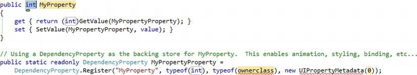
Figure 12-2. The code inserted into a class using the propdp snippet
- The
Labelproperty stores and returns a string, so type instring, overwriting the selected text ofint, and press TAB. - Enter the name of the property (
Label), and press TAB. - Enter the name of the class this dependency property is being added to. (In this case, enter
FormField.) - Press ESC to leave the replacement mode for the snippet.
- Remove the comment (it serves no value), and set the
PropertyMetadataparameter of theRegistermethod tonullinstead ofnew UIPropertyMetadata(0). - Now perform the same steps for the
Valueproperty. Your final code should look like this:using System.Windows;
using System.Windows.Controls;


namespace AdventureWorks.Controls

{

    public partial class FormField : UserControl

    {

        public FormField()
{
InitializeComponent();
}
public string Label
{
get { return (string)GetValue(LabelProperty); }set { SetValue(LabelProperty, value); }
}
public static readonly DependencyProperty LabelProperty =
DependencyProperty.Register("Label", typeof(string),
typeof(FormField), null);
public string Value
{
get { return (string)GetValue(ValueProperty); }
set { SetValue(ValueProperty, value); }
}
public static readonly DependencyProperty ValueProperty =
DependencyProperty.Register("Value", typeof(string),
typeof(FormField), null);
}
} - Recall that when we had only implemented standard properties, assigning binding expressions to the
Label/Valueproperties values in the view that hosted the control threw an exception:<my:FormField Label="Test:" Value="{Binding FirstName}" Width="350" />
However, now that the Value and Label properties are dependency properties, you will now be able to successfully assign a binding expression to them when consuming the FormField control.
Obtaining the Local Value
As per the value precedence order, a local value assigned to a dependency property has a high level of importance in the determination of the dependency property's value. You can determine whether the dependency property has a local value assigned by using the ReadLocalValue method on the dependency object As opposed to the GetValue method, which gets the value of the dependency property based on all its sources and the value precedence, the ReadLocalValue method returns a value only when a local value has been assigned. If no local value is assigned, it will return a value of DependencyProperty.UnsetValue:
object localValue = ReadLocalValue(ValueProperty);


if (localValue == DependencyProperty.UnsetValue)

{

    // No local value has been assigned to this dependency property

    // and it gets its value from other sources

}

else

{

    // This dependency property has a local value

}
Resetting a Dependency Property's Value
At times, you don't want to assign the dependency property a new value but simply want to clear the specific value that you have assigned to it—that is, its local value. This enables it to return to resolving its value from its other sources (template, style, or default) as per the value precedence order. You can use the ClearValue method provided by the DependencyObject class, to clear its value, passing it the dependency property identifier of the dependency property to clear, like so:
ClearValue(ValueProperty);
Dependency Properties in Summary
Dependency properties can be a difficult topic to grasp initially, so here are some of the most important points you need to remember about them:
- Dependency properties are just like other standard CLR properties that you declare on your classes, but they have additional features that extend their utility in the Silverlight environment (or more specifically cater to XAML's demands).
- Dependency properties are needed to support some of Silverlight's advanced features, such as data binding and animation.
- The most important features dependency properties support include evaluating markup extension expressions at runtime, and automatically notifying bound controls when their value changes.
- Although dependency properties are declared as static properties, their values are maintained per object instance, just like standard CLR properties. When you call the
GetValueorSetValuemethods, you are calling them on an object instance. Therefore, the dependency system knows which object instance the value relates to, and can get or set the corresponding value accordingly. - Dependency properties and their values are managed by the dependency system. Therefore, the developer does not need to create a member variable to maintain the property value for the class. Instead, the dependency system maintains these values in a hash table, and you ask it to get or set a property value using the
GetValueorSetValuemethods. - Even though it's not necessary to do so, dependency properties are generally wrapped in standard CLR properties, which call the
GetValueandSetValuemethods, making it easier to get or set their values in code. - These standard CLR property wrappers should not have any logic in their getters and setters.
Type Converters
When you assign the value of a property in XAML, whatever value you give it, you are simply providing that value as a string. However, the XAML parser needs to convert the value from the string that you provided to the property's type before it can assign it to the property.
For a predefined subset of property types (string, integer, Boolean, and so on), this conversion is handled automatically by the XAML parser, and you will immediately be able to set the values of those properties in XAML when you consume the user control in a view. However, only a very limited number of types are actually supported natively by the XAML parser. For example, say you have a control named MyCustomControl, that exposes a property of type decimal:
public decimal TotalCost { get; set; }
and you want to be able to assign this property a value in XAML when you consume the control:
<my:MyCustomControl TotalCost="42" />
The XAML parser doesn't have built-in support for converting the string value of “42” set in XAML to a decimal type that the control's property accepts. Assigning a value to a property whose type isn't supported by the XAML parser like this will result in an exception similar to the following:
Failed to create a 'System.Decimal' from the text '42'.
If you need to expose a property from your control as a type not supported by the XAML parser, such as Decimal or DateTime, and you want to enable that value to be assigned in XAML, you will need to implement a type converter. A type converter is used to provide the logic for converting one type to another.
To create a type converter, you will need to create a new class that inherits from TypeConverter, from the System.ComponentModel namespace, and override its methods (CanConvertFrom, ConvertFrom, CanConvertTo, and ConvertTo), providing them with the appropriate logic.
Note In the previous chapter, we discussed value converters. Value converters can be used as part of the data binding process to completely change the source value to another for use by the target. Type converters are quite similar in nature to value converters, but their role is (generally) only to translate the string values specified in XAML to the type of the control/object properties they are being assigned to.
Let's take a look at the implementation of a simple type converter for the Decimal type:
public class DecimalTypeConverter : TypeConverter

{

    public override bool CanConvertFrom(ITypeDescriptorContext context,

                                        Type sourceType)

    {

        return sourceType == typeof(string);

    }


    public override bool CanConvertTo(ITypeDescriptorContext context,

                                      Type destinationType)

    {

        return destinationType == typeof(string);

    }


    public override object ConvertFrom(ITypeDescriptorContext context,

                       System.Globalization.CultureInfo culture, object value)

    {

        return Convert.ToDecimal(value);

    }
    public override object ConvertTo(ITypeDescriptorContext context,

                                     System.Globalization.CultureInfo culture,

                                     object value, Type destinationType)

    {

        return value.ToString();

    }

}
As you can see, very little logic is actually required, with each method requiring only a single line of code to implement. The CanConvertFrom and CanConvertTo methods determine whether this converter can actually convert between the type being represented (a decimal) and a given type. (Note that type converters don't actually check whether the value itself can be converted.) This given type will always be a string, when solving the problem of converting the value assigned in XAML, so we need to support only a source/destination type of string. Then, in the ConvertFrom and ConvertTo methods, you can perform the actual conversion of the given value to and from a string.
Note You can find a DateTimeTypeConverter and a TimeTypeConverter in the source code for the Silverlight Toolkit. Rather than creating a type converter for each type, another option is provided by Anthony Jones, who has an implementation of a generic type converter that you might wish to use, which you can obtain at http://geekswithblogs.net/codingbloke/archive/2010/05/14/silverlight-iconvertible-typeconverter.aspx.
To use the DecimalTypeConverter type converter, you need to decorate a property in your user control with the TypeConverter attribute, passing it your converter as a parameter. For example:
[TypeConverter(typeof(DecimalTypeConverter))]

public decimal TotalCost { get; set; }
Note XAML has built-in support for enumeration types, so you don't need to implement a type converter for each of those types.
Implementing the ISupportInitialize Interface
If you have logic that is executed when the value of a property is changed, often you won't want this logic to actually be implemented on your user control until all the initial values of its properties have been assigned. This is particularly important when you have properties that are dependent on one another, or whose values need to be set in order.
This is where the ISupportInitialize interface, from the System.ComponentModel namespace, can help. It includes two methods, BeginInit and EndInit, which are called, respectively, before and after the initial values are assigned to the properties from the XAML. This enables you to set a flag, using a member variable, when the BeginInit method is called, and if that flag is set, you can skip any logic in your property setters. You can then reset the flag in the EndInit method, and execute any logic at that point, as required.
Note Markup extensions assigned to dependency properties often won't be evaluated until after the EndInit method is called, so you will not be able to use these values in the logic that you want to execute in the EndInit method.
Exposing Methods
You expose a method from your user control in exactly the same way as you would expose a method publicly from a class. For example:
public void DoSomething()

{

    // Do something here

}
Exposing Events
In Chapter 2, you learned about the concepts of direct events and routed events in Silverlight. In summary, direct events only raise the event on their source, whereas routed events bubble up the event along the object hierarchy until the root visual is reached or a control marks the event as handled.
Note There is no concept of tunneled events in Silverlight as there is in WPF.
You define a direct event on a Silverlight control in exactly the same way as you would in any standard C# application. Simply choose an existing delegate to use, such as the standard or generic EventHandler delegate, or create your own and define your event. The following example demonstrates creating an event named ValueChanged, which simply makes use of the standard EventHandler delegate:
public event EventHandler ValueChanged;
When implementing events in your custom controls, I recommend that you raise your events from a protected virtual method, enabling any controls that inherit from your control to suppress that event and handle it differently. The convention is to name the method with the same name as your event, but prefixed with On. For example:
protected virtual void OnValueChanged()

{

    if (ValueChanged != null)

        ValueChanged(this, new EventArgs());

}
When you want to raise the corresponding event, simply call this method.
Note Remember to always check for any listeners to your event before attempting to raise it, by checking whether it's null, as demonstrated. Otherwise, an exception will be thrown if you attempt to raise it but no one is listening for it.
Unfortunately, you cannot create your own routed events in Silverlight. If you want to provide a routed event on your control, you might wish to take a look at the custom implementation provided in the project, found here at http://sl3routedevents.codeplex.com.
Determining Whether a Control Is Executing in Design-Time or Runtime Mode
One thing that you might not have realized is that when you are viewing the control in the Visual Studio or Expression Blend designer, the control (including its code-behind), is actually being executed from the latest compiled version of your project. This is why you need to compile your project after creating the control for it to appear in the Toolbox. However, sometimes you need to implement a behavior in your control that should be executed at runtime, but not at design time—for example, when communicating with a web service to retrieve data for display.
To determine whether your control is being executed in a designer, you can simply check the value of the IsInDesignTool property of the DesignerProperties class, found in the System.ComponentModel namespace. When true, the control is executing in the Visual Studio or Expression Blend designer; when false, it is executing at runtime within your application.
if (DesignerProperties.IsInDesignTool)

    MessageBox.Show("Is in design-time mode");

else

    MessageBox.Show("Is in runtime mode");
Constraining the User Control's Size
If you want your user control to have a fixed size, handle its SizeChanged event, and set its width and height as required in the handler. For example:
private void UserControl_SizeChanged(object sender, SizeChangedEventArgs e)

{

    this.Width = 300;

    this.Height = 30;

}