
The PivotViewer Control
The PivotViewer control is a neat control that you can use to display data in an innovative and interactive manner, and in some cases, you can even use it in place of reports, letting users pivot and mine data for information. Let's take a look at its features and how you can make use of it in your Silverlight business application.
Key Features of the PivotViewer Control
To understand the control, it's best to look at and play with it in action. The sample code accompanying this chapter (available from the Apress web site) provides a working example that's worth opening if you have it available, but for now, I'll point out its key features in screenshots. Figure 15-7 shows the control displaying product data retrieved from the server.

Figure 15-7. The PivotViewer control displaying filtered data
Each data item, in this case, each product, is shown as a trading card within the control. A trading card is a visual representation of a data item and often consists of a related image. For example, each trading card in the figures demonstrating the PivotViewer control throughout this section display an image of the product that it represents. The control essentially allows you to filter, sort, and group data freely, with the trading cards rearranging and stacking themselves according to how you've filtered, sorted, and grouped the data.
Filtering Data
Note the filter pane on the left side of the control, shown in Figure 15-6. This allows users to filter the data items displayed in the control according to their needs. They can search for items using the search text box at the top of the pane, and they can also filter for items with specific property values for the different filter categories that have been defined. Figure 15-7 demonstrates filtering the items to just those that have a value of Road Bikes, Mountain Bikes, or Mountain Frames for their Subcategory property. The users can filter values across categories if they wish. For numeric and date properties, the user can also filter by range. The trading cards will fly in and out of the control as they are included in or out of the filtered data set.
Sorting Data
Data items can be sorted by selecting a property to sort by from the Sort dropdown menu at the top of the control. Figure 15-8 demonstrates sorting the data items by their List Price property.
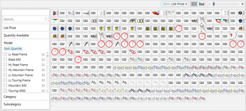
Figure 15-8. The PivotViewer control displaying sorted data
Grouping the Data
Figure 15-9 demonstrates grouping of the data items by their List Price property. Seeing that this was a numeric property, the PivotViewer control automatically divided up the list prices into discrete ranges and stacked the product cards into their corresponding range, with the result looking just like a bar chart. As you can see, the list price of the majority of products that the AdventureWorks store sells is within the range of $0 to $500. You can change the grouping of the data using the Sort drop-down menu at the top of the control (grouping is effectively a form of sorting).
 Note The PivotViewer control also supports grouping by date range and by string values.

Figure 15-9. The PivotViewer control displaying grouped/stacked data
Viewing Details of a Data Item
The PivotViewer control allows you to zoom in and out on the data items. You can zoom using the scroll wheel on your mouse, or by using the zoom slider at the top-right corner of the control. When you zoom in close enough on a data item or select one, the details pane will be shown on the right side of the control, showing details of the item, as shown in Figure 15-10.
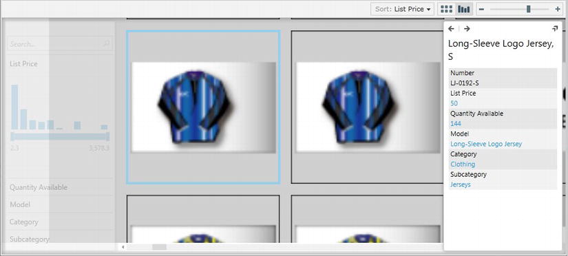
Figure 15-10. The PivotViewer control displaying details of a selected data item
Note You can customize the details pane to suit your needs by defining a control template for it and assigning the template to the PivotViewer control's DetailPaneStyle property. Tony Champion demonstrates this on his blog here: http://tonychampion.net/blog/index.php/2011/10/sl5-pivotviewer-custom-detailpanestyle.
Comparing the Silverlight 4 and Silverlight 5 Versions of the Control
The PivotViewer control was available for you to use with Silverlight 4 as a separate download, but the Silverlight 5 Tools package now comes with it included, as part of the Silverlight Software Development Kit (SDK). The Silverlight 4 version required the data to be provided by the server as a specially structured XML file known as a CXML file (the control could not be populated with data on the client) and did not allow the trading cards to be customized on the client. The Silverlight 5 version removes these limitations and enables the control to be much more customizable. One of the key new features that it provides is the ability to now bind data to its ItemsSource property, just as you would for a DataGrid or ListBox control, allowing you to have much more control over what data it should display and removing a lot of the complexity entailed in creating a CXML file (previously used to populate the control with data) on the server. In addition, the PivotViewer control originally used Deep Zoom to display images downloaded from the server, but the Silverlight 5 version of the control has introduced the ability to use XAML templates to define the trading cards.
Configuring the PivotViewer Control for Use
There are two different means of populating the PivotViewer control with data:
- Server-side data, using a CXML file
- Client-side data, using a collection of objects
Let's look at each of these separately.
Populating the PivotViewer Control with Data from a CXML File
The server-side data method requires the generation of a specially formatted XML file, known as a CXML file, which contains the data used to configure and populate the PivotViewer control. The CXML file defines a set of facets on which the data items can be pivoted (i.e., filtered, sorted, and grouped), and it also contains the data items themselves. Accompanying this CXML file, the server needs to provide the images for each data item as a Deep Zoom collection.
The CXML file can either be pre-generated or just-in-time (JIT) generated. If the data is relatively static, it's best to pre-generate the CXML file, which multiple users can then download. If the data will change between users or individual calls, you will have to generate the CXML as the user requires it.
Microsoft has fairly comprehensively documented the means by which you can generate the CXML file and the associated Deep Zoom collection here: www.silverlight.net/learn/data-networking/ pivot-viewer/collection-tools (this chapter will instead focus on populating the PivotViewer control with client-side data).
One you have the CXML file, you can populate the PivotViewer control with its data by creating an instance of the CxmlCollectionSource class and passing it a URL pointing to the CXML file. You then assign the properties exposed by this object (ItemProperties, ItemTemplates, and Items) to their corresponding properties on the PivotViewer control (PivotProperties, ItemTemplates, and ItemsSource). This will display the data from the CXML file in the control.
Populating the PivotViewer Control with a Collection of Objects
The other way to populate a PivotViewer control is to define pivot properties on the control and bind a collection of objects to the controls' ItemsSource property. The latter option was introduced with the Silverlight 5 version of the PivotViewer control and is an easier and more flexible means of populating the control with data than using a CXML file.
There are three key steps involved in configuring the PivotViewer control for use with client-side data:
- Configure its pivot properties.
- Define the trading cards for each data item.
- Bind its
ItemsSourceproperty to a collection of objects, which will be used as the data items displayed within the PivotViewer control.
Let's look at these steps in a bit more depth.
Defining Pivot Properties
Pivot properties are points that the user can use to “pivot” the data items in the PivotViewer control around (i.e., filter, sort, and group them). Each pivot property has a type, which will determine how it can be pivoted. The following pivot property types are available:
PivotViewerStringPropertyPivotViewerNumericPropertyPivotViewerDateTimePropertyPivotViewerLinkProperty
The following code demonstrates the definition of a string pivot property in XAML. As you can see, you give it a unique ID, a display name, options specifying how the data can be pivoted around this property, and a binding expression that binds the pivot property to a property on the objects in the collection used to populate the control with data.
<sdk:PivotViewerStringProperty Id="Model" DisplayName="Model" Options="CanFilter"

                               Binding="{Binding Model}" />
You then need to assign these pivot properties to the collection exposed by the PivotViewer control's PivotProperties properties:
<sdk:PivotViewer>

    <sdk:PivotViewer.PivotProperties>

        <sdk:PivotViewerStringProperty Id="Category" DisplayName="Category"

                                       Options="CanFilter" Binding="{Binding Category}" />

    </sdk:PivotViewer.PivotProperties>

</sdk:PivotViewer>
NoteCXML files use the term “facets” instead of “pivot properties.”
Customizing the Trading Cards
You define the layout of the trading cards using one or more XAML templates. The PivotViewer control has an ItemTemplates property, to which you can assign one or more PivotViewerItemTemplate templates. The PivotViewerItemTemplate class has a DataType property that enables you to display different trading card templates based on the type of object that the data item is bound to. It also has a MaxWidth property, which allows you to display different templates at different zoom levels. When the width of a trading card exceeds the value assigned to its template's MaxWidth property, the PivotViewer control will then change the item's template to one supporting a larger sized trading card. This capability allows to you completely change the layout and look of the trading card as the user zooms into it if you wish.
The following code demonstrates a very simple item template, simply displaying a text block bound to the data item's Name property:
<sdk:PivotViewer>

    <sdk:PivotViewer.ItemTemplates>

        <sdk:PivotViewerItemTemplate>

            <Border Height="100" Width="100" BorderBrush="Black" BorderThickness="1">

                <TextBlock Text="{Binding Name}" />

            </Border>

        </sdk:PivotViewerItemTemplate>

    </sdk:PivotViewer.ItemTemplates>

</sdk:PivotViewer>
Note Trading cards must have a fixed height and width. Otherwise, the control will crash when attempting to display the items. If you are only defining a single item template to be displayed at all resolutions, it's best to define it at a high resolution so that when users zoom in, the item will still have a crisp and clean appearance.
You might expect that by defining the trading cards' templates in XAML you would be able to make them interactive by adding various controls, such as buttons, to them. However, this is not the case. The PivotViewer control is still a Deep Zoom viewer, and thus the trading cards are rendered to images for use by the control. Therefore, although the controls will appear in the trading card, they will not provide interactivity because they are just part of the trading card's image. If you want the user to be able to interact with a trading card—for example, selecting an item and adding it to a shopping cart—you will need to provide item adorners, which replace custom actions in the Silverlight 4 version of the control. Item adorners are XAML overlays that display on a data item when the mouse is over it, enabling the user to interact with that item. For example, an item adorner might display a button that, when clicked, will execute some logic. To define an item adorner for the trading cards, you simply need to define the XAML for it as a control template and assign it to the PivotViewer control's ItemAdornerStyle. We'll look at how you do this in a workshop shortly.
Populating the PivotViewer Control with Data
Once you have configured the PivotViewer control with pivot properties and trading card templates, you can simply populate the PivotViewer control with data by binding a collection of objects to the control's ItemsSource property.
<sdk:PivotViewer ItemsSource="{Binding ProductCollectionView}" />
Populating the PivotViewer Control with a CXML File or a Collection of Objects
The ability added to the Silverlight 5 version of the PivotViewer control that enables you to populate it with a collection of objects makes the control much easier to implement than generating a CXML file and corresponding Deep Zoom collection on the server. Therefore, you will most likely choose this approach when implementing the PivotViewer control in your Silverlight application. However, the CXML file approach does provide one key benefit that you should consider before automatically taking the collection-based approach. When you want to display large images for data items' trading cards in the PivotViewer control that are located on the server, each of those images would need to be downloaded to the client at their full resolution before the PivotViewer control can display the data when using the collection-based approach. By providing the images as a Deep Zoom collection on the server, the PivotViewer control can progressively download the images at higher resolutions as it requires them, improving the performance of the control greatly. Therefore, take this point into consideration before automatically choosing the collection-based approach by default.
Saving and Restoring the PivotViewer Control's State
You can save the user's filter options, sort options, and zoom state using the PivotViewer control's SerializeViewerState method, like so:
string viewerState = pv.SerializeViewerState();
You can then restore this state (or set a predefined state) using the PivotViewer control's SetViewerState method, like so:
pv.SetViewerState(viewerState);
Uses for the PivotViewer Control
You might want to use the PivotViewer control myriad ways in your Silverlight business application. For example, you might use it to allow users to mine the data in the database in a very flexible manner without resorting to predefined reports. Another possibility is to implement interactive summary lists – giving your users a cool, fun, and flexible way of navigating through the data in the application and drilling down to records.
Finding More Information on the PivotViewer Control
The PivotViewer control can be quite a complex control, and you'll no doubt want some more information about certain aspects of it. Some good additional information can be found at the following web sites and blogs:
www.silverlight.net/learn/data-networking/pivot-viewer/http://xpert360.wordpress.com/2011/05/17/xpert360-pivotviewer-blog-article-index/http://tonychampion.net/blog/index.php/category/silverlight/pivotviewer-silverlight/www.jasonrshaver.com/?tag=/PivotViewerwww.rogernoble.com/tag/pivotviewer/
 Workshop: Implementing the PivotViewer Control
In this workshop, we'll walk through how you can populate the PivotViewer control with a collection of objects.
- Add a new view to your application, and make sure that you can navigate to it (as detailed in Chapter 3).
- Add a reference to the
System.Windows.Controls.Pivot.dllassembly to your Silverlight project. - Add the following namespace prefix declaration to your view:
xmlns:sdk="http://schemas.microsoft.com/winfx/2006/xaml/presentation/sdk" - You need to provide a source of data for the control. Let's populate the control with a collection of
ProductSummaryobjects that we exposed from the server via RIA Services in Chapter 4 and learned how to consume in our Silverlight application in Chapters 5 and 6. We'll use the DomainDataSource control to do so in this workshop:<riaControls:DomainDataSource Name="productSummaryDDS"
AutoLoad="True"
QueryName="GetProductSummaryList"
LoadedData="productSummaryDDS_LoadedData">
<riaControls:DomainDataSource.DomainContext>
<my:ProductSummaryContext />
</riaControls:DomainDataSource.DomainContext>
</riaControls:DomainDataSource> - Define the PivotViewer control in your view and bind its
ItemsSourceproperty to the DomainDataSource control'sDataproperty:<sdk:PivotViewer ItemsSource="{Binding Data, ElementName=productSummaryDDS}">
</sdk:PivotViewer> - Define some pivot properties on the control, and bind them to properties on the
ProductSummaryobjects being returned from the server. Note that the type of pivot property being defined depends on the type of data that it is binding to:<sdk:PivotViewer ItemsSource="{Binding Data, ElementName=productSummaryDDS}">
<sdk:PivotViewer.PivotProperties>
<sdk:PivotViewerStringProperty Id="Name" Options="CanSearchText"
DisplayName="Name" Binding="{Binding Name}" />
<sdk:PivotViewerStringProperty Id="Number" Options="CanSearchText"
DisplayName="Number" Binding="{Binding Number}" />
<sdk:PivotViewerNumericProperty Id="ListPrice" Options="CanFilter"
DisplayName="List Price"
Binding="{Binding ListPrice}" />
<sdk:PivotViewerNumericProperty Id="QuantityAvailable" Options="CanFilter"
DisplayName="Quantity Available"
Binding="{Binding QuantityAvailable}" />
<sdk:PivotViewerStringProperty Id="Model" Options="CanFilter"
DisplayName="Model" Binding="{Binding Model}" />
<sdk:PivotViewerStringProperty Id="Category" Options="CanFilter"
DisplayName="Category"
Binding="{Binding Category}" />
<sdk:PivotViewerStringProperty Id="Subcategory" Options="CanFilter"
DisplayName="Subcategory"
Binding="{Binding Subcategory}" />
</sdk:PivotViewer.PivotProperties>
</sdk:PivotViewer> - Define one or more item templates for the data items' trading cards. To keep this workshop simple, we'll simply display a TextBlock control bound to the
Nameproperty on the source data item object.<sdk:PivotViewer ItemsSource="{Binding Data, ElementName=productSummaryDDS}">
<!--Pivot property definitions excluded for brevity-->
<sdk:PivotViewer.ItemTemplates>
<sdk:PivotViewerItemTemplate>
<Border Height="100" Width="100" BorderBrush="Black" BorderThickness="1">
<TextBlock Text="{Binding Name}" />
</Border>
</sdk:PivotViewerItemTemplate>
</sdk:PivotViewer.ItemTemplates>
</sdk:PivotViewer> Note The code accompanying this chapter, downloadable from the Apress web site, displays an image of each product. However, due to the complexity of the data being returned from the server as GIFs that need to be translated to a format that Silverlight can understand, we'll stick to simply displaying the name of the product here instead. - Run your application. The collection of
ProductSummaryobjects will be retrieved from the server and used to populate the PivotViewer control. You can then pivot the data around the defined pivot properties.
Workshop: Applying an Item Adorner to Trading Cards
In this workshop, we'll define an item adorner to be applied to each trading card, allowing the user to interact with the data in the PivotViewer control. The item adorner will display a button that, when clicked, will simply show a message box displaying the name of the corresponding product.
- The first step is to assign a control template to the PivotViewer control's
ItemAdornerStyleproperty. The following code demonstrates displaying a Button control in the top-right corner of the trading card. You'll also note the use of the Rectangle control. This will highlight the trading card under the mouse by overlaying it with the rectangle filled with a color but containing some opacity so that you can still see through to the trading card underneath.<sdk:PivotViewer ItemsSource="{Binding Data, ElementName=productSummaryDDS}">
<!--Pivot property and item template definitions excluded for brevity-->
<sdk:PivotViewer.ItemAdornerStyle>
<Style TargetType="sdk:PivotViewerItemAdorner">
<Setter Property="Template">
<Setter.Value>
<ControlTemplate TargetType="sdk:PivotViewerItemAdorner">
<Grid>
<Grid.RowDefinitions>
<RowDefinition MaxHeight="40" />
<RowDefinition />
</Grid.RowDefinitions>
<Grid.ColumnDefinitions>
<ColumnDefinition />
<ColumnDefinition Width="2*" MaxWidth="100" />
</Grid.ColumnDefinitions>
<Rectangle Fill="Navy" Opacity="0.5"
Grid.ColumnSpan="2" Grid.RowSpan="2" />
<Button Content="Details" Click="ItemAdornerButton_Click"
Grid.Column="1" Margin="3" />
</Grid>
</ControlTemplate>
</Setter.Value>
</Setter>
</Style>
</sdk:PivotViewer.ItemAdornerStyle>
</sdk:PivotViewer> - We now need to handle the Button control's
Clickevent in the code behind, to which we assigned an event handler in the previous XAML. In this event handler, we'll get a reference to the bound object, and display the product's name in a message box:private void ItemAdornerButton_Click(object sender, System.Windows.RoutedEventArgs e)
{
Button button = sender as Button;
ProductSummary product = button.DataContext as ProductSummary;
MessageBox.Show("Item adorner clicked for the " + product.Name + " product!");
} - Run your application. When you put your mouse over a data item in the PivotViewer control, the item adorner will appear at the top left of the data item. When you click the button, the associated command will be executed, and a message box will display the name of the selected product.