
Creating Custom Controls
An alternative way of creating a reusable control is to create a custom control. Custom controls are structured quite differently than user controls, imposing a much stricter separation of their look (defined in XAML), and their behavior (defined in code). This strict separation between the control's look and behavior enables the controls to be retemplated (have their look completely redefined) when they are used. To enable a custom control to be retemplated, you need to provide a formal contract between them using the parts and states model, as discussed back in Chapter 9.
When you should create a custom control instead of a user control is a difficult line to define. One of the advantages of a custom control is that they are templatable, unlike user controls. Typically, you would use user controls to bring a number of controls together into a single reusable component and, thus, they are not intended to be templated in the same way as custom controls are. Being less structured than custom controls, user controls are easier to create.
Essentially, if you are simply encapsulating some common functionality that is more or less specific to a single project, combining that functionality into a user control is the most appropriate strategy. However, if you want to create a very generic control that you could use in any project, then a custom control is your best choice.
 Note As a general rule, third-party controls are always custom controls.
Let's take a look at creating a control named WaitIndicator, which you can use as an alternative to the BusyIndicator control discussed back in Chapter 6. This will display an animation while something is happening in the background. Figure 12-3 displays the animation.

Figure 12-3. The WaitIndicator control
Note The Silverlight Toolkit is a great resource for helping you understand how to write Silverlight custom controls. It can even provide a great starting point when creating your own controls.
 Workshop: Creating the Base of a Custom Control
Let's create the base of a WaitIndicator custom control.
- Generally, when you create custom controls, you will want to maintain them in a separate project from your main project, as a control library, making it easier to reuse the controls. Start by adding a new Silverlight Class Library project named
MyControlLibraryto your solution. - Delete the default
Class1.csfile so that the project is empty. - Add a new item to your project using the Silverlight Templated Control item template, as opposed to the Silverlight User Control we used earlier to create a user control, and name it
WaitIndicator.
Note At the time of writing, this item template would crash when the PowerCommands extension was installed for Visual Studio. If you experience this problem and have this extension installed, disable it, restart Visual Studio, and the item template should work correctly.
This will create a WaitIndicator.cs file, and it will also automatically create a Themes folder, containing a resource dictionary file named Generic.xaml, which you can see in Figure 12-4.

Figure 12-4. The solution structure for the class library
Note There is no XAML file corresponding to the custom control's code file as there is with user controls. Instead, the default control template (that is, the XAML defining its default look) is defined in the Generic.xaml file.
The Control Structure
Let's take a closer look at the files that were created for us. First, we have the WaitIndicator.cs file, which defines the control and its associated behavior:
using System;

using System.Collections.Generic;

using System.Linq;

using System.Net;

using System.Windows;

using System.Windows.Controls;

using System.Windows.Documents;

using System.Windows.Input;

using System.Windows.Media;

using System.Windows.Media.Animation;

using System.Windows.Shapes;


namespace MyControlLibrary.Controls

{

    public class WaitIndicator : Control

    {

        public WaitIndicator()

        {
            this.DefaultStyleKey = typeof(WaitIndicator);

        }

    }

}
Note that the WaitIndicator class inherits from Control instead of from UserControl, as the user control did. In its constructor, it sets the DefaultStyleKey property in order to link the control's behavior, defined in this class, to its look. I will discuss how this works shortly.
Whereas user controls define their look in a .xaml file, which holds the presentation template for just that control, custom controls define their look in the Generic.xaml resource dictionary file, in the project's Themes folder, as a control template. This Generic.xaml file holds the control templates for all the custom controls in that assembly, each as a separate style resource.
The Silverlight Templated Control item template created this Generic.xaml file for us and defined an empty control template for our control:
<ResourceDictionary

    xmlns="http://schemas.microsoft.com/winfx/2006/xaml/presentation"

    xmlns:x="http://schemas.microsoft.com/winfx/2006/xaml"

    xmlns:local="clr-namespace:MyControlLibrary">


    <Style TargetType="local:WaitIndicator">

        <Setter Property="Template">

            <Setter.Value>

                <ControlTemplate TargetType="local:WaitIndicator">

                    <Border Background="{TemplateBinding Background}"

                          BorderBrush="{TemplateBinding BorderBrush}"

                          BorderThickness="{TemplateBinding BorderThickness}">

                    </Border>

                </ControlTemplate>

            </Setter.Value>

        </Setter>

    </Style>

</ResourceDictionary>
You can then define the look of your control in the control template defined in this style. By default, the control template simply incorporates a border around your control.
Note An important aspect to recognize and understand when designing custom controls is that the behavior is the control itself. The control template defines the visual characteristics of the control, but it can be replaced and switched, with alternative templates applied interchangeably as required. The structure of custom controls promotes a strict separation between its look and its behavior, with a contract on the control defining the interface that a control template must adhere to. The result of this structure is that the behavior will have no knowledge of the contents of the control template apart from what it expects to be available, as defined in its contract. The control templates, however, will know about the control, its contract, and the properties that it exposes. It's this structure that enables a custom control to be retemplated.
When you use a control in your project, it needs to determine what template to use. If one has not been explicitly specified when it is used, it will need to use its default template, if one has been defined. Custom controls know to always look in the Generic.xaml file under the Themes folder for their default control template, and find the correct control template by matching the type applied to the DefaultStyleKey property, which should be set in the control's constructor, as previously demonstrated, to the type assigned to a style resource's TargetType property.
Defining the Control's Default Template
In Chapter 9, we discussed how you can retemplate a custom control to give it a completely new look, and you learned about the parts and states model for controls in Silverlight with the VisualStateManager. You learned that the structure of a control template includes:
- States
- State transitions
- State groups
- Template parts
You use that same breakdown when creating your control template, except you won't have an existing template to work from as you did then because we are now creating the template from scratch. Therefore, you need to break up the visual aspects of your control in order to define each of these in its control template.
Note By structuring your control's default template properly, and keeping a strict separation between its look and behavior, you will make it possible for your control to be completely retemplated when it is being used, as was demonstrated in Chapter 9.
Creating/Editing the Control Template in Expression Blend
The easiest way to create a control template is in Expression Blend. Visual Studio doesn't enable you to modify or even view control templates defined in the Generic.xaml file in the designer, instead only displaying the message shown in Figure 12-5.
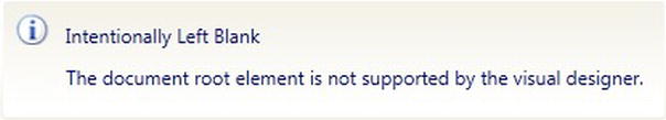
Figure 12-5. The message shown in the XAML designer when opening a ResourceDictionary
Therefore, unless you prefer writing all the XAML by hand, you are better off working in Blend. We won't be discussing how to use Expression Blend to create control templates in any depth here, but let's take a brief look at the basics of getting started doing so.
When you open the Generic.xaml file in Expression Blend, you will get a message stating that the file cannot be edited in design view. However, if you open the Resources tab and expand the Generic.xaml entry, you will see a list of the style resources in the file, and you can click the Edit Resource button next to one in order to view the control template defined in it. To modify this control template, right-click the control in the design view, and select Edit Template  Edit Current from the context menu. You can now define the states, state groups, and state transitions in the States tab, and define the state animations and state transition animations in the Objects and Timeline tab.
Creating the Base State
The best place to start when creating a control template is to simply define the base state for the control, and work from there.
What Is a Base State?
The base state for a control is technically not a state at all, but defines all the visual elements of the control that will be used by each of the states. As a standard practice, the XAML you define here should define the layout and look of the control in its initial (Normal) state.
Any elements/controls that should not be visible in this initial state should have their Visibility property set to Collapsed, or their Opacity property set to 0 (which makes it invisible, but it will still consume its given area).
Workshop: Specifying the Base State
Add the following XAML in bold to the control template that was created for the control in the Generic.xaml file:
<ControlTemplate TargetType="local:WaitIndicator">

    <Border Background="{TemplateBinding Background}"

            BorderBrush="{TemplateBinding BorderBrush}"

            BorderThickness="{TemplateBinding BorderThickness}">

        <Canvas x:Name="LayoutRoot" Opacity="0">

            <Ellipse x:Name="Ellipse1" Fill="#1E777777"

                     Canvas.Left="0" Canvas.Top="11" Height="8" Width="8"/>

            <Ellipse x:Name="Ellipse2" Fill="#1E777777"

                     Canvas.Left="3" Canvas.Top="3" Height="8" Width="8"/>

            <Ellipse x:Name="Ellipse3" Fill="#1E777777"

                     Canvas.Left="11" Canvas.Top="0" Height="8" Width="8"/>

            <Ellipse x:Name="Ellipse4" Fill="#2E777777"

                     Canvas.Left="19" Canvas.Top="3" Height="8" Width="8"/>

            <Ellipse x:Name="Ellipse5" Fill="#3E777777"

                     Canvas.Left="22" Canvas.Top="11" Height="8" Width="8"/>

            <Ellipse x:Name="Ellipse6" Fill="#6D777777"

                     Canvas.Left="19" Canvas.Top="19" Height="8" Width="8"/>

            <Ellipse x:Name="Ellipse7" Fill="#9C777777"

                     Canvas.Left="11" Canvas.Top="22" Height="8" Width="8"/>

            <Ellipse x:Name="Ellipse8" Fill="#CC777777"

                     Canvas.Left="3" Canvas.Top="19" Height="8" Width="8"/>

        </Canvas>

    </Border>

</ControlTemplate>
This XAML defines eight ellipses arranged in a circle, as was shown in Figure 12-3, each with a base color of #777777 (a gray color) but with varying degrees of alpha channel applied in the fill to lighten this color. It's the animation of this Fill property, specifically the alpha value, which will make the wait indicator “spin.” Note that the Canvas in this XAML has its Opacity property set to 0 accordingly, as the control is to be invisible by default.
Identifying Visual States, and Organizing Them into Visual State Groups
As you learned in Chapter 9, each visual state defines how the control should look based on its current state, such as when it has the focus, is clicked, is disabled, and so on. To achieve this, a visual state defines the changes required, implemented as animations, to the base visual appearance of the control to visually indicate that the control is in that state.
For the simplest controls, you might only need to support a single state, in which case this will be your base visual state and no additional states or state groups need be defined in the control's default control template. However, in most cases, your custom control will need to support multiple states, and at times be in more than one state simultaneously.
Let's look at how you go about identifying and grouping these visual states.
Identifying Visual States
Once you've defined the base state for your control, the next step is to identify what states your control needs to support, and whether the control can exist in multiple states simultaneously. Let's use the CheckBox control as an example. A check box has the following states:
NormalMouseOverPressedDisabledCheckedUncheckedIndeterminateFocusedUnfocusedValidInvalid
As you may be able to tell, some of these states are mutually exclusive, such as the checked and unchecked states, whereas others, such as the checked state and the focused state, could simultaneously but independently coexist on the control.
Grouping Visual States into Visual State Groups
If you find there needs to be support for the control to be in more than one state simultaneously, you will need to group the states into named sets, in which the states in each set are mutually exclusive. For example, the CheckBox's states are grouped as follows:
CommonStates:Normal,MouseOver,Pressed, andDisabledCheckStates:Checked,Unchecked, andIndeterminateFocusStates:FocusedandUnfocusedValidationStates:ValidandInvalid
Note In the actual implementation of the CheckBox control, the Invalid state is actually split into InvalidFocused and InvalidUnfocused. However, we'll disregard this for the purposes of simplicity in this discussion.
Each group can have only a single active state at any one time. However, a control may have multiple states active simultaneously (one from each group). Hence, the control can be only in the Focused or the Unfocused state, never both at the same time, but it can, for example, be simultaneously in the Normal, Checked, Focused, and Valid states. These groups are known as visual state groups.
As the control can only have a single active state in a visual state group, when your control transitions to a new state, the visual state manager will first automatically transition the control away from any existing state that it is in within that same state group.
Note Even if you've determined that all the control's states are mutually exclusive, and the control does not need to exist in multiple states simultaneously, you still need to define one state group that will contain the various states you define. In other words, all states must exist within a state group.
Workshop: Defining Visual States and Visual State Groups
Our WaitIndicator control is actually very simple when it comes to its states. Our control will simply display an animation that can be turned on and off. Therefore, as no user interaction or input is involved, there is no need for focus states, mouse-over states, or validation states. This means that the control will need two primary states for use at runtime:
Inactive(invisible and not animating)Active(visible and animated)
We'll also include an additional state named Static, which we'll use only when the control is being displayed in the designer so that the control is visible but not animated, to avoid distracting the designer.
Since each of these states is mutually exclusive, we need only a single state group, which we will call CommonStates. (The convention when defining custom control templates is to have the core control states in a state group with this name.) Let's define this state group and its related states in the control template now.
- Add a
VisualStateManager.VisualStateGroupselement to your control template:<ControlTemplate TargetType="local:WaitIndicator">
<Border Background="{TemplateBinding Background}"
BorderBrush="{TemplateBinding BorderBrush}"
BorderThickness="{TemplateBinding BorderThickness}">
<VisualStateManager.VisualStateGroups>
</VisualStateManager.VisualStateGroups>
<!--XAML for the default/base state of this control goes here-->
<!--as defined earlier. Removed for brevity purposes-->
</Border>
</ControlTemplate> - Add a
VisualStateGroupto theVisualStateManager.VisualStateGroupselement for each visual state group that you've identified. As already discussed, theWaitIndicatorcontrol will only have one visual state group—CommonStates:<VisualStateManager.VisualStateGroups>
<VisualStateGroup x:Name="CommonStates">
</VisualStateGroup>
</VisualStateManager.VisualStateGroups> - Add a
VisualStateelement to the group for each visual state that it should contain, giving each a name:<VisualStateGroup x:Name="CommonStates">
<VisualState x:Name="Inactive">
</VisualState>
<VisualState x:Name="Static" />s
</VisualState>
<VisualState x:Name="Active" />
</VisualState>
</VisualStateGroup>
The full XAML control template that you now have should be as follows:
<ControlTemplate TargetType="local:WaitIndicator">

    <Border Background="{TemplateBinding Background}"

            BorderBrush="{TemplateBinding BorderBrush}"

            BorderThickness="{TemplateBinding BorderThickness}">

        <VisualStateManager.VisualStateGroups>

            <VisualStateGroup x:Name="CommonStates">

                <VisualState x:Name="Inactive">

                </VisualState>


                <VisualState x:Name="Static">

                </VisualState>


                <VisualState x:Name="Active">

                </VisualState>

            </VisualStateGroup>
        </VisualStateManager.VisualStateGroups>


        <Canvas x:Name="LayoutRoot" Opacity="0">

            <Ellipse x:Name="Ellipse1" Fill="#1E777777"

                     Canvas.Left="0" Canvas.Top="11" Height="8" Width="8"/>

            <Ellipse x:Name="Ellipse2" Fill="#1E777777"

                     Canvas.Left="3" Canvas.Top="3" Height="8" Width="8"/>

            <Ellipse x:Name="Ellipse3" Fill="#1E777777"

                     Canvas.Left="11" Canvas.Top="0" Height="8" Width="8"/>

            <Ellipse x:Name="Ellipse4" Fill="#2E777777"

                     Canvas.Left="19" Canvas.Top="3" Height="8" Width="8"/>

            <Ellipse x:Name="Ellipse5" Fill="#3E777777"

                     Canvas.Left="22" Canvas.Top="11" Height="8" Width="8"/>

            <Ellipse x:Name="Ellipse6" Fill="#6D777777"

                     Canvas.Left="19" Canvas.Top="19" Height="8" Width="8"/>

            <Ellipse x:Name="Ellipse7" Fill="#9C777777"

                     Canvas.Left="11" Canvas.Top="22" Height="8" Width="8"/>

            <Ellipse x:Name="Ellipse8" Fill="#CC777777"

                     Canvas.Left="3" Canvas.Top="19" Height="8" Width="8"/>

        </Canvas>

    </Border>

</ControlTemplate>
Implementing the Visual States
We've now defined the visual states for the control, but they don't actually do anything yet. Each visual state now needs to define how the base state will be transformed to visually indicate that the custom control is in that state. This transformation is handled via an animation.
Implementing the “Inactive” Visual State
As a general rule, you should define an initial state in each state group, which will be empty—that is, it makes no modifications to the base state. This will provide a starting point for the control that you can then return to. The initial state for our WaitIndicator control should be the Inactive state, so the base state will be configured as per the requirements for the Inactive state. (Recall that we set the Opacity property of the LayoutRoot to 0 when defining the base state earlier, making the contents of the control invisible.) Therefore, we'll make no changes to the base state in the definition for the Inactive state, and leave it as it is (empty).
<VisualState x:Name="Inactive" />
Workshop: Implementing the “Static” Visual State
The next state we need to implement is the Static state. This will make the ellipses in the wait indicator visible, although we won't animate them in this state. In the base state, we had set the Opacity property of the LayoutRoot to 0, so we need to animate this property to change its value from 0 to 1 over a duration of 0 seconds, resulting in the ellipses immediately becoming visible when we transition to this state.
Add the following animation to the definition of the Static visual state:
<VisualState x:Name="Static">

    <Storyboard>

        <DoubleAnimation Duration="0" To="100"

                         Storyboard.TargetProperty="(UIElement.Opacity)"

                         Storyboard.TargetName="LayoutRoot" />

    </Storyboard>

</VisualState>
As you can see, we use an animation to change the value of the Opacity property of the element named LayoutRoot to 1, via a combination of the Storyboard.TargetName, Storyboard.TargetProperty, and the To property of a DoubleAnimation object. The Duration property for this animation is set to 0 (seconds), so the value of the LayoutRoot's Opacity property will immediately change from 0 (its base value) to 1 (as per the animation). Extending this duration will result in the LayoutRoot object fading into view, because the value of its Opacity property will change linearly from 0 to 1 over the given duration. You could even specify an easing function such that the value changes nonlinearly.
Note As you can see from the XAML, all animations are defined within a Storyboard. Creating these animations and the corresponding XAML is a relatively simple and quick process using Expression Blend. However, coverage of animations in Silverlight is beyond the scope of this book.
Workshop: Implementing the “Active” Visual State
The final state that we need to implement for our WaitIndicator control is the Active state. Like the Static state, we need to make the ellipses visible, but we also need to implement a repeating in-state animation.
While this in-state animation is running, it changes the alpha value of the ellipse's Fill property every 0.15 seconds, and repeats itself every 1.2 seconds. Each ellipse is 0.15 seconds out of phase, which gives the visual illusion of rotation. There are nine values for each ellipse's alpha value, with the first and the last alpha values being the same.
The XAML defining this animation is quite lengthy, so it won't be included here in its entirety, but here is a snippet of the animation for two of the ellipses:
<VisualState x:Name="Active">

    <Storyboard>

        <DoubleAnimation Duration="0" To="100"

                         Storyboard.TargetProperty="(UIElement.Opacity)"

                         Storyboard.TargetName="LayoutRoot" />


        <ColorAnimationUsingKeyFrames

                Storyboard.TargetName="Ellipse1"

                Storyboard.TargetProperty="(Fill).(Color)"

                BeginTime="0" RepeatBehavior="Forever">


          <LinearColorKeyFrame Value="#CC777777" KeyTime="00:00:00" />

          <LinearColorKeyFrame Value="#9C777777" KeyTime="00:00:00.15" />
          <LinearColorKeyFrame Value="#6D777777" KeyTime="00:00:00.3" />

          <LinearColorKeyFrame Value="#3E777777" KeyTime="00:00:00.45" />

          <LinearColorKeyFrame Value="#2E777777" KeyTime="00:00:00.60" />

          <LinearColorKeyFrame Value="#1E777777" KeyTime="00:00:00.75" />

          <LinearColorKeyFrame Value="#1E777777" KeyTime="00:00:00.90" />

          <LinearColorKeyFrame Value="#1E777777" KeyTime="00:00:01.05" />

          <LinearColorKeyFrame Value="#CC777777" KeyTime="00:00:01.20" />

        </ColorAnimationUsingKeyFrames>


        <ColorAnimationUsingKeyFrames

                Storyboard.TargetName="Ellipse2"

                Storyboard.TargetProperty="(Fill).(Color)"

                BeginTime="0" RepeatBehavior="Forever">


          <LinearColorKeyFrame Value="#1E777777" KeyTime="00:00:00" />

          <LinearColorKeyFrame Value="#CC777777" KeyTime="00:00:00.15" />

          <LinearColorKeyFrame Value="#9C777777" KeyTime="00:00:00.3" />

          <LinearColorKeyFrame Value="#6D777777" KeyTime="00:00:00.45" />

          <LinearColorKeyFrame Value="#3E777777" KeyTime="00:00:00.60" />

          <LinearColorKeyFrame Value="#2E777777" KeyTime="00:00:00.75" />

          <LinearColorKeyFrame Value="#1E777777" KeyTime="00:00:00.90" />

          <LinearColorKeyFrame Value="#1E777777" KeyTime="00:00:01.05" />

          <LinearColorKeyFrame Value="#1E777777" KeyTime="00:00:01.20" />

        </ColorAnimationUsingKeyFrames>


        <!--And so on for each ellipse.-->

        <!--Download the full animation from the Apress website-->


    </Storyboard>

</VisualState>
Note how the RepeatBehavior property of the ColorAnimationUsingKeyFrames object is set to Forever. This means that once complete, it will restart continually until the control transitions away from the Active state.
You can download the full code for this control from this book's web site.
Note When you run the control, it won't actually be in one of the states you have defined. Instead, it will be in its base state. Ideally, you want it to be in one of your defined states, so immediately after applying the control template to the control (in the OnApplyTemplate method, described shortly), you should tell the VisualStateManager to go to the initial state within each state group. We'll do this when we implement the code for this control.
Adding State Transition Animations
When you transition from one state to another, you might wish to ease the visual impact of jumping between the states by implementing a transition animation. Using the VisualTransition object, you can specify an animation for how the control should transition between two given states, from any state to a given state, or from a given state to any other state.
There are two ways that you can implement a transition. The first is to let the VisualStateManager determine how it should transition between the two states. You simply specify the duration for the transition and the states you want it to go to and from, and it will work out how to transition between those states smoothly—such as changing colors, opacity, and control positions—over the given duration. In the following example, I define a VisualTransition, specifying that the transition between the Inactive and Active states should be smoothly animated, over the duration of two seconds.
<VisualStateGroup x:Name="CommonStates">

    <VisualStateGroup.Transitions>

        <VisualTransition GeneratedDuration="0:0:2" From="Inactive" To="Active" />

    </VisualStateGroup.Transitions>


    <!--Visual State definitions removed for brevity-->

</VisualStateGroup>
Note You can omit the From property if you want the transition to be applied whenever the control transitions to the state specified by the To property, regardless of what state the control was previously in. Alternatively, you can omit the To property if you want the transition to be applied whenever the control transitions away from the state specified by the From property, regardless of what state the control is changing to.
Alternatively, we can explicitly define our own animation for the transition by adding a Storyboard specifying the transition animation to the VisualTransition element. For example, the following transition consists of an animation that will fade in the control named LayoutRoot. It does so by changing the value of its Opacity property from 0 to 1 over a period of two seconds when transitioning from the Inactive to the Active state:
<VisualTransition GeneratedDuration="0:0:2" From="Inactive" To="Active">

    <Storyboard>

        <DoubleAnimation From="0" To="1"

                         Storyboard.TargetProperty="(UIElement.Opacity)"

                         Storyboard.TargetName="LayoutRoot" />

    </Storyboard>

</VisualTransition>
A state transition might seem like the best place to define the changes that should be made to the base state to get to a given visual state, but this is actually not the case. For example, when our WaitIndicator control transitions to the Static or Active states, the LayoutRoot element needs to become visible. That is, the value of its Opacity property needs to be set to 1. However, a transition is not the place to define the animation to do this, for a number of reasons. Transition animations can be skipped when moving from one state to another, so there's no guarantee that the animation will be executed. More importantly, however, is the fact that any changes made to the control's element's properties are applied only for the duration of the transition. If, for example, you define an animation as per the previous example, where we gradually made the LayoutRoot element visible, as soon as the transition animation is complete, the control will enter the destination state, and the VisualStateManager will apply that state's changes to the base state—not to the changes that were made during the transition. Therefore, unless you set the LayoutRoot element to be visible within the state itself, it will return to being invisible as soon as the transition has completed. Therefore, the rule is that all changes to the base state required by a state should be defined within the state itself.
Our WaitIndicator control has no need to transition between states, so we won't define any state transitions for it.
Binding to Properties in the Code
Earlier in this chapter, we discussed consuming properties defined in a user control's code-behind in XAML by binding to them. As mentioned at the time, custom controls do this in a different way than user controls. Rather than using a standard binding, you will usually use the TemplateBinding markup extension instead. In some cases, when you need a two-way binding, you will use a standard binding expression that makes use of the RelativeSource markup extension. Let's look at both of these methods now.
One-Way Binding Using the TemplateBinding Markup Extension
When binding a control property in your control template to a property on the control, you will usually use the TemplateBinding markup extension. This binding automatically finds the templated control and binds to the specified property on it. For example, if your custom control defines a property named HeaderText, you can bind the Text property of a TextBlock control to it, like so:
<TextBlock Text="{TemplateBinding HeaderText}" />
Note This is where the pull-based model, discussed earlier in relation to user controls, comes in again, enabling the code to take a back seat, and simply act as a provider to the view. Although the code/behavior has no knowledge of the contents of the control template, apart from what it defines in its contract, the control template does know about the behavior. Hence, this scenario is ideal for implementing the pull-based model. To implement a push-based model, you would have to define the TextBlock control as a template part so that you could refer to it in the control's code; therefore, the pull-based model is a much better way.
Two-Way Binding Using the RelativeSource Markup Extension
The TemplateBinding markup extension is a OneWay binding only, and it has no Mode property to alter this like other binding types. This is fine in most scenarios, but if the control in the control template needs to update the property that it is bound to—that is, it requires a TwoWay binding—you will not be able to use the TemplateBinding markup extension for this purpose.
For example, say the TextBlock control from the previous example was actually a TextBox, where the user can modify the bound value. The TemplateBinding markup extension would be of no use here, as it would not enable the bound property to be updated according to the user's input.
To enable the bound property to be updated, you can use a combination of the Binding markup extension and the RelativeSource markup extension (detailed in Chapter 11) to bind to the property instead. The Binding markup extension will enable you to set up a TwoWay binding, and the RelativeSource markup extension will enable you to bind to the templated parent (that is, the control itself).
This binding is equivalent to the TemplateBinding example we used earlier, except this enables the binding to be TwoWay:
<TextBox Text="{Binding HeaderText, Mode=TwoWay,

                        RelativeSource={RelativeSource TemplatedParent}}" />
Splitting Your Generic.xaml File into Smaller Pieces
When you start adding many controls to your control library, you will begin to find that the Generic.xaml file becomes unwieldy and hard to navigate. Each control template can become quite large, compound-ing the problem even further. You might wish to consider defining your control templates in separate resource dictionary files, one control template per file, and merge those into the Generic.xaml file using the techniques described in Chapter 2. For example, you could create a new resource dictionary file named WaitIndicator.xaml under the Themes folder of the MyControlLibrary project, and define the WaitIndicator control's control template in that file instead of Generic.xaml. You then need to merge the contents of the WaitIndicator.xaml file into Generic.xaml, by adding the following XAML to Generic.xaml:
<ResourceDictionary.MergedDictionaries>

    <ResourceDictionary

        Source="/MyControlLibrary;component/Themes/WaitIndicator.xaml" />

</ResourceDictionary.MergedDictionaries>
Note You can't use a relative path when setting the Source property of the ResourceDictionary entry. Instead, you must use the full path to the XAML resource file, including the assembly name.
Each control can then define its control template in a separate file, which can then be merged into the Generic.xaml file. This will make your Generic.xaml file much more manageable and make it easier to modify the control templates for your custom controls when necessary.
Defining the Control's Behavior
In the control's behavior (code), you will define and expose properties (generally as dependency properties), methods, and events, just as you did with the user control. Where things differ, however, is when you actually need to interact with elements defined in the control's template. Because of the strict separation between the control's look and its behavior, and because the control knows nothing about the template that has been applied to it, this presents a problem.
This is where the control needs to identify the parts and states that it needs to reference and interact with in the control template, in the form of a contract. When a template part is defined in the control's contract, it essentially states that “a control/element of this type with this name must be present in the control template.” Similarly, when a template visual state is defined in the control's contract, it expects a state with the given name to exist in the control template.
When the control is initialized, the Silverlight runtime will apply a control template to it, either one explicitly specified by the developer or its default control template, and notify the control when it has done so, by calling the OnApplyTemplate method on the control. It's up to the control in this method to get a reference to all the parts it requires from the control template, as defined by the contract, and store these references in member variables. It can then reference these controls in the control template via these member variables when required.
Let's take a deeper look at implementing the contract and behavior for a custom control.
Defining the Contract
If you want to interact with anything in the control template from the control's code, you should define a contract, by decorating the control's class with attributes. In this contract, you specify the parts and states that the control expects to exist in the control template.
Note It's not essential to define this contract on the control, but it is recommended as it formalizes the requirements of the control from its template, and provides benefits when retemplating the control in Expression Blend.
To specify that the control requires a given visual state, you decorate the class with the TemplateVisualState attribute, setting its Name and GroupName properties, using named parameters, to the name of the state that it expects to be defined in the control template, and the name of the visual state group that the state should be found in. For example, the following code demonstrates a contract that expects a visual state named Inactive to exist in the control template, within the CommonStates state group:
[TemplateVisualState(Name = "Inactive", GroupName = "CommonStates")]

public class WaitIndicator : Control
When you need to reference a named control/element from the control template in code, you should define a template part in the control's contract denoting that requirement, using the TemplatePart attribute. Using named parameters, you specify the name that you expect a control/element in the control template to have, and the type of control it should be. For example, this attribute defines that the control expects a template part named Ellipse1 to exist in the control template, of type Ellipse:
[TemplatePart(Name = "Ellipse1", Type = typeof(Ellipse))]

public class WaitIndicator : Control
Ideally, you should define as few template parts as possible, because each template part places additional restrictions and constraints on the freedom of the control template designer, and adds coupling points between the control and its template. Therefore, define a template part only if you really need access to it from the code, and see if you can expose a property that the control/element can bind to in order to implement the requirement instead. For example, instead of specifying a TextBlock as a template part so that you can set its Text property from the control's code, expose a property on the control that the Text property of the TextBlock can bind to.
You might have noticed that when defining the visual states and the template parts on the control, these were defined as strings. Magic string values are never a good idea, especially when they need to be used in multiple locations within the code, so it's generally best practice to define them as constants on the class. The name of each state, state group, and template part should be defined as a constant within the control's class, and you can then use them instead of the magic strings. For example, StateInactive, StateGroupCommon, and PartEllipse1 in the following example are all string constants that are defined in the control's class and used in place of the magic strings from the previous examples:
[TemplateVisualState(Name = StateInactive, GroupName = StateGroupCommon)]

[TemplatePart(Name = PartEllipse1, Type = typeof(Ellipse))]

public class WaitIndicator : Control

{

    private const string StateActive = "Active";

    private const string StateInactive = "Inactive";

    private const string StateStatic = "Static";

    private const string StateGroupCommon = "CommonStates";

    private const string PartEllipse1 = "Ellipse1";
Connecting the Code and the Default Control Template
When a control is initialized, the Silverlight runtime will automatically determine what template it should use, either its default template from the Generic.xaml file or the template provided by the consuming view, and apply it to the control. After it's done that, it will call the OnApplyTemplate method in the control's code. This method is defined in the base Control class, and you will need to override it to be notified that the template has been applied.
public override void OnApplyTemplate()

{

    base.OnApplyTemplate();

}
After the template has been applied, you are free to get a reference to all the elements required by the control, as defined as template parts in the contract, from the control template, and you can store these references in member variables that the control can use when it needs to interact with them. To get a reference to these elements, use the GetTemplateChild method, which is defined in the base Control class. Pass the GetTemplateChild method the name of the element that you want to get a reference to from the control template, and it will return the instance of that element (or null, if it's not found).
_ellipse1 = GetTemplateChild("Ellipse1") as Ellipse;
Note This code assumes a variable named _ellipse1, of type Ellipse, has been defined as a member variable on the control's class.
You can get a reference to each control/element defined in the control's contract using this method, but this can be a bit laborious when you have many template parts. Alternatively, you can use reflection to get these references automatically for you. Assuming you have defined all your required template parts in the control's contract, and have a corresponding member variable of the correct type and with a name matching that of the template part, you can use the following code to loop through each template part defined in the contract, get a reference to that control/element in the control template, and assign the reference to a member variable in the control's class with the same name:
public override void OnApplyTemplate()

{

    base.OnApplyTemplate();


    // Get all the attributes on this class that

    // are of type TemplatePartAttribute

    object[] templateParts =

      this.GetType().GetCustomAttributes(typeof(TemplatePartAttribute), true);


    // Loop through each of these attributes, get the member variable with the

    // same name as the template part, get the template part, and assign it to

    // the member variable

    foreach (TemplatePartAttribute attribute in templateParts)

    {

        FieldInfo field = this.GetType().GetField(attribute.Name,

            BindingFlags.Instance | BindingFlags.NonPublic |

            BindingFlags.Public);


        field.SetValue(this, GetTemplateChild(attribute.Name));

    }

}
After you've done this, you can interact with each of the elements via their corresponding member variable. For example:
Ellipse1.Fill = new SolidColorBrush(Colors.LightGray);
If a template part defined in the contract doesn't actually exist in the control template, the GetTemplateChild method will return null. You will need to decide how you want to handle this scenario. You can choose to continue without this part, or throw an exception. If you decide to continue without the template part, you will need to check if it's null each time before you try to use it in the code.
Note Be sure not to try interacting with any of the controls/elements defined as template parts before the control template has been applied, and references to the elements have been obtained. For example, let's say you want to set a property on a control/element in the control template when the value of a property on the control itself is changed. If the control's property is assigned a value in the XAML when it's being used, that property will actually be assigned the value before the OnApplyTemplate method is called. Therefore, you won't have a reference to the control/element as yet, which will cause problems. This is one of the reasons why you should use template parts as sparsely as possible, and where possible, look at binding the properties of the corresponding control/element to properties exposed by the control instead.
Handling Events for Elements Defined in the Control Template (in the Code)
If you need to handle events raised by controls/elements in your control's template, you will need to first ensure that those elements are defined as template parts, and that you get a reference to them in the control's OnApplyTemplate method. After you've gained a reference to the control/element, add the required event handlers that you need:
You can then respond accordingly to the events in the event handlers that you've defined, which may involve accordingly raising an event on the control itself to notify the consuming view of that event.
Transitioning Between States
To transition from one state to another in your control, you can use the GoToState method of the VisualStateManager class, passing it the control to change the state for, the name of the state to transition to, and whether to display any transition animation defined between those states. The VisualStateManager will then handle the transition to that state accordingly. The following example demonstrates transitioning to the state named Active on the current custom control, with transition animations turned on:
VisualStateManager.GoToState(this, "Active", true);
Note If the state that you are attempting to transition to does not exist in the control template, this method will fail silently. It does, however, return a Boolean value that specifies whether or not it failed.
Workshop: Implementing the WaitIndicator's Behavior
The following code for the control will have been created for you by the item template:
using System;

using System.Collections.Generic;

using System.Linq;

using System.Net;

using System.Windows;

using System.Windows.Controls;

using System.Windows.Documents;

using System.Windows.Input;

using System.Windows.Media;

using System.Windows.Media.Animation;

using System.Windows.Shapes;


namespace MyControlLibrary

{

    public class WaitIndicator : Control

    {

        public WaitIndicator()

        {

            this.DefaultStyleKey = typeof(WaitIndicator);

        }

    }

}
As you can see, it doesn't actually do much yet. It simply sets the DefaultStyleKey property for the control, which tells the Silverlight runtime what control template it should use by default from the Generic.xaml file—that is, the template with a TargetType of WaitIndicator.
We now need to code the behavior of our control. For our WaitIndicator control, this behavior is actually very simple. We simply need a property on the control named IsBusy, which when toggled will show and hide the animation. That is, simply change the active visual state in the CommonStates visual state group.
- Because we don't need to reference any controls/elements in the control template from the code-behind, there's no need to define template parts in the control's contract. We do need to control transitioning between visual states, so we do have to define our three states in the contract:
[TemplateVisualState(Name = StateInactive, GroupName = StateGroupCommon)]

[TemplateVisualState(Name = StateActive, GroupName = StateGroupCommon)]

[TemplateVisualState(Name = StateStatic, GroupName = StateGroupCommon)]

public class WaitIndicator : Control - So that we don't need to use magic strings in the contract's attributes, define the state names and state group name as constants:
private const string StateActive = "Active";

private const string StateInactive = "Inactive";

private const string StateStatic = "Static";

private const string StateGroupCommon = "CommonStates"; - Now we need to override the
OnApplyTemplatemethod. We have no template parts that we need to obtain a reference to, so this is quite minimal in its implementation. We do, however, need to set the default visual state for the control now that the control template has been applied. We'll tell it to transition from its base state at this point to the state that it should currently be in, by calling theSetVisualStatemethod that we are about to define.public override void OnApplyTemplate()
{
base.OnApplyTemplate();
SetVisualState();
} - We now need to create this
SetVisualStatemethod. This method defines the logic determining what state the control should be in, and tells the Visual State Manager to go to that state accordingly:private void SetVisualState()
{
if (DesignerProperties.IsInDesignTool)
VisualStateManager.GoToState(this, StateStatic, true);
else
VisualStateManager.GoToState(this,
IsBusy ? StateActive : StateInactive, true);
} - Finally, we need to define a dependency property that will be used to control what state the control should be in: busy (animated) or not busy (invisible). This is a simple Boolean property, and it will call the
SetVisualStatemethod when its value is changed to update its current state accordingly:public static readonly DependencyProperty IsBusyProperty =
DependencyProperty.Register("IsBusy", typeof(bool), typeof(WaitIndicator),
new PropertyMetadata(false, IsBusyPropertyChanged));
public bool IsBusy
{
get { return (bool)GetValue(IsBusyProperty); }
set { SetValue(IsBusyProperty, value); }
}
private static void IsBusyPropertyChanged(DependencyObject d,
DependencyPropertyChangedEventArgs e)
{
((WaitIndicator)d).SetVisualState();
}
Testing the Control
Now that the control is complete, you can test it. Start by compiling the MyControlLibrary project, as the control will actually be executing from the latest compiled version of it when displayed in the designer.
Assuming the MyControlLibrary project and the Silverlight test project are in the same solution, you will find that the control will automatically appear in your Toolbox, as shown in Figure 12-6, when you open a view in your Silverlight test project.
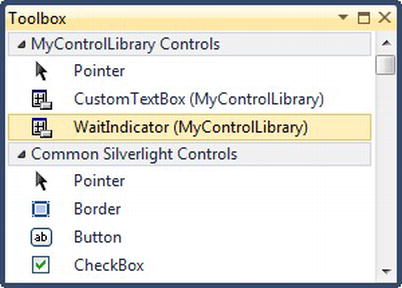
Figure 12-6. The WaitIndicator control in the Toolbox
Note If the MyControlLibrary project and the Silverlight test projects are not in the same solution, right-click the Toolbox, select Choose Items from the context menu, navigate to the compiled MyControlLibrary assembly, and add the control(s) from that assembly to the Toolbox.
Now, you can simply drag the control onto the design surface. Using the Properties window, set its IsBusy property to True. When you run your project, the control will be visible and animate. The custom control is complete!