
Creating the Data Entry User Interface
A typical data entry form consists of a number of editable fields—such as text boxes, drop-down lists, and check boxes, each with a corresponding label displaying the name of that field, and a tab order assigned such that users can tab between fields in a logical fashion. Ideally, the users should be able to enter data into the form and submit it without ever having to use the mouse (i.e., the process should be able to be completely keyboard driven), making the data entry process smoother and more efficient. As a developer, you likely will have created countless data entry forms in your career, so this will be a fairly familiar task for you. Let's take a look at how to create a data entry form that achieves these goals in Silverlight, and then move on to refine its functionality.
Laying Out the Data Entry Form
In the past, you may have been used to laying out data entry forms using fixed positioning, with each control assigned a Left and a Top value. Although you can do this in Silverlight by laying out the controls on a canvas, it's usually better to create a flexible layout using the Grid control and lay out the controls in the Grid control's cells. This helps you keep the controls aligned and enables you to have the controls dynamically resize according to the size of the application's window.
You can use a number of different methods to create a data entry form. Although you can manually lay out the form yourself, a couple of time-saving means are available to help you create a data entry form from the object that it will be bound to. Let's take a look at those now.
Using the Data Sources Window
As shown in Chapter 6, you can open the Data Sources tool window in Visual Studio and drag an entity from this window onto your design surface. A DataGrid will be created in the view, with a column defined for each property on the entity. You can make this process create a details view instead by selecting Details from the drop-down menu for the entity in the Data Sources window (as shown in Figure 7-1) before dragging it onto the design surface.

Figure 7-1. Selecting the control to generate for an entity
Now when you drag the entity onto the design surface, a field and corresponding label will be created for each property on the entity, laid out using a Grid control (as shown in Figure 7-2), with the field's binding to the source property already configured.

Figure 7-2. Details form generated by the Data Sources window
The control created for each property on the entity will default to the one best suited to the property's type (e.g., TextBox for strings, CheckBox for Booleans, DatePicker for dates), but you can change the type of controls that will be generated by expanding the entity in the Data Sources window and selecting different control types for the properties that you want to change (as shown in Figure 7-3). The labels will contain the name of the property, with some spaces intelligently inserted into the name, followed by a colon.
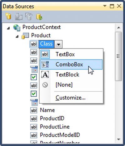
Figure 7-3. Selecting the control that will be generated for a property on the entity
 Note Unfortunately, there is no way to order the properties of an entity in the Data Sources window before dragging it onto the view. This means that the fields will be created on the form in alphabetical order rather than the actual logical order that you want for them. Therefore, you will need to reorder the fields once they have been created in the form, assigning the fields to the actual grid row in which you want them to appear.
A DomainDataSource control will be automatically configured for you if one doesn't already exist in the view, and the DataContext property of the “container” Grid control will be bound to it and will be inherited and available to all the controls within the Grid.
This is an easy way of creating the fields required for a data entry form, but the lack of ability to order the data entry fields before dragging it onto the view does result in the need for quite a bit of additional work in arranging it to suit your needs.
Workshop: Using XAML Power Toys
Another method you can use to create a data entry form is to use the XAML Power Toys add-in for Visual Studio, created by Karl Shifflet, which you can get at http://karlshifflett.wordpress.com/xaml-power-toys. After you download and install this add-in, it will add a new submenu to your right-click context menus in the XAML and code editors, as shown in Figure 7-4.

Figure 7-4. The XAML Power Toys menu
Note The context menu doesn't appear in the right-click context menu in the XAML designer view—it appears only in the XAML editor view.
- Add a new view to the AdventureWorks project that you've been working with.
- Right-click in the XAML editor, and select the “Create Form, ListView or DataGrid From Selected Class” menu item from the XAML Power Toys submenu.
- From the dialog that appears, you need to select the object that you want to create the data entry form from (i.e., the object that the form will bind to). Select the
Productclass from under theAdventureWorks.Webnamespace, and click the Next button. The screen shown in Figure 7-5 will be displayed.
Figure 7-5. The XAML Power Toys add-in's Create Business Form For Class dialog
- Ensure that the “Select Object To Create” drop-down box at the top left of the dialog is set to Business Form.
- Now, drag and drop properties from the Class Properties section on the left side of the screen into the right side. You can then configure various properties for each field as required, including
- The type of control
- Its display format, maximum length, and width
- Its binding mode, which needs to be set to
TwoWayso that the updated value can be propagated back to the bound object, as discussed in Chapter 2 - Its label
Note The tool helps you by automatically setting a default value for the label based on the property name. It intelligently splits the property name into separate words, inserting a space before each capital letter in the property name. - Reorder the fields if required, by simply clicking and dragging the item up and down to a new position in the list.
- Once you've completed configuring your form, you can click the Create button.
- Clicking the Create button doesn't actually insert anything into your XAML. Instead, the XAML that was generated has been copied to the clipboard and is ready for you to paste in the appropriate location in your XAML file. Place the cursor at the position in the XAML file to insert the form, and paste the contents of the clipboard to that location (press Ctrl+V). Your data entry form has now been created, and you can modify the XAML further as required.
Note You may have to declare various namespace prefixes used in the generated XAML—these are included when you paste the XAML into the XAML editor in commented-out form. You can then add them to your root element if they aren't already declared.
There are numerous other options that we won't go into here, but essentially, this method enables you a lot more control over the configuration of the data entry form before it's generated than the Data Sources window provides.
Note XAML Power Toys includes number of other features that you will probably find useful when working with XAML, in both Silverlight and WPF. The source code is also available for download, enabling you to make modifications, including adding features to help you create data entry forms faster.
Using the DataForm Control
In addition to the two methods shown previously, you can take another approach to creating a data entry form—using the DataForm control. The DataForm control is a part of the Silverlight Toolkit whose key feature is that it can dynamically create a data entry form at runtime from an object.
Note The DataForm control is designed to be bound to an object. For simple unbound data entry scenarios, such as a login window, it's best not to use the DataForm control—simply lay out standard controls within a Grid control instead.
Creating a DataForm Control with Automatically Generated Fields
The DataForm control makes is very easy to create data entry forms. You can simply drop a DataForm control onto the design surface, and either bind its CurrentItem property to an object for the user to edit or bind its ItemsSource property to a collection of objects for when you want the user to be able to edit multiple objects. The DataForm control will then dynamically generate a data entry form at runtime suitable for editing the object that it's currently bound to.
 Workshop: Adding the DataForm Control to a View
Let's create a DataForm control and bind it to a DomainDataSource control that will handle retrieving a collection of Product entities from the server.
- Create a new view in the AdventureWorks project that you've been working with, and add a DomainDataSource control to it, configured to load product data from the server:
<riaControls:DomainDataSource AutoLoad="True" QueryName="GetProducts"

                              Name="productDomainDataSource"

                              Height="0" Width="0">

    <riaControls:DomainDataSource.DomainContext>

        <my:ProductContext />

    </riaControls:DomainDataSource.DomainContext>

</riaControls:DomainDataSource>
Note The riaControlsnamespace prefix should be defined in your view, like so:xmlns:riaControls="clr-namespace:System.Windows.Controls;
assembly=System.Windows.Controls.DomainServices" - Define the
toolkitnamespace prefix in the root element of the view:xmlns:toolkit="http://schemas.microsoft.com/winfx/2006/xaml/presentation/toolkit"Add a DataForm control to your view, set its
Headerproperty, and bind itsItemsSource:<toolkit:DataForm Header="Product Data Entry"
ItemsSource="{Binding ElementName=productDomainDataSource, Path=Data}" /> Note If you want to bind the DataForm control to a collection of objects, you bind the collection to the DataForm control's ItemsSourceproperty, as was demonstrated here. However, if you want to bind the DataForm to a single object, you need to bind that object to the DataForm control'sCurrentItemproperty instead. - Now if you run your application, a data entry form similar to that shown in Figure 7-6 will be displayed.
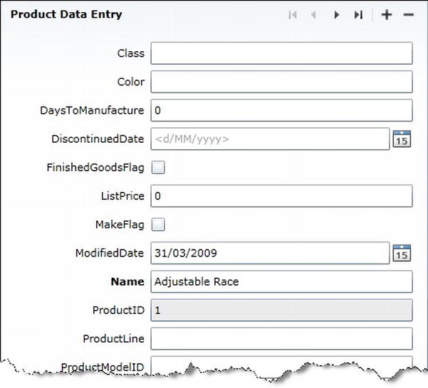
Figure 7-6. A DataForm control
Note This data entry form is generated at runtime, so none of these fields will appear at design time unless you bind the form to sample data, as discussed in Chapter 10. Alternatively, you can bind its CurrentItem property to an object using the design-time data properties discussed in Chapter 10. However, when doing so, you will not be able to simultaneously have a binding assigned to the DataForm control's ItemsSource property because that will result in an error.
Configuring the Layout of the Fields
You may have noticed from the DataForm created in the previous workshop that the output is not suitable for users as yet. Issues with the layout include
- There is no logical order to the fields. Instead, fields were created in alphabetical order by property name.
- The fields use the names of the properties that they're bound to as their labels, rather than something more meaningful for users.
- A field is being created for all the properties on the object.
- The fields aren't necessarily generated using the control that you want to be used for editing the property value.
You can have more control over the process and customize it to your needs however. In Chapter 4, you saw how to decorate the properties of your entities/objects with attributes—either directly or via metadata classes. You can use the Display attribute that was described to control the generation of the corresponding fields in the DataForm control, for example:
[Display(Name="Product Number:", Order=3)]

public string ProductNumber;
When the corresponding field for the ProductNumber property is generated in the data entry form, its label will have the text that is assigned to the Name property of the Display attribute and will appear third in the list of fields, based on the value assigned to the Order property.
Other useful properties of the Display attribute that you can use to control the field generation include the following:
AutoGenerateField: This property can be used to prevent a field from being generated for the property.Description: This can be used to assign a tooltip description to the field, as will be described shortly.ResourceType: In scenarios where your application will be localized for different languages, you can define the values for theNameandDescriptionproperties in resource files instead of hard-coding them. Assign theResourceTypeproperty the resources file's type, denoting where theNameandDescriptionresources can be found for this entity property. Then instead of assigning an actual value to theNameandDescriptionproperties, you need to assign each the name of its corresponding string resources. For example, the followingDisplayattribute specifies that theNameandDescriptionproperty values should come from a resource file namedProductResources, and their values will come from resources in that file namedProductNumberLabelandProductNumberDescriptionrespectively:
[Display(ResourceType = typeof(ProductResources), Name="ProductNumberLabel",

         Description="ProductNumberDescription")]

public string ProductNumber;
Note When using resources in this manner, you will need to link the resource file in your web project to your Silverlight project so that the two projects share the same resources. The Silverlight Business Application project template generates projects with two resource files already shared between the two projects: RegistrationDataResources.resx and ValidationErrorResources.resx.
Miscellaneous Issues
Now, when the fields are generated at runtime in the DataForm, they will use this metadata and be laid out accordingly. However, there are some issues with generating the data entry form in this manner. The first is the still-limited control you have over how the data entry form is generated. For simple forms, this won't be too much of a problem; however, for more complex forms where you need to use other controls, such as ComboBox controls, assign custom properties to each field control, or have less of a structured layout (e.g., with multiple fields in a single row), then this method really isn't satisfactory. Some of these issues can be worked around by handling the DataForm control's AutoGeneratingField event, which is raised when each field is being created, enabling you to make changes to the field being generated.
Note See the LoginForm and RegistrationForm user controls in your project (created by the Silverlight Business Application project template) for examples of how you can customize the fields generated by the DataForm control while it's generating them.
The most important issue, however, is really conceptual. Decorating your entities/objects with presentation-related attributes violates the separation-of-concerns principle. How the data entry form is laid out is a presentation tier/layer issue, not a middle tier/layer issue (which is where the entities/objects exist). By decorating your entities/objects with presentation-related attributes, you are creating a murky boundary between the two tiers/layers, which is against good design principles. Therefore, the DataForm control used this way is best suited to small applications and prototypes.
Creating a DataForm Control with Explicitly Defined Fields
Instead of having the fields in the data entry form dynamically generated at runtime as per the previous method, you can instead explicitly define the fields within the DataForm control in XAML instead. You'll then have complete control over the DataForm's fields, and will be able to lay out the fields exactly as required. However, the DataForm control can offer you a few benefits over laying out a data entry form manually without it, including
- The ability to navigate through each entity, if the control is bound to a collection, without needing to implement another means, such as a ListBox or a DataGrid, to select the current item. The header of the control contains some navigation buttons that you can use for this purpose.
- Built-in add and delete buttons, which will appear if the control is bound to a collection.
- Support for objects that implement the
IEditableObjectinterface (discussed later in this chapter). A cancel button is displayed in the bottom-right corner of the control, enabling the user to cancel all their changes to the current item and will revert the bound properties back to their original values. - The ability to display an icon next to the field, which will show a description for that field in a tooltip when the user hovers the mouse over it. This uses the DescriptionViewer control from the Silverlight Toolkit and can be used outside of the DataForm control if you wish.
- A built-in ValidationSummary control, displaying a summary of all the validation errors on the bound entity at the bottom of the control.
- A built-in ScrollViewer control that automatically displays a scroll bar if the fields extend past the area of the data entry form.
- The ability to define a different data template for each state that the DataForm control can be in. There are three data templates that you can define:
ReadOnlyTemplate: Used when the DataForm control is in read-only mode, this will be the default mode when the DataForm control'sAutoEditproperty is set toFalse, and it will also be used whenever the DataForm control'sIsReadOnlyproperty is set toTrue.EditTemplate:Used when the DataForm control is in edit mode, this will be the mode when the DataForm control'sAutoEditproperty is set toTrue,assuming the user hasn't clicked the Edit button for the current item, and when itsIsReadOnlyproperty is set toFalse.NewItemTemplate:Used when adding a new item to the bound collection.
You might notice some similarities between the structure of the DataForm control and the FormView and DetailsView controls in ASP.NET, such as that both support the ability to define different templates for different modes. With these controls, in ASP.NET, you could simply bind them to an ObjectDataSource control at design time, and the control would automatically generate the HTML for all the fields for you that you could then rearrange to create a custom layout.
Unfortunately, the DataForm control does not have this same feature. The XAML for the fields in a DataForm control is a little different than what we used earlier. For example, here is the XAML required for a simple DataForm, containing two explicitly defined fields:
<toolkit:DataForm AutoGenerateFields="False" Header="Product Data Entry"

         ItemsSource="{Binding ElementName=productDomainDataSource, Path=Data}">

    <toolkit:DataForm.EditTemplate>

        <DataTemplate>

            <Grid>

                <Grid.RowDefinitions>

                    <RowDefinition Height="Auto" />

                    <RowDefinition Height="Auto" />

                </Grid.RowDefinitions>


                <Grid.ColumnDefinitions>

                    <ColumnDefinition />

                </Grid.ColumnDefinitions>


                <toolkit:DataField Grid.Row="0" Grid.Column="0"

                                   Label="Name:" LabelPosition="Auto">

                    <TextBox Text="{Binding Path=Name, Mode=TwoWay}"

                            Name="NameTextBox"

                            HorizontalAlignment="Stretch" VerticalAlignment="Top" />

                </toolkit:DataField>


                <toolkit:DataField Grid.Row="1" Grid.Column="0"

                                           Label="Product Number:"

                                           LabelPosition="Auto">

                    <TextBox Text="{Binding Path=ProductNumber, Mode=TwoWay}"

                             HorizontalAlignment="Stretch" VerticalAlignment="Top" />

                </toolkit:DataField>

            </Grid>

        </DataTemplate>

    </toolkit:DataForm.EditTemplate>

</toolkit:DataForm>
Note the following from this XAML:
- The fields are defined within a data template, and assigned to the DataForm control's
EditTemplateproperty. - Each field is defined using a DataField control, to which you assign an input control (such as a TextBox control) as its content.
- There is no Label or TextBlock control defined for each field to display the field label. Instead, the text to be used as the field's label should be assigned to the DataField control's
Labelproperty. - The DataField controls are laid out in a Grid, which contains only a single column. The DataForm control takes care of creating the labels and ensuring that the data input fields remain aligned regardless of the differing lengths of the labels.
The DataForm control in the preceding XAML results in the output shown in Figure 7-7 when it is bound to an entity or collection of entities.

Figure 7-7. A DataForm control with a custom edit template
Note Optionally, you can assign a string to the DataField control's Description property. Doing so will display an icon next to the field that shows the description when the user hovers the mouse over it.
Unfortunately, the Data Sources window does not provide the ability to automatically generate a data entry form using the DataForm control. However, the XAML Power Toys add-in does have this ability, so you can use the method described in the previous section to create a data entry form, but with one difference. Instead of selecting Business Form from the Select Object To Create drop-down box at the top of the dialog, select Silverlight Data Form. This will create the XAML required for a data entry form using a DataForm control with explicitly defined fields and will save you a lot of time over building it manually.
Note When you paste the XAML for a DataForm control generated by the XAML Power Toys into your view, you'll need to change the dataFormToolkit namespace prefix that it uses to the toolkit namespace prefix we defined in the previous workshop. Alternatively, you can simply define the dataFormToolkit namespace prefix for your view.
Positioning the Labels
Although labels are, by default, positioned to the left of the fields, you can also position them above the fields by setting the DataForm control's LabelPosition property to Top. Top-aligned labels require less horizontal space, and some research has suggested that they enable users to complete forms faster because they can see both the label and the field together as they scan the form. In addition, you don't have to worry so much about how much room the label requires when a form is to be localized. Figure 7-8 demonstrates top-aligned labels.

Figure 7-8. A DataForm control with top-aligned labels
More information on this can be found at these two URLs:
www.uxmatters.com/mt/archives/2006/07/label-placement-in-forms.phpwww.lukew.com/ff/entry.asp?504
Note The labels for the fields in Figure 7-8 are bolded, which indicates to the user that these fields require a value. This is because the bound properties are decorated with the Required validation attribute.
The Cancel Button
You may have noticed that a Cancel button has also been automatically been created at the bottom of the data entry form. When the DataForm is bound to an object that implements the IEditableObject interface, such as the entities and objects exposed by a domain service with RIA Services, this button will become enabled. The IEditableObject provides a mechanism with which any changes made to an object can be rolled back and the object restored to a previous state. If the bound object does not implement this interface, then the Cancel button will remain disabled. The IEditableObject interface will be discussed in more detail later in this chapter.
Note You can use the CancelButtonContent and CancelButtonStyle properties to customize the Cancel button if required.
The AutoEdit and AutoCommit Properties
By default, when the user navigates to a record, it will be immediately put into edit mode. In addition, the user will be able to navigate away from the record without saving their changes. You can make the editing of a record more explicit using the AutoEdit and AutoCommit properties on the DataForm control.
- Setting the DataForm control's
AutoEditproperty toFalsemeans that whenever the user navigates to a record, it will be in read-only mode, and will display the read-only template (if defined). A pencil icon will appear in the header of the DataForm control when it's in this read-only mode, which the user will need to click in order to be able to edit the record. - Setting the DataForm control's
AutoCommitproperty toFalsewill result in an OK button appearing at the bottom of the DataForm control, next to the Cancel button. The user will need to click either the OK button or the Cancel button to navigate to a different record. However, note that any changes that the user makes to the data will still be immediately committed to the object as they are made.
Note You can use the CommitButtonContent and CommitButtonStyle properties to customize the OK button if required.
Customizing the Header
If the DataForm control's header doesn't suit the look of your application, you can retemplate it by assigning a new data template to its HeaderTemplate property, or remove it completely by changing its HeaderVisibility property to Collapsed. If you do hide the header, you can still invoke the functionality it provided using the DataForm control's methods. For example, the DataForm control has the following methods:
AddNewItem: Adds a new item to the bound collection and navigates to itDeleteItem: Deletes the current item from the bound collectionBeginEdit: Changes the mode to edit modeCommitEdit: Commits the current changes to the entityCancelEdit: Cancels the changes made since the editing began and restores the original property values of the control to what they were whenBeginEditwas called
You may have noticed that there are no methods to navigate through the items in the bound collection. You can, however, use the CurrentIndex property for this purpose: increment and decrement it to move to the next and previous items; set it to 0 to move to the first item in the collection, or set it to the item count minus one to move to the last item in the collection.
Note Alternatively, if you've bound the DataForm control to a collection view, you can use the navigation methods provided by the collection view to navigate between records in code. This is particularly useful when you're following the MVVM design pattern and want to be able to navigate between records from a ViewModel class.
You can also choose which buttons you want to appear in the header. The DataForm control's CommandButtonsVisibility property can be used for this purpose, accepting any of the following values from the DataFormCommandButtonsVisibility enumeration:
None: Don't show any buttons.Add: Show the Add button.Delete: Show the Delete button.Edit: Show the Edit button.Navigation: Show the first, previous, next, and last item buttons.Commit: Show the OK button (at the bottom of the DataForm control).Cancel: Show the Cancel button (at the bottom of the DataForm control).All: Show all the buttons (as appropriate).
You can combine multiple values if you wish. For example, you can configure the DataForm control in code to show only the Add and Delete buttons, like so:
ProductsDataForm.CommandButtonsVisibility = DataFormCommandButtonsVisibility.Add |

                                            DataFormCommandButtonsVisibility.Delete;
And here's how to do the same in XAML:
CommandButtonsVisibility="Add,Delete"
Refining the Data Entry Form's Functionality
It's extremely important that you create data entry forms in your applications that are easy to navigate and use. You want to minimize the amount of work that the user has to do to enter the data and preferably enable power users to keep their hands on the keyboard, increasing their productivity. In this section, we'll look at the most popular data input controls available in Silverlight and provide tips for making it easier for the user to enter data into the application.
Data Input Controls
Many data input controls are available in Silverlight and the Silverlight Toolkit that you can use in your data entry forms. Let's take a brief look at some of the more common ones.
The TextBox Control
The TextBox control enables users to enter free-form text, as shown in Figure 7-9.
Figure 7-9. A TextBox control
You can get/set the text in the TextBox via its Text property:
<TextBox Text="{Binding Name, Mode=TwoWay}" />
Sometimes, you need to format the bound value before displaying it—particularly when you're binding to a nonstring property such as a DateTime or a decimal. Use the StringFormat property on the binding to set the format, using the same types of formatting strings you would use if you were to format the value using its ToString method in code using either standard or custom formats. For example, the following binding displays the value formatted as currency, as shown in Figure 7-10:
<TextBox Text="{Binding TotalCost, Mode=TwoWay, StringFormat=C}" />
Figure 7-10. A bound TextBox control with a custom string format
Note You will find more information about using the Binding object's StringFormat property in Chapter 11.
Unfortunately, the TextBox control doesn't have any masked edit functionality to restrict the input into the TextBox from the user. There are a number of third-party masked edit controls, as well as an open source one on CodePlex that you can get here: http://sivlerlightinputctrl.codeplex.com (note the misspelling of Silverlight in the URL name).
Alternatively, you can assign a behavior that adds masked edit functionality to a text box. For example, you will find one, written by Jim Fisher, in the Microsoft Expression Gallery, at http://gallery.expression.microsoft.com/en-us/CMEditMaskBehavior (using behaviors is discussed in Chapter 10.)
Here are some other miscellaneous features of Silverlight's TextBox control:
- You can set the maximum number of characters accepted by the TextBox control using its
MaxLengthproperty. - If you want to stop the user from being able to enter text into the TextBox control, you can set its
IsReadOnlyproperty toTrue. Doing so still allows the user to select and copy text in the TextBox control, which can't be done when the TextBox control is disabled. The background of the TextBox control will change to a light gray color to indicate it cannot be edited. - You can horizontally align the text in the TextBox control using its
TextAlignmentproperty. You can left-align the text (the default), right-align it, or center it. Note that althoughJustifyappears in IntelliSense and the Properties window as an alignment option, it will throw an exception when used. - By default, when more text is entered into the TextBox control than it can display, the text will remain on a single line and the beginning of the text will disappear off the TextBox's left edge. However, if you make your text box tall enough to display multiple lines, then you can get the text to wrap onto the next line by setting the TextBox control's
TextWrappingproperty toWrap(the default beingNoWrap). If you want the user to be able to start new lines in the text box by pressing the Return/Enter key, you will need to set the TextBox control'sAcceptsReturnproperty toTrue. - By default, the vertical and horizontal scroll bars in the TextBox are hidden/disabled. You can enable them via the
VerticalScrollBarVisibilityandHorizontalScrollBarVisibilityproperties. Setting their values toAutowill cause the scroll bars to display only when the text exceeds the corresponding dimension of the text box, and setting them toVisiblewill cause them to display them regardless of whether they're required.
Note Setting the HorizontalScrollBarVisibility property to Visible will disable text wrapping.
The CheckBox Control
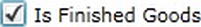
The CheckBox control enables the user to enter a True or False value, or a null value in the case of a three-state check box, as shown in Figure 7-11. You can get or set the value of the check box via its IsChecked property and set its label using its Content property:
<CheckBox IsChecked="{Binding FinishedGoodsFlag, Mode=TwoWay}"

          Content="Is Finished Goods" />
Figure 7-11. A bound CheckBox control
You can turn it into a three-state check box by setting its IsThreeState property to True. This enables an additional state, with a value of null, for the check box, which you may use to indicate that a value has not been set. Figure 7-12 shows what the third state looks like.
Figure 7-12. The third state in a three-state check box
The RadioButton Control
Radio buttons, also known as option buttons, enable the user to select one option from a number of options, as shown in Figure 7-13.

Figure 7-13. Option buttons
Much like the CheckBox control, you can get or set the value of a radio button via its IsChecked property and set its label using its Content property:
<RadioButton Content="Option 1" IsChecked="{Binding Option1, Mode=TwoWay}" />

<RadioButton Content="Option 2" IsChecked="{Binding Option2, Mode=TwoWay}" />

<RadioButton Content="Option 3" IsChecked="{Binding Option3, Mode=TwoWay}" />

<RadioButton Content="Option 4" IsChecked="{Binding Option4, Mode=TwoWay}" />
Often, you will want to bind a set of RadioButton controls to a single enumeration property on an object or entity, enabling the user to select the value it should have from a set of possible values. For example, say you want the RadioButton controls from the previous XAML to all be bound to the following property:
public enum Options

{

    Option1,

    Option2,

    Option3,

    Option4

}


public Options SelectedOption { get; set; }
To enable this, you will need to create a value converter and use it as part of the binding process. This value converter will need to compare the value of a property with a given value passed into the value converter as a parameter, returning True if the values match and False if they don't. We look at value converters further in Chapter 11, but you can find an example of a value converter that solves this problem in the sample code for this chapter, downloadable from the Apress web site.
All radio buttons are implicitly “linked,” such that when you select one radio button, any currently selected radio button will be deselected. If you want to have multiple groups of radio buttons in your view that you don't want to interact, you can separate them by assigning each radio button to a group via its GroupName property. You can give each group whatever name you wish, and only the radio buttons with the same group name will interact. When you group radio buttons, ensure that the groups are visually separated in the view so that the user recognizes which options belong to which groups.
The ComboBox Control
The ComboBox control in Silverlight is not strictly a combo box as such, but a drop-down list (proper ComboBox controls accept free-form text entry, whereas the Silverlight ComboBox does not). You can bind its ItemsSource property to a collection of objects to display in much the same way as the ListBox control, or declare the items in XAML using the Items property. You can then get or set the selected item using its SelectedItem property.
The following XAML demonstrates creating a ComboBox in XAML, with the items to be displayed in the list also declared in XAML. This gives the output shown in Figure 7-14.
<ComboBox>

    <ComboBox.Items>

        <ComboBoxItem Content="Option 1" />

        <ComboBoxItem Content="Option 2" />

        <ComboBoxItem Content="Option 3" />

        <ComboBoxItem Content="Option 4" />

    </ComboBox.Items>

</ComboBox>

Figure 7-14. A ComboBox control
Let's now look at a real-world example. Say, for example, that you have a Product entity that has a property named ModelID, and a collection of Model objects, each with ID and Name properties. The ModelID property on the Product entity is a foreign key, representing an item in the collection of Model objects. You then want to enable the user to select a model for the product from a drop-down list, populated with Model objects, and displaying the name of the model for each item. When the user selects an item in the list, the ID of the selected Model needs to be assigned to the ModelID property of the Product entity. For this scenario, you need to
- Bind the collection of
Modelobjects to the ComboBox'sItemsSourceproperty. - Set its
SelectedValuePathtoID. - Set its
DisplayMemberPathtoName. - Bind its
SelectedValueproperty to theProductentity'sModelIDproperty.
for example
<ComboBox ItemsSource="{StaticResource modelsResource}"

          SelectedValuePath="ID"

          SelectedValue="{Binding ModelID, Mode=TwoWay}"

          DisplayMemberPath="Name" />
The various properties that need to be set can be a little confusing, especially because the ComboBox control also has a SelectedItem property. Here's a summary:
- The
SelectedItemproperty gets or set the entire object that the selected item in the ComboBox is bound to. So in our previous example, theSelectedItemproperty will return theModelobject currently selected in the ComboBox control. For binding purposes however, this property is rarely used, as it requires theProductentity to provide a property exposing an entireModelobject that it can be bound to, whereas theProductentity will generally be able to provide only a property exposing theModelobject's primary key value. - The
SelectedValuePathproperty is used to specify the name of the property on the objects in the bound collection that will be used to uniquely identify each object in that collection. In our example, this is assigned theIDproperty on theModelobject. - The
SelectedValueproperty is used in conjunction with theSelectedValuePathproperty. Just like theSelectedItemproperty, it is used to get or set the selected item in the ComboBox control. However, you need to provide it with only the value of the property specified by theSelectedValuePathproperty to select that corresponding item. In our example, we just need to bind the ComboBox control'sSelectedValueproperty to theModelIDproperty on theProductentity. The ComboBox control will then find theModelobject in the collection that it's bound to whoseIDproperty is equal to the value assigned to theProductentity'sModelIDproperty and will select that item. - The
DisplayMemberPathproperty is used to designate a property on the objects in the bound collection whose value will displayed to represent each object. In our example, we've configured the ComboBox control to display the value of theNameproperty for eachModelobject in the collection.
One issue that you need to be aware of is that the collection of items to display in the ComboBox needs to be populated before you can bind its SelectedItem/SelectedValue property; otherwise, the ComboBox will not display the selected item. In other words, you need to populate the collection that the ComboBox control is bound to before you can bind the ComboBox control's selected item. This is something that you particularly need to be wary of when loading the contents of the ComboBox control from the server. A common pattern used when the data to populate a ComboBox control needs to be retrieved from the server is to bind the ComboBox control's ItemsSource property to an empty ObservableCollection and simply add items to that collection once the server has returned the data. However, if the items haven't been populated when a value is assigned to the ComboBox control's SelectedItem/SelectedValue property, it won't have an item available to select and will remain blank—even when the items are finally populated. Kyle McClellan has blogged about this problem and provided a solution that you can use if you're also experiencing it: http://blogs.msdn.com/b/kylemc/archive/2010/06/18/combobox-sample-for-ria-services.aspx.
Note As with the ListBox control, you can customize the data template of each item by assigning a custom data template to the ComboBox's ItemTemplate property. This will allow you to show images, have multiple columns, and so on for your items.
The ListBox Control
You've already seen how to use the ListBox control to display a summary list and enable the user to drill down to a record in Chapter 6. You could also use it in a data entry scenario in much the same way as described for the ComboBox control—enabling the user to select an item from a collection. Another common use for the ListBox control in a data entry scenario is to have two lists, with the user able to move items from one list to another via dragging and dropping an item between lists or simply by selecting an item and clicking a button to move that item to the other list.
The Date Input Controls
There are two controls for entering and selecting dates in the Silverlight SDK: the Calendar control and the DatePicker control.
Note To use these controls, your project will need a reference to the System.Windows.Controls.dll assembly, and the sdk namespace prefix needs to be defined, like so:
xmlns:sdk="http://schemas.microsoft.com/winfx/2006/xaml/presentation/sdk".
The Calendar Control
The Calendar control (shown in Figure 7-15) enables the user to select a date from a calendar. You can get this selected date from the Calendar control's SelectedDate property:
<sdk:Calendar SelectedDate="{Binding StartDate, Mode=TwoWay}"/>
You can also allow the user to select a range of dates by changing the control's SelectionMode property from SingleDate to SingleRange or MultipleRange. You can then get the selected dates from the control's SelectedDates property. Alternatively, you can use the Calendar control for display purposes only by setting its SelectionMode property to None.

Figure 7-15. A Calendar control
You can narrow the range of the date(s) that can be selected by assigning a start date for the range to the Calendar control's DisplayDateStart property and the end date for the range to the DisplayDateEnd property. All dates outside this range will be blanked out and nonselectable. You can also use the BlackoutDates property to set additional dates that the user cannot select. Instead of being blanked out, these dates will display a gray cross over them. This feature can be used to prevent a weekend or a public holiday from being selected. To assign dates to the BlackoutDates property, you will need to add CalendarDateRange objects to the collection, with a from and to date, or bind the property to a collection of these objects in XAML.
By default, the current date is always highlighted in the calendar. You can disable this by setting the IsTodayHighlighted property to False. You can change the first day of the week using the FirstDayOfWeek property.
The month view isn't the only type of view supported by the Calendar control. Using the control's DisplayMode property, you change the mode between Month, Year, and Decade.
The DatePicker Control
The DatePicker control has many features in common with the Calendar control, as shown in Figure 7-16. Clicking the button next to the text box or pressing Ctrl+down arrow when the text box has focus will pop up a calendar that the user can select the date from. Unlike the Calendar control, only a single date can be entered into or selected from the DatePicker control. However, you can still restrict the date entered to be within a range and black out various date ranges, like you can with the Calendar control. It does have one additional property: SelectedDateFormat. Instead of using the default short date format, you can change the date format to the long date format via that property.
<sdk:DatePicker SelectedDate="{Binding StartDate, Mode=TwoWay}" />

Figure 7-16. A DatePicker control
The Time Input Controls
In addition to the date data input controls in the Silverlight SDK, there are two controls for entering times in the Silverlight Toolkit: the TimeUpDown control and the TimePicker control.
Note To use these controls, your project will need a reference to the System.Windows.Controls.Data.Toolkit.dll assembly, and the toolkit namespace prefix will need to be defined, like so: xmlns:toolkit="http://schemas.microsoft.com/winfx/2006/xaml/presentation/toolkit".
The TimeUpDown Control
The TimeUpDown control shown in Figure 7-17 lets the user either enter a time or select one using the up and down buttons. The control enables the user to enter a part of the time, and guesses the rest of it when the user tabs away. For example, the user can simply enter 9, and the control will fill in 9:00 AM. The user can also select a particular part of the time (hour, minute, etc.) and use the up and down buttons to change it accordingly.
Figure 7-17. A TimeUpDown control
You can get or set the time via its Value property:
<toolkit:TimeUpDown Value="{Binding StartTime, Mode=TwoWay}" />
You can change the format of the time's display in the control using the TimeUpDown control's Format property and assigning it either a standard or custom date formatting string. For example, you could specify HH:mm:ss as the format, which uses 24-hour time and includes the seconds.
You can force the user to enter the time only via the up and down buttons, by setting the control's IsEditable property to False. You can also stop the user from going past 11:59 p.m. or before 12:00 a.m. by setting the IsCyclic property to False.
The TimePicker Control
The TimePicker control is similar to the TimeUpDown control, except it also has a drop-down list that the user can select a time from, as shown in Figure 7-18.
<toolkit:TimePicker Value="{Binding StartTime, Mode=TwoWay}" />

Figure 7-18. A TimePicker control
By default, the drop-down list contains an item for every half hour, but you could change this to every quarter of an hour, for example, by setting PopupMinutesInterval to 15.
The Up and Down Controls
You've seen how the TimeUpDown and TimePicker controls have up and down buttons to enable the user to modify the time using only the mouse. Two other controls in the Silverlight Toolkit also implement this same feature for other data types: the NumericUpDown control for numbers and the DomainUpDown control for selecting an item from a collection.
Note To use these controls, your project will need a reference to the System.Windows.Controls.Data.Toolkit.dll assembly, and the toolkit namespace prefix defined, like so: xmlns:toolkit="http://schemas.microsoft.com/winfx/2006/xaml/presentation/toolkit".
The NumericUpDown Control
The NumericUpDown control allows only the entry of numbers—attempting to enter a nonnumeric value will result in the value being reverted to its original value when the field loses the focus. Its key features include
- The ability to set the number of decimal places that are displayed via the
DecimalPlacesproperty - The ability to set how much the value will increment or decrement when using the up or down buttons with the
Incrementproperty - The ability to get or set the value via its
Valueproperty
The following code demonstrates creating a NumericUpDown control in XAML, and Figure 7-19 shows the result:
<toolkit:NumericUpDown DecimalPlaces="2" Increment="0.5"

                       Value="{Binding ListPrice, Mode=TwoWay}" />
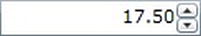
Figure 7-19. A NumericUpDown control
The DomainUpDown Control
The DomainUpDown control is a bit like the ComboBox control in that it enables you use the up and down buttons to enter or select an item from a list of items. You bind a list of items to the ItemsSource property to select from, which could be an array of strings or a collection of objects. The user is constrained to entering values from only that collection.
You can choose from one of the following options as to what happens if the value entered by the user does not match an item in the list via the InvalidInputAction property:
- The
UseFallbackItemoption will result in the value being reverted to the value of theFallBackItemproperty when the field loses the focus. If a value for theFallBackItemproperty has not been specified, entering a value not in the list will result in the previous value being reinstated when the field loses the focus. - The
TextBoxCannotLoseFocusoption forces the user to enter or select a valid item from the list before they can move on.
When binding the ItemsSource property to a collection of objects, you can use either the ValueMemberPath property or the ValueMemberBinding property on the DomainUpDown control to specify the property on the objects that will be displayed in the control:
- Generally, you will use the
ValueMemberPathproperty, to which you simply assign the name of the property identifying that item. - Alternatively, you can use the
ValueMemberBindingproperty, to which you can assign a binding expression pointing to the property to use instead. This enables you to specify a value converter as a part of the binding if necessary.
For example, say you have a collection of objects representing U.S. states, each with two properties: one for the name of the state, and one for its short code (e.g., NY) You can display the name of the state in the control (we'll look at how to do this shortly) but set the ValueMemberPath property to the name of the short code property. If you do this, when editing the value of the field, the user can enter the short code for the state, and when the user tabs away from the field, the corresponding state name is displayed instead.
Note Unfortunately, unlike the ComboBox control, the DomainUpDown control has no DisplayMemberPath or SelectedValuePath property, nor does it have a SelectedValue property. When binding to a collection of objects (that aren't strings), the DomainUpDown control will simply call the ToString method on the object to get the text to display. Unless you have overridden the ToString method in your classes, you will therefore need to create a data template and assign it to the control's ItemTemplate property to customize what is displayed in the control. This also means that you can create a somewhat more complex custom layout to display in the control for each item if you wish.
The index of the currently selected item in the bound collection can be obtained via the CurrentIndex property. Much like the TimeUpDown control, this control also has IsCyclic and IsEditable properties.
The following code demonstrates creating a simple DomainUpDown control in XAML, and Figure 7-20 shows the result:
<toolkit:DomainUpDo.wn ItemsSource="{StaticResource StatesResource}" />
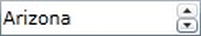
Figure 7-20. A DomainUpDown control
The AutoCompleteBox Control
The AutoCompleteBox control can be used to enable the users to start typing a value that will be used to filter a list of items (appearing below the control when they begin to type), and select an item from the filtered list to complete that field's data input as shown in Figure 7-21. Under the covers, configuring the AutoCompleteBox control is similar to the DomainUpDown control. You bind its ItemsSource property to a collection that will used to populate the list of potential values. Usually this will be a collection of strings, but you can also bind it to a collection of objects and specify the property on these objects to be displayed using the control's ValueMemberPath/ValueMemberBinding property in the same way as previously described for the DomainUpDown control. You can also assign a data template to the AutoCompleteBox control's ItemTemplate property to customize how items appear in the list.

Figure 7-21. The AutoCompleteBox control
Note To speed up data input for power users, you may wish to use this control in some instances instead of a ComboBox control. However, this control does not restrict you from entering a value not in the bound collection.
By default, only items that start with the entered text appear in the list. However, you can alter this behavior using the Filter property. There are a number of different options, but the ones you will generally use are the StartsWith (the default) and Contains options. Alternatively, you could use the Custom option and create your own item or text filter, assigning it to the ItemFilter/TextFilter property accordingly (further discussion of custom filters is beyond the scope of this book).
You can have the text in the text box part of the control automatically complete with the first matching entry. Rather than having the user get partway through entering the value and then selecting an item from the list, which requires further effort, you can set the IsTextCompletionEnabled property to True to have the first matching item in the list already populate the text box, although the user can still keep typing to further refine the results. When the item within the text box is the one the user is after, simply pressing Tab will move to the next field.
The list of matches appears as soon as the user enters the first character, but if you have a very long list of items being filtered, it may be best to increase the MinimumPrefixLength property, which specifies the number of characters that the user has to enter in order for the drop-down list to appear with the matching filtered items. Alternatively (or in addition), you could assign a value to the MinimumPopulateDelay property, which specifies a period of time (in milliseconds) to wait before populating this list.
A very simple example of using the AutoCompleteBox control in XAML is provided here:
<sdk:AutoCompleteBox ItemsSource="{StaticResource StatesResource}" />
The Label Control
Although it's not a data input control as such, the Label control has been designed for use alongside data input controls. You set some text to display (a label for a field) via its Content property, and then associate it with a data input control via its Target property, using ElementName binding (discussed in Chapter 11).
The benefit of using a Label control over a TextBlock control is that you can associate it with a particular data input control, using its Target property. By doing so, when the data entered into that control is invalid, the label will turn red to indicate that the field has an error. In addition, if the data input control is bound to a property marked as Required, using the validation attributes, the label will use bold text.
The following XAML demonstrates associating a Label control with a TextBox control named ProductNameTextBox:
<sdk:Label Content="Name:" Target="{Binding ElementName=ProductNameTextBox}" />
Setting the Tab Order
For the user to navigate between the data input controls using only the keyboard in a logical fashion, using the Tab key to move to the next control and Shift+Tab to move back to the previous control, you should set the tab order for each data input control in the user interface. You do this by assigning a numeric value to each control's TabIndex property. When the user tabs away from a control, the control with the same or next highest TabIndex value will receive the focus. The values do not have to be sequential, so it is a good idea to separate TabIndex values in increments of five or ten so that you can change the tab order of a control and insert it between two other controls without having to update the tab order of all the other controls.
You can prevent a control from getting the focus when the user is tabbing between controls by settings its IsTabStop property to False.
You can also customize the scope and behavior of tabbing using the TabNavigation property. The default value is Local, which tabs through all the data input fields and then through the controls outside the current view, the browser's address bar, and so on, before coming back to tab through the controls again. If you change this property at the container level (such as the view or page level) to Cycle, the focus will cycle between the controls in that container only, enabling you to restrict tab stops to only the data input controls in the data entry form. If you set this property to Once, the container and all its data input controls can be tabbed to only once.
Setting Focus
In addition to enabling the user to logically tab between the controls in your data entry form, you'll want to set the initial focus to a given data input control when a record is loaded. You can do so in the view's code behind by calling the control's Focus method (this requires you to give the control a name in the XAML), for example:
NameTextBox.Focus();
If you want to avoid writing code behind, you can use the control that Rocky Lhotka wrote and blogged about at www.lhotka.net/weblog/SettingFocusInXAMLWithNoCode.aspx. You just drop this control on a view and bind its TargetControl property to the control that should automatically receive the focus, using ElementName binding. Therefore, this control allows you to set the focus to a control without needing to write any code behind.
When the focus needs to be set to a field within a DataForm control, things become a little more complex. Let's first look at the instance where you have explicitly defined fields in your DataForm control—that is, the DataForm control's AutoGenerateFields property is set to False. Two problems arise here:
- The edit template is not instated in the DataForm control until the data is bound to it.
- If you give a data input control a name in XAML (within the DataForm control), it won't have a corresponding variable created in the code-behind that you could use to refer to it. This is because the control is within a data template. Because this template and its content can be repeated, to avoid possible name collisions, each data template is created in its own name scope (discussed in Chapter 2). If you were to refer to a control within a data template in code, it wouldn't know which instance to use.
You can overcome the first issue by waiting for the controls defined in the edit template to be loaded, which will be when the DataForm control's ContentLoaded event is raised. After this event is raised, you can set focus to a control, but first, you need to get a reference to that control. Since a variable is not created for the control in the code behind, you will need to search for it inside the data template. The DataForm control actually makes this procedure easier by providing a FindNameInContent method. Pass it the name of the control, and it will return you its current instance. You can then set the focus to this control, as demonstrated here:
private void dataForm_ContentLoaded(object sender, DataFormContentLoadEventArgs e)

{

    TextBox NameTextBox = ((DataForm)sender).FindNameInContent("NameTextBox")

                                                                        as TextBox;

    NameTextBox.Focus();

}
This works, but doing so interferes with the ability to navigate between records using the DataForm control's navigation buttons. Attempts to navigate between the objects in the collection will fail. The ContentLoaded event will be raised in response to the navigation, but for some reason, setting the focus to a control in the event handler for this event prevents the current item being changed, and the CurrentItemChanged event is consequently never raised. Instead, you will need to make use of the DispatcherTimer to delay setting focus to a control temporarily. The following code demonstrates delaying setting the focus to a control for 100 milliseconds, which solves the problem:
var timer = new DispatcherTimer();

timer.Interval = new TimeSpan(0, 0, 0, 0, 100);

timer.Tick +=

    (a, b) =>

    {

        timer.Stop();

        TextBox NameTextBox =

            ((DataForm)sender).FindNameInContent("NameTextBox") as TextBox;

        NameTextBox.Focus();

    };

timer.Start();
Note Rocky Lhotka's control can be used within the DataForm control's edit template to set the focus to a particular control. However, it also suffers this same drawback of preventing the user from navigating between records. You can modify that control to use a DispatcherTimer as just shown here, which will provide a code-free means of setting the focus to a control within the DataForm control.
When you configure the DataForm control to automatically generate data entry fields for you, you obviously won't be able to set the focus to a named control within it, because none of the controls will be named. Instead, the only solution is to search through the DataForm control's children for a data input control using the VisualTreeHelper class from the System.Windows.Media namespace. The following code provides a way for you to simply enumerate through all the children of a control, without the need to worry about recursion:
public IEnumerable<DependencyObject> Descendents(DependencyObject parent)

{

    int count = VisualTreeHelper.GetChildrenCount(parent);


    for (int index = 0; index < count; index++)

    {

        var child = VisualTreeHelper.GetChild(parent, index);

        yield return child;


        foreach (var descendent in Descendents(child))

            yield return descendent;

    }

}
You can then use this method to find the first TextBox control, which you can set focus to:
TextBox textBox =

    Descendents((DependencyObject)sender).FirstOrDefault(x => x is TextBox)

                                                                    as TextBox;
Getting Focused Control
You can obtain a reference to the control that currently has the focus using the FocusManager object, which you can find in the System.Windows.Input namespace:
object element = FocusManager.GetFocusedElement();
Checking Whether Items Have Changed
It's generally a good idea to notify the user before navigating away from a data entry form where data has been entered or modified but has not been saved to prevent the accidental loss of changes to the data. This is often referred to as checking whether the data is “dirty.” If the data is dirty, you can prompt the user to save or discard those changes.
If your bound object was retrieved from the server via RIA Services, you can cast the CurrentItem property of the DataForm control to a type of Entity and check its HasChanges property, like so:
bool hasChanges = ((Entity)ProductsDataForm.CurrentItem).HasChanges;
Note Although you should be able to check the DataForm control's IsItemChanged property to see whether any changes have been made to the current item, it doesn't seem to work (it only returns False).
If the user can edit multiple items in the data entry form, you will need to check whether the collection has changes. If the collection was returned from the server via RIA Services, you can simply use the HasChanges property of the domain context instance that returned the collection to find out whether unsaved changes have been made to the collection.
Using the DataGrid for Data Entry
In some scenarios, it may be appropriate to use the DataGrid control for data entry purposes instead of using a form-based layout. As described in the previous chapter, the DataGrid control is best suited for data entry purposes, rather than simply displaying data (in which a ListBox control would typically be more appropriate). It's best used when multiple objects in a collection need to be added or maintained, each of these objects relate to the parent entity, and there are few fields to be displayed or modified.
One good example of when you might like to use the DataGrid control is when you are creating a data entry form for editing an invoice. You could use the DataGrid control to display and modify the related invoice lines. In this scenario, there are multiple lines to be entered and displayed, all relating to the same invoice, and typically few fields involved (e.g., description, quantity, unit cost, tax, and line total). These features make this an ideal scenario for using a DataGrid control.
Configuring the Columns
Configuring and customizing the columns in a DataGrid control is discussed in Chapter 6, where you saw that there are three types of columns supported by the DataGrid control:
DataGridTextColumnDataGridCheckBoxColumnDataGridTemplateColumn
You can specify the types of input control used for each field by using the appropriate column type, with the DataGridTemplateColumn type enabling you to insert any type of control into a cell.
Note When you assign bindings to the DataGridTextColumn and DataGridCheckBoxColumn types, the bindings for the corresponding input controls that the DataGrid creates when a row is in edit mode will automatically use the TwoWay binding mode, regardless of the mode assigned to a column's binding. Input controls in a DataGridTemplateColumn column will, however, need their binding mode explicitly set to TwoWay as usual.
Adding a Row
How you handle adding and deleting rows really depends on your requirements. Note that there are no AddRow or DeleteRow methods (or similar) on the DataGrid—instead, you will need to work directly with the underlying bound collection.
Note This bound collection will need to implement the INotifyCollectionChanged interface (such as the ObservableCollection<T> type) for the DataGrid control to recognize that a row has been added and show it accordingly.
The simplest way to implement this behavior is to simply add a button to your view that when clicked will add a new item to the collection that the DataGrid is bound to. If you have a reference to the bound collection or can cast the value of the DataGrid's ItemsSource property to that type, you should be able to simply call its Add method.
However, if the DataGrid control is bound to a DomainDataSource control, you will need to cast the value of the DataGrid's ItemsSource property to a DomainDataSourceView (one of the collection view types discussed in Chapter 6), for example:
DomainDataSourceView view = productDataGrid.ItemsSource as DomainDataSourceView;

Product newProduct = new Product();

view.Add(newProduct);
Once the row has been added, you will want to set focus to it, select it, make sure it's within the current view, and put it into edit mode:
// Scroll the first cell of the new row into view and start editing

productDataGrid.Focus();

productDataGrid.SelectedItem = newProduct;

productDataGrid.CurrentColumn = productDataGrid.Columns[0];

productDataGrid.ScrollIntoView(productDataGrid.SelectedItem,

                               productDataGrid.CurrentColumn);

productDataGrid.BeginEdit();
Note If any of the properties have default values that fail one or more validation rules, the validation summary will be automatically displayed at the bottom of the DataGrid as soon as the user starts editing a row, which isn't a particularly nice user experience. Unfortunately, this is the case with all the methods of adding items to the DataGrid described here. Rather annoyingly, the validation summary often covers the row being edited—hopefully this issue will be resolved in the near future. You can avoid this problem by assigning default values to the new object that will pass the validation rules.
Inserting a Row
You insert a row into a DataGrid control in much the same way as just described for adding a row. Instead of calling the Add method on the bound collection, simply call its Insert method, like so:
ObservableCollection<Product> collection =

    productDataGrid.ItemsSource as ObservableCollection<Product>;


int insertIndex = productDataGrid.SelectedIndex + 1;


// To counter some strange behavior by the DataGrid when the

// first row is selected, but not reported as such by the

// SelectedIndex property (right after the DataGrid is populated)

if (productDataGrid.SelectedIndex == -1 && collection.Count != 0)

    insertIndex = 1;


collection.Insert(insertIndex, new Product());


// Select and scroll the first cell of the new row into view and start editing

productDataGrid.SelectedIndex = insertIndex;

productDataGrid.CurrentColumn = productDataGrid.Columns[0];

productDataGrid.ScrollIntoView(productDataGrid.SelectedItem,

                               productDataGrid.CurrentColumn);

productDataGrid.BeginEdit();
Note If the DataGrid control is bound directly to a DomainDataSource control, you won't be able to insert row because the DomainDataSourceView class doesn't have an Insert method.
Spreadsheet-Like Editing
Another way to let the user enter multiple rows in a spreadsheet-like fashion is to populate the bound collection with items and remove the unused items from the collection before submitting the data back to the server. This is useful when you have a maximum number of rows that you will support. However, when the number of rows is undetermined, setting a fixed maximum number of rows isn't an ideal solution.
Maintaining an Empty Row for the Entry of New Records
The final and generally most user-friendly approach to let users add records using a DataGrid is to automatically maintain an empty row as the last row. Users can enter data for a new item in this row, and the DataGrid should automatically add a new empty row once they do. Sadly, there is no built-in feature like this in the core Silverlight DataGrid. You could add it yourself (the source code for the DataGrid control is available in the Silverlight Toolkit), but it's not a great idea, as you'd be tying yourself to that particular version of the DataGrid control and unable to easily take advantage of new features and bug fixes in future releases of Silverlight and the Silverlight Toolkit. You can, however, handle a number of events raised by the DataGrid control and manage this automatically. The steps are as follows:
- Maintain a class-level variable that will reference the new item object:
private object addRowBoundItem = null; - Add a new item to the bound collection before or shortly after binding, and assign this item to the class-level variable. If binding the DataGrid directly to a DomainDataSource control, you would do this in the
LoadedDataevent of the DomainDataSource control, like so:DomainDataSourceView view = productDataGrid.ItemsSource as DomainDataSourceView;
addRowBoundItem = new Product();
view.Add(addRowBoundItem); - Handle the
RowEditEndedevent of the DataGrid control. If the row being committed is the empty row item that was edited (you can get the item in the collection that it is bound to from theDataContextproperty of the row), it's time to add a new item to the end of the bound collection, ensure it is visible, select it, and put it in edit mode, for example:private void productDataGrid_RowEditEnded(object sender,
DataGridRowEditEndedEventArgs e)
{
if (e.EditAction == DataGridEditAction.Commit)
{
if (e.Row.DataContext == addRowBoundItem)
{
DomainDataSourceView view = productDataGrid.ItemsSource as DomainDataSourceView;

addRowBoundItem = new Product();

view.Add(addRowBoundItem);
productDataGrid.SelectedItem = addRowBoundItem;
productDataGrid.CurrentColumn = productDataGrid.Columns[0];
productDataGrid.ScrollIntoView(addRowBoundItem,
productDataGrid.CurrentColumn);
productDataGrid.BeginEdit();
}
}
} - Remember to always delete the last item in the collection before submitting the changes back to the server, because it will always be the item representing the new row:
DomainDataSourceView view = productDataGrid.ItemsSource as DomainDataSourceView;

view.Remove(addRowBoundItem);
Note The Silverlight 4 GDR1 release did hold out some hope for a nicer way to implement this behavior, but that, unfortunately, has not come to fruition. Collection views have a NewItemPlaceholderPosition property, which supported only a value of None in the Silverlight 4 RTW release. The GDR1 release added an AtEnd value to this enumeration, which, when bound to a DataGrid control, should technically result in an empty row being displayed that would allow users to add new records. However, attempting to set the NewItemPlaceholderPosition property of any of Silverlight's collection view's to AtEnd results in an exception being raised, as none support this value. I've tried creating a collection view from scratch by creating a class that implements the ICollectionView and IEditableCollectionView interfaces, whose NewItemPlaceholderPosition property I could set to AtEnd to see whether this would work, but unfortunately, the DataGrid control does not seem to respond.
Deleting the Selected Rows
Deleting the selected row(s) in the DataGrid requires you to get the bound collection or collection view and enumerate through the SelectedItems property of the DataGrid, removing the corresponding item from the bound collection or collection view. This is can be a somewhat messy process due to removing items in an enumerated collection, but you can use LINQ to simplify the code somewhat:
ObservableCollection<Product> collection =

    productDataGrid.ItemsSource as ObservableCollection<Product>;


// Convert the SelectedItems property to an array so its enumerator won't be

// affected by deleting items from the source collection

// Note that this line requires the System.Linq namespace to be declared

var removeItems = productDataGrid.SelectedItems.Cast<Product>().ToArray();


foreach (Product product in removeItems)

    collection.Remove(product);
Note To use the Cast<T> method in this code, at the top of your file, you'll need to have a using directive to the System.Linq namespace.
Alternatively, you can force only one row to be selected at a time in the DataGrid by setting its SelectionMode property to Single rather than to the default value of Extended, meaning that you only need to worry about removing a single selected item. In this case, the following code would suffice:
ObservableCollection<Product> collection =

    productDataGrid.ItemsSource as ObservableCollection<Product>;


collection.Remove(productDataGrid.SelectedItem as Product);
Adding a Delete Button to Each Row
Adding a delete button to each row is reasonably easy. Simply use a template column, and define a data template for the cell containing a button:
<sdk:DataGridTemplateColumn Width="80">

    <sdk:DataGridTemplateColumn.CellTemplate>

        <DataTemplate>

            <Button Content="Delete" Click="DeleteButton_Click" />

        </DataTemplate>

    </sdk:DataGridTemplateColumn.CellTemplate>

</sdk:DataGridTemplateColumn>
Now, handle the Click event of the button in code to delete the corresponding item. The bound item in the collection is assigned to the data context of the row, and this is inherited down the hierarchy to the cell and then the button. Therefore, you can get the object or entity that the row is bound to from the Button control's DataContext property and remove it from the collection or view that the DataGrid is bound to:
private void DeleteButton_Click(object sender, RoutedEventArgs e)

{

    DomainDataSourceView view = productDataGrid.ItemsSource as DomainDataSourceView;

    view.Remove(((FrameworkElement)sender).DataContext);

}
Note This delete button is generally more attractive and less intrusive if you retemplate the button to simply contain an image. You may also prefer to show the button only when the row is selected.
Implementing DropDown Lists
Unfortunately, the DataGrid control doesn't have a column type that allows the user to pick a value for a cell from a set of values. You can, however, use a template column containing a ComboBox control to implement this behavior. Simply create a data template containing a ComboBox control, and bind its properties as normal, for example:
<sdk:DataGridTemplateColumn x:Name="classColumn" Header="Class" Width="100">

    <sdk:DataGridTemplateColumn.CellEditingTemplate>

        <DataTemplate>

            <ComboBox

                ItemsSource="{Binding Source={StaticResource productClasses}}"

                DisplayMemberPath="Name" SelectedValuePath="ID"

                SelectedValue="{Binding Class, Mode=TwoWay}" />

        </DataTemplate>

    </sdk:DataGridTemplateColumn.CellEditingTemplate>

</sdk:DataGridTemplateColumn>
Note As mentioned earlier, the collection of items to display in the ComboBox needs to be populated before you can bind its SelectedItem/SelectedValue property. Otherwise, the ComboBox will not display the selected item. That is, you need to populate the collection that the ComboBox control is bound to before you can bind the DataGrid to its collection of items.
If you don't want the ComboBox control to be visible unless the cell is in edit mode, you'll need to define another template and assign it to the template column's CellTemplate property, containing a TextBlock control with the description for the bound value. However, you'll face the issue of how to look up the description corresponding to the given value. One option is to use a value converter as part of the binding, which will look up the description for the value from a collection. The sample code accompanying this chapter demonstrates this solution. We'll look at value converters in detail in Chapter 11.