
Applying Visual Transition Effects
Using a visual transition effect when navigating from one view to another can provide a nice touch to your application and can help add some “wow” factor that will impress your client and the users, a step toward securing their acceptance of the new application. By default, Silverlight's navigation framework doesn't incorporate any transitions when navigating between views—it simply removes the current view from the Frame and displays a new one in its place. However, a nice alternative might be to slide the current view out to the left and bring the new view to be displayed in from the right, or fade out the current view as a new one fades in. The options are boundless, limited only by your skills in designing animations in XAML. The focus of this book isn't on animations in XAML, so we won't delve too deeply into the process of creating transition effects, but we will take a quick overview of how view transitions can be implemented within the navigation framework. When designing animations, however, consider Expression Blend your best friend—it will make the process of designing the transition much easier.
 Note Just a word of warning—in small quantities animations can improve the look of your application, but they can just as easily detract from your application and make it look amateurish. It's a fine line, and it's better to underuse animations than overuse them. Animations should be simple and fast to effectively add a professional feel to your application, and they should be used sparsely and not attempt to attract the user's attention. In this situation, less is more. What can amuse the first time can soon get old, especially if it slows the user down from the task at hand.
The easiest way to implement transitions is to make use of the TransitioningContentControl, which is a part of the Silverlight Toolkit. You can include this, along with an animation for the transition, as a part of the control template for the Frame control in MainPage.xaml. Here are the steps to do this:
5. Create a copy of the Frame control's default control template. Performing this task manually is a difficult process, requiring you to use a tool like RedGate's Reflector or some other decompilation tool to extract the default template from the System.Windows.Controls.Navigation.dll assembly, paste it into your project, and set it as the template for your Frame control. Expression Blend makes this process much easier, as it takes care of those steps for you. Open your AdventureWorks project in Expression Blend, and open the
MainPage.xaml view in the designer. Right-click the Frame control, and select Edit Template  Create Copy from the context menu. Give it a key—for example,
 TransitioningContentControlTemplate—and define it in the Styles.xaml resource dictionary, as shown in Figure 3-6.
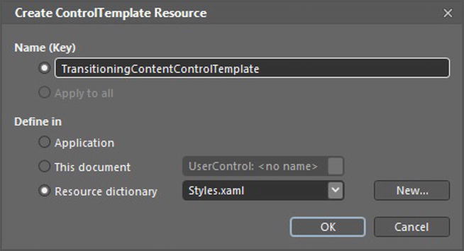
Figure 3-6. Creating a copy of the Frame control's default template
6. Back in Visual Studio, add a reference to the System.Windows.Controls.Layout.Toolkit.dll assembly to your project.
7. Open Styles.xaml, and find the TransitioningContentControlTemplate control template that Expression Blend created for you:
<ControlTemplate x:Key="TransitioningContentControlTemplate"

            TargetType="navigation:Frame">

    <Border Background="{TemplateBinding Background}"

       BorderBrush="{TemplateBinding BorderBrush}"

       BorderThickness="{TemplateBinding BorderThickness}"

       HorizontalAlignment="{TemplateBinding HorizontalContentAlignment}"

       VerticalAlignment="{TemplateBinding VerticalContentAlignment}">

       <ContentPresenter

               Content="{TemplateBinding Content}"

               Cursor="{TemplateBinding Cursor}"

               Margin="{TemplateBinding Padding}"

               HorizontalAlignment="{TemplateBinding HorizontalContentAlignment}"

               VerticalAlignment="{TemplateBinding VerticalContentAlignment}"/>

    </Border>

</ControlTemplate>
8. At the top of Styles.xaml, declare a prefix for the Silverlight Toolkit's layout controls namespace. (This should be on one line.)
xmlns:layout="clr-namespace:System.Windows.Controls;assembly=System.Windows.Controls.Layout.Toolkit"
9. Change the ContentPresenter reference in the control template to TransitioningContentControl, using the namespace prefix you defined in the previous step. Keep the other properties as they were defined for the ContentPresenter on the TransitioningContentControl.
<layout:TransitioningContentControl

        Content="{TemplateBinding Content}"

        Cursor="{TemplateBinding Cursor}"

        Margin="{TemplateBinding Padding}"
        HorizontalAlignment="{TemplateBinding HorizontalContentAlignment}"

        VerticalAlignment="{TemplateBinding VerticalContentAlignment}"/>
10. As it is now, the transitioning will work without any further changes, using a default transition of fading the old view out and the new one in. To use your own transition, you will need to set the Style property for the TransitioningContentControl control to use a new style that you will create for it. This style will contain a control template for the TransitioningContentControl control that defines the animation to use when navigating from one view to another.
Note Some example transition animations can be found in the sample code for this chapter.