
Applying Control Templates
You have now seen how we can define a style resource and apply it to controls, but what if we want to completely change the appearance of the control, including the appearance or function of its elements not exposed by the control as properties? In Silverlight, this is actually possible by applying an alternate control template to the control (in place of its default template). The structure of Silverlight custom controls encourages a separation between the control's presentation and behavior. The behavior of the control should be defined in the code, and its appearance should be defined in the control template. Between the two is a contract defining what the code needs access to from the presentation layer. With this clear separation of concerns, you can completely modify the appearance of a control without affecting its behavior, as long as you adhere to the control's behavior/presentation contract. This is an extremely powerful feature of XAML and really demonstrates its flexibility when defining user interfaces.
 Note A style enables you to simply assign property values to a control, while a control template enables you to directly modify the core XAML of the control itself.
Using Default Control Templates
Default control templates and styles are defined in the Generic.xaml file in the Themes folder of the project or assembly containing the control. Each control template has its own resource dictionary within this file. When you want to apply your own alternate custom control template to a control, the easiest way to start is by making a copy of the default control template of that control and working from there. The easiest way to extract the default control template is using Expression Blend. It will allow you to copy the default control template for that control, from the Generic.xaml file in the control's assembly, into your project as a new resource. You can then customize this control template resource as you see fit—move elements around, add additional control elements, remove elements, and restyle elements—as long as you keep the template parts and states specified in the control's contract.
Unfortunately, without using Expression Blend, the only way to get the existing control template is to follow these steps:
- Open the
Generic.xamlfile of the assembly that contains the control you want to modify. If you don't have the source code for the control, you will need to open the assembly using a decompilation tool (such as .NET Reflector) and extract theGeneric.xamlfile from there. - Find the style resource / control template pertaining to the control, and copy it into your project as a new style resource / control template.
- Assign that new style resource / control template to your control.
As you can see, this is a somewhat messy and convoluted process when performed manually, but Expression Blend helps to automate it and make it easy.
Templating a Control
Using Expression Blend, you can make a copy of a control's default template by right-clicking the control in design view and selecting Edit Control Parts (Template)  Edit a Copy from the context menu. This will open the window shown in Figure 9-1.
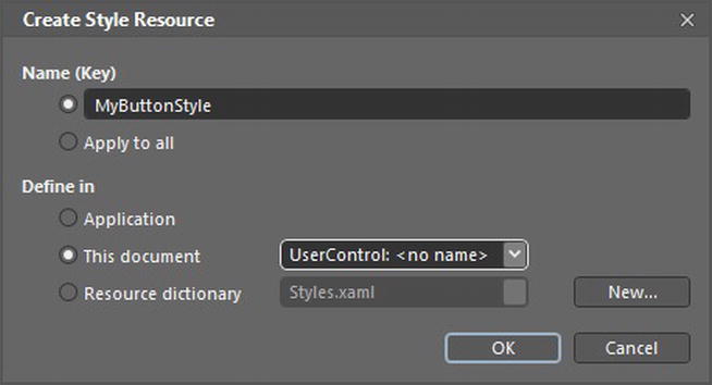
Figure 9-1. The Create Style Resource window in Expression Blend
Give the style resource a name or select the “Apply to all” option to make it an implicit style, and specify a location where it should be defined in your application. Once you've done so, Expression Blend will perform the previously mentioned process automatically and leave the file ready for you to make your customizations, which you can do visually using the Expression Blend design view or by modifying the XAML manually.
Note Despite the fact that you're making a copy of the control template, this process actually creates a style resource for the control, not a control template resource, although the style resource contains the control template. This style resource will then be assigned to the control's Style property. (A style can set property values, and Template is a property on the control.) However, if you already have a style assigned to this control, a control template resource will be created instead and assigned to the control's Template property.
You will find that creating a control template resource inserts a lot of XAML markup into your project. The amount will depend on the complexity of the control, and some controls like the DataGrid can be very complex. There is no way to minimize the amount of XAML generated without simplifying the visual structure of the control itself. For example, if you want to make only a slight adjustment to an existing element in the template, you're faced with an all-or-nothing approach. It's advisable to always maintain control templates in a separate resource file rather than inside a view, even if it is only used by that view, simply to ensure that your views are kept clean and tidy and without the burden of all the XAML that control templates generally impose.
Note Before customizing a control template, it's worth ensuring there isn't a style or template property on the control that will allow you to style or customize just a part of the control, without resorting to customizing the entire template.
Despite my advice against this, for the sake of completion, I'll demonstrate that you don't actually have to create styles and control templates as resources. They can also be defined inline to a control definition using property element syntax, and thus will apply to that control instance only, for example:
<TextBox>

    <TextBox.Template>

        <!-- Control template definition can go here -->

    </TextBox.Template>

</TextBox>
Structuring Control Templates
Let's now take a look at exactly what a control template is and how it is structured. Often, you will hear this structure referred to as the “parts and states model.”
At its simplest, a control template simply defines the XAML that makes up the static presentation of the template that never changes, for example:
Note We'll go through the structure of control templates in more detail in Chapter 12, as we look at how to build custom controls.
Visual States
Rarely will a control have a single static appearance, because almost all controls change their appearance in some way, such as when a control has focus or is disabled. In that case, we would define a base look for the control (its default state), and changes to the control's appearance would be made when appropriate. This default state should also include the elements that would be visible in the alternative states, even if they're not visible in the base state. If an element should not be visible in the control's base state, set its visibility to collapsed, or set its opacity to 0.
For example, a button looks a particular way when it is placed on a form (its default state). This appearance is updated when the control changes state, such as when it has the focus, is disabled, pressed, hovered over, and so on. This is where Visual States come in—each visual state defined describes how the base look of the control will be altered when that state is active to achieve the appearance of the control for that state. This involves altering the elements that make up the control's default state—for example, changing its color, visibility, opacity, and so on—to visually indicate that the control is in that state. In other words, we define each state in our control template, and each state defines the changes that need to be made to the default state in order to achieve its desired appearance. These changes are actually defined as animations and will be discussed in the next section of this chapter.
What triggers a state change on a control? Essentially, the control behavior (that is, the code for the control) manages its current state, based on the events it receives and/or the value assigned to one or more of its properties. For example, when the user clicks a button and holds the mouse button down, meaning the button is in the Pressed state, the button needs to change its visual state to visually indicate as such. Alternatively, the button may be disabled (IsEnabled="false"), in which case the button needs to visually indicate that by entering its Disabled state. The control's logic determines what state it should be in, but it then delegates updating the control's appearance to the Visual State Manager, which does so accordingly.
Note No changes should be made to the visual appearance of the control from the code. All presentation details should be defined within the control template as states.
You may also want to have a constant animation for the control while it is in a particular state, such as a button pulsing when the mouse is over it. This is known as in-state animation and is achieved using a storyboard containing various animations that change the property values of elements within the control over a given duration and that will generally be set to continually repeat while the control is in that state.
A simple example of animating a property on an element within the control is demonstrated in the following example. This animation is used to make the button appear to be pressed. It does so by changing the Opacity property of the PressedBorder element to 1, making that element visible.
<VisualState x:Name="Pressed">

    <Storyboard>

        <DoubleAnimationUsingKeyFrames

                        Storyboard.TargetProperty="(UIElement.Opacity)"

                        Storyboard.TargetName="PressedBorder">

            <EasingDoubleKeyFrame KeyTime="0" Value="1"/>

        </DoubleAnimationUsingKeyFrames>

    </Storyboard>

</VisualState>
Note Each state must exist within a state group, as will be described shortly.
A full discussion of implementing animations is beyond the scope of this book, although you will find further examples in Chapter 12.
State Transitions
A control moves from state to state via a state transition. State transitions can be represented in the control template using the following:
- An explicitly defined animation, defined within a storyboard, in the same way as in-state animations, over a given duration, for example:
<VisualTransition GeneratedDuration="0:0:2" From="Inactive" To="Active">

    <Storyboard>

        <DoubleAnimation From="0" To="1" d:IsOptimized="True"

                        Storyboard.TargetProperty="(UIElement.Opacity)"

                        Storyboard.TargetName="LayoutRoot" />

    </Storyboard>

</VisualTransition> - An automatic transition that smoothly animates each element in the control between its configuration in each state over a given duration, in a process managed by the Visual State Manager, for example:
<VisualTransition GeneratedDuration="0:0:2" From="Inactive" To="Active" />
Note As a general rule, state transitions should have a very short duration (no more than half a second) so as to not slow the user's interaction with the application.
Visual State Groups
We need to take into account one more complexity, and that's when a control can be in more than one state at the one time. For example, a button may be in its Focused state, indicating the button has input focus, but it may also simultaneously be in its Pressed state, where the button has been clicked and the mouse button hasn't been released. How do we represent both states visually at the same time? Well, this is possible by having the states exist in different visual state groups. Visual state groups allow you to group related states together. Although only one state in each group can be active at a time, multiple states can be active across all the defined groups, and the control's appearance can combine each of these together. So as per the previous example, the base look is updated to indicate the button is pressed, and the focus rectangle will be drawn to indicate the button has focus.
<VisualStateManager.VisualStateGroups>

    <VisualStateGroup x:Name="CommonStates">

        <!-- Define common states here -->

    </VisualStateGroup>

    <VisualStateGroup x:Name="Focused">

        <!-- Define focused states here -->

    </VisualStateGroup>

    <VisualStateGroup x:Name="Pressed">

        <!-- Define pressed states here -->

    </VisualStateGroup>

</VisualStateManager.VisualStateGroups>
Template Parts
The final concept to understand is that of template parts. A control may need to reference certain visual elements that belong to it in the code for that control (that is, the behavior management code). Because of the strict separation between the control's behavior and presentation, and the ability for an alternative control template to be applied to the control, these elements need to be defined in the contract between its behavior and presentation as required elements in any control template that is applied. These elements are known as template parts. Template parts will be covered in more depth in Chapter 12.