
One of the newer technologies out there is Silverlight 1.0, which was released in September of 2007. At the time of this writing, Silverlight 1.0 is the only production release of the product. However, Silverlight 2.0 will be released in the first half of 2008.
Silverlight is a lightweight browser plug-in from Microsoft that, much like Adobe's Flash, will allow for greater fluidity in your applications, thereby providing a rich user experience like no other in ASP.NET. The base of Silverlight is XAML — a new markup language for creating applications by Microsoft, such as WPF (Windows Presentation Foundation) applications.
You can build Silverlight applications using Microsoft's new Expression Blend IDE, as well as the new Visual Studio 2008. This chapter looks at the basics of Silverlight and how to build a Silverlight application.
Silverlight is not tied to Microsoft's Internet Explorer. It cannot be. If an application is going to work on the Web, then it has to work in a multitude of browsers. For this reason, Silverlight is a cross-browser platform for the applications you build. It is a standalone environment and has no dependency for items, such as the .NET Framework, on the client machine.
However, even though you are using XAML to build your Silverlight applications, you're not required to have the .NET Framework 3.0 or 3.5 on the client. Instead, the XAML is loaded into the browser and run in the context of the Silverlight plug-in.
Silverlight will not run in every browser on the market. The following list shows which popular browsers Silverlight 1.0 can work with today:
Microsoft's Internet Explorer 6 and later
Firefox 1.5.0.8 and later (running on Windows or the Mac)
Safari 2.0.4 and later (running on the Mac)
Following are the operating systems that can run Silverlight:
Windows XP SP2
Windows Vista
Mac OS X (10.4.8 or better)
You might be wondering why Linux is not on this list. Novell is building a Silverlight plug-in for the Linux environment called Moonlight — a Mono-based implementation of Silverlight.
You can find more information on Moonlight at
www.mono-project.com/Moonlight.
At the time of writing, Silverlight 1.0 has been out for a couple of months. Though revolutionary, this first version of the product supports a model that uses JavaScript programming to interact with the Silverlight objects.
The big change coming with Silverlight 2.0 is that you are going to be able to use managed code (such as Visual Basic) to interact with the Silverlight objects.
Both versions use XAML to control the output to the browser. The difference between the two versions of Silverlight is that JavaScript is used to control the behaviors on the page for version 1.0, and managed code is used for version 2.0.
If you are an end user and you access a Silverlight application (a page on the Internet that makes use of the Silverlight plug-in), then you will be prompted to download the Silverlight plug-in. Obviously, this only occurs when end users don't have the plug-in installed yet on their machines.
For instance, if you direct your browser to the URL www.silverlight.net, which is the URL for the main Silverlight page, you will be prompted to install Silverlight, as shown in Figure 21-1.
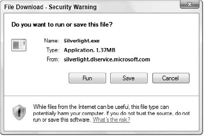
Installing Silverlight is quick and simple. It takes about 20 seconds to perform this 1.3 MB install. Pressing the Click to Install button on the page will give you a File Download security warning (as shown in Figure 21-2). In this case, simple press the Run button.
The Silverlight application will install, and you will get a notification of the install process, as shown in Figure 21-3.
This install process shows what percentage you have installed as well as the version of Silverlight that you are installing (shown in the lower right-hand corner of the dialog).
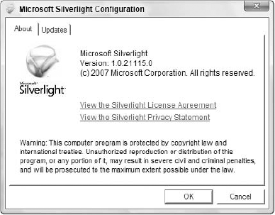
Once you've installed it, you'll be able to right-click on any Silverlight component on the page and view the Silverlight configuration by making the appropriate selection from the provided menu. On the Silverlight Web page, you can see this by right-clicking on the upper menu. You will then see the Silverlight Configuration dialog, shown in Figure 21-4.


When you open Visual Studio 2008, you won't find a Silverlight application template in the list of available options when you create a new project. In order to get that, you need to download the Silverlight SDK from the Silverlight.net website.
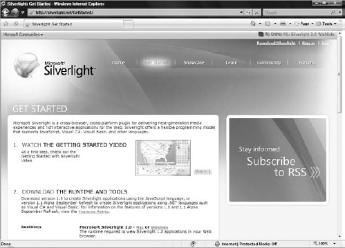
On the Silverlight.net website, click the Get Started option in the menu at the top of the page. The window shown in Figure 21-5 will appear.
From this site, the following items can be downloaded:
Runtimes:
Microsoft Silverlight 1.0 for the Mac or Windows
A version of Microsoft Silverlight 2.0
Developer Tools:
Microsoft Visual Studio 2008
The Microsoft Silverlight Tools for Visual Studio 2008
Designer Tools:
Microsoft's Expression Blend
Expression Encoder
Expression Design
Software Development Kits:
Microsoft Silverlight 1.0 Software Development Kit
Microsoft Silverlight 2.0 Software Development Kit
Assuming you have already installed Visual Studio 2008, you need to install the Silverlight Tools for Visual Studio. Installing this toolset will add the Silverlight Project option to your instance of Visual Studio 2008.
Now that you have installed everything that's needed to build a Silverlight application, the next step is to build a simple application that makes use of the Silverlight plug-in. The first step is select the Silverlight Project template that is now available in Visual Studio 2008 from the install you just did of the Silverlight Tools for Visual Studio.
Within Visual Studio 2008, select File
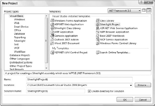
The Silverlight Project option is only available as a .NET Framework 3.5 project, and the default name of the project is SilverlightProject1, as shown in the figure. Selecting the OK button will create the project for you.
Once you have created your application, you will find a series of files contained within the project. The SilverlightProject1 solution is presented in Figure 21-7.
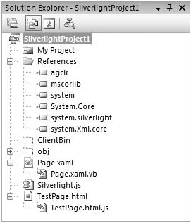
Within this solution are references to agclr (the CLR imbedded in the Silverlight container), mscorlib, System, System.Core, System.Silverlight, and System.Xml.Core. The Silverlight parts to focus on within this application are the Page.xaml and Page.xaml.vb files. These are embedded in the container on the client. The test client, in this case, is the TestPage.html page. Here is a description of the pages included in the solution shown in Figure 21-7.
Looking at the Page.xaml file, you will see the following:
<Canvas x:Name="parentCanvas"
        xmlns="http://schemas.microsoft.com/client/2007"
        xmlns:x="http://schemas.microsoft.com/winfx/2006/xaml"
        Loaded="Page_Loaded"
        x:Class="SilverlightProject1.Page;
           assembly=ClientBin/SilverlightProject1.dll"
        Width="640"
        Height="480"
        Background="White"
        >

</Canvas>
The Canvas control is the container in which you can place any number of child elements. From this bit of code, you can see that the Canvas control has an assigned name:
X:Name="parentCanvas"
There is also an event handler in the code with the Loaded attribute:
Loaded="Page_Loaded"
Finally, other points to pay attention to are the style attributes of Width, Height, and Background:
Width="640"
Height="480"
Background="White"
In version 2.0 of Silverlight, the code-behind page for the .xaml file is a .xaml.vb file. In version 1.0 of Silverlight, you use JavaScript as your code-behind page, so your code-behind file would be .xaml.js.
The example in this chapter uses the 2.0 version of Silverlight, and the code for the Page.xaml.vb file is presented here:
Partial Public Class Page
    Inherits Canvas

    Public Sub Page_Loaded(ByVal o As Object, ByVal e As EventArgs)
        ' Required to initialize variables
        InitializeComponent()

    End Sub

End Class
In this case, you have a Page class that inherits from Canvas. Any page events that you are going to put on your page would happen here on this code-behind page.
The Page.xaml and the Page.xaml.vb files are the files that constitute the Silverlight portion of the application. The other two pages, TestPage.html and TestPage.html.js, are sample pages used to host the Silverlight player. The TestPage.html page is presented in the following code:
<!DOCTYPE html PUBLIC "-//W3C//DTD XHTML 1.0 Transitional//EN"
 "http://www.w3.org/TR/xhtml1/DTD/xhtml1-transitional.dtd">

<html xmlns="http://www.w3.org/1999/xhtml" >
<head>
    <title>Silverlight Project Test Page </title>

    <script type="text/javascript" src="Silverlight.js"></script>
    <script type="text/javascript" src="TestPage.html.js"></script>
    <style type="text/css">
        .silverlightHost { width: 640px; height: 480px; }
    </style>
</head>

<body>
    <div id="SilverlightControlHost" class="silverlightHost" >
        <script type="text/javascript">
            createSilverlight();
        </script>
    </div>
</body>
</html>
This page loads two JavaScript files: Silverlight.js and TestPage.html.js. Keep in mind that the Silverlight.js file is used to detect whether or not the client has Silverlight installed on his or her computer, whereas TestPage.html.js is used for any JavaScript functions that you need on the page. The TestPage.html.js file is presented here:
// JScript source code

//contains calls to silverlight.js, example below loads Page.xaml
function createSilverlight()
{
 Silverlight.createObjectEx({
         source: "Page.xaml",
         parentElement: document.getElementById("SilverlightControlHost"),
         id: "SilverlightControl",
         properties: {
                width: "100%",
                height: "100%",
                version: "1.1",
                enableHtmlAccess: "true"
         },
         events: {}
 });

 // Give the keyboard focus to the Silverlight control by default
    document.body.onload = function() {
      var silverlightControl = document.getElementById('SilverlightControl'),
      if (silverlightControl)
      silverlightControl.focus();
    }

}
This page works with the Silverlight player and assigns the page that this player is to work with when the object is created.
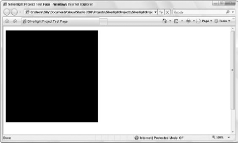
You can view the canvas you are working with by changing the background color of the <Canvas> element, as shown in the following example:
<Canvas x:Name="parentCanvas"
        xmlns="http://schemas.microsoft.com/client/2007"
        xmlns:x="http://schemas.microsoft.com/winfx/2006/xaml"
        Loaded="Page_Loaded"
        x:Class="SilverlightProject1.Page;
           assembly=ClientBin/SilverlightProject1.dll"
        Width="350"
        Height="350"
        Background="Black"
        >

</Canvas>
In this case, the Width and Height properties were changed to 350 pixels, and the Background property value was changed to Black. This would produce the results shown in Figure 21-8.
This shows the Silverlight canvas as it is presented in the browser. In this case, the entire canvas is represented as a black square.
Silverlight's capabilities enable you to do quite a bit, including video, animation, vector-based graphics, and much more — obviously more than what can be represented in a single chapter. The next few sections provide an overview of Silverlight through some basic examples that will help you understand your Silverlight application.
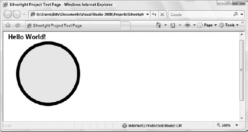
This example creates a Hello World! application. The only requirement here is that you change the Page.xaml file as follows:
<Canvas x:Name="parentCanvas"
        xmlns="http://schemas.microsoft.com/client/2007"
        xmlns:x="http://schemas.microsoft.com/winfx/2006/xaml"
        Loaded="Page_Loaded"
        x:Class="SilverlightProject1.Page;
           assembly=ClientBin/SilverlightProject1.dll"
        Width="640"
        Height="480"
        Background="White"
        >

  <Ellipse Height="200" Width="200" Canvas.Left="30" Canvas.Top="30"
      Stroke="Black" StrokeThickness="10" Fill="Yellow">
  </Ellipse>

  <TextBlock Canvas.Left="5" Canvas.Top="5" Text="Hello World!"
   FontFamily="Arial" FontSize="20" FontWeight="Bold"></TextBlock>

</Canvas>
In this example, the canvas contains two elements. The first is a circle represented with the <Ellipse> element. The ellipse, or circle, is given a size with the Height and Width attributes. Both of these attributes are assigned a value of 200.
Important attributes to understand are the Canvas.Left and Canvas.Top attributes used in this example. These attributes define the location of the element on the page. Figure 21-9 shows how these attributes work.

As shown in Figure 21-9, Canvas.Left defines the number of pixels that the element is positioned from the left side of the canvas. Canvas.Top defines the number of pixels that the element is positioned from the top of the canvas.
The Stroke and StrokeThickness attributes work with the border of the ellipse. The Stroke attribute is given a value of Black and the StrokeThickness is set at 10 pixels. Finally, the Fill attribute defines the color used inside of the ellipse itself. This attribute is set to Yellow.
In addition to the yellow ellipse defined with the <Ellipse> element, there is a second element — a <TextBlock> element. Here, a series of attributes works with the text that appears in the element itself:
<TextBlock Canvas.Left="5" Canvas.Top="5" Text="Hello World!"
   FontFamily="Arial" FontSize="20" FontWeight="Bold"></TextBlock>
Just like the <Ellipse> element, this element also contains Canvas.Left and Canvas.Top attributes to define its position within the canvas. When this page is run, you will get what is presented in Figure 21-10.
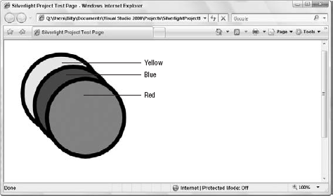
As shown in the preceding example, the canvas contains two elements — an Ellipse control and a TextBlock control. Each of these controls was laid onto the canvas using various attributes. The following example demonstrates what happens when these elements overlap:
<Canvas x:Name="parentCanvas"
        xmlns="http://schemas.microsoft.com/client/2007"
        xmlns:x="http://schemas.microsoft.com/winfx/2006/xaml"
        Loaded="Page_Loaded"
        x:Class="SilverlightProject1.Page;
           assembly=ClientBin/SilverlightProject1.dll"
        Width="640"
        Height="480"
        Background="White"
        >

  <Ellipse Height="200" Width="200" Canvas.Left="30" Canvas.Top="30"
      Stroke="Black" StrokeThickness="10" Fill="Yellow">
  </Ellipse>

  <Ellipse Height="200" Width="200" Canvas.Left="60" Canvas.Top="60"
     Stroke="Black" StrokeThickness="10" Fill="Blue">
  </Ellipse>

  <Ellipse Height="200" Width="200" Canvas.Left="90" Canvas.Top="90"
      Stroke="Black" StrokeThickness="10" Fill="Red">
  </Ellipse>

</Canvas>
In this case, there are three <Ellipse> elements of different colors (yellow, blue, and red), and each has a different position on the canvas defined. Running this page will result in the image shown in Figure 21-11 (without the color, of course).
In order to fully appreciate Figures 21-11 through 21-14, you need to see them in color, which can only be indicated here with callouts. However, if you are following along and creating these code samples yourself, you will be able to see the colored ellipses discussed here.
In this example, three elements overlap one another. A stack order determines how these elements are laid upon the canvas, with the yellow ellipse at the back and the red ellipse at the front.
The purpose of this example is to demonstrate that in addition to positioning your elements within the <Canvas> element, there is also a process for determining how the elements are drawn onto the screen. The order of the elements is what is important to understand. The first element encountered in the .xaml document will be drawn first (the yellow ellipse), followed by the second ellipse (blue). The last element (red) in the document is drawn last.
To see this in action, consider the following code:
<Canvas x:Name="parentCanvas"
        xmlns="http://schemas.microsoft.com/client/2007"
        xmlns:x="http://schemas.microsoft.com/winfx/2006/xaml"
        Loaded="Page_Loaded"
        x:Class="SilverlightProject1.Page;
           assembly=ClientBin/SilverlightProject1.dll"
        Width="640"
        Height="480"
        Background="White"
        >

  <Ellipse Height="200" Width="200" Canvas.Left="90" Canvas.Top="90"
      Stroke="Black" StrokeThickness="10" Fill="Red">
  </Ellipse>

  <Ellipse Height="200" Width="200" Canvas.Left="30" Canvas.Top="30"
      Stroke="Black" StrokeThickness="10" Fill="Yellow">
  </Ellipse>

  <Ellipse Height="200" Width="200" Canvas.Left="60" Canvas.Top="60"
     Stroke="Black" StrokeThickness="10" Fill="Blue">
  </Ellipse>

</Canvas>
In this case, the <Ellipse> element (the red ellipse) that was at the bottom is now at the top, meaning that this element will be drawn before the other two. Running this page will produce the results illustrated in Figure 21-12.
From this image, you can see that the red ellipse is now at the back of the bunch. The red ellipse is drawn first, followed by the yellow ellipse, and then the third ellipse (blue) is drawn last and put on top of the stack.

Now that you can draw items directly onto the canvas for a Silverlight application, the next step is to enable some type of end-user interaction with the elements on this canvas. For this you will find a series of attributes for your elements that can be directly tied to specific events in the Page.xaml.vb code-behind page.
The first step for this example is to create a rectangle on the canvas using the <Rectangle> element:
<Canvas x:Name="parentCanvas"
        xmlns="http://schemas.microsoft.com/client/2007"
        xmlns:x="http://schemas.microsoft.com/winfx/2006/xaml"
        Loaded="Page_Loaded"
        x:Class="SilverlightProject1.Page;
           assembly=ClientBin/SilverlightProject1.dll"
        Width="640"
        Height="480"
        Background="White"
        >

  <Rectangle Opacity="1" Canvas.Left="100" Canvas.Top="100" Width="200"
   Height="200" x:Name="myRec"
   MouseLeftButtonDown="RectangleClick">
    <Rectangle.Fill>
      <LinearGradientBrush StartPoint="0.9, 0.05" EndPoint="0.9, 0.9">
        <LinearGradientBrush.GradientStops>
          <GradientStop Color="Black" Offset="0"/>
          <GradientStop Color="Blue" Offset="0.50"/>
          <GradientStop Color="Purple" Offset="1"/>
        </LinearGradientBrush.GradientStops>
      </LinearGradientBrush>
    </Rectangle.Fill>
    <Rectangle.Stroke>
<SolidColorBrush Color="Black"></SolidColorBrush>
</Rectangle.Stroke>
</Rectangle>
</Canvas>This is a normal <Rectangle> element. Instead of a standard use of the Fill attribute with something like Fill = "Yellow", this uses a <LinearGradientBrush> element to provide a gradient of color from black, to blue, and finally to purple. Then a stroke (border) is set to black around the entire rectangle.
Earlier, you saw that the <Canvas> element had a name value that was provided with the x:Name attribute:
x:Name="parentCanvas"
Note that in this example the <Rectangle> element is also provided a name:
x:Name="myRec"
This action makes it possible to reference the element in the code-behind of the Page.xaml page.
Next is a series of attributes geared to working with code-behind events. This example makes use of the MouseLeftButtonDown attribute and is provided a value of RectangleClick, which is the name of the event you will use in the code-behind page.
The available attributes you can use here include the following:
Now that the <Rectangle> element has a MouseLeftButtonDown attribute in it, the next step is to change the Page.xaml.vb code-behind page to make use of this declaration. Currently, your code-behind page should appear as follows:
Partial Public Class Page
    Inherits Canvas

    Public Sub Page_Loaded(ByVal o As Object, ByVal e As EventArgs)
        ' Required to initialize variables
        InitializeComponent()
End Sub End Class
You first need to wire the event handler that will be built shortly. This can be done within the Page_Loaded subroutine:
Partial Public Class Page
Inherits Canvas
Public Sub Page_Loaded(ByVal o As Object, ByVal e As EventArgs)
' Required to initialize variables
InitializeComponent()
AddHandler myRec.MouseLeftButtonDown, AddressOf RectangleClick
End Sub

End ClassHere, an AddHandler is utilized to add an event handler for the myRec.MouseLeftButtonDown property. This is then assigned a value of RectangleClick. Remember that the myRec value comes from the name of the <Rectangle> element that was defined in the Page.xaml page. The RectangleClick routine can then be added to the code-behind page:
Partial Public Class Page
    Inherits Canvas

    Public Sub Page_Loaded(ByVal o As Object, ByVal e As EventArgs)
        ' Required to initialize variables
        InitializeComponent()

        AddHandler myRec.MouseLeftButtonDown, AddressOf RectangleClick
    End Sub

    Private Sub RectangleClick(ByVal sender As Object, _
       ByVal args As MouseEventArgs)

        Dim rectanglePaintBrush As New SolidColorBrush()
        rectanglePaintBrush.Color = Colors.Red

        myRec.Fill = rectanglePaintBrush
        myRec.Width = 300
        myRec.StrokeThickness = 10
    End Sub

End Class
In this case, a subroutine called RectangleClick() is created, which then changes the structure of the <Rectangle> element. First, an instance of a SolidColorBrush object is created and assigned a color of Color.Red. Then the Fill property of the myRec rectangle is assigned this instance, meaning the rectangle on the page should turn red when the end user clicks the left mouse button on the rectangle itself.
In addition to changing the color of the rectangle, the width and the stroke's thickness are altered using myRec.Width and myRec.StrokeThickness, respectively. When the page is first loaded, the end user will see what is presented in Figure 21-13.
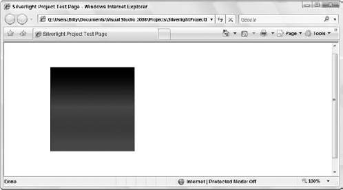
The rectangle is positioned on the page as specified using Canvas.Top and Canvas.Left. It contains a gradient of color from black to blue to purple. Finally, there is a thin, black border around the rectangle.
The next step requires an end user to interact with the rectangle. Clicking on the rectangle with your left mouse button will instantly change the rectangle as shown in Figure 21-14.
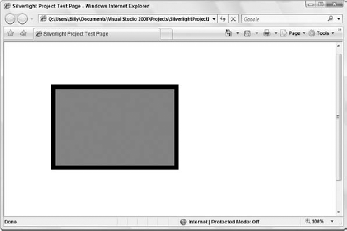
In this case, the rectangle is extended, the color changes, and the thickness of the border is changed. The change happens instantly when the mouse button is clicked.
Silverlight is an outstanding way to bring a rich user experience to your browser-based applications. It is a browser plug-in designed to compete with Flash. This chapter took a look at Silverlight from a developer's perspective, while a designer would instead focus on the user of Microsoft's Expression Blend (for better graphics than what was achieved in this chapter).
Silverlight 1.0 focuses on the use of JavaScript as the code-behind of the XAML pages that you build, whereas Silverlight 2.0 brings a more "managed" experience to the developer. In Silverlight 2.0, you will be able to build XAML pages that have a managed .vb file behind them, as demonstrated in this chapter.