Chapter 7. Histograms
Simple Histograms
Let’s revisit the sbp dataset from the multcomp package. A useful tool for examination of the blood pressure data is the familiar histogram. In this type of graph, the range of values of a numeric variable of interest (e.g., sbp) is usually laid out on the horizontal scale (x-axis). This scale is divided into sections, called bins. The vertical scale (y-axis) shows how many observations fall into each bin.
Figure 7-1 was produced by calling the hist() function four times, once for each graph in the figure. Of course, you could have accomplished the same thing by typing several command lines at the console. The basic command is simply hist(sbp).
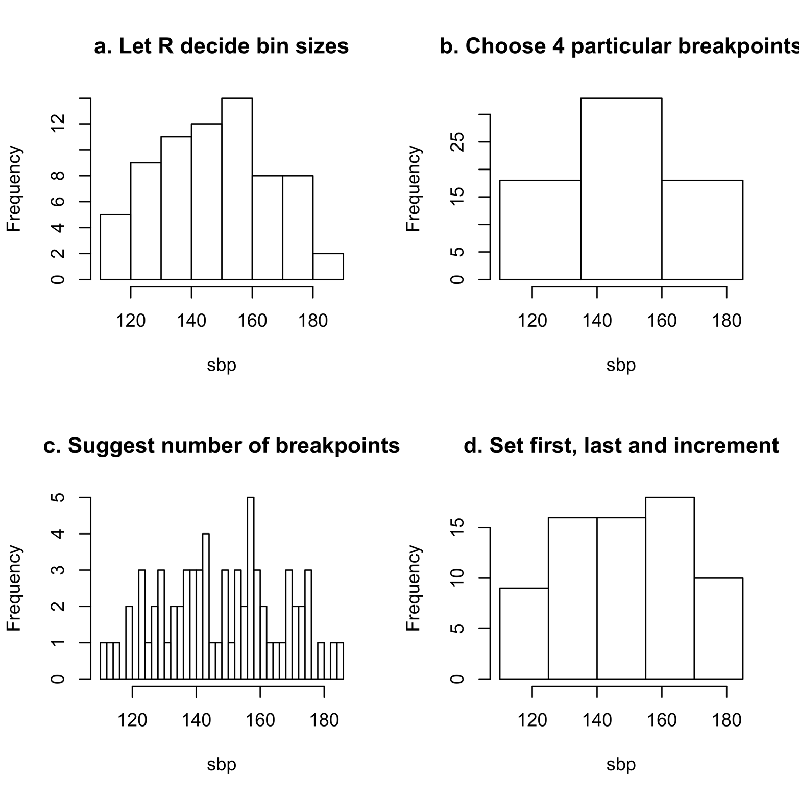
Figure 7-1. Histograms of the sbp variable from the sbp dataset, displaying the effect of differing numbers of bins.
Here is the script to produce Figure 7-1:
# Script for Figure 7-1
library(multcomp)
attach(sbp)
par(mfrow = c(2,2))
hist(sbp, main = "a. Let R decide bin sizes")
hist(sbp, main = "b. Choose 4 particular breakpoints",
  breaks = c(110,135,160,185))
hist(sbp, main = "c. Suggest number of breakpoints",
  breaks = 30)
hist(sbp, main = "d. Set first, last and increment",
  breaks = seq(110,190,15))
detach(sbp)
This code leaves the choice of number of bins to R, which is often a pretty good decision. In addition, each command line adds the argument main = to produce a title for that particular histogram. Finally, except for the first graph, the breaks = argument suggests the number of bins to use and/or how wide the bins should be. Note that in all of the graphs created here, the bins in any one graph are all the same size; in other words, the bars are all the same width. This is the usual practice for histograms. Anything else would be very difficult to interpret.
You can use the breaks argument to do the following:
-
Provide a number of breaks between bars; for example,
breaks = 30. -
Define specified breakpoints; for example,
breaks = c(110,135,160,185). -
Give first, last, and increment values; for example,
breaks = seq(110,190,15). -
Provide any other valid specification of a series of numbers; for example,
breaks = c(110:190).
When using breaks, be careful to begin with the lowest number in the vector; otherwise, you will get an error message. In the previous example, the lowest value in sbp is 110.
Figure 7-1 shows several examples of histograms of the sbp data. All of them are histograms of the same variable, but they look quite different. This is because they all have different numbers of bins. You might draw different conclusions about the distribution of the sbp scores from the various histograms.
Figure 7-1a gives the impression that many patients have an sbp score of about 150–160, but fewer patients have higher and lower scores. Further, the distribution is not symmetrical. Figure 7-1b, however, which was created by using the argument breaks = c(110,135,160,185), gives the impression that the distribution is perfectly symmetrical. Figure 7-1c, which was created by using the argument breaks = 30, is more like 7-1a than 7-1b, but shows more detail than either; it is also more volatile than any of the other histograms, with more sudden ups and downs. Figure 7-1d, created by using the argument breaks = seq(110,190,15), seems to be similar to 7-1a, but does not show the big drop in blood pressure at the high end (near 180).
Figure 7-1a uses the default number of bins; this is the number that R chooses if you do not specify one. Figure 7-1a gives higher resolution than Figure 7-1b—there are more bars and a clearer understanding of just where the data falls—but lower resolution than Figure 7-1c. Looking at all of the histograms, it seems that a lack of symmetry and falling off at the high end are two important features of the data that we would want to show. In this particular example, the default option (Figure 7-1a) gives a very good result. This is often but not always true. See “Exercise 7-1” for an example of a contrary case.
You can control the number of bins in a histogram, but not as easily as you might hope. If you specify the number of breaks, as in Figure 7-1c, this is treated as a suggestion only. R will select a number that is probably close, but satisfies a “pretty” criterion. To find more information about this rule, type ?pretty.
You can add many other arguments to the hist() command. A few of them are demonstrated in the next example and shown in Figure 7-2. For example, las = 1 flips the numbers on the y-axis so that they are upright instead of on their sides, label = T adds the frequency number at the top of each bar, col="maroon" determines the color of the bars, and the xlab = argument provides a more descriptive label on the x-axis:
# Figure 7-2
hist(sbp, main = "sbp dataset", las = 1, label = T,
  col = "maroon", xlab = "Systolic blood pressure")
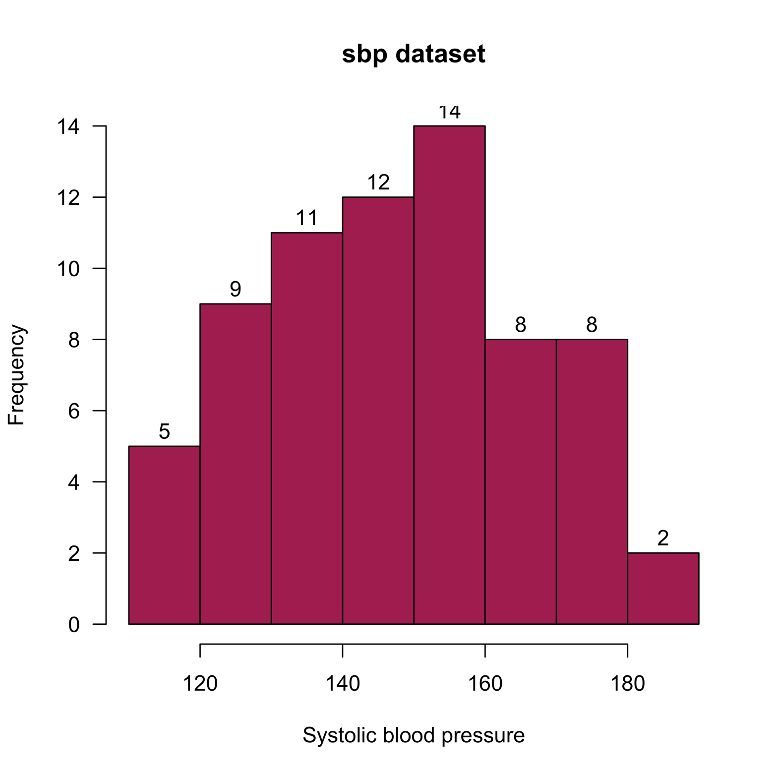
Figure 7-2. A histogram with added features.
Histograms with a Second Variable
Sometimes, it is important to delve deeper into the data than we’re able to do with the simple histogram. For instance, it would be interesting to know if the distribution of blood pressures is similar or different for each gender. One way to assess this possibility is by using a stacked histogram. The sbp dataset includes the variable gender, which we can use with a stacked histogram to divide each of the bars in Figure 7-1a to show how many observations are males and how many are females. Although the hist() function does not allow us to do this, histStack(), a function provided in the plotrix package, makes this easy to do:
# Figure 7-3
library(plotrix)
library(multcomp)
histStack(sbp$sbp, z = sbp$gender,
  col=c("navy","skyblue"),
  main = "Systolic blood pressure by gender",
  xlab = "Systolic blood pressure", legend.pos = "topright")
The result appears in Figure 7-3.
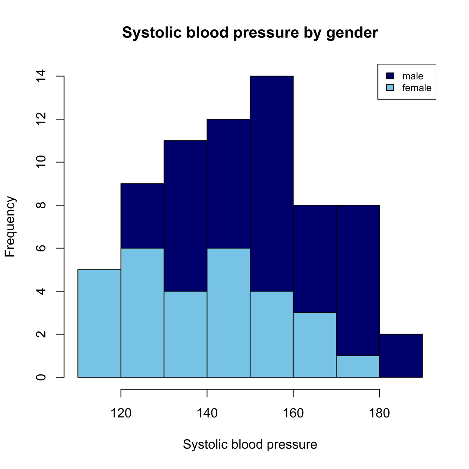
Figure 7-3. A stacked histogram of systolic blood pressure by gender.
The stacked histogram readily provides a lot of useful information. First, it is easy to see the distribution of female blood pressures, in light blue. However, the male distribution is not so easy to interpret: because the bottoms of the bars are all at different levels, it is hard to compare their heights. Nonetheless, we can tell that males have some higher scores than females, and vice versa. There is another way to present this data that most people find easier to read. Rather than putting all the information on one graph, it is possible to break the information up into two graphs that can appear side-by-side or one atop the other. There are several ways to do this in R. One of the easiest is by using the Hist() function in the RCmdrMisc package:
# Figure 7-4
library(RcmdrMisc)
library(multcomp)
Hist(sbp$sbp, groups = sbp$gender,
  main = "Systolic blood pressure by gender",
  col = "navy ", xlab = "Systolic blood pressure")
Figure 7-4 presents the results.
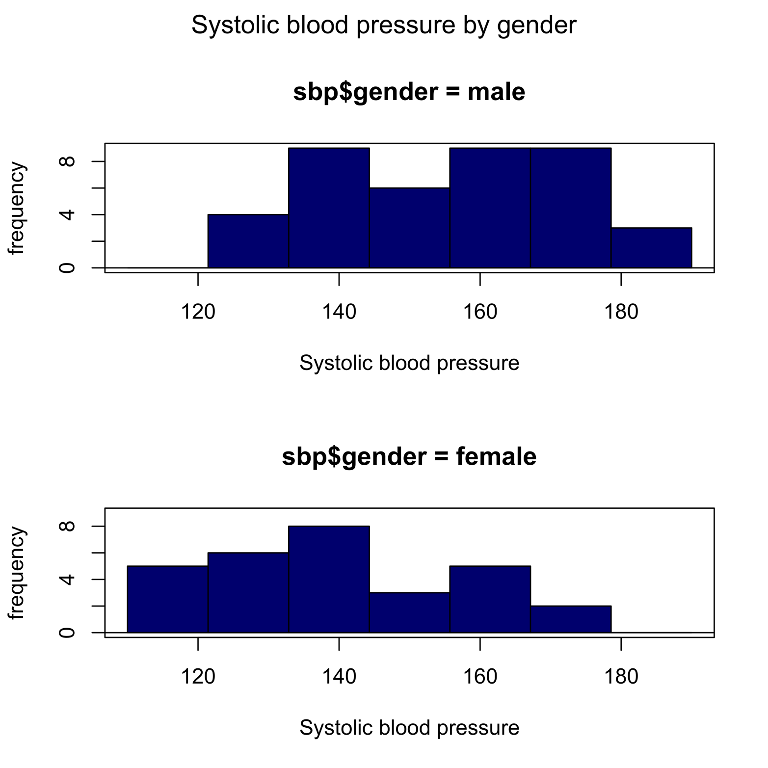
Figure 7-4. Separate histograms of systolic blood pressure for males and females.
The graphs in Figure 7-4 more clearly display not only that males have the highest blood pressures, but that they cluster toward the high end. The Hist() function is fine for a small number of groups, but it is not so convenient when the number of groups is large. For that, we can turn to the lattice package.
The lattice package has a very nice layout for trellis graphics—the graphics are broken down by groups of observations, appearing as separate graphs for each group. The Salaries dataset from the car package includes nine-month salary data for faculty at a college in the United States for the years 2008–2009. It was collected for the purpose of studying differences between male and female compensation. Let’s produce a set of histograms for each combination of rank (three ranks) and gender (two genders), or six groups in all. Install and load the necessary packages first. Then, look at the information provided in the dataset. Notice the slightly different syntax for the histogram() command. The variable Salaries$salary is preceded by a tilde (~). The combination of variables that will form the groups follows the vertical bar symbol (|), and we use an asterisk (*) to indicate crossing the two variables. We get a very readable display in Figure 7-5, in which it is easy to compare male and female faculty salaries at a glance. The order of the grouping variables is important, however. If we had reversed the order, it would have resulted in a display that is not so easy to read. Try it for yourself:
# Figure 7-5
install.packages("lattice") # you probably already have it
install.packages("car")
library(lattice)
library(car)
head(Salaries)

       rank discipline yrs.since.phd yrs.service  sex salary
1      Prof          B            19          18 Male 139750
2      Prof          B            20          16 Male 173200
3  AsstProf          B             4           3 Male  79750
4      Prof          B            45          39 Male 115000
5      Prof          B            40          41 Male 141500
6 AssocProf          B             6           6 Male  97000


histogram(~ Salaries$salary | Salaries$rank * Salaries$sex,
  type = "count", main = "Faculty Salaries by Rank & Gender")

Figure 7-5. Histograms by groups, produced by using the histogram() function in the lattice package.
We can make several observations about the data presented in Figure 7-5. First, comparing the top row of histograms, which show data for males, to the bottom row, we can see that there are many more males than females in this study. Next, looking at the histograms from left to right, it is quite clear that there are many more professors (the highest rank) than associate professors or assistant professors. Finally, the salary distributions of males and females have about the same median for each rank, but there are more males at the high end of salary in both the professor and associate professor ranks.
Exercise 7-1
Consider the case0302 dataset from the Sleuth2 package. Make a histogram of the Dioxin variable, without specifying the number of breaks. Next, try several different ways of creating bins of various sizes. Does the distributional shape seem to change? Look at a strip chart of Dioxin. What does this tell you about the histograms?
Exercise 7-2
Sometimes, you might want to compare two variables. There are many ways to do this, one way being to look at their histograms. If two variables are measured on the same scale, it may be enlightening to look at the histograms back-to-back. The package Hmiscincludes the histbackback() function for just this purpose. You can use this function to study the relation between the IQ measurements of brothers in the Burt dataset from the car package. Also, you can compare male and female salaries from the Salaries dataset.