Chapter 17. Three-Dimensional Plots
3D Scatter plots
The trees dataset has three quantitative variables. We looked at the distribution of one of them, Volume, in a strip chart and the relationship of two of them, Height and Girth, in a scatter plot. It is possible to visualize all three at once in an extension of the scatter plot, a graph commonly called a 3D scatter plot. Several packages have functions to create 3D scatter plots, including lattice, scatterplot3d, rgl, plot3D, car, and probably others.
In this section, the scatterplot3d package is emphasized because its syntax is very much like that of the plot() function in base R. It is also relatively easy to work with and quite versatile. Finally, many of the tricks that you can use to make 3D plots comprehensible are easily demonstrated with this package. A couple of other functions will also be introduced and compared.
The scatterplot3d() function has a basic syntax of either:
scatterplot3d(x, optional arguments)
where x is a data frame or matrix,
or:
scatterplot3d(x, y, z, optional arguments)
where x, y, and z are vectors.
Although the first option is usually more convenient, the second is often preferable because it gives you the ability to decide upon the order of the variables or to select a subset of variables. Variable x is plotted on the horizontal axis, y on the diagonal axis, and z on the vertical axis. In the example script that follows, x, y, and z are Height, Girth, and Volume.
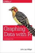
# script for Figure 17-1
library(scatterplot3d)
attach(trees)
par(mfrow = c(2,2),
  cex.main = .9,
  las = 1)

scatterplot3d(Height, Girth, Volume,
  main="a. 3D scatter plot of trees data")
# you could substitute: scatterplot3d(trees)
# to see what happens...

scatterplot3d(Height,Girth,Volume,
  pch = 16,
  highlight.3d = T,
  main = "b. 3D scatter plot with highlighting",
  cex.axis = .5)

scatterplot3d(Height,Girth,Volume,
  pch = 16,
  highlight.3d = T,
  type = "h",
  main = "c. 3D scatter plot with lines and highlighting",
  cex.axis = .5)

scatterplot3d(Height, Girth, Volume,
  pch = 15, type = "h",
  lwd = 5,
  color = "cyan4",
  main = "d. 3D bar plot without box",
  box = F,
  cex.axis = .5)
Figure 17-2 shows the result of this script.
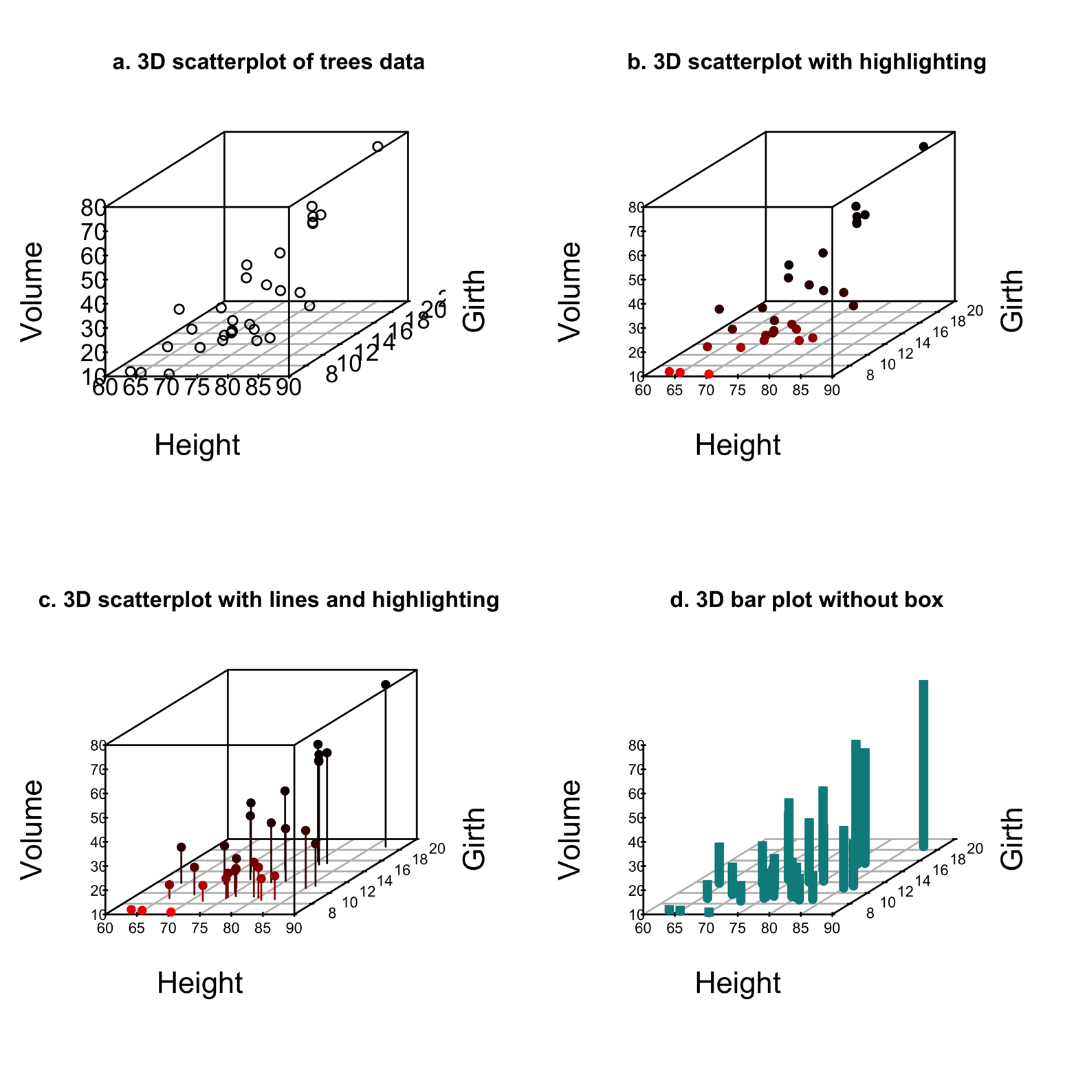
Figure 17-1. The basic scatterplot3d() output and several improvements.
Figure 17-1a shows a basic 3D scatter plot. A grid in the base of the box surrounding the graph helps a little to suggest a three-dimensional space on a two-dimensional surface. It is still pretty difficult to reckon the coordinates of a given point from the picture, however.
Figure 17-1b shows an improvement. Specifying the argument highlight.3d=T adds color to the points in such a way that points “out front” (those with lower y values) are bright red and the color becomes darker as the y values grow larger. The pch=16 argument fills in the circles and thereby strengthens the color effect a bit.
Figure 17-1c makes a further improvement by adding vertical lines from each point to the grid on the base. This is done by using the type="h" argument, making it much easier to discern the precise x and y values.
Finally, Figure 17-1d turns the plot with lines into a bar plot by changing the plot characters to squares and increasing the width of the vertical lines to match the width of the squares. The plot characters are changed by using the pch=15 argument and the line width with lwd=5. Finding the right line width often takes some trial and error. The box around the graph was removed by using box=F. Decide for yourself: which of these plots is easiest to read?
Another way to help the viewer make sense of a 3D plot is to place a reference surface on the graph. This could be a plane or a curved surface. Figure 17-2 shows one possibility, a prediction plane defined by a linear model. If you do not already know about multiple regression, you can skip this example.

Figure 17-2. A 3D scatter plot with a prediction plane/reference surface, made by using scatterplot3d()
Here is the code to produce Figure 17-2:
# Figure 17-2
library(scatterplot3d)
attach(trees)
par(mfrow=c(1,1), las = 1)
# put plot results in an object, sp3
sp3 = scatterplot3d(Height, Girth, Volume, pch = 16,
  highlight.3d = T,
  type = "h",
  main = "3D scatter plot with prediction plane",
  cex.axis = .7,
  box= F)
model = lm(Volume ~ Height  +Girth) # fit linear model, named
  "model" sp3$plane(model)  # draw the plane created by the
                            # model
The plot in Figure 17-2 is a little confusing because it is very hard to gauge whether a particular point lies above or below the reference plane. We can generate a better image by using the scatter3d() function in the car package. The graph displayed in Figure 17-3 is similar, but the plane is colored to give it more substance and the points are colored differently depending on whether they lie above or below the plane.

Figure 17-3. A 3D scatter plot with prediction a plane, made by using scatter3d() in the car package.
In contrast to scatterplot3d(), scatter3d() puts y on the vertical axis, so to make a graph that can easily be compared to the one produced by scatterplot3d(), you must change the order of the variables. Furthermore, the orientation of the z variable is opposite, so the variable Girth has been multiplied by –1 to make the plot comparable to Figure 17-2. This is one of those things that is not clear until you experiment with your code. Following is the code to produce Figure 17-3:
# Figure 17-3
library(car)
library(rgl)
attach(trees)
scatter3d(Height, Volume, -1*Girth)
rgl.snapshot("ch17.3.png", fmt = "png") # save to working dir
Figure 17-3 is clearly an improvement, but it is still difficult to get a good view of all the points. One approach to this problem is to look at the plot from a different angle, which you can accomplish easily by changing the order of the variables, as demonstrated in Figure 17-4.Even better, by adding the argument revolutions = n, as shown in the code that follows, we can make the graph spin around n times on the screen, enabling a good view from all sides. Try it!
# Figure 17-4
library(car)
library(rgl)
attach(trees)

scatter3d(Girth, Volume, Height, revolutions = 2)
rgl.snapshot("ch17.4.png", fmt = "png") # save to working dir

Figure 17-4. The plot from Figure 17-3, but viewed from a different angle. The revolutions = 2 argument makes it spin around twice on the screen.
There are many options to customize scatter3d(), such as colors, lines on the surface grid, speed of revolution, and more. For more information, type ?scatter3d.
False Color Plots
3D scatter plots represent three dimensions as horizontal, vertical, and diagonal. This is sometimes successful, but other times it is confusing. A different approach to representing the third dimension is to use gradations in color to give a sense of depth. Called a false-color plot, this type of 3D plot is implemented in the levelplot() function in the lattice package. Figure 17-5 shows an example of such a plot with two variables represented spatially and the third by color intensity. The dataset plotted here is the coalash dataset from Gomez and Hazen (1970), found in the sm package.
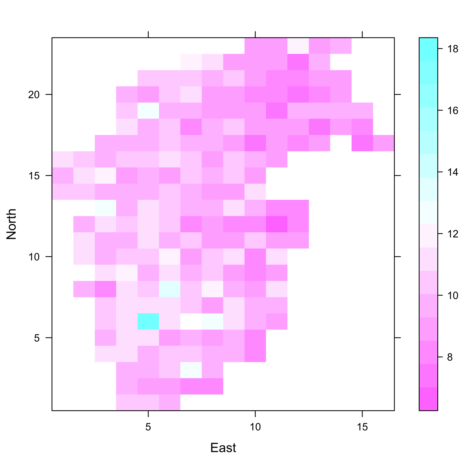
Figure 17-5. False-color plot of coalash data produced by levelplot() in the lattice package. The amount of coal ash, at any point, is represented by color gradient.
The axes represent northerly and easterly directions, whereas the color gradient represents amount of coal ash. It is easy to see how high the concentrations are and the precise locations of each. Following is the code to produce this plot:
# Figure 17-5
library(lattice)
library(sm)
data(coalash)
attach(coalash)
levelplot(Percent ~ East*North)
Bubble Plots
Yet another way to represent three-dimensional data is the bubble plot. In this type of graph, two variables are plotted on the x- and y-axes, and the third variable is represented by the area of the circle, or “bubble,” on the plot. The symbols() function in base R can create bubble plots, but I find PlotBubble(), which you can find in the DescTools package, easier to use. Here is its syntax:
PlotBubble(x = x-variable, y = y-variable,
  area = var represented by bubble,
  col = bubble color,
  border = color of bubble border,
  inches = diameter of largest bubble)
The arguments x, y, area, and col are all required. Note that, because the area of a circle is proportional to the square of the radius, it is necessary to make the area variable proportional to the square root of the variable represented by the bubble. Otherwise, the larger bubbles will be too big, relative to the smaller ones. Another way of thinking about this is that the variable’s size should be represented by the bubble’s area, not by the bubble’s diameter. Fortunately, PlotBubble() does this automatically. Had we used symbols(), an adjustment to Volume would have been necessary. I had to run several problems with each of the two functions and measure the bubbles to convince myself that this is true. You might find it useful to do the same.
First, consider the trees data, with Volume as the variable represented by the bubbles. The code that follows (for Figure 17-6) shows that Volume has been assigned to the area argument. The bubble plot of the trees data might be a bit clearer than other 3D plots of the same data. This is true because the amount of data is small, and with the inches argument set at an appropriate size, there is relatively little overlap of bubbles (try setting inches at various sizes and see what you get):
# Figure 17-6
library(DescTools)
attach(trees)
PlotBubble(x = Height, y = Girth, area = Volume,
  col="steelblue", border = "burlywood",
  inches = .25,
  xlab = "Height", ylab = "Girth",
  main = "Tree volume, proportional to circle area",
  family = "HersheySerif", font.main = 4,
  col.main = "maroon")
Figure 17-6 shows the bubble plot created by this script.
Figure 17-6. Bubble plot of the trees data.
To illustrate another use of the bubble plot we’ll consider a much larger dataset, ex0923 from the Sleuth3 package. The data is taken from a study of male and female incomes, accounting for amount of education and IQ. Our goal is to produce a plot that shows the three quantitative variables, Educ, AFQT, and Income2005, and distinguishes the points by Gender. That is to say, the plot will show four variables! In PlotBubble(), the argument area operates on Income2005, but this particular dataset presents a problem because a few of the income values are very high—more than half a million dollars. PlotBubble() apparently overadjusts by leaving too much empty space on the graph and pushing all the points together. To correct this, make an adjustment in the data by dividing all the incomes by 1,000. This leaves all the relationships between individual incomes intact but prevents the crowding problem:
# Figure 17-7
library(DescTools)
library(Sleuth3)
attach(ex0923)
PlotBubble( x= Educ, y = AFQT, area = Income2005/1000,
  col = SetAlpha(as.numeric(Gender)), border = "burlywood",
  inches = .5, xlab = "Education", ylab = "AFQT test score")
title(main = "Income, proportional to circle area")
legend("left", c("Female","Male"),
  text.col = c(1:2), cex =.9, bty = "n")
The argument col = SetAlpha(as.numeric(Gender)) enables the two values of Gender to have different colors. The argument inches = .5 makes the largest bubble a half-inch wide and scales all the others to be the correct size relative to the largest. In the legend() command, the two values of Gender are in alphabetical order, ensuring that the right names are assigned to the colors.
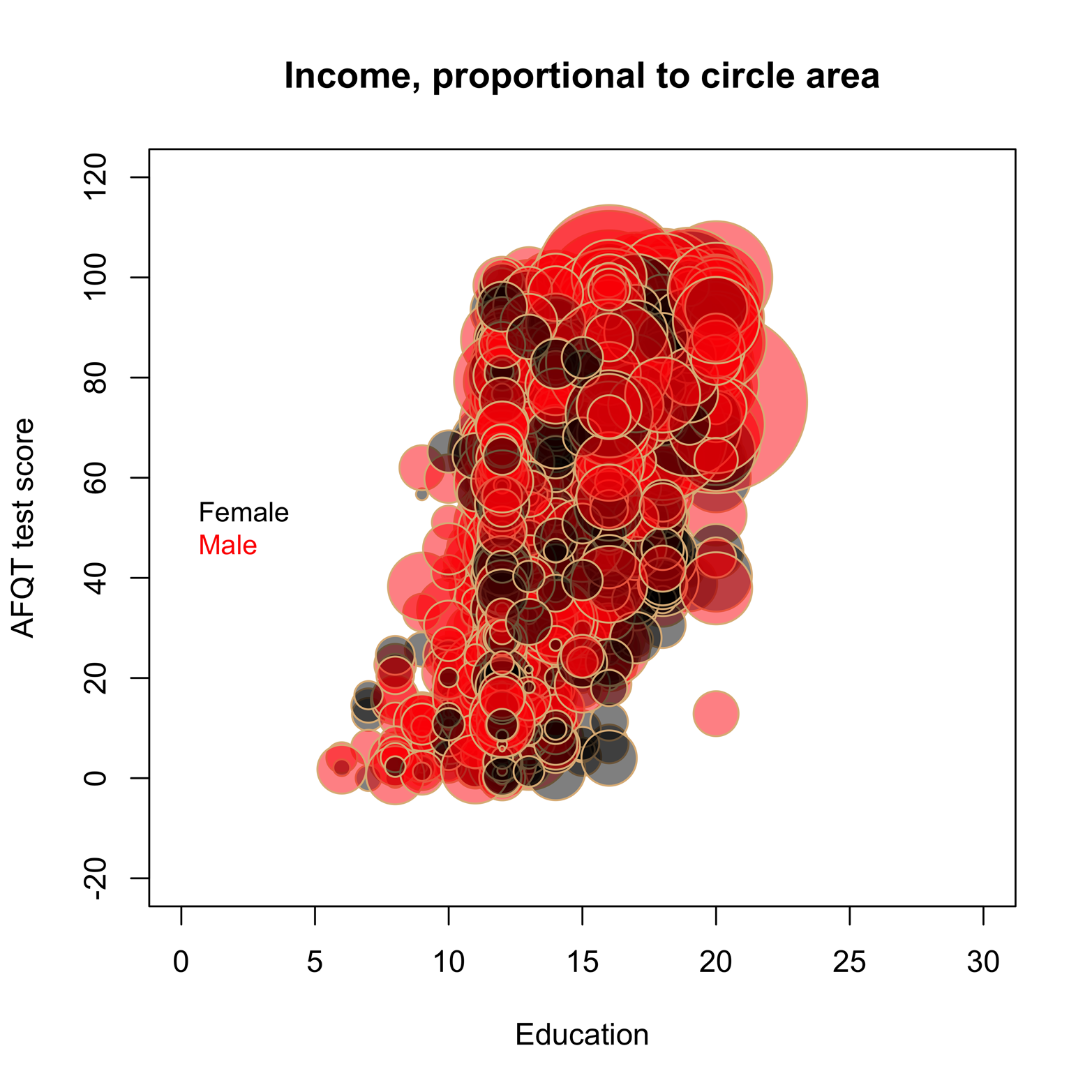
Figure 17-7. Bubble plot of incomes related to education and IQ.
The bubble plot shows that Educ and AFQT are related, but it is difficult to make a determination about income because there are so many overlapping circles. Making inches larger would make things worse, whereas making it smaller might help. Try setting inches at various sizes to see what you get. You probably won’t find a value that helps very much, as bubble plots rarely work well for a large amount of data. To see what effect sample size has, let’s take a random sample of the dataset and make a new bubble plot. We’ll pare the dataset down from more than 2,500 observations to just 100. Our approach to this problem is to use the sample() function to pick a random sample of 100 row numbers. After that, we use the [] method (see the section “Basic Scatter Plots” to review this method) to find a subset of the complete dataset, keeping only the rows from our random sample, but keeping all columns. Note that the resulting subset is a random sample of the larger dataset, because the rows in samp = ex0923[s,] came from a random sample. Here’s the entire script:
# Figure 17-8
library(DescTools)
library(Sleuth3)
attach(ex0923)

# take random sample from ex0923
set.seed(3)              # get the same random sample each time
s = sample(nrow(ex0923), 100) # random sample of 100 row IDs
samp = ex0923[s,]        # all rows in s; all columns in ex0923

detach(ex0923)        # R will not use the full dataset, ex0923
attach(samp)               # R will use the subset data
PlotBubble( x= Educ, y = AFQT, area = Income2005/1000,
  col = SetAlpha(as.numeric(Gender) +3), border = "burlywood",
  inches = .25, xlab = "Education", ylab = "AFQT test score")
title(main = "Income, proportional to circle area")
legend("left", c("Female","Male"),
  text.col = c(1:2)+3, cex =.9, bty = "n")
You can see the result in Figure 17-8.

Figure 17-8. Bubble plot relating education, IQ, income, and gender, in a random sample of the ex0923 dataset.
The argument col = SetAlpha(as.numeric(Gender) +3) makes the two values of Gender have different colors and sets the colors three steps along the color scale that can be seen by issuing the following command(s):
> library(DescTools)
> PlotPar()
Therefore, instead of using the default colors 1 = black and 2 = red, used in Figure 17-6, the colors are 1+3 = dark blue and 2+3 = light blue. Note that it is also necessary to adjust the text.col argument with +3 to make the legend colors match the circles on the plot. There are other color palettes that you could choose, as well. To see other color options, type ?hblue.
Figure 17-8 is much easier to read than the very dense plot in Figure 17-7. We can clearly see that incomes rise with increasing education and IQ. It is also easy to compare the incomes of males and females. In most cases, when other factors are about equal the bubbles for males are bigger, meaning higher income.
Exercise 17-1
Use 3D scatter plots to examine the relationship between deaths, smoke, and SO2 in the SO2 dataset in the epicalc package. Plot deaths on the vertical axis and explain its relationship to the other variables.