Chapter 5. Box Plots
The Box Plot
Sometimes, it can be helpful to look at summary information about a group of numbers instead of the numbers themselves. One type of graph that does this by breaking the data into well-defined ranges of numbers is the box plot. We will try this graph on a relatively large dataset, one with which our previous types of graphs do not work very well.
There are some interesting datasets in the nlme package. Get this package and load it by using these commands:
> install.packages("nlme")
> library(nlme)
Next, take a look at the MathAchieve dataset. With more than 7,000 rows, this is much larger than the datasets we have dealt with previously. What problems will this create for us if we want to examine the distribution of MathAch scores? Let’s see what happens with a strip chart of this data.
In the code that produces Figure 5-1, as in many following examples, the mfrow argument is used in par() to make multiple graphs appear on one page. The format is mfrow = c(i,j), where i is the number of rows of graphs and j is the number of columns:
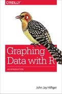
# Figure 5-1
library(nlme)
par(mfrow=c(2,1)) # set up one graph above another: 2 rows/1 col

stripchart(MathAchieve$MathAch, method = "jitter",
  main = "a. Math Ach Scores,
  pch = '19'", xlab = "Scores", pch = "19")

stripchart(MathAchieve$MathAch, method = "jitter",
  main = "b. Math Ach Scores,
  pch = '.'", xlab = "Scores", pch = ".")
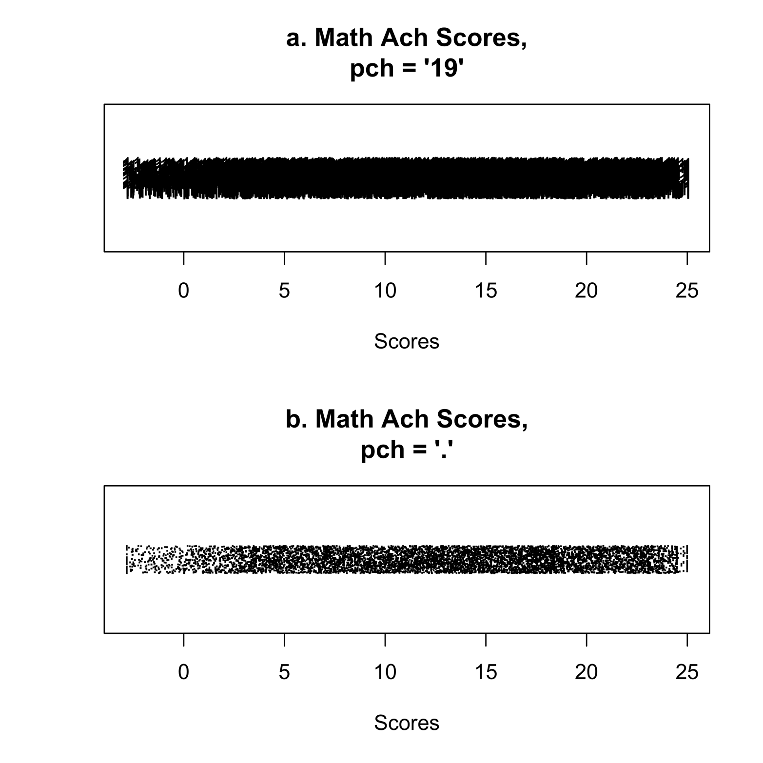
Figure 5-1. Strip charts of math achievement scores
These strip charts show the results of using the plot character from Figure 3-4 (in Figure 5-1a), and using a different, smaller character (in Figure 5-1b). Even then, the plot is very dense. There are too many points, so it is difficult to judge the shape of the distribution. Where is the center? Maybe at about 10, or a little higher? Is the distribution a little skewed, or less dense, to the left? How many points are extreme values? Unfortunately, the help file gives no reference to the study. It would be interesting to know something about the scoring of the math test, because there are many scores below zero.
Perhaps a different kind of chart would be more revealing. The box plot graphically displays several key measurements that are not obvious in the strip chart. First, let’s make some box plots with the code that follows. Note that this time the mfrow argument creates a different layout of graphs on the page, with one row and two columns:
# Figure 5-2
library(nlme)
par(mfrow = c(1,2)) # two graphs side-by-side: 1 row, 2 cols

boxplot(MathAchieve$MathAch,
  main = "Math Achievement Scores", ylab = "Scores")

boxplot(MathAchieve$SES,
  main = "Socioeconomic Status", ylab = "SES score")
The graph, shown in Figure 5-2 (also known as a box-and-whiskers plot) shows a dark line in the center representing the median, the point at which half of the scores are lower and half are higher. Reading off the chart, it appears that the median is about 13. Other ways to describe the median are as the 50th percentile, the point at which 50 percent of the scores are lower, or as the second quartile, the point at which two quarters of the scores are lower. The lower edge of the box is the first quartile, the point at which one quarter, or 25 percent, of the scores are lower. The upper edge of the box is the third quartile, the point at which three-quarters, or 75 percent, of the scores are lower. The vertical lines coming out of the box are the “whiskers,” which go to the highest and lowest points if they are no more than 1.5 times the interquartile range (the distance between the first and third quartiles). If the points are beyond the whiskers, they appear as small circles.

Figure 5-2. Box-and-whiskers plots of math achievement scores and SES
Figure 5-2 shows the distribution of math achievement scores to be nearly symmetrical but slightly skewed to the lower scores; that is, the lower whisker is a little longer.
One of the other variables in the dataset, SES (socioeconomic status), is interesting to examine. Compare its box plot (the right side of Figure 5-2) to that of the math scores. There are several points beyond the whiskers in the SES plot. Extreme values always raise some questions about the variable under scrutiny as well as the accuracy of the data. You might want to check the extreme values to ensure that the data has been entered correctly. If so, it might be appropriate to consult the literature on the SES measure to look for explanations of the extremes and to think about the nature of the sample selected for the study.
Let’s return to the math scores. It might be illuminating to break the sample into smaller groups so that we can compare test scores. Figure 5-3 shows the results of generating box plots of MathAch with several group breakdowns. The par() function sets the page for four graphs by passing to the mfrow argument a vector indicating two rows and two columns. Each graph has a label—on the x-axis—of the command that creates that graph. This is accomplished by including the argument sub = 'text to appear'.
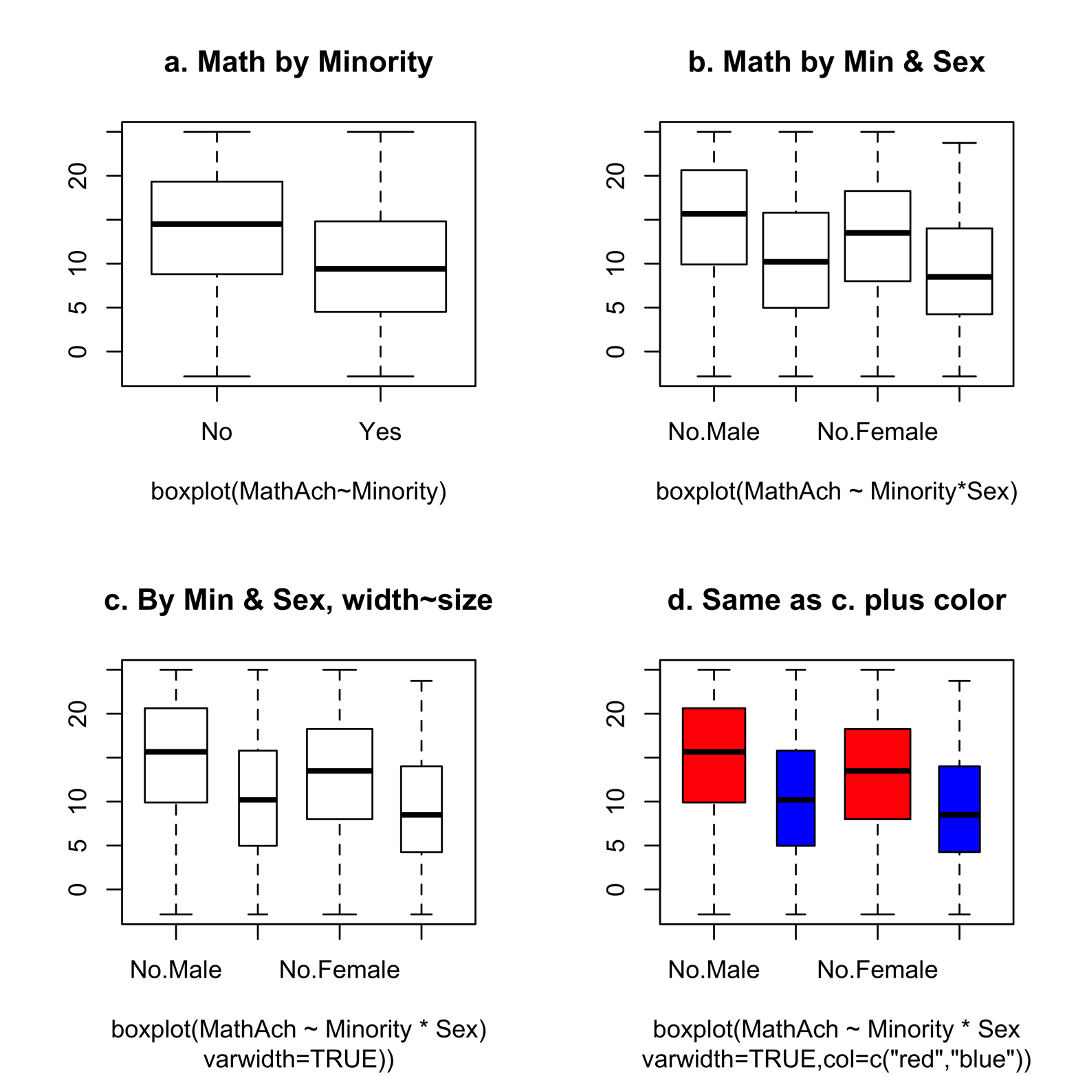
Figure 5-3. A comparison of progressively more detailed graphs.
Here are the commands for creating Figure 5-3:
# Figure 5-3, i.e. 4 graphs
par(mfrow=c(2,2))   #set up page for 2 rows of 2 graphs each
attach(MathAchieve)

boxplot(MathAch ~ Minority, xlab = "boxplot(MathAch~Minority)",
  main = "a. Math by Minority", cex = .4)

boxplot(MathAch~Minority*Sex,
  xlab = "boxplot(MathAch ~ Minority*Sex)",
  main = "b. Math by Min & Sex", cex = .4)

boxplot(MathAch ~ Minority * Sex,
  xlab = "boxplot(MathAch ~ Minority * Sex)",
  sub = 'varwidth=TRUE))', varwidth = TRUE,
  main = "c. By Min & Sex, width~size", cex = .4)

boxplot(MathAch ~ Minority*Sex,
  xlab = 'boxplot(MathAch ~ Minority * Sex',
  varwidth = TRUE, col = c("red","blue"),
  main = "d. Same as c. plus color",
  cex = .4, sub = 'varwidth = TRUE,
  col = c("red","blue"))')
Let’s examine the four graphs. Figure 5-3a shows a box plot for nonminority students and another box plot for minority students. We see that although the median and quartile scores of nonminority students are higher, the maximum and minimum scores are similar. In Figure 5-3b, each of the minority groups has been further broken down by sex. We see not only lower math scores for minorities in both genders, but also lower math scores for females among both minorities and nonminorities. Figure 5-3c and Figure 5-3d are both improvements on Figure 5-3b. In these graphs, the width of each box is related to the size of the group it represents. We can see that fewer of the students are minorities, and there are fewer males than females in each of the minority and nonminority groups. Figure 5-3d uses color to make the groups more easily distinguishable. The color vector specifies only two colors, which are given to the first two boxes and then recycled to give the same two colors to the last two boxes. The effect of this recycling is to give nonminority males and females red, and minority males and females blue. (As we saw in the previous chapter, R recycles any vector that is not long enough to accomplish the task given to it.)
Nimrod Again
Now is a good time to revisit the Nimrod dataset. We can use box plots to look at the distribution of performance times in the various performance media and in amateur versus professional ensembles. Furthermore, we can look at one important piece of information that I neglected to mention earlier. Let’s begin with box plots of time broken down by level and medium:
# Figure 5-4a, first must have loaded Nimrod
#  load("Nimrod.rda")  /  see Chapter 1
attach(Nimrod)
par(mfrow=c(2,1)) #graphs laid out in 1 display w/ 2 rows, 1 col
boxplot(time ~ level * medium,
  main = "a. Performance time by level and medium")
The result of this command is depicted in Figure 5-4a. We see considerable variation by group. Except for the brass bands, professional groups tend to play the piece slower than amateur groups. In the next version of this graph, it might be clearer to highlight amateur versus professional status with color. Because professional groups consistently play the piece slower, does this difference indicate that the “correct” tempo is rather slow? It is certainly something to think about.
Figure 5-4. Performance time of “Nimrod” by medium and level
Now it’s time to reveal the identity of a secretly coded performer in the dataset. “EE” is none other than Edward Elgar, the composer himself! Despite the learned execution of the highly trained professional musicians in the sample, we can reasonably argue that the composer should be taken as a more authoritative source of information about the proper tempo of this work. Of course, we have only one performance by the composer and do not know if he conducted at this tempo, or near this tempo, every time. Nonetheless, it might be revealing to show Elgar’s tempo, in comparison to all the others, on the graph. We can do this by adding a reference line. Upon consulting the spreadsheet we started with (Table 1-4), we find that Elgar’s performance time was 186. A horizontal line, across all the boxes, at the level of 186 would make it easy to compare each performance time to the composer’s. We can do this with the abline() command, which will place a line on the graph produced immediately before this command:
# Figure 5-4b
boxplot(time ~ level * medium,
  main = "b. Performance time by level and medium with reference
  line", col = c("white", "light blue"))
abline(h = 186, lty = "dotted")
detach(Nimrod)
The graph in Figure 5-4b shows that amateur musicians were in much closer agreement with the composer’s idea of tempo than professional musicians. This is a surprising result and will make for a provocative graph. Of course, we have only a small sample of performances. Were it our purpose to make generalizations to professional and amateur performances, our present sample would not be sufficient. However, we are just exploring possible relationships and formulating a hypothesis that we might wish to investigate further, and we have enough data for this.
Making the Data Beautiful
Figure 5-4b does the basic job of showing the relationship of time with level and medium. If this is all you want at this point, you can skip to the exercises at the end of the chapter. You might want to come back to this section later, as you begin to feel more comfortable writing R code and find yourself wanting a more attractive graph.
We can make the Nimrod graph much more eye-catching and appealing as well as easier to interpret. One of the most unsatisfying features of Figure 5-4b is the names of the instrumental groups, “a.bb” and so on. Longer names, such as “amateur brass band,” simply will not fit in the limited space. One way to fix this problem is to make the bars go horizontally, dedicating a line for each group name in the margin. We will also give meaningful names to instrumental groups and put some text on the graph. This new graph appears in Figure 5-5.

Figure 5-5. The improved graph of performance time of “Nimrod” by medium and level. Compare this to Figure 5-4.
Do you agree that Figure 5-5 is an improvement over Figure 5-4b? If so, let’s see how to make these improvements.
The following script will produce the new graph. There are several commands that are set apart by blank lines between them to make reading them a little easier. The comments above each command explain the arguments’ meaning:
# Script for Figure 5-5
attach(Nimrod)

# par() sets bkgrnd color, foreground color, axis color,
# text size (cex), horiz.
# text on y-axis (las=1), margins (mar). Graph too big for
# default margins. ?par for more info on above arguments.

par(bg = "white", fg = "white",
  col.axis = "gray47", mar = c(7,8,5,4),
  cex = .65, las = 1)

# boxplot() determines formula (time ~ level * medium),
# makes plot horizontal,
# sets color for box border and box colors (col),
# creates titles (main, xlab), creates names
# for the combinations of level*medium (names), names size
# (cex.names). One of the names is "" because there is no
# category "amateur organ."

boxplot(time ~ level * medium, horizontal = TRUE,
  border = "cadetblue",
  main="Performance Times of Elgar's Nimrod",
  col = c("deepskyblue","peachpuff4"),
  xlab = "Time in seconds",
  names = c("brass band","brass band","concert
  band", "concert band","", "organ ", "orchestra","orchestra"),
  cex.names = .4)

# abline() puts vert. line at time = 186 sec. to show the
# performance conducted by Elgar. Line type (lty) dotted & color
# (col) black.

abline(v = 186, lty = "dotted", col = "black")

# legend() chooses legend text & color & location on the graph.
# Legend shows that pros are peachpuff4 & amateurs are
# deepskyblue.

legend("right", title = "Level", title.col = "black",
  c("Professional","Amateur"),
  text.col = c("peachpuff4","deepskyblue"),
  text.font = 2, cex = 1.2)

# mtext() puts text at a place specified by the user
mtext("  Elgar himself - - >", side = 3,
  line = -2, adj = 0,
  cex = .7, col = "black")

# axis() modifies x-axis (1)  & sets the color & length and
# tickmarks
axis(1, col = "cadetblue", at = c(160,200,250,300))

detach(Nimrod)
The lesson learned from study of Figure 5-4 and Figure 5-5, again, is that with R, you can produce basic plots for exploring data quickly and easily (often with one line of code)—and if really pretty graphs are needed for presentation purposes, R can make that possible, too (but it might take considerably more effort!).
Exercise 5-1
before, Correlation does not prove causation. The apparent relation between math scores and minority status in Figure 5-3 may actually be a function of other factors. Perform a box plot analysis of the SES variable, grouped by Minority and Sex. Save your graphs (see Chapter 2 for information on how to save graphs) to use in further analysis later. Using a word-processing program, write a paragraph or two about what you discovered, and insert the graphs that illustrate your points. In a later exercise, we will examine the relationship between the math scores and SES directly.
Exercise 5-2
An alternative to box plots comparing two or more groups is the Engelmann-Hecker-Plot (EH-Plot). Compare the box plot of mpg in the mtcars dataset with cyl as a grouping variable (see “Exercise 3-1”) to an EH-Plot that you can create by using the ehplot() function in the plotrix package. In what ways is the EH-Plot better? How is the box plot better?