Chapter 15. QQ Plots
Comparing Sets of Numbers
It can be quite useful to compare the distributions of two sets of numbers; for example, two variables or two vectors. The sets of numbers might both be sets of measurements, or one might be a theoretical distribution. For example, we might want to see how a particular variable compared to the theoretical “normal” distribution.
In the United States and many other parts of the world, it is customary for customers to leave a tip for people who perform services. Just how much to give is a topic of frequent discussion among patrons of restaurants. The reshape2 package includes a dataset, tips, that was compiled by a waiter about tips his own customers gave to him. Let’s take a look inside this interesting dataset:
> library(reshape2)
> attach(tips)
> head(tips)
  total_bill  tip    sex smoker day   time size
1      16.99 1.01 Female     No Sun Dinner    2
2      10.34 1.66   Male     No Sun Dinner    3
3      21.01 3.50   Male     No Sun Dinner    3
4      23.68 3.31   Male     No Sun Dinner    2
5      24.59 3.61 Female     No Sun Dinner    4
6      25.29 4.71   Male     No Sun Dinner    4
Now, we’ll try to learn more about the tip variable. First, how are the tips distributed? We could plot the density of tip to get an idea of that:
# Figure 15-1a
library(reshape2)
attach(tips)
par(mfrow = c(3,2))
plot(density(tip),
  main = "a. Density(tip)",
  col = "blue",
  lwd = 2)
The plot in Figure 15-1a shows that the distribution is quite skewed; that is, it has a long tail to the right. In other words, a few patrons give relatively large tips, but most others are clustered around $2 to $4. This is important because many methods of statistical analysis depend on the data being, at least approximately, “normally distributed,” or nearly aligned with the bell-shaped curve.
Note
Tips are usually based on the size of the bill. Treating the tips in this manner is the subject of one of the exercises at the end of the chapter.
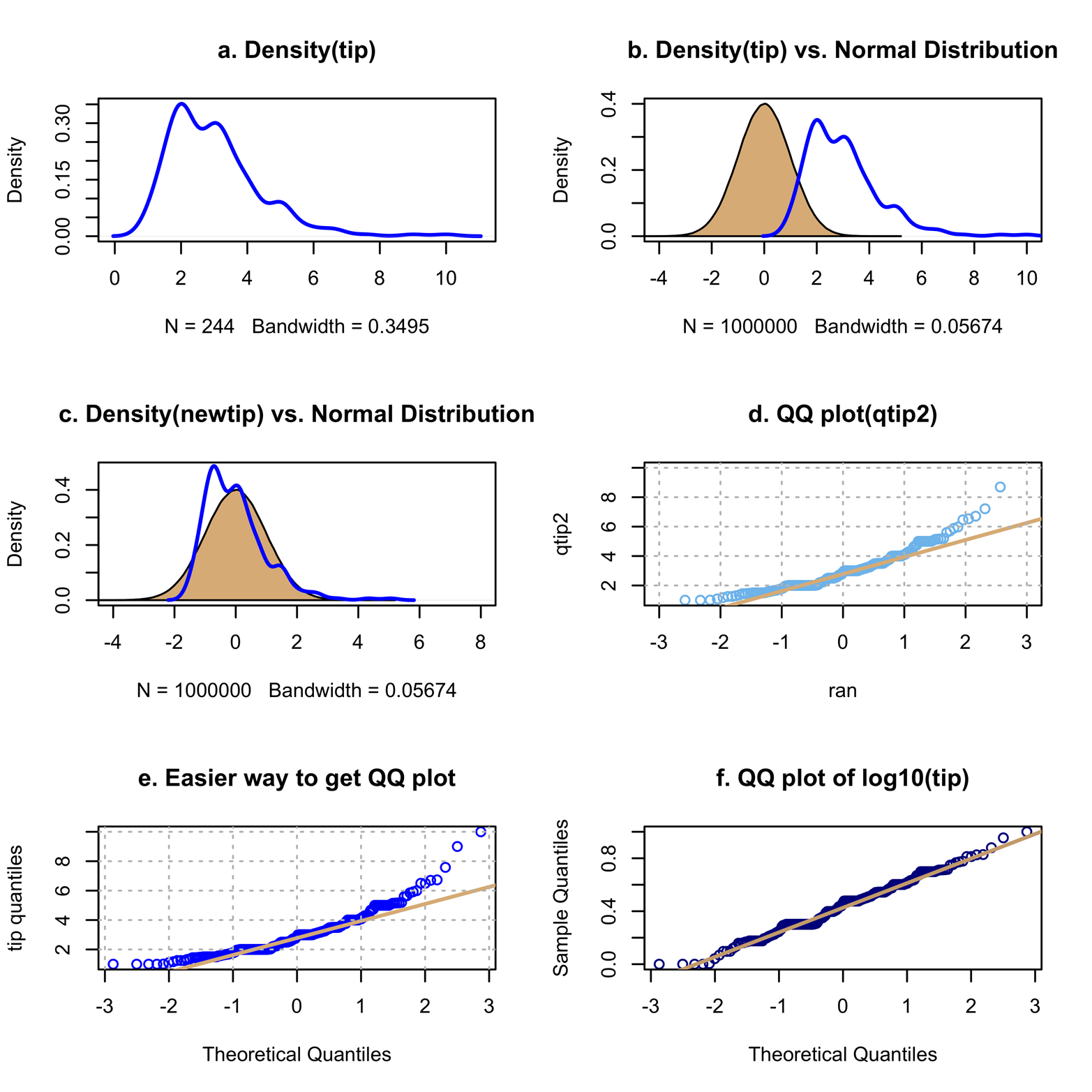
Figure 15-1. Comparing tip (and transformations of tip) to a normal distribution.
To get a better idea of how much the tip variable differs from the normal distribution, we could plot a normal distribution and the tip data on the same graph. To do this, use the rnorm() function to generate a large sample of numbers, which will be called ran, from a normal distribution. Then, plot the density of ran and fill in the curve with the polygon() function. This will make it stand out from the tip density. Finally, use the lines() function to plot the density of tip on the same graph:
# Figure 15-1b
ran = rnorm(1000000)  # a million random obs from a normal dist.
plot(density(ran),
  main = "b. Density(tip) vs. Normal Distribution",
  xlim = c(-4,10))
polygon(density(ran), col = "burlywood")
lines(density(tip),
  col = "blue",
  lwd = 2)
Note
The aspect ratio of a graph is the height of the graph divided by its length. This is important because changing this ratio can make it easier or more difficult for viewers to perceive the relationships between variables on the graph. Research in perceptual psychology has shown that lines with a slope close to 45˚ are optimum. Choosing an aspect ratio to achieve this optimum is called banking. R scatter plots, one per page, generally use an effective aspect ratio, although you can alter this by using arguments such as asp, mar, and ylim. Throughout this book, there are many examples of multiple graphs on one page. When the display is square—2 x 2 or 3 x 3—the aspect ratio of the various graphs on one page stays about the same as it would be in a single-page graph. (Try it yourself.) In Figure 15-1, which is a 3 x 2 display, the aspect ratio has been changed quite a bit. In this case, the advantage of having six graphs on one page for easy comparison was deemed more important than preserving the aspect ratio. Your audiences might not all agree. Be careful when you change aspect ratios!
Figure 15-1b shows the tip density plot superimposed on the normal distribution. This might be a little more informative than Figure 15-1a, but it would be easier to assess the differences if the plots coincided more closely. That is to say, we could compare the plots more readily if they had the same means. The vector ran was created by using the rnorm() function with the default options (what you get if you do not specify values) of mean = 0 and standard deviation = 1. Statisticians often standardize or normalize a variable to make it easy to compare with some distribution with known characteristics. The tip variable can be standardized to have a mean of 0 and standard deviation of 1 by a simple procedure. First, find the mean and standard deviation of tip:
> mean(tip)
[1] 2.998279
> sd(tip)
[1] 1.383638
Next, create a new variable, newtip, by subtracting 2.998 (the mean) from every tip and dividing the resulting number by 1.384 (the standard deviation). This is an example of a transformation of the variable. A transformation is a replacement of the original variable with a function of the variable that keeps the essential information but makes the new variable easier to work with or more closely in compliance with the necessary assumptions underlying the statistical method in use. Here’s the code to create the newtip variable:
> newtip = (tip-2.998)/1.384 # transform tip to have
# mean = 0 and sd = 1
Then, plot the two densities again:
# Figure 15-1c
newtip = (tip-2.998)/1.384 # transform tip to have
# mean=0 and sd=1
plot(density(ran),
  ylim = c(0,.48),
  main = "c. Density(newtip) vs. Normal Distribution",
  xlim = c(-4,8))
polygon(density(ran),
  col = "burlywood")
lines(density(newtip),
  col = "blue",
  lwd = 2)
Figure 15-1c shows the superimposition of the two densities in a much more informative way.
There are other ways to compare the two distributions, leading to different kinds of graphs. Consider first a numerical summary of the tip variable:
> summary(tip)
    Min. 1st Qu.  Median   Mean  3rd Qu.   Max.
  1.000   2.000   2.900   2.998   3.562  10.000
The summary() function gives quartiles—the 25th, 50th (median), and 75th percentiles—as is detailed in Chapter 1. We could divide the distribution of the tip variable into any groupings that we find useful, not just quartiles (four groups). For instance, we could break the variable into groups that were 10 percentage points apart. The breakpoints are called quantiles. There is a quantile() function that you can use to compute quantiles of a given variable, according to the requirements of the user. To see how this works, create a new variable, qtip, which contains the quantiles of tip, spaced every 10 percentage points apart. The quantiles must fall within the range of 0 to 1, so you need to use the seq() function to specify that the first and last points must be 0 and 1 and that the interval is 0.1. Then, print the values in qtip to see how it worked:
> qtip = quantile(tip, seq(0,1,.1))
> qtip
 0%     10%    20%    30%    40%
 1.000  1.500  2.000  2.000  2.476
 50%    60%    70%    80%
 2.900  3.016  3.480  4.000
 90%   100%
 5.000 10.000
We can plot quantiles of the tip variable against quantiles of ran to determine how closely the two distributions conform. So, for instance, the value of the 10th quantile for qtip is plotted against the 10th quantile for ran, and so on. This type of display is called a quantile-quantile plot, or QQ plot. This kind of graph is usually easier to read, because comparing how close a group of dots comes to a straight line is more direct than comparing two curves. Figure 15-1d uses qtip2(), a function that makes the interval between the quantiles smaller than before. This creates more points on the graph. The plotting was done by using the qqplot() function and a reference line was added with the qqline() function. Finally, a grid was added to facilitate reading the axes. The code to produce Figure 15-1d follows:
# Figure 15-1d
qtip2 = quantile(tip, seq(0,1,.005))
qqplot(ran, qtip2,
  main = "d. QQ plot(qtip2)",
  xlim = c(-3,3),
  col = "skyblue2")
qqline(qtip2,
  col = "burlywood",
  lwd = 2)
grid(lty = "dotted",
  col = "gray75")
# required calculation of ran and qtip2 first
Figure 15-1d shows that even though tip is close to a normal distribution (as measured by the straight line) over much of its range, it is far off at both ends, and especially at the high end. This suggests that tip is not close to a normal distribution and that proceeding with an analysis that depends on such a distribution would be unwise.
This plot was used to show what QQ plots are. Now that you understand what they are, it is good to know that you can make virtually the same plot more easily, without first creating quantile variables (i.e., ran and qtip). The qqnorm() function, shown in the following code, can operate directly on the tip variable and produce the plot seen in Figure 15-1e:
# Figure 15-1e
qqnorm(tip,
  main = "e. Easier way to get QQ plot",
  col = "blue",
  ylab = "tip quantiles")
qqline(tip,
  col = "burlywood",
  lwd = 2)
grid(lty = "dotted",
  col = "gray75")
Because tip seems not to be normally distributed, we might see if there is a transformation of tip that is. Recall that the idea behind a transformation is that if the original data does not meet the assumptions required for the analysis to give valid results, sometimes applying a function of the data (i.e., a transformation) can produce data that does meet the assumptions. If so, the analysis can be performed on the transformed data. Conclusions will then necessarily be about the transformed data, not the original data. Although there are many things that could be tried, a log transform is often successful at reducing or removing skewness (the degree of asymmetry of a distribution). The following code produces Figure 15-1f, which shows that the log (common or base 10) transformation works very well:
# Figure 15-1f
logtip = log10(tip)
qqnorm(logtip,
  main = "f. QQ plot of log10(tip)",
  col = "blue4")
qqline(logtip,
  col = "burlywood3",
  lwd = 2)
So far, we have used QQ plots to compare a variable’s distribution to that of a theoretical distribution. You can also use QQ plots to compare the distributions of two variables. This could be two variables such as tip and size in the tips dataset. In this particular dataset, however, it might be much more interesting to compare tips given by men and women, or at lunch and dinner, and so on. To do this, you could form appropriate subsets of the data and make QQ plots of the groups. The lattice package makes it very easy to compare two groups when there are exactly two levels of a variable, such as sex in the tips dataset. Use the qq function:
qq(y~x)
In this case, y has exactly two levels and x is quantitative:
# Figure 15-2,left
library(lattice)
qq(sex ~ tip,
  main = "Tips given by men and women")
Figure 15-2 shows the results, on the left.
![QQ plots of tip for men and women (left) and ratio [i.e., 100*(tip/total_bill)] (right). These plots were produced by using the lattice package.](http://imgdetail.ebookreading.net/data/1/9781491922606/9781491922606__graphing-data-with__9781491922606__assets__gdwr_1502.png)
Figure 15-2. QQ plots of tip for men and women (left) and ratio [i.e., 100*(tip/total_bill)] (right). These plots were produced by using the lattice package.
The graph on the left in Figure 15-2 shows that the distribution of tips given by males and females is pretty similar for tips below about five dollars. Tips higher than five dollars, however, are more likely to be from males. We can confirm that with a numerical summary:
> summary(tip[sex == "Male"])  # subset containing only males
   Min. 1st Qu.  Median    Mean 3rd Qu.    Max.
   1.00    2.00    3.00    3.09    3.76   10.00

> summary(tip[sex == "Female"]) # subset containing only females
   Min. 1st Qu.  Median    Mean 3rd Qu.    Max.
  1.000   2.000   2.750   2.833   3.500   6.500
We have learned some interesting things about the distribution of tips, but perhaps it would make more sense to study not the tips, but the tip as a percentage of the total bill. After all, most guidelines about tipping suggest something like “15 percent of the bill.” We can compute a new variable by multiplying the ratio of tip to total bill by 100. Then, we can make a QQ plot of that variable for males and females:
# Figure 15-2, right
tips$ratio = 100*(tip/total_bill)
qq(sex ~ tips$ratio,
  main = "Tips as percent of total bill, for men and women")
The graph on the right in Figure 15-2 shows males and females as equally generous up to about 25 percent, but then females become more generous, with the exception of one very big extreme. Maybe this guy was trying to impress his girlfriend? Maybe the decimal point was inadvertently moved? Problems like this occur in real data analysis pretty frequently. You’ll need to recheck the data to see if it is right. Further, you will need to decide whether to include or exclude that one point, or analyze the data both ways and report both results. Things like this make life interesting!
Exercise 15-1
Continue analyzing the tips dataset. Use the variable ratio instead of tip. Are other factors related to the size of tips? Do apparent relationships make sense? Could other factors be misleading you?