Chapter 16. Scatter plot Matrices and Corrgrams
Scatter plot Matrix
When faced with many quantitative variables, it sometimes helps to look at the relationships of each of the possible pairs of variables first. To avoid making you type a plot() command for each of the combinations, R provides a shortcut command, pairs(), which will do the same thing. Furthermore, pairs() puts all the plots on the same page so that they can be compared quite easily. The result is called a scatter plot matrix. We will use the scatter plot matrix to study the relationships among member characteristics of various church groups.
A long line of research on American religious life has shown that weekly attendance and membership seem to be related to a church’s strictness. Iannaccone (1994) discusses this research and gives an interesting dataset showing several variables for each of 18 religious denominations. You can find the data in ex1713 from the Sleuth2 package. Let’s take a look:
> library(Sleuth2)
> attach(ex1713)
> head(ex1713)

        Denomination Distinct Attend NonChurch StrongPct AnnInc
1     American Baptist    2.5   25.6      1.01      50.6  24000
2    Assemblies of God    4.8   35.4      0.68      58.6  27100
3             Catholic    3.0   26.4      1.43      40.0  32900
4  Disciples of Christ    2.1   24.3      2.58      47.0  28600
5            Episcopal    1.1   17.3      1.93      32.0  39000
6 Evangelical Lutheran    2.7   23.0      1.71      41.5  33700
To see the codebook for this data, type:
> ?ex1713
Here’s a brief summary of the codebook:
Distinct- The distinctiveness/strictness of discipline, on a seven-point scale
Attend- The average percentage of weekly attendance
NonChurch- The average number of secular organizations to which members belong
StrongPct- The average percentage of members who consider themselves strong church members
AnnInc- The average annual income
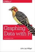
The scatter plot matrix shown in Figure 16-1 was produced by using the pairs() function. Note that the variable names are typed as a formula, beginning with the ~ symbol, followed by the variable names in the order in which they will appear on the graph, separated by the + symbol. Further, you can add any of a number of special arguments for this function, as well as par() arguments. For the code to produce Figure 16-1, only the pch and col arguments have been used:
# Figure 16-1: produce scatter plot matrix of denomination data
library(Sleuth2)
attach(ex1713)
pairs(~ Distinct + Attend + NonChurch + StrongPct + AnnInc,
  pch = 16,
  col = "deepskyblue")
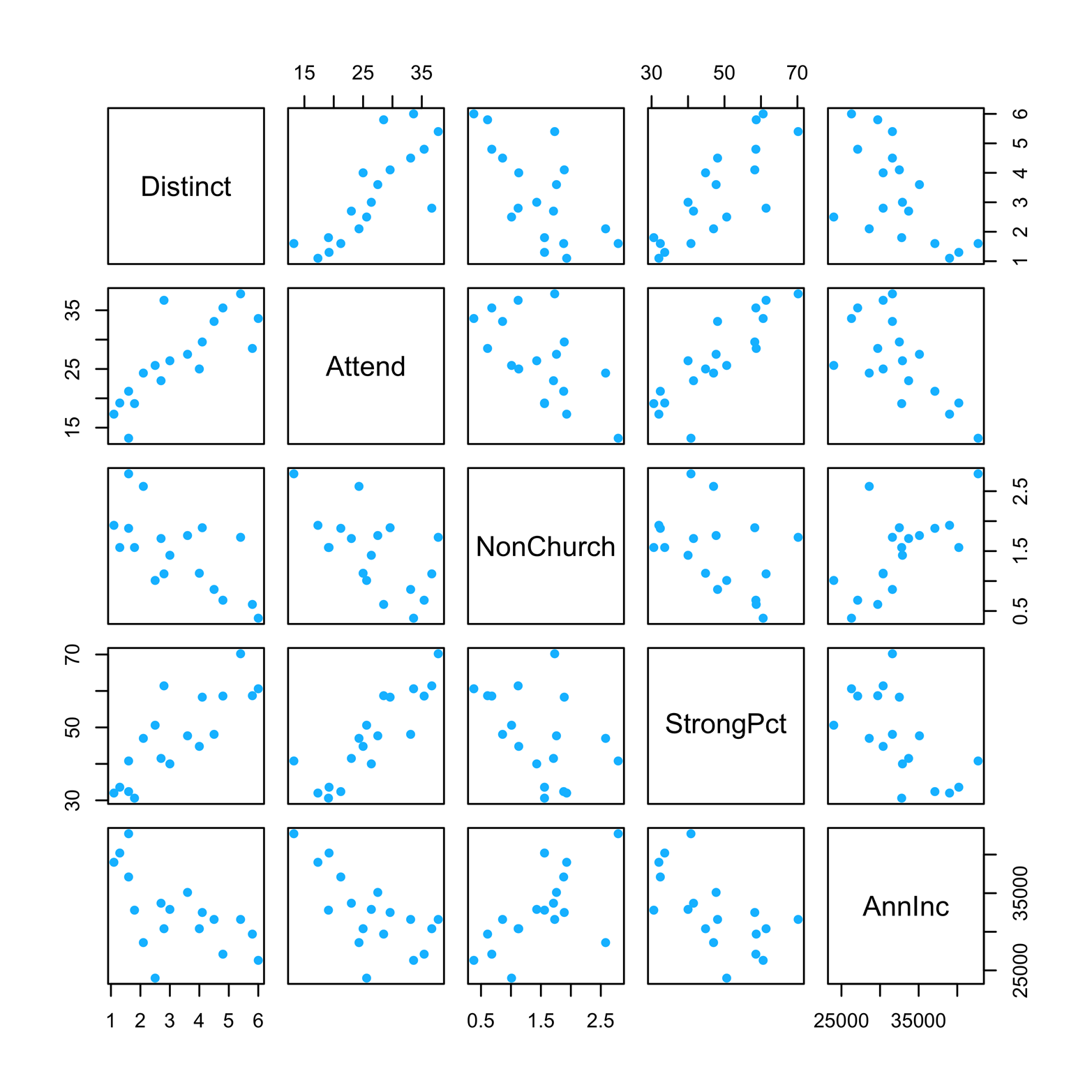
Figure 16-1. A scatter plot matrix of the church denomination data.
In the scatter plot matrix in Figure 16-1, each variable is plotted against every other variable, twice. In each pair, a given variable is once the x-variable and once the y-variable. For example, in the second row, the variable Attend is the y-variable in each of the four scatter plots, and each of the other four variables is the x-variable once. In the second column, Attend is the x-variable in each of the four scatter plots, and each of the other variables is the y-variable one time.
Looking across the second row, we can see that Attend has a positive association with Distinct; that is, as one of these increases, the other does also. Likewise, there is a positive association between Attend and StrongPct. In contrast, Attend has negative associations with NonChurch and AnnInc; as one increases, the other decreases. However, these negative associations are not as strong as the positive ones. In other words, the points in the negative associations do not hug a straight line as tightly as the positive association plots do. This is clearer in Figure 16-3, in which least-squares lines are placed on each scatter plot. Of course, associations, even strong ones, do not imply causation—or, put another way, knowing that greater strictness and higher attendance usually go together does not prove that one causes the other. It does, however, suggest that this relationship might be an interesting one to study further.
The car package has a function called scatterplotMatrix() that adds some useful features to the scatter plot matrix. First, it is easy to plot the distribution of each of the variables on the diagonal of the matrix as a histogram, density plot, box plot, QQ plot, or 1D (diagonal) strip chart. In addition, you can easily add a least-squares line to each plot.
Smoothers are also available for each plot. As we saw in Chapter 12, a smoother is a tool for making patterns in scatter plot data a little easier to see. There are several types of smoothers, but they all show the center of the y’s at a given value of x (or several close x’s) and do it in such a way that the (usually curved) line formed by connecting all such points is relatively smooth. Figure 16-2 shows a scatter plot matrix with smoothers, represented as red lines. You can use the smoother argument to select a smoothing method, but Figure 16-2 uses the default method, “loess,” or locally weighted regression.
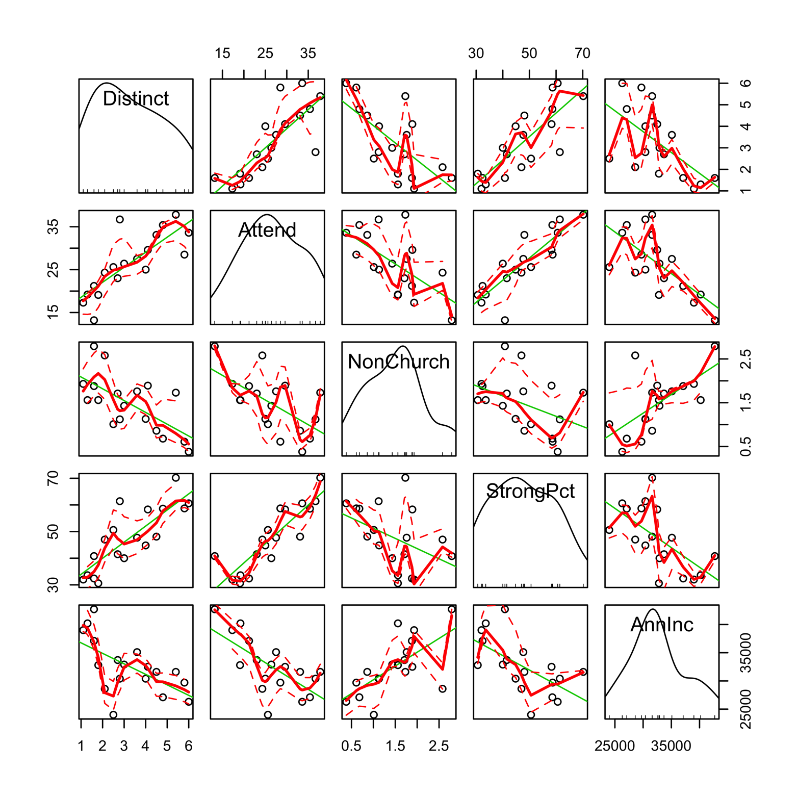
Figure 16-2. A scatter plot matrix produced by scatterplotMatrix() in the car package. The default options add kernel density plots and rug plots in the diagonal as well as least-squares lines and smoothers in each of the plot windows.
Here is the code to produce Figure 16-2:
#Fig 16-2: scatter plot matrix w/ smoother & diagonal density
library(car)
library(Sleuth2)
attach(ex1713)
scatterplotMatrix(~Distinct + Attend + NonChurch + StrongPct +
  AnnInc)
The lines produced by the smoother in Figure 16-2 show some interesting things. The associations between Attend and Distinct and between Attend and StrongPct are close to straight lines and suggest that these relationships may be described as simple linear correlations. Certain other associations that looked close to linear on the simple scatter plot—for example, that between Attend and AnnInc—now appear more complex. It should be noted, however, that this dataset only has 18 denominations in it, which is a rather small number from which to draw conclusions about the shape of the relation between any two variables. This example is merely an illustration of the features available in the package. In most cases, you will probably find it useful to look at a display like Figure 16-1 first; after getting a feel for the data, you might find some of the other features helpful.
You can customize the matrix produced by scatterplot() quite a bit. You can omit the smoother by using the smoother = NULL argument, as shown in the code that follows. Likewise, you could remove the regression line by using the reg.line = F argument. It is also possible to change the type of graph on the diagonals by using the diagonal argument. To see the options, type ?scatterplotMatrix.
Figure 16-3 illustrates the customized scatterplot() matrix created by the following code:
# Figure 16-3: scatter plot matrix w/out smoother & with
  histograms
scatterplotMatrix(~Distinct + Attend + NonChurch + StrongPct
  + AnnInc, diagonal = "histogram",
  smoother = NULL)
Figure 16-3. A scatter plot matrix produced by scatterplotMatrix() in the car package. Smoothers have been left out and the diagonal density plots replaced with histograms.
Figure 16-3 shows a matrix with diagonal histograms. This might be a better choice than the density plots that are produced by default, at least in this instance, given that the sample size is only 18. The distribution of a couple of variables, Attend and NonChurch, is less smooth than the density plots might lead us to think. Further, the two especially large values of NonChurch can cause the relationship between that variable and Attend to appear stronger and more linear than it really is. You can probably see that by looking carefully at the scatter plot of those two variables, but you might have missed it had not the histogram flagged the plot first.
When examining a scatter plot matrix, it is important to remember that you are actually being presented with many separate plots. Do not let yourself become overwhelmed by the amount of information on the page. Look at each plot by itself. After you have done this for many of the plots, you will probably find it enlightening to compare them.
Corrgram
The corrgram (sometimes called “correlogram,” although this term actually refers to something else) is a type of graph related to the scatter plot matrix. In this type of graph, the individual scatter plots are replaced by symbols that represent numbers measuring the amount of linear correlation between two quantitative variables. The Pearson correlation coefficient, usually denoted as r, can vary between –1 and 1. A perfect positive correlation is 1, meaning that all the points on the scatter plot of two quantitative variables lie exactly on an ascending straight line. A perfect negative correlation is –1, indicating that all points lie exactly on a descending straight line. Values near 0 indicate little or no association between two variables. Take note that the correlation coefficient is not a measure of the steepness of a line’s slope. It is, instead, a measure of the total deviation of the points from a straight line. Figure 16-4 illustrates the meaning of the correlation coefficient. A further caution: the correlation coefficient is useful only if the relationship between the variables is linear; that is to say, if the points fall on a straight line. In other situations, the correlation coefficient can be misleading or even deceptive.
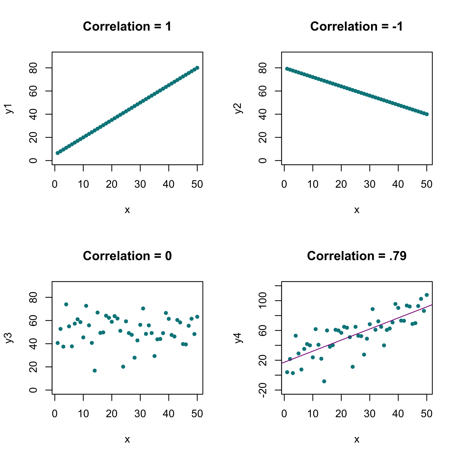
Figure 16-4. A perfect positive correlation of 1 has all the points falling exactly on an upward-sloping line. A perfect negative correlation of –1 has all the points falling exactly on a downward-sloping line. A correlation of 0 shows no discernible pattern. A positive correlation of .79 shows points falling “close” to a straight line.
To make a corrgram, it is first necessary to make a correlation matrix—a matrix containing the correlation coefficients of all the variable pairs in the dataset. This is accomplished by using the cor() function:
> library(Sleuth2)
> attach(ex1713)
> y = cor(ex1713[, 2:6]) # use all rows and columns 2-6
> y
            Distinct     Attend  NonChurch  StrongPct     AnnInc
Distinct   1.0000000  0.7891067 -0.6585883  0.8127124 -0.6003892
Attend     0.7891067  1.0000000 -0.6107342  0.8649691 -0.6766143
NonChurch -0.6585883 -0.6107342  1.0000000 -0.4218525  0.6458747
StrongPct  0.8127124  0.8649691 -0.4218525  1.0000000 -0.6146261
AnnInc    -0.6003892 -0.6766143  0.6458747 -0.6146261  1.0000000
When the correlation matrix has been produced, you can use the corrplot() function from the corrplot package to make several types of corrgram. Some examples appear in Figure 16-5. All of the examples use color to depict size of correlation. You can also use size of object, orientation of object, or numbers to show how large the correlation of a given pair of variables is.
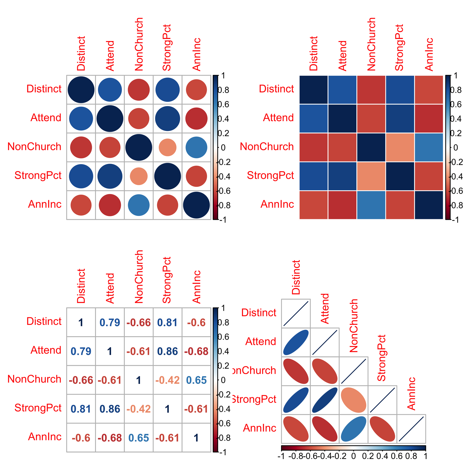
Figure 16-5. Visualizations of the correlation matrix. This is a type of summary, or approximation, of the scatter plot matrix, produced by the corrplot() function in the corrplot package. Upper left: method = “circle”; upper right: method = “color”; lower left: method="number”; lower right: method= “ellipse”, type="lower”
The correlation between variables A and B is the same as the correlation between B and A, so the complete corrgram is redundant. That is to say, the correlations in the upper half are exactly the same as the correlations in the lower half. For this reason, some prefer to display only the upper half or only the lower half of the matrix. An example of this appears in the lower-right corner of Figure 16-5. You can do this by using the argument type = "lower". The code to produce the corrgrams in Figure 16-5 follows:
# Figure 16-5: various corrgrams
library(corrplot)
library(Sleuth2)
attach(ex1713)
y = cor(ex1713[, 2:6])
par(mfrow = c(2,2))
corrplot(y)  # default method is "circle"
corrplot(y, method = "color")
corrplot(y, method = "number")
corrplot(y, method = "ellipse", type = "lower")
Despite all the warnings about correlation coefficients, the corrgram can be an effective way to present and screen data, if you take the time to look at the scatter plots (and possibly smoothers), first, to see if correlation coefficients make sense. Compare the corrgrams in Figure 16-5 to the scatter plot matrices in earlier figures in this chapter to see how consistent the conclusions from these varied displays may be. Corrgrams are also available through the cor.plot() function in the psych package.
All of the plots in Figure 16-5 use color to indicate the strength of the correlation, with a color gradient either on the right or the bottom to show the color meanings. Shades of blue show a positive relationship, with darker colors being stronger (i.e., closer to 1). Shades of red show a negative correlation, with darker colors being closer to –1. In two graphs (the upper-left corner and the lower-right corner), size also indicates strength, but in opposite ways. In the upper-left graph, larger size shows larger absolute value. In the lower-right graph, orientation indicates positive or negative correlation, with narrow ovals showing points close to a line (i.e., strong correlation). Fat ovals indicate a lot of variation around a line, or weaker correlation. You probably picked this up without my telling you, but it feels better to have your suspicions confirmed, right?
It is also possible to combine the scatter plot matrix with the corrgram by putting one of these graphs in the lower half of the matrix, and the other in the upper half. The ggscatmat() function in the GGally package does exactly that:
# Figure 16-6
library(GGally)
library(Sleuth2)
ggscatmat(ex1713, columns = 2:6)
Figure 16-6 shows the results.

Figure 16-6. A combination of scatter plot matrix and corrgram produced by the ggscatmat() function in the GGally package. Note the overprinting on the x-axis in the lower-right corner. This can be fixed!
Note a small problem in Figure 16-6. The x-axis values in the lower-right corner are overprinting because the numbers are too big to fit in a small space. There is a pretty simple fix for this. Change the scale of the values of AnnInc from dollars to thousands of dollars, and redo the graph with this new variable. Accomplishing this will require one new command and a small change in another one. First, create a new variable, Inc, that is AnnInc divided by one thousand. This new variable becomes the seventh column of the data frame. Next, modify the ggscatmat() command to include the desired columns, leaving out AnnInc and including Inc:
# Figure 16-7: fix a bug in Figure 16-6
library(GGally)
library(Sleuth2)
ex1713$Inc = ex1713$AnnInc/1000
ggscatmat(ex1713, columns = c(2:5,7))
Take a look at Figure 16-7 to see how that resolved the overprinting problem.

Figure 16-7. A bug in Figure 16-6 has been fixed. Note that the x-axis in the lower-right corner is now readable.
Generalized Pairs Matrix with Mixed Quantitative and Categorical Variables
Datasets with both quantitative and categorical variables are quite common. In such cases, although scatter plots do not work with categorical variables, it is still possible to produce a meaningful display of all the pairwise plots of variables. It simply means that the display will include several types of plots, each appropriate for the variable types included. This type of graphical display is illustrated in the code example that follows with ggpairs() from the GGally package and gpairs() from the gpairs package.
Consider again the Nimrod dataset. This dataset has one quantitative variable, time, and two categorical variables, level and medium. The variable performer, simply being the names, will not give us any useful insight and will make the page more crowded, so we’ll leave it out. We can do this by using a subset of the dataset (see the section “Basic Scatter Plots”, in Chapter 12 to review this concept). The subset we want is Nimrod[, 2:4]; that is, all the rows, but only columns 2 through 4:
# Figure 16-8
library(GGally)
ggpairs(Nimrod[,2:4])
Look at Figure 16-8 to see how that comes out.
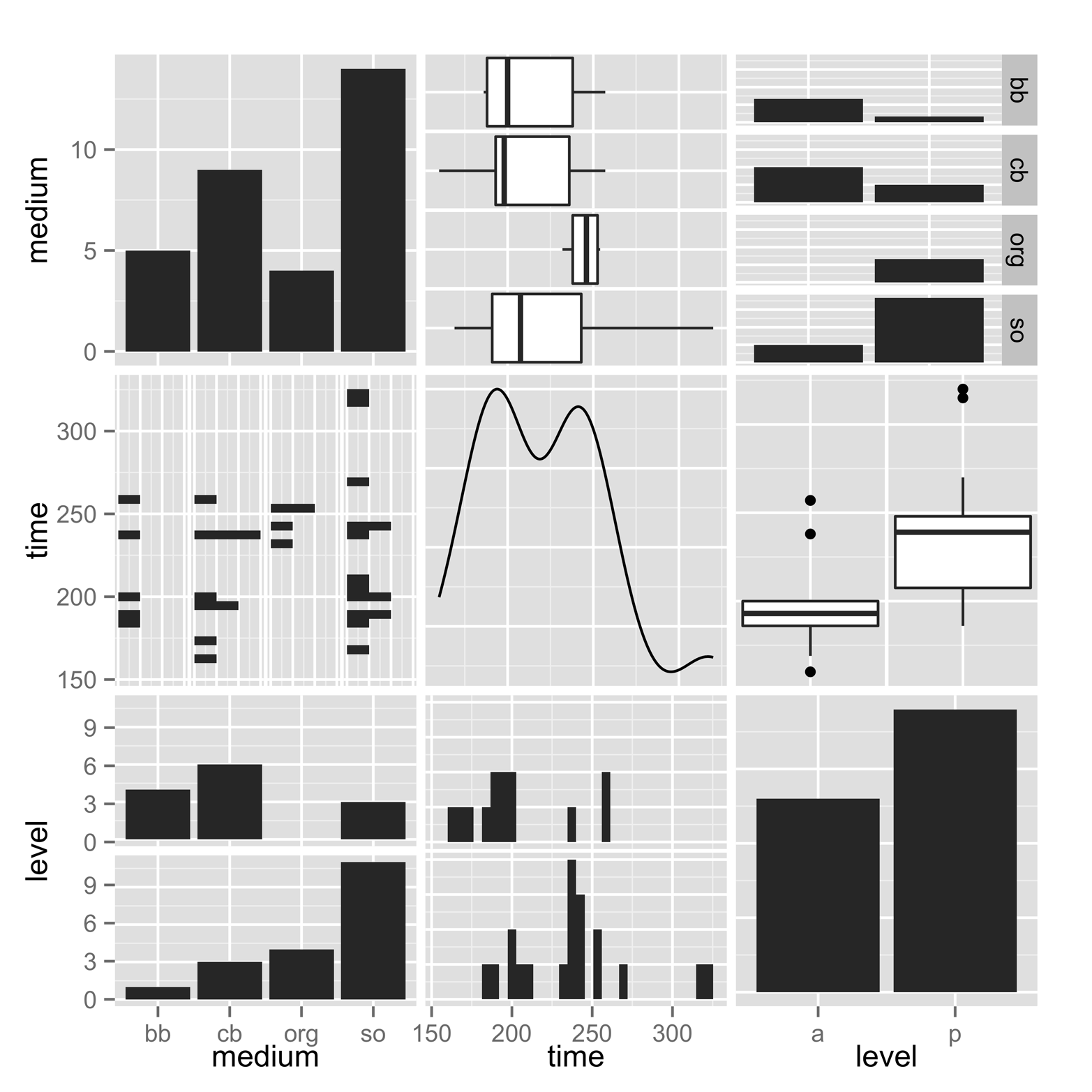
Figure 16-8. Generalized pairs matrix, for data with mixed quantitative and categorical variables. This was produced by using ggpairs() in the GGally package.
There are some familiar types of graphs in Figure 16-8. The diagonal displays bar charts for the two categorical variables and a density plot for the quantitative variable. There are also some box plots, for pairs including one quantitative and one categorical variable.
Additionally, there are some plots that we have not seen yet. The lower-left corner and the upper-right corner are plots of the same two categorical variables. In each case, the square is broken up into multiple bar charts. In the lower left, there are bar charts of medium for each of the two values of level. In the upper-right square, there are bar charts of level for each of the values of medium.
Finally, there are barcode plots in some squares plotting a categorical and a quantitative variable. For instance, the middle square in the lefthand column presents the data as something that looks rather like a barcode stamped on a book cover or other item. Each point is represented by a small bar. The bars are arranged as four strip charts, one for each value of medium. When there are ties, the second bar is not simply overprinted, but placed next to the one already in the location that it shares. In other words, these bars are jittered, but in a very orderly manner. The middle square of the bottom row is also a barcode plot, but this time it contains two strip charts of level, amateur and professional.
One last observation about this figure. Note that when there is a quantitative and a categorical variable, the two displays of that pair are presented as two different types of graph. Each of those two displays gives, perhaps, a slightly different insight about the relationship. There are a number of options available. For more information about them, type ?ggpairs.
The gpairs() function shown in the code that follows gives a similar overview of the pairwise comparisons but introduces one additional type of plot, the mosaic plot. Chapter 20 is devoted to this type of plot, so I will not discuss it here. After you have read about the mosaic plot, it might be worth your time to come back to this example and compare Figure 16-8 and Figure 16-9 again. The code to produce Figure 16-9 is:
# Figure 16-9
install.packages("gpairs") # if not already installed
library(gpairs)
gpairs(Nimrod[,2:4])
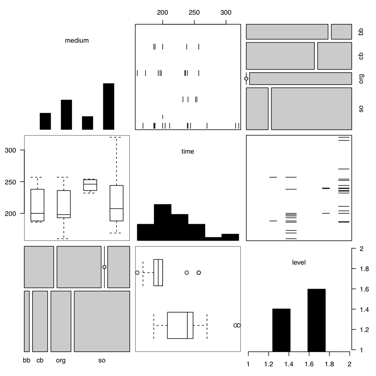
Figure 16-9. Generalized pairs matrix, for data with mixed quantitative and categorical variables. This was produced by using gpairs() in the gpairs package.
Look closely at Figure 16-9. The diagonal mixes the bar plot and the histogram. Which is which? Why? If you are not sure, review Chapter 7 and Chapter 9. To see the options available for gpairs(), type ?gpairs.
Exercise 16-1
Use the tools introduced in this chapter to study the Ginzberg data from the car package—just the first three variables. Do you find some interesting relationships? Are they linear?