Chapter 18. Coplots (Conditioning Plots)
The Coplot
Sometimes, the apparent relationship between two variables can be quite misleading. This may well be due to a strong association that one or both variables have to a third variable. Consider the States dataset from the car package. This is data about the SAT exam, a test that many students in the United States take as part of the college admissions process. States also contains several other variables about secondary education on the state level in 1992. Each of the 51 observations in this dataset represents one state, or the District of Columbia. Figure 18-1 shows a scatter plot of average scores on the SATM, the math subtest of the SAT, against the amount of money (in thousands of dollars per student) spent on public education in each state.

Figure 18-1. A scatter plot of the state average SATM scores and the average amount of state spending on public education, per student, in thousands of dollars. There are 51 points, one for each state and the District of Columbia.
Here is the code to produce Figure 18-1:
# Figure 18-1
library(car)
attach(States)
plot(dollars,SATM,
 pch = 16,
 col = "maroon")
grid(lty = "solid")
Figure 18-1 seems to indicate that states that spent relatively little on education had high SATM scores, whereas higher-spending states had relatively low scores. This is completely counterintuitive! We would expect—or at least hope—that spending more on education leads to better results. Could it be that some other factor is influencing outcomes?
The dataset includes a variable called percent, which is the percentage of graduating seniors who take the SAT. Are test averages different in states where few students take the SAT and those states where most students take the test? Might it be that in states where few take the test, only the higher-performing students are included? Perhaps in states where nearly everyone takes the test, the less talented or less motivated students bring the state average down. We can study this theory with a type of graph called a conditioning plot, or coplot. The idea is to slice the data into pieces so that we can look at several scatter plots of SATM by dollars, each at a different value of percent, the conditioning variable. If all of the scatter plots look the same, or very similar, this indicates that percent did not influence the outcome. If the plots look quite different, however, this shows that percent did influence the relationship between SATM and dollars. The coplot() function takes a formula of the following form:
y ~ x | z
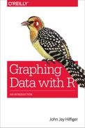
Here, y is the vertical axis, x is the horizontal axis, and z is the conditioning variable. It is also possible to condition with two variables, a and b, in which case the formula is y ~ x | a * b. The following script produces the coplot in Figure 18-2:
# Figure 18-2
library(car)
attach(States)
coplot(SATM ~ dollars | percent,
 pch = 16,
 col = "royalblue",
 bar.bg = c(num = "goldenrod2"))
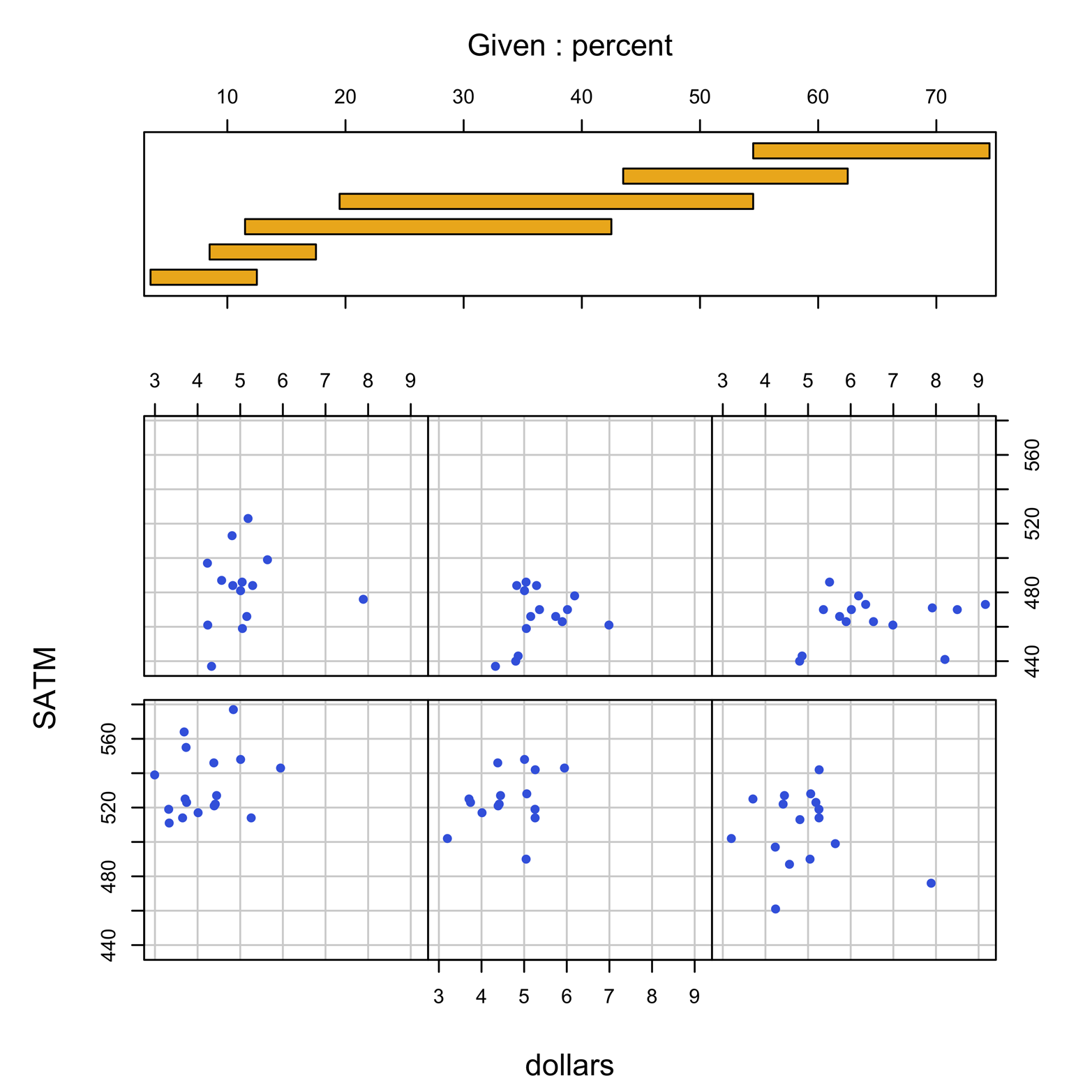
Figure 18-2. Coplot of SATM by dollars with percent as the conditioning variable.
Figure 18-2 shows six scatter plots, each of them for a “slice,” or subset, of the data with a particular range of values of percent. The box at the top of the display shows a group of six bars, each bar indicating what range of percents are included in one of the scatter plots. The bar in the lower-left corner indicates that the plot at the lower left includes states with a percent of up to about 12 percent. The next bar up from the bottom shows that the second plot in the lower row includes states with percent scores of about 8 to about 16. The bar at the top of the pile shows that the plot at the upper right includes states with percent scores of about 54 and higher. The coplot seems to be consistent with the hypothesis expressed earlier: states with the smallest percentage of students taking the test had the highest scores, and vice versa. Furthermore, in none of the six plots does there seem to be any notable association between SATM and dollars!
The bars in Figure 18-2 are overlapping. This means that some states are represented in two, or even three, plots. R does this by default to ensure that there are sufficient points in each plot to make a useful graph. Notice that there are about 15 to 17 points in each plot. If each of the plots were to be nonoverlapping, there would only be about 8 or 9 points in each (51 divided by 6), or possibly a few more or less depending on just where the cut points were. In this case, the defaults chosen by R seem to have done what we had hoped for, but this might not always be true.
It is possible to control how many slices there will be by using the number argument. You can control how much individual slices overlap by using the overlap argument, as is demonstrated in following example:
# Figure 18-3
library(car)
attach(States)
coplot(SATM ~ dollars | percent,
 pch = 16,
 col = "royalblue",
 bar.bg = c(num = "seagreen"),
 overlap = 0,
 number = 5)
As you can see in Figure 18-3, there are only five slices now, and they do not overlap. Notice that R chose where the cut points would be, creating the slices in such a way that the number of points would be about equal in all the plots.

Figure 18-3. Coplot of SATM by dollars with percent as the conditioning variable. The user specified five slices, with no overlap.
The results in Figure 18-3 still look pretty good, even though we surrendered control of the cut points to R. There might be circumstances in which we want to pick the exact cut points without availing ourselves of R’s sage wisdom, though. It is possible, but it takes a little bit of effort. Suppose that we want to have four nonoverlapping plots and to pick the precise cut points. We need to create a matrix with four rows, one for each plot. Each row will have two numbers: the lowest percent in the plot and the highest. The name of the matrix will be supplied to the given.values argument. The matrix will look like this:
 0  19.9
20  39.9
40  59.9
60  75
Figure 18-4 has four slices with exactly equal widths of percent (except the highest one), but very different numbers of points in each plot. The script to create it follows:
# Figure 18-4
library(car)
attach(States)
mat = matrix(c(0,19.9,20,39.9,40,59.9,60,75),
 byrow = T,
 nrow = 4,
 ncol = 2)
coplot(SATM ~ dollars |percent,
 pch = 16,
 col = "royalblue",
 bar.bg = c(num = "maroon"),
 given.values = mat)
Figure 18-4 shows you the results.
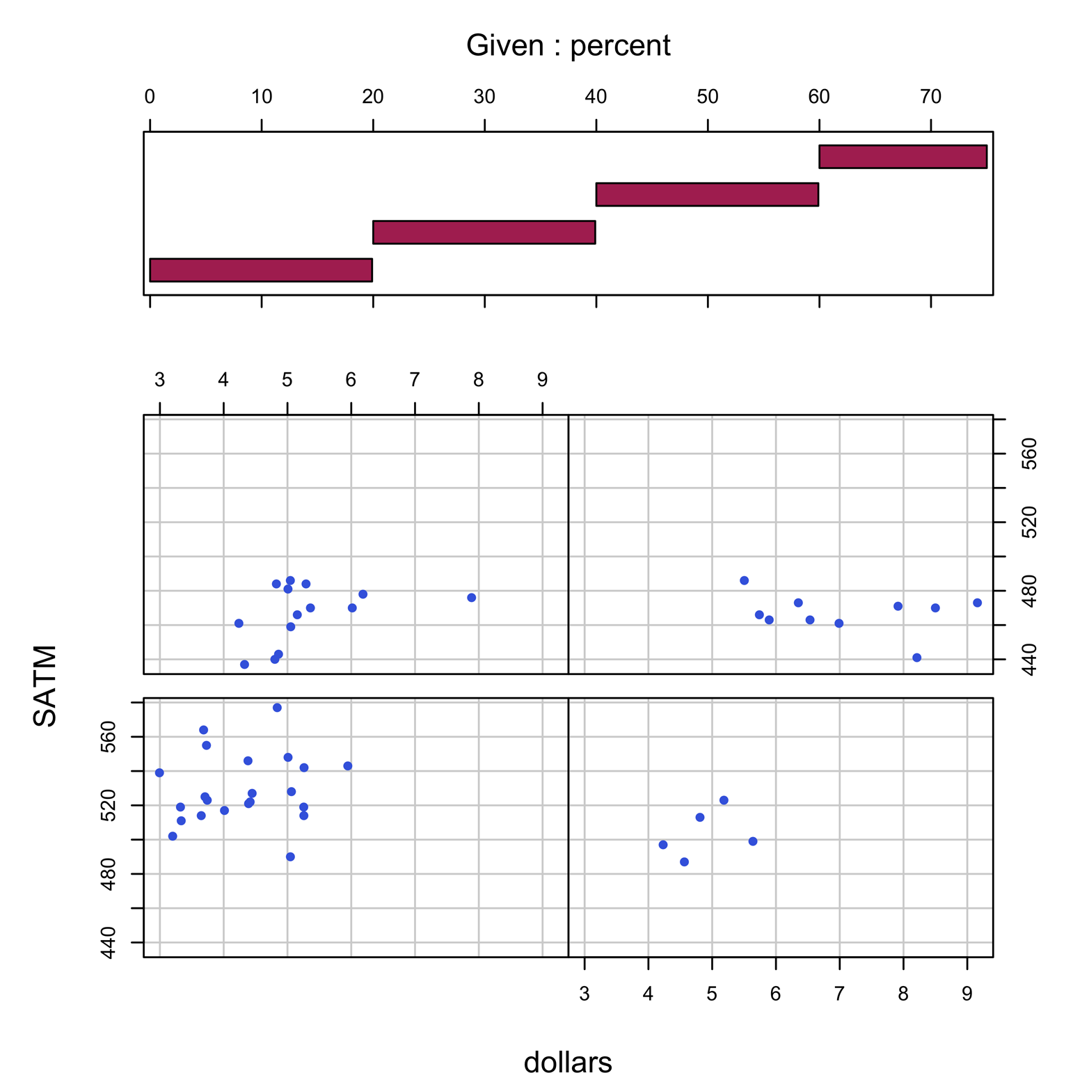
Figure 18-4. Coplot of SATM by dollars with percent as the conditioning variable. The user has specified four slices with precise cut points.
The extent of the relationship of percent with SATM is still so strong that our conclusion is unchanged. In this case, there were no fewer than five points in a panel. However, there could be instances where one or more panels contain zero, one, or two points, making those panels of little value or difficult to interpret. Thus, R defaults to the overlapping bars we saw in Figure 18-2, thereby avoiding empty or nearly empty panels. We always have the option to create a coplot with panels that do not overlap. When given a sufficiently large number of points, this will often be easier to interpret.