Chapter 19. Clustering: Dendrograms and Heat Maps
Clustering
Clustering refers to a number of related methods for exploring multivariate data. There are dozens of clustering functions available in R. We will focus on just one of them in this chapter: the hclust() function in base R. This function performs hierarchical clustering, which is one of the most commonly used clustering techniques and will be a good introduction to clustering in general. The idea is to put observations into clusters, or groups, in which the members of a single cluster are similar to each other and different from observations in other clusters. Further, a particular cluster may be judged to be similar, in varying degrees, to other clusters. We will use a graph called the dendrogram—which looks like an inverted tree—to understand the relationships of clusters to one another. Figure 19-2, later in this chapter, presents an example of a dendrogram.)
Consider the mtcars dataset from Motor Trend Magazine’s 1974 report on the characteristics of a number of new models for that year. Let’s take a look at the first six rows of this dataset by using the head() function:
> head(mtcars)
                   mpg cyl disp  hp drat    wt  qsec vs am
Mazda RX4         21.0   6  160 110 3.90 2.620 16.46  0  1
Mazda RX4 Wag     21.0   6  160 110 3.90 2.875 17.02  0  1
Datsun 710        22.8   4  108  93 3.85 2.320 18.61  1  1
Hornet 4 Drive    21.4   6  258 110 3.08 3.215 19.44  1  0
Hornet Sportabout 18.7   8  360 175 3.15 3.440 17.02  0  0
Valiant           18.1   6  225 105 2.76 3.460 20.22  1  0
                  gear carb
Mazda RX4            4    4
Mazda RX4 Wag        4    4
Datsun 710           4    1
Hornet 4 Drive       3    1
Hornet Sportabout    3    2
Valiant              3    1
We would like to put the various models into clusters, such that similar cars are in the same cluster. There are two ways to do this. The agglomerative method begins by making a cluster of the most closely matched pair, then making a cluster of the next most closely matched of either a pair of single observations or a pair of a single observation and an existing cluster, and so on, until all the observations are in one big cluster. The other approach, the divisive method, breaks the total group into subgroups, those subgroups into further subgroups, and so on. The hclust() function uses agglomeration, but there are several methods available. We will use the default method, “complete.”
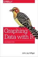
How should we measure the similarity, or distance, between two observations? This involves finding a measure—combining all the available information—to determine the “distance” between one car model and another. If we had only one variable to consider, the absolute difference between the values of that variable for each car model would be the obvious choice. In our example, however, there are 11 variables, so we would like to have a distance measure that takes all 11 into account. Let’s begin with a simpler example. Suppose that there are two cars, Car-1 and Car-2, each with measurements on two variables, x and y. So, Car-1 is a point (x1,y1) and Car-2 is a point (x2,y2). These two points are represented in the graph in the upper left of Figure 19-1. The shortest distance between the points is displayed by the solid line in Figure 19-1, in the graph in the upper-right corner.
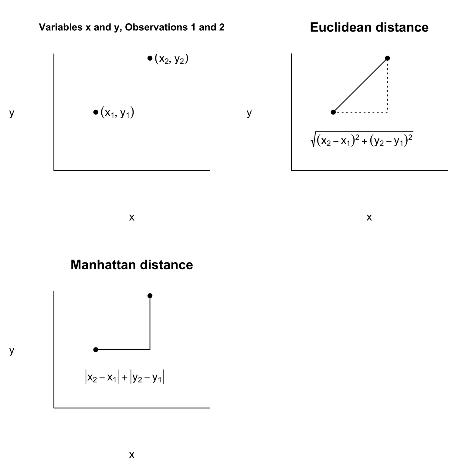
Figure 19-1. Measuring distances in two-dimensional space.
Note that this line is the hypotenuse of a right triangle, so it is easy to calculate the distance:
distance = sqrt[(x2 - x1)^2 + (y2 - y1)^2]
Remember that the square of the hypotenuse equals the sum of the squares of the two sides. This distance, “as the crow flies,” is called the Euclidean distance; it is the default distance measure used by the dist() function in R. There are several other ways to measure distance. One of them is shown in the graph in the lower left of Figure 19-1. This is the Manhattan option, also called “taxi cab” or “city block” distance. Depending on the particular problem you are solving, this measure might be more appropriate. R makes this option available as well as several others, but we will stick with Euclidean distance for this problem. If there are three variables, you can extend the Euclidean method as follows:
Euclidean distance = sqrt[(x2 - x1)^2 + (y2 - y1)^2 +
  (z2 - z1)^2]
Likewise, you can extend the measure to as many variables as needed.
Notice that the values of the variables in mtcars vary widely. For example, disp has values well in excess of 100, but cyl is all in single digits. This means that disp will play a much more important role in determining the distance than cyl will, if only because of the scale on which it is measured. Imagine that two variables were measurements of length but one was expressed in inches, whereas the other was in feet. The exact same distance would be noted in very different numbers, giving the one with a higher number more influence on the Euclidean distance. For this reason, it makes sense to convert all the variables to a comparable measurement scale.
We can normalize (or “standardize”) the data by applying a simple transformation. We will make each variable have a mean of 0 and a standard deviation of 1. Let’s try this with mpg. First get the mean and standard deviation of mpg:
> mean(mpg)
[1] 20.09062
> sd(mpg)
[1] 6.026948
If we subtract the mean from each value of mpg and divide that by the standard deviation, we will have an mpg variable that has a mean of 0 and standard deviation of 1:
> mpg2 = (mpg - 20.09)/6.026948
> mean(mpg2)
[1] 0.0001037009        # tiny round-off error!
> sd(mpg2)
[1] 1
This kind of process of normalization happens so frequently that R provides a function that makes it a one-step operation:
> mpg3 = scale(mpg)
> mean(mpg3)
[1] 7.112366e-17   #tiny, tiny; for all practical purposes = 0
> sd(mpg3)
[1] 1
Fortunately, we do not need to scale each variable: we can do an entire matrix at once. Let’s now convert the data frame to a matrix, make the distance measurements on a scaled matrix, compute the clusters, and plot the dendrogram:
# Figure 19-2
attach(mtcars)
cars = as.matrix(mtcars)  # convert to matrix- dist requires it
h = dist(scale(cars)) # scale cars matrix & compute dist matrix
h2 = hclust(h)                # compute clusters
plot(h2)                 # plot dendrogram
The dendrogram in Figure 19-2 shows the results of the clustering procedure.
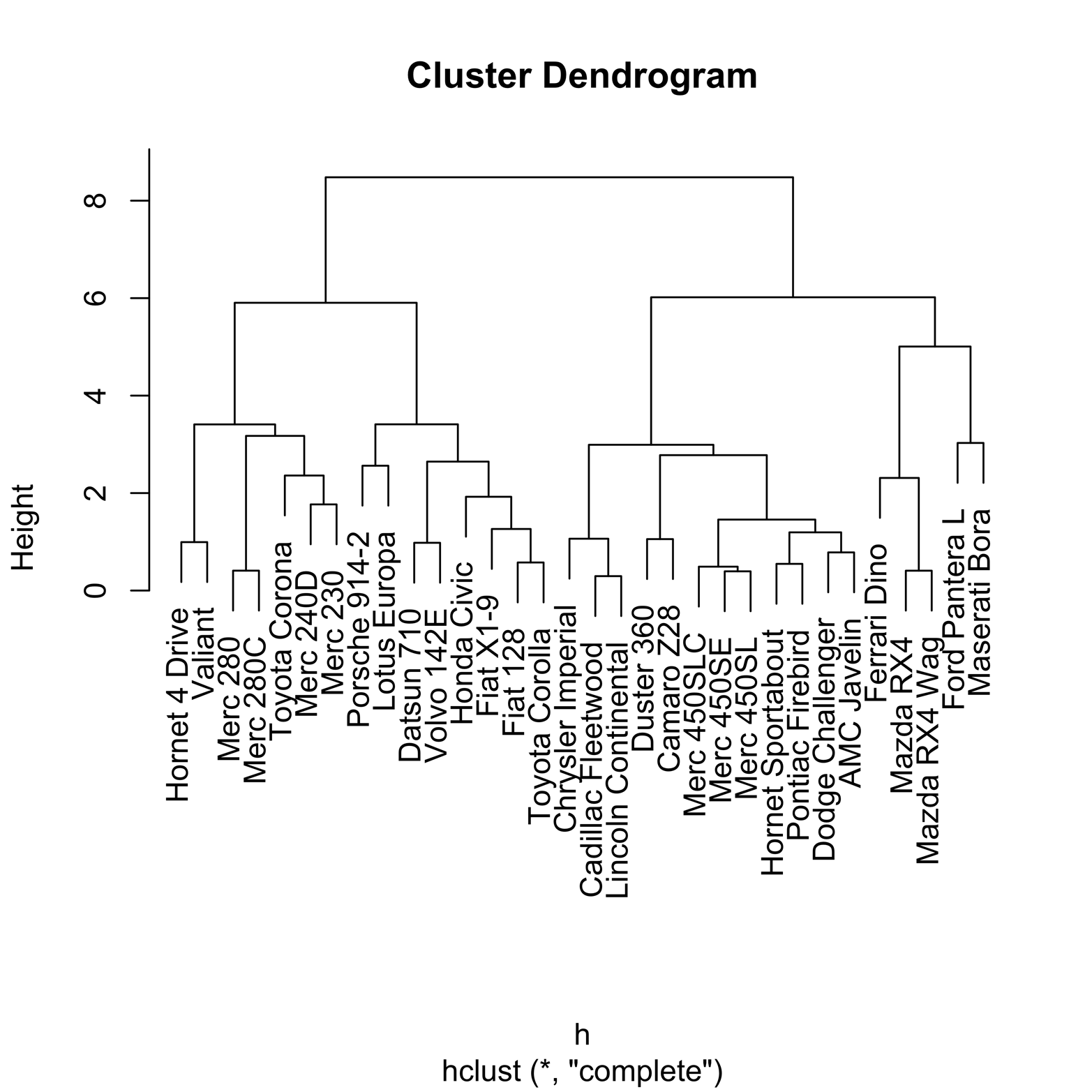
Figure 19-2. Dendrogram of clusters in mtcars dataset.
The vertical scale, called “Height,” will help us to understand what has happened. The figures that look rather like staples connect observations in the same cluster. The lower down on the Height scale the horizontal part of the staple is, the earlier that cluster was formed. Thus, the staples that have a Height near zero were the first ones formed and therefore are the closest in Euclidean distance. Conversely, clusters with a Height of close to eight were among the last formed and thus are relatively far apart. Clusters that are next to each other are not necessarily close! For example, look at the righthand side of the graph. The two Mazda models are very close, having formed a cluster at a height of about 1. The Ford Pantera, which is next to the Mazda cluster, is not especially close to the Mazdas, because it did not become part of a cluster with them until a height of about 5.
It is also possible to cluster the variables, rather than the observations, by transposing the cars matrix; that is, making the first row become the first column, the first column become the first row, and so on:
newcars = t(cars)  # newcars is the transpose of cars
h = dist(scale(newcars))
h2 = hclust(h)
plot(h2)
Heat Maps
Another way to get an overview of all the numbers in the mtcars dataset is to look at a heat map. In this kind of visualization, every number in the standardized matrix is transformed into a colored rectangle. This is done in a systematic way so that a color represents the approximate value, or intensity, of the number. For instance, one possible range of colors we might use runs from dark red for very low numbers, through ever lighter shades of red, orange, yellow, and finally white as the numbers become higher. This range of colors is the default for the image() function, but many other color sets are possible. A simple heat map on scaled values in the mtcars dataset appears in Figure 19-3. The code that produced it follows:
# Figure 19-3
attach(mtcars)
cars = as.matrix(mtcars)
image(scale(cars))    # simple heat map

Figure 19-3. Heat map of mtcars dataset in default colors
The col = rainbow() argument controls the color range in the image() function. Another reasonable color scheme is a range of blues, from very dark to very light. The following command shows how to invoke the blue range of colors:
# Figure 19-4
image(scale(cars), col = rainbow(256, start = .5, end = .6))
# heat map with range of blues
The result appears in Figure 19-4.
Figure 19-4. Heat map of mtcars dataset in a range of blue colors.
Not all color sets are easily interpreted. If you used all possible colors, it would be difficult to know whether, for instance, dark green was more positive or more negative than dark blue. The color schemes in Figure 19-3 and Figure 19-4, however, are relatively easy for most people to grasp. Each of the values start and end in the rainbow argument must be 0 or larger but no larger than 1, and the two values must be different. You might experiment with different values and see if you find a combination that works as well for you as the two demonstrated here. For more information, type ?rainbow.
The heat map in Figure 19-3 (also Figure 19-4) is turned on its side, as if the data matrix fell to the left. If you count, you can find 11 rows and 32 columns, instead of the 11 columns and 32 rows in the original dataset. Even though the colors show a wide range of values, with many dark red (low) values and some pale yellow and white (high) values, there does not seem to be any obvious pattern in the graph.
We would like to find patterns in the data, just as we did with the cluster analysis. It is actually possible to combine the dendrogram and the heat map into one visual display to aid in understanding the relationships among the variables and particular car models. The heatmap() function can both perform clustering and make a heat map at the same time. Rows and/or columns are reordered to put like items together, and cells are colored appropriately. The command that follows produced Figure 19-5, using the default options:
> heatmap(scale(cars)) # Figure 19-5
Note
See the help file for more information about the many options available, such as whether to include a row and/or column dendrogram, methods for measuring distances, how to weight rows and columns, and more.

Figure 19-5. A heat map of clusters in mtcars
You can see some striking patterns in Figure 19-5. Notice how the colors set off some groups of car models from others. Compare those clusters to the ones indicated by the dendrogram on the lefthand side. We can see not only that certain models are in the same clusters, but that models within clusters—especially in the ones that were among the earliest formed—have similar color patterns among the variables.
A similar heat map is shown in Figure 19-6.
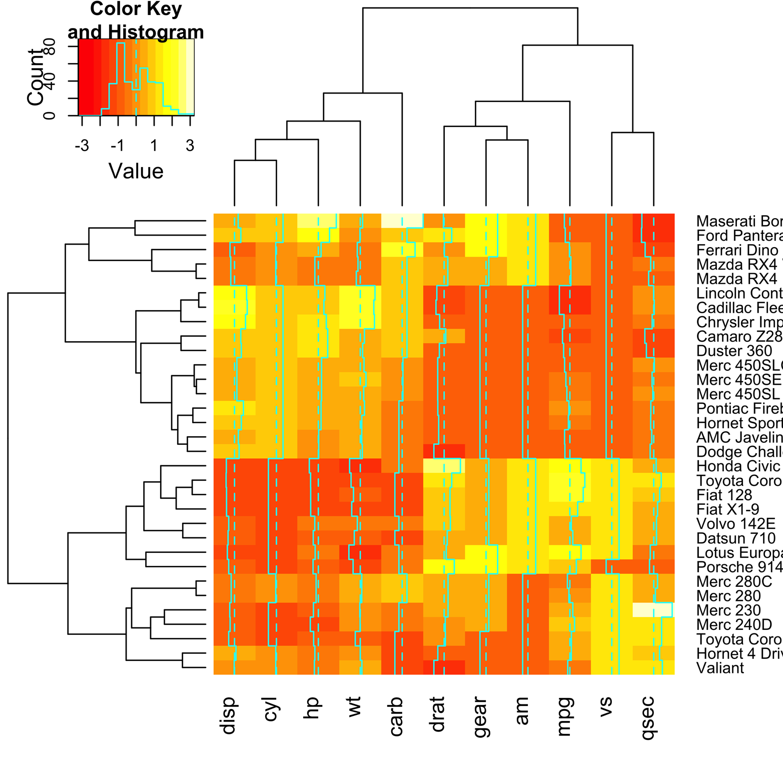
Figure 19-6. Heat map of mtcars, using heatmap.2() from the gplots package.
Figure 19-6 was made by using the function heatmap.2() from the gplots package. There are a couple of extra features provided by heatmap.2() that make interpretation of the map a bit easier. First, there is a key in the upper-left corner that shows the relation of the colors to variable values. Second, there is a system of vertical lines running through each of the columns. The dotted line represents the value 0. The solid line shows how much the value in a particular cell varies, positively or negatively, from 0. This reinforces the key, giving a confirmation in each cell. The code to produce this figure follows:
# Figure 19-6
library(gplots)
heatmap.2(scale(cars))
Clustering is not an exact science; rather, it is a way of searching for order in complex data. Clustering algorithms, dendrograms, and heat maps are tools we use in that search. Like other tools, they can help us reach our goals, or they can scrape, cut, or burn, if we are not careful! The foregoing discussion is far from a complete explanation of clustering, but more of a teaser, perhaps inspiring you to go ahead and learn more. There are many other clustering and heat map functions provided in R.
Exercise 19-1
Create a new dendrogram for the mtcars data by using a different agglomerative method. Use the help function (?hclust) to see what methods are available. How different are the results? The alternate methods will not necessarily give the same answers. You might find one method works very well on one problem, but not well on another problem. Furthermore, you can try a different method of measuring distance. Type ?dist to see the methods available.
Exercise 19-2
Make alternate heat maps of the mtcars data by using each of these color schemes:
heat.colors
cm.colors
terrain.colors
topo.colors
rainbow.colors
Are some easier to read than others? Which ones do you think you will continue to use? Are there any that you will not use?
Exercise 19-3
Recall that the airquality dataset we examined in Chapter 1 had a number of missing values. The missmap() function in the Amelia package uses a simple type of heat map to look for missing values. Install and load Amelia and find the missing values in airquality. In what way is this heat map simpler than the ones discussed in this chapter? How does this graphic help you to understand the dataset? Compare it to the output provided by the missiogram() function in the epade package.