Chapter 10. Pie Charts
Ordinary Pie Chart
The pie chart is one of the most familiar types of graph. It would be difficult to imagine that you have not seen hundreds of them. One place where they seem to be taken for granted is in the realm of investment portfolios. Investment advisors recommend that their clients allocate their holdings to certain categories of investment, in specified amounts. Such recommendations are usually presented in the form of pie charts. Fund managers also report their holdings (at a point in time) in a similar way. Consider the following portfolio, allocated to “sectors” (this is not a recommendation, by the way):
-
Domestic stocks—30 percent
-
Foreign stocks—25 percent
-
Bonds—28 percent
-
Gold/precious metals—10 percent
-
Cash equivalents—7 percent
We can make a vector out of the percentages and use the pie() function to produce the desired chart, as shown in the following script:
# Script for Figure 10-1
par(mfrow = c(2,2))

allocation = c(30,25,28,10,7)  # investment allocations

# sector & sectcol will be reused; we won't have to retype them
sector = c("Stock","For'n'","Bonds",
           "Gold","Cash") # names fit page
sectcol = c("burlywood","turquoise","firebrick",
            "gold3","green4")

# Figure 10-1 top left
pie(allocation, labels = sector, main = "pie, default colors")

# Figure 10-1  top right
pie(allocation, labels = sector, col = sectcol,
  main = "pie, choose colors")

# Figure 10-1 bottom left
install.packages("plotrix", dependencies = TRUE)
library(plotrix) # must have first installed plotrix
pie3D(allocation, labels = sector, col = sectcol, explode = .1,
  labelcex = .95, labelrad = 1.3, main = "pie3D")
# explode separates pieces/labelrad pushes labels away from edge

# Figure 10-1 bottom right
barplot(allocation, names.arg = sector, col = sectcol,
  main = "barplot")
Figure 10-1 shows the results of this script.

Figure 10-1. Pie charts and a bar plot of the same data. Notice how much easier it is to compare group sizes with the bar plot.
Figure 10-1 displays three pie charts: one with default colors, created by using the pie() function; one with the colors in the sectcol vector, also created by using the pie() function; and one sporting a three-dimensional view (which looks great!), created by using the pie3D() function. There is also a bar plot for comparison. Notice that in the pie charts, the largest three categories appear to be pretty much the same size. Likewise, the smaller categories, “Gold” and “Cash,” seem to be equal. However, the bar plot, which was produced with exactly the same numbers, clearly shows there are differences. Thus, you may not be surprised to learn that pie charts get a lot of bad press from statisticians, and for good reason!
Despite the shortcomings of pie charts, there are times when they might be useful. When there are few categories, and the differences are pretty obvious, you might prefer to use this type of graph. Further, when you want to emphasize what part of the whole is represented by a single slice, the pie chart does this well. There are various ways in which you could organize data to make a pie chart. Working on the exercises for this chapter will help you to get a better understanding of this problem.
Fan Plot
An alternative to the pie chart is the fan plot, which you can see in Figure 10-2.
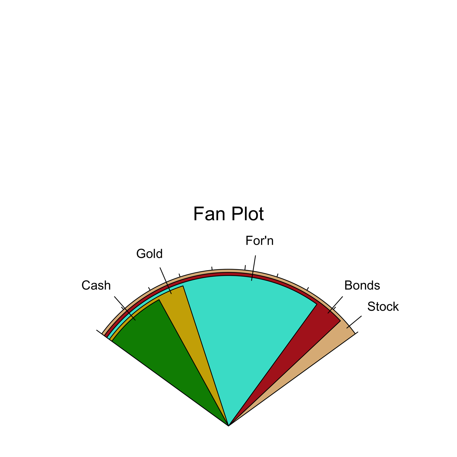
Figure 10-2. A fan plot.
This type of graph looks a little like a pie chart but fixes the most serious problem of that kind of graph. Here is the code to create Figure 10-2:
# Figure 10-2
library(plotrix)
allocation = c(30,25,28,10,7)  # investment allocations
# sector & sectcol will be reused; we won't have to retype them
sector = c("Stock","For'n","Bonds","Gold","Cash")
sectcol = c("burlywood","turquoise","firebrick","gold3",
  "green4")

fan.plot(allocation, labels = sector, col = sectcol,
  ticks = 30, main = "Fan Plot")
The fan plot in Figure 10-2 uses similar labels and the same colors as the pie charts in Figure 10-1. It is a little confusing, though, in that the sizes of the visible wedges do not represent the proportions of the portfolio given to the sectors named by the wedges. Rather, the allocations are represented by the arc in the color of each named wedge. So, you can see that the “Stock” portion is largest, “Bonds” is second largest, and so on. Another way to think about this graph is to imagine that the slices from the pie chart were laid down with the biggest on the bottom, the second largest on top of that, and so forth. Then, the visible part of the largest slice shows how much larger that slice is than the second largest. Likewise, we can easily see how much larger the second largest slice is than the next largest. If you understand how this plot works, it can be useful to you, but if you use it for presentation of your data, you will need to explain it carefully. Even so, there is a good chance that some people will not understand it, and will conclude, for instance, that the “foreign” sector is the largest in Figure 10-2. The fan plot is a very clever design, but long experience with the pie chart may be an impediment to its adoption. Be careful with this one.
Exercise 10-1
Make a pie chart of the causes of death of British soldiers during the Crimean War. You can find the data in the Nightingale dataset in the HistData package. You will need to install and load the package first. Notice how the dataset is structured; the three causes of death are three separate variables. You will need to create a new vector with three numbers: the sums of each of the variables. You can do it this way:
install.packages("HistData")
library(HistData)
attach(Nightingale)
deaths = c(sum(Disease), sum(Wounds), sum(Other))
Explain how this works. Is this a better use of the pie chart than the portfolio example? Why or why not?