Chapter 12. Scatter Plots and Line Charts
Basic Scatter Plots
The scatter plot may be one of the most useful graphic tools that we have. We can easily study the associations between two variables—or lack thereof—on this familiar type of graph. Further, many other graph types are simply variants of the basic scatter plot.
Again, let’s examine the trees dataset. Remember, the head() function prints out the first six rows. You can see the entire dataset by typing trees:
> head(trees)
  Girth Height Volume
1   8.3     70   10.3
2   8.6     65   10.3
3   8.8     63   10.2
4  10.5     72   16.4
5  10.7     81   18.8
6  10.8     83   19.7
There are probably strong relationships among the three variables, which we should be able to see on a scatter plot. We will use the plot() function to produce scatter plots. Its basic form is as follows:
plot(x-variable, y-variable, arguments...)
The following scripts produce several scatter plots of the trees data:
# 4 short scripts to produce the 4 graphs in Fig. 12-1
attach(trees)
par(mfrow = c(2,2), cex = .7)

# Fig. 12-1a: show just 2 points on the graph
trees2 = trees[1:2,] # trees2 a subset, only 1st 2 trees
                     # see sidebar
plot(trees2$Height, trees2$Girth,
  xlim = c(63,80),
  ylim = c(7.8,10),
  xlab = "Height",
  ylab = "Girth",
  main = "a. First two trees")

# text() allows annotation on the graph
text(72,8.1,labels = "(Height = 70, Girth = 8.3)",
  xlim = c(61,80),
  ylim = c(8,22))
text(65,8.8, labels = "(65, 8.6)",
  xlim = c(62,89),
  ylim = c(8,22))

# Fig. 12-1b: note that a basic plot requires very little
  coding!
plot(Height, Girth, main = "b. All trees")

# Fig. 12-1c /  see Table 3-1 for plot characters
plot(Height, Girth,
  main = "c. Change plot character, add grid",
  pch = 20,
  col = "deepskyblue")
grid(col = "gray70")

# Fig. 12-1d # abline puts linear regression line on plot
plot(Height, Girth,
  main = "d. Add regression line", pch = 20,
  col = "deepskyblue")
abline(lm(Girth ~ Height),
  col = "dodgerblue4",
  lty = 1,
  lwd = 2) # writes over last plot
grid(col = "gray70")
detach(trees)
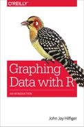
Figure 12-1 displays the results.
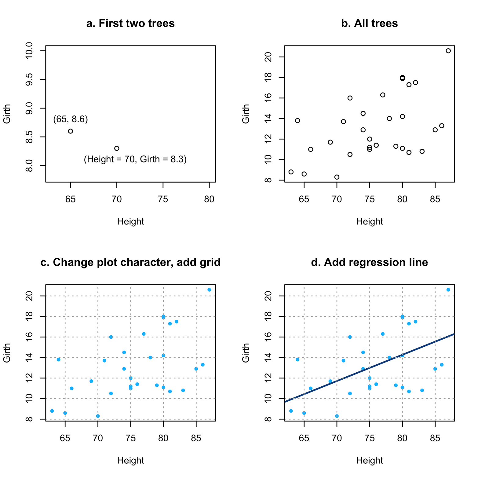
Figure 12-1. Scatter plots of Height and Girth.
Figure 12-1 shows several things about using scatter plots. Figure 12-1a shows how to interpret the points (little circles here), just in case it has been a long time since you did high school math. The very first tree in the dataset had a Height of 70 and Girth of 8.3. You can see how it is placed on the graph to correspond to those measurements.
Figure 12-1b takes the next step of plotting all the points (i.e., trees) on the graph. Note that there does seem to be a relationship between Height and Girth. As Height becomes bigger, so does Girth. It is not a perfect relationship, but it is not a random scatter, either.
Figure 12-1c takes the simple step of changing the plot characters. Not only does this look better, but it is a little easier to read, too. It also introduces a grid. The grid() function will add reference lines to the active plot, which is the last plot created if you have not issued a further command after you created the plot. By default, it draws the grid lines at the tick marks on the axis, but you can change this if desired. Type ?grid to see how.
Figure 12-1d adds a regression line on top of the points. This was done by using the abline() function, which writes over the active plot. Linear regression is a method of finding the “best-fitting” straight line to the observed data. If you found the vertical distance from each point to the place on the line having the same x value, that distance is an “error”; in other words, it shows how far off the line was in predicting the value of that point. As a measure of how well any particular line fits, square all the errors and add them up. The “best fitting” of the infinite number of lines one could put on the graph is the one with the smallest sum of squared errors: the “least squares” line. R finds that line with the lm() function that you can see in the abline() command in the script of the trees data from earlier. If the points had fit even closer to the line, we would have concluded that the relationship between Height and Girth was even stronger than what we see in Figure 12-1d.
Recall the formula for a straight line, where Y is a point on the line:
Y = a + (b * X)
In the formula, a = the intercept (the point on the y-axis where the line crosses it), and b = the slope (the “rise over the run”; that is, the amount Y changes for every unit change of X).
Here’s how you can get the values for intercept and slope:
lm(Girth ~ Height)

Call:
lm(formula = Girth ~ Height)

Coefficients:
(Intercept)       Height
    -6.1884       0.2557
So, the formula tells us that the line is determined by the equation:
Girth = –6.1884 + (0.2557 * Height)
Further, we could get relevant statistics for this model by using the following command:
summary(lm(Girth ~ Height))
Interpretation of that information, however, is beyond the scope of this book. In other situations, we might have seen a pattern in the data that was not close to a straight line, and might have attempted to fit a curve or have concluded that there was no association between the two variables. Although it is great to have the capability of adding regression lines to your plot, if you do not really understand what you are doing, you will be a bit like a child playing with matches, so be cautious!
Line Charts
A special case of the scatter plot that is very common and very useful is the line chart (also called “line graph” or “line plot”). In this type of graph, no two points have the same x value. Further, the points are connected by a line from the point with the lowest x value to the point with the next lowest x, and so on. It is also possible to display two or more line charts on the same set of axes. The plot() function, used for scatter plots, also produces line charts. Some examples of line charts are presented in Figure 12-2.
To create our charts, let’s use the Nightingale dataset from the HistData package, which you first saw in “Exercise 10-1”. Load this package and take a look at the data:
# if not already done, must install HistData or the
# following won't work
# install.packages("HistData", dep = T)
library(HistData)
attach(Nightingale)
head(Nightingale)     # head() prints out the 1st 6 rows

      Date  Month Year  Army Disease Wounds Other
1 1854-04-01   Apr 1854  8571       1      0     5
2 1854-05-01   May 1854 23333      12      0     9
3 1854-06-01   Jun 1854 28333      11      0     6
4 1854-07-01   Jul 1854 28722     359      0    23
5 1854-08-01   Aug 1854 30246     828      1    30
6 1854-09-01   Sep 1854 30290     788     81    70
  Disease.rate Wounds.rate Other.rate
1        1.4          0.0         7.0
2        6.2          0.0         4.6
3        4.7          0.0         2.5
4       150.0         0.0         9.6
5       328.5         0.4        11.9
6       312.2        32.1        27.7
The data records the monthly deaths of British soldiers in the Crimean War. Each line of the data represents one month, with a number of variables such as the month and year, army size, and number of deaths from each of three causes. It is easy enough to plot the number of deaths from Disease for each Date, which would give an ordinary scatter plot. You might want to try it. The graph will give a much greater sense of order, however, if the dots are connected, from the first month to the second month, the second to the third, and so on. This is a basic line chart. You can create such a graph by adding the argument type = "b" to plot(). It is also necessary to add the argument lty = "solid" to specify the type of line. (The line could also be "dotted", "dashed", or other types; type ?par for more information.) The following script produces the line charts in Figure 12-2:
# Figure 12-2 - 4 graphs
par(mfrow = c(2,2)) # put 4 graphs on one page
library(HistData)
attach(Nightingale)

# Figure 12-2a
plot(Date, Disease,
  type = "b",
  pch = 20,
  lty = "solid",
  main = "a. Line chart of Disease")

# Figure 12-2b
plot(Date,Disease,
  type = "l",
  lty = "solid",
  main = "b. Line chart, Disease, Wounds, Other")
lines(Date,Wounds,
  lty = "dashed",
  col = "red",
  lwd = 2)
lines(Date, Other,
  lty = "dotted",
  col = "navyblue",
  lwd = 2)

# Figure 12-2c
plot(Date, Disease,
  type = "h",
  lty = "solid",
  lwd = 20,
  main = "c. Change Disease to histogram",col="gray67",
    lend="butt")
lines(Date,Wounds,
  lty = "solid",
  col = "red",
  lwd = 2)
lines(Date, Other,
  lty = "dotted",
  col = "navyblue",
  lwd = 2)

# Figure 12-2d
plot(Date, Disease,
  type = "h",
  lty = "solid",
  lwd = 20,
  main = "d. Add legend, remove box",col="gray67",
  lend ="butt",bty="l")
lines(Date, Wounds,
  lty = "solid",
  col = "red",
  lwd = 2)
lines(Date, Other,
  lty = "dotted",
  col = "navyblue",
  lwd = 2)
legend("topleft",
  c("Death from Disease","Death from Wounds","Other Deaths"),
  text.col = c("gray40", "red", "navyblue"),
  bty = "n",
  cex = .5)
detach(Nightingale)
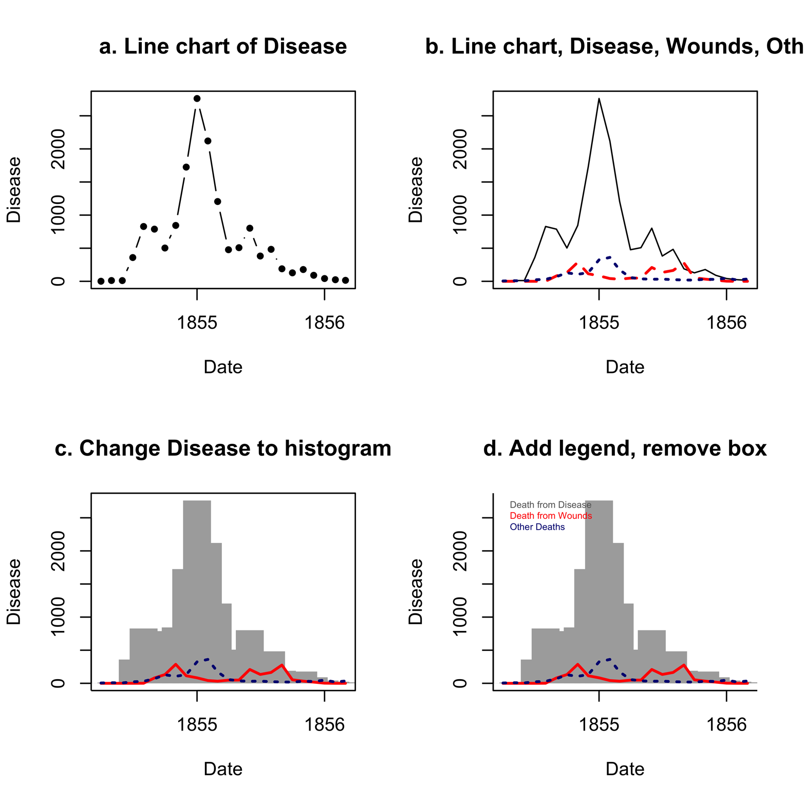
Figure 12-2. A line chart of the causes of death in the Nightingale dataset, in several transformations.
For the moment, take a look at Figure 12-2a. Another way to present this plot is to leave out the dots and have a completely connected line, which we can do by changing type = "b" to type = "l", as in Figure 12-2b. The lines() function has also been applied to Figure 12-2b to place two additional lines on the chart, the deaths due to Wounds and Other.
The differences in cause of death over the course of the war are stunning. Deaths from disease far outnumber deaths from wounds and other causes for much of the war. Although the effect is notable in Figure 12-2b, we can highlight it by a simple change in the graph . See Table 12-1 for type argument options. One of them is type = "h" for histogram, which is what we see in the plot in Figure 12-2c. It was also necessary to add lend = "butt" to make the histogram bars (line end or “lend”) have square corners instead of rounded ones.
Figure 12-2c tells the story more dramatically, showing the gray bars of disease in the histogram, looming over the entire war. As if war were not tragic enough, disease, for which the British were not prepared, multiplied the catastrophe. The next step is to add a legend in which the colors of the various causes of death are identified, as is done in Figure 12-2d. (If you need to review the legend() function, refer to the section “Data Can Be Beautiful”.) Furthermore, Figure 12-2d removes the box around the plot by using the bty = "l" argument.
| Argument | Line type |
|---|---|
type = "p"type = "l"type = "b"type = "c"type = "o"type = "h"type = "s"type = "S"type = "n" |
Points Lines Both lines and open points Lines with spaces at the places points would be Overplotted (i.e., lines with filled-in points) Histogram-like vertical lines Stair steps Different stair steps No plotting |
lty = "blank"lty = "dotted"lty = "dashed"lty = "dotdash"lty = "longdash"lty = "solid"lty = "twodash" |
|
lwd = 1 |
Line width. The default is 1. Specify a greater number for a thicker line or a smaller number for a thinner line. |
Finally, the next graph (see Figure 12-3) might seem a little “over the top” in terms of the amount of extra work it takes, but it is included here to make a point. We’ll go over how to create it, but if you want, you can just skip to the last paragraph of this section.
Figure 12-3. A completed line chart of the Nightingale dataset.
Here are several improvements that make the graph in Figure 12-3 more attractive and more complete:
- Add a title by using the
mainargument inplot()as well as labels for the axes - I have chosen to make the already long
plotcommand shorter by defining a vector,t, separately and then usingmain = tinplot(). Similarly, the vectorsxandyhave been created for labels. - Add another line to show the size of the army during each month
- This is a little tricky because the size of the army is much larger than the number of deaths. Using the same scale would either send the
Armydata off the graph or makeWoundsandOtherso small and close to the horizontal axis that they would be barely noticeable. I decided to divideArmyby 20 and plot the resulting new variable with a second vertical axis, on the right side, to show the scale for troop strength. Plotting a variable that is measured on a different scale can be confusing or misleading, so you need to take great care when doing it. In this case, I deliberately made the right axis quite different from the left axis, in terms of color, size of numbers, and line type so that it would be as clear as possible that two different scales are being presented. - Improve the presentation of the horizontal axis
- Figure 12-4 shows only two points on the x-axis for the
Datevariable. I created a new variable,mon, with values from 1 to 24 for the 24 months during which the war took place. This variable will be on the x-axis. This works only because the dataset is sorted by month. Inplot(), the argumentxaxt = "n"suppresses the printing of x-axis labels so that a new axis can be created with the labels that will be specified for three months of each year, enough to give sufficient detail, but not so many that they run together and become unreadable. Theatargument gives the values of months and thelabelsargument gives the names of the months.
The following is the script to create the enhanced Figure 12-3:
# Script for Figure 12-3
# if not already done, must:
# install.packages("HistData", dep = T)
library(HistData)
attach(Nightingale)
par(mar = c(6,6,5,5), cex = .8) # control size of plot window

Army2 = (Army)/20   # reduce size of Army so it fits on plot
t = "British Army Deaths, Crimean War" # make plot stmt shorter
x = "Date, by Month, from April, 1854 to March, 1856"
y = "Number of Deaths per Month"
mon = 1:24   # create new var, easier to work with than Date

plot(mon, Disease,
  type = "h",
  lwd = 22,
  col = "gray67",
  lend = "butt",
  main = t,
  col.main = "maroon",
  ylab = y,
  xlab = x,
  cex.lab = .8,
  las = 1,
  cex.axis = .9,
  bty = "l",
  xaxt = "n")
#xaxt = "n" suppresses x-axis labels; use axis() for custom axis

lines(mon,Wounds,
  pch = 18,
  col = "red",
  lty = "solid",
  lwd = 2)
lines(mon, Other,
  lty = "dotted",
  col = "navyblue",
  lwd = 3)
lines(mon, Army2,
  lty = "dashed",
  col = "seagreen4",
  lwd = 2)

# horizontal axis
axis(1, at = c(2,6,10,14,18,22),
  labels = c("May 54","Sep 54","Jan 55","May 55","Sep 55",
    "Jan 56"))
# right axis
axis(4, at = c(0,500,1000,1500,2000,2500),
  labels = c("0", "10K","20K","30K","40K","50K"),
  las = 1,
  tick = T,
  cex.lab = .6,
  col = "seagreen4",
  col.axis = "seagreen4",
  ylab = "Troop Strength")

legend("topleft", c("Death from Disease","Death from Wounds",
  "Other Deaths","Troop Strength"),
  text.col = c("gray40","red","navyblue","seagreen4"),
  bty = "n",
  cex = .8)

detach(Nightingale)
This section demonstrated the construction of a complex line chart. As with some previous examples, constructing this graph involved creating several layers, applied one-by-one to make a complex display that afforded us a great deal of control over the final product. Maybe Figure 12-2b would have met your needs and you would not have needed to go to all the trouble of producing a graph like that in Figure 12-3. On the other hand, you might want a really eye-catching display. Sometimes, you might need to do all the ugly work to get one, but you can make really beautiful graphs. Other times, you can take advantage of the work that the maker of a package has already done, as we will see in the next section.
Templates
R produces fine basic scatter plots with little trouble. You can also customize your plots by taking advantage of the many arguments available with the plot() function. You can alter the axes; add titles; change the plot characters; change the colors of the background, titles, and points; and so on. This customization can sometimes be a lot of work, as it was in the preceding section. However, some package designers have included templates, or style types, in their packages to make a variety of styles easy to implement. One that I like is from the latticeExtra package, which imitates the style used for graphs in the Economist magazine. Figure 12-4 presents the plot from Figure 12-1b, redone with this style.

Figure 12-4. Plot of trees data as a lattice graph with asTheEconomist() function.
You get a very pretty graph with very little code:
# use a template to produce Fig. 12-4
# if not already done, must:
# install.packages("latticeExtra", dependencies = T)
library(latticeExtra)
attach(trees)
asTheEconomist(xyplot(Girth ~ Height), xlab = "Height",
  type = "p", with.bg = T)
detach(trees)
Another set of templates is provided in the epade package. The scatter.ade() function produces scatter plots. Using its wall argument, you can choose from several output styles. The argument wall = 0 produces a graph similar to the plot() function, but arguments from 1 to 6 create interesting alternatives. Each of the six fancy graphs in Figure 12-5 required just one line of code. There are also arguments for colors of points, text, background, and lines, as well as arguments for legends, line types, point types, and so on. For more information, type ?scatter.ade.
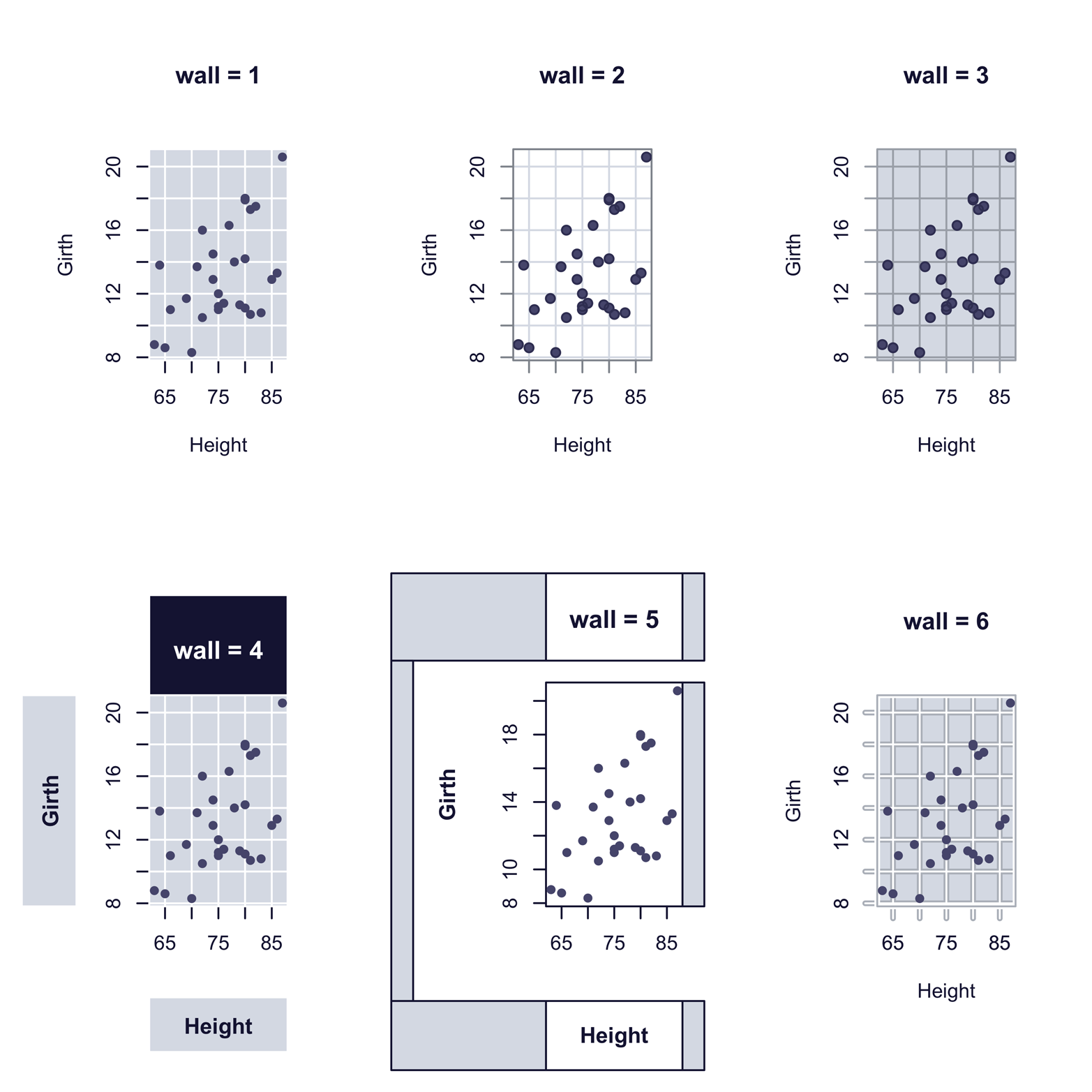
Figure 12-5. Scatter plot styles produced by scatter.ade() function in the epade package
The script that follows shows how easy it was to produce the six graphs in Figure 12-5. You may or may not like the styles, but they will look quite different in color, as you will see later, in Figure 12-7:
# Figure 12-5
install.packages("epade") # if not already installed
library(epade)
attach(trees)
par(mfrow = c(2,3))
scatter.ade(Height, Girth, wall = 1, main = "wall = 1")
scatter.ade(Height, Girth, wall = 2, main = "wall = 2")
scatter.ade(Height, Girth, wall = 3, main = "wall = 3")
scatter.ade(Height, Girth, wall = 4, main = "wall = 4")
scatter.ade(Height, Girth, wall = 5, main = "wall = 5")
scatter.ade(Height, Girth, wall = 6, main = "wall = 6")
detach(trees)
Any of the styles in Figure 12-4 and Figure 12-5 would have taken quite a bit of effort to produce from scratch, and a lot of code. However, the package developers shared their efforts with us, and it was pretty easy to make graphs using the templates they provided. The epade package also provides similar templates for certain other functions. Although it can take a lot of time to search through the thousands of R packages, it is frequently time well spent.
Enhanced Scatter Plots
In addition to plot(), there are many other R functions for scatter plots. Some of them offer substantial enhancements. A good example is scatter plot() from the car package. Figure 12-6 shows a plot produced by this function including several extras:
-
Box plots in the margins to show the distribution of each variable
-
A regression line, in green
-
A grid
-
A smoother, in red, with a measure of spread, in dotted red
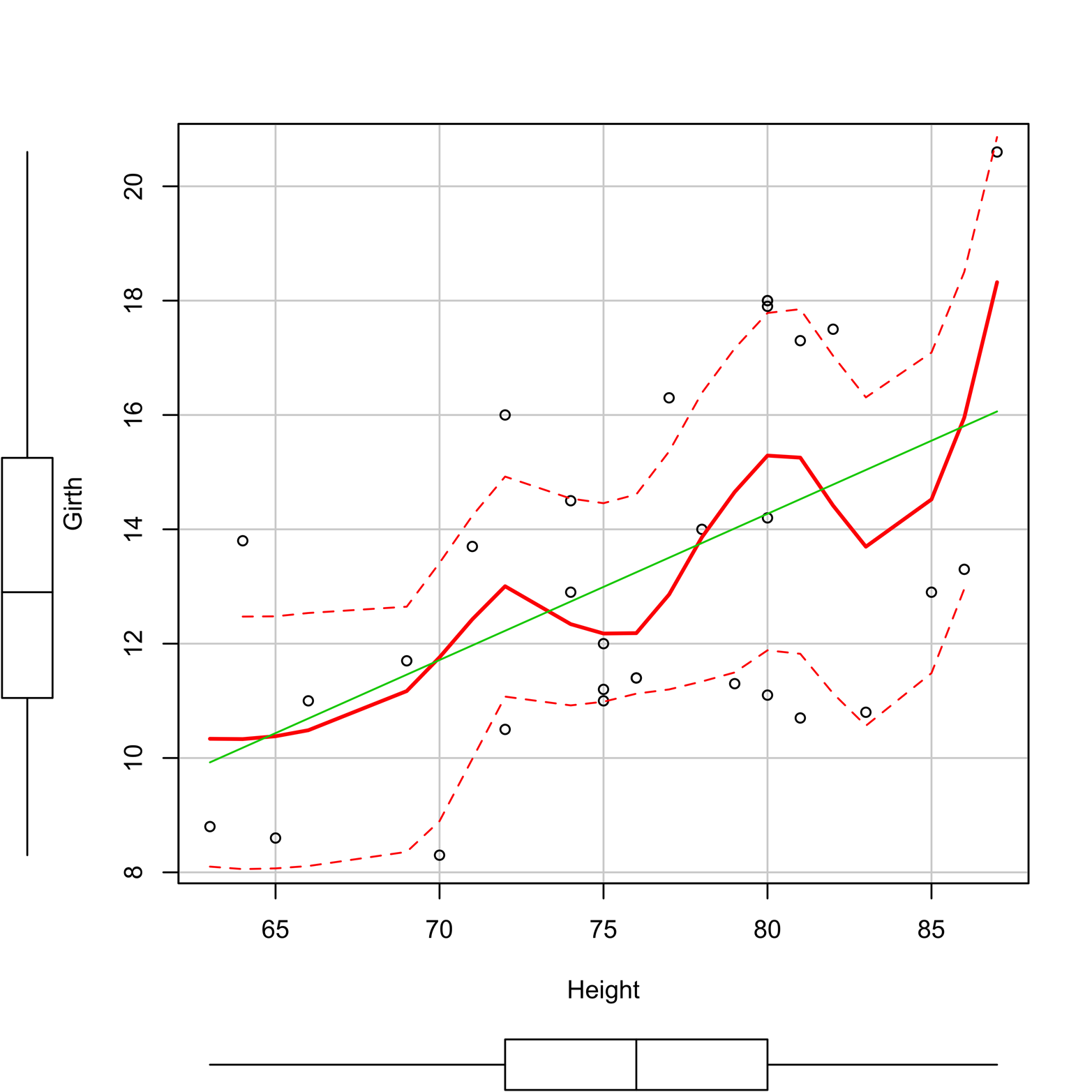
Figure 12-6. Scatter plot of Girth and Height produced by the scatterplot() function in the car package.
A smoother is a tool for making patterns in scatter plot data a little easier to see. There are several types of smoothers, but they all show the center of the y’s at a given value of x (or several close x’s) and do it in such a way that the (usually curved) line formed by connecting all such points is relatively smooth. Figure 12-6 shows a scatter plot with a smoother, represented as a red line. You can use the smoother argument to select a smoothing method, but Figure 12-6 uses the default method, “loess,” or locally weighted regression.
scatterplot() can also easily handle regression lines by groups, outlier identification, and other things that are beyond the scope of this book. For more information, type ?sp. Here is the code to produce Figure 12-6:
# Figure 12-6
library(car)
attach(trees)
sp(Height, Girth)  # note the abbreviation "sp"
detach(trees)
Aside from the templates that we saw in the last section, the scatter.ade() function in the epade package has a few other notable features. It can plot data by groups; it can plot points with size representing magnitude; or it can place linear regression, loess, or polynomial lines on a plot, and handle legends quite easily. Figure 12-7 shows an example of scatter.ade() plotting data by the groups “treated” and “untreated.” To get a little information about the experiment from which the data came, you can type ?Puromycin.

Figure 12-7. Plot of Puromycin data by scatter.ade() in the epade package.
Here is the code to produce Figure 12-7:
# Figure 12-7
library(epade)
attach(Puromycin)
scatter.ade(conc, rate, group=state,
  col = c("royalblue3", "sienna1"),
  legendon = "topleft", wall = 6,
  main = "Puromycin dataset")
detach(Puromycin)
The lattice package is designed to produce trellis plots, which were first mentioned in the section “lattice”. This might be a good time to go back and review that section. There is an example of a scatter plot trellis graph in Figure 2-3. Figure 12-8 shows the Puromycin data plotted by using lattice, with the treated and untreated subjects in different windows, or panels. Contrast this to Figure 12-7.

Figure 12-8. The Puromycin data plotted as a trellis graph by xyplot() in the lattice package.
Following is the code to create Figure 12-8:
# Figure 12-8
library(lattice)
attach(Puromycin)
xyplot(rate ~ conc | state)
detach(Puromycin)
The scatter plot is, perhaps, the most useful and most frequently used type of graph. Many other graphs, including several of the graphs in following chapters of this book, are based on the scatter plot. R provides many implementations of this graphic type, a few of which have been discussed in this chapter. Ponder for a moment that the varied scatter plots in this chapter are all “R.” The plot functions in this chapter will probably serve you well, but there are more scatter plot functions to find in R, if you care to search for them.
Exercise 12-1
If you saved the emissions dataset used in “Exercise 1-2”, you can retrieve it now by using the command:
> load("emiss.rda")
If you did not save it, enter part of the data now, as three vectors:
> Year  =  c(2004:2010)
> Europe = c(7.9, 7.9, 7.9, 7.8, 7.7, 7.1, 7.2)
> Eurasia = c(8.5, 8.5, 8.7, 8.6, 8.9, 8, 8.4)
Make a line chart showing emissions in both Europe and Eurasia over the seven-year period. Make the lines different, by color and/or line type. Include a legend. Your graph should look something like Figure 12-9.

Figure 12-9. A line chart of emissions in Eurasia and Europe.
Exercise 12-2
Make a simple plot of the Velocity (x-axis) and Distance (y-axis) of the nebulae outside the Milky Way, which you can find in the case0701 dataset from the Sleuth2 package. What is the relationship between these two variables? Next, use a template of your own choosing to make a more interesting display of the data.