Chapter 2. An Overview of R Graphics
This chapter discusses how to export a graph and the differences between exploratory and presentation graphs. There is also a brief overview of several graphics systems in R. If you have some past programming experience or substantial experience with graphics, you will probably appreciate having this information before going on to the specifics of R graph types. If you’re not coming from that background, you might find this material a little too technical and unnecessary at this point. If so, go directly to Chapter 3 and come back to this one when you are ready for it.
Exporting a Graph
After you have made a graph, you will probably want to save it or put it in a document. How you do this will depend on what other software you are using. With some word processors, for instance, you can simply copy the graph by opening the graph window in R and clicking Copy in the Edit menu or a context menu connected to the graph. You can then paste it into the word processor.
Other software will require a little more effort on your part. If you have tried the copy-and-paste method and it does not work, you will need to choose a file type and instruct R to save your graph in this format, to a specific file. You can save the graph in any one of several formats, including .bmp, .pdf, .jpeg, .png, .tiff, .ps (PostScript), and others. The code example that follows shows how to save the graph we made in “Exercise 1-1.” to a .jpeg file, named test.jpeg (you could, of course, give it any other name you choose, as long as the extension is “.jpeg”; for example, you might name it mywork.jpeg):
jpeg("test.jpeg") # opens a device
plot(year,rate)
dev.off()   # closes the graphic device - you must do this
After the graph has been saved in this manner, you can insert it into the word processor document. For example, in OpenOffice, you open the Insert window, click Picture, click From File, and then select the file test.jpeg from the working directory. Of course, after your graph is saved in a file, it is ready to load into all kinds of applications, such as drawing or illustration programs—for example, you can “brush up” your R graphs in Adobe Illustrator or Inkscape, if so desired. The graphs in this book were saved as .png files and uploaded, with no brushing up, to my editor’s Google Drive account. For a higher resolution graph, I used this code:
dpi=600
png("filename.png", width = 6*dpi, height = 6*dpi,
  res = dpi)
graphic commands
dev.off()
For more information on saving files this way, type ?png.
Exploratory Graphs and Presentation Graphs
Graphs are useful both for exploration and for presentation. Exploration is the process of analyzing the data and finding relationships and patterns. Presentation of your findings is making your case to others who have not studied the data as intensively as you have. While you are exploring the data, your graphs can be stark, lean, and somewhat unattractive. In the role of data analyst—the person who knows the data, and is getting to know it better with each graph made—you do not need all the titles, labels, reference details, and colors that someone sitting through a presentation might expect, and indeed might find necessary. Furthermore, adding all this extraneous detail just slows down the exploration phase. Also, some graphs will prove to be dead ends or just not very interesting. Consequently, many graphs might be discarded during the discovery journey.
As the process of exploration continues, adding some details can make relationships a little clearer. As you get closer to presentation and/or publication, the graphs become more detailed and prettier. You will probably create many plain graphs in the process of analysis and relatively few beautiful graphs to appear in the final report.
Following are two graphs of the mtcars dataset included with the base installation of R, which shows the relationship between mpg (miles per gallon) and wt (weight of the car). The first graph (see Figure 2-1) is an early attempt to discern the relationship between the two variables by using a scatter plot. It clearly shows that as the weight of a car increases, the mileage per gallon decreases. If you are not familiar with scatter plots, you might want to come back to this example after you have read Chapter 12. The second graph, shown in Figure 2-2, shows quite a bit of refinement over the first effort. It includes a title, labels on the axes, and a breakdown of cars by the number of cylinders, and, of course, color is applied. This might be something that appears in a PowerPoint presentation. Between these two examples, there might have been several other relatively plain exploratory graphs. Because this book is about the process of graphic analysis, many of the examples included will be plain and skeletal, but they lead toward an attractive finished product.

Figure 2-1. An exploratory graph of wt versus mpg.

Figure 2-2. Presentation graph of wt versus mpg; a refinement of the graph in Figure 2-1.
One line of code produced the graph in Figure 2-1:
plot(mtcars$wt, mtcars$mpg, pch=16)
The more colorful and elaborate graph in Figure 2-2 required several more lines of code. It took more work, but its usefulness as a presentation object makes this worth the effort. The various types of commands that went into this graph are not explained here; we will examine them in several chapters later in the book. The point is that simple and effective graphs are easy to make with R, but if you want very fancy graphs, you can get them with a bit of extra labor. The script to produce Figure 2-2 looks like this:
# Script producing Figure 2-2
library(car)
attach(mtcars)
par(bg="snow",fg="snow",col.axis="black",bty="l")
mtcars$wt2 = 1000*wt
attach(mtcars)
scatter plot(mpg~wt2|cyl,
  smoother=FALSE,
  reg.line=FALSE,
  col=c("indianred4","blue","purple"),
  pch=c(15,16,17),
  main="Fuel Consumption in Selected Cars",
  ylab="Miles per Gallon",
  xlab="Weight of Car in Pounds",las=1,
  legend.plot=FALSE,bty="l")
axis(2,col="black",at=c(10,15,20,25,30,35),las=2)
axis(1,col="black",at=c(1000,2000,3000,4000,5000,6000))
legend("topright",
  title="No. of Cylinders",
  c("4","6","8"),
  inset=-.005,
  text.col=c("indianred4",
  "blue","purple"),
  title.col="black",
  cex =.65,
  pch=c(15,16,17),
  col=c("indianred4","blue","purple"),
  bty="n")
detach(mtcars)
Graphics Systems in R
There are several graphics systems available in R. Base R includes many useful graphic functions, but different R users have extended the graphics capabilities by contributing new graphics packages. The following discussion characterizes the strengths and styles of various graphics packages.
Base Graphics and grid
Base R includes a graphics package that is automatically installed when you first install R, and is also automatically loaded each time you start R. It is quite powerful in that it is able to produce many kinds of graphics that you can customize extensively. Many R users will never need more power or flexibility than what is provided in base R, so this is a good place to begin. Most of the graphics in this book were produced by the base R graphics package.
Even though base R graphics are quite impressive, there are sometimes applications that call for more control over the details of graphic output. For this reason, a package called grid was developed for low-level graphics. “Low-level” means that grid provides a number of tools or materials that are used by developers of still other packages that will be used, in turn, to make finished graphs.
In this respect, grid is somewhat like a lumber mill that makes boards (low-level material) that will be used by builders or homeowners for projects in a house (high-level), such as floors or bookshelves. One can be a fine builder without being concerned about how the lumber mill sections trees, rough-cuts planks, and planes them smooth. The builder starts with the board, not the tree. The grid package provides processed materials used to make the other graphics systems discussed in this chapter, as well as some graphic procedures included in various other R packages. It does not provide any functions that we will use directly to make finished graphs. However, some of the graphic functions we will use have been built from grid functions. For detailed information about grid, see Murrell (2011). Because users generally do not write grid code directly, there is no grid example given here.
lattice
The lattice package was developed to provide improved graphics for multivariate data—i.e., for graphing more than two variables at a time. lattice is modeled on the trellis graphics described by Cleveland (1985, 1993). The idea here is that sometimes the most effective way to visualize relationships of several variables is not to attempt to put all of them in one graph, but to look at several related graphs, organized in a purposeful way. For example, Figure 2-3 shows a trellis plot of four windows, or panels, from the BP dataset in the epicalc package. In each panel, there is a plot of systolic blood pressure by diastolic blood pressure. Each panel shows the plot for a combination of sex and saltadd (whether salt was added to the diet).
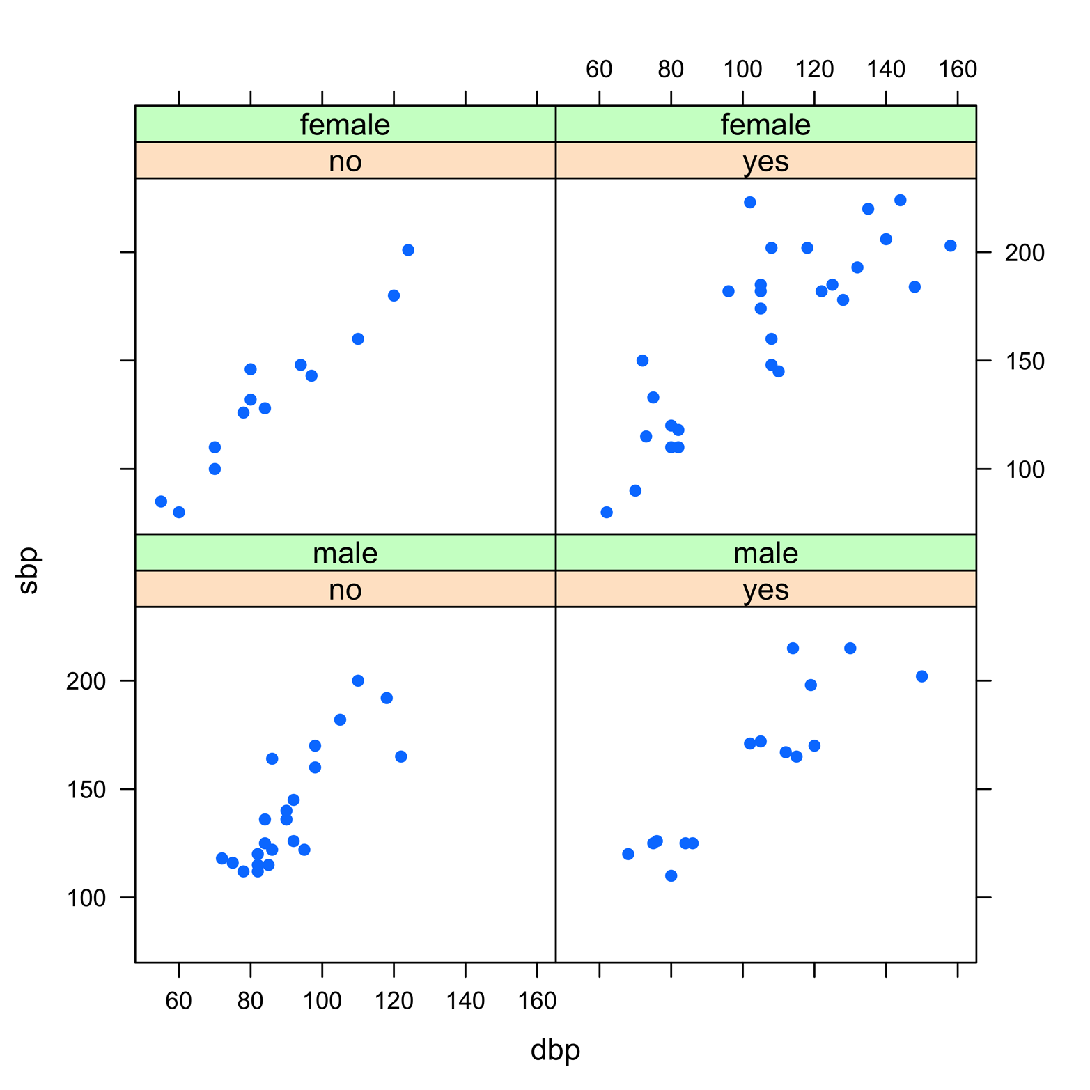
Figure 2-3. A trellis plot produced by using the lattice package.
Figure 2-3 demonstrates a way of examining the relationship of four variables at once by scanning four related graphs on one page. Here is the code to do it:
# Figure 2-3
library(lattice)
library(epicalc)
attach(BP)
xyplot(sbp~dbp|saltadd*sex,pch=16)
detach(BP)
lattice comes with the base R installation, but you must load it during each session for which you need it. In addition to trellis graphics, it includes functions for many other graphic types as well. Although this book uses only a few examples of lattice, it is an excellent graphics package that extends the capabilities of R. You might find it worth the time to learn, after you become more familiar with R and base graphics.
ggplot2
The ggplot2 package is designed to have a syntax that is consistent across all graphic types; that is to say, the command language is surprisingly similar from one type of graph to another. This is in marked contrast to base R, for which there are many arguments that can be used for several different kinds of graphs, but there are also a number of inconsistencies. The ggplot2 package is also quite versatile, enabling you to customize graphical displays relatively easily. Because the syntax of this package differs so much from that of base R graphics, very few examples of its use appear in this book. I should mention, however, that there are a few commands that are designed to look similar to base R, so you can try some of the capabilities of ggplot2 without much effort. If you have need for some of the special features of this package, it might be something for you to learn after you have acquired a greater understanding of R. The aesthetic style of ggplot2 is rather different from base R graphics, and you might or might not like it. An example appears in Figure 2-4, and the code that follows is what created it:
# Figure 2-4
library(ggplot2)
ggplot(mtcars, aes(x=wt, y=mpg)) + geom_point()

Figure 2-4. A simple graph produced by ggplot2, based on the same data as the base R graphs in Figure 2-1 and Figure 2-2.
ggplot2 does not come with base R, so if you want it, you must install it first and then load it during every session for which you want to use it.
Special Applications/Graphs Incorporated into Packages
Many packages, even those that are not primarily graphics packages, include some graphic capabilities. You can get a sense of the diverse and plentiful graphic offerings at the CRAN Task Views web page (http://cran.r-project.org/web/views/). Click Graphics to see a one-page overview of the types of graphics included in many packages, but keep in mind that this does not include all graphics. Also, some packages might have only a few graphic functions mixed in with many other features, and these kinds of packages will not usually appear in Task Views. Use your favorite search engine to scour the Internet for references to a particular graphic in R. Among the thousands of R packages, it can be a daunting quest to find exactly what you need!
User-Written Graphic Functions
If you just cannot find the right graphic for your data, it is possible to write your own graphic function. This is simply an extension of the method covered in Chapter 1, but later I will introduce a number of graphics tools that you can include in such functions. An example of a user-written graphic function to produce a Bland-Altman plot is presented in Chapter 14.