Chapter 13. High-Density Plots
Working with Large Datasets
Sometimes a large dataset can be a challenge when applying techniques such as scatter plots. Let’s consider one such dataset from the car package. Vocab contains more than 21,000 observations containing some basic demographic data and scores on a vocabulary test. Load the package and look at the data (be careful to use the head() command; you do not want to print the entire dataset!):
> library(car)
> attach(Vocab)
> head(Vocab)

         year    sex education vocabulary
20040001 2004 Female         9          3
20040002 2004 Female        14          6
20040003 2004   Male        14          9
20040005 2004 Female        17          8
20040008 2004   Male        14          1
20040010 2004   Male        14          7
It might be interesting to examine the relationship between vocabulary and education. Does it seem reasonable to expect that those with low education will have low vocabulary scores and that the scores will increase as amount of education increases? A scatter plot should make this clear. Here’s how to create it:
# Figure 13-1
library(car)
attach(Vocab)
plot(education, vocabulary)
detach(Vocab)
The scatter plot in Figure 13-1 is anything but clear! There is not a simple line or band of points showing the relationship we thought we would see. There is a little whitespace at the upper left and the lower right, but every other place looks equally populated.

Figure 13-1. A scatter plot of education and vocabulary
The two variables are discrete; that is, even though they are numeric, not categorical, they take on only limited numbers of values over their numerical range. The amount of education is measured in number of complete years. Therefore, an individual might have completed 12 years of education, but not 12.4 or 10.75. Likewise, vocabulary is measured in number of correct answers. With vocabulary taking only 11 values, from 0 to 10, and education taking only 21 values, from 0 to 20, there are just 11 x 21 = 231 places on the graph where points can appear—yet there are more than 21,000 people in the survey. This means, of course, that there is a lot of overprinting. What can we do?
In Chapter 3, we used a clever trick called jittering to deal with a similar problem in a strip chart. This might work. However, if points are jittered up or down, it will look like the vocabulary scores are not whole numbers, suggesting a more precise test than it actually was. Let’s try it, with scatter plot(), which has a jitter argument:
# Figure 13-2
library(car)
attach(Vocab)
sp(education, vocabulary, jitter = list(x = 2, y = 2),
   smoother  = F, spread = F, reg.line = F)
Figure 13-2 depicts the results.

Figure 13-2. Scatter plot with jittering.
The scatter plot in Figure 13-2 shows a marked improvement over the first plot, and we can now discern a clear pattern. You can control the amount of jittering using the following argument:
jitter = list(x = 2, y = 2)
Try changing the jitter amount from 2 to other values to see what effect this has.
The other method we used earlier was to employ a smaller plot symbol, but that trick is no good in this situation. Here, it would not separate the points, it would only make them smaller. However, making smaller points and jittering at the same time could clear things up a little more. Try it.
Sunflower Plot
Another alternative method of plotting is the sunflower plot. This type of plot uses differing characters on a particular graph location, depending on how many points are coincident at that spot. Let’s take a look:
# Figure 13-3
library(car)
attach(Vocab)
sunflowerplot(education, vocabulary,
   main = "Sunflower Plot",
   col.main = "deepskyblue3",
   family = "HersheySerif",
   font.lab = 3)   # x and y labels are in italic
detach(Vocab)
Figure 13-3 shows what this plot looks like.
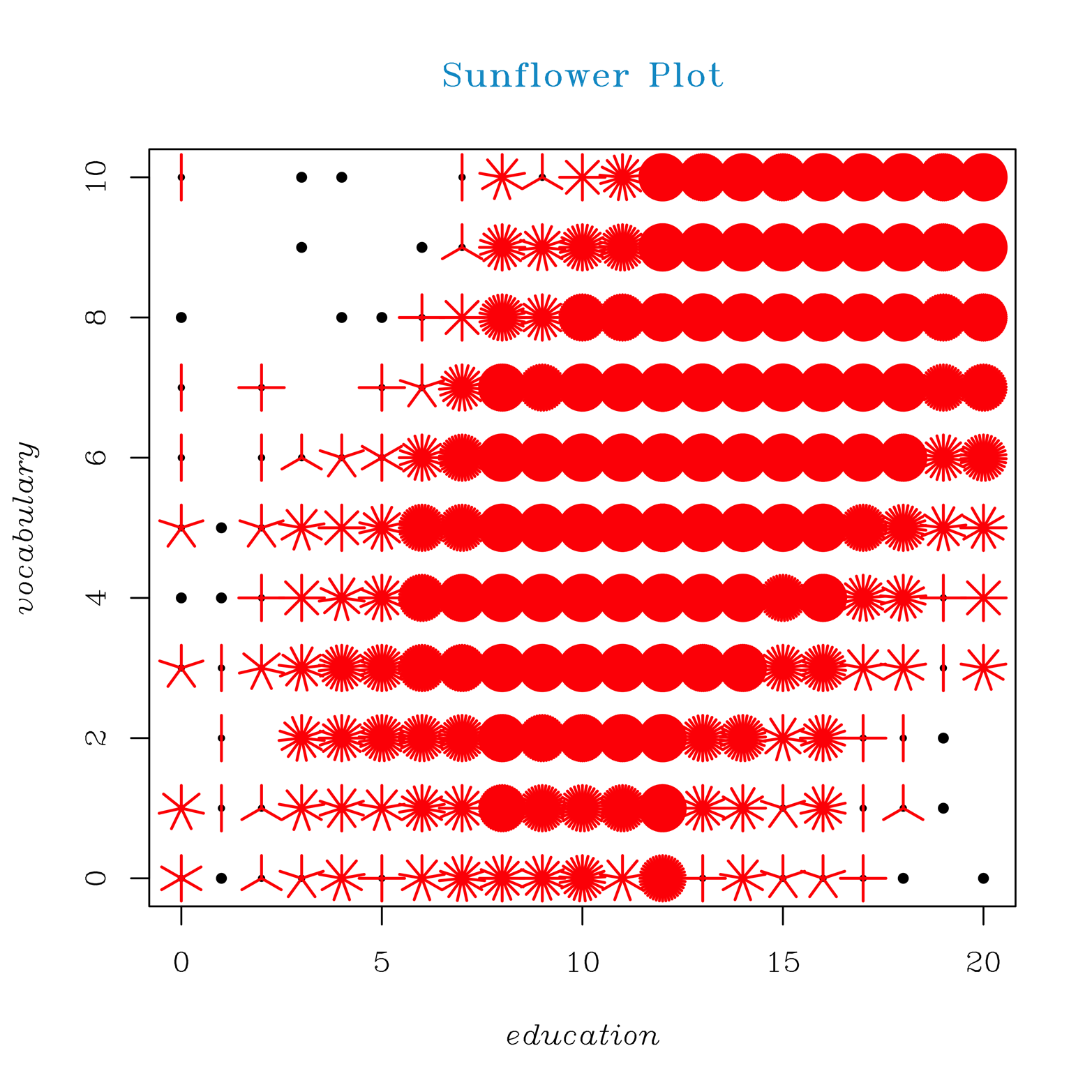
Figure 13-3. A sunflower plot of education and vocabulary
The sunflower plot in Figure 13-3 looks somewhat similar to the jittered scatter plot. Let’s consider how the sunflower plot represents the data. Look at the point at the extreme upper left. It is a black dot with a red petal above the dot and another red petal below. This represents two observations (there were actually 2 of the 21,000 people in the survey who reported no education and a perfect score on the vocabulary test!). Likewise, at the lower left, there is one person with 20 years of education (PhD? MD? Two master’s degrees?) who answered no questions correctly on the vocabulary test. Might this say something about the quality of the data? Are there mistakes here? If we go back to the upper left and move across the top of the graph, toward the right, we see the next two dots representing one observation each, another point with two petals, a point with nine petals (representing nine observations), the next with three petals, and so on. The solid red circles represent many observations; so many, in fact, that we can no longer count the petals.
Although this graph still does not offer ideal visual resolution, it does provide a pretty good indication of the density of points at any particular location on the graph. It seems that the expected relationship between years of education and vocabulary holds true.
Smooth Scatter Plot
There are even better graphical tools in R to deal with this problem of high-density data. The smoothScatter() function takes a different approach:
# Figure 13-4
library(car)
attach(Vocab)
smoothScatter(education, vocabulary,
  las = 1,
  family = "HersheyGothicGerman",
  main = "Smooth Scatter Plot", font=3)
# las = 1 rotates numbers on y-axis
detach(Vocab)
Figure 13-4 shows the results of using smoothScatter().

Figure 13-4. A smooth scatter plot of education and vocabulary.
The smooth scatter plot in Figure 13-4 uses hue and color intensity to show areas of high versus low density. This is not only more aesthetically pleasing than the sunflower plot, but it offers better resolution, too. Notice, for instance, a very dark spot for about 12 years of education (high school graduate) and vocabulary scores of about 5 to 7. There are other dark bands at about 14 years of education (community college) and 16 years of education (college graduate). No such thing was visible on the sunflower plot.
The sunflower plot shows the major trend quite well, perhaps even better than the smooth scatter plot. The smooth scatter plot, on the other hand, shows certain details that we would have missed entirely had we relied only on the sunflower plot. While exploring data, it is usually a good idea to look at the data in several different ways. Even though the smooth scatter might be our choice for a final presentation of this data, it will not always be the best choice.
Hexbin Plot
Another choice for such a large dataset is to do binning. This is rather like the sunflower plot, but provides counts in bins rather than simply varying shapes. This can be accomplished using the hexbin() function provided in the hexbin package; an example of the result appears in Figure 13-5. Several color gradients are available, as colramp = options. (For more information, type ?ColorRamps.) The example shown uses the color gradient BTC. Note that there is a key on the right side, showing the number of counts represented by a particular color. A number of options are also possible, such as smoothing, trellis hexbins, adding a straight line, hexbin plot matrices, and others. For more information, type ?hexbin.
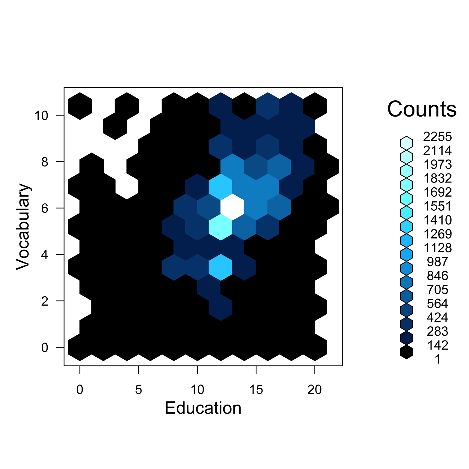
Figure 13-5. An example of binning by using the hexbin() function.
Here is the code to produce Figure 13-5:
# Figure 13-5 - hexbinning
install.packages("hexbin", dependencies = T)
library(car)
library(hexbin)
plot(hexbin(Vocab$education, Vocab$vocabulary, xbins = 10),
  xlab = "Education", ylab = "Vocabulary", colramp = BTC)
You do not always need the xbins argument. In this particular case, though, it is very useful. Try making this plot without the xbins argument to see what happens. The default value of xbins (the number of bins along the x-axis) is 30. The argument xbins = 10 makes the bins wide enough to fill up the empty space. A higher number puts smaller bins farther apart, and a lower number puts fatter bins closer together.
It would, perhaps, be more satisfying to see a smoother plot, but there are a couple of constraints that prevent this. First, the data is discrete, consisting only of whole numbers, so there can only be 11 levels of vocabulary and only 21 levels of education. Second, the color ramp is designed to have only so many levels that the progression from one color to the next is a “just detectable difference.” Therefore, we can have no more than 16 levels of color.
The hexbin and smooth scatter plots are two types of false-color plots, which use color gradients to represent amounts or intensities. The heat map plot, discussed later in the book, is another type of false-color plot.
Exercise 13-1
Make a simple scatter plot of MathAch (y-axis) and SES (x-axis) from the MathAchieve dataset in the nlme package. Is there a clear trend? Can you get a better grasp of the relationship with another kind of plot? Try each of the plot types introduced in this chapter. Which type offered the most insight, and which offered the least?