The previous chapter discussed the basics of Windows Forms 2.0. These capabilities are sufficient for straightforward user interfaces for systems written in VB 2008, along with the built-in capabilities of forms and controls available in Windows Forms 2.0.
However, as applications become larger and more complex, it becomes more important to use the advanced capabilities of the .NET environment to better structure the application. Poorly structured large systems tend to have redundant code. Repeated code patterns end up being used (in slightly different variations) in many, many places in an application, which has numerous bad side effects — longer development time, less reliability, more difficult debugging and testing, and tougher maintenance.
Examples of needs that often result in repeated code include ensuring that fields are entered by the user, that the fields are formatted correctly, and that null fields in the database are handled correctly. Proper object-oriented design can encapsulate such functionality, making it unnecessary to use repeated code. Using the full object-oriented capabilities of the .NET environment, plus additional capabilities specific to Windows Forms programming, you can componentize your logic, allowing the same code to be used in numerous places in your application.
This chapter discusses techniques for componentizing code in Windows Forms applications. It is assumed that you have already read Chapters 2 and 3 on inheritance and other object-oriented techniques available in .NET before working with this chapter.
As shown in the last chapter, Windows Forms user interfaces are based on using controls. A control is simply a special type of .NET class (just as forms are). As a fully object-oriented programming environment, VB 2008 gives you the capability to inherit and extend classes, and controls are no exception. Therefore, it is possible to create new controls that extend what the built-in controls can do.
There are four primary sources of controls for use on Windows Forms interfaces:
Controls packaged with the .NET Framework (referred to in this chapter as built-in controls)
Existing ActiveX controls that are imported into Windows Forms (these are briefly discussed in Chapter 25)
Third-party .NET-based controls from a software vendor
Custom controls that are created for a specific purpose in a particular project or organization
If you can build your application with controls from the first three categories, so much the better. Using prewritten functionality that serves the purpose is generally a good idea. However, this chapter assumes you need more than such prepackaged functionality.
If you are primarily familiar with versions of Visual Basic before the .NET era (VB6 and earlier), you know that the only technique available then for such packaging was the UserControl class. While UserControl is also available in Windows Forms (and is much improved), this is only one of several techniques available for writing visual controls.
There are three basic techniques for creating custom Windows Forms controls in .NET, corresponding to three different starting points. This range of options offers the flexibility to choose a technique that allows an appropriate balance between simplicity and flexibility:
You can inherit from an existing control.
You can build a composite control (using the
UserControlclass as your starting point).You can write a control from scratch (using the very simple
Controlclass as your starting point).
These options are in rough order of complexity, from simplest to most complex. Let's look at each one with a view to understanding the scenarios in which each one is useful.
The simplest technique starts with a complete Windows Forms control that is already developed. A new class is created that inherits the existing control. This new class has all the functionality of the base class from which it inherits, and the new logic can be added to create additional functionality in this new class or, indeed, to override functionality from the parent (when permitted).
Here are some typical scenarios where it might make sense to extend an existing Windows Forms control:
Each of these scenarios starts with an existing control that simply needs some additional functionality. The more often such functionality is needed in your project, the more sense it makes to package it in a custom control. If a text box that needs special validation or editing will be used in only one place, then it probably doesn't make sense to create an inherited control. In that case, it's probably sufficient to simply add some logic in the form where the control is used to handle the control's events and manipulate the control's properties and methods.
In some cases, a single existing control does not furnish the needed functionality, but a combination of two or more existing controls does. Here are some typical examples:
A set of buttons with related logic that are always used together (such as Save, Delete, and Cancel buttons on a file maintenance form)
A set of text boxes to hold a name, address, and phone number, with the combined information formatted and validated in a particular way
A set of option buttons with a single property exposed as the chosen option
As with inherited controls, composite controls are only appropriate for situations that require the same functionality in multiple places. If the functionality is only needed once, then simply placing the relevant controls on the form and including appropriate logic right in the form is usually better.
Composite controls are the closest relative to VB6 UserControls, and they are sometimes referred to as UserControls. In fact, the base class used to create composite controls is the UserControl class in Windows Forms.
If a control needs special functionality not available in any existing control, then it can be written from scratch to draw its own visual interface and implement its own logic. This option requires more work, but it enables you to do just about anything within .NET and Windows Forms, including very sophisticated user interfaces.
To write a control from scratch, it is necessary to inherit from the Control class, which provides basic functionality such as properties for colors and size. With this basic functionality already built in, your required development tasks include adding any specific properties and methods needed for the control, writing rendering logic that will paint the control to the screen, and handling mouse and keyboard input to the control.
With this background on the options for creating custom controls, the next step is to look in depth at the procedures used for their development. First up is creating a custom control by inheriting from an existing control and extending it with new functionality. This is the simplest method for the creation of new controls, and the best way to introduce generic techniques that apply to all new controls.
After you look at the general steps needed to create a custom control via inheritance, an example illustrates the details. It is important to understand that many of the techniques described for working with a control created through inheritance also apply to the other ways that a control can be created. Whether inheriting from the Control class, the UserControl class, or from an existing control, a control is a .NET class. Creating properties, methods, and events, and coordinating these members with the Visual Studio designers, is done in a similar fashion, regardless of the starting point.
Here are the general stages involved in creating a custom control via inheritance from an existing control. This is not a step-by-step recipe, just an overview. A subsequent example provides more detail on the specific steps, but those steps follow these basic stages:
Create or open a Windows Control Library project and add a new custom control to the project. The class that is created will inherit from the
System.Windows.Forms.Controlbase class. The line that specifies the inherited class must be changed to inherit from the control that is being used as the starting point.The class file gets new logic added as necessary to add new functionality. Then the project is compiled with a
Buildoperation in order to create a DLL containing the new control's code.The control is now ready to be used. It can be placed in the Windows Forms Toolbox with the Choose Items option in Visual Studio 2008. From that point forward, it can be dragged onto forms like any other control.
Stage 2, of course, is where the effort lies. New logic for the custom control may include new properties, methods, and events. It may also include intercepting events for the base control and taking special actions as necessary. These tasks are done with standard .NET coding techniques.
Several coding techniques are specific to developing Windows Forms controls, such as using particular .NET attributes. While our example includes adding routine properties and events, we focus on these special techniques for programming controls.
This section discusses how to place new logic in an inherited control, with special emphasis on techniques that go beyond basic object orientation. A detailed example using the techniques follows this section.
Creating a property for a custom control is just like creating a property for any other class. It is necessary to write a property procedure, and to store the value for the property somewhere, most often in a module-level variable, which is often called a backing field.
Properties typically need a default value — that is, a value the property takes on automatically when the control is instantiated. Typically, this means setting the backing field that holds the property value to some initial value. That can be done when the backing field is declared, or it can be done in the constructor for the control.
Here's the code for a typical simple property for a custom control:
Dim _nMaxItemsSelected As Integer = 10
Public Property MaxItemsSelected() As Integer
Get
    Return _nMaxItemsSelected
  End Get
  Set(ByVal Value As Integer)
    If Value < 0 Then
      Throw New ArgumentException("Property value cannot be negative")
    Else
      _nMaxItemsSelected = Value
    End If
  End Set
End Property
After a property is created for a control, it automatically shows up in the Properties window for the control. If your Properties window is arranged alphabetically, you will see it in the list. If your window is arranged by category, then the new property will appear in the Misc category. However, you can use some additional capabilities to make the property work better with the designers and the Properties window in Visual Studio.
Controls are normally dragged onto a visual design surface, which is managed by the Visual Studio IDE. In order for your control to work effectively with the IDE, it must be able to indicate the default value of its properties. The IDE needs the default value of a property for two important capabilities:
To reset the value of the property (done when a user right-clicks the property in the Properties window and selects Reset)
To determine whether to set the property in designer-generated code. A property that is at its default value does not need to be explicitly set in the designer-generated code.
There are two ways for your control to work with the IDE to accomplish these tasks. For properties that take simple values, such as integers, Booleans, floating-point numbers, or strings, .NET provides an attribute. For properties that take complex types, such as structures, enumerated types, or object references, two methods need to be implemented.
You can learn more about attributes in Chapter 4, but a short summary of important points is included here. Attributes reside in namespaces, just as components do. The attributes used in this chapter are in the System.ComponentModel namespace. To use attributes, the project must have a reference to the assembly containing the namespace for the attributes. For System.ComponentModel, that's no problem — the project automatically has the reference.
However, the project will not automatically have an Imports statement for that namespace. Attributes could be referred to with a full type name, but that's a bit clumsy. To make it easy to refer to the attributes in code, put the following line at the beginning of all modules that need to use the attributes discussed in this chapter:
Imports System.ComponentModel
That way, an attribute can be referred to with just its name. For example, the DefaultValue attribute, discussed in detail below, can be declared like this:
< DefaultValue(4)> Public Property MyProperty() As Integer
All the examples in this chapter assume that the
Importsstatement has been placed at the top of the class, so all attributes are referenced by their short name. If you get a compile error on an attribute, then it's likely that you've omitted that line.
An attribute for a property must be on the same line of code as the property declaration. Of course, line continuation characters can be used so that an attribute is on a separate physical line but still on the same logical line in the program. For example, the last example could also be written as follows:
< DefaultValue(4)> _
Public Property MyProperty() As Integer
The .NET Framework contains many attributes. Most are used to tag classes, properties, and methods with metadata — that is, information that some other entity, such as a compiler or the Visual Studio IDE, might need to know.
For example, the DefaultValue attribute tells the Visual Studio IDE the default value of a property. We can change the preceding code for a simple property to include a DefaultValue attribute. Here are the first few lines, showing the change to the property declaration that applies the attribute:
Dim mnMaxItemsSelected As Integer = 10
 <DefaultValue(10)> Public Property MaxItemsSelected() As Integer
  Get
    Return mnMaxItemsSelected
...
Including the DefaultValue attribute enables the Properties window to reset the value of the property back to the default value. That is, if you right-click the property in the Properties window and select Reset from the pop-up context menu, the value of the property returns to 10 from any other value to which it was set.
Another effect of the attribute can be seen in the code generated by the visual designer. If the preceding property is set to any value that is not the default, a line of code appears in the designer-generated code to set the property value. This is called serializing the property.
For example, if the value of MaxItemsSelected is set to 5, then a line of code something like this appears in the designer-generated code:
MyControl.MaxItemsSelected = 5
If the property has the default value of 10 (because it was never changed or it was reset to 10), then the line to set the property value is not present in the designer-generated code. That is, the property does not need to be serialized in code if the value is at the default.
To see serialized code, you need to look in the partial class that holds the Windows Forms designer-generated code. This partial class is not visible in the Solution Explorer by default. To see it, press the Show All Files button in the Solution Explorer.
The last sample property returned an Integer. Some custom properties return more complex types, such as structures, enumerated types, or object references. These properties cannot use a simple DefaultValue attribute to take care of resetting and serializing the property. An alternate technique is needed.
For complex types, designers check to see whether a property needs to be serialized by using a method on the control containing the property. The method returns a Boolean value that indicates whether a property needs to be serialized (True if it does, False if it does not).
For the following examples, suppose a control has a property named MyColor, which is of type Color. The Color type is a structure in Windows Forms, so the normal DefaultValue attribute can't be used with it. Further suppose the backing variable for the property is named _MyColor.
In this case, the method to check serialization would be called ShouldSerializeMyColor. It would typically look something like the following code:
Public Function ShouldSerializeMyColor() As Boolean
  If Color.Equals(_MyColor, Color.Red) Then
    Return False
  Else
    Return True
  End If
End Function
This is a good example of why a DefaultValue attribute can't work for all types. There is no equality operator for the Color type, so you have to write appropriate code to perform the check to determine whether the current value of the MyColor property is the default. In this case, that's done with the Equals method of the Color type.
If a property in a custom control does not have a related ShouldSerializeXXX method or a DefaultValue attribute, then the property is always serialized. Code for setting the property's value is always included by the designer in the generated code for a form, so it's a good idea to always include either a ShouldSerializeXXX method or a DefaultValue attribute for every new property created for a control.
The ShouldSerialize method only takes care of telling the IDE whether to serialize the property value. Properties that require a ShouldSerialize method also need a way to reset a property's value to the default. This is done by providing a special reset method. In the case of the MyColor property, the reset method is named ResetMyColor. It would look something like the following:
Public Sub ResetMyColor()
  _MyColor = Color.Red
End Sub
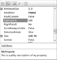
DefaultValue is not the only attribute that is useful for properties. The Description attribute is also one that should be used consistently. It contains a text description of the property, and that description shows up at the bottom of the Properties windows when a property is selected. To include a Description attribute, the declaration of the preceding property would appear as follows:
<DefaultValue(100), _
Description("This is a pithy description of my property")> _
Public Property MyProperty() As Integer
Such a property will look like Figure 16-1 when highlighted in the Properties window.
Another attribute you will sometimes need is the Browsable attribute. As mentioned earlier, a new property appears in the Properties window automatically. In some cases, you may need to create a property for a control that you do not want to show up in the Properties window. In that case, you use a Browsable attribute set to False. Here is code similar to the last, making a property nonbrowsable in the Properties window:
<Browsable(False)> _
Public Property MyProperty() As Integer
One additional attribute you may want to use regularly is the Category attribute. Properties can be grouped by category in the Properties window by pressing a button at the top of the window. Standard categories include Behavior, Appearance, and so on. You can have your property appear in any of those categories, or you can make up a new category of your own. To assign a category to a property, use code like this:
<Category("Appearance")> _
Public Property MyProperty() As Integer
There are other attributes for control properties that are useful in specific circumstances. If you understand how the common ones discussed here are used, then you can investigate additional attributes for other purposes in the documentation.
Events in .NET are covered in Chapter 2. To recap, for controls, the process for creating and handling an event includes these steps:
Declare the event in the control. The event can have any arguments that are appropriate, but it cannot have named arguments, optional arguments, or arguments that are
ParamArrays. Though not required, normally you will want to follow the same convention as events in the .NET Framework, which means an event declaration similar to this:Public Event MyEvent(ByVal sender As Object, e As EventArgs)
Elsewhere in the control's code, implement code to raise the event. The location and circumstances of this code vary depending on the nature of the event, but a typical line that raises the preceding event looks like the following code:
RaiseEvent MyEvent(Me, New EventArgs)
The form that contains the control can now handle the event. The process for doing that is the same as handling an event for a built-in control.
As the preceding example shows, the standard convention in .NET is to use two arguments for an event: Sender, which is the object raising the event, and e, which is an object of type EventArgs or a type that inherits from EventArgs. This is not a requirement of the syntax (you can actually use any arguments you like when you declare your event), but it's a consistent convention throughout the .NET Framework, so it is used in this chapter. It is suggested that you follow this convention as well, because it will make your controls consistent with the built-in controls in their operation.
The following example illustrates the concepts discussed. In this example, you create a new control that contains a custom property and a custom event. The property uses several of the attributes discussed.
This example inherits the built-in CheckedListBox control and extends its functionality. If you are not familiar with this control, it works just like a normal ListBox control except that selected items are indicated with a check in a check box at the front of the item, rather than by highlighting the item.
To extend the functionality of this control, the example includes the creation of a property called MaxItemsToSelect. This property holds a maximum value for the number of items that a user can select. The event that fires when a user checks an item is then monitored to determine whether the maximum has already been reached.
If selection of another item would exceed the maximum number, then the selection is prevented, and an event is fired to let the consumer form know that the user has tried to exceed the maximum limit. The code that handles the event in the form can then do whatever is appropriate. In this case, a message box is used to tell the user that no more items can be selected.
The DefaultValue, Description, and Category attributes are placed on the MaxItemsToSelect property to coordinate with the IDE.
Here is the step-by-step construction of our example:
Start a new Windows Control Library project in Visual Studio and name it MyControls. In the Solution Explorer, select the
UserControl1.vbfile, right-click it, and delete it.Select Project

Click the button in the Solution Explorer to show all files for the project. Bring up the file
LimitedCheckedListBox.Designer.vb, which is found by clicking the plus sign next toLimitedCheckedListBox.vb. (If you don't see a plus sign next toLimitedCheckedListBox.vb, click the Show All Files button at the top of the Solution Explorer.)At the top of the
LimitedCheckedListbox.Designer.vbcode, look for the line that readsInherits System.Windows.Forms.Control.Change that line to read
Inherits System.Windows.Forms.CheckedListbox.Add the following declarations at the top of the code (before the line declaring the class):
Imports System.ComponentModel
This enables you to utilize the attributes required from the
System.ComponentModelnamespace.The code for
LimitedCheckedListBox.vbwill contain an event for painting the control. Since you are not using a control that draws its own surface, delete that event. (It won't hurt to leave it, but you don't need it.)Begin adding code specifically for this control. First, implement the
MaxItemsToSelectproperty. A module-level variable is needed to hold the property's value, so insert this line just under the class declaration line:Private _nMaxItemsToSelect As Integer = 4
Create the code for the property itself. Insert the following code into the class just above the line that says
End Class:<DefaultValue(4), Category("Behavior"), _ Description("The maximum number of items allowed to be checked")> _ Public Property MaxItemsToSelect() As Integer Get Return _nMaxItemsToSelect End Get Set(ByVal Value As Integer) If Value < 0 Then Throw New ArgumentException("Property value cannot be negative") Else _nMaxItemsToSelect = Value End If End Set End PropertyThis code sets the default value of the
MaxItemsToSelectproperty to4, and sets a description for the property to be shown in the Properties window when the property is selected there. It also specifies that the property should appear in the Behavior category when properties in the Properties window are sorted by category.Declare the event that will be fired when a user selects too many items. The event is named
MaxItemsExceeded. Just under the code for step 9, insert the following line:Public Event MaxItemsExceeded(Sender As Object, e As EventArgs)
Insert code into the event routine that fires when the user clicks on an item. For the
CheckedListBoxbase class, this is called theItemCheckproperty. Open the left-hand drop-down box in the code window and select the optionLimitedCheckedListBox Events. Then, select theItemCheckevent in the right-hand drop-down box of the code window. The following code will be inserted to handle theItemCheckevent:Private Sub LimitedCheckedListBox_ItemCheck(ByVal sender As Object, _ ByVal e As System.Windows.Forms.ItemCheckEventArgs) _ Handles MyBase.ItemCheck End SubThe following code should be added to the
ItemCheckevent to monitor it for too many items:Private Sub LimitedCheckedListBox_ItemCheck(ByVal sender As Object, _ ByVal e As System.Windows.Forms.ItemCheckEventArgs) _ Handles MyBase.ItemCheck If (Me.CheckedItems.Count >= _nMaxItemsToSelect) _ And (e.NewValue = CheckState.Checked) Then RaiseEvent MaxItemsExceeded(Me, New EventArgs) e.NewValue = CheckState.Unchecked End If End SubBuild the project to create a DLL containing the
LimitedCheckedListBoxcontrol.Add a new Windows Application project to the solution (using the File
Scroll to the top of the controls in the Toolbox. The
LimitedCheckedListBoxcontrol should be there.The Windows Application will have a Form1 that was created automatically. Drag a
LimitedCheckedListBoxcontrol onto Form1, just as you would a normal list box. Change theCheckOnClickevent for theLimitedCheckedListBoxtoTrue(to make testing easier). This property was inherited from the baseCheckedListBoxcontrol.In the
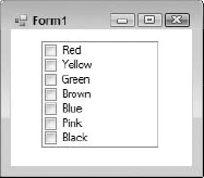
Itemsproperty of theLimitedCheckedListBox, click the button to add some items. Insert the following list of colors: Red, Yellow, Green, Brown, Blue, Pink, and Black. At this point, your Windows Application Project should have a Form1 that looks something like Figure 16-2.Bring up the code window for Form1. In the left-hand drop-down box above the code window, select LimitedCheckedListBox1 to get to its events. Then, in the right-hand drop-down box, select the
MaxItemsExceededevent. The empty event will look like the following code:Private Sub LimitedCheckedListBox1_MaxItemsExceeded( _ ByVal sender As System.Object, e As System.EventArgs) _ Handles LimitedCheckedListBox1.MaxItemsExceeded End SubInsert the following code to handle the event:
MsgBox("You are attempting to select more than " & _
       LimitedCheckedListBox1.MaxItemsToSelect & _
       " items. You must uncheck some other item " & _
        " before checking this one.")
Start the Windows Application project. Check and uncheck various items in the list box to verify that the control works as intended. You should get a message box whenever you attempt to check more than four items. (Four items is the default maximum, and it was not changed.) If you uncheck some items, then you can check items again until the maximum is once again exceeded. When finished, close the form to stop execution.
If you want to check the serialization of the code, look at the designer-generated code in the partial class for Form1 (named
LimitedCheckedListBox.Designer.vb), and examine the properties forLimitedCheckedListBox1. Note that there is no line of code that setsMaxSelectedItems. Remember that if you don't see the partial class in the Solution Explorer, then you'll need to press the Show All button at the top of the Solution Explorer.Go back to the Design view for Form1 and select
LimitedCheckedListBox1. In the Properties window, change theMaxSelectedItemsproperty to3.Return to the partial class and look again at the code that declares the properties for
LimitedCheckedListBox1. Note that there is now a line of code that setsMaxSelectedItemsto the value of3.Go back to the Design view for Form1 and select
LimitedCheckedListBox1. In the Properties window, right-click theMaxSelectedItemsproperty. In the pop-up menu, select Reset. The property will change back to a value of4, and the line of code that sets the property you looked at in the last step will be gone.
These last few steps showed that the DefaultValue attribute is working as it should.
In the earlier example, a new control was created by inheriting from an existing control. As is standard with inheritance, this means the new control began with all the functionality of the control from which it inherited. Then new functionality was added.
This chapter didn't discuss the base class for this new control (CheckedListBox) because you probably already understand a lot about the properties, methods, events, and behavior of that class. However, you are not likely to be as familiar with the base classes used for the other techniques for creating controls, so it's appropriate to discuss them now.
Two generic base classes are used as a starting point to create a control. It is helpful to understand something about the structure of these classes to know when the use of each is appropriate.
The classes discussed in this chapter are all in the
System.Windows.Formsnamespace. There are similarly named classes for some of these in theSystem.Web.UInamespace (which is used for Web Forms), but these classes should not be confused with anything discussed in this chapter.
The Control class is contained within the System.Windows.Forms namespace and contains base functionality to define a rectangle on the screen, provide a handle for it, and process routine operating system messages. This enables the class to perform such functions as handling user input through the keyboard and mouse. The Control class serves as the base class for any component that needs a visual representation on a Win32-type graphical interface. Besides built-in controls and custom controls that inherit from the Control class, the Form class also ultimately derives from the Control class.
In addition to these low-level windowing capabilities, the Control class also includes such visually related properties as Font, ForeColor, BackColor, and BackGroundImage. The Control class also has properties that are used to manage layout of the control on a form, such as docking and anchoring.
The
Controlclass does not contain any logic to paint to the screen except to paint a background color or show a background image. While it does offer access to the keyboard and mouse, it does not contain any actual input processing logic except for the ability to generate standard control events such asClickandKeyPress. The developer of a custom control based on theControlclass must provide all of the functions for the control beyond the basic capabilities provided by theControlclass.
A standard set of events is also furnished by the Control class, including events for clicking the control (Click, DoubleClick), for keystroke handling (KeyUp, KeyPress, KeyDown), for mouse handling (MouseUp, MouseHover, MouseDown, etc.), and drag-and-drop operations (DragEnter, DragOver, DragLeave, DragDrop). Also included are standard events for managing focus and validation in the control (GotFocus, Validating, Validated). See the help files on the Control class for details on these events and a comprehensive list.
The built-in functionality of the Control class is a great starting point for controls that will be built from scratch, with their own display and keyboard handling logic. However, the Control class has limited capability for use as a container for other controls.
That means that composite controls do not typically use the Control class as a starting point. Composite controls combine two or more existing controls, so the starting point must be able to manage contained controls. The class that meets this requirement is the UserControl class. Because it ultimately derives from the Control class, it has all of the properties, methods, and events discussed earlier for that class.
However, the UserControl class does not derive directly from the Control class. It derives from the ContainerControl class, which, in turn, derives from the ScrollableControl class.
As the name suggests, the ScrollableControl class adds support for scrolling the client area of the control's window. Almost all the members implemented by this class relate to scrolling. They include AutoScroll, which turns scrolling on or off, and controlling properties such as AutoScrollPosition, which gets or sets the position within the scrollable area.
The ContainerControl class derives from ScrollableControl and adds the capability to support and manage child controls. It manages the focus and the capability to tab from control to control. It includes properties such as ActiveControl to point to the control with the focus, and Validate, which validates the most recently changed control that has not had its validation event fired.
Neither ScrollableControl nor ContainerControl are usually inherited from directly; they add functionality that is needed by their more commonly used child classes: Form and UserControl.
The UserControl class can contain other child controls, but the interface of UserControl does not automatically expose these child controls in any way. Instead, the interface of UserControl is designed to present a single, unified interface to outside clients such as forms or container controls. Any object interface that is needed to access the child controls must be specifically implemented in your custom control. The following example demonstrates this.
Our earlier example showed inheriting an existing control, which was the first of the three techniques for creating custom controls. The next step up in complexity and flexibility is to combine more than one existing control to become a new control. This is similar to the process of creating a UserControl in VB6, but it is easier to do in Windows Forms.
The main steps in the process of creating a UserControl are as follows:
Start a new Windows Control Library project and assign names to the project and the class representing the control.
The project will contain a design surface that looks a lot like a form. You can drag controls onto this surface just as you would a form. Writing code that works with the controls, such as event routines, is done the same way as with a form, but with a few extra considerations that don't apply to most forms. In particular, it is important to handle resizing when the
UserControlis resized. This can be done by using theAnchorandDockproperties of the constituent controls, or you can create resize logic that repositions and resizes the controls on yourUserControlwhen it is resized on the form containing it. Another option is to useFlowLayoutPaneland/orTableLayoutPanelcontrols to do automatic layout.Create properties of the
UserControlto expose functionality to a form that will use it. This typically means creating a property to load information into and get information out of the control. Sometimes properties to handle cosmetic elements are also necessary.Build the control and use it in a Windows application exactly as you did for the inherited controls discussed earlier.
There is a key difference between this type of development and inheriting a control, as shown in the preceding examples. A
UserControlwill not by default expose the properties of the controls it contains. It exposes the properties of theUserControlclass plus any custom properties that you give it. If you want properties for contained controls to be exposed, you must explicitly create logic to expose them.
To demonstrate the process of creating a composite UserControl, the next exercise builds one that is similar to what is shown in Figure 16-3. The control is named ListSelector.
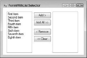
This type of layout is common in wizards and other user interfaces that require selection from a long list of items. The control has one list box holding a list of items that can be chosen (on the left), and another list box containing the items chosen so far (on the right). Buttons enable items to be moved back and forth.
Loading this control means loading items into the left list box, which we will call SourceListBox. Getting selected items back out involves exposing the items that are selected in the right list box, named TargetListBox.
The buttons in the middle that transfer elements back and forth are called AddButton, AddAllButton, RemoveButton, and ClearButton, from top to bottom, respectively.
There are several ways to handle this kind of interface element in detail. A production-level version would have the following characteristics:
Buttons would gray out (disable) when they are not appropriate. For example,
btnAddwould not be enabled unless an item were selected inlstSource.Items could be dragged and dropped between the two list boxes.
Items could be selected and moved with a double-click.
Such a production-type version contains too much code to discuss in this chapter. For simplicity, the exercise has the following limitations:
Buttons do not gray out when they should be unavailable.
Drag-and-drop is not supported. (Implementation of drag-and-drop is discussed in Chapter 15, if you are interested in adding it to the example.)
No double-clicking is supported.
This leaves the following general tasks to make the control work, which are detailed in the step-by-step exercise that follows:
Add the list boxes and buttons to the
ListSelectordesign surface, using aTableLayoutPaneland aFlowLayoutPanelto control layout when the control is resized.Add logic to transfer elements back and forth between the list boxes when buttons are pressed. (More than one item may be selected for an operation, so several items may need to be transferred when a button is pressed.)
Expose properties to enable the control to be loaded, and for selected items to be fetched by the form that contains the control.
As shown in Figure 16-3, there are three main areas of the control: the two Listbox controls and a vertical strip between them that holds the buttons. As the control is resized, these areas need to also be appropriately resized.
If the ListSelector control gets too small, then there won't be enough room for the buttons and the list boxes to display properly, so it needs to have a minimum size. That's enforced by setting the MinimumSize property for the UserControl in the designer. The MinimumSize property is inherited from the Control class (as discussed in the previous chapter).
The rest of the resizing is handled by using a TableLayoutPanel that contains three columns, one for each of the three areas. That is, the first column of the TableLayoutPanel will hold SourceListBox, the second column will hold the buttons, and the third column will hold TargetListBox. The capabilities of the TableLayoutPanel enable the middle column to be a fixed size, and the left and right columns to share all remaining width.
The middle column could contain a standard Panel to hold the buttons, but it's a bit easier to use a FlowLayoutPanel because it automatically stacks the buttons.
Most of the controls contained in the composite control in this exercise do not need to expose their interfaces to the form that will use the composite control. The buttons, for example, are completely private to the ListSelector — none of their properties or methods need to be exposed.
The easiest way to load up the control is to expose the Items property of the source list box. Similarly, the easiest way to allow access to the selected items is to expose the Items property of the target list box. The Items property exposes the entire collection of items in a list box, and can be used to add, clear, or examine items. No other properties of the list boxes need to be exposed.
The exercise also includes a Clear method that clears both list boxes simultaneously. This allows the control to be easily flushed and reused by a form that consumes it.
Here is the step-by-step procedure to build our composite UserControl:
Start a new Windows Control Library project and name it ListSelector.
Right-click on the
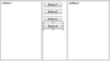
UserControl1.vbmodule that is generated for the project and select Rename. Change the name of the module toListSelector.vb. This automatically changes the name of your class toListSelector.Go to the design surface for the control. Increase the size of the control to about 300 × 200. Then drag a
TableLayoutPanelonto the control and set theDockproperty of theTableLayoutPaneltoFill.Click the smart tag (the triangular glyph in the upper-right corner) of the
TableLayoutPanel. A menu will appear. Select Edit Rows and Columns.Highlight Column2 and click the Insert button. The
TableLayoutPanelwill now have three columns. In the new column just inserted (the new Column2), the width will be set to an absolute size of 20 pixels. Change that width to 100 pixels. The dialog containing your column settings should now look like Figure 16-4.Click the Show drop-down menu in the upper-left corner and select Rows. Press the Delete button to delete a row because you need only one row in the control. Click OK. The design surface for the control should now look similar to Figure 16-5.
Drag a
Listboxinto the first cell and another one into the third cell. Drag aFlowLayoutPanelinto the middle cell. For all three of these, set theDockproperty toFill.Drag four buttons into the
FlowLayoutPanelin the middle. At this point your control should look like the one shown in Figure 16-6.Change the names and properties of these controls as shown in the following table:
Original Name
New Name
Properties to Set for Control
Listbox1SourceListBoxListbox2TargetListBoxButton1AddButtonText= "Add >"Size.Width= 90Button2AddAllButtonText= "Add All >>"Size.Width= 90Button3RemoveButtonText= "< Remove"Margin.Top= 20Size.Width= 90Button4ClearButtonText= "<< Clear"Size.Width= 90In the Properties window, click the drop-down at the top and select
ListSelectorso that the properties for theUserControlitself appear in the Properties window. Set theMinimumSizeheight and width to 200 pixels each.Create the public properties and methods of the composite control. In this case, you need the following members:
Member
Purpose
Clears both list boxes of their items
Exposes the items collection for the source list box
Exposes the items collection for the target list box
The code for these properties and methods is as follows:
<Browsable(False)> _
Public ReadOnly Property SourceItems() As ListBox.ObjectCollection
    Get
        Return SourceListBox.Items
    End Get
End Property

<Browsable(False)> _
Public ReadOnly Property SelectedItems() As ListBox.ObjectCollection
    Get
        Return TargetListBox.Items
    End Get
End Property

Public Sub Clear()
    SourceListBox.Items.Clear()
    TargetListBox.Items.Clear()
End Sub
Remember that your class must have an
ImportsforSystem.ComponentModelat the top so that the attributes can be identified by the compiler.Put logic in the class to transfer items back and forth between the list boxes and clear the target list box when the Clear button is pressed. This logic manipulates the collections of items in the list boxes, and is fairly brief. You need one helper function to check whether an item is already in a list box before adding it (to avoid duplicates). Here are the click events for each of the buttons, with the helper function at the top:
Private Function ItemInListBox(ByVal ListBoxToCheck As ListBox, _
                               ByVal ItemToCheck As Object) As Boolean
    Dim bFound As Boolean = False
    For Each Item As Object In ListBoxToCheck.Items
        If Item Is ItemToCheck Then
            bFound = True
            Exit For
        End If
    Next
    Return bFound
End Function Private Sub AddButton_Click(ByVal sender As System.Object, _ ByVal e As System.EventArgs) _ Handles AddButton.Click For Each SelectedItem As Object In SourceListBox.SelectedItems If Not ItemInListBox(TargetListBox, SelectedItem) Then TargetListBox.Items.Add(SelectedItem) End If Next End Sub Private Sub AddAllButton_Click(ByVal sender As System.Object, _ ByVal e As System.EventArgs) _ Handles AddAllButton.Click For Each SelectedItem As Object In SourceListBox.Items If Not ItemInListBox(TargetListBox, SelectedItem) Then TargetListBox.Items.Add(SelectedItem) End If Next End Sub ' For both the following operations, we have to go through the ' collection in reverse because we are removing items. Private Sub RemoveButton_Click(ByVal sender As System.Object, _ ByVal e As System.EventArgs) _ Handles RemoveButton.Click For iIndex As Integer = TargetListBox.SelectedItems.Count - 1 To 0 Step −1 TargetListBox.Items.Remove(TargetListBox.SelectedItems(iIndex)) Next iIndex End Sub Private Sub ClearButton_Click(ByVal sender As System.Object, _ ByVal e As System.EventArgs) _ Handles ClearButton.Click For iIndex As Integer = TargetListBox.Items.Count - 1 To 0 Step −1 TargetListBox.Items.Remove(TargetListBox.Items(iIndex)) Next iIndex End SubThe logic in the
Clickevents forRemoveButtonandClearButtonneeds a bit of explanation. Because items are being removed from the collection, it is necessary to go through the collection in reverse. Otherwise, the removal of items will confuse the looping enumeration and a runtime error will be generated.Build the control. Then create a Windows Application project to test it in. You can drag the control from the top of the Toolbox, add items in code (via the
Addmethod of theSourceItemscollection), resize, and so on. When the project is run, the buttons can be used to transfer items back and forth between the list boxes, and the items in the target list box can be read with theSelectedItemsproperty.

Keep in mind that you can also use the techniques for inherited controls in composite controls, too. You can create custom events, apply attributes to properties, and create ShouldSerialize and Reset methods to make properties work better with the designer. (That wasn't necessary here because our two properties were ReadOnly.)
If your custom control needs to draw its own interface, you should use the Control class as your starting point. Such a control gets a fair amount of base functionality from the Control class. A partial list of properties and methods of the Control class was included earlier in the chapter. These properties arrange for the control to automatically have visual elements such as background and foreground colors, fonts, window size, and so on.
However, such a control does not automatically use any of that information to actually display anything (except for a BackgroundImage, if that property is set). A control derived from the Control class must implement its own logic for painting the control's visual representation. In all but the most trivial examples, such a control also needs to implement its own properties and methods to gain the functionality it needs.
The techniques used in the earlier example for default values and the ShouldSerialize and Reset methods all work fine with the controls created from the Control class, so that capability is not discussed again. Instead, this section focuses on the capability that is very different in the Control class — the logic to paint the control to the screen.
The base functionality used to paint visual elements for a custom control is in the part of .NET called GDI+. A complete explanation of GDI+ is too complex for this chapter, but an overview of some of the main concepts is needed here.
GDI+ is an updated version of the old GDI (Graphics Device Interface) functions provided by the Windows API. GDI+ provides a new API for graphics functions, which then takes advantage of the Windows graphics library.
The GDI+ functionality can be found in the System.Drawing namespace and its subnamespaces. Some of the classes and members in this namespace will look familiar if you have used the Win32 GDI functions. Classes are available for such items as pens, brushes, and rectangles. Naturally, the System.Drawing namespace makes these capabilities much easier to use than the equivalent API functions.
With the System.Drawing namespace, you can manipulate bitmaps and use various structures for dealing with graphics such as Point, Size, Color, and Rectangle. Also included are numerous classes for use in drawing logic. The first three such classes you need to understand represent the surface on which drawing takes place, and the objects used to draw lines and fill shapes:
Graphics — Represents the surface on which drawing is done. Contains methods to draw items to the surface, including lines, curves, ellipses, text, and so on.
Pen — Used for drawing line-based objects
Brush — Used for filling shapes (includes its subclasses)
The System.Drawing namespace includes many other classes and some subsidiary namespaces. Let's look at the Graphics class in a bit more detail.
Many of the important drawing functions are members of the System.Drawing.Graphics class. Methods such as DrawArc, FillRectangle, DrawEllipse, and DrawIcon have self-evident actions. More than 40 methods provide drawing-related functions in the class.
Many drawing members require one or more points as arguments. A point is a structure in the System.Drawing namespace. It has X and Y values for horizontal and vertical positions, respectively. When a variable number of points are needed, an array of points may be used as an argument. The next example uses points.
The System.Drawing.Graphics class cannot be directly instantiated. It is only supposed to be manipulated by objects that can set the Graphics class up for themselves. There are several ways to get a reference to a Graphics class, but the one most commonly used in the creation of Windows controls is to get one out of the arguments in a Paint event. That technique is used in a later example. For now, to understand the capabilities of GDI+ a little better, let's do a quick example on a standard Windows Form.
Here is an example of a form that uses the System.Drawing.Graphics class to draw some graphic elements on the form's surface. The example code runs in the Paint event for the form, and draws an ellipse, an icon (which it gets from the form itself), and two triangles: one in outline and one filled.
Start a Windows Application project in VB 2008. On the Form1 that is automatically created for the project, place the following code in the Paint event for the form:
' Need a pen for the drawing. We'll make it violet.
Dim penDrawingPen As New  _
       System.Drawing.Pen(System.Drawing.Color.BlueViolet)

' Draw an ellipse and an icon on the form
e.Graphics.DrawEllipse(penDrawingPen, 30, 100, 30, 60)
e.Graphics.DrawIcon(Me.Icon, 90, 20)

' Draw a triangle on the form.
' First have to define an array of points.
Dim pntPoint(2) As System.Drawing.Point

pntPoint(0).X = 150
pntPoint(0).Y = 100

pntPoint(1).X = 150
pntPoint(1).Y = 150

pntPoint(2).X = 50
pntPoint(2).Y = 70

e.Graphics.DrawPolygon(penDrawingPen, pntPoint)

' Do a filled triangle.
' First need a brush to specify how it is filled.
Dim bshBrush As System.Drawing.Brush bshBrush = New SolidBrush(Color.Blue) ' Now relocate the points for the triangle. ' We'll just move it 100 pixels to the right. pntPoint(0).X += 100 pntPoint(1).X += 100 pntPoint(2).X += 100 e.Graphics.FillPolygon(bshBrush, pntPoint)
Start the program. The form that appears will look like the one shown in Figure 16-7.

To apply GDI+ to control creation, you create a custom control that displays a "traffic light," with red, yellow, and green signals that can be displayed via a property of the control. GDI+ classes will be used to draw the traffic light graphics in the control.
Start a new project in VB 2008 of the Windows Control Library type and name it TrafficLight. The created module has a class in it named UserControl1. We want a different type of control class, so you need to get rid of this one. Right-click on this module in the Solution Explorer and select Delete.
Next, right-click on the project and select Add New Item. Select the item type of Custom Control and name it TrafficLight.vb.
As with the other examples in this chapter, it is necessary to include the Imports statement for the namespace containing the attribute you will use. This line should go at the very top of the code module for TrafficLight.vb:
Imports System.ComponentModel
The TrafficLight control needs to know which "light" to display. The control can be in three states: red, yellow, or green. An enumerated type will be used for these states. Add the following code just below the previous code:
Public Enum TrafficLightStatus
    statusRed = 1
statusYellow = 2
statusGreen = 3
End EnumThe example also needs a module-level variable and a property procedure to support changing and retaining the state of the light. The property is named Status. To handle the Status property, first place a declaration directly under the last enumeration declaration that creates a module-level variable to hold the current status:
Private mStatus As TrafficLightStatus = TrafficLightStatus.statusGreen
Then, insert the following property procedure in the class to create the Status property:
<Description("Status (color) of the traffic light")> _
Public Property Status() As TrafficLightStatus
    Get
        Status = mStatus
    End Get
    Set(ByVal Value As TrafficLightStatus)
        If mStatus <> Value Then
            mStatus = Value
            Me.Invalidate()
        End If
    End Set
End Property
The Invalidate method of the control is used when the Status property changes, which forces a redraw of the control. Ideally, this type of logic should be placed in all of the events that affect the rendering of the control.
Now add procedures to make the property serialize and reset properly:
Public Function ShouldSerializeStatus() As Boolean
    If mStatus = TrafficLightStatus.statusGreen Then
        Return False
    Else
        Return True
    End If
End Function

Public Sub ResetStatus()
    Me.Status = TrafficLightStatus.statusGreen
End Sub
Place code to do painting of the control, to draw the "traffic light" when the control repaints. We will use code similar to that used previously. The code generated for the new custom control will already have a blank OnPaint method inserted. You just need to insert the following highlighted code into that event, below the comment line that says Add your custom paint code here:
Protected Overrides Sub OnPaint(ByVal pe As _
                         System.Windows.Forms.PaintEventArgs)
MyBase.OnPaint(pe)
'Add your custom paint code here
Dim grfGraphics As System.Drawing.Graphics
grfGraphics = pe.Graphics
' Need a pen for the drawing the outline. We'll make it black.
Dim penDrawingPen As New _
System.Drawing.Pen(System.Drawing.Color.Black)
' Draw the outline of the traffic light on the control.
' First have to define an array of points.
Dim pntPoint(3) As System.Drawing.Point
pntPoint(0).X = 0
pntPoint(0).Y = 0
pntPoint(1).X = Me.Size.Width - 2
pntPoint(1).Y = 0
pntPoint(2).X = Me.Size.Width - 2
pntPoint(2).Y = Me.Size.Height - 2
pntPoint(3).X = 0
pntPoint(3).Y = Me.Size.Height - 2
grfGraphics.DrawPolygon(penDrawingPen, pntPoint)
' Now ready to draw the circle for the "light"
Dim nCirclePositionX As Integer
Dim nCirclePositionY As Integer
Dim nCircleDiameter As Integer
Dim nCircleColor As Color
nCirclePositionX = Me.Size.Width * 0.02
nCircleDiameter = Me.Size.Height * 0.3
Select Case Me.Status
Case TrafficLightStatus.statusRed
nCircleColor = Color.OrangeRed
nCirclePositionY = Me.Size.Height * 0.01
Case TrafficLightStatus.statusYellow
nCircleColor = Color.Yellow
nCirclePositionY = Me.Size.Height * 0.34
Case TrafficLightStatus.statusGreen
nCircleColor = Color.LightGreen
nCirclePositionY = Me.Size.Height * 0.67
End Select
Dim bshBrush As System.Drawing.Brush
bshBrush = New SolidBrush(nCircleColor)
' Draw the circle for the signal light
grfGraphics.FillEllipse(bshBrush, nCirclePositionX, _
nCirclePositionY, nCircleDiameter, nCircleDiameter)
End SubBuild the control library by selecting Build from the Build menu. This will create a DLL in the /bin directory where the control library solution is saved.
Next, start a new Windows Application project. Drag a TrafficLight control from the top of the Toolbox onto the form in the Windows Application project. Notice that its property window includes a Status property. Set that to statusYellow. Note that the rendering on the control on the form's design surface changes to reflect this new status. Change the background color of the TrafficLight control to a darker gray to improve its contrast. (The BackColor property for TrafficLight was inherited from the Control class.)
At the top of the code for the form, place the following line to make the enumerated value for the traffic light's status available:
Imports TrafficLight.TrafficLight
Add three buttons (named btnRed, btnYellow, and btnGreen) to the form to make the traffic light control display as red, yellow, and green. The logic for the buttons looks something like the following:
Private Sub btnRed_Click(ByVal sender As System.Object, _
ByVal e As System.EventArgs) Handles btnRed.Click
TrafficLight1.Status = TrafficLightStatus.statusRed
End Sub
Private Sub btnYellow_Click(ByVal sender As System.Object, _
ByVal e As System.EventArgs) Handles btnYellow.Click
TrafficLight1.Status = TrafficLightStatus.statusYellow
End Sub
Private Sub btnGreen_Click(ByVal sender As System.Object, _
ByVal e As System.EventArgs) Handles btnGreen.Click
TrafficLight1.Status = TrafficLightStatus.statusGreen
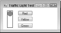
End SubIn the Solution Explorer, right-click your test Windows Application, and select Set as Startup Project. Then press F5 to run. When your test form comes up, you can change the "signal" on the traffic light by pressing the buttons. Figure 16-8 shows a sample screen.
Of course, you can't see the color in a black-and-white screen shot, but as you might expect from its position, the circle is red. The "yellow light" displays in the middle of the control, and the "green light" displays at the bottom. These positions are all calculated in the Paint event logic, depending on the value of the Status property.
For a complete example, it would be desirable for the control to allow the user to change the Status by clicking on a different part of the "traffic light." That means including logic to examine mouse clicks, calculate whether they are in a given area, and change the Status property if appropriate. In the code available for download for this book, the TrafficLight example includes such functionality.
By default, the icon that appears in the Toolbox next to your control's name is a gear-shaped icon. However, you can attach an icon to a control for the Toolbox to display. There are two ways to do that.
Windows Forms includes a ToolboxBitmap attribute that can specify an icon for a class. It can be used in several ways, and you can see examples in the help file for the ToolboxBitmap attribute.
The easy way to attach an icon to your control is to let Visual Studio do it for you. Simply locate or draw the icon you want to use, and add it to the project containing your control. Then rename the icon so that it has the same name as your control but an extension of ico instead of vb.
For example, to attach an icon to the TrafficLight control in the preceding example, find an icon you like, place it in your project, and name it TrafficLight.ico. Then Visual Studio will attach the icon to your control during the compilation process; and when your control is added to the Toolbox, your icon will be used instead of the gear-shaped one.
Custom icons are displayed for a control in the Toolbox only when the control is added with the Toolbox's Choose Items option. Controls that appear in the Toolbox at the top because their project is currently loaded do not exhibit custom icons. They always have a blue, gear-shaped icon.
Another valuable technique for creating custom controls is to embed other controls. In a sense, the UserControl does this; but when a UserControl is used as the base class, by default it only exposes the properties of the UserControl class. Instead, you may want to use a control such as Textbox or Grid as the starting point, but embed a Button in the Textbox or Grid to obtain some new functionality.
The embedding technique relies on the fact that in Windows Forms, all controls can be containers for other controls. Visual Basic developers are familiar with the idea that Panels and GroupBoxes can be containers, but in fact a TextBox or a Grid can also be a container of other controls.
This technique is best presented with an example. The standard ComboBox control does not have a way for users to reset to a "no selection" state. Once an item is selected, setting to that state requires code that sets the SelectedIndex to −1.
This exercise creates a ComboBox that has a button to reset the selection state back to "no selection." That enables users to access that capability directly. Now that you have worked with several controls in the examples, rather than proceed step by step, we'll just show the code for such a ComboBox and discuss how the code works:
Public Class SpecialComboBox
    Inherits ComboBox
Dim WithEvents btnEmbeddedButton As Button
Public Sub New()
Me.DropDownStyle = ComboBoxStyle.DropDownList
' Fix up the embedded button.
btnEmbeddedButton = New Button
btnEmbeddedButton.Width = SystemInformation.VerticalScrollBarWidth
btnEmbeddedButton.Top = 0
btnEmbeddedButton.Height = Me.Height - 4
btnEmbeddedButton.BackColor = SystemColors.Control
btnEmbeddedButton.FlatStyle = FlatStyle.Popup
btnEmbeddedButton.Text = "t"
Dim fSpecial As New Font("Wingdings 3", Me.Font.Size - 1)
btnEmbeddedButton.Font = fSpecial
btnEmbeddedButton.Left = Me.Width - btnEmbeddedButton.Width - _
SystemInformation.VerticalScrollBarWidth
Me.Controls.Add(btnEmbeddedButton)
btnEmbeddedButton.Anchor = CType(AnchorStyles.Right _
Or AnchorStyles.Top Or AnchorStyles.Bottom, AnchorStyles)
btnEmbeddedButton.BringToFront()
End Sub
Private Sub btnEmbeddedButton_Click(ByVal sender As Object, _
ByVal e As System.EventArgs) Handles btnEmbeddedButton.Click
Me.SelectedIndex = −1
Me.Focus
End Sub
Private Sub BillysComboBox_DropDownStyleChanged(ByVal sender As Object, _
ByVal e As System.EventArgs) Handles MyBase.DropDownStyleChanged
If Me.DropDownStyle <> ComboBoxStyle.DropDownList Then
Me.DropDownStyle = ComboBoxStyle.DropDownList
Throw New _
InvalidOperationException("DropDownStyle must be DropDownList")
End If
End Sub
End ClassAs in the first example in the chapter, this example inherits from a built-in control. Thus, it immediately gets all the capabilities of the standard ComboBox. All you need to add is the capability to reset the selected state.
To do that, you need a button for the user to press. The class declares the button as a private object named btnEmbeddedButton. Then, in the constructor for the class, the button is instantiated, and its properties are set as necessary. The size and position of the button need to be calculated. This is done using the size of the ComboBox and a special system parameter called SystemInformation.VerticalScrollBarWidth. This parameter is chosen because it is also used to calculate the size of the button used to drop down a combo box. Thus, your new embedded button will be the same width as the button that the regular ComboBox displays for dropping down the list.
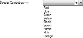
Of course, you need to display something in the new button to indicate its purpose. For simplicity, the preceding code displays a lowercase "t" using the WingDings 3 font (which all Windows systems should have installed). This causes a left-pointing triangle to appear, as shown in Figure 16-9, which is a screen shot of the control in use.
The button is then added to the Controls collection of the ComboBox. You may be surprised to learn that a ComboBox even has a Controls collection for embedded controls, but all controls in Windows Forms have one.
Finally, the Anchor property of the new button is set to maintain the position if the SpecialComboBox is resized by its consumer.
Besides the constructor, only a couple of small routines are needed. The click event for the button must be handled, and in it the SelectedIndex must be set to −1. In addition, because this functionality is only for combo boxes with a style of DropDownList, the DropDownStyleChanged event of the ComboBox must be trapped, and the style prevented from being set to anything else.
This chapter discussed how to create custom controls in Windows Forms, enabling you to consolidate logic used throughout your user interfaces. The full inheritance capabilities in .NET and the classes in the Windows Forms namespace allow several options for creating controls. It is probably best to start by overriding these controls in order to learn the basics of creating properties and coordinating them with the designer, building controls and testing them, and so on. These techniques can then be extended by creating composite controls, as illustrated by the examples in the chapter.
We also discussed creating a control from scratch, using the base Control class. In the course of writing a control from scratch, it was necessary to discuss the basics of GDI+, but if you are going to do extensive work with GDI+, you will need to seek out additional resources to aid in that effort.
The key concept that you should take away from this chapter is that Windows Forms controls are a great way both to package functionality that will be reused across many forms and to create more dynamic, responsive user interfaces much more quickly with much less code.