Windows Forms is a part of the .NET Framework that is used to create user interfaces for local applications, often called Win32 clients. Windows Forms does not change in moving from Visual Basic 2005 to Visual Basic 2008. Accordingly, the version number used for Windows Forms in Visual Studio 2008 is still 2.0.
The pace of change in Windows Forms is slowing because of the advent of Windows Presentation Foundation (WPF). Visual Studio 2008 is the first version of Visual Studio with a capable visual designer for WPF. Going forward, you can expect continued innovation in WPF, but not much in Windows Forms. However, that does not imply that you should abandon Windows Forms or be reluctant to write programs in it. Windows Forms still has many advantages over WPF.
Those advantages include a more complete set of controls and a mature, easy-to-use designer. The result is faster development in Windows Forms compared to WPF. WPF has advantages of its own, of course. These are discussed in Chapter 17, which provides an introduction to WPF.
This chapter summarizes the changes in Windows Forms 2.0 compared to the earlier 1.0 and 1.1 versions that were present in Visual Studio 2002 and 2003. This enables those with some experience in previous versions of Windows Forms to quickly identify key changes. Then the chapter looks at the behavior of forms and controls, with emphasis on those elements that are most important for routine application development.
Chapter 16 includes more advanced treatment of certain aspects of Windows Forms. After gaining a basic understanding of the key capabilities in this chapter, you'll be ready to go on to the more advanced concepts in that chapter.
If you have already used Windows Forms 1.0 or 1.1, much of the material in this chapter will be familiar to you. To help you quickly focus on the new capabilities in Windows Forms 2.0, here is a summary of changes and additions.
Changes to existing controls in Windows Forms 2.0 are minor, but are helpful additions of functionality. Some changes apply to all controls because they are part of the base Control class in Windows Forms 2.0. Other changes apply only to specific controls.
Many controls in Windows Forms 2.0 display a small triangle, or glyph, toward the top, right side of the control when highlighted in the visual designer. This is a new feature called a smart tag. If you click this glyph, you get a pop-up dialog with common operations for the control. Many of the features that you access through the property box can also be accessed through the smart tag. In general, this chapter uses the Properties window for manipulating properties, but you should be aware of the smart tag shortcut for commonly used features.
Text boxes and combo boxes have new properties for autocompletion of text entries. This capability could be added manually or with third-party controls in previous versions, but is now built in. The AutoCompleteMode property controls how autocompletion works in the control, while the AutoCompleteSource and AutoCompleteCustomSource properties tell the control where to get entries for autocompletion.
An example of autocompletion in action is shown later, in the section entitled "Advanced Capabilities for Data Entry."
The base Control class, which is a base class for all Windows Forms controls, has several new properties in Windows Forms 2.0. Because all controls inherit from this class, all Windows Forms controls gain these new properties and the new functionality that goes along with them.
Two of the new properties, Padding and Margin, are most useful when used in conjunction with some new controls, TableLayoutPanel and FlowLayoutPanel. Those two properties are discussed later in the chapter. The other new properties are discussed here. They include MaximumSize, MinimumSize, and UseWaitCursor.
The MaximumSize and MinimumSize properties specify the control's maximum and minimum height and width, respectively. Forms had these properties in Windows Forms 1.0 and 1.1, but now all controls have them.
If the maximum height and width are both set to the default value of 0, then there is no maximum. Similarly, if the minimum height and width are set to zero, then there is no minimum. The form or control can be any size.
If these properties are set to anything else, then the settings become limits on the size of the control. For example, if the MaximumSize height and width are both set to 100, then the control cannot be bigger than 100 × 100 pixels. The visual designer will not make the control any larger on the form design surface. Attempting to set the height or width of the control in code at runtime to a value greater than 100 will cause it to be set to 100 instead.
The MaximumSize and MinimumSize properties can be reset at runtime to enable sizing of the controls outside the limits imposed at design time. However, the properties have a return type of Size, so resetting either property requires creating a Size structure. For example, you can reset the MinimumSize property for a button named Button1 with the following line of code:
Button1.MinimumSize = New Size(20, 20)
This sets the new minimum width and height to 20 pixels.
The Size structure has members for Height and Width, which can be used to fetch the current minimum or maximum sizes for either height or width. For example, to find the current minimum height for Button1, use the following line of code:
Dim n As Integer = Button1.MinimumSize.Height
Windows Forms interfaces can use threading or asynchronous requests to allow tasks to execute in the background. When a control is waiting for an asynchronous request to finish, it is helpful to indicate that to the user by changing the mouse cursor when the mouse is inside the control. Normally, the cursor used is the familiar hourglass, which is called the WaitCursor in Windows Forms.
For any control, setting the UseWaitCursor property to True causes the cursor to change to the hourglass (or whatever is being used for the WaitCursor) while the mouse is positioned inside the control. This allows a control to visually indicate that it is waiting for something. The typical usage is to set UseWaitCursor to True when an asynchronous process is begun and then set it back to False when the process is finished and the control is ready for normal operation again.
Windows Forms 2.0 includes a number of new controls. Some are brand-new controls that offer completely new functionality. Others are replacements for existing controls, offering additional functionality.
Even smart client applications often need to display HTML or browse websites. Windows Forms 1.0 or 1.1 did not include a true Windows Forms control for browsing. The legacy ActiveX browsing control built into Windows could be used via interoperability, but this had drawbacks for deployment and versioning.
The legacy ActiveX control is still the ultimate foundation for browsing capability, but Windows Forms 2.0 includes an intelligent Windows Forms wrapper that makes it much easier to use and deploy the control.
Windows Forms 1.0 offered replacements for almost all of the controls available in Visual Basic 6, but one notable exception was the MaskedEdit control. In Windows Forms 1.0 and 1.1, masked edit capabilities were available only through third-party controls or by doing your own custom development.
That omission has now been rectified. The MaskedTextbox control resembles the old MaskedEdit control in functionality. It allows a mask for input and a variety of useful properties to control user interaction with the control. More information on this control is available in the section "Advanced Capabilities for Data Entry."
Browser-based user interfaces are good at dynamically arranging controls at runtime, because browser windows can be different sizes for different users. Forms-based interfaces have traditionally lacked such capabilities. Dynamic positioning can be done in forms, but it requires writing a lot of sizing and positioning logic.
Two new controls in Windows Forms 2.0 mimic layout capabilities in a browser, offering better options for dynamic positioning of controls: FlowLayoutPanel and TableLayoutPanel. Both are containers than can automatically reposition controls that are placed in them, based on the current space available in the container.
An example illustrating usage of both controls is included in the section "Dynamic Sizing and Positioning of Controls."
The Toolbar, MainMenu, ContextMenu, and StatusBar controls in Windows Forms 1.0 and 1.1 offered basic functionality. These controls are still available in Windows Forms 2.0, but in most cases you won't want to use these controls because new replacements offer significantly enhanced capabilities. Because the old versions are still available, the new versions have different names. The table that follows summarizes these replacements:
Old Control | New Control | Most Important New Capabilities |
|---|---|---|
| Enables many new types of controls on the toolbar. Supports rafting, which enables the toolbar to be detached by the user and float over the application. It also enables users to add or remove buttons or other toolbar elements, and includes new cosmetics, enabling toolbars to look like those in Office 2003. | |
| Both new menu controls inherit from | |
| ||
| Inherits from | |
Less difficult to set up |
The old versions no longer show up by default in the Toolbox. If you want to use them in new projects, then you must add them to the Toolbox by right-clicking on the Windows Forms Toolbox tab, selecting Choose Items, and placing a check mark on the older control that you want added to the Toolbox. However, you'll probably only want to use the older controls for compatibility with older projects, using the improved versions for new development.
These controls are covered in more detail, including examples, in the sections "Toolbars and the New ToolStrip Control," "Menus," and "Dynamic Sizing and Positioning of Controls."
In VB6 and earlier, a form named Form1 could be shown by merely including the following line:
Form1.Show
This capability was not available in Visual Basic 2002 and 2003. Instead, a form was treated like any other class, and had to be instantiated before use. Typical code to show a form in Windows Forms 1.0 and 1.1 looked like this:
Dim f As New Form1()
f.Show
This technique is still recommended because it fits object-oriented conventions, but the first form returned to Visual Basic starting with the 2005 version, with the minor change of parentheses at the end of the call:
Form1.Show()
Showing a form without instancing it, as in the first form shown, is referred to as using the default instance of the form. That default instance is available from anywhere in a project containing a form. There is only one default instance, and any reference to it will bring up the same underlying instance of the form.
Another way to get to the default instance of a form is through the new My namespace. The following line has exactly the same effect, showing the default instance of a form:
My.Forms.Form1.Show()
You've already seen how namespaces are used to organize related classes in the .NET Framework. The main namespace used for Windows Forms classes is System.Windows.Forms. The classes in this namespace are contained in the System.Windows.Forms.dll assembly.
If you choose a Windows application project or Windows Control Library project in VS.NET, a reference to System.Windows.Forms.dll is added by default. In some other cases, such as creating a library that will work with controls, you need to add that reference manually. (You can learn more about creating controls in Windows Forms in Chapter 16.)
A form is just a special kind of class in Windows Forms. A class becomes a form based on inheritance. A form must have the System.Windows.Forms class in its inheritance tree, which causes the form to have the behavior and object interface a form requires.
The previous section on changes to Windows Forms 2.0 mentioned that forms can be used by referring to a default instance. However, the preferred technique is to treat a form like any other class, which means creating an instance of the form and using the instance. Typical code would look like this:
Dim f As New Form1
f.Show()
There is one circumstance in which loading a form the same way as a class instance yields undesirable results. Let's cover that next.
When a form is instanced via the technique just described, it is referenced by an object variable, which establishes an object reference to the instance. References are covered in detail in Chapter 2.
References can disappear as object variables go out of scope or are set to other references or to Nothing. When all object references to a form are gone, the form is disposed of and therefore vanishes. This is particularly apparent if you want to start your application with a Sub Main, and then show your first form inside Sub Main. You might think the following would work:
' This code will not work in any .NET version of VB!!
Sub Main()

    ' Do start up work here
    ' After start up work finished, show the main form...
    Dim f As New Form1
    f.Show()

End Sub
If you try this, however, Form1 briefly appears and then immediately vanishes, and the application quits. That's because the object variable $f$ went out of scope, and it was the only reference to the form that was shown. Therefore, the form was destroyed because it had no references pointing to it.
To get around this behavior, you could use the default instance as the startup form, but there's a better way that stays within good object-oriented conventions. Replace the line that shows the form, as shown here:
' This code will work fine in VB 2008
Sub Main()

    ' Do start up work here
    Dim f As New Form1
    Application.Run(f)

End Sub
Now Sub Main will transfer control to the form, and the form won't vanish when Sub Main ends.
Instead of using Sub Main as your application entry point, you can also define a startup form, which is the form that is loaded first when your application begins. To define the startup form, open the Properties dialog box for the project and set the Startup form setting. Do this using the Project
If the Properties menu item doesn't appear under your Project menu, open the Solution Explorer (Ctrl+Alt+L), highlight the project name (it will be in bold font), and then try again.
Often, you'll want a form to be centered on the screen when it first appears. VB.NET does this automatically for you when you set the StartPosition property. The following table shows the settings and their meanings:
StartPosition Value | Effect |
|---|---|
Shows the form positioned at the values defined by the form's | |
Shows the form centered on the screen | |
Shows the form at the window's default location | |
Shows the form at the window's default location, with the window's default bounding size | |
Shows the form centered in its owner |
Forms have a number of border options in Windows Forms. The FormBorderStyle property is used to set the border option, and the options can affect the way a form can be manipulated by the user. The options available for FormBorderStyle include the following:
None— No border, and the user cannot resize the formFixedSingle— Single 3-D border, and the user cannot resize the formFixed3D— 3-D border, and the user cannot resize the formFixedDialog— Dialog-box-style border, and the user cannot resize the formSizeable— Same asFixedSingle, except that the user can resize the formFixedToolWindow— Single border, and the user cannot resize the formSizeableToolWindow— Single border, and the user can resize the form
Each of these has a different effect on the buttons that appear in the title bar of the form. For details, check the help topic for the FormBorderStyle property.
Some forms need to remain visible at all times, even when they don't have the focus, e.g., floating toolbars and tutorial windows. In Windows Forms, forms have a property called TopMost. Set it to True to have a form overlay other forms even when it does not have the focus.
Note that a form with TopMost set to True is on top of all applications, not just the hosting application. If you need a form to only be on top of other forms in the application, then this capability is provided by an owned form.
As with the TopMost property, an owned form floats above the application but it does not interfere with using the application. An example is a search-and-replace box. However, an owned form is not on top of all forms, just the form that is its owner.
When a form is owned by another form, it is minimized and closed with the owner form. Owned forms are never displayed behind their owner form, but they do not prevent their owner form from gaining the focus and being used. However, if you want to click on the area covered by an owned form, the owned form has to be moved out of the way first.
A form can only have one "owner" at a time. If a form that is already owned by Form1 is added to the owned forms collection for Form2, then the form is no longer owned by Form1.
There are two ways to make a form owned by another form. It can be done in the owner form or in the owned form.
In the owner form, another form can be made owned with the AddOwnedForm method. The following code makes an instance of Form2 become owned by Form1. This code would reside somewhere in Form1 and would typically be placed just before the line that shows the instance of Form2 to the screen:
Dim frm As New Form2
Me.AddOwnedForm(frm)
The relationship can also be set up in the owned form. This is done with the Owner property of the form. Here is a method that would work inside Form2 to make it owned by a form that is passed in as an argument to the function:
Public Sub MakeMeOwned(frmOwner As Form)
    Me.Owner = frmOwner
End Sub
Because this technique requires a reference to the owner inside the owned form, it is not used as often as using the AddOwnedForm method in the Owner form.
The owner form can access its collection of owned forms with the OwnedForms property. Here is code to loop through the forms owned by a form:
Dim frmOwnedForm As Form
For Each frmOwnedForm In Me.OwnedForms
  Console.WriteLine(frmOwnedForm.Text)
Next
The owner form can remove an owned form with the RemoveOwnedForm property. This could be done in a loop like the previous example, with code like the following:
Dim frmOwnedForm As Form
For Each frmOwnedForm In Me.OwnedForms
  Console.WriteLine(frmOwnedForm.Text)
  Me.RemoveOwnedForm(frmOwnedForm)
Next
This loop would cause an owner form to stop owning all of its slaved forms. Note that those "deslaved" forms would not be unloaded, they would simply no longer be owned.
Windows Forms offers advanced capabilities to make forms translucent, or parts of a form transparent. You can even change the entire shape of a form.
The Opacity property measures how opaque or transparent a form is. A value of 0 percent makes the form fully transparent. A value of 100 percent makes the form fully visible. Any value greater than 0 and less than 100 makes the form partially visible, as if it were a ghost. Note that an opacity value of 0 percent disables the capability to click the form.
Very low levels of opacity, in the range of 1 or 2 percent, make the form effectively invisible, but still allow the form to be clickable. This means that the Opacity property has the potential to create mischievous applications that sit in front of other applications and "steal" their mouse clicks and other events.
Percentage values are used to set opacity in the Properties window, but if you want to set the
Opacityproperty in code, you must use values between 0 and 1 instead, with 0 equivalent to 0 percent and 1 equivalent to 100 percent.
Tool and dialog windows that should not completely obscure their background are one example of a usage for Opacity. Setting expiration for a "free trial" by gradually fading out the application's user interface is another.
The following block of code shows how to fade a form out and back in when the user clicks a button named Button1. You may have to adjust the Step value of the array, depending on your computer's performance:
Private Sub Button1_Click(ByVal sender As System.Object, _
                          ByVal e As System.EventArgs) _
                          Handles Button1.Click
   Dim i As Double
   For i = −1 To 1 Step 0.005
     ' Note - opacity is a value from 0.0 to 1.0 in code
     ' Absolute value is used to keep us in that range
     Me.Opacity = System.Math.Abs(i)
     Me.Refresh
   Next i
End SubInstead of making an entire form translucent or transparent, the TransparencyKey property enables you to specify a color that will become transparent on the form. This enables you to make some sections of a form transparent, while other sections are unchanged.
For example, if TransparencyKey is set to a red color and some areas of the form are that exact shade of red, then they will be transparent. Whatever is behind the form shows through in those areas; and if you click in one of those areas, you are actually clicking the object behind the form.
TransparencyKey can be used to create irregularly shaped "skin" forms. A form can have its BackgroundImage property set with an image, and by just painting a part of the image with the TransparencyKey color, you can make parts of the form disappear.
Another way to gain the capability of "skins" is by using the Region property of a form. The Region property allows a shape for a form to be encoded as a "graphics path," thereby changing the shape from the default rectangle to another shape. A path can contain line segments between points, curves, and arcs, and outlines of letters, in any combination.
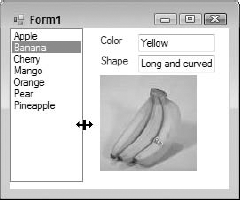
The following example changes the shape of a form to an arrow. Create a new Windows application. Set the FormBorderStyle property of Form1 to None. Then place the following code in the Load event for Form1:
Dim PointArray(6) As Point
PointArray(0) = New Point(0, 40)
PointArray(1) = New Point(200, 40)
PointArray(2) = New Point(200, 0)
PointArray(3) = New Point(250, 100)
PointArray(4) = New Point(200, 200)
PointArray(5) = New Point(200, 160)
PointArray(6) = New Point(0, 160)
Dim myGraphicsPath As _
System.Drawing.Drawing2D.GraphicsPath = _
        New System.Drawing.Drawing2D.GraphicsPath

myGraphicsPath.AddPolygon(PointArray)
Me.Region = New Region(myGraphicsPath)
When the program is run, Form1 will appear in the shape of a right-pointing arrow. If you lay out the points in the array, you will see that they have become the vertices of the arrow.
By inheriting from System.Windows.Forms.Form, any class automatically gets all the properties, methods, and events that a form based on Windows Forms is supposed to have. However, a class does not have to inherit directly from the System.Windows.Forms.Form class to become a Windows form. It can become a form by inheriting from another form, which itself inherits from System.Windows.Forms.Form. In this way, controls originally placed on one form can be directly inherited by a second form. Not only is the design of the original form inherited, but also any code associated with these controls (the processing logic behind an Add New button, for example). This means you can create a base form with processing logic required in a number of forms, and then create other forms that inherit the base controls and functionality.
VB 2008 provides an Inheritance Picker tool to aid in this process. Note, however, that a form must be compiled into either an .exe or .dll file before it can be used by the Inheritance Picker. Once that is done, adding a form that inherits from another form in the project can be achieved by selecting Project
Some applications need fields that will fit on a single screen. While you could split the data entry into multiple screens, an alternative is a scrollable form.
You can set your forms to automatically have scrollbars when they are sized smaller than the child controls they contain. To do so, set the AutoScroll property of your form to True. When you run your program, resize the form to make it smaller than the controls require and presto — instant scrolling.
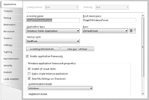
MDI (Multiple Document Interface) forms are forms that are created to hold other forms. The MDI form is often referred to as the parent, and the forms displayed within the MDI parent are often called children. Figure 15-2 shows a typical MDI parent with several children displayed within it.
In Windows Forms, a regular form is converted to an MDI parent form by setting the IsMDIContainer property of the form to True. This is normally done in the Properties window at design time.
A form can also be made into an MDI parent at runtime by setting the IsMDIContainer property to True in code, but the design of an MDI form is usually different from that of a normal form, so this approach is not often needed.
In VB6, an MDI parent form can only contain controls that have a property called Align, which is similar to the Dock property in Windows Forms. These controls, such as a PictureBox, can then contain other controls.
In Windows Forms, an MDI parent can contain any control that a regular form can contain. Buttons, labels, and the like can be placed directly on the MDI surface. Such controls appear in front of any MDI child forms that are displayed in the MDI client area.
It is still possible to use controls such as PictureBoxes to hold other controls on a Windows Forms MDI parent. These controls can be docked to the side of the MDI form with the Dock property, which is discussed in the section "Dynamic Sizing and Positioning of Controls."
In Windows Forms, a form becomes an MDI child at runtime by setting the form's MDIParent property to point to an MDI parent form. This makes it possible to use a form as either a standalone form or an MDI child in different circumstances. In fact, the MDIParent property cannot be set at design time — it must be set at runtime to make a form an MDI child. (Note that this is completely different from VB6, where it was necessary to make a form an MDI child at design time.)
Any number of MDI child forms can be displayed in the MDI parent-client area. The currently active child form can be determined with the ActiveForm property of the MDI parent form.
To see these changes to MDI forms in action, try the following exercise. It shows the basics of creating an MDI parent and making it display an MDI child form:
Create a new Windows application. It will have an empty form named
Form1. Change both the name of the form and the form'sTextproperty toMDIParentForm.In the Properties window, set the
IsMDIContainerproperty forMDIParentFormtoTrue. This designates the form as an MDI container for child windows. (Setting this property also causes the form to have a different default background color.)From the Toolbox, drag a
MenuStripcontrol to the form. Create a top-level menu item called File with submenu items called New MDI Child and Quit. Also create a top-level menu item called Window. The FileIn the Component Tray at the bottom of the form, click the
MenuStripitem and select Properties. In the Properties window, set theMDIWindowListItemproperty toWindowToolStripMenuItem. This enables the Window menu to maintain a list of open MDI child windows, with a check mark next to the active child window.Create an MDI child form to use as a template for multiple instances. Select Project
Return to
MDIParentForm. In the menu editing bar, double-click the New MDI Child option under File. The Code Editor will appear, with the cursor in the event routine for that menu option. Place the following code in the event:Protected Sub NewMdiChildToolStripMenuItem _Click(ByVal sender As Object, ByVal e As System.EventArgs) ' This line may change if you are using a form with a different name. Dim NewMDIChild As New Form2() 'Set the Parent Form of the Child window. NewMDIChild.MDIParent = Me 'Display the new form. NewMDIChild.Show() End SubIn the menu editing bar for
MDIParentForm, double-click the Quit option under File. The Code Editor will appear, with the cursor in the event routine for that menu option. Place the following code in the event:Protected Sub QuitToolStripMenuItem_Click(ByVal sender As Object, _ ByVal e As System.EventArgs) End End SubRun and test the program. Use the File
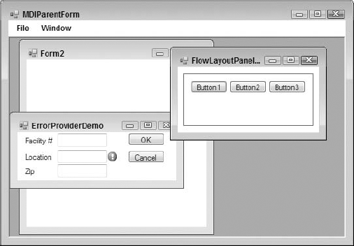
MDI parent forms have a method called LayoutMDI that automatically arranges child forms in the familiar cascade or tile layout. For the preceding example, add a menu item to your Windows menu called Tile Vertical and insert the following code into the menu item's Click event to handle it:
Me.LayoutMdi(MDILayout.TileVertical)
To see an example of the rearrangement, suppose that the MDI form in Figure 15-2 is rearranged with the MDILayout.TileVertical option. It would then look similar to the image in Figure 15-3.
In VB6 and earlier, forms were shown with the Show method, and this technique is still used in Windows Forms. In both VB6 and VB 2008, the Show method by default displays modeless forms, which are forms that enable the user to click off them onto another form in the application.
Applications also sometimes need forms that retain control until their operation is finished. That is, you can't click off such a form onto another form. Such a form is called a modal form.
In VB6, showing a modal form required using a special parameter on the Show method. Showing a form modally is done differently in Windows Forms, with the ShowDialog method. The following code shows a modal dialog in Windows Forms, assuming the project contains a form with a type of DialogForm:
Dim frmDialogForm As New DialogForm
frmDialogForm.ShowDialog()
When showing a dialog form, you'll often need to get information about what action the user selected. This was often done with a custom property in VB6, but Windows Forms has a built-in property for that purpose. When a form is shown with the ShowDialog method, the form has a property called DialogResult to indicate its state.
The DialogResult property can take the following enumerated results:
DialogResult.AbortDialogResult.CancelDialogResult.IgnoreDialogResult.NoDialogResult.NoneDialogResult.OKDialogResult.RetryDialogResult.Yes
When the DialogResult property is set, the dialog is hidden as a byproduct. That is, setting the DialogResult property causes an implicit call to the Hide method of the dialog form, so that control is released back to the form that called the dialog.
The DialogResult property of a dialog box can be set in two ways. The most common way is to associate a DialogResult value with a button. Then, when the button is pressed, the associated value is automatically placed in the DialogResult property of the form.
To set the DialogResult value associated with a button, the DialogResult property of the button is used. If this property is set for the button, then it is unnecessary to set the DialogResult in code when the button is pressed.
Here is an example that uses this technique. In Visual Studio 2008, start a new VB Windows application. On the automatic blank form that comes up (named Form1), place a single button and set its Text property to Dialog.
Now add a new Windows form by selecting Project
Property | Value for First Button | Value for Second Button |
|---|---|---|
|
|
|
|
|
|
|
|
|
Do not put any code in DialogForm at all. The form should look like the one shown in Figure 15-4.

On the first form, Form1, place the following code in the Click event for Button1:
Private Sub Button1_Click(ByVal sender As System.Object, _
  ByVal e As System.EventArgs) Handles Button1.Click
   Dim frmDialogForm As New DialogForm()
   frmDialogForm.ShowDialog()

   ' You're back from the dialog - check user action.
   Select Case frmDialogForm.DialogResult
     Case DialogResult.OK
       MsgBox("The user pressed OK")
     Case DialogResult.Cancel
       MsgBox("The user pressed cancel")
   End Select
   frmDialogForm = Nothing
End Sub
Run and test the code. When a button is pressed on the dialog form, a message box should be displayed (by the calling form) indicating the button that was pressed.
The second way to set the DialogResult property of the form is in code. In a Button_Click event, or anywhere else in the dialog form, a line like the following can be used to set the DialogResult property for the form and simultaneously hide the dialog form, returning control to the calling form:
Me.DialogResult = DialogResult.Ignore
This particular line sets the dialog result to DialogResult.Ignore, but setting the dialog result to any of the permitted values also hides the dialog form.
The life cycle of a form is like that of all objects. It is created and later destroyed. Forms have a visual component, so they use system resources, such as handles. These are created and destroyed at interim stages within the lifetime of the form. Forms can be created and will hold state as a class, but will not appear until they are activated. Likewise, closing a form doesn't destroy its state.
The following table summarizes the states of a form's existence, how you get the form to that state, the events that occur when the form enters a state, and a brief description of each:
The controls included in Windows Forms provide basic functionality for a wide range of applications. This section covers the features that all controls use (such as docking) and summarizes the standard controls available to you. Important changes from pre-.NET versions of Visual Basic (VB6 and earlier) are briefly mentioned.
The VS 2008 design environment enables you to set the tab order of the controls on a form simply by clicking them in sequence. To activate the feature, open a form in the designer and select View
To set the values, simply click on each control in the sequence you want the tab flow to operate. The screen shot in Figure 15-5 shows a simple form with the tab order feature enabled.
In Windows Forms 2.0, it is possible to have two or more controls with the same tab index value. At runtime, Visual Basic will break the tie by using the z-order of the controls. The control that is highest in the z-order receives the focus first. The z-order is a ranking number that determines which controls are in front of or behind other controls. (The term comes from the z-axis, which is an axis perpendicular to the traditional x-axis and y-axis.) The z-order can be changed by right-clicking the control and selecting Bring to Front.
Windows Forms 2.0 includes a variety of ways to enable dynamic user interfaces. Not only can controls be set to automatically stretch and reposition themselves as a form is resized, they can also be dynamically arranged inside some special container controls intended for that purpose. This section covers all these ways of enabling dynamic sizing and positioning of controls.
Docking refers to gluing a control to the edge of a parent control. Good examples of docked controls are menu bars and status bars, which are typically docked to the top and bottom of a form, respectively. All visual controls have a Dock property.
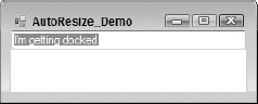
To work through an example, create a new Windows application and place a Textbox on a form. Set the Text property of the TextBox to I'm Getting Docked. The result when you show the form should look something like Figure 15-6.

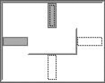
Suppose that you need to glue this TextBox to the top of the form. To do this, view the Dock property of the label. If you pull it down, you'll see a small graphic like the one shown in Figure 15-7.

Simply click the top section of the graphic to stick the label at the top of the form. The other sections give you other effects. (A status bar would use the bottom section, for example. Clicking the box in the middle causes the control to fill the form.) The TextBox control will immediately "stick" to the top of your form. When you run your program and stretch the window sideways, you'll see the effect shown in Figure 15-8.
Note
If you try to dock multiple controls to the same edge, Windows Forms must decide how to break the tie. Precedence is given to controls in reverse z-order. That is, the control that is furthest back in the z-order will be the first control next to the edge. If you dock two controls to the same edge and want to switch them, then right-click the control you want docked first and select Send to Back.
If you want a gap between the edge of your form and the docked controls, set the DockPadding property of the parent control. You can set a different value for each of the four directions (Left, Right, Top, Bottom). You can also set all four properties to the same value using the All setting.
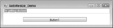
Anchoring is similar to docking except that you can specifically define the distance that each edge of your control will maintain from the edges of a parent. To see it in action, add a button to the form in the docking example. The result should look like what is shown in Figure 15-9.

Dropping down the Anchor property of the button gives you the graphic shown in Figure 15-10.
The four rectangles surrounding the center box enable you to toggle the anchor settings of the control. Figure 15-10 shows the default anchor setting of Top, Left for all controls.
When the setting is on (dark gray), the edge of the control maintains its original distance from the edge of the parent as the parent is resized. If you set the anchor to two opposing edges (such as the left and right edges), the control stretches to accommodate this, as shown in Figure 15-11.
One of the most common uses of anchoring is to set the Anchor property for buttons in the lower-right portion of a form. Setting the Anchor property of a button to Bottom, Right causes the button to maintain a constant distance from the bottom-right corner of the form.
You can also set the Anchor property in code. The most common scenario for this would be for a control created on-the-fly. To set the Anchor property in code, you must add the anchor styles for all the sides to which you need to anchor. For example, setting the Anchor property to Bottom, Left would require a line of code like this:
MyControl.Anchor = Ctype(AnchorStyles.Bottom + AnchorStyles.Right, AnchorStyles)
Early versions of Windows Forms used the Splitter control to allow resizing of containers. This control is still available in Windows Forms 2.0, but it doesn't appear by default in the Toolbox. In its place is a replacement control, SplitContainer, that provides the same functionality with less work on your part.
A single SplitContainer acts much like two panels with an appropriately inserted Splitter. You can think of it as a panel with two sections separated by a movable divider so that the relative sizes of the sections can be changed by a user.
To use a SplitContainer, simply drop it on a form, resize it, and position the draggable divider to the appropriate point. If you want the divider to be horizontal instead of vertical, you change the Orientation property. Then you can place controls in each subpanel in any way you like. It is common to insert a control such as a TreeView or ListBox, and then dock it to its respective subpanel. This enables users to resize such contained controls. A typical example of a SplitContainer in action is shown in Figure 15-12.
The cursor in Figure 15-12 shows that the mouse is hovering over the divider, allowing repositioning of the divider by dragging the mouse. A SplitContainer may be nested inside another SplitContainer. This enables you to build forms in which several parts are resizable relative to each other.
The FlowLayoutPanel enables the dynamic layout of controls contained within it, based on the size of the FlowLayoutPanel. This is quite a departure from traditional Windows Forms layout, in which controls in a container are positioned solely according to their Top and Left properties.
FlowLayoutPanel works conceptually much like a simple HTML page shown in a browser. The controls placed in the FlowLayoutPanel are positioned in sequence horizontally until there's not enough space for the next control, which then wraps further down for another row of controls. The following walk-through demonstrates this capability.
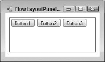
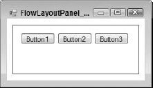
Start a new Windows application project. On the blank Form1 included in the new project, place a FlowLayoutPanel control toward the top of the form, making it a bit less wide than the width of the form. Set the Anchor property for the FlowLayoutPanel to Top, Left, and Right. Set the BorderStyle property for the FlowLayoutPanel to FixedSingle so it's easy to see.
Place three Button controls in the FlowLayoutPanel, keeping their default sizes. The form you create should look like the one shown in Figure 15-13.
Run the application. The initial layout will be similar to the design-time layout. However, if you resize the form to about two thirds of its original width, the layout of the buttons changes. Because there is no longer enough room for them to be arranged side by side, the arrangement automatically switches. Figure 15-14 shows the form in three configurations: first with its original width, then narrower so that only two buttons fit in the FlowLayoutPanel, and finally so narrow that the buttons are all stacked in the FlowLayoutPanel.
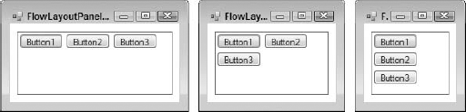
Note that no logic of any kind was added to the form — the FlowLayoutPanel handles the repositioning of the buttons automatically. In fact, any position information you set for the button controls is ignored if they are placed in a FlowLayoutPanel.
To assist in positioning controls in the FlowLayoutPanel, all controls have a new property called Margin. There are settings for Margin.Left, Margin.Right, Margin.Top, and Margin.Bottom. These settings determine how much space is reserved around a control when calculating its automatic position in a FlowLayoutPanel.
You can see the Margin property in action by changing the Margin property for one or more of the buttons in the previous example. If you change all the Margin settings for the first Button to 10 pixels, for example, and run the application, the form will look like the one shown in Figure 15-15.
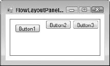
The first button now has a 10-pixel separation from all the other controls in the FlowLayoutPanel, as well as a 10-pixel separation from the edges of the FlowLayoutPanel itself.
The Padding property is for the FlowLayoutPanel or other container control. When a control is embedded into a FlowLayoutPanel, the Padding.Left, Padding.Right, Padding.Top, and Padding.Bottom properties of the FlowLayoutPanel determine how far the control should be positioned from the inside edge of the container.
You can see the Padding property in action by changing the Padding property for the FlowLayoutPanel in the previous example. If you set all Padding settings to 20 pixels, and reset the Margin property for the first Button back to the default, then the form will look like what is shown in Figure 15-16 in the visual designer.
Notice that all the controls in the FlowLayoutPanel are now at least 20 pixels from the edges.
The Padding property is also applicable to other container controls, if the contained controls have their Dock property set. If the settings for Padding are not zero, then a docked control will be offset from the edge of the container by the amount specified by the Padding property.
Another control that uses dynamic layout of child controls is the TableLayoutPanel. This control consists of a table of rows and columns, resulting in a rectangular array of cells. You can place one control in each cell. However, that control can itself be a container, such as a Panel or FlowLayoutPanel.
The dimensions of the columns and rows can be controlled by setting some key properties. For columns, set the number of columns with the ColumnCount property, and then control each individual column with the ColumnStyles collection. When you click the button for the ColumnStyles collection, you get a designer window that enables you to set two key properties for each column: SizeType and Width.
SizeType can be set to one of the following enumerations:
The Width property is only applicable if you do not choose a SizeType of AutoSize. It sets either the number of pixels for the width of the column (if the SizeType is Absolute) or the percentage width for the column (if the SizeType is Percent).
Similarly, for rows, there is a RowCount property to set the number of rows, and a RowStyles collection to manage the size of the rows. Each row in RowStyles has a SizeType, which works the same way as SizeType does for Columns except that it manages the height of the row instead of the width of a column. The Height property is used for rows instead of a Width property, but it works in a corresponding way. Height is either the number of pixels (if SizeType is Absolute) or a percentage of the height of the TableLayoutPanel (if SizeType is Percent). If SizeType is AutoSize, then a row is sized to the height of the tallest control in the row.
An advanced UI layout technique is to first create a TableLayoutPanel, and then embed a FlowLayoutPanel in some of the cells of the TableLayoutPanel. This allows several controls to be contained in a cell and repositioned as the size of the cell changes.
A step-by-step example of using a TableLayoutPanel, with an embedded FlowLayoutPanel, is included in the next chapter in the section "Creating a Composite UserControl."
Of course, not all applications need the dynamic layout of the containers just discussed. Windows Forms includes two controls that are static containers, in which the positions and layout of the contained controls are not adjusted at all.
In VB6, the Frame control was used for this purpose. However, Windows Forms has two such containers, with minor differences between them: the GroupBox control and the Panel control.
These two are similar in the following ways:
They can serve as a container for other controls.
If they are hidden or moved, then the action affects all the controls in the container.
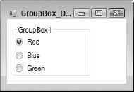
The GroupBox control is the one that most closely resembles an old VB6 Frame control visually. It acts much like a VB6 Frame control too, with one significant exception: There is no way to remove its border. It always has a border, and it can have a title, if needed. The border is always set the same way. Figure 15-17 shows a form with a GroupBox control containing three RadioButtons.
The Panel control has three major differences from GroupBox:
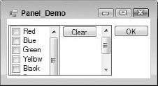
Figure 15-18 shows a form containing a Panel control with its BorderStyle property set to FixedSingle, with scrolling turned on by setting AutoScroll to True, and with a CheckedListBox that is too big to display all at once (which forces the Panel to show a scrollbar).
Windows Forms has a family of components that can only be used in association with visual controls. These components are known as extender providers. They work with the Visual Studio IDE to cause new properties to appear in the Properties window for controls on the form.
Extender providers have no visible manifestation except in conjunction with other controls, so they appear in the component tray. The three extender providers available with Windows Forms 2.0 are the HelpProvider, the ToolTip, and the ErrorProvider. All three work in basically the same way. Each extender provider implements the properties that are "attached" to other controls. The best way to see how this works is to go through an example, so let's do that with a ToolTip component.
The ToolTip is the simplest of the built-in extender providers. It adds just one property to each control: ToolTip on ToolTip1 (assuming the ToolTip control has the default name of ToolTip1). This property works in very much the same way the ToolTipText property works in VB6, and in fact replaces it.
To see this in action, create a Windows Forms application. On the blank Form1 that is created for the project, place a couple of buttons. Take a look at the Properties window for Button1. Notice that it does not have a ToolTip property of any kind.
Drag over the ToolTip control, which will be placed in the component tray. Go back to the Properties window for Button1. A property named ToolTip on ToolTip1 is now present. Set any string value you like for this property.
Run the project and hover the mouse pointer over Button1. You will see a tooltip containing the string value you entered for the ToolTip on ToolTip1 property.
Other properties of the ToolTip component enable you to control other characteristics of the tooltip, such as the initial delay before the tooltip appears.
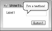
New in Windows Forms 2.0 is the capability to change the shape of tooltips to a "balloon." This is done by setting the IsBalloon property of the Tooltip component to True. Instead of a hovering rectangular tooltip, the tooltip has a rounded rectangular outline with a pointer to the control it is associated with, not unlike the dialog balloons in a comic strip. Figure 15-19 shows an example.
The HelpProvider enables controls to have associated context-sensitive help available by pressing F1. When a HelpProvider is added to a form, all controls on the form get the following new properties, which show up in the controls' Properties window:
Property | Usage |
|---|---|
Provides a pop-up tooltip for the control when F1 is pressed while the control has the focus. If the | |
| Provides a keyword or other index to use in a help file for context-sensitive help for this control. The |
Contains an enumerated value that determines how the value in | |
Determines whether the |
Filling in the HelpString property immediately causes the control to provide tooltip help when F1 is pressed while the control has the focus. The HelpProvider control has a property to point to a help file (either an HTML help file or a Win32 help file), and the help topic in the HelpTopic property points to a topic in this file.
The ErrorProvider component presents a simple, visual way to indicate to a user that a control on a form has an error associated with it. The added property for controls on the form when an ErrorProvider is used is called Error on ErrorProvider1 (assuming the ErrorProvider has the default name of ErrorProvider1). Setting this property to a string value causes the error icon to appear next to a control. In addition, the text appears in a tooltip if the mouse hovers over the error icon.
Figure 15-20 shows a screen with several text boxes, and an error icon next to one (with a tooltip). The error icon and tooltip are displayed and managed by an ErrorProvider.

The ErrorProvider component's default icon is a red circle with an exclamation point. When the Error property for the text box is set, the icon blinks for a few moments, and hovering over the icon causes the tooltip to appear. Writing your own code to set the Error property is explained in the section "Working with Extender Providers in Code."
In addition to providing other controls with properties, extender providers also have properties of their own. For example, the ErrorProvider has a property named BlinkStyle. When it is set to NeverBlink, the blinking of the icon is stopped for all controls affected by the ErrorProvider.
Other properties of the ErrorProvider enable you to change things such as the icon used and where the icon appears in relation to the field containing the error. For instance, you might want the icon to appear on the left side of a field instead of the default right side. You can also have multiple error providers on your form. For example, you might wish to give users a warning, rather than an error. A second error provider with a yellow icon could be used for this feature.
Setting the Error property in the previous example can be done with the Properties window, but this is not very useful for on-the-fly error management. However, setting the Error property in code is not done with typical property syntax. By convention, extender providers have a method for each extended property they need to set, and the arguments for the method include the associated control and the property setting. To set the Error property in the previous example, the following code was used:
ErrorProvider1.SetError(txtName, "You must provide a location!")
The name of the method to set a property is the word Set prefixed to the name of the property. The preceding line of code shows that the Error property is set with the SetError method of the ErrorProvider.
There is a corresponding method to get the value of the property, and it is named with Get prefixed to the name of the property. To determine the current Error property setting for txtName, you would use the following line:
sError = ErrorProvider1.GetError(txtName)
Similar syntax is used to manipulate any of the properties managed by an extender provider. The discussion of the tooltip provider earlier mentioned setting the tooltip property in the Properties window. To set that same property in code, the syntax would be as follows:
ToolTip1.SetToolTip(Button1, "New tooltip for Button1")
Windows Forms 2.0 includes some advanced capabilities for data entry that were not available in earlier versions. Textbox and Combobox controls in 2.0 have autocompletion capabilities, and a MaskedTextbox control allows entry of formatted input such as phone numbers.
Responsive user interfaces help users accomplish their purposes, thereby making them more productive. One classic way to do this is with autocompletion.
An example of autocompletion is IntelliSense in Visual Studio. Using IntelliSense, the user only has to type in a few letters, and Visual Studio presents a list of probable entries matching those letters. If the desired entry is found, the user only needs to select it, rather than type the entire entry.
Autocompletion is available in Windows Forms 2.0 with text boxes and combo boxes. Both use a set of properties to control how autocompletion works and from where the list of entries available to the user comes.
To see autocompletion in action, create a Windows application project. Drag a Textbox from the toolbox onto the blank Form1 created for the project. Set the AutoCompleteMode for the text box to Suggest in the Properties window. Then set the AutoCompleteSource to CustomSource. Finally, click the button in the setting window for AutoCompleteCustomSource. You'll see a window for adding entries that is very similar to the window for entering items for a list box or combo box.
Enter the following items into the dialog:
Holder
Holland
Hollis
Holloway
Holly
Holstein
Holt
Start the project and type Hol into the text box. As soon as you start typing, a drop-down will appear that contains entries matching what you've typed, including all seven elements in the list. If you then type another 1, the list will decrease to four elements that begin with Holl. If you then type an o, the list will contain only the entry Holloway.
The AutoCompleteMode has two other modes. The Append mode does not automatically present a drop-down, but instead appends the rest of the closest matching entry to the text in the Textbox or ComboBox, and highlights the untyped characters. This allows the closest matching entry to be placed in the text area without the user explicitly selecting an entry.
The SuggestAppend mode combines Suggest and Append. The current best match is displayed in the text area, and the drop-down with other possibilities is automatically displayed. This mode is the one most like IntelliSense.
You can also set the list of items to be included in the autocompletion list at runtime, which is the most common usage scenario. A list of items from a database table would typically be loaded for autocompletion. Here is typical code to create a list of items and attach the list to a combo box:
Dim autoCompleteStringCollection1 As New AutoCompleteStringCollection
Dim nReturn As Integer
nReturn = autoCompleteStringCollection1.Add("Holder")
nReturn = autoCompleteStringCollection1.Add("Holland")
nReturn = autoCompleteStringCollection1.Add("Hollis")
nReturn = autoCompleteStringCollection1.Add("Holloway")
ComboBox1.AutoCompleteCustomSource = autoCompleteStringCollection1
For this sample to work properly, the Combobox control's AutoCompleteSource property must be set to CustomSource.
Several built-in lists are available for use with autocompletion. Instead of setting AutoCompleteSource to CustomSource, you can set it to sources such as files in the file system, or URLs recently used in Internet Explorer. See the documentation for AutoCompleteSource for additional options; or, if you are using AutoCompleteSource in code, IntelliSense will show the options available.
The MaskedTextbox control fulfills the same function as the old VB6 MaskedEdit control. If you have used MaskedEdit in VB6, the MaskedTextbox will feel quite familiar.
After dragging a MaskedTextbox control to a form, you typically want to first set the mask associated with the control. You can do this in the Properties window by selecting the Mask property, but you can also click the smart tag (right-pointing arrow) on the right side of the MaskedTextbox. In either case, you can either construct a mask manually or select one of the commonly used masks from a list.
If you need to create your own mask, you need to design it based on the following set of formatting characters:
Literal characters are simply inserted automatically by the MaskedTextbox control. If you have literal characters for the parentheses in a phone number, for example, the user need not type these in order for them to show up in the text area of the control.
As an example of a mask, suppose that you have an account number that must consist of exactly two uppercase letters and five digits. You could construct a mask of >??00000. The first character forces all letters to uppercase. The two question marks specify two required alphabetic characters, and the five zeros specify five required digits.
Once you have set the Mask for the MaskedTextbox, all entries in the control will be coerced to the Mask pattern. Keystrokes that don't conform will be thrown away.
Most controls that you place on a form require that its content be validated in some way. A text box might require a numeric value only or simply require that the user provide any value and not leave it blank.
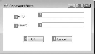
The ErrorProvider component discussed earlier makes this task significantly easier than it was in previous versions. To illustrate the use of an ErrorProvider in data validation, create a new Windows application project and change the Text property for the blank Form1 to Data Validation Demo. Then place two text boxes on the form that will hold a user ID and password, as shown in Figure 15-21.
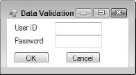
Name the first text box UserNameTextBox and name the second text box PasswordTextBox. Drag an ErrorProvider onto the form, which will cause it to appear in the component tray. In the next section, you'll add the code that simply verifies that the user has filled in both text boxes and gives a visual indication, via the ErrorProvider, if either of the fields has been left blank.
The Validating event fires when your control begins its validation. It is here that you need to place the code that validates your control, and set a visual indication for an error. Insert the following code to see this in action:
Private Sub UserNameTextBox_Validating(ByVal sender As Object, _
                            ByVal e As System.ComponentModel.CancelEventArgs) _
                            Handles UserNameTextBox.Validating
    If userNameTextbox.Text = "" Then
        ErrorProvider1.SetError(UserNameTextBox, "User Name cannot be blank")
    Else
        ErrorProvider1.SetError(UserNameTextBox, "")
    End If
End Sub
Private Sub PasswordTextBox_Validating(ByVal sender As Object, _
ByVal e As System.ComponentModel.CancelEventArgs) _
Handles PasswordTextBox.Validating
If passwordTextbox.Text = "" Then
ErrorProvider1.SetError(PasswordTextBox, "Password cannot be blank")
Else
ErrorProvider1.SetError(PasswordTextBox, "")
End If
End SubRun the program and then tab between the controls without entering any text to get the error message. You'll see an icon blink next to each of the text box controls; and if you hover over an error icon, you'll see the appropriate error message.
There is also a Validated event that fires after a control's Validating event. It can be used, for example, to do a final check after other events have manipulated the contents of the control.
The CausesValidation property determines whether the control will participate in the validation events on the form. A control with a CausesValidation setting of True (it is True by default) has two effects:
The control's
Validating/Validatedevents fire when appropriate.The control triggers the
Validating/Validatedevents for other controls.
It is important to understand that the validation events fire for a control not when the focus is lost but when the focus shifts to a control that has a CausesValidation value of True.
To see this effect, set the CausesValidation property of the password text box in your application to False (be sure to leave it True for the user ID and OK button). When you run the program, tab off the user ID text box and again to the OK button. Notice that it isn't until the focus reaches the OK button that the validating event of the user ID text box fires. Also notice that the validating event of the Password field never fires.
Ultimately, if you determine that the control is not valid, you need to specify what happens. That may include setting the focus to the control that needs attention (as well as indicating the error with an ErrorProvider).
As mentioned in the summary of new features in Windows Forms 2.0, the ToolStrip control replaces the Toolbar control from Windows Forms 1.0 and 1.1. ToolStrip has many improvements. It supports movement to sides of a form other than the place where it was laid out, and you have much more flexibility in placing items on the toolbar. It also integrates better with the IDE to assist in creating toolbars and manipulating the many settings available.
The ToolStrip does not sit alone on a form. When a ToolStrip is dragged onto a form, the container that actually sits on the form is called a RaftingContainer. This container handles the positioning so that the toolbar created by a ToolStrip can be dragged to other parts of the form.
The ToolStrip sits inside the RaftingContainer and is the container for toolbar elements. It handles the sizing of the toolbar, movement of toolbar elements, and other general toolbar functions.
The items on the toolbar must be from a set of controls specially designed to serve as toolbar items. All of these items inherit from the ToolStripItem base class. The controls available for toolbar items are as follows:
Control | Description |
|---|---|
| Replicates the functionality of a regular |
| Replicates the functionality of a regular |
| A visual toolbar element that displays a vertical bar to separate other groups of elements (no user interaction) |
| Replicates the functionality of a regular |
| Replicates the functionality of a regular |
| A hosting container for other controls that reside on a |
| A hosting container for toolbar elements that feature drop-down functionality. It can host a |
| A button that supports drop-down functionality. Clicking the button shows a list of options from which the user must select the one desired. This item is used when the user needs to select from a group of options, none of which is used a large majority of the time. |
| A combination of a regular button and a drop-down button. This item is often used when there is a frequently used option to click, but you also need to offer users other options that are less frequently used. |
| A selectable option displayed on a menu or context menu. This item is typically used with the menu controls that inherit from the |
Note that almost any control can be hosted on a toolbar using the ToolStripControlHost. However, for buttons, text boxes, labels, and combo boxes, it is much easier to use the ToolStrip version instead of the standard version.
Try an example to see how to build a toolbar using the ToolStrip control. Create a new Windows application. Add a ToolStrip control to the blank Form1 that is included with the new project. Make the form about twice its default width so that you have plenty of room to see the ToolStrip as you work on it.
The ToolStrip is positioned at the top of the form by default. It does not contain any elements, although if you highlight the ToolStrip control in the component tray, a "menu designer" will appear in the ToolStrip.
The easiest way to add multiple elements to the ToolStrip is to use the designer dialog for the ToolStrip. Highlight the ToolStrip in the component tray and click the button in the Properties window for the Items property. You'll see a designer dialog like the one shown in Figure 15-22.

The drop-down in the upper-left corner contains the different types of items that can be placed on the toolbar. The names in the drop-down are the same as the names in the table of controls except that the "Toolstrip" prefix is not present. Add one each of the following types, with the setting specified:
Button— Set theTextproperty toGo. Set theDisplayStyleproperty toText.ComboBox— Leave theTextproperty blank. SetDropDownStyletoDropDownList. Open the Items dialog and add the names of some colors.SplitButton— Set theTextproperty toOptions. Set the Display property toText.TextBox— Leave theTextproperty blank.
Click OK. The ToolStrip will look like the one shown in Figure 15-23.
You can now handle events on any of these toolbar elements the same way you would any other controls. You can double-click to get a Click event routine or access the event routines through the drop-downs in the Code Editor.
To make the Toolstrip more dynamic, it must be embedded in a ToolStripContainer. You can do that manually by dragging one over and putting the Toolstrip in it, but the easy way to do it is to click the smart tag on the Toolstrip and then select Embed in ToolStripContainer. This causes a ToolStripContainer to appear on your form. Set the Dock property for the ToolStripContainer to Fill and it will provide a surface for the Toolstrip that includes all four edges of the form.
Run your program. Using the mouse, grab the dotted handle on the far left edge of the toolbar. If you drag this to the right, then the toolbar will be repositioned. If you drag it to other positions on the form, then the entire toolbar will dock to different edges of the form.

By default, the AllowItemReorder property of the ToolStrip is set to False. If you change that to True, then the elements on the toolbar can be moved around in relation to one another (reordered) at runtime.
Change the AllowItemReorder property to True for the ToolStrip and run your program again. Hold down the Alt key and drag elements on the toolbar around. They will assume new positions on the toolbar when you drop them.
If you need a toolbar that has the typical visual elements for cut, copy, paste, and so on, it is not necessary to create the elements. The designer will do it for you.
Create a new form in your project and drag a ToolStrip onto it. As before, it will be positioned at the top and will not contain any elements. With the ToolStrip highlighted in the component tray, click the Item property. Below the properties in the Properties window, a link named Insert Standard Items will appear. Click that link; elements will be inserted into the ToolStrip, making it look like the one shown in Figure 15-24.
Menus are added to a form in Windows Forms 2.0 by dragging controls called MenuStrip or ContextMenuStrip onto your form. MenuStrip implements a standard Windows-style menu at the top of the form. ContextMenuStrip allows a pop-up menu with a right mouse button click.
These controls are actually subclasses of the ToolStrip, so much of the information you learned earlier in this chapter about working with the ToolStrip also applies to the MenuStrip and ContextMenuStrip. When dragged onto the form, these controls appear in the component tray just as the ToolStrip does, and you access the designer for these controls the same way you do for the ToolStrip. However, because these are menus, the most common way to add items is to type them directly into the menu designer that appears when the control is highlighted.
The menu designer is extremely intuitive — the menu appears on your form just as it would at runtime, and you simply fill in the menu items you need. Each item can be renamed, and each can have a Click event associated with it.
If your form's menu needs to have the standard top-level options (File, Edit, and so on) and the typical options under these items, then you can have all these usual options inserted for you automatically.
To see this capability in action, drag a MenuStrip to a form and then click the smart tag (the right arrow at the right edge) for the MenuStrip to bring up the designer dialog. Click the Insert Standard Items link at the bottom of the dialog.
Each menu item has an Image property. Setting this property to an image causes the image to appear on the left side of the text for the menu option. You can see this property in use by looking at the standard items inserted in the preceding example. The File
Items can also have check marks beside them. This is done by changing the Checked property of the item to True. You can do this at design time or runtime, enabling you to manipulate the check marks on menus as necessary.
To implement a context menu for a form or any control on a form, drag a ContextMenuStrip to the form and add the menu items. Items are added and changed the same way as they are with the MenuStrip.
To hook a context menu to a control, set the control's ContextMenuStrip property to the ContextMenuStrip menu control you want to use. Then, when your program runs and you right-click in the control, the context menu will pop up.
Menus can be adjusted at runtime using code. Context menus, for instance, may need to vary depending on the state of your form. The following walk-through shows how to add a new menu item to a context menu and how to clear the menu items.
Create a new Windows application. On the blank Form1 for the project, drag over a MenuStrip control. Using the menu designer, type in a top-level menu option of File. Under that option, type in options for Open and Save.
Now place a button on the form. Double-click the button to get its Click event, and place the following code into the event:
Dim NewItem As New ToolStripMenuItem
NewItem.Text = "Save As"
' Set any other properties of the menu item you like.
FileToolStripMenuItem.DropDownItems.Add(NewItem)
AddHandler NewItem.Click, _
     AddressOf Me.NewMenuItem_Click
Add the event handler referenced in this code at the bottom of the form's code:
Private Sub NewMenuItem_Click(ByVal sender As System.Object, _
                              ByVal e As System.EventArgs)
   MessageBox.Show("New menu item clicked!")
End Sub
If you now run the program and look at the menu, it will only have File and Save options. Clicking the button will cause a new Save As item to be added to the menu, and it will be hooked to the event routine called NewMenuItem_Click.
Windows Forms provides you with seven common dialog controls. Each control opens a predefined form that is identical to the one used by the operating system.
These dialogs cannot be shown modeless. They have a ShowDialog method to show them modally. That method returns one of the standard DialogResult values, as discussed earlier in this chapter.
These two controls open the standard dialog control that enables users to select files on the system. They are quite similar except for the buttons and labels that appear on the actual dialog box when it is shown to the user. Each prompts the user for a file on the system by allowing the user to browse the files and folders available.
Use the following properties to set up the dialog boxes:
The following code opens the standard dialog box, asking the user to select a file that currently exists on the system, and simply displays the choice in a message box upon return:
OpenFileDialog1.InitialDirectory = "C:"
OpenFileDialog1.Filter = "Text files|*.txt|All files|*.*"
OpenFileDialog1.FilterIndex = 1
OpenFileDialog1.RestoreDirectory = True
If OpenFileDialog1.ShowDialog() = Windows.Forms.DialogResult.OK Then
    MessageBox.Show("You selected """ & OpenFileDialog1.FileName & """")
End IfAs the name implies, this control gives the user a dialog box from which to select a color. Use the following properties to set up the dialog boxes as follows:
ColorDialog1.Color = TextBox1.BackColor
ColorDialog1.AllowFullOpen = True
If ColorDialog1.ShowDialog()= Windows.Forms.DialogResult.OK Then
    TextBox1.BackColor = ColorDialog1.Color
End If
Property | Comments |
|---|---|
| The |
Boolean value that, when | |
| Displays the dialog |
This control displays the standard dialog box, allowing a user to select a font. Use the following properties to set up the dialog boxes:
Property | Comments |
|---|---|
| The |
Boolean value that, when | |
Boolean value that, when | |
Boolean value that, when | |
| Displays the dialog |
Using these properties looks like this:
FontDialog1.Font = TextBox1.Font
FontDialog1.ShowColor = True
FontDialog1.ShowEffects = True
FontDialog1.FixedPitchOnly = False
If FontDialog1.ShowDialog()= Windows.Forms.DialogResult.OK Then
    TextBox1.Font = FontDialog1.Font
End IfImplementing a drag-and-drop operation in the .NET Framework is accomplished by a short sequence of events. Typically, it begins in a MouseDown event of one control, and always ends with the DragDrop event of another.
To demonstrate the process, begin with a new Windows application. Add two list boxes to your form, and add three items to the first using the Items Property Designer. This application enables you to drag the items from one list box into the other.
The first step in making drag and drop work is specifying whether or not a control will accept a drop. By default, all controls reject such an act and do not respond to any attempt by the user to drop something onto them. In this case, set the AllowDrop property of the second list box (the one without the items added) to True.
The next item of business is to invoke the drag-and-drop operation. This is typically done in the MouseDown event of the control containing the data you want to drag (although you're not restricted to it). The DoDragDrop method is used to start the operation. This method defines the data that will be dragged and the type of dragging that is allowed. Here, you'll drag the text of the selected list box item, and permit both a move and a copy of the data to occur.
Switch over to the code window of your form and add the following code to the MouseDown event of ListBox1:
Private Sub ListBox1_MouseDown(ByVal sender As Object, _
                              ByVal e As System.Windows.Forms.MouseEventArgs) _
                               Handles ListBox1.MouseDown
   Dim DragDropResult As DragDropEffects
   If e.Button = MouseButtons.Left Then
      DragDropResult = ListBox1.DoDragDrop( _
                    ListBox1.Items(ListBox1.SelectedIndex), _
                    DragDropEffects.Move Or DragDropEffects.Copy)
      ' Leave some room here to check the result of the operation
      ' (You'll fill it in next).
   End If
End Sub
Notice the comment about leaving room to check the result of the operation. You'll fill that in shortly. For now, calling the DoDragDrop method has gotten you started.
The next step involves the recipient of the data — in this case, ListBox2. Two events here are important to monitor: DragEnter and DragDrop.
As you can guess by the name, the DragEnter event occurs when the user first moves over the recipient control. The DragEnter event has a parameter of type DragEventArgs that contains an Effect property and a KeyState property.
The Effect property enables you to set the display of the drop icon for the user to indicate whether a move or a copy occurs when the mouse button is released. The KeyState property enables you to determine the state of the Ctrl, Alt, and Shift keys. It is a Windows standard that when both a move or a copy can occur, a user is to indicate the copy action by holding down the Ctrl key. Therefore, in this event, you check the KeyState property and use it to determine how to set the Effect property.
Add the following code to the DragEnter event of ListBox2:
Private Sub ListBox2_DragEnter(ByVal sender As Object, _
                               ByVal e As DragEventArgs) _
                               Handles ListBox2.DragOver
   If e.KeyState = 9 Then ' Control key
      e.Effect = DragDropEffects.Copy
   Else
      e.Effect = DragDropEffects.Move
   End If
End Sub
Note that you can also use the DragOver event if you want, but it will fire continuously as the mouse moves over the target control. In this situation, you only need to trap the initial entry of the mouse into the control.
The final step in the operation occurs when the user lets go of the mouse button to drop the data at its destination. This is captured by the DragDrop event. The parameter contains a property holding the data that is being dragged. It's now a simple process of placing it into the recipient control as follows:
Private Sub ListBox2_DragDrop(ByVal sender As Object, _
                              ByVal e As System.Windows.Forms.DragEventArgs) _
                              Handles ListBox2.DragDrop
   ListBox2.Items.Add(e.Data.GetData(DataFormats.Text))
End Sub
One last step: You can't forget to manipulate ListBox1 if the drag and drop was a move. Here's where you'll fill in the hole you left in the MouseDown event of ListBox1. Once the DragDrop has occurred, the initial call that invoked the procedure returns a result indicating what ultimately happened. Go back to the ListBox1_MouseDown event and enhance it to remove the item from Listbox1 if it was moved (and not simply copied):
Private Sub ListBox1_MouseDown(ByVal sender As Object, _
              ByVal e As System.Windows.Forms.MouseEventArgs) _
              Handles ListBox1.MouseDown
   Dim DragDropResult As DragDropEffects

   If e.Button = MouseButtons.Left Then
      DragDropResult = ListBox1.DoDragDrop( _
                    ListBox1.Items(ListBox1.SelectedIndex), _
                    DragDropEffects.Move Or DragDropEffects.Copy)
       ' If operation is a move (and not a copy), then remove then
       ' remove the item from the first list box.
       If DragDropResult = DragDropEffects.Move Then
         ListBox1.Items.RemoveAt(ListBox1.SelectedIndex)
       End If
    End If
End Sub
When you're done, run your application and drag the items from Listbox1 into Listbox2. Try a copy by holding down the Ctrl key when you do it. The screen shot in Figure 15-25 shows the result after Item1 has been moved and Item3 has been copied a few times.
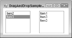
Windows Forms, of course, contains most of the controls that you are accustomed to using in pre-.NET versions of Visual Basic. This section lists the basic controls that are generally quite intuitive and don't warrant a full example to explain. Where appropriate, the important differences from pre-.NET versions of Visual Basic are noted.
Can now display both an icon and text simultaneously. The image is set using the
Imageproperty (instead ofPicture). The image position can be set using theImageAlignproperty (left, right, center, and so on).Text on the button can be aligned using the
TextAlignproperty.Can now have different appearances using the
FlatStylepropertyNo longer has the
DefaultandCancelproperties. These are now managed by the form itself using theAcceptButtonandCancelButtonproperties.
Now uses the
Textproperty instead ofCaptionCan now appear as a toggle button using the
AppearancepropertyCheck box and text can now be positioned within the defined area using the
CheckAlignandTextAlignpropertiesUses the
CheckStateproperty instead ofValueHas a
FlatStyleproperty controlling the appearance of the check box
A list box that has check boxes beside each item (see
Listbox)
Like the new
ListBoxcontrol, it can now hold a collection of objects instead of an array of strings (seeListBox).Now has a
MaxDropDownItemsproperty that specifies how many items to display when the list opens
Formerly known as a
DTPickerin VB6 and earlier
A simple one-line version of a list box
Can hold a collection of objects and will display the
ToStringresult of an item in the collectionCan wrap around the list to give a continuous scrolling effect using the
Wrapproperty
Unchanged
Same as previous versions, but with an improved window for managing the images within the list. The
MaskColorproperty is nowTransparentColor.
Essentially the same as previous versions
Can now display an image and text
Has automatic sizing capability. Set the
AutoSizeproperty toTruefor automatic horizontal sizing (this is the default value of the property).The
TextAlignproperty is especially useful. The text of a label beside a text box in VB6 would always be a few pixels higher than the text in the text box. Now, by setting the label'sTextAlignproperty so that the vertical alignment isMiddle, this problem is solved.Can now specify whether a mnemonic should be interpreted (if
UseMnemonicisTrue, then the first ampersand (&) in theTextproperty specifies underlining the following character and having it react to the Alt key shortcut, placing the focus on the next control in the tab order that can hold focus, such as a text box).
Identical to a label, but behaves like a hyperlink with extra properties, such as
LinkBehavior(for example,HoverUnderline),LinkColor, andActiveLinkColor
A list box can now hold a collection of objects, instead of an array of strings. Use the
DisplayMemberproperty to specify what property of the objects to display in the list, and theValueMemberproperty to specify what property of the objects to use as the values of the list items. (This is similar to theItemDataarray from previous versions.) For example, a combo box could store a collection of employee objects, and display to the user theNameproperty of each, as well as retrieve theEmployeeIdas the value of the item currently selected.Can no longer be set to display check boxes using a
Styleproperty. Use theCheckedListBoxcontrol instead.
Same functionality as the VB6 version but with an improved Property Editor that enables you to define the list view item collection and its sub-items at design time
Sub-items can have their own font display properties.
New
HeaderStyleproperty instead ofHideColumnHeaders
Gives a form an icon in the system tray
Tooltip of the icon is set by the
Textproperty of the controlPop-up menus are set using a
ContextMenucontrol (see the "Menus" section earlier in chapter).
A single-line text box that displays a number and up/down buttons that increment/decrement the number when clicked
Now has a
Stepmethod that automatically increments the value of the progress bar by the amount defined in theStepproperty
Now has a
TabPagescollection ofTabPageobjects. ATabPageobject is a subclass of thePanelcontrol specialized for use in theTabControl.Uses the
Appearanceproperty to display the tabs as buttons, if desired (formerly theStyleproperty of theTabStripcontrol)
TextBoxThis is essentially unchanged from previous versions.
The timer is now disabled by default.
You cannot set the interval to zero to disable it.
Formerly known as the
Slidercontrol in VB6, it is essentially unchanged.
Same functionality as in VB6 but with a new Node Tree Editor that enables you to visually design the tree
Unchanged
The following list outlines the controls from VB6 that you won't find in Windows Forms and how to reproduce their functionality:
Use the
DomainUpDownorNumericUpDowncontrol.
Windows Forms has no
LineorShapecontrol, nor any immediate equivalent. A "cheap" way of reproducing a horizontal or vertical line is to use a label control. Set its background color to that of the line you want, and then set either theSize.HeightorSize.Widthvalue to 1.Diagonal lines and shapes must be drawn using GDI+ graphics methods.
DirListBox, FileListBox, DriveListBoxYou would typically use these controls to create a file system browser similar to Windows Explorer. Windows Forms has no equivalent controls. You can use the
OpenFileDialogandSaveFileDialog(see the previous section) to meet your needs in most circumstances.
Occasionally it is necessary for a set of controls to be treated as a group. For example, a set of RadioButton controls might be related, and you might want to channel the Click event for all the controls in the group to the same event handler.
In VB6 and earlier, that functionality required a control array, but Windows Forms 2.0 does not support control arrays. However, .NET offers greatly enhanced control over event handling, and it's easy to route events from multiple controls to a single handler.
To have a single method handle multiple events from controls, you must attach those controls' events to the handler. You can do that with multiple controls specified in a Handles clause or by using AddHandler for each control. Unless controls are being added to your form on-the-fly, using additional controls in the Handles clause is usually preferable. Here is an example of a declaration for a Click event that handles three RadioButton controls:
Private Sub RadioButton3_Click(ByVal sender As Object, _
          ByVal e As EventArgs) _
          Handles RadioButton1.Click, _
          RadioButton2.Click, RadioButton3.Click
There is no Index property as in old-style control arrays in VB6. Instead, simply use the Sender parameter of the event handler to determine which control originated the event.
A simple example is helpful to see how to set this up. Create a new Windows application and set the Text property of the blank Form1 to Add Dynamic Control Demo. Then add two buttons to the form, as shown in Figure 15-26.
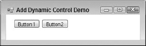
Double-click Button1 to switch over to the code that handles the Button1.Click event. To make this method respond to the Button2.Click event as well, simply add the Button2.Click event handler to the end of the Handles list, and then add some simple code to display a message box indicating what button triggered the event:
' Note the change in the method name from Button1_Click. Since
' two objects are hooked up, it's a good idea to avoid having the
' method specifically named to a single object.
Private Sub Button_Click(ByVal sender As System.Object, _
                 ByVal e As System.EventArgs) _
         Handles Button1.Click, Button2.Click
   Dim buttonClicked As Button
   buttonClicked = CType(sender, Button)
   ' Tell the world what button was clicked
   MessageBox.Show("You clicked " & buttonClicked.Text)
End Sub
Run the program and click the two buttons. Each one will trigger the event and display a message box with the appropriate text from the button that was clicked.
Another capability that control arrays provided in VB6 and earlier was making it easy to add controls to a form at runtime. That's also easy to do in Windows Forms, even without control arrays. Here is an example that enhances the preceding program to add a third button dynamically at runtime. Add another button to your form that will trigger the addition of Button3, as shown in Figure 15-27.

Name the new button AddNewButton and add the following code to handle its Click event:
Private Sub AddNewButton_Click(ByVal sender As System.Object, _
                    ByVal e As System.EventArgs) _
                    Handles addNewButton.Click

    Dim newButton As Button

    ' Create the new control
    newButton = New Button()

    ' Set it up on the form
    newButton.Location = New System.Drawing.Point(184, 12)
    newButton.Size = New System.Drawing.Size(75, 23)
    newButton.Text = "Button3"

    ' Add it to the form's controls collection
    Me.Controls.Add(newButton)

    ' Hook up the event handler.
    AddHandler newButton.Click, AddressOf Me.Button_Click
End  Sub
When the AddNewButton button is clicked, the code creates a new button, sets its size and position, and then does two essential things. First, it adds the button to the form's controls collection; second, it connects the Click event of the button to the method that handles it.
With this done, run the program and click the AddNewButton button. Button3 will appear. Then, simply click Button3 to prove that the Click event is being handled. You should get the result shown in Figure 15-28.
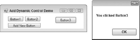
Here are some other handy programming tips for using Windows Forms:
Switch the focus to a control — Use the .
Focusmethod. To set the focus toTextBox1, for example, use the following code:TextBox1.Focus()
Quickly determine the container control or parent form — With the use of group boxes and panels, controls are often contained many times. You can now use the
FindFormmethod to immediately get a reference to the form. Use theGetContainerControlmethod to access the immediate parent of a control.Traverse the tab order — Use the
GetNextControlmethod of any control to get a reference to the next control on the form in the tab order.Convert client coordinates to screen coordinates (and back) — Want to know where a control is in screen coordinates? Use the
PointToScreenmethod. Convert back using thePointToClientmethod.Change the z-order of controls at runtime — Controls now have both
BringToFrontandSendToBackmethods.Locate the mouse pointer — The
controlclass now exposes aMousePositionproperty that returns the location of the mouse in screen coordinates.Manage child controls — Container controls, such as a group box or panel, can use the
HasChildrenproperty andControlscollection to determine the existence of, and direct references to, child controls, respectively.Maximize, minimize, or restore a form — Use the form's
WindowStateproperty.
Windows Forms is still an excellent technology for the development of rich client and smart client interfaces. While Windows Presentation Foundation will experience more innovation in coming generations of the .NET platform, at present it's significantly easier to develop on Windows Forms. The maturity of the designer and control set in Windows Forms makes it a good choice for many client-based applications, and Windows Forms will be supported indefinitely on the .NET platform.
Becoming a capable Windows Forms developer requires becoming familiar with the controls that are available, including their properties, events, and methods. This takes time. If you are inexperienced with form-based interfaces, you can expend a fair amount of time using the reference documentation to find the control capabilities you need. However, that investment is worthwhile, both because it allows you to be a proficient Windows Forms developer and also because many of the concepts will carry over into WPF.
Many professional Windows Forms developers need to go beyond just creating forms and laying out controls. Complex applications often also require creating new controls or enhancing built-in controls. Accordingly, the next chapter discusses how to create and modify Windows Forms controls, along with some additional advanced Windows Forms topics.