Windows Presentation Foundation (WPF) — previously known as Avalon — is the next-generation presentation library and development paradigm for user interfaces. It was introduced with Windows Vista as a key architectural component in the .NET 3.0 Framework. This chapter introduces you to the WPF programming model and discusses key elements you'll need to know in order to work with WPF. Rest assured you will be creating applications that leverage the features of WPF in the future. Visual Studio introduces a fully enabled development environment for creating and customizing WPF-based applications.
The libraries that make up WPF were released in conjunction with the release of Windows Vista — not the commercial and much-publicized public launch of Vista in January 2007, but the initial release of Vista to enterprise partners in November 2006. The libraries shipped with Vista and coincidentally with Microsoft Office 2007, but what you may or may not have noticed at the time was the lack of development tools.
However, with Visual Studio 2008, not only are there tools for the .NET 3.5 libraries, but also tools for all of the .NET 3.0 libraries. Additionally, Microsoft released the Expression suite of tools, in particular Blend, which you'll also need if you are going to create custom WPF applications.
This chapter covers several key areas, including the following:
The WPF strategy
Why you should use WPF
Creating a WPF application
XAML
Implementing a custom WPF application
Customizing the user interface
Using Blend for custom graphics and behavior
This chapter introduces a basic WPF application and then focuses on the underlying XAML that's used to declare WPF and other applications. Then it picks up with a custom WPF Windows framework application that you can leverage. The goal is to introduce you to WPF in a manner that should be familiar to Windows Forms developers and then expand on what additional items WPF brings to the equation. This chapter will not make you an expert WPF developer — WPF is too large a topic to fully cover in a single chapter — but it does provide a good starting place.
When .NET was released, most people realized that in terms of application development, a paradigm shift was occurring. The release of WPF was the first step in yet another paradigm shift, this one focusing on how user interfaces are designed and implemented. Therefore, it's appropriate to take a little time to look at not only where the user interface models are coming from, but also where they are going. Understanding that will enable you to see how WPF fits in, and not only why you'll want WPF in the future, but also how you can start leveraging it today.
The original user interfaces were punch cards for input and hard copy text for output. OK, maybe that's going a little too far back. Instead, let's jump ahead to the part of the user interface's resume that applies to where we're going today. The 1980s through 1990s saw several computer and software manufacturers introduce the graphical user interface (GUI). These GUI environments, while implemented differently on different platforms, became a part of the operating system. For Windows, this is the User32.dll and its companion UI classes. The original Visual Basic 1.0 was designed to enable developers to interact in a simple manner with these files, unlike C++, which referenced the raw User32.dll interfaces for everything.
Over time, Visual Basic's simple drag-and-drop approach to creating the forms users would access as part of an application in that GUI environment helped make it the most popular development language. However, with Web migrations, the paradigm started to shift. The Web introduced its own way of creating forms — one that used HTML. The HTML model is more declarative and doesn't guarantee the behavior of the components in the user interface. For example, the HTML page may declare it wants a text box, but it's up to the browser to interpret and provide the code that creates the actual object. The HTML control model is supported on Windows by Internet Explorer and by third-party tools such as Firefox and Netscape.
.NET ushered in the next stage of client UI implementation with ASP.NET and Windows Forms. Changing the UI model wasn't a primary focus of .NET; .NET introduced new tools for the UI. .NET shipped with two user-interface implementations: ASP.NET's HTML-based UI and the desktop-centric Windows Forms. It's important to realize that Windows Forms isn't based on the same code that User32 windows are, even though the programming model whereby the designer adds the code to a portion of the application's source is similar. The managed environment represents both the second and third programming models for developing user interfaces under Windows. Of course, other platforms include still other GUI models, but these three GUI models — User32.dll, ASP.NET, and Windows Forms — represent the ones Microsoft supported as of .NET 2.0.
Thus, Microsoft was left repeating many user-interface controls with three distinct implementations, a cost noticeable to even an organization as large as Microsoft. For developers, including those at Microsoft, the pain starts with the fact that a user interface can't be transported seamlessly between a Web-based version of an application and a local desktop version of the same application, or across platforms. For example, Microsoft can't design a UI for Outlook and reuse it for Outlook Web Access (OWA). Instead, it needs a different team of developers with different skills to create the OWA interface, and have you seen a remotely downloadable Windows Forms-based OWA application?
Let's face it: There wasn't much economic incentive to create both a Windows Forms-based and ASP.NET-based user interface for the same application. Until such a task is almost painless, people will continue to select an environment and then build their application targeting that model. In some cases where an application is successful, a follow-up task may be to attempt to reproduce the user interface for another target UI, but that is the exception, not the rule. Thus, while there are several options for creating a user interface, they represent "either-or" decisions.
This is where the WPF model comes in. WPF is a more declarative way of designing interfaces. The idea is that you can use a declaration to describe your user interface and then compile or include that definition with either a desktop or Web or even another operating system version of your application. WPF uses XML to declare the user-interface elements, relying on a standard known as the Extensible Application Markup Language (XAML). This standard is pronounced "zamel" (rhymes with camel). It enables you to layer elements and include elements such as colors and 3-D shapes.
XAML goes well beyond what you normally expect to find in an HTML UI, yet at the same time the format should feel somewhat familiar to those who know HTML and/or XML. As for the implementation of code to interpret XAML UI declarations, Microsoft introduced the components that make up WPF with the release of Vista.
Currently, when you create a Windows Forms control you decide how large, in pixels, that button should be. A similar action is taken with regard to HTML forms, where you can specify either a size in pixels or a percentage of the screen. In both cases, the computer simply lays out a square or rounded square based on a flat set of pixels. It does the same with other images you use, working with what are known as raster graphics. Raster graphics are a collection of points on the surface of a screen that represent an image.
The alternative form of graphics is known as vector graphics. A vector is a line with a point of origin that continues forward in space from that point of origin. Vector graphics aren't based on a collection of points, but rather on a series of vectors. A plane representing the surface of your screen is placed in the path of these vectors, which define a set of points, and that is what you see on your screen. Vector graphics provide much better and more realistic image manipulation. Note that while you can incorporate a raster image with vector graphics, because you can place the raster image in your virtual plane, the reverse isn't feasible.
WPF is the first forms-based engine that relies on this vector-based model. The good news is that you can create user interfaces that truly look fantastic. The bad news is that you need to account for the fact that computing a series of vectors and the plane that intersects those vectors requires more CPU or Graphical Processing Unit (GPU) cycles. Thus, like the Vista UI, all WPF user interfaces require a bit more computing horsepower. However, unlike Vista, for which certain graphical features are disabled if your computer doesn't natively have that horsepower, for WPF that isn't the case. Because WPF is compatible with Windows XP, it isn't limited to those scenarios in which a powerful GPU is available to offload that processing. After all, Windows Vista was the first operating system to support leveraging the GPU, so system performance only degrades when you run a WPF application on Windows XP or an older computer that isn't able to support something such as the Glass display settings.
However, those concerns aside, one of the main appeals of the WPF model is the graphical capabilities. Built around raster graphics and enhanced GPU processor support, WPF enables a much more appealing user interface. You can hide the native Windows frame, as you'll see later in this chapter, make round buttons, and essentially begin to create a truly custom user interface, one that in an artistically designed application has the user saying "wow" in a truly memorable experience.
Microsoft will, of course, need to support all its previous GUI models in addition to WPF for the foreseeable future. However, Microsoft is motivated by the same aspects the rest of us can leverage — better graphics and the idea that a single application can have a UI that runs in multiple environments. Accordingly, Microsoft announced that enhancements to the .NET-based Windows Forms class libraries would not be occurring. While this UI model would receive maintenance and security-related updates, there would be no future new development on that set of libraries.
Does this mean you should automatically plan on moving to WPF for your next Windows application? Well, that depends on several factors. If you want to target a desktop that isn't running Windows XP or Windows Vista, then you can't use WPF. In addition, as noted earlier regarding the change related to graphics, if you don't want to see a performance drop for clients running operating systems such as Windows XP or Windows Server 2003, then you again need to target Windows Forms instead of WPF. Moreover, unlike Windows Forms — which has a mature control set, including items such as DataGridView, Timers, ErrorProvider, and common dialog controls — the WPF control gallery is still in its first release. The array of controls added since the original release of .NET 3.0 with the release of Visual Studio 2008 is rather impressive, but you may still find yourself returning to these standard dialogs or to the WindowsFormsHost control to encapsulate a Windows Forms user control.
You'll also see in this chapter that many of the really cool graphic capabilities that WPF provides come at the cost of limited behavior support. Thus, a simple setting such as Transparency expects you to provide a lot of manual code to implement standard Windows behavior. Additionally, in order to achieve a fancy design, you'll need — not want, but need — a XAML generation tool such as Microsoft Blend. Complex graphics are still complex, and a tool is required to create these items. The Blend tool, although available to developers, is really focused on graphic designers and doesn't provide a Visual Studio look and feel.
Overall, unless you are looking to leverage high-end graphics, you may find that even though WPF is the UI model of the future, the next version of your application is best served by using Windows Forms and perhaps leveraging the WPF interop libraries described in Chapter 18. However, this chapter is going to help you get started with WPF so that you can continue to work toward this next-generation application interface, which is based on a powerful graphic engine and includes built-in multimedia support.
The previous edition of this book, Professional Visual Basic 2005 with .NET 3.0, focused on going through the manual steps of creating a basic WPF application and manually updating the build file to create that application. These steps were appropriate because at the time WPF didn't have a native IDE and code-generation toolset. Most early WPF applications were built by hand or with minor conversation tools that could output graphics as XAML. With the release of Visual Studio 2008, WPF, like the other .NET 3.0 technologies, gained a true IDE and, with the availability of Blend, a powerful design tool. The focus is now on creating applications with Visual Studio 2008 and then customizing the design surface with Blend.
Be aware that while working in Blend it is very easy to spend a lot of time adjusting colors or fades, or adding simple animations. This can chew up an application development budget in nothing flat. In addition, it is possible to create design elements in Blend that are, unfortunately, incompatible or difficult to manipulate once you are trying to hook that design into your application logic. Accordingly, it is recommended that you define the initial application layout and then get the application operational. Only after you have completed the business integration and gotten the control elements working as required should you return to the design surface to provide complex graphics and behavior on top of your application.
Thus, the next step is to use Visual Studio to generate your WPF application and then go from a basic application into Blend to enhance graphic support. This application will go through three phases in this chapter, so three different projects are associated with it. For now we will create the first project, after which we transition to either the _Step_2 or _Step_3 version of the sample project. In each case, the project will contain the completed code for that portion of the project, but because this code is going to transform rather dramatically over the course of the chapter, this format provides you with a series of check points while going through this chapter yourself.
Begin by using the File menu in Visual Studio 2008 and select the option to create a new project. Navigate to the new Visual Basic Window section of the New Project dialog, as shown in Figure 17-1.
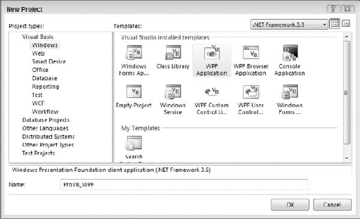
For the purposes of this chapter you can create a .NET 3.5 application called ProVB_WPF. This application could also be created as a .NET 3.0 application, but in that case we wouldn't have access to .NET 3.5 features such as LINQ. Additionally, note that the list of available templates for WPF applications disappears if you choose to target a .NET 2.0 baseline.
Similar to other project templates, Visual Studio opens in the main window you've just declared, but unlike Windows Forms, this isn't just a design surface. The first thing to notice is that there isn't a line of VB code in this project, just a few XAML snippets. As shown in Figure 17-2, the default application does not look entirely different from that of a Windows Form, except when it comes to the design surface. In Windows Forms, the design surface generates code that is placed in the myWindow.Designer.vb file. The generated file *.designer.vb is a partial class definition that Visual Studio uses to hold the definition of each control you place onto the form, as well as the form itself.
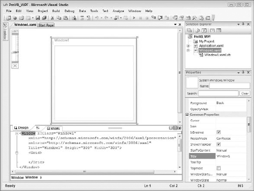
However, with WPF and XAML, that partial class definition is instead a collection of XML declarations that define your window and its behavior. More important, although parts may be generated, that XAML file isn't considered generated code; instead, it is a fully editable definition, and as such is available in the same display as the graphical representation of your display. You'll find that as you work with your design surface, Visual Studio 2008 automatically updates the XAML file; and similarly when you edit the XAML file, Visual Studio 2008 automatically updates the design surface.
The design surface shown in Figure 17-2 has several features specific to WPF. The first you'll find in the upper left-hand corner as you look at the screen. That scrollbar enables you to zoom in on a specific portion of your interface. You can choose to limit your view to just a portion of the overall window by zooming in for a closer look at how elements are aligned. Alternatively, you can "back" away from your overall window to look at the entire display, even when that design is larger then the design area available on your screen.
The second item to note about the display relates to the relationship between the currently top design surface in the display and the XAML tab located below it. Between these two tabs, in the middle of the screen, is a pair of up and down arrows. These arrows aren't just there for decoration to indicate that these two surfaces are related, but rather to swap the location of each of these two surfaces. Thus, if you are working with the XAML and directly making changes to it, you can shift that to the top of the display and reduce the graphical display.
However, having the code located above or below your design surface may not be your preferred display. That's where the three little icons located on the tab bar come in. The first two are a vertical line and a horizontal line, respectively. These buttons indicate that you can choose to place the XAML code and the design surface in a side-by-side display mode or in a top-bottom design mode, respectively. The third button, which shows double down arrows, enables you to collapse the combined display so that the tabs are along the bottom or the right side of the design display. Thus, if you prefer to maximize the available display surface, you can create a display similar to what you have when editing ASP.NET Web pages.
Of course, you are probably wondering about the XAML that is shown in Figure 17-2 and that defines your main window. This is one of two XAML files that are generated with your project. This XAML file has a top-level node of Window that tells the compiler that it defines a window. The top-level node ties this window to the class Window1, which matches the default filename, as shown in the following code:
<Window x:Class="Window1"
    xmlns="http://schemas.microsoft.com/winfx/2006/xaml/presentation"
    xmlns:x="http://schemas.microsoft.com/winfx/2006/xaml"
    Title="Window1" Height="300" Width="300">
    <Grid>

    </Grid>
</Window>
Because the XML namespace declarations are shared between this file and the second XAML file, let's jump to the remaining attributes of the window. By default, the window is given a title that matches the class same, as in Windows Forms, and the default size is a Height of 300 and a Width of 300. In addition to these attributes, the Window node that declares the actual main window contains a single control, a grid. The grid is the default control in the window because it provides developers with the most consistent design experience from Windows Forms.
Next, let's review the second XAML file, application.xaml. This file contains the application definition. Like your Visual Basic Windows Forms code, the Application object represents the application to the CLR. It is this object that represents the base reference for things such as garbage collection, and it is registered as the primary process. Because the Application object is implemented as an object in the System.Windows namespace, it supports properties, methods, and events just like any other class. The contents of application.xaml are shown in the following:
<Application x:Class="Application"
    xmlns="http://schemas.microsoft.com/winfx/2006/xaml/presentation"
    xmlns:x="http://schemas.microsoft.com/winfx/2006/xaml"
    StartupUri="Window1.xaml">
    <Application.Resources>

    </Application.Resources>
</Application>
This file is a good place to take a moment to discuss the basics of XAML. As you can see, this file starts with a reference to an x:Class declaration as an attribute of the Application node. The x: represents an alias similar to what you find in Visual Basic, where the x: indicates that Class is defined in the schema http://schemas.microsoft.com/winfx/2006/xaml, the XAML schema. You'll notice there is a second declaration for http://schemas.microsoft.com/winfx/2006/xaml/presentation. This second declaration is the one that references the actual WPF libraries. The last item in the attributes of the Application node is a StartupUri. This property tells the compiler that when this application is started, the next step is to open the file Window1.xaml in order to find the definition of the window to be displayed.
Similar to a traditional Windows Forms application, the application doesn't actually define a window; instead, it defines the application context, and then it calls another class to create the window. However, this file is a great place to add XAML resources that will apply across your application. Resources refers to the fact that in WPF it is possible to declare the color, shape, and behavior (in terms of hover over, mouse down, etc.) of your controls. Placing these XAML declarations in the Application.Resources section of the application definition is a natural way to share them across all of that type of control in your application. However, before continuing with this discussion of shared resources, it's important to understand XAML itself so that you'll have a better understanding of the XML node declarations.
The ProVB_WPF example doesn't have much purpose yet, but it makes it easier to keep the discussion of XAML in context. The next step is to take a more detailed look at just what XAML is and how it relates to WPF. XAML is a markup-based protocol. Similar to SOAP and several other XML-based formats, the XAML specification describes a potentially open standard for describing user-interface elements. WPF is Microsoft's implementation of this standard. Currently, XAML isn't an open standard and it's unknown whether XAML will ever be a true open standard. However, the .NET implementation separates the definition of the XAML elements from the implementation of WPF, which means that creating an open standard is a possibility for XAML.
Regardless of whether XAML ever actually becomes an open standard, Microsoft has implemented WPF using a minimum of two XML namespaces. As noted in the application.xaml file, one namespace is focused on the definition of XAML, and the second is focused on WPF's custom classes. Returning to the ProVB_WPF Application.xaml file, the following namespace declaration is included:
xmlns="http://schemas.microsoft.com/winfx/2006/xaml/presentation"
The preceding line is similar to an Imports statement for XML in that it indicates a set of nodes and keywords that will be used within the associated XML file. In this case, the winfx/2006/xaml/presentation namespace contains the definition of WPF — not the definition of XAML keywords, but rather the definition of WPF, which is why you see statements such as Application.Window in that XML. The classes contained in the presentation namespace are the .NET implementation of WPF. The XAML file contains declarations referencing these classes, either as part of the XAML standard or as part of WPF. To start working with commands and controls that are part of the XAML standard, a second namespace reference is needed:
xmlns:x=http://schemas.microsoft.com/winfx/2006/xaml
This second reference is used throughout all XAML files to declare the actual XAML language standard. By convention, it is aliased as x:. For those of you who may not have done much XML development, this means that within the XAML you'll see things such as x:Class, x:Code, and other similar nodes. The x: is required to indicate that what follows is an element of the XAML languages, as opposed to, for example, WPF or some other .NET library. The x: nodes are the actual XAML declarations. What is important to remember is that the XAML namespace can be and is used for things other than just WPF. As you'll see in Chapter 27, Windows Workflow Foundation is based on XAML; it has its own /workflows namespace.
XAML is defined as a language consisting of a collection of elements, attributes, and related objects. These objects are referenced from the XAML namespace, which by convention precedes each class with an x :. .NET extends and maps these declarative structures into .NET.
Before getting to the syntax, take a look at the three categories of XML statement you will find within the XAML namespace: attribute, markup extension, and XAML directive. Each is a separate category of language element.
Within XML, attributes refer to named properties that are associated with a given XML node. Thus, the XML node object might have several attributes such as ID, Name, Text, and so on associated with it. These attributes in XML live within the definition of the XML node. They are not contained within the XML node but its definition, as shown here:
<object id="myObject"></object>
Within XAML, the list of attributes includes those in the following table. Be aware that the term "object" in the following snippets can be replaced with one of several WPF objects, including Application, Window, Button, Brush, and so on:
Notice that none of the preceding attributes are actually referenced as a node within XML. Instead, they modify the properties associated with a node. Thus, the attributes are modifiers, as opposed to the next category of elements: markup extensions. As implied by the word "extensible" in the name Extensible XML, one of the features of this model is that the format allows for the definition of extensions. These extensions expand on the base elements associated with that markup definition. XAML includes a limited number of such extensions. Unlike an attribute, a markup extension can be used to create an XML node or a collection of XML attributes. When used to create a node, the markup extension allows for the definition of property values within this node. When used to allow for the creation of a collection of attributes, it can be recognized by the surrounding curly braces, as shown in the preceding TypeArguments definition. Markup extensions for XAML are shown in the following table:
XAML Markup Extension | Description and Example |
|---|---|
Used to provide support for arrays. The array declaration allows for the assignment of a data type, to support strong typing and the inclusion of a series of elements. | |
Nothing in Visual Basic, but the extension is implemented based on the C#/C++ keyword of | |
Supports the reference of constant values, shared properties of objects, and enumeration values. Similar to an attribute, it is most commonly used as an attribute with the format | |
As previously introduced with the |
Don't let that last extension confuse you; there are two ways that markup extensions are used — either as attributes contained within curly braces or as nodes that may contain their own attributes and properties. Some, such as x:Static, always appear as attributes; others, such as x:Null and x:Array, always appear as nodes; and of course x:Type can be found in either location. Up until now, all the XAML language elements have been used to operate within the definition of XML. That is, they define attributes and nodes, and as long as you understand the definition of the keyword, you can understand the data it references.
However, at times you need to truly reference data. For example, none of the preceding extensions would support embedding other XML data into your XAML file or referencing code directly from within your XAML file. These two capabilities are available based on XAML directives. XAML directives enable you to embed elements that don't follow the XML formatting rules. There are two such directives:
XAML Directive | Description and Example |
|---|---|
Enables you to embed Visual Basic code directly into your XAML file. However, although you can do it, you shouldn't: It's considered a very poor coding practice — not only because it isolates code outside of a code-behind file, but also because such code makes the XAML dependent on a language for compilation, and is isolated and more difficult to debug and maintain. However, you may come across such an element. In general, it is considered best to further nest any embedded code within an | |
The second item that isn't standard XAML that you might want to embed within your XAML document is another XML document. For example, you might want to display an e-mail message or a Word document that has been converted to XML, so you might want this data to be within your XAML document. The key point is that you don't want this additional XML to accidentally use the same tag information associated with your XAML. Thus, you need to provide an |
As you can see, the scope of the XML definition for what you're going to see within a XAML file is not that complex. You're probably wondering where all the controls, windows, and even the application object that we've already seen in action are. These items, while defined as part of the WPF implementation, are not part of the core XAML language definition. They are the WPF extensions, and the reason why you added a second namespace reference to the Presentation folder. Everything else you see in XAML that falls into this second category is also available for reference from your .NET application, so let's take a look at the integration of XAML and Visual Basic.
It is possible to do much of your WPF programming using XAML, but the next step is to examine how XAML can be integrated with code. After all, at some point you probably expect to start seeing some Visual Basic code again. Until now the ProVB_WPF sample has been a pure XAML application, so first we will make a quick plan for what this application will do and then we will create a first-cut implementation. For demonstration purposes, we will create a simple photo-viewing application. The user should be able to select a folder containing one or more images and then view those images, moving forward and backward through the list.
For now, that will be the limit of the requirements; later, after the basic application is operational, you can expand the scope to customize the look and feel further. Begin by modifying the "empty" window. Of course, it's not really empty. The window actually has a grid within it, so you can start with that and create three sections. After selecting the grid, hover over the left-hand border of your window. You'll see a point appear within the border that sends a guide line horizontally across the window. Select a point about 40 pixels from the top and a second point around 40 pixels from the bottom, dividing your grid into three sections.
Don't worry about being exactly on 40, because after you've selected your two points you are going to switch to the XAML view. Now, instead of the previous default display, you have code similar to what appears in the following block:
<Window x:Class="Window1"
    xmlns="http://schemas.microsoft.com/winfx/2006/xaml/presentation"
    xmlns:x="http://schemas.microsoft.com/winfx/2006/xaml"
Title="ProVB_WPF" Height="335" Width="415" Name="MainWindow">
<Grid>
<Grid.RowDefinitions>
<RowDefinition Height="45" />
<RowDefinition Height="215*" />
<RowDefinition Height="40" />
</Grid.RowDefinitions>
</Grid>
</Window>This may look familiar because the preceding code includes a few edits that you can reproduce at this point. Note that the title of the window has been modified to match the project name. On this same line, you can see that the default size of the window has changed, and that the name of this instance of the Window1 class is now MainWindow. These are relatively minor in comparison to the newly added lines in this file.
The XAML now includes a new section related to the Grid.RowDefinitions. This section contains the specification of sections within the points in the grid. When you selxected those points in the designer, you were defining these sections. The default syntax associated with the height of each section is the number of pixels followed by an asterisk. The asterisk indicates that when the window is resized, this row should also resize. For this application, only the center section should resize, so the asterisk has been removed from the top and bottom row definitions.
This provides a set of defined regions that can be used to align controls within this form. Thus, the next step is to add some controls to the form and create a basic user interface. In this scenario, the actions should be very familiar to any developer who has worked with either Windows Forms or ASP.NET forms.
WPF provides an entirely different set of libraries for developing applications. However, although these controls exist in a different library, how you interact with them from Visual Basic is generally the same. Each control has a set of properties, events, and methods that you can leverage. The XAML file may assign these values in the declarative format of XML, but you can still reference the same properties on the instances of the objects that the framework creates within your Visual Basic code.
Starting with the top section, drag the following from the Toolbox onto the form: a label, a text box, and a button control. These can be aligned into this region in the same order they were added. Ensure that the label is bound to the left side and top of the window, while the button is bound to the right side and top of the window. Meanwhile, the text box should be bound to the top and both sides of the window so that as the window is stretched, the width of the text box increases. The resulting XAML should be similar to this:
<Window x:Class="Window1"
  xmlns="http://schemas.microsoft.com/winfx/2006/xaml/presentation"
  xmlns:x="http://schemas.microsoft.com/winfx/2006/xaml"
    Title="ProVB_WPF" Height="335" Width="415" Name="MainWindow">
    <Grid>
        <Grid.RowDefinitions>
            <RowDefinition Height="45" />
<RowDefinition Height="215*" />
<RowDefinition Height="40" />
</Grid.RowDefinitions>
<Label Margin="0,11,0,0" Name="Label1" HorizontalAlignment="Left" Width="80"
Height="23" VerticalAlignment="Top">Image Path:</Label>
<TextBox Margin="81,13,92,0" Name="TextBox1" Height="21"
VerticalAlignment="Top" />
<Button HorizontalAlignment="Right" Margin="0,11,9,11" Name="ButtonBrowse"
Width="75">Images ...</Button>
</Grid>
</Window>As shown in the newly added lines, each control is assigned a name and defines a set of editable properties. Note that these names can be addressed from within the code and that you can handle events from each control based on that control's named instance. For now, however, just adjust the text within the label to indicate that the text box to its immediate right will contain a folder path for images, and adjust the button control. Place a new label on the button control's Images and rename the control to ButtonBrowse. There is obviously more to do with this button, but for now you can finish creating the initial user interface.
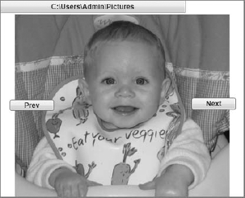
Next, add the following controls in the following order. First, add an Image control. To achieve a design surface similar to the one shown in Figure 17-3, drop the Image control so that it overlaps both the middle and bottom sections of the grid display. Now add three buttons to the bottom portion of the display. At this point the controls can be aligned. You can do this through a combination of editing the XAML directly and positioning things on the screen. For example, expand the image control to the limits of the two bottom grid rows using the design surface; similarly, align the buttons visually on the design surface.
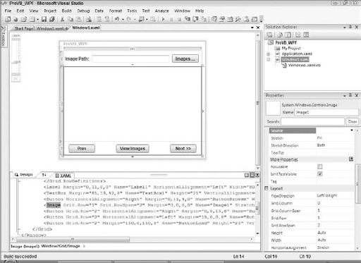
As shown in the figure, the separations for the two row definitions are described in the design surface, and each of the buttons has a custom label. Note that the Next button is followed by a pair of greater than symbols, but the Prev button is missing a matching set of less than symbols. The problem is that the less than and greater than symbols have special meaning in XAML, so it can be difficult to use them in the XAML. Therefore, one of the changes to be made in the Visual Basic code is the addition of these symbols to the button label.
First, however, review the XAML code and ensure that, for example, the Image control is assigned to Grid.Row 1 and that the property Grid.RowSpan is 2. Unlike the items that were in Grid.Row 0, the items in other rows of the grid must be explicitly assigned. Similarly, the name and caption of each button in the bottom row of the grid are modified to reflect that control's behavior. These and similar changes are shown in the following XAML:
<Window x:Class="Window1"
  xmlns="http://schemas.microsoft.com/winfx/2006/xaml/presentation"
  xmlns:x="http://schemas.microsoft.com/winfx/2006/xaml"
    Title="ProVB_WPF" Height="335" Width="415" Name="MainWindow">
    <Grid>
        <Grid.RowDefinitions>
            <RowDefinition Height="45" />
            <RowDefinition Height="215*" />
            <RowDefinition Height="40" />
        </Grid.RowDefinitions>
        <Label Margin="0,11,0,0" Name="Label1" HorizontalAlignment="Left" Width="80"
Height="23" VerticalAlignment="Top">Image Path:</Label>

        <TextBox Margin="81,13,92,0" Name="TextBox1" Height="21"
VerticalAlignment="Top" />

        <Button HorizontalAlignment="Right" Margin="0,11,9,11" Name="ButtonBrowse"
Width="75">Images ...</Button>

        <Image Grid.Row="1" Grid.RowSpan="2" Margin="0,0,0,0" Name="Image1"
Stretch="Fill" />

        <Button Grid.Row="2" HorizontalAlignment="Right" Margin="0,0,15,8"
Name="ButtonNext" Width="75" Height="23" VerticalAlignment="Bottom">Next >>
</Button>

        <Button Grid.Row="2" HorizontalAlignment="Left" Margin="15,0,0,8"
Name="ButtonPrev" Width="75" Height="23" VerticalAlignment="Bottom">
Prev</Button>

        <Button Grid.Row="2" Margin="150,0,150,8" Name="ButtonLoad" Height="23"
VerticalAlignment="Bottom">View Images</Button>
    </Grid>
</Window>
Note in the shaded sections the description of the new controls. The Image control is first, and it is positioned in Grid.Row number 1, which, because .NET arrays are always zero-based, is the second row. The second attribute on this node indicates that it will span more then a single row in the grid. For now, this control uses the default name, and it has been set so that it will stretch to fill the area that contains it.
Following the Image control are the definitions for the three buttons along the bottom of the display. For now, these buttons will control the loading of images; over the course of this chapter, these buttons will be either removed or redone significantly. The order of these buttons isn't important, so following their order in the file, the first button is like the others positioned in the final row of the grid. This button has been placed on the right-hand side of this area and is bound to the bottom and right corners of the display. Its name has been changed to ButtonNext and its label is Next >>.
The next button is the Prev button, which has been placed and bound to the left-hand side and bottom of the display. Its name has been changed to ButtonPrev, and its display text has been changed to read Prev. As noted, the arrow symbols are not in the button name; and, as you can test in your own code, attempting to add them here causes an error.
Finally, there is the ButtonLoad button, which is centered in the display area. It has been bound to both sides of the display to maintain its position in the center. The label for this button is View Images, which is, of course, the goal of this application. However, in order for that to happen, you need an event handler for this button; in fact, you need several event handlers in order to get the basic behavior of the application in place.
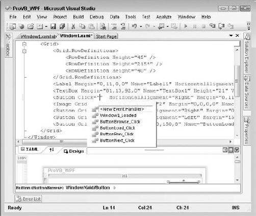
Begin by adding some event handlers to the application. In previous versions of Visual Studio you could click on a control and Visual Studio would automatically generate the default event handler for that control in your code. Fortunately, WPF also provides this behavior, so generate the following event handlers:
Double-click on the title bar of the form to generate the
Window1_Loadedevent handler.Double-click on the Images button to create the
ButtonBrowse_Clickhandler.Double-click on the Load button to create the
ButtonLoad_Clickhandler.Double-click on the Prev button to create the
ButtonPrev_Clickhandler.Double-click on the Next button to create the
ButtonNext_Clickhandler.
To create each of these handlers, you need to return to the design display and click on the associated control, but after they are created you can stay in code mode for most of this section. Take a look at the ButtonBrowse_Click event handler's method stub:
Private Sub ButtonBrowse_Click(ByVal sender As System.Object, _
     ByVal e As System.Windows.RoutedEventArgs) _
     Handles ButtonBrowse.Click
End Sub
The preceding code was reformatted with line extension characters to improve readability, but this is essentially what each of your event handlers looks like. As a Visual Basic developer, you should find this syntax very familiar. Note that the method name has been generated based on the control name and the event being handled. The parameter list is generated with the "sender" and e parameter values, although the e value now references a different object in the System.Windows namespace. Finally, defined here is the VB-specific Handles syntax that indicates this method is an event handler and which specific event or events it handles.
While this is a very familiar, powerful, and even recommended way of defining event handlers with VB and WPF, it isn't the only way. WPF allows you to define event handlers within your XAML code. To be honest, if this were a book on C#, we would probably spend a fair amount of time covering the advantages of that type of event handler declaration. After all, C# doesn't support the direct association of the event handler declaration with the method handling the event; as a result, C# developers prefer to declare their event handlers in XAML.
Visual Basic provides a default implementation of WPF that encourages less coupling of the UI and business logic than C# does.
However, one of the goals of XAML is the separation of the application logic from the UI, and placing the names of event handlers in the UI actually couples the UI to the business logic. It shouldn't matter to the UI whether the Click event or the DoubleClick or any other event is being handled by custom logic. Therefore, although this section introduces the way to define events directly in XAML, the recommendation is to define event handlers with the code that implements the handler.
In order to demonstrate this in the code, return to the design view for your form. Select the Images button and position your cursor just after the word Button, which names this node. Press the spacebar. You'll see that you have IntelliSense, indicating which properties and events are available on this control. Typing a c adjusts the IntelliSense display so that you see the Click event. Select this event by pressing Tab and you'll see the display shown in Figure 17-4.
As shown here, not only does the XAML editor support full IntelliSense for selecting properties and events on a control, when an event is selected, it displays a list of possible methods that can handle this event. Of particular note is the first item in the list, which enables you to request that a new event handler be created in your code. Selecting this item tells Visual Studio to generate the same event handler stub that you created by double-clicking on the control; however, instead of placing the Handles clause on this method, the definition of this method as an event handler is kept in the XAML.
This causes two issues. First, if you are looking only at the code, then nothing explicitly indicates whether a given method in your code is in fact an event handler. This makes maintaining the code a bit (not a lot) more difficult to maintain. Second, if you have handled an event that is specific to Windows as opposed to the Web, then your XAML won't be portable. Neither of these side effects is desirable. Thus, given the VB syntax for defining events as part of the method declaration, the code in this chapter avoids the embedded XAML style of declaring standard Windows event handlers. At this point, you could run your application. It won't do anything except allow you to close it, but you can verify that it behaves as expected and save your work.
It's almost time to make this UI do something, but there is one more step before you start working with code. As part of this application, you want to allow users to select the directory from which images should be displayed. In theory, you could (and in practice, at some time probably would) write a custom interface for selecting or navigating to the images directory. However, for this application that isn't important, and you want a quick and easy solution.
Unfortunately, WPF doesn't offer any native control that supports providing a quick and easy view into the file system. However, Windows Forms does, and in this case you want to leverage this control. The good news is that you can, and the even better news is that you don't need the Windows interop library in order to do so. Because something like the Browse Folders dialog isn't a control hosted on your form, you can reference it from your code. Thus, although you need the Windows Forms Integration Library and the WindowsFormsHost control discussed in Chapter 18 for any UI-based controls, in this case the code just needs to reference the System.Windows.Forms library.
Because the System.Windows.Forms library isn't automatically included as a reference in a WPF application, you need to manually add a reference to this library. Open the My Project display and select the References tab. Click the Add button to open the Add Reference dialog and then select the System.Windows.Forms library, as shown in Figure 17-5. You can't add controls to your WPF form without leveraging the Windows.Forms.Integration library, but you can, behind the scenes, continue to reference controls and features of Windows Forms.
With this additional reference, you can begin to place some code into this application. Start with the window_loaded event. This event is where you'll define the default path for the image library, set up the label for the Prev button, and change the default property of the grid control so that it handles the images the way you want:
Private Sub Window1_Loaded(ByVal sender As System.Object, _
                           ByVal e As System.Windows.RoutedEventArgs) _
                           Handles MyBase.Loaded
    ' Append the << to the text for the button since these are _
    ' reserved characters within XAML
    ButtonPrev.Content = "<< " + ButtonPrev.Content.ToString()
    ' Set the default path from which to load images
    TextBox1.Text = _
           Environment.GetFolderPath(Environment.SpecialFolder.MyPictures)
' Have the images maintain their aspect ration
Image1.Stretch = Stretch.Uniform
End Sub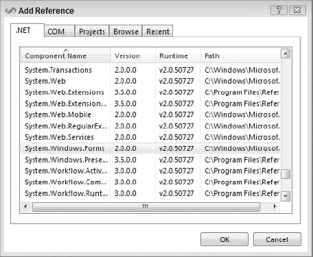
The preceding implementation handles these three tasks. It takes the content of the ButtonPrev control and appends the two less than symbols to the front of the string so that both buttons are displayed uniformly. Of course, long term, this code is going to be disposed of, but for now it helps illustrate that while controls such as Button may seem familiar from Windows Forms, these controls are in fact different. The WPF version of the Button control doesn't have a text property; it has a content property. The content property is, in fact, an untyped object reference. In the case of this application, you know this content is a string to which you can append additional text. However, this code is neither a good idea nor easily maintained, so this is just a temporary solution.
Next, the code updates the text property of the TextBox control used on the form. This text box displays the folder for the images to display. In order to provide a dynamic path, the code leverages the Environment class to get a folder path. To this shared method the code passes a shared environment variable: Environment.SpecialFolder.MyPictures. This variable provides the path to the current user's My Pictures folder (on Vista, the Pictures folder). By using this value, the code automatically points to a directory where the current user would be expected to have images.
Finally, to again demonstrate that any of the WPF classes can in fact be modified within your code, this code sets a property on the image control. Specifically, it updates the Stretch property of the Image control to ensure that images are resized with their aspect maintained. Thus, if an image is square, then when your image control becomes a rectangle, the image remains square. The Stretch.Uniform value indicates that aspect should be maintained, while other members of the Windows.Stretch enumeration provide alternative behavior.
The next step is to implement your first button handler, the ButtonBrowse_Click handler. When this button is clicked, the application should open the Folder Browse dialog, displaying the currently selected folder as the default. The user should be allowed to navigate to an existing folder or create a new folder. When the dialog is closed, the application should, if the user selected a new folder, update the folder's text box to display this new location:
Private Sub ButtonBrowse_Click(ByVal sender As System.Object, _
ByVal e As System.Windows.RoutedEventArgs) _
Handles ButtonBrowse.Click
Dim folderDialog As System.Windows.Forms.FolderBrowserDialog = _
New System.Windows.Forms.FolderBrowserDialog()
folderDialog.Description = "Select the folder for images."
folderDialog.SelectedPath = TextBox1.Text
Dim res As System.Windows.Forms.DialogResult = _
folderDialog.ShowDialog()
If res = System.Windows.Forms.DialogResult.OK Then
TextBox1.Text = folderDialog.SelectedPath
End If
End SubThe preceding code block declares an instance of the System.Windows.Forms.FolderBrowserDialog control. As noted when the reference was added, this control isn't part of your primary window display, so you can create an instance of this dialog without needing the Windows.Forms.Interface library. It then sets a description indicating to users what they should do while in the dialog, and updates the current path for the dialog to reflect the currently selected folder. The dialog is then opened and the result assigned directly into the variable res. This variable is of type System.Windows.Forms.DialogResult and is checked to determine whether the user selected the OK or Cancel button. If OK was selected, then the currently selected folder is updated.
Now it's time to start working with the images. That means you need to retrieve a list of images and manipulate that list as the user moves forward and backward through it. You could constantly return to the source directory to find the next and previous images, but you will get much better performance by capturing the list locally and keeping your current location in the list. This implies two local variables; and because you want these variables available across different events, you need to declare them as member variables to your class:
Class Window1
Private m_imageList As String() = {}
Private m_curIndex As Integer = 0
Private Sub Window1_Loaded(ByVal sender As System.Object, _
ByVal e As System.Windows.RoutedEventArgs) _
Handles MyBase.Loaded
' Append the << to the text for the button since these are _
' reserved characters within XAML
ButtonPrev.Content = "<< " + ButtonPrev.Content.ToString()
' Set the default path from which to load images
TextBox1.Text = _
Environment.GetFolderPath(Environment.SpecialFolder.MyPictures)
' Have the images maintain their aspect ration
    Image1.Stretch = Stretch.Uniform
End SubPrivate Sub ButtonBrowse_Click(ByVal sender As System.Object, _
ByVal e As System.Windows.RoutedEventArgs) _
Handles ButtonBrowse.Click
Dim folderDialog As System.Windows.Forms.FolderBrowserDialog = _
New System.Windows.Forms.FolderBrowserDialog()
folderDialog.Description = "Select the folder for images."
folderDialog.SelectedPath = TextBox1.Text
Dim res As System.Windows.Forms.DialogResult = _
folderDialog.ShowDialog()
If res = System.Windows.Forms.DialogResult.OK Then
TextBox1.Text = folderDialog.SelectedPath
End If
End Sub
Private Sub ButtonLoad_Click(ByVal sender As System.Object, _
ByVal e As System.Windows.RoutedEventArgs) _
Handles ButtonLoad.Click
Image1.Source = Nothing
m_imageList = System.IO.Directory.GetFiles(TextBox1.Text, "*.jpg")
m_curIndex = 0
If m_imageList.Count > 0 Then
Image1.Source = _
New System.Windows.Media.Imaging.BitmapImage( _
New System.Uri(m_imageList(m_curIndex)))
End If
End SubThe beginning of the preceding code adds two new properties to class Window1. Both values are private variables that have not been exposed as public properties. They are being made available for use in the image-handling buttons. Your code should look similar to the preceding code. The second shaded section is an implementation of the ButtonLoad event handler. This event handler is called when the user clicks ButtonLoad, and the first thing it does is clear the current image from the display. It then leverages the System.IO.Directory class, calling the shared method GetFiles to retrieve a list of files. For simplicity, this call screens out all files that don't have the extension .jpg. In a full production application, this call would probably use a much more complex screening system to gather all types of images and potentially feed a folder navigation control so that users could change the selected folder or even add multiple folders at once.
Once the list of files is retrieved and assigned to the private variable m_imageList, the code clears the current index and determines whether any files were returned for the current directory. The screenshots in this chapter have three images in the folder in order to obtain a small array; however, if no images are present, then the code exists without displaying anything. Here, presume an image is available. The code uses the System.Windows.Media.Imaging class to load an image file as a bitmap. It does this by accepting the URI or path to that image, a path that was returned as an array from your call to GetFiles. Note that the BitmapImage call doesn't need an image formatted as a bitmap, but instead converts the chosen image to a bitmap format that can then be directly referenced by the source property of the Image control:
Private Sub ButtonPrev_Click(ByVal sender As System.Object, _
                             ByVal e As System.Windows.RoutedEventArgs) _
                             Handles ButtonPrev.Click
    If m_imageList.Count > 0 Then
m_curIndex -= 1
If m_curIndex < 0 Then
m_curIndex = m_imageList.Count - 1
End If
Image1.Source = New System.Windows.Media.Imaging.BitmapImage( _
New System.Uri(m_imageList(m_curIndex)))
End If
End Sub
Private Sub ButtonNext_Click(ByVal sender As System.Object, _
ByVal e As System.Windows.RoutedEventArgs) _
Handles ButtonNext.Click
If m_imageList.Count > 0 Then
m_m_curIndex += 1
If m_curIndex > m_imageList.Count - 1 Then
m_curIndex = 0
End If
Image1.Source = New System.Windows.Media.Imaging.BitmapImage( _
New System.Uri(m_imageList(m_curIndex)))
End If
End Sub
End ClassAfter the code to load an image has been added, implementing the ButtonPrev and ButtonNext event handlers is fairly simple. In both cases the code first checks to ensure that one or more images are available in the m_imageList. If so, then the code either decrements or increments the m_curIndex value, indicating the image that should currently be displayed. In each case the code ensures that the new index value is within the limits of the array. For example, if it is below 0, then it is reset to the last image index; and if it is greater than the last used index, the counter is reset to 0 to return it to the start of the list.
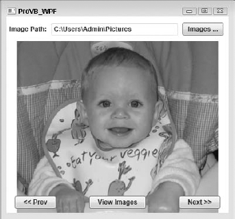
The next logical step is to run the application. Clicking the Run button within Visual Studio ensures that your application starts. If you have images loaded in your Pictures folder, then you can open the first of these images in the application. If not, then you can navigate to another directory such as the Samples folder using the Images button. At this point, you'll probably agree that the sample application shown in Figure 17-6 looks just like a typical Windows Forms application — so much so in fact that the next steps are included to ensure that this doesn't look like a Windows Forms application.
However, before adding new features, there is a possibility that when you loaded your image, your application didn't display the image quite like the one shown in Figure 17-6; in fact, it might look more like the image shown in Figure 17-7. If, when you worked on your own code, you added the Image control after adding the View, Prev, and Next buttons, then your buttons — in particular, the View Images button — might be completely hidden from view. This is caused by the way in which WPF layers and loads controls, and to resolve it you need to change the order in which the controls are loaded in your XAML. Before doing that, however, this is a good place to discuss layers and the WPF layering and layout model.
WPF supports a very robust model for control layout, which it achieves by leveraging the capability to layer controls and by providing a set of controls directly related to layout. Combined with the capability to define a reasonable set of layout information for each control, what you wind up with is an adaptable environment that can, at the extreme, provide unique behavior.
How does the process work? Within each control are the basic elements associated with the sizing of that control. As with past versions of Windows Forms, included is the concept of height and width and the four associated limitations: MaxHeight, MaxWidth, MinHeight, and MinWidth. Additionally, as shown in this chapter, it is possible to bind controls to window borders.
The layout properties aren't the focus of this section, however. More important is the concept of layered controls. What happens when you layer an image on top of something such as a grid? Recall how the Image control you defined was bound to the four borders of its display area. In fact, the control isn't bound to the limits of the window per se; it is bound to the limits of the grid control upon which it is explicitly layered. This layering occurs because the Image control is defined as part of the content of the grid. That content is actually a collection containing each of the layered controls for the selected control.
When it comes to layout and layering, keep in mind that if a control is explicitly layered on top of another control as part of its content, then its display boundaries are by default limited by the containing control's boundaries.
You can override this behavior using the ClipToBounds property, the LayoutClip property, and the GetLayoutClip method of the container. Note, however, that the default behavior of WPF controls is to set ClipToBounds to false and then use the LayoutClip property and the GetLayoutClip method to specify the actual clipping bounds. Resetting and manually managing the clipping behavior enables a control to be drawn outside the bounds of its parent container. That behavior is beyond the scope of this chapter, as the process is somewhat involved and the preferred behavior, when available, is to clip within the region of the parent control.
The fact that your control can be drawn beyond the limits of its container is an important concept. It means your controls are no longer "contained," but rather are truly layered. This may sound trivial, but the implications are significant. Under previous UI models, an object had a container of some sort. For example, a panel could contain other controls of certain types, but not necessarily all types. A button's content was generally text unless you had a button configured for images, but you couldn't really find a button configured to contain, for example, a drop-down list box, unless you wrote a custom display implementation.
By moving to a more layered approach, you can create a single control that handles text, images, and other controls. The technique chosen to accomplish that was for those controls that support layering to include a content presenter control. Thus, when you indicated that the Image control in ProVB_WPF should stretch, it stretched in accordance with the grid control. Were you to change the XAML definition of the grid control and give it a fixed height or width, then even though the window might change, the Image control would still be bound to the limits of the grid control.
This behavior is explicit layering, and it is only available with certain control types. For example, WPF provides a series of different "panel" controls that are used to provide a framework for control layout. The grid is probably the one most familiar to .NET Windows Forms developers because it maps most closely to the default behavior of Windows Forms. Other similar controls include StackPanel, Canvas, DockPanel, ToolBar, and Tab-related controls. Each of these provides unique layout behavior. Because these are available as controls, which you can nest, you can combine these different layout paradigms within different sections of a single form, which enables you to group controls and achieve a common layout behavior of related controls.
To be clear, however, explicit layering or nesting isn't just available with panel controls; another WPF example is the Button control. The button has a layer of generic button code — background color, border, size, and so on — that is managed within the display for the button. Then the button has a content presenter within its definition that takes whatever was placed into the button's content property and calls the presentation logic for that control. This enables the button and many other controls to contain other controls of any type.
You can place a button on a form and bind it to the form's borders, and then place other controls on the form. Because the button exposes a content property, it supports explicit layering, and other controls can in fact be placed within the content of the button. Thus, whenever a user clicks on the surface of the form, a click event is raised to the underlying button that is the owner of that content. The fact that WPF controls forward events up the chain of containers is an important factor to consider when capturing events and planning for application behavior. The formal name for this behavior is routed events.
Routed events are a key new concept introduced with WPF, and they are important in the sense that as you add controls to your UI, you create a hierarchy. In the example thus far, this hierarchy is rather flat: There is a window, and then a grid, and each of the controls is a child of the grid. However, you can make this hierarchy much deeper, and routed events enable the controls at the top of the hierarchy to be notified when something changes in the controls that are part of their content structure.
In addition to these explicit concepts of layering, hierarchy, and routed events, WPF also has the concept of implicit layering. An implicit layer describes the scenario when you have two different controls defined to occupy the same space on your form. In the case of the example code, recall that the image was defined to overlay both of the row definitions, including the one containing the three Image control buttons. Thus, these controls were defined to display in the same area, which isn't a problem for WPF, but which in the current design isn't ideal for display purposes either.
The key idea is that there is implicit layering and explicit layering. In case you didn't see the same behavior that's been described in terms of the loaded image hiding the control buttons, you'll need to modify the XAML code. Note that the code available for download implements the solution correctly, so if you are following along with the sample code you'll need to modify the XAML in Window1.xaml. The incorrect version of this XAML is as follows:
<Grid>
    <Grid.RowDefinitions>
<RowDefinition Height="45" />
<RowDefinition Height="215*" />
<RowDefinition Height="40" />
</Grid.RowDefinitions>
<Label Margin="0,11,0,0" Name="Label1" HorizontalAlignment="Left" Width="80"
Height="23" VerticalAlignment="Top">Image Path:</Label>
<TextBox Margin="81,13,92,0" Name="TextBox1" Height="21"
VerticalAlignment="Top" />
<Button HorizontalAlignment="Right" Margin="0,11,9,0" Name="ButtonBrowse"
Width="75" Height="23" VerticalAlignment="Top">Images ...</Button>
<Button Grid.Row="2" HorizontalAlignment="Right" Margin="0,0,15,8"
Name="ButtonNext" Width="75" Height="23" VerticalAlignment="Bottom">Next >></Button>
<Button Grid.Row="2" HorizontalAlignment="Left" Margin="15,0,0,8"
Name="ButtonPrev" Width="75" Height="23" VerticalAlignment="Bottom"> Prev</Button>
<Button Grid.Row="2" Margin="150,0,150,8" Name="ButtonLoad" Height="23"
VerticalAlignment="Bottom">View Images</Button>
<Image Grid.Row="1" Grid.RowSpan="2" Margin="0,0,0,0" Name="Image1"
Stretch="Fill" />
</Grid>In the preceding XAML, the buttons are defined and loaded, and the image control isn't defined until later. As a result, the Image control is considered to be layered on top of the button controls. When the application starts, you might expect that Image control to immediately block the buttons, but it doesn't. That's because there is no image to display, so the Image control essentially stays out of the way, enabling the controls that would otherwise be behind it to both be displayed and receive input. WPF fully supports the concept of transparency, as demonstrated later in this chapter.
When there is something to display, the resulting image can block the same buttons that were used to load it, as shown in Figure 17-7. Because the image isn't part of the content for any of these buttons, none of the click events that would occur on the image at this point are raised to those buttons, so the buttons that are hidden don't respond. This is different behavior from what you get when you layer controls, and much closer to what a Windows Forms developer might expect. As a result, you need to be aware, just as with other user interfaces, of which order controls overlap in the same display area that's loaded.

Thus, everything you've done in the past, both with Windows Forms and ASP.NET, is still possible. On the surface, the WPF controls have more in common with existing programming models than might at first seem apparent.
Now that we have uttered heresy against this new UI paradigm, it's time to examine what is meant by a paradigm shift with the XAML model. As noted, it starts with a new set of classes and a new declarative language, but it continues with being able to have much finer control over your application's UI behavior.
While you can create a user interface that looks disappointingly similar to a Windows Forms application, the real power of WPF is the customization it enables you to create for your application. At this point, our example moves from the ProVB_WPF application to the second application, ProVB_WPF_Step_2. The goal here is to provide, through Visual Studio 2008, an even cleaner interface — not one that leverages all of WPF's power, but one that at least reduces the Windows Forms look and feel of this application.
The first step is to change some of the application, so for starters, a text box with the name of the selected directory is redundant. You don't expect users to type that name, but rather to select it, so you can instead display the currently selected directory on the actual button label. Accordingly, the current label and text box controls in the form can be removed. Additionally, both at load and following a change to the selected folder, instead of waiting for the user to request the image folder, just have the application query and pull the initial image into the application.
Carrying out these changes is relatively simple. The first step is to adjust the existing button handler for the View Images button. Because this button will be deleted but the actions that the handler implements are still needed, change the method definition from being an event handler with associated parameters to being a private method that doesn't require any parameters:
Private Sub LoadImages()
Next, this method needs to be called when a new directory is chosen, so update the event handler for the ButtonBrowse_Click to include a call to this method when the name of the directory is updated.
Now you can get rid of the Label and TextBox controls. Eliminating the Label control is easy, as it isn't referenced in the code, but the TextBox poses a challenge. You can replace the TextBox control with a reference to the content of the Button control, but in this case you've jumped from the frying pan into the fire in terms of maintenance. Face it: The button content over time could be anything.
From a coding standpoint, it makes much more sense to store the current path as part of your local business data. Then, if the goal is to have the label of that button display the current path, fine; but if for some reason that changes, then you can minimize the changes required to your application code. Therefore, add a new private value to your class:
Private m_curImagePath As String = ""
Now replace all of the references to TextBox1.Text with the new value of m_curImagePath in your code. There are likely more than you would expect, and not using the button's label for this task should make more sense at this point. Next, you need to update the button label for when the m_curImagePath value changes. This occurs only in two places: in the Window1_Loaded event handler and in the ButtonBrowse_Click event handler.
Finally, update the code in the load event. There are three actions in the current method, and two of them should be eliminated. The first is where the code is adding the "<<" to the ButtonPrev label. This label is going to become an image, so get rid of this assignment statement. Similarly, setting the Stretch property of the Image control within this event is duplicate effort. Instead, update the XAML and set that property to the desired value directly in the XAML. When you are done, the code for your class and its first three methods should look similar to the following code, given that there were no changes to the event handlers for ButtonPrev and ButtonNext:
Class Window1
Private m_imageList As String() = {}
Private m_curIndex As Integer = 0
Private m_curImagePath As String = ""
Private Sub Window1_Loaded(ByVal sender As System.Object, _
ByVal e As System.Windows.RoutedEventArgs) _
Handles MyBase.Loaded
' Set the default path from which to load images and load them
m_curImagePath = _
Environment.GetFolderPath(Environment.SpecialFolder.MyPictures)
ButtonBrowse.Content = m_curImagePath
LoadImages()
End Sub
Private Sub ButtonBrowse_Click(ByVal sender As System.Object, _
ByVal e As System.Windows.RoutedEventArgs) _
Handles ButtonBrowse.Click
Dim folderDialog As System.Windows.Forms.FolderBrowserDialog = _
New System.Windows.Forms.FolderBrowserDialog()
folderDialog.Description = "Select the folder for images."
folderDialog.SelectedPath = m_curImagePath
Dim res As System.Windows.Forms.DialogResult = _
folderDialog.ShowDialog()
If res = System.Windows.Forms.DialogResult.OK Then
m_curImagePath = folderDialog.SelectedPath
ButtonBrowse.Content = m_curImagePath
LoadImages()
End If
End Sub
Private Sub LoadImages()
Image1.Source = Nothing
m_imageList = System.IO.Directory.GetFiles(m_curImagePath, "*.jpg")
m_curIndex = 0
If m_imageList.Count > 0 Then
Image1.Source = New System.Windows.Media.Imaging.BitmapImage( _
New System.Uri(m_imageList(m_curIndex)))
End If
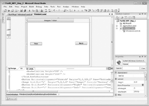
End SubNow that you have updated your code, it's time to clean up the XAML. First, delete the Label and TextBox controls and move the button that is currently on the right-hand side of the top section to the left-hand side. Next, bind the window to both sides of the display and expand its size to allow it to display the full path. Of course, this is ugly, which means it will be changed as part of the upcoming UI changes. Next, delete the ShowImages button from the design surface. At this point you could stop, but to help prepare for other design changes you are going to make, review the placement of the Prev and Next buttons. Currently, these buttons are tied to the bottom portion of the grid; instead, get rid of that third grid row definition and center the Prev and Next buttons on the side of the image. At this point, the designer should look similar to what is shown in Figure 17-8.
This is a much simpler and cleaner interface. The XAML is as follows:
<Grid>
       <Grid.RowDefinitions>
           <RowDefinition Height="25" />
           <RowDefinition Height="215*" />
       </Grid.RowDefinitions>
       <Button HorizontalAlignment="Stretch" Margin="0,0,100,2" Name="ButtonBrowse" >
Images Folder</Button>
       <Image Grid.Row="1" Margin="0,0,0,0" Name="Image1" Stretch="Uniform" />
       <Button Grid.Row="1" HorizontalAlignment="Right" Name="ButtonNext"
VerticalAlignment="Center" Margin="0,0,15,8" Width="75">Next</Button>
       <Button Grid.Row="1" HorizontalAlignment="Left" Name="ButtonPrev"
VerticalAlignment="Center" Margin="17,113,0,116" Width="75"> Prev</Button>
   </Grid>
This indicates that the Grid now has only two row definitions, and the Image control was updated to be located in row 1, as were the Prev and Next buttons.
Now you are ready to address the next set of changes to make this application look and behave more like a WPF application. One is to get rid of the "ugly" Windows frame around the application. (Your designer may want to skin this application later, and that frame just won't support the look desired.) Second, the designer wants the Prev and Next buttons modified so that they are circular instead of square and use images instead of text; and just to be consistent, the designer would like those buttons hidden except when the user hovers over them.
Removing the Windows frame from your application is actually fairly easy to do, as you only need to set two properties on your form. The first is WindowStyle, which is set to "None"; the second is AllowTransparency, which is set to "True". You can accomplish that by adding the following line before the closing bracket of your window attributes:
WindowStyle="None" AllowsTransparency="True">
Once you've added this line to your XAML, run the application in the debugger. This is a good point to test not only what happens based on this change, but also the other changes you made to reduce the number of controls in your application. The result is shown in Figure 17-9. You probably notice that there are no longer any controls related to moving, resizing, closing, or maximizing your window. In fact, if you don't start the application within the Visual Studio debugger, you'll need to go to the Task Manager in order to end the process, as you haven't provided any way to end this application through the user interface.
In order to be able to skin this application, you need to provide some controls that implement many of the baseline window behaviors that most form developers take for granted. This isn't as hard as it might sound. The main challenge is to add a series of buttons for maximizing and restoring your application window, closing the application, and, of course, resizing the application. Because your designer wants to skin the application, you decide that the best way to handle the resize capability is with a single hotspot in the bottom right corner that represents the resize capability.
However, your first task is to provide a way to move the window. To do that you are going to add a rectangular area that maps to the top Grid.Row. This rectangle supports capturing the mouse down event and then responds if the user drags the window with the mouse button down. Because moving the window is essentially a mouse down and drag activity, as opposed to a click event, the Rectangle is a quick and easy way to implement this feature. It takes only a single line of XAML added as the first control in the grid:
<Rectangle Name="TitleBar" HorizontalAlignment="Stretch" Margin="0,0,0,0"
Stroke="Black" Fill="Green" VerticalAlignment="Stretch" />
Now, of course, you've filled the default rectangle with a beautiful green color to help with visibility, leaving the black border around the control. These two elements help you see where the rectangle is prior to taking this XAML into a designer and cleaning it up. Aside from this, however, having a control is only half the equation; the other half is detecting and responding to the drag event.
This is done with the following event handler, which is added using VB:
Private Sub Rectangle_MouseLeftButtonDown(ByVal sender As Object, _
                   ByVal e As System.Windows.Input.MouseButtonEventArgs) _
                   Handles TitleBar.MouseLeftButtonDown
    Me.DragMove()
End Sub
To recap, that's a single line of code in the handler calling the built-in method on the Window base class — DragMove. This method handles dragging the window to a new location. Right now the handler only looks for the dragging to occur from a control named TitleBar, but you could change this to something else or even change which control was called Titlebar.
Having resolved the first issue, you can move to the second: implementing the three buttons required for Minimize, Maximize, and Close. In each case the action required only occurs after a Click event. One of the unique characteristics of a button is that it detects a Click event, so it is the natural choice for implementing these actions. The buttons in this case should be images, so the first step is to create a few simple images.
Four image references have been added to the example project. Yes, these images are ugly, but the goal here isn't to create flashy design elements. You can literally spend days tweaking minor UI elements, which shouldn't be your focus. The focus here is on creating the elements that can be used in the UI. The color of the buttons, whether the Close button looks like the Windows icon, and so on are irrelevant at this point. What you care about here is providing a button with basic elements that a designer can later customize. As a rule, don't mix design and implementation.
The simplest way for an engineer to create graphics is with the world-famous Paint program. That's right, nothing fancy but reasonably meaningful. Create the four necessary .jpg files as 24 × 24 pixel images, and include an image for the resize handle for the window. Next, access the MyProject page and select the Resources tab. Then, select each of your .jpg files and add them as Image resources to the project, as shown in Figure 17-10.
Note that Visual Studio automatically places these items in the Resources folder for your project. Next, verify that in the properties for each file, the Build Action property is set to Resource. In order for these resources to be referenced from within your XAML, they need to be designated as resources, not just located in this folder. Now do a complete build of your project so the resources are compiled.
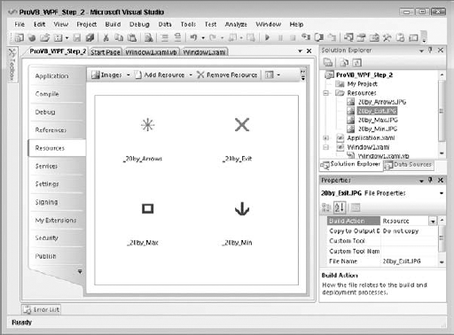
At this point you can move back to the XAML designer and add the three buttons for Minimize, Maximize, and Close. For your purposes, they should reside in the upper-right corner of the display and be around the same size as your new graphics. Drag a button onto the design surface and then edit the XAML to place it in the upper-right corner and size it to a height and width of 20 pixels. After doing this, one easy way to proceed is to simply copy that first button and paste two more buttons just like it into the XAML. Then all you need to do is change the button names and locations. Voilà — three buttons.
Of course, your goal is for these buttons to have images on them, so you need to add an Image control to the form and then move it so that it becomes the content for the first button. In this case, just bind the button to the borders of the button and then add a source to the button. Here, the source is the local reference to your .jpg resource, so in the case of ButtonClose, the source value is set to /Resources/20by_Exit.jpg. Add an Image control to the other two buttons and reference the associated resource in order to get the XAML here:
<Button Height="20" Width="20" HorizontalAlignment="Right" Margin="0,1,1,0"
                                Name="ButtonClose" VerticalAlignment="Top">
    <Image Margin="0,0,0,0" Name="Image2" Stretch="Fill"
               Source="/Resources/20by_Exit.JPG"/>
</Button>
<Button Height="20" Width="20" HorizontalAlignment="Right" Margin="0,1,25,0"
                                  Name="ButtonMax" VerticalAlignment="Top" >
      <Image Margin="0,0,0,0" Name="Image3" Stretch="Fill"
                                  Source="/Resources/20by_Max.JPG"/>
</Button>
<Button Height="20" Width="20" HorizontalAlignment="Right" Margin="0,1,47,0"
Name="ButtonMin" VerticalAlignment="Top" >
<Image Margin="0,0,0,0" Name="Image4" Stretch="Fill"
Source="/Resources/20by_Min.JPG"/>
</Button>At this point the basic XAML elements needed in order to implement a custom shell on this application are in place. Note that each button has a specific name: ButtonClose, ButtonMax, and ButtonMin. You'll need these, and the design can't change them because you'll use the button names to handle the Click event for each button. In each case, you need to carry out a simple action:
Private Sub ButtonMin_Click(ByVal sender As Object, _
                            ByVal e As RoutedEventArgs) _
                            Handles ButtonMin.Click
    Me.WindowState = WindowState.Minimized
End Sub

Private Sub ButtonMax_Click(ByVal sender As Object, _
                            ByVal e As RoutedEventArgs) _
                            Handles ButtonMax.Click
    If (Me.WindowState = WindowState.Maximized) Then
        Me.WindowState = WindowState.Normal
    Else
        Me.WindowState = WindowState.Maximized
    End If
End Sub

Private Sub ButtonClose_Click(ByVal sender As Object, _
                              ByVal e As RoutedEventArgs)
                              Handles ButtonClose.Click
    Me.Close()
End Sub
The code is fairly simple. After all, it's not as if the methods you need aren't still available; all you are doing is providing part of the plumbing that will enable your custom UI to reach these methods. Thus, to minimize the button's Click event, merely reset the window state to minimized. The real plumbing, however, was prebuilt for you as part of the way WPF layers controls. Keep in mind that when users click the minimize button, they are actually clicking on an image. WPF routes the Click event that occurred on that image.
When you hear about routed events and how powerful they are, remember that they are a capability built into the way that WPF layers and associates different controls. The routing mechanism in this case is referred to as bubbling because the event bubbles up to the parent; however, note that routed events can travel both up and down the control hierarchy.
For the ButtonMax event handler, the code is significantly more complex. Unlike minimizing a window, which has only one action when the button is pressed, the maximize button has two options. The first time it is pressed it takes the window from its current size and fills the display. If it is then pressed again, it needs to detect that the window has already been maximized and instead restore that original size. As a result, this event handler has an actual If statement that checks the current window state and then determines which value to assign.
Finally, the ButtonClose event handler has that one line of code that has been with VB developers pretty much since the beginning: Me.Close, telling the current window it's time to close. As noted, there isn't much magic here; the actual "magic" occurs with resizing.
Up until this point, changing the default window frame for a set of custom controls has been surprisingly easy. Now, however, if you are working on your own, you are about to hit a challenge. You need a control that will respond to the user's drag action and enable the user to drag the window frame while providing you with updates on that status.
There isn't a tool in the Visual Studio Toolbox for WPF that does this, but there are things such as splitter windows and other resizable controls that have this behavior. WPF was written in such a way that most of what you consider "controls" are actually an amalgamation of primitive single-feature controls. In this case, the primitive you are looking for is called a Thumb. The Thumb control is a WPF control, and it is located in the System.Windows.Controls.Primitives namespace.
Fortunately, you can directly reference this control from within your XAML, and once you have added it to your XAML, handling the events is just as simple as it is with your other custom UI elements. However, this control can't contain another control, and its default look is blank. For the moment, examine the XAML that is used to create an instance of this control on your form:
<Thumb Grid.Row="1" Cursor="ScrollAll" Name="ThumbResize" Height="20" Width="20"
HorizontalAlignment="Right" VerticalAlignment="Bottom" Margin="0,0,0,0" />
Note a few items of customization. Because the typical location to resize from in most UI models is the lower right corner, this control is placed in the lower right corner and aligned to the bottom and left edges of the bottom grid row. The control itself is sized to match the other buttons used to control the window's behavior. The name ThumbResize is used to indicate the control, and in this case the property Cursor is set. The Cursor property enables you to control the display of the mouse cursor when it moves over the control. There are several options in the enumeration of standard mouse cursors, and for this control arrows are displayed in every direction.
Before you change the default display any further, it makes sense to wire up an event handler. This enables you to test the control's behavior. Just as with the other event handlers, double-clicking on the control in the designer generates a default event handler for the control. In this case, the event to be handled is the DragDelta event. As the name implies, this event fires every time the potential size of the display area is changed. There are multiple ways to handle resizing. For this application, having the window redisplay as the user drags the mouse is feasible because the amount of time to update the display is short.
If that weren't the case, then you would want to override two additional events: DragStarted and DragOver. These events enable you to catch the window's start size and the final size based on the end of the user's action. You would then only resize the form in the DragOver event instead of in the DragDelta event. You would still need to override DragDelta because it is in this event that you monitor whether the window's minimum and/or maximum size constraints have been met:
Private Sub ThumbResize_DragDelta(ByVal sender As System.Object, _
                               ByVal e As Primitives.DragDeltaEventArgs) _
                               Handles ThumbResize.DragDelta
    Me.Height += e.VerticalChange
    If (Me.Height < Me.MinHeight) Then
Me.Height = Me.MinHeight
End If
Me.Width += e.HorizontalChange
If (Me.Width < Me.MinWidth) Then
Me.Width = Me.MinWidth
End If
End SubThe preceding block of code illustrates the code for this event handler. Notice that in this case the parameter e is specific to the DragDeltaEventArgs structure. This structure enables you to retrieve the current totals for both the vertical and horizontal change of the current drag location from the current window's frame.
This code enables you to see the visible window as the window is dragged because each time the event is fired, the Height and Width of the window are updated with the changes so that the window is resized. Note that this code handles checking the minimum height and width of your window. The code to check for the maximum size is similar. At this point, you can rerun the application to verify that the event is handled correctly and that as you drag the thumb, the application is resized.
Once you have the ThumbResize control working, the next step is to customize the display of this control. Unlike a button or other more advanced controls, this control won't allow you to associate it with an image or have content. As one of the primitive control types, you are limited to working with things such as the background color; and just assigning a color to this control really doesn't meet your needs. Thus, this is an excellent place to talk about another WPF feature: resources.
Typically, there comes a point where you want to include one or more resources with your application. A resource can be anything, including a static string, an image, a graphics element, and so on. In this case, you want to associate an image with the background of a control that would otherwise not support an image. Resources enable you to set up a more complex structure than just a color that can then be assigned to a control's property. For this simple example you'll create a simple application-level resource that uses an image brush, and then have your control reference this resource.
As noted in the introduction to XAML syntax, the definition for x:Key included the label object.Resources. The implication is that objects of different types can include resources. The scope of a resource, then, is defined by the scope of the object with which it is defined. For a resource that will span your application, you can in fact define that resource within your application XAML. Resources that are to be available within a given window are defined in the XAML file for that window. The following XAML demonstrates adding a resource to the application file of the sample application created earlier:
<Application x:Class="Application"
    xmlns="http://schemas.microsoft.com/winfx/2006/xaml/presentation"
    xmlns:x="http://schemas.microsoft.com/winfx/2006/xaml"
          StartupUri="Window1.xaml">
    <Application.Resources>
        <ImageBrush x:Key="ResizeImage"
                                    ImageSource="/Resources/20by_Arrows.JPG">
        </ImageBrush>
</Application.Resources> </Application>
Here, you are going to create a new ImageBrush. An image brush, as you would expect, accepts an image source and then it "paints" this image onto the surface where it is applied. In the XAML, notice that you assign an x:Key value. As far as XAML is concerned, this name is the identity of the resource. Once this has been assigned, other controls and objects within your XAML can reference this resource and apply it to an object or property. Thus, you need to add a reference to this resource to your definition of the ThumbResize control. This should result in a change to your XAML similar to this:
<Thumb Grid.Row="1" Cursor="ScrollAll" HorizontalAlignment="Right" Height="20"
Background="{StaticResource ResizeImage}" Name="ThumbResize"
Margin="0,0,0,0" Width="20" VerticalAlignment="Bottom" />
This change involves what is assigned to the background property of your Thumb control. As you look through XAML files, you will often see references to items such as StaticResources, and these can become fairly complex when you start to work with a tool such as Blend. However, this example should help you recognize what you are seeing when you look at more complex XAML files. You will also see references to dynamic resources, which are discussed later in this chapter in conjunction with dependency properties.
Resources can be referenced by several different controls and even other resources. However, resources aren't the only, or most maintainable, resource in all instances. Because a resource must be referenced within each object that uses it, it doesn't scale well across several dozen controls. In addition, during maintenance, each time someone edited a XAML file that applied resources to every control, they would also need to be careful to add that resource to any new controls. Fortunately, XAML borrows other resource types based on the basic idea of style sheets. WPF supports other types of resources, including templates and styles, which are discussed later in this chapter. Unlike styles and resources, templates are applied to all objects of the same type. Coverage of templates is beyond the scope of this chapter, but they work similarly to resources except that the settings they define are automatically applied to every control of a given type.
This juncture is an excellent point to test your application. When you start the application, you should see something similar to Figure 17-11. As noted earlier, at this point the application isn't exactly going to win a beauty contest (although the baby might). What you have achieved is a custom framework that enables you to literally treat an application UI as a blank slate, while still providing the standard Windows services that users have come to expect. This is important as you start to create applications that truly push the UI design envelope.
Your next task is to adjust the buttons in the application. Recall that the ButtonPrev and ButtonNext controls need to be round and only appear when the mouse is over them. This requires both XAML updates and new event handlers to hide the buttons. The second task results from the fact that when the mouse hovers over a button, Windows automatically changes the color of that button. This is a problem because the graphic guru doesn't want Windows changing the color of elements in the display.
We'll begin with making the current buttons round and changing them to use images instead of text. Making the buttons round in Visual Studio isn't as hard as it sounds. You can clip the button display and thus quickly create a round button. The easiest way to do this is to place the button on a Panel control and then clip the display region of the panel. You might be tempted to clip the button or place it within a border region, but neither of these actions will work as expected.
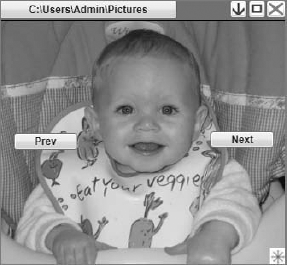
What you need to leverage is the capability to layer controls and a panel control for each of these buttons. In this case, placing a panel on the display and then telling the panel that its contents have been clipped to fit within a geometric shape enables the clipped control to be displayed with the desired shape. Additionally, when it comes to hiding the button and only showing it when the mouse is over the control, the container is the control you need to detect the MouseEnter event. Instead of adding a panel to your application window, you are welcome to try the following: Go to the ButtonPrev XAML and set its visibility to Hidden. Next, from within the XAML, add a new event handler for the MouseEnter event and generate the stub. Within this stub, add a single line of code to make the button visible and set a breakpoint on this line of code.
Now start your application. Do you see any good way of knowing when the mouse is over the area where the control should be? No matter how many times you move across the area where the control should be, your MouseEnter event handler isn't called. Similarly, you can stop your application and change the visibility setting on the button from Hidden to Collapsed. Restart the application. You'll get the same result. In fact, short of attempting to track where the mouse is over your entire application and then computing the current location of the buttons to determine whether the mouse's current position happens to fall in that region, there isn't a good way to handle this aside from adding another control. If you chose to run this experiment, you should remove the reference to the event handler from your XAML — you can leave the button visibility set to either Hidden or Collapsed — and the event handler code.
The UI trick is that the panel, or in this case the StackPanel control that you use, supports true background transparency. Thus, even though it doesn't display, it does register for handling events. Thus, the StackPanel acts not only as a way to clip the display area available to the button, but also as the control that knows when the button should be visible. You'll create MouseEnter and MouseLeave event handlers for the StackPanel, and these will then tell ButtonNext when to be visible and when to be hidden.
First, add a StackPanel control to your display. This stack panel, once it has been added to your design surface, will be easier to manipulate from within the XAML display. Ensure that the StackPanel was created in the second grid row. Then ensure that it has both an open and a close tag, and position these tags so they encapsulate your existing ButtonNext declaration. At this point, the ButtonNext declaration is constrained by the StackPanel's display region. Next, ensure that most of the layout settings previously associated with the button are instead associated with the StackPanel:
<StackPanel Background="Transparent" Margin="0,0,25,0" Height="75" Width="75"
Name="StackPanelNext" Grid.Row="1" HorizontalAlignment="Right"
VerticalAlignment="Center" >
      <Button Grid.Row="1" Height="75" Width="75" HorizontalAlignment="Center"
VerticalAlignment="Center" Name="ButtonNext" Visibility="Hidden">Next</Button>
</StackPanel>
The preceding snippet shows how the Margin property that was set on the button is now associated with the StackPanel. Similarly, the StackPanel has the VerticalAlignment and HorizontalAlignment settings that were previously defined on the button. The Button now places both its vertical and horizontal alignment settings to Stretch because it is mainly concerned with filling the available area. Finally, note that both the ButtonNext control and the StackPanelNext control are given a Height and Width of 75 pixels, making them square.
Before you address that issue, it makes sense to set up the event handlers to show and hide ButtonNext; otherwise, there won't be anything in the display. Within the code you can create an event handler for the MouseLeave event and associate it with Handles StackPanelNext.MouseLeave. If you previously attempted to capture the MouseEnter event with the button itself, you already have that method and all you need to do is add the Handles clause to the event definition:
Private Sub StackPanelNext_MouseEnter(ByVal sender As System.Object, _
                        ByVal e As System.Windows.Input.MouseEventArgs) _
                        Handles StackPanelNext.MouseEnter
    ButtonNext.Visibility = Windows.Visibility.Visible
End Sub

Private Sub StackPanelNext_MouseLeave(ByVal sender As System.Object, _
                         ByVal e As System.Windows.Input.MouseEventArgs) _
                         Handles StackPanelNext.MouseLeave
    ButtonNext.Visibility = Windows.Visibility.Hidden
End Sub
At this point, test your code and ensure that it compiles. If so, make a test run and see whether the button is hidden and reappears as you mouse over the area where it should be located. If everything works, you are almost ready to repeat this logic for ButtonPrev. First, however, add the clip region to your StackPanel control so that the button displays as a circle instead of as a square.
The Clip property wants a geometry for the display region. Creating this requires that you define another object and then assign this object to that property. Since you'll want to report this geometric definition for both buttons, the most efficient way of doing this is to add a resource to your window. Go to the top of your Window1 XAML, just below the attributes for the window. Add a new XML node for <Window.Resources></Window.Resources>. Between the start and end tags, create a new EllipseGeometry object. A radius is the distance from the center to the edge of a circle, so define your X and Y radius properties as 34. This is less than the distance between any edge and the center of your stack panel. Next, center the ellipse on the point 36, 36 — placing it near the center of your StackPanel and far enough from the edges that neither radius reaches all the way to one of the edges. The resulting XAML is shown in the following code block:
<Window.Resources>
        <EllipseGeometry x:Key="RoundPanel" Center="36, 36" RadiusX="34" RadiusY="34">
</EllipseGeometry>
    </Window.Resources>
Define the Clip property for your StackPanel to reference this new resource. As shown in the sample code, the name for this resource is RoundPanel. Then, add the following property definition to your StackPanelNext control:
Clip="{StaticResource RoundPanel}"Next, add the images that will be used on these buttons. From the Resources tab of the MyProject screen, add two new images: LeftArrow.jpg and RightArrow.jpg. The images here were created with Microsoft Paint. Of course, both images are also square, but from the standpoint of what will be visible this doesn't matter. Once the images have been loaded, the last step is to add an Image control to the ButtonNext content, similar to what was done earlier for your Minimize, Maximize, and Close buttons:
<Image Margin="0,0,0,0" Stretch="Fill"
                                 Source="/Resources/RightArrow.jpg"></Image>
Once you have defined this you can then copy the StackPanel definition you've set up around ButtonNext and replicate it around ButtonPrev. You'll need to customize the location settings and then create event handlers for the StackPanelPrev mouse events that update the visibility of the ButtonPrev control. The code block that follows shows the complete XAML file to this point:
<Window x:Class="Window1"
    xmlns="http://schemas.microsoft.com/winfx/2006/xaml/presentation"
    xmlns:x="http://schemas.microsoft.com/winfx/2006/xaml"
    Title="ProVB_WPF" Height="335" Width="415" Name="MainWindow"
    WindowStyle="None" AllowsTransparency="True">
    <Window.Resources>
        <EllipseGeometry x:Key="RoundPanel" Center="36, 36" RadiusX="34" RadiusY="34">
</EllipseGeometry>
    </Window.Resources>
    <Grid>
        <Grid.RowDefinitions>
            <RowDefinition Height="25" />
            <RowDefinition Height="215*" />
        </Grid.RowDefinitions>
        <Rectangle Name="TitleBar" HorizontalAlignment="Stretch" Margin="0,0,0,0"
Stroke="Black" Fill="Green" VerticalAlignment="Stretch" />
        <Button HorizontalAlignment="Stretch" Margin="0,0,130,2" Name="ButtonBrowse"
>Images Folder</Button>
<Button Height="20" Width="23" HorizontalAlignment="Right" Margin="0,1,1,0"
Name="ButtonClose" VerticalAlignment="Top">
<Image Margin="0,0,0,0" Name="Image2" Stretch="Fill" Source="/Resources/
20by_Exit.JPG"/>
</Button>
<Button Height="20" Width="20" HorizontalAlignment="Right" Margin="0,1,25,0"
Name="ButtonMax" VerticalAlignment="Top" >
<Image Margin="0,0,0,0" HorizontalAlignment="Center" Name="Image3"
Stretch="Fill" Source="/Resources/20by_Max.JPG"/>
</Button>
<Button Height="20" Width="20" HorizontalAlignment="Right" Margin="0,1,47,0"
Name="ButtonMin" VerticalAlignment="Top" >
<Image Margin="0,0,0,0" Name="Image4" Stretch="Fill" Source="/Resources/
20by_Min.JPG"/>
</Button>
<Image Grid.Row="1" Margin="0,0,0,0" Name="Image1" Stretch="Uniform" />
<StackPanel Background="Transparent" VerticalAlignment="Center"
Margin="0,0,25,0" Height="75" Name="StackPanelNext" Grid.Row="1"
HorizontalAlignment="Right" Width="75" Clip="{StaticResource RoundPanel}">
<Button Grid.Row="1" HorizontalAlignment="Stretch"
VerticalAlignment="Stretch" Name="ButtonNext" Height="75" Width="75"
Visibility="Hidden">
<Image Margin="0,0,0,0" Stretch="Fill" Source="/Resources/
RightArrow.jpg"></Image>
</Button>
</StackPanel>
<StackPanel Background="Transparent" VerticalAlignment="Center"
Margin="25,0,0,0" Height="75" Name="StackPanelPrev" Grid.Row="1"
HorizontalAlignment="Left" Width="75" Clip="{StaticResource RoundPanel}">
<Button Grid.Row="1" HorizontalAlignment="Left" VerticalAlignment="Center"
Name="ButtonPrev" Height="75" Width="75" Visibility="Hidden">
<Image Margin="0,0,0,0" Stretch="Fill" Source="/Resources/ LeftArrow.jpg"></Image>
</Button>
</StackPanel>
<Thumb Grid.Row="1" Cursor="ScrollAll" Background="{StaticResource
ResizeImage}" Height="20" Width="20" HorizontalAlignment="Right" Margin="0,0,0,0"
Name="ThumbResize" VerticalAlignment="Bottom" />
</Grid>
</Window>
LeftArrow.jpg"></Image>
</Button>
</StackPanel>
<Thumb Grid.Row="1" Cursor="ScrollAll" Background="{StaticResource
ResizeImage}" Height="20" Width="20" HorizontalAlignment="Right" Margin="0,0,0,0"
Name="ThumbResize" VerticalAlignment="Bottom" />
</Grid>
</Window>Next, test run the application. Figure 17-12 shows the application with the mouse over the Prev button, causing that button to appear.
That completes the steps for the code in the ProVB_WPF_Step_2 project.
The remaining task is to enable the mouse cursor to move over one of the buttons without highlighting it. This task illustrates two things about WPF. The first is how styles work. More important, however, this task illustrates a key point: If you want to create a customer user interface with WPF, you need Blend. As you'll see, it is almost a requirement for you to have Blend in order to accomplish what might on the surface seem like a simple task.
Before proceeding, save a backup copy of your application thus far. The sample code that is provided for download branches at this point, and moving forward the changes that are shown are available from the ProVB_WPF_Step_3 project.
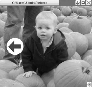
What probably isn't obvious is that every project has an implicit style definition if you don't override it. For example, when you added a button to your form, how did it know that its background should be a gradient silver-like color? Where did those hover over and mouse down effects come from?
The answer is that every control is associated with one or more styles. As part of your work, you can create a style just as you created a resource. Styles can be assigned similarly to resources — that is, either by referencing them by name when assigning a new style to an instance of a control, or by creating a style that is associated with all instances of a given type. In either case, the Style property of a control is what is known as a dependency property.
When you hear the term dependency your initial reaction may be that this means the property has a dependency on some other item. However, in the context of WPF, a better way to think of the term dependency is that "it depends on who set that specific value in the object that defines that property." A dependency property isn't dependent on some external item; the property's value varies over time depending upon the last update to the property.
Going into the details of why this occurs is beyond the scope of this chapter. However, dependency properties are coupled with change notification logic, and play a significant role in things such as animation and 3-D layout. For the purposes of this chapter, it's only necessary to understand a few things about dependency properties. First, they reference resources and styles as dynamic resources, not static resources. Second, they are identified in the documentation of the WPF components. Finally, as stated already, the Style property is in fact a dependency property.
Styles essentially leverage the concept of resources. With a style you have the option of either referencing all objects of a common type and setting the default style for that control type or creating a custom style that is specific to those control instances that reference it. In short, styles provide a mechanism for you to apply a theme across an application and to override that theme in those specific instances where you want to. If another developer later adds new elements to your application, the default styles are automatically applied.
Styles are defined like resources; in fact, they are defined within the same section of your XAML file in which resources are defined. As with resources, when you define a style at the application level, the style can be applied across all of the windows in the application. Conversely, if a style is meant to target only the objects in a given window, page, or user control, then it makes sense to define them at that level.
Rather than provide a simple example of a style, in this case the goal is to understand where the hover effect for a standard button comes from, so the following code block provides the default style assigned to each control of type Button. As you might guess, this style was retrieved using Blend; it isn't available via Visual Studio. With Blend, you can request that it allow you to edit these default templates, and you can do so such that your changes will be used only on those controls for which you explicitly assign your custom style.
<Style x:Key="ButtonFocusVisual">
  <Setter Property="Control.Template">
    <Setter.Value>
      <ControlTemplate>
        <Rectangle SnapsToDevicePixels="true" Stroke="Black" StrokeDashArray="1 2"
StrokeThickness="1" Margin="2"/>
      </ControlTemplate>
    </Setter.Value>
  </Setter>
</Style>
<LinearGradientBrush x:Key="ButtonNormalBackground" EndPoint="0,1" StartPoint="0,0">
  <GradientStop Color="#F3F3F3" Offset="0"/>
  <GradientStop Color="#EBEBEB" Offset="0.5"/>
  <GradientStop Color="#DDDDDD" Offset="0.5"/>
  <GradientStop Color="#CDCDCD" Offset="1"/>
</LinearGradientBrush>
<SolidColorBrush x:Key="ButtonNormalBorder" Color="#FF707070"/>
<Style x:Key="ButtonStyle1" TargetType="{x:Type Button}">
  <Setter Property="FocusVisualStyle" Value="{StaticResource ButtonFocusVisual}"/>
  <Setter Property="Background" Value="{StaticResource ButtonNormalBackground}"/>
  <Setter Property="BorderBrush" Value="{StaticResource ButtonNormalBorder}"/>
  <Setter Property="BorderThickness" Value="1"/>
  <Setter Property="Foreground" Value="{DynamicResource {x:Static SystemColors.
ControlTextBrushKey}}"/>
  <Setter Property="HorizontalContentAlignment" Value="Center"/>
  <Setter Property="VerticalContentAlignment" Value="Center"/>
  <Setter Property="Padding" Value="1"/>
  <Setter Property="Template">
    <Setter.Value>
      <ControlTemplate TargetType="{x:Type Button}">
<Microsoft_Windows_Themes:ButtonChrome SnapsToDevicePixels="true"
x:Name="Chrome" Background="{TemplateBinding Background}" BorderBrush="{
TemplateBinding BorderBrush}" RenderDefaulted="{TemplateBinding IsDefaulted}"
RenderMouseOver="{TemplateBinding IsMouseOver}" RenderPressed="{TemplateBinding
IsPressed}">
<ContentPresenter SnapsToDevicePixels="{TemplateBinding
SnapsToDevicePixels}" HorizontalAlignment="{TemplateBinding
HorizontalContentAlignment}" Margin="{TemplateBinding Padding}"
VerticalAlignment="{TemplateBinding VerticalContentAlignment}"
RecognizesAccessKey="True"/>
</Microsoft_Windows_Themes:ButtonChrome>
<ControlTemplate.Triggers>
<Trigger Property="IsKeyboardFocused" Value="true">
<Setter Property="RenderDefaulted" TargetName="Chrome" Value="true"/>
</Trigger>
<Trigger Property="ToggleButton.IsChecked" Value="true">
<Setter Property="RenderPressed" TargetName="Chrome" Value="true"/>
</Trigger>
<Trigger Property="IsEnabled" Value="false">
<Setter Property="Foreground" Value="#ADADAD"/>
</Trigger>
</ControlTemplate.Triggers>
</ControlTemplate>
</Setter.Value>
</Setter>
</Style>There are two lines of interest in the preceding code block. The first concerns the actual button style defined. Styles often reference other resources, and similar to early C compilers, references must be defined before they are actually referenced. Thus, the Style defined in the preceding code block is actually the last Style entry that starts thus:
<Style x:Key="ButtonStyle1" TargetType="{x:Type Button}">This line indicates that this set of resources defines a style with the key ButtonStyle1. Because this style is defined with a key, it is not a default style applied to all controls of the target type. Styles always define a target type because different control types expect different specific values defined within all of the detailed elements of a style.
To have every control button use the same style, instead of providing a key for the style ButtonStyle1, you provide only the type definition. If at some point you want objects of different types to share certain characteristics, this can be done by defining a resource and then applying it to the style for each of the types. If these styles are then designated without a key, then they are by default applied to every object of that type.
All of that is great, but the goal is to find a way to remove the default highlight that occurs as you mouse over a button. The good news is that the hook that causes that behavior is in fact included in this file; the bad news is that it references a template that is then assigned to that behavior. The following line of XAML shows that the RenderMouseOver property is being associated with the template IsMouseOver:
RenderMouseOver="{TemplateBinding IsMouseOver}"It is this template that causes the button to change its look to reflect this state. Thus, to have a button without this default behavior, you need to either define a new template or delete this line of XAML from your custom style.
You could, of course, take the preceding code block, make the necessary change, and paste it into your application's XAML. Certainly that will work if you also carry out the other steps that you need. However, long term, the preceding block of XAML is specific to controls of the type Button. Moreover, all of the preceding code was in fact generated from within Blend, so if you needed to customize the runtime behavior of another control type, you would have to find some way to generate the default style for that control.
This is where Blend becomes a requirement. Blend enables you to open your application directly. If, as assumed here, you are using Visual Studio 2008, then you can't open your projects using the current release of Blend. Blend 1.0 targets project files based on the Visual Studio 2005 format. In order to directly open your projects, you must have installed Service Pack 1 for Blend 1.0, which can open Visual Studio 2008 projects.
Normally when you open Blend, you can select any control in your application and generate the XAML for the default style. Blend will automatically integrate this style information into your XAML file, enabling you to proceed efficiently. However, in order to better understand styles, you are going to manually extract some style information generated by Blend for use within Visual Studio 2008.
Figure 17-13 shows the startup screen for Expression Blend. The only reason this screen is being shown is to highlight the fact that, of the three potential tabs in this window, the Samples tab is selected. This tab shows the list of samples that ship with Blend. These samples are not installed on disk with Blend. If you choose to open one of these samples, Blend generates the associated project at that time. What you need to know is that if you then modify anything in that project, even something as simple as adding a space to a XAML file, Blend will ask whether you want to create a copy of that sample on your local disk.
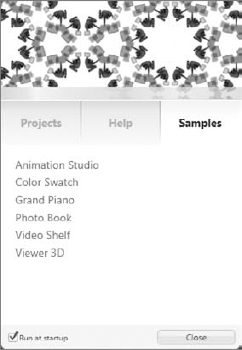
Once Blend opens, you are presented with what is probably best described as a rather dark and busy user interface. Fortunately, you can change the coloring. From the Tools menu, select Options. As shown in Figure 17-14, this opens the Options window. The first screen is the Theme setting. Changing this from Expression Dark to Expression Light enables you to see the interface in the same format for which the screens are being captured for this chapter. There don't seem to be any settings to reduce how much information the tool presents at once. In fact, this is one tool that, as these screenshots will demonstrate, isn't actually usable at 1024 × 768.
Once you've opened the tool, the next step is to open or create a project. Although you have a Visual Studio 2008 project, you'll want to create a new project to follow this demonstration on the default styling of a button. Use the File menu and select a new project. When the New Project dialog opens, you have the option to select a language, but because you only care about the XAML that will be generated, it doesn't matter which language or project name you select.
Once you have a new project, the main display area presents a clean white canvas, as shown in Figure 17-15. In order to add a button to this canvas, ensure that the Button control is selected in the toolbar. Unlike the Visual Studio toolbar, which lists each control, Blend groups the controls by category, from which you select a control. When you want to add that control to your display, you first click and hold the mouse button on that category to open the list of controls for that category. You then verify or select the control you wish to create.
Once you have selected the control, it displays above that category in the toolbar. You then take your mouse and draw that control onto your form. The Blend interface is not a drag and drop interface for adding controls. For this example, you'll select the button control and then draw that control onto your user interface.
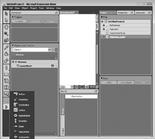
Notice that unlike the Visual Studio editor that places both the design surface and the source XAML in the same display, Blend has room for only one of these surfaces. On the right-hand side of the display are the tabs that enable you to move between the design surface and the source XAML. You could edit a complete XAML file through this interface, but for now the only goal is to generate and retrieve the default style information associated with your control. Therefore, once you've added your button to this display, the next step is to ensure that it is selected on the design surface.
After you've added a button to your display surface, as shown in Figure 17-16, it is time to look for the XAML associated with the default style of that button. To generate this XAML, you need to first ensure that the control is selected. Next, as shown in Figure 17-16, open the Object menu, select the Edit Style menu option, and then select the Edit a Copy menu option.
Once you have selected this menu item, you'll be taken to the Create Style Resource dialog shown in Figure 17-17. This dialog enables you to customize the type of style declaration that is generated and to determine what level of scope this resource should have.
As Figure 17-17 shows, when you generate your style to include a key, it is specific to those controls that reference it. However, you can choose to generate a style that applies to all instances of a given control. The other option allows you to generate a resource that is defined at and within your application scope. The default is to create a resource at the level of the current window. Both of these options are acceptable; however, the designers of Blend foresaw that in the case of very large projects these files could start to become extremely large and unwieldy. As a result, Blend allows you to create a resource dictionary as part of your project.
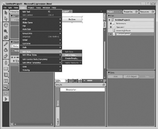
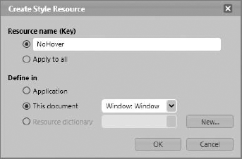
In short, you can choose to create a new file that is referenced by either your application or window XAML file, and that contains and isolates your custom style and other resource definitions. The advantages of this method include not only a smaller file size for your key files, but the capability to separate the different resources into different files for scenarios in which multiple people are working on the same project. For example, one designer could work on customizing the style for buttons while another person is customizing the style of the drop-down lists.
For this example, call the new style NoHover and click OK. Once you complete this dialog, Blend generates the same style definition that was included earlier. You'll need to use the XAML tab, shown earlier in Figure 17-16, to switch to the source view; and just as you've seen previously when you created a resource manually, Blend adds all of the XAML for your default button behavior into this file.
Copy this text from Blend and return to Visual Studio. In Visual Studio, paste the text from Blend directly into the XAML for Window1.XAML. This places the new style definition into your project and immediately triggers an error. Typically when this is generated, and in fact in the sample project you just created in Blend, the Blend engine takes care of hooking your custom style into the project. The first step in this process is adding a reference to the classes that define that style. Thus, you need to add a new reference to your project. Figure 17-18 shows the MyProject References page with a newly added reference.
The reference at the project level to the PresentationFramework.Aero libraries allows you various source files to reference this library. However, there is still one more step. You need to reference this library from within the XAML for Window1. Go to the definition of the window and its attributes at the top of your XAML file and add another xmlns, also known as an XML namespace declaration:
<Window x:Class="Window1"
    xmlns="http://schemas.microsoft.com/winfx/2006/xaml/presentation"
    xmlns:x="http://schemas.microsoft.com/winfx/2006/xaml"
    xmlns:Microsoft_Windows_Themes="clr-namespace:Microsoft.Windows.Themes;
assembly=PresentationFramework.Aero"
    Title="ProVB_WPF" Height="335" Width="415" Name="MainWindow"
    WindowStyle="None" AllowsTransparency="True">
The highlighted line is the line that needs to be added to your source file. Once this line is added you'll find that the XAML errors that occurred when you pasted the new style definition into your window go away. This is the same reference that you added to your project, but in this case you are defining for the XML compiler where to find things such as the definition for Chrome. As with the project reference, Blend typically handles this automatically for you.
At this point there is only one more manual step in this process. Although you've added a new style to your project, you haven't referenced that style anywhere. For the purpose of this version, you are just going to add that style definition to the ButtonBrowse definition. Doing so works just like other resources you've referenced, but in this case the assignment to the Style property is for a dynamic resource:
<Button Style="{DynamicResource NoHover}" HorizontalAlignment="Stretch"
Margin="0,0,130,2" Name="ButtonBrowse" >Images Folder</Button>
You should then be able to compile and run the application and get a result similar to what is shown in Figure 17-19. Notice that many of the graphics have been updated to be less stark, and include some basic color gradients. I did this by closing Visual Studio and reopening the project in Blend. Just as with Visual Studio, you can open the solution file for ProVB_WPF_Step_3. Blend displays your project on the right-hand side, in a window just like the Visual Studio Solution Explorer, although the tab is named Project. Open your Window1.xaml file. On the right-hand side you'll see the tree that represents the controls used in your XAML.
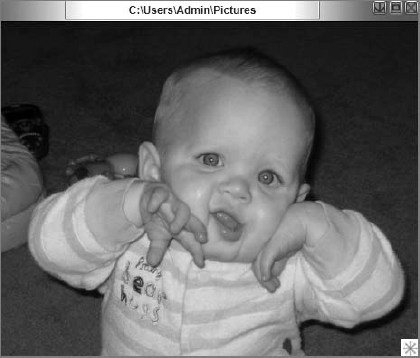
Selecting, for example, the button, you want to then select the Properties tab, which is located next to your Project tab. Once you have opened this, you have access to many of the display properties of your control. In the case of ButtonBrowse, I modified its background brush to be transparent. I did this by first selecting the Brushes section and then selecting the background. I then made certain that a solid brush was selected from the row of buttons so that I would see the color selector. There are four color options: Red, Green, and Blue (RGB) are self-explanatory. The remaining value is the A channel, which reflects transparency. Setting this to 100 means that you can't see through that item; setting this to 0 means that a given value is invisible.
I set the button background to be transparent, and then repositioned it to be centered better in the title bar. Next, I selected that rectangle called Title Bar to edit its display properties. I went to the brushes section of the Properties again, but this time I selected a gradient brush for the background. This results in the color display, but below it you have what looks similar to the ruler in Word. The ruler in Word is where you manage page elements such as page borders and tabs, and setting gradient colors works similarly.
On the left side of the toolbar is a little tag; if you drag this tag to the right, the default black color continues and the gradient section of the display decreases. Similarly, on the right-hand side of the display is a tag is associated with white. To change the default colors, you select that tag and then edit the color resources, just as you edit the A channel for transparency, only this time you focus on the RGB values. However, a gradient brush isn't limited to two color tags; in the ProVB_WPF_Step_3 project, the left corner of the title bar is green and the right side is blue.
To replicate this requires four tags on your gradient bar, and to add those tags you simply click on the bar. Just like adding tabs in Word, you can easily define additional color transition points. By defining the two inner tags as white and adjusting their position near the edges of the ButtonBrowse display, you can create a white background for the button while creating a gradient on either side of the title bar.
For the three control buttons, I first created a blue gradient background for each button. However, because the buttons actually display images, this background isn't visible, so I expanded each button and selected the image associated with the display of that button. Each image has an opacity property. The opacity property is another way of referencing the A channel for the color system, and by reducing the opacity from 100 percent to 50 percent, the blue background for each button is visible. The result is a version of the application that matches the final code in ProVB_WPF_Step_3 and looks similar to what is shown in Figure 17-19.
The next step is to separate out the custom window framework that was the focus of the ProVB_WPF_Step_2 project created earlier in this chapter. This can act as a base set of application classes that can be reused across multiple different applications. You can leverage the main application in Window1 just for managing your window and take the logic associated with its contents for displaying images and move that into a user control.
As for the specific controls available in WPF, you've seen in this chapter that several are available, although even those like the button that seem familiar may not work as expected. The fact is that WPF controls need to fit a different paradigm than the old Windows Forms model. In that model, a control could be associated with data, and in some cases undergo minor customization to its look and feel. Under WPF, the concept of a grid is used. It isn't, however, similar to the old Windows Forms DataGridView in any way. The WPF grid is a much more generic grid that enables you to truly customize almost everything about its behavior.
Part of the goal of WPF is to make it immaterial which environment your application will work in, Web or desktop. For example, consider a couple of the bottom-layer elements. The one used most in this chapter is the Window control. As demonstrated in the first ProVB_WPF example, a window includes a frame and a title in addition to its content area. You might want to apply a layout grid or a panel — for example, a stack panel — within this content area. Conversely, you could take a different tack and place a user control within this window. In fact, in most cases this is the recommended path because of the other low-level WPF element — the Page.
A Page control is, of course, the base UI element for a Web application, so it's easy to see how this paradigm of the content area can support the layering of two different user-interface implementations. Once you have defined the base elements of your user interface you can leverage user controls, which are equally happy on the desktop or in the browser. Of course, creating applications that flexible is a bit more challenging, unless you are leveraging services. In other words, instead of targeting the file system, you would target a service that might be local or remote and that would be focused on the appropriate file system. Then the application is running on a local computer. It can encapsulate the pages in a Window control; and when hosted in a browser, it can use those same user controls within the framework of a Page.
Aside from some standard user interface controls, the WPF Toolbox contains nearly all of the controls that you can find in every other Windows-based user interface model, such as tabs, toolbars, tooltips, text boxes, drop downs, expanders, and so on. It should also be noted that the WPF namespace consists of several graphics, ink, and even data and data-bound controls.
Accordingly, the key to working with WPF is taking these basic controls and using WPF user control projects to create the building blocks that you will then use to create your custom user interfaces. If the example in this chapter demonstrated anything, it is how time consuming making changes to the XAML can be.
A good exercise moving forward with the demonstration code from this chapter is to combine this code with the Photo Book example provided with Blend. You could combine these elements for a dynamic page-turning image viewer. The Photo Book sample application includes an excellent user control, Photobook.xaml, that encapsulates the page-turning effect. Of course, that control is currently implemented to reference local resources, and the application relies on the Windows default frame. The challenge isn't just to leverage this control but to enhance it, to perhaps leverage the full Windows.Media.MediaPlayer control so that you could display not only saved images but also recordings.
This chapter focused on familiarizing you with WPF and XAML. WPF implements a new application development paradigm for user interfaces. You can start designing and planning the next versions of your applications to use these new controls. Keep in mind that this single chapter hasn't covered all the new features you can potentially leverage with WPF — that would require an entire book. Instead, you should now have an understanding of the base principals of the WPF programming model and how it integrates with Visual Basic.
WPF is the user interface paradigm of the future for .NET developers. However, while the graphic support is more powerful, certain elements of this model require you to handle more of what traditionally was thought of as standard window behavior. It is hoped that this chapter has clarified several key concepts that you need to know when working with WPF:
XAML is a declarative standard for defining your user interface.
WPF-based applications leverage traditional programming languages such as Visual Basic.
WPF separates the UI creator from the business logic developer.
Creating the custom window behaviors, while sometimes required, is not especially difficult.
Visual Basic is uniquely positioned with literal XML strings to dynamically generate and display XAML elements as part of your application.
Blend is a required tool if you are trying to design a custom user interface that includes custom display characteristics.
This chapter focused on the WPF libraries within the context of building new applications. At this point you are probably wondering about your existing applications. Chapter 18 continues working with the WPF libraries, but looks at how to leverage WPF elements in an existing application.