
Windows Presentation Foundation (WPF) was introduced in the preceding chapter as Microsoft's next-generation solution to graphical user-interface development. In terms of user interfaces, the transition to this new model will be similar in significance and paradigm shift to the shift from COM-based Visual Basic to Visual Basic .NET. In other words, the paradigms and syntax familiar to developers of Windows applications are changing, and most of the changes are not backwardly compatible. Currently, there are no plans for an automated migration from any existing user-interface paradigm, forms, or Web, to the new WPF format.
You will need to transition existing application source code to a new technology paradigm. Perhaps not this year or next, but at some point the WPF paradigm will be used to update the look and feel of existing applications. How will this transition compare to the last major .NET-related transition — the one from COM? The original version of Visual Studio .NET included a tool to aid in migrating code from the COM-based world to .NET. No migration tool will be provided to transition existing user interfaces to WPF, which should be considered a good thing, considering the history of the current migration tools.
Instead, Microsoft learned the lesson that migration is both difficult and time consuming and is best done at the developer's pace. This is seen in the new Power Pack tools for Visual Basic, which Microsoft first released in 2006. These tools, which are now on version 2.0, are covered in Appendix B and are similar in concept to the interop methodology that Microsoft has chosen to follow with WPF. Microsoft is providing libraries that enable user-interface developers to integrate these two interface models. In the long run, this integration will probably go the way of COM-Interop, which is to say it will be available but carry such a stigma that people will only use it when absolutely necessary.
This chapter takes you through several key areas of Windows Forms integration, including the following:
The focus of this chapter is how to use these libraries to best enable you to both leverage WPF with your existing code and leverage your existing code and related Forms-based code with your new WPF applications. Just as with COM-Interop, the point of this tool is to help you, the developer, transition your application from Windows Forms to WPF over time, while working with time and budget constraints that all developers face and potentially waiting on the availability of a control that isn't available in WPF.
Crossbow was the code name for the project to provide a library that enables WPF applications to host Windows Forms controls and vice versa. The Crossbow project's focus was to provide a .NET library that developers could leverage; what it created was the WindowsFormsIntegration library. WindowFormsIntegration.dll supports the Windows.Forms.Integration namespace. This namespace provides the tools necessary for using WPF and Windows Forms in a single application. At the core of this namespace are the two classes ElementHost and WindowsFormHost. These two classes provide for interoperability in the WPF and the Windows Forms environment, respectively.
With Visual Studio 2008, the WindowsFormsIntegration.dll is located with the other .NET library classes and is imported like any other common namespace. It's the last item in the list of .NET references for most Windows Forms applications. Once it's imported, you'll find that the appropriate control class
for your project type — ElementHost or WindowsFormHost — is available in its respective designer.
The next step in looking at this library is to review a list of the classes and the delegate that make up the Windows.Forms.Integration namespace:
Class | Description |
|---|---|
This class is used when passing event arguments to the | |
| This is the core class for embedding WPF controls within Windows Forms. Using the |
This is the base class for the | |
This class enables you to return information related to a Layout error within a host class to the hosting environment, Windows Forms, or WPF. | |
A property on each of the host classes. It provides a way for a Windows Form to handle a change that occurs to one of the properties of a hosted control — for example, if the size of the | |
Similar to the layout exception class, this enables a hosted control to return information related to an exception to the hosting environment. | |
This is the primary control when a WPF application wants to host Windows Forms controls. Similar to | |
This is the only delegate in this namespace. It is used within your Visual Basic code to enable you to translate properties from a |
These classes enable your application to host controls within its display area. As noted, when you add the appropriate host class to your display area, the host class contains a child control. Each host contains only a single child control. The 1-to-1 relationship enables the integration library to assign the display area allocated to the host directly to the child and not be concerned with maintaining positioning multiple children but instead be focused on a single target child. Thus, when you assign a control to a WindowsFormsHost, behind the scenes the Margin, Docking, AutoSizing, and Location properties of the WindowsFormsHost control are automatically applied to the Child control. The host controls don't contain a great deal of logic on the workings of what they are hosting; instead, they just act as an interop layer. The properties of the child are controlled via the host, and that control can, via user controls and panels, act as a native host for the other controls that you want to display within the host control.
Similar to the WindowsFormsHost, the ElementHost control automatically controls the display characteristics associated, including the following properties: Height, Width, Margin, HorizontalAlignment, and VerticalAlignment. In both cases, the host control acts as the virtual display area for the hosted control, and you should manage that display area via the host control, not the child it contains. Even though both controls are targeted at area controls such as user controls and panels, their purpose is to access controls and features across the UI display models.
Hosting WPF controls within your existing Windows Forms—based applications enables you to introduce new functionality that requires the capabilities of WPF without forcing you to entirely rewrite your application. This way, even as you work on upgrading an existing application to WPF, you aren't forced to take on a single large project. As for the integration itself, it isn't page- or window-based, although you can introduce new WPF windows to an existing application. The integration is focused on enabling you to incorporate new user controls into your existing Windows Forms application.
Accordingly, the model is based around the idea that you can encapsulate the functionality of a set of WPF UI features as a user control. This has a couple of key advantages, the first being that if you've been working with .NET, you are already familiar with user controls and how they function. Once again, the paradigms of previous user-interface models appear and are reused within WPF. The second big advantage to modeling this around user controls is that as more of your application moves to WPF, you don't have to rewrite the user controls you create today when later they are used within a pure WPF environment.
With this goal in mind of creating a control that can later be moved from being hosted within a Windows Form application to running unchanged within a WPF application, you can turn your attention to creating a sample solution.
The first step is to open Visual Studio 2008 and go to the New Project dialog. From here, select the Windows category of Templates and create a new Windows Forms application. For example purposes, you can name this ProVBWinForm_Interop. As discussed in Chapter 13, Visual Studio uses the template to create a new Windows Forms project, and you can accept the default of targeting .NET 3.5. At this point, using the File menu, add a second project to your solution.
Again select the Windows category of Templates and create a new WPF user control library. For demonstration purposes, use the name WpfInteropCtrl. When you are done, the Visual Studio Solution Explorer will look similar to what is shown in Figure 18-1. The next step is to add the customization to the newly created WPF library, after which the Windows Form application will be updated to reference the integration library and the new WPF user control.
The first customization is to the grid, which is by default in the display area. For this example, you will change the background color of the grid that fills your control's display. You will also add a new Image control to the grid and bind it to the edges using the margin property, not the height or width properties.
The complete XAML is shown in the following code block:
<UserControl x:Class="UserControl1"
    xmlns="http://schemas.microsoft.com/winfx/2006/xaml/presentation"
    xmlns:x="http://schemas.microsoft.com/winfx/2006/xaml"
    Height="300" Width="300">
    <Grid Background="LightSteelBlue">
            <Image Margin="10,10,10,10" Name="Image1" />
    </Grid>
</UserControl>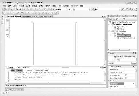
Now that you have completed your work in XAML, it's time for some code to accompany your control. As you can imagine, this WPF control is fairly simple in that you merely want it to display an image. This means you need a property that represents the path to the image to be displayed, some logic to load that image, the capability to respond to changes in size, and, for the purposes of custom code, the capability to prevent increasing the size of the image beyond its original size.
To meet these requirements you add a public property Image to your control that represents the path to the image that will be loaded. Within the Set logic for this property, you load the image. As noted in the following code block, the internal value has been set to a specific picture, but to be thorough, take a minute to review the accessors.
The Get and Set property accessors have been defined, with the Set accessor being customized. Note that after assigning the path for the current image to the internal value, this accessor then creates a new local image object and attempts to load the selected image path as a bitmap. WPF comes with converters for several common image types, but because this is demo code, no real checking is done to ensure the validity of the path passed in.
Thus, this logic is located within a Try-Catch block, and if the image load fails, the image value in the control is set to nothing. However, if a valid image path is provided, then the code loads the image and calls the local ResizeMargins method to handle adding margins based on the size of the image. Similarly, the SizeChanged event has been handled in this code, and it calls the same private method to ensure that the image is not stretched beyond its original size:
<UserControl x:Class="UserControl1"
Class UserControl1
    ' The default directory and image path are native to Windows Vista.
    ' On other operating systems select an appropriate directory.
    Private m_Image As String = _
             "C:UsersPublicPicturesSample PicturesGreen Sea Turtle.jpg"

    Public Property Image() As String
Get
Return m_Image
End Get
Set(ByVal value As String)
m_Image = value
Dim image As BitmapImage
Try
image = New Windows.Media.Imaging.BitmapImage( _
New Uri("file:///" + m_Image))
' Add path validation prior to loading the selected file...
Image1.Source = image
' Resize Margins if appropriate
ResizeMargins(image)
Catch
Image1.Source = Nothing
Return
End Try
End Set
End Property
Private Sub UserControl1_SizeChanged(ByVal sender As Object, _
ByVal e As System.Windows.SizeChangedEventArgs) _
Handles Me.SizeChanged
If Image1.Source IsNot Nothing Then
ResizeMargins(CType(Image1.Source, _
Windows.Media.Imaging.BitmapImage))
End If
End Sub
Public Sub ResizeMargins(ByVal image As Windows.Media.Imaging.BitmapImage)
' ActualHeight and ActualWidth represent the size of the image control
' whether margin is set or not. If the actual size is greater than the
' size of the image reset margins to the max size of the image.
Dim imgH As Double = image.Height
Dim ctrlH As Double = Me.ActualHeight
Dim marginHorizontal As Double
If imgH > ctrlH Then
marginHorizontal = 0
Else
marginHorizontal = (ctrlH - imgH) / 2
End If
Dim imgW As Double = image.Width
Dim ctrlW As Double = Me.ActualWidth
Dim marginSide As Double
If imgW > ctrlW Then
marginSide = 0
Else
marginSide = (ctrlW - imgW) / 2
End If
Image1.Margin = New Thickness(marginSide, marginHorizontal, _
marginSide, marginHorizontal)
End Sub
End Class</UserControl>The remaining custom code is in fact the ResizeMargins method. This method is reasonably simple. It takes the size of the image itself and compares this to the size of the control Image1. Note that this code references the ActualHeight property. Unlike the Height property, which for controls that are docked doesn't provide a valid size, the ActualHeight property reflects the current size of the Image1 control. If the control size is larger than the original size of the image, then the code adjusts the margins to fill in around the image.
This completes the definition of your sample WPF control library, so compile your application to ensure that no errors are pending.
The next step is to customize the Windows Forms application. Begin by adding the five required references that enable you to embed and manipulate this control. They are the four framework libraries — Windows.Forms.Integration, PresentationCore, PresentationFramework, and WindowsBase — and a project reference to your custom WpfInteropCtrl library. Open the project properties for your ProVBWinForm_Interop project and go to the References tab.
Choose Add References, and in the list of available .NET libraries you'll find all four framework references available. Other presentation libraries are also available from this screen, and depending on what you intend to do in your application you can choose to add other library references to your project as well. Finally, switch to the Project References tab and add a reference to your local project.
Now go to the Design mode for the Form1.vb file that was created by the Windows Forms template when you created this project. Extend the default size of the design surface with the size of your control in mind, allocating enough room to align three rows of Windows Forms controls above your custom user control.
Starting at the top, you are going to add a new Button control to the upper-right corner of the display. The label on this button will be "Select Folder," and the button should be resized to display its full size. Next, add a FolderBrowserDialog control to your window; this control doesn't have a display element and will be shown below your form. Now add a Label control below your button and change its display text to "Image:". Once this is in place, add a ComboBox control to the right of this label. Accept the default name of ComboBox1 and specify that this control should expand as the form widens.
Next, add a Label control to the right of your button, and use the text "Mask:". To the right of the "Mask:" label, add a new combo box, ComboBox2, in the sample code. Go to the context menu for this ComboBox and select Edit Items to open the edit window. Within this screen add the three options that will make up the image mask options: No Mask, Ellipse, and Rectangle. Ensure that this control is also bound to the form's width.
Below the image ComboBox, in a third row on your Windows Form. add a Label control with the text "Margin:" and a TextBox control with the name TextBoxMargin. Set the default value for this TextBox to 10 and limit its length to 4 characters in the properties display. Similarly, alongside this text box, add another Label control with the text "Corner Radius," and a second TextBox control called TextBoxRounding. Set the default value for this second text box to 50.
At this point, add the ElementHost control to your form. Your first reaction might be to drag and drop your UserControl1 directly onto the form surface. Doing this will appear to work until the first time you run your project, at which point an error will occur in the designer. This may be repaired in a future release, but for now the correct step is to go to the Toolbox and drag and drop the control ElementHost1 onto your form. Resize the control to fill up the area in the display. Next, drag and drop your custom UserControl1 onto the display area of ElementHost1 and use the control's context menu to have it dock with the parent container.
The design view for Form1 should look similar to the one shown in Figure 18-2. Note the expanded Properties pane. This is currently set to display/edit the properties for ElementHost1, focusing on its reference to the user control.
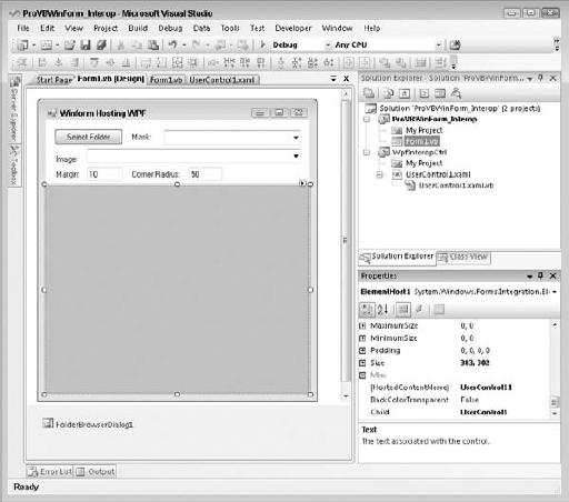
The next step is to add some custom code to this form. The form will allow you to select a folder containing images and then display any of those images. Additionally, you will have the capability to place a mask over the image to provide a custom "frame" around the displayed image. The goal is to demonstrate not only adding a control, but also a scenario in which you need to map one of the ElementHost's properties within your code.
The next listing provides the basis for your customization. The first item is to hold onto the current directory path. The private value is defined on the form class, and a default path for images on Vista is assigned to this property. Next, the Load event for the form is handled. Within the Load event the code will get the list of files from the default directory and then load ComboBox1 with this list of files. It will select the first file from the list, and then ensure that no mask is selected. Finally, the sample code calls the method AddPropertyMapping. This call is currently commented on, and you will uncomment it after the reason for mapping a property is illustrated.
The next method shown in this code block is the event handler for the button's Click event. This event handler opens a folder browsing dialog using the control FolderBrowserDialog1. It uses the current path as the default for this dialog, and if the user selects a new directory for images, it loads the new list of files into the ComboBox. Note that it doesn't change the selected image, so a user won't see a new image automatically displayed when the list of files is loaded.
Public Class Form1
    ' The default directory path is native to Windows Vista.
    ' On other operating systems select an appropriate directory.
    Private m_path As String = "C:UsersPublicPicturesSample Pictures";
    Private Sub Form1_Load(ByVal sender As System.Object, _
                           ByVal e As System.EventArgs) _
                           Handles MyBase.Load

        For Each filename As String In System.IO.Directory.GetFiles(m_path)
            ComboBox1.Items.Add(filename)
        Next
        ComboBox1.SelectedIndex = 0
        Me.ComboBox2.SelectedIndex = 0

        'AddPropertyMapping()
    End Sub

    Private Sub Button1_Click(ByVal sender As System.Object, _
                             ByVal e As System.EventArgs) _
                             Handles Button1.Click
        FolderBrowserDialog1.SelectedPath = m_path
        If (FolderBrowserDialog1.ShowDialog() = _
                                         Windows.Forms.DialogResult.OK) Then
            If Not m_path = FolderBrowserDialog1.SelectedPath Then
                m_path = FolderBrowserDialog1.SelectedPath
                ComboBox1.Items.Clear()
                For Each filename As String In _
                                          System.IO.Directory.GetFiles(m_path)
                    ComboBox1.Items.Add(filename)
                Next
            End If
        End If
    End Sub

    Private Sub ComboBox1_SelectedIndexChanged( _
                ByVal sender As System.Object, ByVal e As System.EventArgs) _
                Handles ComboBox1.SelectedIndexChanged
        Dim x As WpfInteropCtrl.UserControl1 = _
                        CType(ElementHost1.Child, WpfInteropCtrl.UserControl1)
        x.Image = ComboBox1.SelectedItem.ToString
    End Sub
End Class
Finally, the preceding code includes the SelectedIndexChanged event handler, which is called when a user selects a new item from the list of available image files. This event handler retrieves the selected image path and passes this path to the child of the ElementHost1 control. Because the child object is in fact an instance of the class WpfInteropCtrl.UserControl, the generic child property can be cast to this object, which supports the public property defined as part of the user control's definition, discussed earlier.
At this point, if you are following along with the text, you should save, build, and run your project. The project will work, although to be honest at this point it isn't doing too much. It illustrates that you can, in fact, host classes from the System.Windows.Controls namespace in an ElementHost control.
The next part of this demonstration involves altering the display of the ElementHost content based on code located within the Windows form. Accordingly, the next block of code uses a geometric shape to overlay a mask above the selected display, making it possible to round the corners or the entire image. The application of the mask occurs based on the second ComboBox control that was added to the form.
This control was assigned three values, and when one of the values is selected, it triggers the ComboBox2.SelectedIndexChanged event, which has been handled in this code. The code follows a best practice and calls a private method that implements the appropriate action based on which value was selected. The method ApplyMask uses a Select Case statement to identify which of the three fixed maps has been selected and then either disables the clipping region or enables a clipping region of the appropriate shape.
The clipping region is a WPF property available on WPF controls. The Clip property enables you to overlay a given control with a geometric shape that masks out portions of the targeted control. This example implements two simple masks: an ellipse and a rectangle. Selecting to not have a mask sets the Clip property for the Child object within the control ElementHost1 to Nothing. However, selecting a mask to screen out a portion of the display results in the code calling one of a pair of methods, EllipseMask and RectMask, each of which is focused on a single geometric shape.
These two methods share the majority of their logic, first getting the available display area from ElementHost1's Child property. Both then use the TextBoxMargin to allow the user to change the size of the margin surrounding the clip region. Note that in both cases the margin isn't applied in the same manner as setting a margin in WPF was.
Under WPF, a Margin property is defined as a thickness or distance between the edge of the control and the edge of the display for each of the four sides. Thus, both the left and right or top and bottom values are the same. However, in the case of a clipping region, the code is defining the size of a rectangle. Thus, the size of the rectangle needs to account for the fact that moving the top of the image 10 pixels lower means that the box needs to be 20 pixels smaller on the length of the side so that the 10 pixels from the top balance the 10 matching pixels on the bottom. This is why the margin is doubled when describing the height and width and not doubled when defining the upper-left corner location.
Private Sub ComboBox2_SelectedIndexChanged(ByVal sender As System.Object, _
                                     ByVal e As System.EventArgs) _
                                     Handles ComboBox2.SelectedIndexChanged
    ApplyMask()
End Sub

Private Sub ApplyMask()
Select Case ComboBox2.SelectedIndex
Case 0
ElementHost1.Child.Clip = Nothing
TextBoxMargin.Enabled = False
TextBoxRounding.Enabled = False
Case 1
EllipseMask()
TextBoxMargin.Enabled = True
TextBoxRounding.Enabled = False
Case 2
RectMask()
TextBoxMargin.Enabled = True
TextBoxRounding.Enabled = True
Case Else
' An error has occurred. Pick the top entry and try again...
ComboBox2.SelectedIndex = 0
End Select
End Sub
Private Sub EllipseMask()
Dim width As Double = ElementHost1.Child.RenderSize.Width
Dim height As Double = ElementHost1.Child.RenderSize.Height
Dim margin As Double = Convert.ToDouble(TextBoxMargin.Text)
If width = 0 Then
width = ElementHost1.Width
End If
If height = 0 Then
height = ElementHost1.Height
End If
If (margin * 2) > height Or (margin * 2) > width Then
ElementHost1.Child.Clip = Nothing
Else
ElementHost1.Child.Clip = New Windows.Media.EllipseGeometry( _
New Windows.Rect(margin, margin, _
width - (margin * 2), height - (margin * 2)))
End If
End Sub
Private Sub RectMask()
Dim width As Double = ElementHost1.Width
Dim height As Double = ElementHost1.Height
Dim margin As Double = Convert.ToDouble(TextBoxMargin.Text)
If (margin * 2) > height Or (margin * 2) > width Then
ElementHost1.Child.Clip = Nothing
Else
Dim rect As New Windows.Media.RectangleGeometry( _
New Windows.Rect(margin, margin, _
width - (margin * 2), height - (margin * 2)))
rect.RadiusX = Convert.ToDouble(TextBoxRounding.Text)
rect.RadiusY = rect.RadiusX
ElementHost1.Child.Clip = rect
End IfEnd Sub
Private Sub TextBoxMargin_TextChanged(ByVal sender As System.Object, _
ByVal e As System.EventArgs) _
Handles TextBoxMargin.TextChanged
Dim margin As Double
If Double.TryParse(TextBoxMargin.Text, margin) Then
ApplyMask()
Else
TextBoxMargin.Text = 0
End If
End Sub
Private Sub TextBoxRounding_TextChanged(ByVal sender As System.Object, _
ByVal e As System.EventArgs) _
Handles TextBoxRounding.TextChanged
Dim margin As Double
If Double.TryParse(TextBoxRounding.Text, margin) Then
ApplyMask()
Else
TextBoxRounding.Text = 0
End If
End SubAside from the margin, note that in the RectMask function the code also applies the value from the TextBoxRounding control to the RadiusX and RadiusY properties on the rectangle. These properties cause the corners of the rectangle to be rounded, so when the rectangle mask is selected, the user is able to apply a value that changes the amount of corner rounding.

Finally, the preceding code block includes two additional event handlers, one for each of the two text boxes on the form. The first one handles events related to the margin's width, and the second event is related to the radius for rounded corners on your rectangle map. In both cases they call the same ApplyMask method, which is called when you select a mask.
Now it's time to build and run your application. After building and running your control, you should see a display similar to the one shown in Figure 18-3. Superficially, this application works and allows you to apply different masks and resize these masks. Notice that you are now modifying your WPF controls from within your Windows Forms application.
However, apply a mask and then resize your main frame. Notice how even though the image was resized, the mask remained static. Your application isn't recognizing a change in the size of control ElementHost1 or the need to recalculate the size and location of the mask.
There are a couple of potential solutions to this problem; however, for the purposes of this chapter, which focuses on demonstrating the features of the WindowsFormsIntegration library, the solution described here uses a mapped property on your control. The ability to access the mapped properties of WPF controls is one of the features of this library that provides you with greater flexibility. One of the available properties on control ElementHost1, the PropertyMap collection, enables you to select one or more of the ElementHost1 properties and essentially register for a custom event handler. This is not an event handler in the traditional Windows Forms sense of the word, but rather the assignment of a delegate that is called when that property is changed.
The first step is to go to the load event described earlier in this chapter and uncomment the line that is calling the method AddPropertyMapping. Once you have uncommented this line, add the functions shown in the block of code that follows. The first of these is, in fact, the custom function AddPropertyMapping. This function simply calls the Add method on the PropertyMap collection to assign a new delegate in the form of a PropertyTranslator from the Windows.Forms.Integration library that will be called when the Size property of control ElementHost1 is changed. Note that by assigning this value at the end of the Form1_Load event handler, your application will now make this call whenever the size of the control changes.
' The AddPropertynMapping method assigns a custom
' mapping for the Size property.
Private Sub AddPropertyMapping()
    ElementHost1.PropertyMap.Add( _
        "Size", _
        New Integration.PropertyTranslator(AddressOf OnEHSizeChange))
End Sub

''' <summary>
''' Called when the ElementHost control's size is changed
''' </summary>
''' <param name="h"></param>
''' <param name="propertyName"></param>
''' <param name="value"></param>
''' <remarks>A change of this property requires the form hosting this
''' control to adjust the clipping region, so the Property Mapper
''' in the Integration library is used to map an "event" handler.</remarks>
Private Sub OnEHSizeChange(ByVal h As Object, _
ByVal propertyName As String, ByVal value As Object)
ApplyMask()
End SubThe second method in the preceding block of code is the actual OnEHSizeChange method. Note that this method has three parameters:
The first is the actual object that has been changed.
The second is the name of the property, so multiple properties could call the same delegate in your Windows Forms code.
The third is the new value of that property.
For the purposes of this demonstration, because this method will only be called for a single property on a single object, and because the new value will already be assigned within the control, the only thing this method needs to do is call the same ApplyMask method that is called elsewhere to correctly apply the mask to the image. Save, build, and run your example code again and notice how the mapping of the property has allowed your form to detect when a property on control ElementHost1, or potentially even on one of the WPF controls within your ElementHost control, has changed. As an exercise, consider changing this example to detect when the image hosted in control Image1 changes.
This example illustrates how you can create a new WPF component that can be incorporated into an existing Windows Forms application. You can start the process of migrating your application to WPF while still focusing the majority of your available resources on adding new capabilities to your existing application. Migration in this context means you are not forced to attempt to spend the majority of your cycles rewriting your entire existing interface. Instead, you can integrate these two display methodologies. The preceding example demonstrates one way of working with a WPF control within a Windows Forms application.
Other methods for carrying out the same tasks, including adding WPF controls within the context of the same project, are also possible. However, defining WPF controls within a Windows Forms project reduces your ability to migrate your control into a larger WPF model. Using the method demonstrated in this chapter makes that transition easy, as you'll just be hosting Windows Forms controls in WPF.
In the case of WPF hosting Windows Forms controls, you might choose to do this if you have an existing application that relies on certain controls that have not yet been implemented in WPF. For example, the following table lists some of the controls that are not directly supported in WPF:
In addition to these controls that aren't directly supported, still other controls may behave differently in this release. For example, the ComboBox control in WPF doesn't provide built-in support for AutoComplete. In other cases, such as the HelpProvider (F1 Help), a control isn't supported because the WPF provides an alternative implementation. Even if you have an application in which the existing user interface takes advantage of one of the preceding control's features, it is understandable that you might be interested in integrating your existing investment in the next version of your application.
However, there is a real possibility that if you have heavily leveraged a DataGridView control, you will want to reuse your existing control, rather than attempt to design a custom replacement.
To walk through the process of using the WindowsFormsHost control, create a new WPF Windows Application called ProVBWPFInterop. Once you have that application, go to the File menu and use the Add option to add a second project to this solution. This time, pick a Windows Control Library called WinFormInteropCtrl. Again, Visual Studio will execute the template to create a new project. At this point you will have access to a new control called UserControl1. Go to the designer for this new user control and add a Button control and a DataGridView control to the design surface, as shown in Figure 18-4.
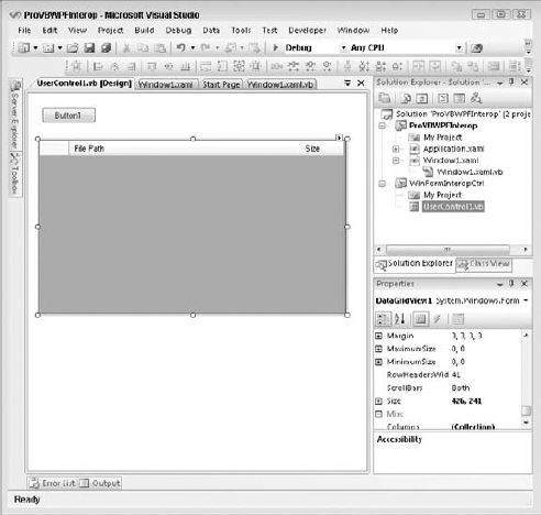
Figure 18-4 shows one way to arrange these controls. For the purposes of this demonstration, the Button control is static; it is there to demonstrate a formatting issue. Next, manually add the two columns shown in the grid through Visual Studio 2008. The first column will wind up holding string values representing the available images; this control represents a complex grid but is not meant to be one. Resize the grid to fit within the display area of your user control. This demonstration focuses on display characteristics, so there is no need to edit the default code-behind or provide an action for the click event of the button.
After you have created a new UserControl1, build the project so that the WinFormInteropCtrl has been compiled and then close this window. The next step is to update your WPF project with the appropriate references. Three references need to be added. From the Project Settings window, select the References tab. Add references to the .NET assemblies System.Windows.Forms and Windows.Forms.Integration. Finally, add a reference to the WinFormInteropCtrl project. After adding these three references, close the Project Settings window and recompile the project.
Having created a new user control and added the references, open the Window1.xaml file that's created with this template. In that XAML file you'll see the "Window" declaration. This declaration in Visual Studio imports two namespaces, as discussed in Chapter 17. You'll want to change the title of the form to reflect the new form title.
Next, switch to design view and add a button to the upper-right corner of the display. This button will illustrate two concepts. First, just as with the Windows Forms example, where the code leveraged some of the WPF classes outside the context of the interop form, this WPF form is going to leverage the same FolderBrowseDialog that was used in the preceding Windows form. Second, it will help show that although WPF and Windows Forms share the same control, a button, the default display of that control is very different, a problem that can be corrected. Label this button Select Folder and add an event handler for its click event.
Next, add a second button to the upper-right corner of the display. Align the buttons, label this as a Close button, and then set up an event handler for this button's click event. Next, drag and drop a WindowsFormsHost control onto the display. The control should be docked to the bottom bounds of the display below the two buttons.
Unlike the Windows Forms project earlier in this chapter, the WPF design surface currently does not support adding your custom user control to this display. At this point you can review the XAML view within Visual Studio to compare your XAML to the XAML shown in the following listing. Additionally, your overall display should look similar to Figure 18-5.
<Window x:Class="Window1"
    xmlns="http://schemas.microsoft.com/winfx/2006/xaml/presentation"
    xmlns:x="http://schemas.microsoft.com/winfx/2006/xaml"
  Title="ProVB WPF Interop" Height="300" Width="450" Name="Window1">
    <Grid>
        <Button Height="23" HorizontalAlignment="Left" Margin="14,14,0,0"
            Name="Button1" VerticalAlignment="Top"
            Width="100">Select Folder</Button>
        <Button Height="23" HorizontalAlignment="Right" Margin="0,14,26,0"
                Name="Button2" VerticalAlignment="Top"
                Width="75">Close</Button>
        <my:WindowsFormsHost Margin="0,50,0,0" Name="WindowsFormsHost1"
xmlns:my="clr-namespace:System.Windows.Forms.Integration;assembly=
WindowsFormsIntegration" />
    </Grid>
</Window>
Once you have set up your application's look, it's time to start handling some of the code. You'll notice in the code that follows there is again a default directory that is the images directory on Vista. The next method is the Window1_Loaded method. This method is called once when your form is initially loaded, and it's a great place to create an instance of your custom user control and assign it as the child of WindowsFormsHost1. There is also a line that has been commented out in this initial listing; you will uncomment that line after the first time you test run your application.

The majority of this code is associated with the Button1.Click event handler. In this case, for brevity, the application doesn't automatically load the contents of the directory. Instead when you first click Button1, you'll be allowed to select the default folder and then have it load the contents of that folder. Notice that although the grid was created with two columns, this sample code merely loads the document name for demonstration purposes into the grid that is part of your custom user control:
Class Window1
    ' The default directory path is native to Windows Vista.
    ' On other operating system's select an appropriate directory.
    Private m_path As String = "C:UsersPublicPicturesSample Pictures"

    Private Sub Window1_Loaded(ByVal sender As System.Object, _
                               ByVal e As System.Windows.RoutedEventArgs) _
                               Handles MyBase.Loaded
        WindowsFormsHost1.Child = New WinFormInteropCtrl.UserControl1()
        'System.Windows.Forms.Application.EnableVisualStyles()
    End Sub

    Private Sub Button1_Click(ByVal sender As System.Object, _
                              ByVal e As System.Windows.RoutedEventArgs) _
                              Handles Button1.Click
        Dim FolderBrowserDialog1 As New System.Windows.Forms.FolderBrowserDialog()
        FolderBrowserDialog1.SelectedPath = m_path
        If (FolderBrowserDialog1.ShowDialog() = Windows.Forms.DialogResult.OK) Then
            m_path = FolderBrowserDialog1.SelectedPath
            Dim uc As WinFormInteropCtrl.UserControl1 = _
                CType(WindowsFormsHost1.Child, WinFormInteropCtrl.UserControl1)
            Dim roid As Integer
For Each control As System.Windows.Forms.Control In uc.Controls
If TypeOf control Is System.Windows.Forms.DataGridView Then
Dim grid As System.Windows.Forms.DataGridView = control
grid.Rows.Clear()
For Each filename As String In _
System.IO.Directory.GetFiles(m_path)
roid = grid.Rows.Add()
grid.Rows(roid).Cells(0).Value = filename
Next
End If
Next
End If
End Sub
Private Sub Button2_Click(ByVal sender As System.Object, _
ByVal e As System.Windows.RoutedEventArgs) _
Handles Button2.Click
Me.Close()
End Sub
End ClassFinally, note that the last method is the event handler for the Button2.Click event. As you might expect, this event handles closing the window, an important capability if you hide the outer frame of your window.
At this point you can run the application. If you are using the downloadable package, you should see the results shown in Figure 18-6. If you are creating your own copy of the project, you should see similar results; however, the button in WindowsFormsHost1 should have the incorrect styling.

The first item that should jump out at you is that the WinFormInteropCtrl has lost the Windows XP visual styling. Referring back to Figure 18-6, you can confirm that this styling was present in the designer for this control. To resolve this issue, go to the code-behind file for your Window1.xaml file, Window1.xaml.vb. Within the Window1_Loaded method, either before or after the call to create your user control as the child of the control WindowsFormsHost1, add the following line of code:
System.Windows.Forms.Application.EnableVisualStyles()
Rerun the application. The visual styling is now correct, but you should also be able to see that WPF and Windows Forms render this style differently on a similar control. Thus, you'll want to ensure that you minimize the number of similar controls you reference on different sides of the host boundary. In this case, you simply needed to manually reset the display settings for your control to indicate that it should use the XP styling; however, this styling issue provides an excellent introduction to the next topic.
Private Sub Window1_Initialized(ByVal sender As Object, _
                     ByVal e As System.EventArgs) Handles Me.Initialized
    Me.WindowStyle = Windows.WindowStyle.None
    Me.AllowsTransparency = True
End Sub
One of the options discussed in the preceding chapter that focused on WPF was the capability to change the window style so that the traditional border and controls in the frame were hidden. Once this is done, it is possible to enable transparency and really work on creating a custom look and feel for your application. However, you'll note that the preceding code is commented out in the online materials. That's because this code is there to illustrate one of the limitations of the WindowsFormsHost control.
If you enable this code, you'll find that instead of getting your interop control to display, the WPF rendering engine does not render anything. Thus, while the limitations include not being able to use certain types of transparency with the control, this provides a much better illustration of how using a WindowsFormsHost control can impact your overall application look and feel.
The challenge with integration is that these two display models don't operate under the same paradigm. The Windows Forms world and the WindowsFormsHost are based on window handles, also known as HWnd structures. WPF, conversely, has only a single HWnd to define its display area for the operating system and then avoids using HWnds. The thing to remember, then, is that when you are working with encapsulating a control, that control — be it WPF or Windows Forms — will be affected by the environment in which it is hosted.
For example, if you host a WPF control inside a Windows Forms application, then the ability to control low-level graphical display characteristics such as opacity or background may be limited by the rules for Windows Forms. Unlike WPF, which layers control characteristics supporting the display of a control at a layer below the current control, Windows Forms controls are contained; when the control doesn't paint a background on your WPF control, the display may see that region as not painted and use a black or white background instead. Note that setting the AllowTransparency property for a control is supported when hosting WPF controls on a Windows Form. You can play with the background color used for the ElementHost control introduced earlier in this chapter to get a feel for this issue.
Recognizing that the host control is often limited by the underlying environment containing it is a good guide to predicting limitations. Although sometimes the actual characteristics of the parent application framework might come as a surprise, as you gain more experience with WPF you'll be able to predict where issues are likely to exist. For example, you can create both window- and page-based WPF applications, but these applications work on entirely different models. For example, a page-based WPF application is stateless. To support this stateless nature in those instances where it finds itself used in a page-based WPF application, the WindowsFormsHost control fully refreshes the contained control each time the page is refreshed — losing any user input that you might expect to remain within a Windows Forms control.
Another issue can arise with the advanced scaling capabilities of WPF. While Windows Forms controls are scalable, Windows Forms doesn't support the concept of scaling down to 0 and then restoring properly.
Similarly, be aware of the message loop, current control focus, and property mapping of hosted controls. The host controls support passing messages to the controls they contain, but across the application the ordering of messages may not occur in the expected order. Similarly, when a WindowsFormsHost control has passed focus to a contained control and then the form is minimized, the host control may lose track of which control within its Child has that focus. As a result, even though the unseen host has the current focus within your WPF application, there is no visible control with that focus. Finally, there are additional potential issues with property mapping other than the background color issue described earlier, so you need to watch the behavior of these controls carefully and be prepared to manually map properties as shown in this chapter's first example.
The preceding list is not a complete list of potential issues you may encounter when attempting to integrate these two distinct user-interface implementations. One final warning is that you can't nest host controls. Both Windows Forms and WPF can contain multiple-host controls within a given window, but each of these host controls must be separate and of the same type. Thus, you can't create a WPF application containing a WindowsFormsHost control that contains an ElementHost control. If you're integrating controls, try to minimize the number of user controls or panels containing the host controls so that you don't accidentally attempt to nest the embedded host controls in another layer of integration.
This chapter extended the coverage of WPF with regard to how you can leverage WPF within your Windows Forms applications and, conversely, how you can leverage existing Forms based components to work with WPF applications. The chapter introduced the Windows.Forms.Integration library and the ability to have WPF and Windows Forms components provide an application user interface. This library is similar to other transitional libraries in that the focus is on supporting business needs and not on complete support for the features of WPF by Windows Forms components within the WPF environment. Key points from this chapter include the following:
It is possible to start a migration to a WPF-based application interface using the
Windows.Forms.Integrationlibrary and theElementHostclass.Such an interface enables you to embed enhanced image processing into an existing Windows Forms application.
Using the
WindowsFormsHostclass enables you to embed a complex business or third-party control that you are not ready to replace within a WPF application.Using the integration library, you can support key business-driven components, but it may affect the visual appeal of your user interface.
While this chapter introduced the Windows Forms integration library, you may have noticed that the overall tone isn't describing this as the next great feature. This isn't because the integration library didn't require significant effort to create or wasn't well designed. This library is an excellent resource — in the limited area for which it was designed: to support your transition from Windows Forms to WPF. Using this library across a few releases of your application as you migrate to a WPF-based user interface is an excellent way to manage complexity, but always remember that you want to fully commit to the WPF-based paradigms, which means moving beyond this library.
Finally, if you do have the opportunity to create a complete new user interface and can avoid the added complexity associated with working with this integration class, then you should.