- Title Page
- Copyright Page
- Contents at a Glance
- Table of Contents
- About the Authors
- Dedications
- Acknowledgments
- We Want to Hear from You!
- Reader Services
- Introduction
- Part I. Planning for and Deploying SharePoint Server 2010
- Chapter 1. Introducing SharePoint 2010
- Chapter 1. Introducing SharePoint 2010
- Understanding the Capabilities of SharePoint 2010
- Exploring the SharePoint 1.0 Wave: SharePoint Team Services and SharePoint Portal Server 2001
- Exploring the SharePoint 2.0 Wave: Windows SharePoint Services 2.0 and SharePoint Portal Server 2003
- Exploring the SharePoint 3.0 Wave: Windows SharePoint Services 3.0 and Microsoft Office SharePoint Server 2007
- Exploring the Latest SharePoint 4.0 Wave: SharePoint Foundation Server and Microsoft SharePoint Server 2010
- Using SharePoint for Collaboration and Document Management
- Outlining Improvements in SharePoint 2010
- Understanding the Scalable Service Application Model in SharePoint 2010
- Outlining Search Improvements in SharePoint 2010
- Accessing the Improved Administration, Monitoring, and Backup Tools
- Using the Improved Backup and Restore Tools
- Gaining Storage Flexibility with the Remote BLOB Storage Option
- Using the Improved Interface and Ribbon Integration
- Securing SharePoint 2010 with New Security Enhancements
- Leveraging Metadata and Content Types
- Social Networking Tool Advances
- Working with Office Web Apps
- Creating Powerful and Flexible Workflows
- Developing Applications Using Visual Studio
- Leveraging Business Intelligence Tools in SharePoint 2010
- Governing the SharePoint Environment
- Summary
- Best Practices
- Chapter 2. Architecting a SharePoint 2010 Deployment
- Chapter 2. Architecting a SharePoint 2010 Deployment
- Understanding the SharePoint Server Roles
- Understanding the Reasons for Deploying Multiple Farms
- Choosing the Right Hardware for SharePoint
- Determining Optimal Operating System Configuration
- Planning for Database and Additional Software
- Examining Real-World SharePoint 2010 Deployments
- Addressing Common Business Issues with SharePoint Features
- Addressing the Redundant Re-creation of Documents with SharePoint
- Addressing the Inability to Efficiently Search Across Different Types of Content
- Addressing Inefficient Means of Document Collaboration with SharePoint Document Libraries
- Addressing the Excessive Use of Email Attachments/Ability to Know When Documents Have Been Modified
- Addressing Difficulty Organizing or Classifying Content
- Addressing Access to Line-of-Business Application Information
- Using SharePoint for Sharing Information with Partners, Vendors, and Clients
- Deploying a Team Collaboration Solution with SharePoint
- Deploying a Corporate Intranet Solution with SharePoint
- Deploying a Customer Extranet Solution with SharePoint
- Summary
- Best Practices
- Chapter 3. Installing a Simple SharePoint Server 2010 Farm
- Chapter 4. Advanced SharePoint 2010 Installation and Scalability
- Chapter 5. Migrating from Legacy SharePoint to SharePoint Server 2010
- Chapter 5. Migrating from Legacy SharePoint to SharePoint Server 2010
- Formulating a Migration Strategy
- Planning for an Upgrade to SharePoint 2010
- Examining SharePoint 2010 Migration Paths
- Performing an In-Place Upgrade of a SharePoint Environment
- Performing a Database Attach Upgrade
- Using Visual Upgrade
- Summary
- Best Practices
- Chapter 1. Introducing SharePoint 2010
- Part II. Administering and Maintaining SharePoint Server 2010
- Chapter 6. Managing and Administering SharePoint 2010 Infrastructure
- Chapter 6. Managing and Administering SharePoint 2010 Infrastructure
- Operations Management with the SharePoint Central Administration Tool
- Administering Application Management Tasks in SPCA
- Administering System Setting Tasks in SPCA
- Administering Monitoring Tasks in SPCA
- Reviewing Backup and Restore Settings in SPCA
- Reviewing Security Settings in SPCA
- Reviewing Upgrade and Migration Settings in SPCA
- Reviewing General Application Settings in SPCA
- Using the Configuration Wizard’s Page in SPCA
- Administering Site Collections and Sites
- Using Additional Administration Tools for SharePoint
- Summary
- Best Practices
- Chapter 7. Leveraging PowerShell for Command-Line SharePoint Administration and Automation
- Chapter 7. Leveraging PowerShell for Command-Line SharePoint Administration and Automation
- Understanding Windows PowerShell Concepts
- Getting Started with Windows PowerShell
- Using PowerShell to Display “Hello World!”
- Using the Integrated Scripting Environment
- Site Collections, Sites, and Webs
- The SharePoint Software Development Kit (SDK)
- Get-Command and Get-Help
- The First SharePoint Cmdlet
- Verbs and Nouns
- Working with Variables, Function, and Cmdlets
- PowerShell Command Piping
- Formatting Results
- PowerShell—The New STSADM
- SharePoint Administration with PowerShell
- The Naming of PowerShell Cmdlets
- Retrieving Site Collections and Sites with PowerShell
- Modifying Site Collection Properties with PowerShell
- Working with Solutions and Features
- Deploying a Custom Solution with Features
- PowerShell Backup and Restore Options
- Automating Site Collection Backup and Restore
- Exporting SharePoint Sites and Content
- Importing Exported Content
- Monitoring SharePoint Databases and Site Collection Usage
- Managing Content Databases and Site Collections
- Analyzing Events in the Event Log
- Cataloging the Best Scripts to Automate SharePoint Administration
- Understanding Advanced PowerShell Topics
- Beyond Built-In SharePoint PowerShell Cmdlets
- Creating Custom Functions with PowerShell
- Functions and Parameters
- Using the SharePoint .NET API to Extend PowerShell
- Retrieving SharePoint Lists with PowerShell
- Creating New Lists and Document Libraries
- Modify List Properties
- Creating List Items On-the-Fly
- Managing Backend Systems with PowerShell
- Windows PowerShell Snap-In for IIS 7.5
- Windows PowerShell Server Management Cmdlets
- Automate User Provisioning with PowerShell
- Summary
- Best Practices
- Chapter 8. Leveraging and Optimizing Search in SharePoint 2010
- Chapter 8. Leveraging and Optimizing Search in SharePoint 2010
- Outlining the Capabilities of SharePoint 2010 Search
- Deploying a Native SharePoint 2010 Search Service Application
- Define Content Sources
- Search Scopes
- Federating Search
- Keywords and Best Bets
- Customizing the Search User Interface
- Installing FAST Search Server 2010 for SharePoint
- Deploying FAST Search Service Applications
- Customizing the FAST Search User Interface
- Uninstalling FAST Search Server 2010 for SharePoint
- Summary
- Best Practices
- Chapter 9. Managing and Maintaining SQL Server in a SharePoint Environment
- Chapter 10. Backing Up and Restoring a SharePoint Environment
- Chapter 10. Backing Up and Restoring a SharePoint Environment
- Backing Up and Recovering SharePoint Components
- Using the Recycle Bin for Recovery
- Using SharePoint Central Administration for Backup and Restore
- Performing Granular Backup Using the SharePoint Central Administration
- Restoring SharePoint Using SharePoint Central Administration
- Using SharePoint 2010 Management PowerShell for Backup and Restore
- Backing Up Internet Information Services v7 Configuration
- SQL Backup Tools
- Summary
- Best Practices
- Chapter 11. Monitoring a SharePoint 2010 Environment
- Chapter 11. Monitoring a SharePoint 2010 Environment
- Using the SharePoint Health Analyzer
- Using SharePoint’s Native Reporting Capabilities
- Understanding Timer Jobs for SharePoint 2010
- Using System Center Operations Manager to Simplify Management of SharePoint 2010
- Establishing Maintenance Schedules for SharePoint
- Summary
- Best Practices
- Chapter 6. Managing and Administering SharePoint 2010 Infrastructure
- Part III. Securing, Protecting, and Optimizing SharePoint Architecture
- Chapter 12. Virtualizing SharePoint Components
- Chapter 12. Virtualizing SharePoint Components
- Microsoft’s Virtualization Support Story
- Virtualization Infrastructure Requirements and Recommendations
- Software Recommendations and Licensing Notes
- Virtualization of SharePoint Roles
- Exploring Sample Virtualized SharePoint 2010 Architecture
- Virtual Machine Management with System Center Virtual Machine Manager
- Summary
- Best Practices
- Chapter 13. Deploying SharePoint for Extranets and Alternative Authentication Scenarios
- Chapter 13. Deploying SharePoint for Extranets and Alternative Authentication Scenarios
- Understanding Extranets for Collaborating with Partners, Vendors, and Clients
- Outlining Common Extranet Scenarios and Topologies
- Understanding SharePoint 2010 Extranet Security
- Implementing Authentication Scenarios
- Configuring Mixed-Mode Authentication Scenarios
- Configuring Multiple Authentication Scenarios
- Multiple Authentication Versus Mixed Authentication
- Using Alternate Access Mappings in Extranet Deployments
- Understanding Host-Named Site Collections
- Examining Mobile Administration for SharePoint Extranets
- Implementing a Partner Extranet Solution
- Upgrading an Existing Extranet Solution from SharePoint 2007
- Security Consideration for SharePoint Extranet Solutions
- Resources
- Summary
- Best Practices
- Chapter 14. Protecting SharePoint with Advanced Antivirus and Edge Security Solutions
- Chapter 14. Protecting SharePoint with Advanced Antivirus and Edge Security Solutions
- Understanding the Forefront Edge Line of Products
- Outlining the Need for the Forefront Edge Line for SharePoint Environments
- Outlining the Inherent Threat in SharePoint Web Traffic
- Securing SharePoint Sites with Forefront TMG 2010
- Securing SharePoint Sites Using Forefront UAG
- Protecting SharePoint 2010 from Viruses Using Forefront Protection 2010 for SharePoint
- Summary
- Best Practices
- Chapter 15. Implementing and Validating SharePoint 2010 Security
- Chapter 15. Implementing and Validating SharePoint 2010 Security
- Identifying Isolation Approaches to SharePoint Security
- Physically Securing SharePoint Servers
- Securing SharePoint’s SQL Server Installation
- Utilizing Security Templates to Secure a SharePoint Server
- File-Level Security for SharePoint Servers
- Verifying Security Using the Microsoft Baseline Security Analyzer
- Deploying Transport-Level Security for SharePoint
- Examining Integration Points Between SharePoint and Public Key Infrastructure
- Using IPsec for Internal SharePoint Encryption
- Summary
- Best Practices
- Chapter 16. Configuring Email-Enabled Content, Presence, and Exchange Server Integration
- Chapter 16. Configuring Email-Enabled Content, Presence, and Exchange Server Integration
- Enabling Incoming Email Functionality in SharePoint
- Working with Email-Enabled Content in SharePoint 2010
- Understanding Microsoft Exchange Server 2010
- Planning for an Exchange Server 2010 Environment
- Integrating Exchange 2010 with SharePoint 2010
- Enabling Presence Information in SharePoint with Microsoft Communications Server 2010
- Summary
- Best Practices
- Chapter 17. Safeguarding Confidential Data in SharePoint 2010
- Chapter 17. Safeguarding Confidential Data in SharePoint 2010
- Understanding the Threats to SharePoint Data
- SQL Server Database Mirroring for SharePoint Farms
- Examining Supported Topologies
- Outlining Database Mirroring Requirements
- Enabling SQL Database Mirroring
- Using SQL Transparent Data Encryption (TDE)
- Enabling TDE for SharePoint Content Databases
- Using Active Directory Rights Management Services (AD RMS) for SharePoint Document Libraries
- Summary
- Best Practices
- Chapter 12. Virtualizing SharePoint Components
- Part IV. Using SharePoint 2010 Technologies for Collaboration and Document Management
- Chapter 18. SharePoint Foundation Versus SharePoint Server 2010
- Chapter 18. SharePoint Foundation Versus SharePoint Server 2010
- Clarifying the Different SharePoint Products from a High Level
- Feature Comparison Between SharePoint Foundation 2010 and SharePoint Server 2010 for Farm Administrators
- Service Applications Available in the Different Versions of SharePoint 2010
- Reviewing the Central Administration Tools on the Home Page in SharePoint Foundation 2010 and SharePoint Server 2010
- Comparing General Application Settings in SharePoint Foundation 2010 and SharePoint Server 2010 Enterprise
- Site Collection Options in SharePoint Foundation 2010 and SharePoint Server 2010
- Site Settings Compared in SharePoint Foundation 2010 and SharePoint Server 2010
- Document Library and List Options in SharePoint Foundation 2010 and SharePoint Server 2010
- Web Parts Available in SharePoint Foundation 2010 and SharePoint Server 2010
- Summary
- Best Practices
- Chapter 19. Using Libraries and Lists in SharePoint 2010
- Chapter 19. Using Libraries and Lists in SharePoint 2010
- Empowering Users Through SharePoint 2010 Libraries
- Working with the Other Standard Tools in a Document Library
- Working with the New Document and Upload Document Tools
- Pros and Cons of the New Folder Tool
- Using the Edit Document Tool, Check Out, Check In, and Discard Check Out Tools
- Reviewing the View Properties and Edit Properties Tools
- Using the Version History Tool
- Using the Document Permissions Tool
- Using the Delete Button and Recycle Bins
- Reviewing the E-mail a Link and Alert Me Tools
- Understanding the Download a Copy, Send To, Manage Copies, and Go To Source Tools
- A High-Level Overview of Workflows
- How to Use the Publish, Unpublish, and Cancel Approval Tools
- Using the I Like It and Tags & Notes Tools
- Empowering Users Through SharePoint 2010 Lists
- Summary
- Best Practices
- Chapter 20. Customizing and Managing Libraries and Lists to Meet Business Requirements
- Chapter 20. Customizing and Managing Libraries and Lists to Meet Business Requirements
- Planning the List and Library Ecosystem
- Creating Lists and Libraries
- Mastering the Library Tab from the Ribbon
- Document Library Settings Page Tools Reviewed
- Permissions and Management Tools for Lists and Libraries
- Document Sets Compared to Folders as Organizational Tools in Document Libraries
- Content Organizer as a Document Routing Tool
- Summary
- Best Practices
- Chapter 21. Designing and Managing Pages and Sites for Knowledge Workers
- Chapter 21. Designing and Managing Pages and Sites for Knowledge Workers
- Understanding Site Collection Options
- Creating a Site Collection
- Reviewing the Scope of an Existing Site Collection
- Controlling Who Can Create Sites
- Creating Pages and Sites
- Reviewing the Users and Permissions Tools
- Reviewing the Galleries Tools
- Reviewing the Site Administration Tools
- Reviewing the Look and Feel Tools
- Reviewing the Site Actions Tools
- An Overview of Site Collection Administration Tools
- Understanding and Using Site Variations
- Reviewing Site Features and Site Collection Features
- Summary
- Best Practices
- Chapter 22. Managing Metadata and Content Types in SharePoint 2010
- Chapter 22. Managing Metadata and Content Types in SharePoint 2010
- Effectively Using Metadata in Lists and Libraries
- Working with Metadata in a Word 2010 Document and Document Libraries
- Reviewing the Column Choices in SharePoint 2010
- Differences in Multiple Lines of Text Columns in Libraries and Lists
- Working with Lookup Columns in Document Libraries
- Setting Metadata Standards with Default Values
- Site Columns Practical Applications
- Content Types Practical Applications
- Creating and Using Managed Metadata
- Content Type Syndication Hubs
- Metadata as a Navigation Aid
- Enabling the Developer’s Dashboard for Troubleshooting
- Summary
- Best Practices
- Chapter 23. Leveraging Social Networking Tools in SharePoint 2010
- Chapter 23. Leveraging Social Networking Tools in SharePoint 2010
- Reviewing the Components of a Healthy My Site Configuration
- Reviewing the User Profile Service Application Settings
- Restricting User Access to and Creation of My Site Sites
- Mapping a SharePoint Profile Field to Active Directory
- User Profile Job Review
- Components of My Sites
- Summary
- Best Practices
- Chapter 24. Governing the SharePoint 2010 Ecosystem
- Chapter 18. SharePoint Foundation Versus SharePoint Server 2010
- Part V. Leveraging Office Applications with SharePoint
- Chapter 25. Using Office 2010 Applications with SharePoint 2010
- Chapter 25. Using Office 2010 Applications with SharePoint 2010
- Support for Earlier Versions of Office with SharePoint 2010
- The Basics of Saving a Word Document to a SharePoint Document Library
- Creating Shortcuts to SharePoint 2010
- Coauthoring Word 2010 and PowerPoint 2010 Documents Stored in SharePoint 2010
- Using SharePoint Workspace with SharePoint 2010
- Connecting SharePoint 2010 Content to Outlook 2010
- Creating Meeting Workspaces from Outlook 2007 and Outlook 2010
- Summary
- Best Practices
- Chapter 26. Extending SharePoint 2010 with Excel Services, Access Services, and Visio Graphics Services
- Chapter 26. Extending SharePoint 2010 with Excel Services, Access Services, and Visio Graphics Services
- Working with Excel Data in SharePoint 2010
- Getting to Know the Excel Services Service Application
- Publishing to Excel Services
- Access Services Overview
- Visio Graphics Services Overview
- Summary
- Best Practices
- Chapter 27. Office Web Apps Integration with SharePoint 2010
- Chapter 27. Office Web Apps Integration with SharePoint 2010
- Planning for Office Web Apps Use
- Installing and Configuring Office Web Apps for SharePoint 2010
- Reviewing Central Administration Settings for the PowerPoint Service Application and Word Viewing Service Application
- Verifying the Site Collection Features Are Enabled for Office Web Apps
- Verifying the Settings in the Document Library
- Set the Default Open Behavior for Site Collections in Central Administration
- Testing Office Web Apps Functionality
- Summary
- Best Practices
- Chapter 28. Out-of-the-Box Workflows and Designer 2010 Workflows
- Chapter 28. Out-of-the-Box Workflows and Designer 2010 Workflows
- Defining Workflows in the Business Environment
- Reviewing the Workflow-Related Settings in Central Administration and Site Settings
- Testing the Three-State Workflow
- An Overview of Other Standard Workflows
- Verifying the Web Application Settings for SharePoint Designer 2010 Use
- Downloading and Installing SharePoint Designer 2010
- Creating a Reusable Workflow from SharePoint Designer 2010
- Summary
- Best Practices
- Chapter 25. Using Office 2010 Applications with SharePoint 2010
- Part VI. Extending the SharePoint Environment
- Chapter 29. Application Development with SharePoint Designer 2010 and Visual Studio 2010
- Chapter 29. Application Development with SharePoint Designer 2010 and Visual Studio 2010
- Deciding Whether Development Is Required to Meet Business Needs
- Evolutions in the SharePoint Platform for Developers
- Considering SharePoint Designer 2010 for Development
- Creating a Workflow-Based Application in SharePoint Designer 2010
- Using Visual Studio 2010 with SharePoint 2010
- Developing a Visual Web Part
- Summary
- Best Practices
- Chapter 30. Business Intelligence in SharePoint 2010 with PerformancePoint Services
- Chapter 31. Business Intelligence in SharePoint 2010 with Business Connectivity Services
- Chapter 29. Application Development with SharePoint Designer 2010 and Visual Studio 2010
- Index
Indicators Defined
KPIs are typically presented in a graphical fashion, using visual indicators. An indicator can be any type of visual display that represents the degree to which the target measurement has been achieved or exceeded. Examples of indicators include fuel gauges, thermometers, stop lights, and many others.
Each indicator is divided into multiple levels, each of which displays differently. A stop-light indicator, for example, might have three indicators: red, yellow, and green. A green-level would visually demonstrate that the target measurement has been achieved or exceeded. A yellow indicator would show that the actual result is slightly off-target. And a red indicator would mean that the actual result is farther off-target.
They say a picture is worth a thousand words, and KPIs make this adage a reality. When viewing multiple KPIs on a single scorecard, a manager can quickly scan through the KPIs to quickly identify and root out those that are off-target and focus on those that warrant additional investigation.
When creating a new indicator, a number of different visual indicators are available, as shown in Figure 30.7.
Figure 30.7. Different indicator template styles available for KPIs.
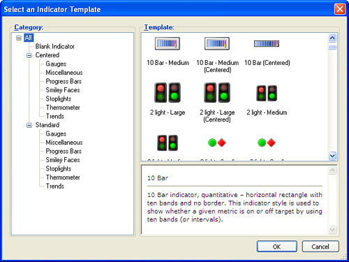
Different indicators serve different purposes and visually convey different messages. For example:
• The various “trending” indicators display arrows in various colors—red, yellow, and green—and pointing in various directions. These indicators would be useful for KPIs that compare the results of a previous period to the current one.
• Some indicators, such as Stoplights and Smiley Faces, are helpful in demonstrating targets versus actual at the end of a measurable period of time. Use these indicators to show how sales figures at the end of a year or quarter compare to their corresponding target measurements.
• The sets of Bar, Cylinder, Gradient, and Gauge indicators might be appropriate for showing progress during the middle of a measurable period of time. They might be appropriate in scenarios where you want to present things such as the amount of budget exhausted or month-to-date or year-to-date figures versus the corresponding targets for the month or year. Because the measure would continue to change over the course of the measurable period, this set of indicators would convey the amount of progress toward a specific goal. Halfway through the month or quarter, you would expect to see progress of halfway (or better) toward the goal.
Besides the display style for indicators, you can apply a couple of other settings to make the indicator set unique. KPIs can have both positive and negative measurements. With targets such as sales volumes, the more the better. Thus, with a positive KPI, exceeding the target result is good. On the other hand, for a measurement such as number of safety incidents, the fewer the better. Thus staying at or below the target level is preferable. When defining indicators, designers can specify whether more is better or less is better.
In addition, for each level within a set of indicators, you can specify the percentage toward the actual goal that applies to each level. For some goals, 75% of the total may be considered “slightly off target,” whereas for other measurements, 75% would be considered “way off target.”
-
No Comment