
- Microsoft® Excel® 2010 Inside Out
- Dedication
- A Note Regarding Supplemental Files
- Acknowledgments
- Questions and Support
- Conventions and Features Used in This Book
- 1. Examining the Excel Environment
- 1. What’s New in Microsoft Excel 2010
- New and Improved for 2010
- Backstage View
- Ribbon Customization
- Sparklines
- Paste Preview
- Improved Picture Editing
- Office Web Apps
- Slicers
- Improved Conditional Formatting
- New Functions and Functional Consistency
- Improved Math Equation Support
- Improved Charting Capacity
- Additional SmartArt Graphics
- 64-Bit Edition
- Office Mobile 2010
- If You Missed the Last Upgrade
- Retired in 2007
- If You Missed the Last Two Upgrades
- Onward
- New and Improved for 2010
- 2. Exploring Excel Fundamentals
- What Happens After You Install Excel?
- Examining the Excel 2010 Workspace
- Exploring File Management Fundamentals
- Importing and Exporting Files
- Using the Help System
- Recovering from Crashes
- 3. Custom-Tailoring the Excel Workspace
- 4. Security and Privacy
- 1. What’s New in Microsoft Excel 2010
- 2. Building Worksheets
- 5. Planning Your Worksheet Design
- 6. How to Work a Worksheet
- 7. How to Work a Workbook
- 3. Formatting and Editing Worksheets
- 8. Worksheet Editing Techniques
- Copying, Cutting, and Pasting
- Inserting and Deleting
- Undoing Previous Actions
- Editing Cell Contents
- Finding and Replacing Stuff
- Getting the Words Right
- Editing Multiple Worksheets
- Auditing and Documenting Worksheets
- Outlining Worksheets
- Consolidating Worksheets
- 9. Worksheet Formatting Techniques
- Formatting Fundamentals
- Using Themes and Cell Styles
- Formatting Conditionally
- Formatting in Depth
- Using Template Files to Store Formatting
- 8. Worksheet Editing Techniques
- 4. Adding Graphics and Printing
- 10. Creating and Formatting Graphics
- Using the Shapes Tools
- Creating WordArt
- Creating SmartArt
- Inserting Other Graphics
- Formatting Graphics
- Working with Graphic Objects
- More Tricks with Graphic Objects
- 11. Printing and Presenting
- 10. Creating and Formatting Graphics
- 5. Creating Formulas and Performing Data Analysis
- 12. Building Formulas
- Formula Fundamentals
- Using Functions: A Preview
- Working with Formulas
- Naming Cells and Cell Ranges
- Using Names in Formulas
- Defining and Managing Names
- Editing Names
- Workbook-Wide vs. Worksheet-Only Names
- Creating Names Semiautomatically
- Naming Constants and Formulas
- Using Relative References in Named Formulas
- Creating Three-Dimensional Names
- Inserting Names in Formulas
- Creating a List of Names
- Replacing References with Names
- Using Go To with Names
- Getting Explicit About Intersections
- Creating Three-Dimensional Formulas
- Formula-Bar Formatting
- Using Structured References
- Naming Cells and Cell Ranges
- Worksheet Calculation
- Using Arrays
- Linking Workbooks
- Creating Conditional Tests
- 13. Using Functions
- 14. Everyday Functions
- Understanding Mathematical Functions
- Understanding Text Functions
- Understanding Logical Functions
- Understanding Information Functions
- Understanding Lookup and Reference Functions
- 15. Formatting and Calculating Date and Time
- 16. Functions for Financial Analysis
- Calculating Investments
- Calculating Depreciation
- Analyzing Securities
- The DOLLARDE and DOLLARFR Functions
- The ACCRINT and ACCRINTM Functions
- The INTRATE and RECEIVED Functions
- The PRICE, PRICEDISC, and PRICEMAT Functions
- The DISC Function
- The YIELD, YIELDDISC, and YIELDMAT Functions
- The TBILLEQ, TBILLPRICE, and TBILLYIELD Functions
- The COUPDAYBS, COUPDAYS, COUPDAYSNC, COUPNCD, COUPNUM, and COUPPCD Functions
- The DURATION and MDURATION Functions
- Using the Euro Currency Tools Add-In
- 17. Functions for Analyzing Statistics
- Analyzing Distributions of Data
- Understanding Linear and Exponential Regression
- Using the Analysis Toolpak Data Analysis Tools
- Installing the Analysis Toolpak
- Using the Descriptive Statistics Tool
- Creating Histograms
- Using the Rank And Percentile Tool
- Generating Random Numbers
- Distributing Random Numbers Uniformly
- Distributing Random Numbers Normally
- Generating Random Numbers Using Bernoulli Distribution
- Generating Random Numbers Using Binomial Distribution
- Generating Random Numbers Using Poisson Distribution
- Generating Random Numbers Using Discrete Distribution
- Generating Semi-Random Numbers Using Patterned Distribution
- Sampling a Population of Numbers
- Calculating Moving Averages
- 18. Performing What-If Analysis
- Using Data Tables
- Using the Scenario Manager
- Using the Goal Seek Command
- Using the Solver
- Stating the Objective
- Specifying Variable Cells
- Specifying Constraints
- Other Solver Options
- Saving and Reusing the Solver Parameters
- Assigning the Solver Results to Named Scenarios
- Generating Reports
- The Sensitivity Report
- The Answer Report
- The Limits Report
- 6. Creating Charts
- 19. Basic Charting Techniques
- Selecting Data for Your Chart
- Choosing a Chart Type
- Changing the Chart Type
- Switching Rows and Columns
- Choosing a Chart Layout
- Choosing a Chart Style
- Moving the Chart to a Separate Chart Sheet
- Adding, Editing, and Removing a Chart Title
- Adding, Editing, and Removing a Legend
- Adding and Positioning Data Labels
- Adding a Data Table
- Manipulating Axes
- Adding Axis Titles
- Changing the Rotation of Chart Text
- Displaying Gridlines
- Adding Text Annotations
- Changing the Font or Size of Chart Text
- Applying Shape Styles and WordArt Styles
- Adding Glow and Soft Edges to Chart Markers
- Saving Templates to Make Chart Formats Reusable
- 20. Using Sparklines
- 21. Advanced Charting Techniques
- Selecting Chart Elements
- Repositioning Chart Elements with the Mouse
- Formatting Lines and Borders
- Formatting Areas
- Formatting Text
- Working with Axes
- Specifying the Line Style, Color, and Weight
- Specifying the Position of Tick Marks and Axis Labels
- Changing the Numeric Format Used by Axis Labels
- Changing the Scale of a Value Axis
- Changing the Scale of a Text Category Axis
- Changing the Scale of a Date Category Axis
- Formatting a Depth (Series) Axis
- Working with Data Labels
- Formatting Data Series and Markers
- Modifying the Data Source for Your Chart
- Using Multilevel Categories
- Adding Moving Averages and Other Trendlines
- Adding Error Bars
- Adding High-Low Lines and Up and Down Bars
- 19. Basic Charting Techniques
- 7. Managing Databases and Tables
- 22. Managing Information in Tables
- How to Organize a Table
- Creating a Table
- Adding Totals to a Table
- Sorting Tables and Other Ranges
- Filtering a List or Table
- Using Filters
- Determining How Many Rows Pass the Filter
- Removing a Filter
- Using Filter Criteria in More Than One Column
- Using a Filter to Find the Top or Bottom n Items
- Using a Filter to Display Blank Entries
- Using Filters to Select Dates
- Using Filters to Specify More Complex Criteria
- Using Custom Filters to Specify Complex Relationships
- Using the Advanced Filter Command
- An Example Using Three ORs on a Column
- An Example Using Both OR and AND
- Applying Multiple Criteria to the Same Column
- Using Computed Criteria
- Extracting Filtered Rows
- Removing Duplicate Records
- Using Filters
- Using Formulas with Tables
- Formatting Tables
- 23. Analyzing Data with PivotTable Reports
- Introducing PivotTables
- Creating a PivotTable
- Rearranging PivotTable Fields
- Refreshing a PivotTable
- Changing the Numeric Format of PivotTable Data
- Choosing Report Layout Options
- Formatting a PivotTable
- Displaying Totals and Subtotals
- Sorting PivotTable Fields
- Filtering PivotTable Fields
- Changing PivotTable Calculations
- Grouping and Ungrouping Data
- Displaying the Details Behind a Data Value
- Creating PivotCharts
- 24. Working with External Data
- Using and Reusing Data Connections
- Opening an Entire Access Table in Excel
- Working with Data in Text Files
- Working with XML Files
- Using Microsoft Query to Import Data
- Using a Web Query to Return Internet Data
- Using an Existing Web Query
- Creating Your Own Web Query
- Using the From Web Command
- Copying and Pasting from the Web Browser
- Exporting from Internet Explorer to Excel
- 8. Collaborating
- 25. Collaborating on a Network or by E-Mail
- 26. Collaborating Using the Internet
- 9. Automating Excel
- 27. Recording Macros
- 28. Creating Custom Functions
- 29. Debugging Macros and Custom Functions
- Using Design-Time Tools
- Dealing with Run-Time Errors
- 10. Integrating Excel with Other App ication
- 30. Using Hyperlinks
- 31. Linking and Embedding
- 32. Using Excel Data in Word Documents
- 11. Appendixes
- Index
- About the Authors
- Copyright
- 22. Managing Information in Tables
- 12. Building Formulas
PivotTables are linked to the data from which they’re derived. If the PivotTable is based on external data (data stored outside Excel), you can choose to have it refreshed at regular time intervals, or you can refresh it whenever you want.
Figure 23-1 shows Books.xlsx, a list of sales figures for a small publishing firm. The list is organized by year, quarter, category, distribution channel, units sold, and sales receipts. The data spans a period of eight quarters (2009 and 2010). The firm publishes six categories of fiction (Mystery, Western, Romance, Sci Fi, Young Adult, and Children) and uses three distribution channels—domestic, international, and mail order. It’s difficult to get useful summary information by looking at a list like this, even though the list itself is well organized.

Figure 23-1. It’s difficult to see the bottom line in a flat list like this; turning the list into a PivotTable will help.
Figures Figure 23-2 through Figure 23-4 show several ways you can transform this flat table into PivotTables that show summary information at a glance.
The example on the left in Figure 23-2 breaks the data down first by category, second by distribution channel, and finally by year, with the total sales at each level displayed in column B. Looking at this table, you can see (among many other details) that the Children category generated domestic sales of $363,222, with more revenue in 2010 than in 2009.
In the example on the right in Figure 23-2, the per-category data is broken out first by year and then by distribution channel. The data is the same; only the perspective is different.

Both the PivotTables shown in Figure 23-2 are single-axis tables. That is, we generated a set of row labels (Children, Mystery, Romance, and so on) and set up outline entries below these labels. (And, by default, Excel displays outline controls beside all the headings, so we can collapse or expand the headings to suit our needs.)
Figure 23-3 shows a more elaborate PivotTable that uses two axes. Along the row axis, we have categories broken out by distribution channel. Along the column axis, we have years (2009 and 2010), and we added the quarterly detail (not included in the Figure 23-2 examples) so we can see how each category in each channel did each quarter of each year. With four dimensions (category, distribution channel, year, and quarter) and two axes (row and column), we have a lot of choices about how to arrange the furniture. Figure 23-3 shows only one of many possible permutations.

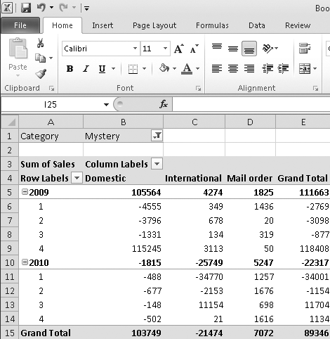
Figure 23-4 presents a different view. Now the distribution channels are arrayed by themselves along the column axis, while the row axis offers years broken out by quarters. The category, meanwhile, has been moved to what you might think of as a page axis. The data has been filtered to show the numbers for a single category, Mystery, but by using the filter control at the right edge of cell B2, we could switch the table to a different category (or combination of categories). Filtering the Category dimension by one category after another is like flipping through a stack of index cards.
None of these tables required more than a few clicks to generate.
-
No Comment