
When you select one or more cells that contain sparklines, Excel displays a new Design tab under the heading Sparkline Tools:

You can use this tab to customize the color (and in the case of line sparklines, the weight) of chart markers, to emphasize particular points in a sparkline, to switch a sparkline from one chart type to another, and to modify a sparkline’s axes.
You can change the color of a sparkline by choosing from the gallery in the Style group:

If you don’t find the color you want, click Sparkline Color and choose from the array of theme colors and standard colors that appears. If those options still don’t meet your needs, click Sparkline Color and then click More Colors. To change the weight of a line sparkline—that is, to make the line thicker or thinner—click Sparkline Color and then Weight.
The check boxes in the Show group allow you to draw attention to particular points in a sparkline—the highest or lowest point, the first or last point, or any points with negative values. If you select High Point, for example, Excel plants a marker on the high point of a line sparkline or uses a contrasting color to draw the highest column in a column sparkline. You can select as many or as few of the check boxes in the Show group as you need or want to, and you can use the Marker Color drop-down list to tailor the colors of various marker types individually.

In keeping with their minimalist approach to graphic communication, sparklines are drawn by default without axes. (You can add a horizontal axis if you want; see the following section.) If your data includes negative as well as positive numbers and you don’t want to add a horizontal axis, you’ll probably need to mark the negative points. Without such markers, a line sparkline might look like this:

Marking the negative points brings the picture into focus:
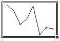
For sparklines that traverse a wide range of data points, marking the high and low values can be illuminating. In the following example, the high and low markers make it clear that the low price of MSFT during the preceding 12 months occurred near the beginning of the date range and the high point occurred near the end:

Sparklines appear by default without axes. You can add a horizontal axis (but not a vertical axis) by clicking Axis (in the Group group) and choosing Show Axis:

Note that if your sparkline’s data range lies entirely above or below zero and you use default scaling for the vertical axis, you will not see a horizontal axis even if you choose Show Axis. To adjust the default vertical-axis scaling, see the following section.
By default, Excel scales a sparkline’s vertical axis so that the minimum and maximum values are just below and above the data range. These default scale settings are called Automatic and are designed to make the sparkline fit snugly within the vertical confines of its cell. (This scaling behavior differs from the default scaling of independent—that is, nonsparkline—charts.) In some circumstances, you might want to override the automatic scaling. In column sparklines, for example, the lowest value might be barely visible if the axis minimum is set to Automatic:
To change the vertical-axis scaling, click Axis, and then choose Custom Value (in either the Minimum Value or Maximum Value section of the menu).
Although formatting attributes for a sparkline within a group are applied to all members of the group, scaling calculations are performed individually. That enables each sparkline within a group to fit well within its cell. If you prefer to see a set of sparklines plotted along a common axis, click Axis, and then choose Same For All Sparklines (in either the Minimum Value or Maximum Value section of the menu).
Excel ordinarily plots sparkline points evenly across the horizontal axis. If your data is associated with dates, and if the dates are not evenly spaced, you might prefer a time-scaled axis. With time scaling, points are plotted according to where they fall along the time axis. To switch from ordinary scaling to time-axis scaling, click Axis, and then choose Date Axis Type. In the ensuing dialog box, specify the range that includes your dates. To cancel time-axis scaling, return to the same menu and choose General Axis Type.
Because sparklines are meant to be simple, Excel doesn’t offer titling or annotation options. However, nothing precludes you from adding worksheet data to a cell that contains a sparkline. In the following example, the sparkline cell includes the text MSFT 2009:

You might need to adjust the alignment of text (for example, change the vertical alignment from Bottom to Top) to keep the verbal message distinct from the graphic.