
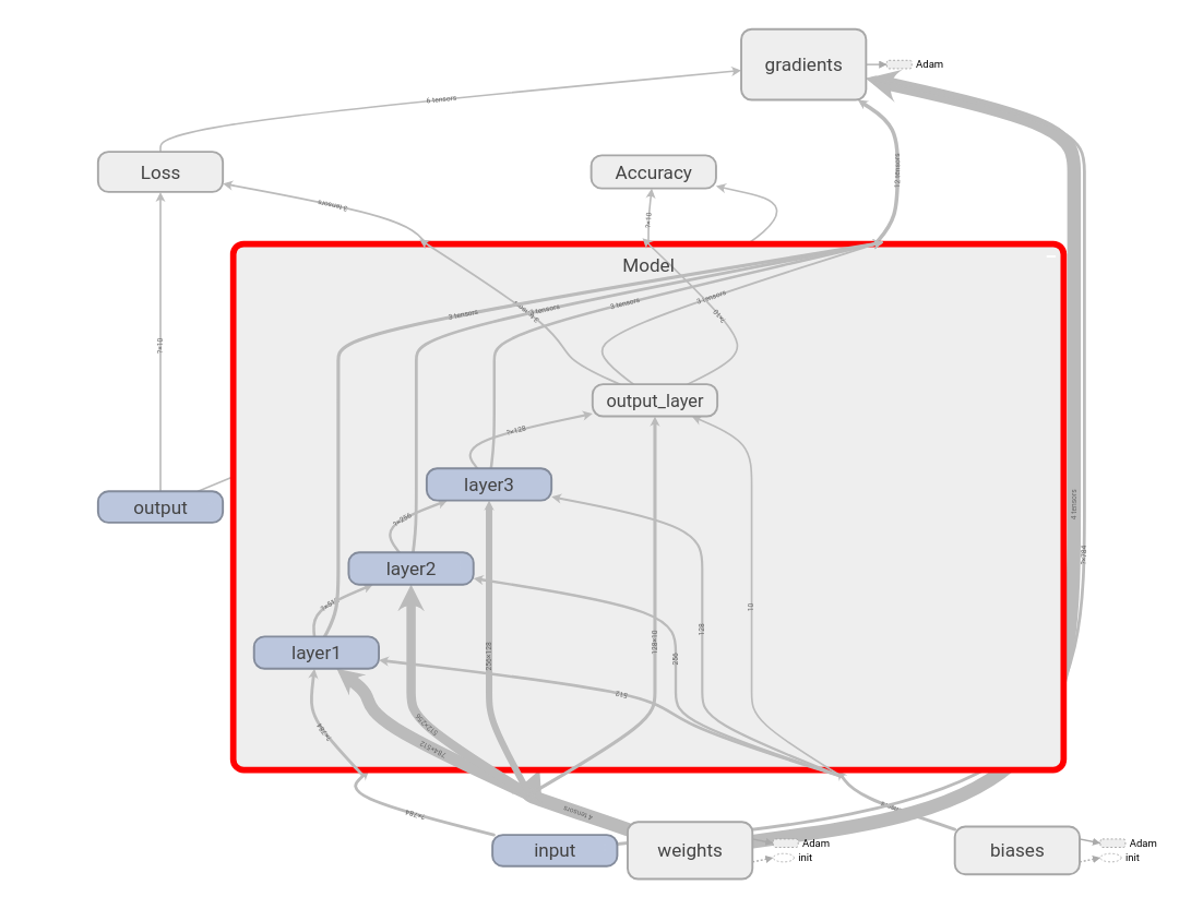
After training, we can visualize our computational graph in TensorBoard, as shown in the following diagram. As you can see, our Model takes input, weights, and biases as input and returns the output. We compute Loss and Accuracy based on the output of the model. We minimize the loss by calculating gradients and updating weights. We can observe all of this in the following diagram:

If we double-click and expand the Model, we can see that we have three hidden layers and one output layer:
Similarly, we can double-click and see every node. For instance, if we open weights, we can see how the four weights are initialized using truncated normal distribution, and how it is updated using the Adam optimizer:

As we have learned, the computational graph helps us to understand what is happening on each node. We can see how the accuracy is being calculated by double-clicking on the Accuracy node:

Remember that we also stored the summary of our loss and accuracy variables. We can find them under the SCALARS tab in TensorBoard, as shown in the following screenshot. We can see how that loss decreases over iterations, as shown in the following screenshot:

The following screenshot shows how accuracy increases over iterations:
