
In this recipe, we will learn how to make a contour plot with the areas between the contours filled in solid color.
We are only using the base graphics functions for this recipe. So, just open up the R prompt and type the code we are about to see. We will use the inbuilt volcano dataset, so we need not load anything.
Let's make a filled contour plot showing the terrain data of the Maunga Whau volcano in R's inbuilt volcano dataset:
filled.contour(x = 10*1:nrow(volcano),y = 10*1:ncol(volcano),
z = volcano, color.palette = terrain.colors,
plot.title = title(main = "The Topography of Maunga Whau",
xlab = "Meters North",ylab = "Meters West"),
plot.axes = {axis(1, seq(100, 800, by = 100))
             axis(2, seq(100, 600, by = 100))},
key.title = title(main="Height
(meters)"),
key.axes = axis(4, seq(90, 190, by = 10)))
If you type ?filled.contour you will see that the preceding example is taken from that help file (see the second example at the end of the help file). The filled.contour() function creates a contour plot with the areas between the contour lines filled with solid colors. In this case, we chose the terrain.colors() function to use a color palette suitable for showing geographical elevations. We set the color.palette argument to terrain.colors and the filled.contour() function automatically calculates the number of color levels.
The basic arguments are the same as those for contour(), namely, x and y that specify the locations of the grid at which the height values (z) are specified. The contour data z is provided by the volcano dataset in a matrix form.
The filled.contour() function is slightly different from other basic graph functions because it automatically creates a layout with the contour plot and key. We can't suppress or customize the styling of the key to a great extent. Also, some of the standard graph parameters have to be passed to other functions. For example, the axis labels xlab and ylab have to be passed as arguments to the title() function which is passed as the value for the plot.title argument. We cannot directly pass xlab and ylab to filled.contour().
We also have to add our custom axes by setting the plot.axes argument to a list of function calls to the axis() function. Unlike other functions, we cannot simply set axes to FALSE and call axis() after drawing the graph because of the internal use of layout() in filled.contour(). If we add axes after calling filled.contour(), the X axis will extend beyond the contour plot up to the key.
Finally, we set the title and tick labels of the key using the key.title and key.axes arguments respectively. Once again, we had to set these arguments to function calls to title() and axis() respectively instead of directly specifying the values.
We can adjust the level of detail and smoothness between the contours by increasing their number using the nlevels argument:
filled.contour(x = 10*1:nrow(volcano),
y = 10*1:ncol(volcano), z = volcano,
color.palette = terrain.colors,
plot.title = title(main = "The Topography of Maunga Whau",
xlab = "Meters North",ylab = "Meters West"),nlevels=100,
plot.axes = {axis(1, seq(100, 800, by = 100))
             axis(2, seq(100, 600, by = 100))},
key.title = title(main="Height
(meters)"),
key.axes = axis(4, seq(90, 190, by = 10))) 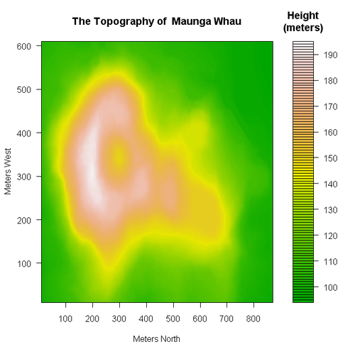
Note that there are a lot more contours now and the plot looks a lot smoother. The default value of nlevels is 20, so we increased it by 5 times. The key doesn't look very nice because of too many black lines between each tick mark; however, as pointed out earlier, we cannot control that without changing the definition of the filled.contour() function itself.