
In this recipe, we will learn how to make dot charts with grouped variables. Dot charts are often preferred to bar charts because they are less cluttered and convey the same information more clearly with less ink.
We will continue using the citysales.csv example dataset in this recipe. Make sure you have loaded it into R and type the recipe at the R prompt. You may also want to save the recipe as a script so that you can easily run it again later. We will need the reshape package to change the structure of the dataset. So let's make sure we have it installed and loaded:
install.packages("reshape")
library(reshape)We will first apply the
melt() function to the citysales dataset to convert it to long form and then use the dotchart() function:
sales<-melt(citysales)

sales$color[sales[,2]=="ProductA"] <- "red"
sales$color[sales[,2]=="ProductB"] <- "blue"
sales$color[sales[,2]=="ProductC"] <- "violet"

dotchart(sales[,3],labels=sales$City,groups=sales[,2],
col=sales$color,pch=19,
main="Sales Figures",
xlab="Sales Revenue (1,000's of USD)")
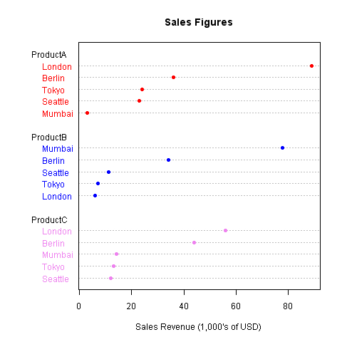
We first converted the data into long form by applying the
melt() function from the reshape library. The following is what the new dataset looks like:
|
City |
Variable |
Value |
|---|---|---|
|
Mumbai |
ProductA |
3 |
|
London |
ProductB |
6 |
|
Tokyo |
ProductB |
7 |
|
Seattle |
ProductB |
11 |
|
Seattle |
ProductC |
12 |
|
Tokyo |
ProductC |
13 |
|
Mumbai |
ProductC |
14 |
|
Seattle |
ProductA |
23 |
|
Tokyo |
ProductA |
24 |
|
Berlin |
ProductB |
34 |
|
Berlin |
ProductA |
36 |
|
Berlin |
ProductC |
44 |
|
London |
ProductC |
56 |
|
Mumbai |
ProductB |
78 |
|
London |
ProductA |
89 |
Then we add a column called color, which holds a different value of color for each product (red, blue, and violet).
Finally we call the dotchart() function with the values column as the first argument. We set the
labels argument to the city names and group the points by the second column (product). The color is set to the color column using the col argument. This results in a dot chart with the data points grouped and colored by products on the Y axis.