
In this recipe, we will learn how to make histograms and density plots, which are useful to look at the distribution of values in a dataset.
The simplest way to demonstrate the use of a histogram is to show a normal distribution:
hist(rnorm(1000))

Another example of a histogram is one which shows a skewed distribution:
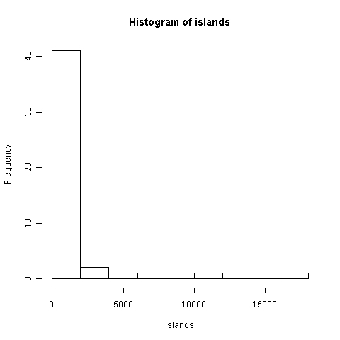
hist(islands)
The hist() function is also a function of R's base graphics library. It takes only one compulsory argument, that is the variable whose distribution of values we wish to visualize.
In the first example, we passed the rnorm() function as the variable. rnorm(1000) generates a vector of 1,000 random numbers with a normal distribution. As you can see in the histogram, it's a bell-shaped curve.
In the second example, we passed the inbuilt islands dataset (which gives the areas of the world's major landmasses) as the argument to hist(). As you can see from that histogram, islands has a distribution skewed heavily towards the lower value range of 0 to 2,000 square miles.
As you may have noticed in the preceding examples, the default setting for histograms is to display the frequency or number of occurrences of values in a particular range on the Y axis. We can also display probabilities instead of frequencies by setting the prob (for probability) argument to TRUE or the freq (for frequency) argument to FALSE.
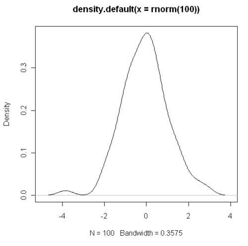
Now let's make a density plot for the same function rnorm(). To do so, we need to use the
density() function and pass it as our first argument to plot() as follows:
plot(density(rnorm(1000)))
We will cover more details such as setting the breaks, density, formatting of bars and other advanced recipes in Chapter 6, Creating Histograms.