
In this recipe, we will learn how to split a variable at arbitrary intervals of our choice to compare the box plots of values within each interval.
We will continue using the base graphics library functions, so we need not load any additional library or package. We just need to run the recipe code at the R prompt. We can also save the code as a script to use it later. Here, we will use the metals.csv example dataset again:
metals<-read.csv("metals.csv")Let's make a box plot of copper (Cu) concentrations split at values 0, 40 and 80:
cuts<-c(0,40,80)
Y<-split(x=metals$Cu, f=findInterval(metals$Cu, cuts))

boxplot(Y,xaxt="n",
border = "white",col = "black",boxwex = 0.3,
medlwd=1,whiskcol="black",staplecol="black",
outcol="red",cex=0.3,outpch=19,
main="Summary of Copper concentrations",
xlab="Concentration ranges",las=1)

axis(1,at=1:length(clabels),
labels=c("Below 0","0 to 40","40 to 80","Above 80"),
lwd=0,lwd.ticks=1,col="gray")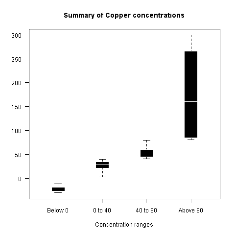
We used a combination of a few different R functions to create the example graph shown. First, we defined a vector called cuts with values at which we wanted to cut our vector of concentrations. Then we used the split() function to split the copper concentrations vector into a list of concentration vectors at specified intervals (you can verify this by typing Y at the R prompt and hitting Enter). Note that we used the findInterval() function to create a vector of labels (factors) corresponding to the interval each value in metals$Cu lies in, and set the f argument of the split() function. Then we used the boxplot() function to create the basic box plot with the new Y vector and suppressed the default X axis. We then used the axis() function to draw the X axis with our custom labels.
Let's turn the previous example into a function to which we can simply pass a variable and the intervals at which we wish to cut it, and it will draw the box plot accordingly:
boxplot.cuts<-function(y,cuts,...) {

    Y<-split(metals$Cu, f=findInterval(y, cuts))

    b<-boxplot(Y,xaxt="n",
    border = "white",col = "black",boxwex = 0.3,
    medlwd=1,whiskcol="black",staplecol="black",
    outcol="red",cex=0.3,outpch=19,
    main="Summary of Copper concentrations",
    xlab="Concentration ranges",las=1,...)


    clabels<-paste("Below",cuts[1])

    for(k in 1:(length(cuts)-1)) {
        clabels<-c(clabels, paste(as.character(cuts[k]),
        "to", as.character(cuts[k+1])))
    }

    clabels<-c(clabels,
    paste("Above",as.character(cuts[length(cuts)])))

    axis(1,at=1:length(clabels),
    labels=clabels,lwd=0,lwd.ticks=1,col="gray")

}Now that we have defined the function, we can simply call it as follows:
boxplot.cuts(metals$Cu,c(0,30,60))
Another way to plot a subset of data in a box plot is by using the subset argument. For example, if we want to plot copper concentrations grouped by source above a certain threshold value (say 40), we can use:
boxplot(Cu~Source,data=metals,subset=Cu>40)
Note that we included an extra argument ... to the definition of boxplot.cuts() in addition to y and cuts. This allows us to pass in any extra arguments which we don't explicitly use in the call to boxplot() inside the definition of our function. For example, if we can pass ylab as an argument to boxplot.cuts() even though it is not explicitly defined as an argument.
If you find this example too cumbersome (especially with the labels), following is an alternative definition of boxplot.cuts() which uses the cut() function and its automatic label creation:
boxplot.cuts<-function(y,cuts) {

    f=cut(y, c(min(y[!is.na(y)]),cuts,max(y[!is.na(y)])),
    ordered_results=TRUE);
    Y<-split(y, f=f)

    b<-boxplot(Y,xaxt="n",
    border = "white",col = "black",boxwex = 0.3,
    medlwd=1,whiskcol="black",staplecol="black",
    outcol="red",cex=0.3,outpch=19,
    main="Summary of Copper concentrations",
    xlab="Concentration ranges",las=1)


    clabels = as.character(levels(f))
    axis(1,at=1:length(clabels),
    labels=clabels,lwd=0,lwd.ticks=1,col="gray")

}
To create a box plot similar to the example shown earlier, we can run:
boxplot.cuts(metals$Cu,c(0,40,80))
