
In this recipe, we will see how we can adjust the styling of plotting symbols, which is useful and necessary when we plot more than one set of points representing different groups of data on the same graph.
All you need to try out this recipe is to run R and type the recipe at the command prompt. You can also choose to save the recipe as a script so that you can use it again later on. We will also use the cityrain.csv example data file that we used in the first chapter. Please read the file into R as follows:
rain<-read.csv("cityrain.csv")The plotting symbol and size can be set using the pch and cex arguments:
plot(rnorm(100),pch=19,cex=2)
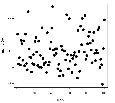
The pch argument stands for plotting character (symbol). It can take numerical values (usually between 0 and 25) as well as single character values. Each numerical value represents a different symbol. For example, 1 represents circles, 2 represents triangles, 3 represents plus signs, and so on. If we set the value of pch to a character such as "*" or "£" in inverted commas, then the data points are drawn as that character instead of the default circles.
The size of the plotting symbol is controlled by the
cex argument, which takes numerical values starting at 0 giving the amount by which plotting symbols should be magnified relative to the default. Note that cex takes relative values (the default is 1). So, the absolute size may vary depending on the defaults of the graphic device in use. For example, the size of plotting symbols with the same cex value may be different for a graph saved as a PNG file versus a graph saved as a PDF.
The most common use of pch and cex is when we don't want to use color to distinguish between different groups of data points. This is often the case in scientific journals which do not accept color images. For example, let's plot the city rainfall data we looked at in Chapter 1 as a set of points instead of lines:
plot(rain$Tokyo,
ylim=c(0,250),
main="Monthly Rainfall in major cities",
xlab="Month of Year",
ylab="Rainfall (mm)",
pch=1)

points(rain$NewYork,pch=2)
points(rain$London,pch=3)
points(rain$Berlin,pch=4)

legend("top",
legend=c("Tokyo","New York","London","Berlin"),
ncol=4,
cex=0.8,
bty="n",
pch=1:4)