
In this recipe we will learn how to plot country-wise data on a world map.
We will use a few different additional packages for this recipe. We need the maps package for the actual drawing of the maps, the WDI package to get world bank data by countries, and the RColorBrewer package for color schemes. So let's make sure these packages are installed and loaded:
install.packages("maps")
library(maps)
install.packages("WDI")
library(WDI)
install.packages("RColorBrewer")
library(RColorBrewer)There are a lot of different data we can pull in using the world bank API provided by the WDI package. In this example, let's plot some CO2 emissions data:
colors = brewer.pal(7,"PuRd")
wgdp<-WDIsearch("gdp")
w<-WDI(country="all", indicator=wgdp[4,1], start=2005, end=2005)

w[63,1] <- "USA"

x<-map(plot=FALSE)

x$measure<-array(NA,dim=length(x$names))

for(i in 1:length(w$country)) {
    for(j in 1:length(x$names)) {
        if(grepl(w$country[i],x$names[j],ignore.case=T))
            x$measure[j]<-w[i,3]
    }
}

sd <- data.frame(col=colors,
values <- seq(min(x$measure[!is.na(x$measure)]),
max(x$measure[!is.na(x$measure)]) *1.0001,
length.out=7))

sc<-array("#FFFFFF",dim=length(x$names))

for (i in 1:length(x$measure))
    if(!is.na(x$measure[i]))
        sc[i]=as.character(sd$col[findInterval(x$measure[i],
        sd$values)])

#2-column layout with color scale to the right of the map
layout(matrix(data=c(2,1), nrow=1, ncol=2), widths=c(8,1),
heights=c(8,1))

# Color Scale first
breaks<-sd$values

par(mar = c(20,1,20,7),oma=c(0.2,0.2,0.2,0.2),mex=0.5)

image(x=1, y=0:length(breaks),z=t(matrix(breaks))*1.001,
col=colors[1:length(breaks)-1],axes=FALSE
breaks=breaks,xlab="",ylab="",xaxt="n")

axis(side=4,at=0:(length(breaks)-1),
labels=round(breaks),col="white",las=1)

abline(h=c(1:length(breaks)),col="white",lwd=2,xpd=F)

#Map
map(col=sc,fill=TRUE,lty="blank")
# If you get a figure margins error while running the above code, enlarge the plot device or adjust the margins so that the graph and scale fit within the device.


map(add=TRUE,col="gray",fill=FALSE)
title("CO2 emissions (kg per 2000 US$ of GDP)")
The map plot of CO2 emissions looks like the following:
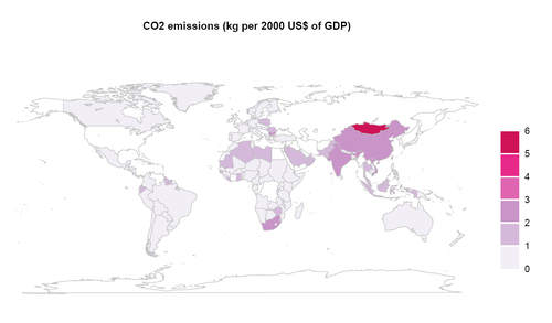
We used the maps package in combination with world bank data from the WDI package above to plot CO2 emissions data per 2.000 US$ of GDP for various countries across the world.
First we chose an
RColorBrewer color scheme and saved it as a vector called colors. We then pulled a list of GDP-related variables using the WDIsearch() function. If you type wgdp at the R prompt and hit Enter, you will see a list of codes and descriptions of each of these variables. For the previous example, we chose the fourth variable (wgdp[4,1]), which gives CO2 emissions (kg per 2.000 US$ of GDP), and passed it to the WDI() function to get data for all countries for the year 2005 by setting the country argument to "all" and start and end to 2005.
Next, we created a map object x simply by calling the map() function and setting plot to FALSE, so that the map is not drawn yet. We did this so that we can map the data we pulled from WDI to the country polygons contained in the map object.
First we added a new array called measure to x, with NA as default values and length matching the number of country names in x. If you type x$names at the R prompt and hit Enter, you will see the whole list of country names. Similarly, w$country contains the names of the countries for which the WDI package has data. Note that the map object has a lot more names because it contains regional information at a finer detail than just countries. So, we must first match the names of countries in the two datasets.
For the example, we use a simple search function grepl(), which looks for the WDI country names in the map object x and assigns the corresponding CO2 emissions values from w to x$measure. This is a very approximate solution and misses on countries where the names in the two datasets are not the same. For example, the United States is named USA in the WDI dataset. To match all the countries exactly, we need to manually check the important ones we are interested in. In the example, the United States was corrected manually.
Next we created a data frame called sd to define a color scheme with intervals based on a sequence from the minimum to the maximum values in x$measure. We use sd to assign a color for each of the values in x$measure by creating a vector called sc. First we create sc with default values of white, so that any missing values are depicted without any color. Then we used the findInterval() function to assign a color to each value of x$measure.
Finally, we have all the ingredients for making the map. We first used the layout() function to create a 1X2 layout just like we did for heat maps in the previous chapter.
We need to plot the color scale first here because if we plot the map first, the scale cannot be plotted on the same layout and results in a new plot with just the scale. We reversed this plotting order by setting the data argument in layout() to c(2,1) instead of c(1,2).
The color scale is drawn in exactly the same way as in the previous chapter for heat maps, using the
image() function. To draw the map itself, we used the map() function. We set the col argument to the vector sc which contains colors corresponding to each polygon on the map. We set fill to TRUE and lty to "blank", so that we get the polygons filled with the specified colors and no blank borders around them. Instead, we add gray borders by calling the map() function with add set to TRUE, col set to gray and fill set to FALSE. Finally, we added a plot title using the title() function.
The example shows just one variable for one year visualized on a map. The world bank package gives 73 different metrics related to GDP alone (as can be seen in the wgdp variable). See the help section for the WDI package for more details about other data available (?WDI and ?WDIsearch). If you have any other data by country from another source, you can use that with the map() function in the example as long as the country names can be matched to the names of regions in the map object.