
In this recipe, we will learn how to make a correlation heat map from a matrix of correlation coefficients.
We are only using the base graphics functions for this recipe. So, just open up the R prompt and type the following code. We will use the genes.csv example dataset for this recipe. So let's first load it:
genes<-read.csv("genes.csv")Let's make a heat map showing the correlation between genes in a matrix:
rownames(genes)<-genes[,1]
data_matrix<-data.matrix(genes[,-1])

pal=heat.colors(5)

breaks<-seq(0,1,0.2)

layout(matrix(data=c(1,2), nrow=1, ncol=2), widths=c(8,1), heights=c(1,1))

par(mar = c(3,7,12,2),oma=c(0.2,0.2,0.2,0.2),mex=0.5)

image(x=1:nrow(data_matrix),y=1:ncol(data_matrix),
z=data_matrix,xlab="",ylab="",breaks=breaks,
col=pal,axes=FALSE)

text(x=1:nrow(data_matrix)+0.75, y=par("usr")[4] + 1.25,
srt = 45, adj = 1, labels = rownames(data_matrix),
xpd = TRUE)

axis(2,at=1:ncol(data_matrix),labels=colnames(data_matrix),
col="white",las=1)

abline(h=c(1:ncol(data_matrix))+0.5,v=c(1:nrow(data_matrix))+0.5,
col="white",lwd=2,xpd=F)

title("Correlation between genes",line=8,adj=0)

breaks2<-breaks[-length(breaks)]

# Color Scale
par(mar = c(25,1,25,7))
image(x=1, y=0:length(breaks2),z=t(matrix(breaks2))*1.001,
col=pal[1:length(breaks)-1],axes=FALSE,
breaks=breaks,xlab="",ylab="",
xaxt="n")

axis(4,at=0:(length(breaks2)),labels=breaks,col="white",las=1)
abline(h=c(1:length(breaks2)),col="white",lwd=2,xpd=F)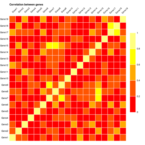
Just like in the previous recipe, first we format the data using the first column values as row names and cast the dataframe as a matrix. We created a palette of five colors using the heat.colors() function and defined a sequence of breaks 0, 0.2, 0.4,...1.0.
Then we created a layout with one row and two columns (one for the heat map and the other for the color scale). We created the heat map using the image() command in a similar way to the previous recipe passing the data matrix as the value of the z argument.
We added custom X axis labels using the text() function, instead of the axis() function to rotate the axis labels. We also placed the labels in the top margin instead of the bottom margin as usual to improve the readability of the graph. This way it resembles a gene correlation matrix of numbers more closely, where the names of the genes are shown on the top and left. To create the rotated labels, we set the srt argument to 45, thus setting the angle of rotation to 45 degrees.
Finally, we added a color scale to the right of the heat map.
We can use a more contrasting color scale to differentiate between the correlation values. For example, to highlight the diagonal values of 1 more clearly, we can substitute the last color in our palette with white.