
In this recipe, we will look at some slightly advanced code to embed histograms inside another kind of graph. We learnt how to make pairs plots (a matrix of scatter plots) in Chapters 1 and Chapter 3. In those pairs plots, the diagonal cells running from the top-left to the bottom-right showed the names of the variables, while the other cells showed the relationship between any two pairs of variables. It would be useful if we could also see the probability distribution of each variable in the same plot. Here, we will learn how to do that by adding histograms inside the diagonal cells.
We will use the inbuilt iris flowers dataset of R. So we need not load any other datasets. We can simply type the given code at the R prompt.
So let's make an enhanced pairs plot showing the relationship between different measurements of the iris flower species and how each measurement's values are spread across the range:
panel.hist <- function(x, ...)
  {
    par(usr = c(par("usr")[1:2], 0, 1.5) )
    hist(x, prob=TRUE,add=TRUE,col="black",border="white")
  }

plot(iris[,1:4],
main="Relationships between characteristics of iris flowers",
pch=19,col="blue",cex=0.9,
diag.panel=panel.hist)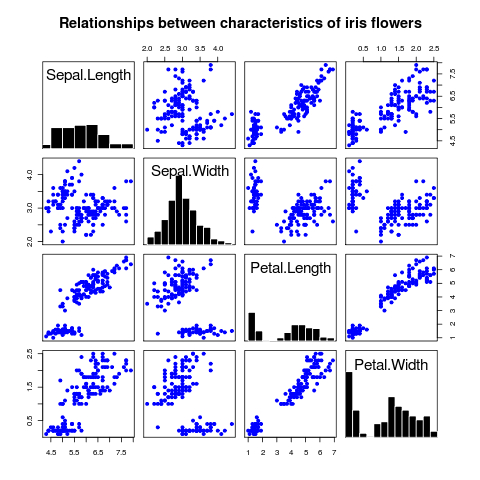
We first defined the panel.hist() function which handles how the histograms are drawn. It is called by the plot() function later when the argument diag.panel is set to panel.hist.
The panel.hist() function only has two simple lines of code. First, we call the par() function to set the X and Y limits using the usr argument. To reiterate what we learnt in Chapter 2, the usr arguments takes values in the form of a vector c(xmin,xmax,ymin,ymax) giving the minimum and maximum values on the X and Y axes respectively. In the code, we keep the X axis limits the same as already set up by the plot() function call. We need to change the Y axis limits for each diagonal cell because they are set by plot() to be the same as the X axis limits. We need the Y axis limits in terms of the kernel density of each variable, so we set them to 0 and 1.5.
Then we make the hist() function call with the style arguments of our choice and one key argument add (set to TRUE), which makes sure the histograms are added to the existing pairs plot and not drawn as new plots. Any panel function should not start a new plot or it will terminate the pairs plot. So, we can't use the hist() function without setting add to TRUE.