
In this recipe, we will learn how to present more than one graph in a single image. Pairs plots are one example as we saw in the last recipe, but here we will learn how to include different types of graphs in each cell of a graph matrix.
Let's say we want to make a 2x3 matrix of graphs, made of two rows and three columns of graphs. We use the par() command as follows:
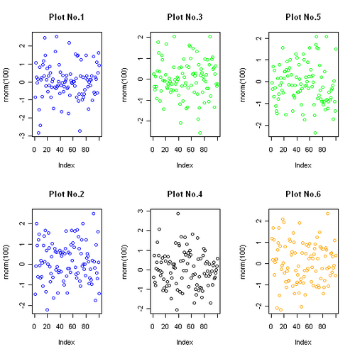
par(mfrow=c(2,3))
plot(rnorm(100),col="blue",main="Plot No.1")
plot(rnorm(100),col="blue",main="Plot No.2")
plot(rnorm(100),col="green",main="Plot No.3")
plot(rnorm(100),col="black",main="Plot No.4")
plot(rnorm(100),col="green",main="Plot No.5")
plot(rnorm(100),col="orange",main="Plot No.6")

The par() command is by far the most important function for customizing graphs in R. It is used to set and query many graphical arguments (hence par), which control the layout and appearance of graphs.
Please note that we need to issue the par() command before the actual graph commands. When you first run the par() command, only a blank graphics window appears. The par() command sets the argument for any subsequent graphs made. The mfrow argument is used to specify how many rows and columns of graphs we wish to plot. The mfrow argument takes values in the form of a vector of length two: c(nrow,ncol). The first number specifies the number of rows and the second specifies the number of columns. In our previous example, we wanted a matrix of two rows and three columns, so we set mfrow to c(2,3).
Note that there is another argument mfcol, similar to mfrow, which can also be used to create multiple plot layouts. mfcol also takes a two value vector specifying the number of rows and columns in the matrix. The difference is that mfcol draws subsequent figures by columns, rather than by rows as mfrow does. So, if we used mfcol instead of mfrow in the earlier example, we would get the following plot:
Let's look at a practical example where a multiple plot layout would be useful. Let's read the dailymarket.csv example file that contains data on the daily revenue, profits, and number of customer visits for a shop:
market<-read.csv("dailymarket.csv",header=TRUE)Now, let's plot all the three variables over time in a plot matrix with the graphs stacked over one another:
par(mfrow=c(3,1))

plot(market$revenue~as.Date(market$date,"%d/%m/%y"),
type="l", #Specify type of plot as l for line
main="Revenue",
xlab="Date",
ylab="US Dollars",
col="blue")

plot(market$profits~as.Date(market$date,"%d/%m/%y"),
type="l", #Specify type of plot as l for line
main="Profits",
xlab="Date",
ylab="US Dollars",
col="red")

plot(market$customers~as.Date(market$date,"%d/%m/%y"),
type="l", #Specify type of plot as l for line
main="Customer visits",
xlab="Date",
ylab="Number of people",
col="black")

The preceding graph is a good way to visualize variables with different value ranges over the same time period. It helps in identifying where the trends match each other and where they differ.