
In this recipe, we will learn how to adjust the orientation of bars to horizontal or vertical.
We will use the same dataset we used in the last few recipes (citysales.csv) and the RColorBrewer color palette package.
Let's make a bar chart with horizontal bars:
barplot(as.matrix(citysales[,2:4]), beside=TRUE,horiz=TRUE,
legend.text=citysales$City, args.legend=list(bty="n"),
col=brewer.pal(5,"Set1"),border="white",
xlim=c(0,100), xlab="Sales Revenue (1,000's of USD)",
main="Sales Figures")
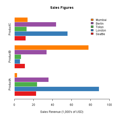
In the example, we set the
horiz argument to TRUE, which makes the bars horizontal. By default horiz is set to FALSE, making the bars vertical. While it's really easy to make the bars horizontal, we must remember that the axes are reversed when we do that. So, in the example, we had to set the limits for the X axis (xlim instead of ylim) and set xlab (instead of ylab) to "Sales Revenue". We also removed the horiz=TRUE argument from the legend arguments list because that would have plotted some of the legend labels on top of the ProductC bars. Removing the horiz argument puts the legend back into its default top right position.
Let's draw the stacked bar chart from the last recipe with horizontal bars:
par(mar=c(5,4,4,8),xpd=T)

barplot(as.matrix(citysalesperc[,2:4]), horiz=TRUE,
col=brewer.pal(5,"Set1"),border="white",
xlab="Percentage of Sales",
main="Perecentage Sales Figures")

legend("right",legend=citysalesperc$City,bty="n",
inset=c(-0.3,0),fill=brewer.pal(5,"Set1"))
Again, we had to simply set the
horiz argument to TRUE and adjust the margins to accommodate the legend to the right outside the plot region.