
In this first recipe, we will learn how to make bar charts for data with more than one category. Such bar charts are commonly used for comparing values of the same measure across different categories.
We will be using the base library
barplot() function, but we will also use the RColorBrewer package to choose a good color palette. So let's first install and load that package:
install.packages("RColorBrewer") #if not already installed
library(RColorBrewer)Let's use the citysales.csv example dataset that we used in the first chapter once again:
citysales<-read.csv("citysales.csv")

barplot(as.matrix(citysales[,2:4]), beside=TRUE,
legend.text=citysales$City,
args.legend=list(bty="n",horiz=TRUE),
col=brewer.pal(5,"Set1"),
border="white",ylim=c(0,100),
ylab="Sales Revenue (1,000's of USD)",
main="Sales Figures")

box(bty="l")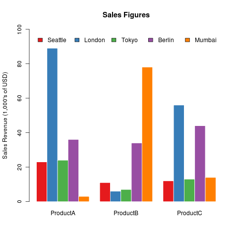
The key argument for drawing bar charts with more than one category is the beside argument, which must be set to TRUE. The first argument is the input data, which must be in the form of a matrix. The columns of the matrix are the categories (in this case ProductA, ProductB, and ProductC), while the rows are the set of values for each category. If we do not set the beside argument to TRUE, we will get a stacked bar chart (as we will see later in this chapter).
Most of the other arguments of the
barplot() function work the same way as they do for plot(). The args.legend argument takes a list of arguments and passes them on to the legend() function. We can instead also call the legend() function separately after the barplot() call.