
- R Graphs Cookbook
- R Graphs Cookbook
- Credits
- About the Author
- About the Reviewers
- www.PacktPub.com
- Preface
- 1. Basic Graph Functions
- Introduction
- Creating scatter plots
- Creating line graphs
- Creating bar charts
- Creating histograms and density plots
- Creating box plots
- Adjusting X and Y axes limits
- Creating heat maps
- Creating pairs plots
- Creating multiple plot matrix layouts
- Adding and formatting legends
- Creating graphs with maps
- Saving and exporting graphs
- 2. Beyond the Basics: Adjusting Key Parameters
- Introduction
- Setting colors of points, lines, and bars
- Setting plot background colors
- Setting colors for text elements: axis annotations, labels, plot titles, and legends
- Choosing color combinations and palettes
- Setting fonts for annotations and titles
- Choosing plotting point symbol styles and sizes
- Choosing line styles and width
- Choosing box styles
- Adjusting axis annotations and tick marks
- Formatting log axes
- Setting graph margins and dimensions
- 3. Creating Scatter Plots
- Introduction
- Grouping data points within a scatter plot
- Highlighting grouped data points by size and symbol type
- Labelling data points
- Correlation matrix using pairs plot
- Adding error bars
- Using jitter to distinguish closely packed data points
- Adding linear model lines
- Adding non-linear model curves
- Adding non-parametric model curves with lowess
- Making three-dimensional scatter plots
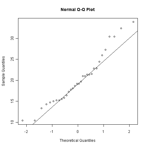
- How to make Quantile-Quantile plots
- Displaying data density on axes
- Making scatter plots with smoothed density representation
- 4. Creating Line Graphs and Time Series Charts
- Introduction
- Adding customized legends for multiple line graphs
- Using margin labels instead of legends for multiple line graphs
- Adding horizontal and vertical grid lines
- Adding marker lines at specific X and Y values
- Creating sparklines
- Plotting functions of a variable in a dataset
- Formatting time series data for plotting
- Plotting date and time on the X axis
- Annotating axis labels in different human readable time formats
- Adding vertical markers to indicate specific time events
- Plotting data with varying time averaging periods
- Creating stock charts
- 5. Creating Bar, Dot, and Pie Charts
- Introduction
- Creating bar charts with more than one factor variable
- Creating stacked bar charts
- Adjusting the orientation of bars—horizontal and vertical
- Adjusting bar widths, spacing, colors, and borders
- Displaying values on top of or next to the bars
- Placing labels inside bars
- Creating bar charts with vertical error bars
- Modifying dot charts by grouping variables
- Making better readable pie charts with clockwise-ordered slices
- Labelling a pie chart with percentage values for each slice
- Adding a legend to a pie chart
- 6. Creating Histograms
- Introduction
- Visualizing distributions as count frequencies or probability densities
- Setting bin size and number of breaks
- Adjusting histogram styles: bar colors, borders, and axes
- Overlaying density line over a histogram
- Multiple histograms along the diagonal of a pairs plot
- Histograms in the margins of line and scatter plots
- 7. Creating Box and Whisker Plots
- Introduction
- Creating box plots with narrow boxes for a small number of variables
- Grouping over a variable
- Varying box widths by number of observations
- Creating box plots with notches
- Including or excluding outliers
- Creating horizontal box plots
- Changing box styling
- Adjusting the extent of plot whiskers outside the box
- Showing the number of observations
- Splitting a variable at arbitrary values into subsets
- 8. Creating Heat Maps and Contour Plots
- 9. Creating Maps
- 10. Finalizing graphs for publications and presentations
- Introduction
- Exporting graphs in high resolution image formats: PNG, JPEG, BMP, TIFF
- Exporting graphs in vector formats: SVG, PDF, PS
- Adding mathematical and scientific notations (typesetting)
- Adding text descriptions to graphs
- Using graph templates
- Choosing font families and styles under Windows, Mac OS X, and Linux
- Choosing fonts for PostScripts and PDFs
In this recipe, we will see how to make Quantile-Quantile (Q-Q) plots, which are useful for comparing two probability distributions.
For this recipe, we don't need to load any additional libraries. We just need to type the recipe at the R prompt or run it as a script.
Let's see how the distribution of mpg in the mtcars dataset compares with a normal distribution using the qnorm() function:
qqnorm(mtcars$mpg)
qqline(mtcars$mpg)

-
No Comment
..................Content has been hidden....................
You can't read the all page of ebook, please click here login for view all page.