
- R Graphs Cookbook
- R Graphs Cookbook
- Credits
- About the Author
- About the Reviewers
- www.PacktPub.com
- Preface
- 1. Basic Graph Functions
- Introduction
- Creating scatter plots
- Creating line graphs
- Creating bar charts
- Creating histograms and density plots
- Creating box plots
- Adjusting X and Y axes limits
- Creating heat maps
- Creating pairs plots
- Creating multiple plot matrix layouts
- Adding and formatting legends
- Creating graphs with maps
- Saving and exporting graphs
- 2. Beyond the Basics: Adjusting Key Parameters
- Introduction
- Setting colors of points, lines, and bars
- Setting plot background colors
- Setting colors for text elements: axis annotations, labels, plot titles, and legends
- Choosing color combinations and palettes
- Setting fonts for annotations and titles
- Choosing plotting point symbol styles and sizes
- Choosing line styles and width
- Choosing box styles
- Adjusting axis annotations and tick marks
- Formatting log axes
- Setting graph margins and dimensions
- 3. Creating Scatter Plots
- Introduction
- Grouping data points within a scatter plot
- Highlighting grouped data points by size and symbol type
- Labelling data points
- Correlation matrix using pairs plot
- Adding error bars
- Using jitter to distinguish closely packed data points
- Adding linear model lines
- Adding non-linear model curves
- Adding non-parametric model curves with lowess
- Making three-dimensional scatter plots
- How to make Quantile-Quantile plots
- Displaying data density on axes
- Making scatter plots with smoothed density representation
- 4. Creating Line Graphs and Time Series Charts
- Introduction
- Adding customized legends for multiple line graphs
- Using margin labels instead of legends for multiple line graphs
- Adding horizontal and vertical grid lines
- Adding marker lines at specific X and Y values
- Creating sparklines
- Plotting functions of a variable in a dataset
- Formatting time series data for plotting
- Plotting date and time on the X axis
- Annotating axis labels in different human readable time formats
- Adding vertical markers to indicate specific time events
- Plotting data with varying time averaging periods
- Creating stock charts
- 5. Creating Bar, Dot, and Pie Charts
- Introduction
- Creating bar charts with more than one factor variable
- Creating stacked bar charts
- Adjusting the orientation of bars—horizontal and vertical
- Adjusting bar widths, spacing, colors, and borders
- Displaying values on top of or next to the bars
- Placing labels inside bars
- Creating bar charts with vertical error bars
- Modifying dot charts by grouping variables
- Making better readable pie charts with clockwise-ordered slices
- Labelling a pie chart with percentage values for each slice
- Adding a legend to a pie chart
- 6. Creating Histograms
- Introduction
- Visualizing distributions as count frequencies or probability densities
- Setting bin size and number of breaks
- Adjusting histogram styles: bar colors, borders, and axes
- Overlaying density line over a histogram
- Multiple histograms along the diagonal of a pairs plot
- Histograms in the margins of line and scatter plots
- 7. Creating Box and Whisker Plots
- Introduction
- Creating box plots with narrow boxes for a small number of variables
- Grouping over a variable
- Varying box widths by number of observations
- Creating box plots with notches
- Including or excluding outliers
- Creating horizontal box plots
- Changing box styling
- Adjusting the extent of plot whiskers outside the box
- Showing the number of observations
- Splitting a variable at arbitrary values into subsets
- 8. Creating Heat Maps and Contour Plots
- 9. Creating Maps
- 10. Finalizing graphs for publications and presentations
- Introduction
- Exporting graphs in high resolution image formats: PNG, JPEG, BMP, TIFF
- Exporting graphs in vector formats: SVG, PDF, PS
- Adding mathematical and scientific notations (typesetting)
- Adding text descriptions to graphs
- Using graph templates
- Choosing font families and styles under Windows, Mac OS X, and Linux
- Choosing fonts for PostScripts and PDFs
Smoothed density scatter plots are a good way of visualizing large datasets. In this recipe, we will learn how to make them using the
smoothScatter() function.
For this recipe, we don't need to load any additional libraries. We just need to type the recipe at the R prompt or run it as a script.
We will use the smoothScatter() function which is part of the base graphics library. We will use an example from the help file which can be accessed from the R prompt with the help command:
n <- 10000
x  <- matrix(rnorm(n), ncol=2)
y  <- matrix(rnorm(n, mean=3, sd=1.5), ncol=2)
smoothScatter(x,y)
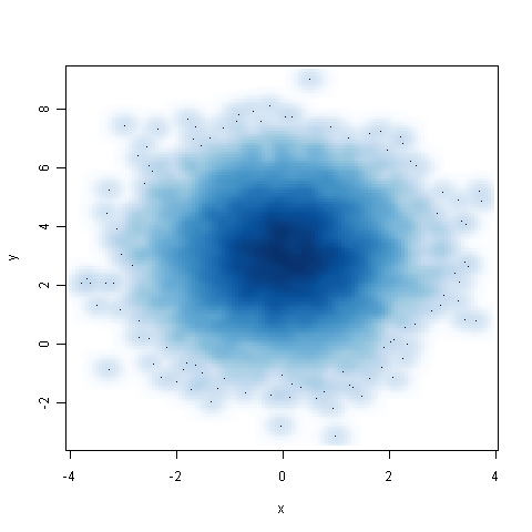
The smoothScatter() function produces a smoothed color density representation of the scatter plot, obtained through a kernel density estimate. We passed the x and y variables which represented the data to be plotted. The gradient of the blue color shows the density of the data points, with most points in the center of the graph. The dots in the outer light blue circles are outliers.
We can pass a number of arguments to smoothScatter() to adjust the smoothing, for example nbin for specifying the number of equally spaced grid points for the density estimation, and nrpoints to specify how many points to show as dots. In addition, we can also pass standard arguments such as xlab, ylab, pch, cex, and so on to modify axis and plotting symbol characteristics.
-
No Comment