
Heat maps are colorful images, which are very useful for summarizing a large amount of data by highlighting hotspots or key trends in the data.
There are a few different ways to make heat maps in R. The simplest is to use the heatmap() function in the base library:
heatmap(as.matrix(mtcars),
Rowv=NA,
Colv=NA,
col = heat.colors(256),
scale="column",
margins=c(2,8),
main = "Car characteristics by Model")
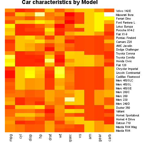
The example code has a lot of arguments, so it may look difficult at first sight. But if we consider each argument in turn, we can understand how it works. The first argument to the heatmap() function is the dataset. We are using the inbuilt dataset mtcars, which holds data such as fuel efficiency (mpg), number of cylinders (cyl), weight (wt), and so on for different models of cars. The data needs to be in a matrix format, so we use the as.matrix() function. Rowv and Colv specify if and how dendrograms should be displayed to the left and top of the heat map.
Note
See help(dendrogram) and http://en.wikipedia.org/wiki/Dendrogram for details on dendrograms.
In our example, we suppress them by setting the two arguments to NA, which is a logical indicator of a missing value in R. The scale argument tells R in what direction the color gradient should apply. We have set it to column, which means the scale for the gradient will be calculated on a per-column basis.
Heat maps are very useful for looking at correlations between variables in a large dataset. For example, in bioinformatics, heat maps are often used to study the correlations between groups of genes.
Let's look at an example with the genes.csv example data file. Let's first load the file:
genes<-read.csv("genes.csv",header=T)Let's use the image() function to create a correlation heat map:
rownames(genes)<-colnames(genes)

image(x=1:ncol(genes),
y=1:nrow(genes),
z=t(as.matrix(genes)),
axes=FALSE,
xlab="",
ylab="" ,
main="Gene Correlation Matrix")

axis(1,at=1:ncol(genes),labels=colnames(genes),col="white",
las=2,cex.axis=0.8)
axis(2,at=1:nrow(genes),labels=rownames(genes),col="white",
las=1,cex.axis=0.8)

We have used a few new commands and arguments in this example, especially for formatting the axes. We will discuss these in detail starting in Chapter 2, Beyond the Basics and with more examples in later chapters.
Heat maps will be explained in a lot more detail with more examples in Chapter 8, Creating Heat Maps.