
Given R's powerful analysis and graphical capabilities, it is no surprise that R is very popular in the world of finance. In this recipe, we will learn how to plot data from the stock market using some special libraries.
We need the tseries and
quantmod packages to run the following recipes. Let's install and load these two packages:
install.packages("quantmod")
install.packages("tseries")
library(quantmod)
library(tseries)Let's first see an example using the tseries library function get.hist.quotes(). We will compare stock prices of three technology companies:
aapl<-get.hist.quote(instrument = "aapl", quote = c("Cl", "Vol"))

goog <- get.hist.quote(instrument = "goog", quote = c("Cl", "Vol"))

msft <- get.hist.quote(instrument = "msft", quote = c("Cl", "Vol"))

plot(msft$Close,main = "Stock Price Comparison",
ylim=c(0,800), col="red", type="l", lwd=0.5,
pch=19,cex=0.6, xlab="Date" ,ylab="Stock Price (USD)")

lines(goog$Close,col="blue",lwd=0.5)
lines(aapl$Close,col="gray",lwd=0.5)

legend("top",horiz=T,legend=c("Microsoft","Google","Apple"),
col=c("red","blue","gray"),lty=1,bty="n")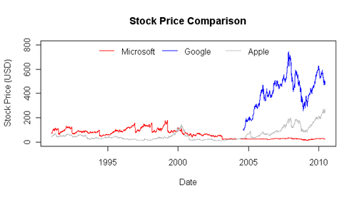
The get.hist.quote() function retrieves historical financial data from one of two providers (yahoo (for Yahoo) or oanda (for OANDA), yahoo being the default). We passed the instrument and quote arguments to this function which specify the name of the stock and the measure of stock data we want. In our example, we used the function three times to pull the closing price and volume for Microsoft (msft), Google (goog), and Apple (aapl). We then plotted the three stock prices on a line graph using the plot() and lines() functions.
Now let's make some charts using the quantmod package. This package provides inbuilt graphics functions to visualize the stock data:
getSymbols("AAPL",src="yahoo")
barChart(AAPL)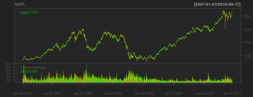
First we obtained stock data for Apple using the
getSymbols() function by specifying the stock name and source. Again, the default source is Yahoo. The stock data is stored in an R object with the same name as the stock symbol (AAPL for Apple, GOOG for Google, and so on). Then we passed this object to the barChart() function to produce the previous graph above. Of course, it is more than just a bar chart.
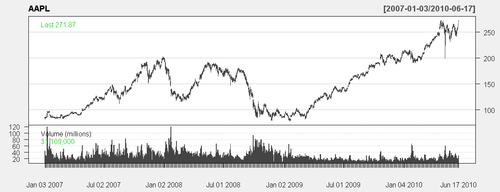
A similar chart in a different color scheme can be drawn as follows:
candleChart(AAPL,theme="white")
For more detailed information about the quantmod package, visit its website at:http://www.quantmod.com